
Colors play a crucial role in every design — they bring life to it, help add meaning to the features you implement, and make your product accessible through a proper contrast ratio.
In fact, color contrast is a key consideration in the Web Content Accessibility Guidelines (WCAG). And adherence to these guidelines guarantees that your design is inclusive and accessible to all users, regardless of their visual abilities.
Moreover, randomly adding colors to designs can lead to trouble. Inconsistencies and varying shades of the same color can emerge across the product. And this would translate into a terrible user experience.
Having a clear color palette helps you avoid color clashes and inconsistencies. It also speeds up the design process since the colors are already chosen, allowing you to focus more on other creative aspects of your work.
In this article, I help you build your own color palette. Follow along!
This section will detail the steps to create an effective color palette. We’ll cover selecting the appropriate hierarchy, choosing a color model, selecting the best tools, understanding accessibility guidelines, and applying the five-step rule for color selection.
Think of what colors resonate with your product. You could use your logo, other elements on your old design system, or colors that generally resonate with your brand as references.
For this tutorial, I’ll use blue and grey as primary colors, with green, red, and yellow as secondary colors (inspired by the traffic lights, a standard color scheme in many products).
We have tons of different color models — RGB, CMYK, Pantone, HSB, HEX, and HSL, among others. And one important aspect of these models is the hue. Understanding and controlling the hue of your colors is crucial for creating a harmonious (and effective) color palette.
HSB is the best for a digital color palette. I say this because you must stick with one hue value to ensure consistency in your color palette. Deviating from that number might result in shades that are not a good fit. You can also end up with a different shade and a tally color:
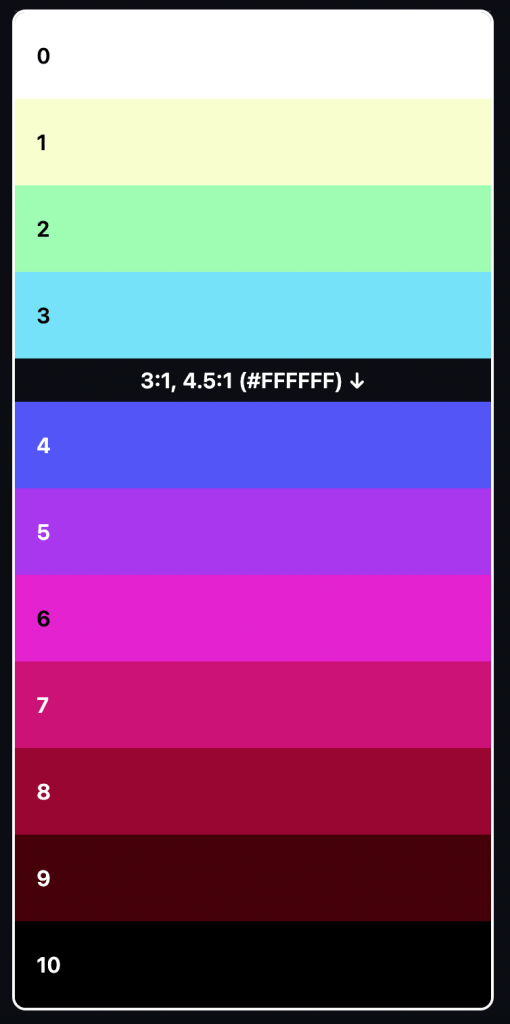
So first, define the color that meets your needs and check its hue value.
This number is now your source of truth; you’ll need to use it to create your scale.
You might need to change the brightness of some shades to pass accessibility standards (discussed later in this article).
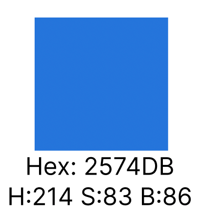
I will use this blue as an example:
ColorBox is an intuitive tool for creating palettes. Of course, you have other options, such as the Canva color palette generator, Colorspace, Kroma, and Color Hunt.
I decided to use ColorBox because we can have our palette done within a few clicks, with the important codes only one click away from you.
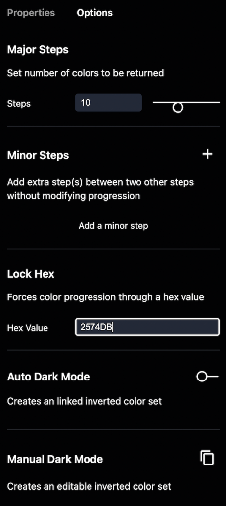
Set your hue, which in this case is 214. Also, ensure that the start and end values are the same.
Next, set all curves as linear to ensure your selected color is placed in the middle of this palette. If you apply other values, this position can vary, and then you will not have enough shades above or below it:
Define the number of steps you want. Here, I will go with eleven, with white at the beginning, black at the end, and nine shades between them.
You can also add minor steps if you need an extra shade between them.
Finally, use your main HEX code (here, #2574DB) as a major reference to force the color progression through the same value:
If you enable the option, you can also see all HSB and HEX codes and contrast ratios of the colors generated.

If you’ve been following along, you’ll recall that your main color is the number 5, which lies exactly in the middle of your palette.
This color plays an important role here: you have five lighter shades above it and five darker shades below it.
But you must be sure that this shade has at least AA accessibility standards. So, test this color on black and white backgrounds, and to do it, you can use Adobe Color. Here’s how:
Go to Accessibility tools and select the Contrast Checker.
Next, paste your color in the text field and set the background to white.
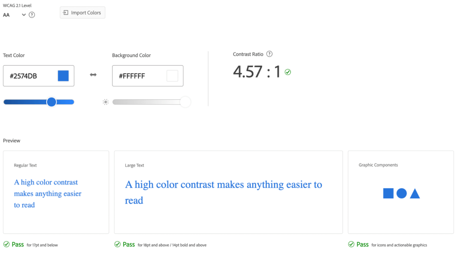
Our white background check shows a 4.57 ratio, which means it passes for regular and large texts and graphic components and meets the AA standard (WCAG 2.1 level).
Now, let’s do the same with a completely black background:
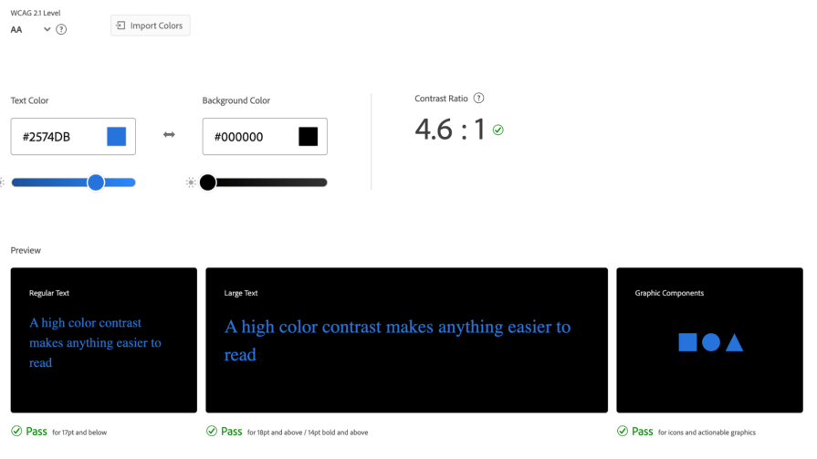
The black background check shows a 4.6 ratio, so we are good here.
You can also invert the colors to double-check the ratios to ensure they pass AA standards in both ways.
Now that you have successfully conducted an accessibility check on your main color, it is time to check the contrast between the other shades.
But, you often cannot do this check on black and white backgrounds.
Think of my example: the lighter shade of blue has a terrible contrast with white, and the darker shade is barely visible on black:
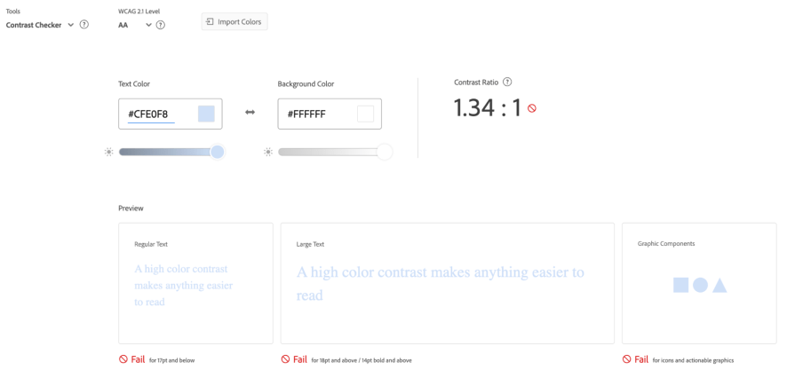
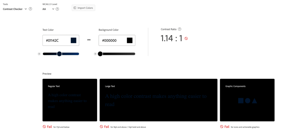
This brings me to the 5-step rule. This rule is all about matching lighter and darker shades.
In the color palette you just built, name your colors from 0 to 100. This naming is essential — it makes the matching easier as the rule is about combining colors that are five steps away (0 – 50, 10 – 60, 20 – 70, 30 – 80, 40 – 90, 50 – 100):

After naming your colors, check if the rule is working.
For this example, I chose the colors 10 and 60 and pasted them onto Adobe Color to check the ratio:
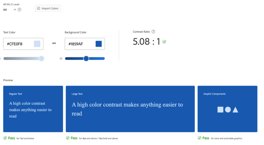
The ratio turned out to be 5.08. Fantastic!
Do the same with the other pairs of shades, say, 20–70, 30–80, and 40–90, and check the ratios. These pairs should also pass the test.
But what if your color pairs don’t pass the ratio test?
If those shades don’t pass the test, it could badly impact your product’s UX, causing bad readability and accessibility problems that, depending on the country, could push your work into lawsuits.
To fix those that don’t pass the test, go to your design tool and change the luminosity until you find one shade that passes the contrast ratio test. You could choose to make the lighter color dark or vice versa — it is totally up to you.
Repeat steps two through five for all the colors you defined in the beginning.
Here is the palette I created for my colors:
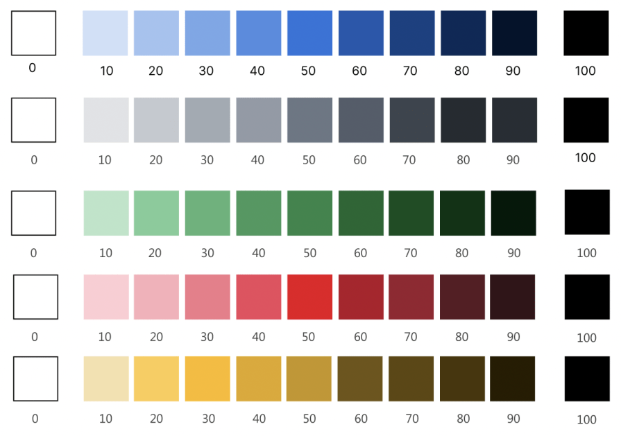
Yellow is the hardest color to work with in terms of accessibility for your users.
Think of it this way — when you want to make it darker, there is no ‘dark yellow’; it turns into a shade of brown, rust, or orange.
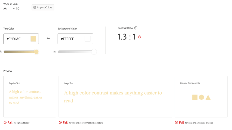
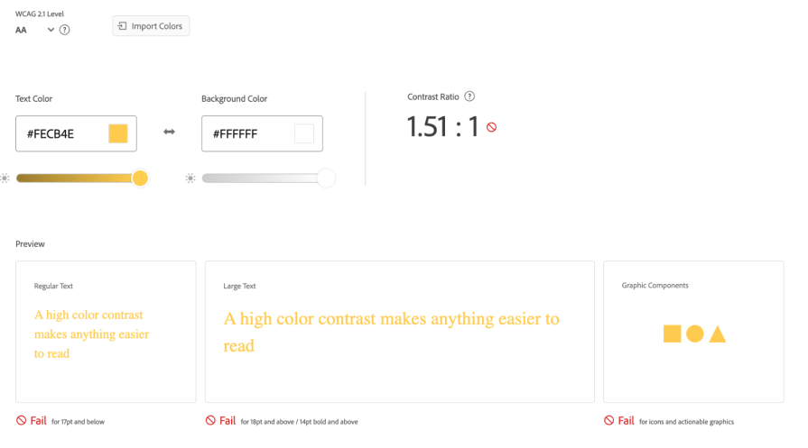
Plus, this color has a terrible contrast with white:
Let’s help you find a way to work with yellow palettes.
Below is a list of the different options you may choose from:
Because yellow does not pass basic accessibility standards, you can try to remove it from your product. Choosing this way out would be especially easier if your design project is fresh.
But if you’ve been working on it for a while and your design relies on the traffic light scheme, be careful. Changing it would mislead your users, as these color coils play an important role in your product.
If you are willing to change it, you must interview your users and test your prototype with different people to understand their feelings about those changes.
As we discussed before, yellow has a bad contrast ratio with white.
Wonderfully, it is the opposite when we talk about its contrast with black. So, if your brand color palette allows you to have a dark background, you can easily play with different shades of yellow. Go for it!
You may choose to use yellow for warnings. In these design aspects, you must draw the user’s attention to the message, not the background.
This means that if your background is not accessible, it wouldn’t be a UX problem.
![]()
If you need your yellow to be visible, apply a dark border to the design element and then add the same color on the border and the text.
For instance, if your background is yellow 30, choose yellow 80 or above.
By doing this, you ensure all colors on that element are accessible. Here’s an example:
![]()
Creating your digital color palette is crucial in ensuring your product meets accessibility standards. Accessibility enhances the user experience for everyone — whether it’s a ramp on a sidewalk, a color palette for a digital product, or devices that aid people with disabilities.
When developing your color palette, it’s important to understand the WCAG 2.0 guidelines, which classify accessibility into three levels:
A thoughtfully designed color palette that meets Level AA standards means your product adheres to good accessibility practices. Achieving Level AAA indicates that your palette — and overall design — exceeds typical requirements, providing an exceptional user experience.
However, remember that a good color palette is just one part of the accessibility puzzle. While it’s essential, comprehensive accessibility involves many factors beyond color choices.
By focusing on creating an accessible color palette as a foundational step, you set the stage for designing digital products that are inclusive, usable, and enjoyable for all users.
LogRocket's Galileo AI watches sessions and understands user feedback for you, automating the most time-intensive parts of your job and giving you more time to focus on great design.
See how design choices, interactions, and issues affect your users — get a demo of LogRocket today.

I’ve spent enough time designing with WCAG 2.2 to know it’s not enough. Here’s why I’m skeptical and cautiously hopeful about WCAG 3.0.

I learned this lesson the hard way. Good UX doesn’t survive endless approval loops. Here’s what went wrong — and how to protect your vision.

I’ve reviewed “final” designs more times than I can count — and the copy almost always gives users a reason to hesitate.

The checkbox is one of the most common elements in UX design. Learn all about the feature, its states, and the types of selection.