We’re living in a world where new devices seem to be coming out every day. From large monitors to tiny smartwatches, the tech industry keeps innovating. And as designers we have to keep up with the changes.
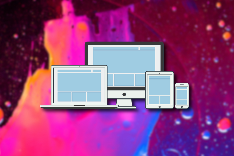
For UX to be truly great, no matter what device a user is on — whether it’s a 6-inch smartphone or a 27-inch monitor — they should be able to navigate the UI intuitively. But how do we make sure our designs adapt to all these different screen sizes without compromising on quality?
This is where responsive and adaptive designs step in. You might know what they are, but the adaptive vs. responsive design debate’s been hot. Which one is better? And when should you use each? Let’s dive in and find out.
Quick overview. I’ll keep it simple.
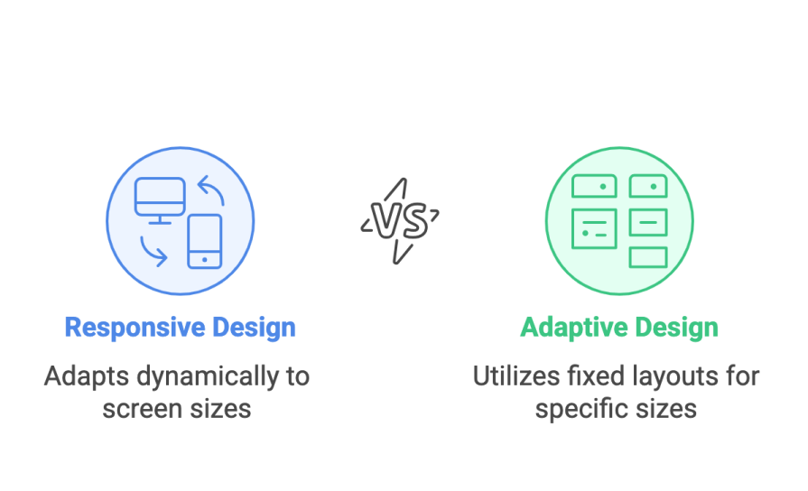
Responsive design is when a single user interface dynamically adapts to different device layouts. It changes based on the screen width and adapts the placement of elements to fit the space. This keeps the grids and content consistent and flexible, whether the user is on a phone or a desktop.
Adaptive design, on the flip side, serves up a tailored experience. It uses a set of fixed layouts designed for specific screen sizes — usually one of six common widths like 320px, 480px, or 1200px. The design doesn’t change dynamically; instead, it ensures the user sees a perfect version of the UI for their device.
Responsive design has pretty much become the gold standard for modern web design. Why? Because it offers seamless device switching. Ethan Marcotte, who first coined the term, made sure we all knew this was the future.
A key argument supporting the rise of responsive design is a user’s love for consistency across devices. Uniform design elements create a predictable easy to navigate environment resulting in an intuitive user experience and reduced cognitive overload.
From a business standpoint, the customer is more satisfied with the UI that they are familiar with, leading to more engagement and increased brand loyalty.
Furthermore, this aligns with Jakob’s law, which states that users prefer websites they’ve used before. Through the use of familiar design patterns such as card-based layouts, which are easier to adjust and re-arrange, websites using responsive design ensure the familiarity required by this law, further increasing user satisfaction.
This becomes even more important when taking into account that in today’s world, over 61.5% of global internet traffic happens on mobile devices. This makes it incredibly important for web traffic to seamlessly translate to mobile traffic without any major changes to the design.
Despite these benefits, responsive design requires meticulous design and extensive testing to make sure that all design elements properly fit across all platforms. Moreover, when adding new design elements, what fits into one layout might not perfectly fit into another, which then requires more design work to make sure everything fits into every space.
Furthermore, layout shifts where design elements move unexpectedly once the page loads can frustrate users. This can, however, be mitigated by reserving space for dynamic elements so that they don’t push away other content when shifting.
Anyone who’s ever worked on a large-scale design project knows how tedious and time-consuming it can be to make different versions of the same design. This is not only true for UX designers but also for the developers who have to code every single iteration of the same design.
Moreover, multiple design teams, strategies, and back-end interfaces are required when developing separate desktop and mobile websites.
This increases development and maintenance costs, as even if the responsive website still ends up being a costly project, maintaining two separate entities will cost a lot more than one all-encompassing one in the long run. This includes things such as hosting the websites, which will cost less if they are under one URL.
Moreover, this is also beneficial from a business standpoint, as responsive websites with a URL that serves all devices are better for search engine optimization (SEO).
Responsive design ensures that your websites adapt really well to new devices as it excels at using a given space as effectively as possible. With new innovations in technology happening every day, the future of mobile and desktop devices is both exciting and unpredictable, and responsive designs will be able to scale naturally to these devices while maintaining uniformity.
However, while this can be very beneficial, it can also have its drawbacks, as with emerging trends in UI animations, more emphasis is being put on unique user experiences for specific devices.
Furthermore, with the rapid development of unique devices such as VR goggles and AI glasses, responsive design might struggle to adapt to these new browsing environments.
Adaptive design is all about offering a tailored experience. It was introduced in 2011 and quickly became the go-to for mobile-first designs. It’s a great fit for projects where the user experience needs to be optimized for specific devices.
The main factor supporting the acceptance of adaptive design is the greater amount of control it gives designers and developers.
Using fixed layouts allows designers to create tailored experiences depending on the device used. Keeping usability in mind, all layouts and design elements are modified to perfectly fit the selected screen width. As a result, this increases usability as all design elements and how users interact with them are context-based and device-specific.
Furthermore, coupled with context-aware design, for example, creating touch targets by increasing button size on mobile devices or having hover animations for desktop users, design elements are also tailored to specific user behavior, which creates more intuitive experiences across various devices.
Adaptive design ensures that complex design elements such as images stay high quality without distorting or that the visual hierarchy remains optimal for every screen size. However, this also has its drawbacks, as significant work and resources are required in the development and maintenance of different versions of the same interface.
Furthermore, since the screen sizes are limited in number, established designs can have trouble adapting to new sizes, resulting in some users, such as tablet users who are in the middle of web and mobile devices, having less than optimal interfaces.
As more devices with varying sizes are created over time, these adaptive designs will require more updates in the long run.
Websites using adaptive design will often outperform those using responsive design. Since the designs are tailored for specific screen sizes and devices, only resources and assets necessary for that size are included. The server then identifies which device type is in use and then loads the correct design, which results in less data being used and faster loading times across multiple devices.
However, this can also have its drawbacks, as the ability of a server to correctly identify the type of device being used, like all computer programs, can sometimes fail. This failure can then result in the incorrect design being applied to the user’s device, which can lead to a bad user experience.
While actual loading speed should, in fact, be fast, users care more about how fast the website feels rather than its actual speed. What they care about is perceived performance, and this can be used to one’s advantage to ensure smooth user performance.
One technique is lazy loading, where non-essential content like images or videos are loaded last, making it seem like all content is loading fast. Another technique is including skeleton screens, which mimic the page’s layout while it loads, creating the illusion that progress is happening. These are among a few of the techniques that can be used to increase a user’s perceived performance and, as such, their user experience.
The choice between responsive and adaptive design depends on your project’s scope, your audience, and your goals.
Use responsive design if:
Use adaptive design if:
I’ve also summarized all of that talk in this short table. This is all you’ll need to consider when picking an approach for your next project. For each criterion, mark the question that best describes your project’s needs. And then whichever column has the most answers, that approach is likely the best fit:
| Criteria | Adaptive design | Responsive design |
| Budget and resources | Have the time and resources for tailored layouts? | Need a more cost-effective, flexible solution? |
| Target audience and devices | Users mainly on specific devices (smartphones, tablets)? | Wide audience using all kinds of devices? |
| Performance requirements | Need optimized, fast load times for each device? | Flexible layout works fine across devices? |
| UX priorities | Is device-specific experience critical? | Consistency is key across devices? |
| Maintenance and future-proofing | Ready for ongoing updates? | Want something scalable with little maintenance? |
| SEO and URL structure | Separate URLs or dynamic serving is fine? | Prefer a single URL for better SEO? |
Both responsive design and adaptive design offer distinct advantages and challenges, and the right choice ultimately depends on your project’s specific needs. When deciding between the two, consider key factors like accessibility, performance, and future-proofing — ensuring that your design remains effective across evolving technologies. In some cases, a hybrid approach may even be the best solution.
Additionally, aligning with WCAG guidelines — a best practice for all responsible UX designers — reveals that both responsive and adaptive design contribute to accessibility in different ways. Regardless of the approach, the priority should always be a user-centric experience.
By critically analyzing your target audience, project goals, and potential pain points, you can select the strategy that delivers the most seamless and inclusive UX.

LogRocket's Galileo AI watches sessions and understands user feedback for you, automating the most time-intensive parts of your job and giving you more time to focus on great design.
See how design choices, interactions, and issues affect your users — get a demo of LogRocket today.

Learn what makes a great login screen through real-world examples and UX best practices for creating secure, accessible, and low-friction authentication flows.
Skeuomorphism helped define early digital interfaces by mimicking real-world objects to make technology more intuitive. Learn how it compares with flat design and neumorphism, why it declined, and where it still has a place in modern UX.

Memos don’t have to be complicated. Just keep them clear, concise, and focused on actionable items. More on that in this blog.
AI has made polished, confident content easy to generate, but that does not make it trustworthy. This article explains how UX teams can design stronger quality signals using source transparency, validation, confidence communication, and reputation.

 Learn more →
