
Every day, new tech advances are leading to more diverse web displays, like foldable and curved screens. However, the availability of more displays has bigger implications for developers. Website owners must ensure their sites are accessible and user-friendly across this wide spectrum of devices.

Zoom functionality is not just a convenience — it’s a necessity for many users, especially those with visual impairments. Zooming allows users to magnify or reduce the content on a webpage, making it easier to read, interact with, and navigate. Understanding and supporting zoom behaviors on the web can significantly enhance user experience and inclusivity.
In this article, we’ll examine three types of zoom behaviors in browsers, why these behaviors are crucial for accessibility, and how to effectively support them in your web designs.
The Replay is a weekly newsletter for dev and engineering leaders.
Delivered once a week, it's your curated guide to the most important conversations around frontend dev, emerging AI tools, and the state of modern software.
There are three primary types of zoom behavior to consider when designing web applications: browser zoom, text zoom, and pinch zoom.

Browser zoom is a fundamental feature available in all major web browsers, designed to enhance user accessibility and control over web content. It allows users to zoom in or out on an entire webpage, magnifying or reducing all elements on the page, including text, images, videos, and other embedded content.
Browser zoom is especially useful for individuals who have difficulty reading small text or viewing detailed images, providing a way to tailor the web experience to their specific needs.
The default zoom level is typically set at 100 percent, leaving the webpage display as intended by the designer. However, users can easily adjust this level using keyboard shortcuts (Ctrl + + to zoom in, Ctrl + - to zoom out on Windows, or Cmd + + and Cmd + - on macOS) or through the browser’s user interface, often found in the settings menu or toolbar.
Text zoom is a specialized zooming feature that specifically targets text elements on a webpage, allowing users to increase or decrease the size of the text independently of the overall page zoom. Unlike browser or page zoom, which magnifies or reduces all content on a page — including images, videos, and other media — text zoom focuses solely on adjusting the size of the text.
Primarily supported by Firefox and Safari, text zoom offers a granular level of control, making it invaluable for users with visual impairments or those with specific reading preferences.
For example, users who find standard text sizes too small can use text zoom to enlarge the text without affecting the webpage’s surrounding images, buttons, or overall layout. This ensures the page remains visually consistent while catering to individual accessibility needs.

Pinch zoom is a gesture-based zooming technique that has become a standard feature on touch-enabled devices such as smartphones, tablets, and touchscreen laptops. It’s an intuitive method that allows users to zoom in or out on content by pinching their fingers together or spreading them apart on the screen.
Pinch zoom is mostly advantageous for mobile users, as it offers a direct and interactive way to control the scale of web content with simple, natural gestures. Its importance lies in its ability to adapt web content to fit mobile device screen sizes and resolutions. As users pinch to zoom, the content dynamically resizes, providing a closer or broader view of the webpage.
Pinch zoom is often used with other touch gestures, such as swiping or double tapping, to create a seamless navigation experience on mobile devices.
Zoom behavior is vital in enhancing the usability, accessibility, and overall user experience on the web. Here’s how:
To effectively support zoom behavior in your application, you must use CSS techniques to ensure content remains accessible, responsive, and visually consistent across different zoom levels. Let’s look at some of those techniques.
Flexible layout models like Flexbox and CSS Grid are crucial for maintaining a responsive design that adapts well to zoom behavior.
Both Flexbox and Grid allow you to create layouts that can dynamically adjust as the zoom level changes, ensuring that elements remain properly aligned and visually balanced.
Flexbox is ideal for creating one-dimensional layouts where the elements can grow, shrink, or wrap based on the available space. It ensures that content reflows properly when zoomed. Here’s an example:
.container {
  display: flex;
  flex-wrap: wrap;
  justify-content: space-between;
}

.item {
  flex: 1 1 auto;
  margin: 10px;
  padding: 20px;
}
You can achieve the same effect using Grid, a powerful tool for creating two-dimensional layouts. Grid allows these layouts to adapt to different screen sizes and zoom levels. With Grid, you can define rows and columns that adjust automatically based on the content and viewport size:
>.grid-container {
  display: grid;
  grid-template-columns: repeat(auto-fill, minmax(200px, 1fr));
  gap: 20px;
}
These layout models ensure that your content remains visually coherent and accessible, regardless of how much the page is zoomed in.
Typography is crucial in maintaining readability, especially when users zoom in or out. To support text zoom and overall zoom behavior, it’s important to use responsive typography techniques that allow text to scale appropriately.
You can do that using either relative units or viewport units:
Instead of using fixed units like px for font sizes, consider using relative units like em, rem, or %. These units allow text to scale proportionally with the rest of the content and the browser’s zoom level:
body {
  font-size: 1rem; /* 16px by default */
}

h1 {
  font-size: 2.5rem; /* 40px by default */
}
You can also use viewport-relative units like vw (viewport width) and vh (viewport height) can be used to create text sizes that respond to the size of the viewport, ensuring consistent readability at different zoom levels:
body {
  font-size: 5vw;
}
Media elements also need to scale appropriately with the rest of the content. You can use a couple of different methods to ensure that your media is responsive and that quality is maintained across different zoom levels.
Use CSS to ensure that images scale with the content. The max-width: 100% rule allows images to resize within their container, preventing them from overflowing and maintaining their aspect ratio:
img {
  max-width: 100%;
  height: auto;
}
Scalable Vector Graphics (SVGs) are resolution-independent and can scale smoothly without losing clarity, making them ideal for logos, icons, and other vector-based graphics. Their ability to maintain quality makes them best for images that need to maintain their quality at any zoom level.
If you use background images, ensure they are responsive by combining background-size: cover; or background-size: contain; with media queries to adjust the image based on screen size and zoom level.
When supporting zoom behavior, it’s essential to consider how your layout responds to different zoom levels, particularly at critical breakpoints. Use media queries to adjust the layout and ensure content remains accessible and visually appealing at various zoom levels by defining breakpoints that accommodate different zoom levels and screen sizes.
For example, you could adjust the layout for screens zoomed to a width below a certain threshold:
@media (max-width: 768px) {
  .sidebar {
    display: none;
  }

  .main-content {
    width: 100%;
  }
}
Pinch zoom on touch devices requires special attention to ensure an intuitive user experience. Most modern devices support pinch zoom natively. Still, you can always go the extra mile to ensure that touch gestures aren’t being blocked by other elements on the page:
html {
  touch-action: manipulation;
}

img {
  max-width: 100%;
  height: auto;
}
By setting touch-action to manipulation on the <html> element, you are essentially enabling default touch behavior for the entire page. This means that users can pinch to zoom and pan around the content, just as they would with a native app.
Although text zoom is natively supported only in Firefox and Safari, you can implement a similar feature in other browsers using JavaScript. This can be particularly useful for accessibility, as it allows users to increase or decrease text size based on their preferences. Here’s one way of doing that:
<button id="increase-text">Increase Text Size</button>
<button id="decrease-text">Decrease Text Size</button>

<p id="text-content">This is some example text that will be zoomed in or out.</p>

<script>
  const increaseTextBtn = document.getElementById('increase-text');
  const decreaseTextBtn = document.getElementById('decrease-text');
  const textContent = document.getElementById('text-content');

  let fontSize = 16;

  increaseTextBtn.addEventListener('click', () => {
    fontSize += 2;
    textContent.style.fontSize = fontSize + 'px';
  });

  decreaseTextBtn.addEventListener('click', () => {
    if (fontSize > 10) {
      fontSize -= 2;
      textContent.style.fontSize = fontSize + 'px';
    }
  });
</script>
In this example, two buttons allow the user to increase or decrease the text size. The fontSize variable controls the text size, which updates dynamically when the buttons are clicked.
If you want something more intuitive, you can listen for multi-touch gestures on touch devices and adjust the text size accordingly, like this:
// Initialize variables to store the initial distance between touch points and the current font size
let initialDistance = null;
let fontSize = 16; // Start with an initial font size of 16 pixels

// Reference to the text element that will be resized
const textContent = document.getElementById('zoomable-text');

// Event listener for 'touchstart' to capture the initial touch points and calculate the initial pinch distance
document.addEventListener('touchstart', (event) => {
    if (event.touches.length === 2) { // Ensure there are exactly two touch points
        const touch1 = event.touches[0];
        const touch2 = event.touches[1];
        // Calculate the initial distance using the Pythagorean theorem
        initialDistance = Math.hypot(
            touch2.clientX - touch1.clientX,
            touch2.clientY - touch1.clientY
        );
    }
});

// Event listener for 'touchmove' to handle ongoing touches and calculate the new distance between touch points
document.addEventListener('touchmove', (event) => {
    if (event.touches.length === 2) { // Continue only if there are exactly two touch points
        const touch1 = event.touches[0];
        const touch2 = event.touches[1];

        // Calculate the current distance between the two touch points
        const currentDistance = Math.hypot(
            touch2.clientX - touch1.clientX,
            touch2.clientY - touch1.clientY
        );

        // Only proceed if the initial distance was set
        if (initialDistance != null) {
            const scaleFactor = currentDistance / initialDistance; // Determine the scale factor

            // Adjust the font size based on the scale factor
            if (scaleFactor > 1 && fontSize < 100) { // Zoom in condition
                fontSize += 2; // Increase the font size by 2 pixels
            } else if (scaleFactor < 1 && fontSize > 10) { // Zoom out condition
                fontSize -= 2; // Decrease the font size by 2 pixels
            }

            // Apply the new font size and update the initial distance for the next movement
            textContent.style.fontSize = fontSize + 'px';
            initialDistance = currentDistance;
        }
    }
});

// Event listener for 'touchend' to reset the initial distance when the touch ends
document.addEventListener('touchend', (event) => {
    if (event.touches.length < 2) { // Reset when fewer than two fingers are detected
        initialDistance = null; // Clear the initial distance to prepare for a new gesture
    }
});
Here, the script detects the distance between two touch points (fingers) and adjusts the text size based on whether the user is pinching in or out.
Ultimately, supporting zoom behaviors is an integral part of modern web design that goes beyond aesthetics. It facilitates accessibility and ensures that your site is engaging on all levels — not only will it be visually responsive, but it’ll also be functional and comfortable for all users.
By understanding and implementing the best practices for browser, text, and pinch zoom behaviors, you can create a more responsive, accessible, and user-friendly website that meets the needs of a diverse audience.
As web frontends get increasingly complex, resource-greedy features demand more and more from the browser. If you’re interested in monitoring and tracking client-side CPU usage, memory usage, and more for all of your users in production, try LogRocket.

LogRocket lets you replay user sessions, eliminating guesswork around why bugs happen by showing exactly what users experienced. It captures console logs, errors, network requests, and pixel-perfect DOM recordings — compatible with all frameworks.
LogRocket's Galileo AI watches sessions for you, instantly identifying and explaining user struggles with automated monitoring of your entire product experience.
Modernize how you debug web and mobile apps — start monitoring for free.
Debugging code is always a tedious task. But the more you understand your errors, the easier it is to fix them.
LogRocket allows you to understand these errors in new and unique ways. Our frontend monitoring solution tracks user engagement with your JavaScript frontends to give you the ability to see exactly what the user did that led to an error.
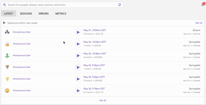
LogRocket records console logs, page load times, stack traces, slow network requests/responses with headers + bodies, browser metadata, and custom logs. Understanding the impact of your JavaScript code will never be easier!

A hands-on test of Claude Code Review across real PRs, breaking down what it flagged, what slipped through, and how the pipeline actually performs in practice.

CSS art once made frontend feel playful and accessible. Here’s why it faded as the web became more practical and prestige-driven.

Learn how inline props break React.memo, trigger unnecessary re-renders, and hurt React performance — plus how to fix them.

This article showcases a curated list of open source mobile applications for Flutter that will make your development learning journey faster.
Hey there, want to help make our blog better?
Join LogRocket’s Content Advisory Board. You’ll help inform the type of content we create and get access to exclusive meetups, social accreditation, and swag.
Sign up now