The Replay is a weekly newsletter for dev and engineering leaders.
Delivered once a week, it's your curated guide to the most important conversations around frontend dev, emerging AI tools, and the state of modern software.
A grid or grid system is a collection of vertical and horizontal lines that defines a structure to stack design elements in a consistent and manageable fashion.

Grids are project-agnostic, meaning they can be used on any project. A grid typically consists of rows, columns, and gutters (the space between the rows and columns). And they enable design elements to be stacked vertically or horizontally.
Web technologies such as HTML and CSS have existed for years without a grid system. However, CSS frameworks such as Bootstrap have popularized the use of grid systems on the web.
Also, W3C has released the CSS Grid module 1 to define two-dimensional grid-based layouts. CSS grid or CSS grid layout is currently not an official standard, it’s a W3C candidate recommendation but it has been supported by most major browsers.
In this article you would learn about the following:
em)calc() function:not() pseudo-selector and the last-child pseudo-classGrid systems make it very easy to create responsive web designs, mobile-friendly designs and are just well suited for almost any kind of layout. They also give an easy and predictable approach to scaffolding layout designs which can help improve productivity.
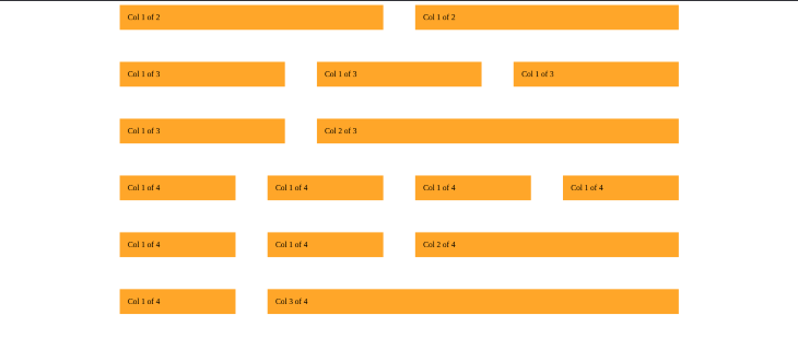
There are several ways to build a custom grid in CSS. We can use the plain, old CSS float property, flexbox, or CSS grid. In this article, we will be using float because it is very straightforward and supported by all browsers. Below is an image of the grid we will be building in this section:

We will build our grid with HTML 5 and SASS (which compiles to pure CSS). We are using SASS (SCSS) because it adds a lot of power and elegance to CSS. SASS features such as nesting and the parent selector are used extensively in this project. Together they make our code clean and maintainable.
I have set up a starter project to get us started easily. Get the starter files by cloning this repository. Then follow the steps below to start the dev server:
cd into the project directory#NPM npm install #YARN yarn install
dev server by running:
#NPM
npm start

#YARN
yarn start
You can now view your app at 127.0.0.1:8080
SASS file and compile it. To do this open a new terminal tab and run:
#NPM
npm run sass

#Yarn
yarn run sass
This starts watching our SCSS file and compiles it into our style.css file. Our project setup is now complete. We can start building our grid in the next section.
The markup for our grid is already provided in the starter files. In this section we will focus on the styling our grid by following the steps below:
The universal selector (*) applies the declared styles to all HTML elements in the page:
*{
  margin: 0px;
  padding: 0px;
  box-sizing: border-box;
}
In the code above we have reset our margin and padding to 0px. This is because browsers, by default, add some margin or padding to certain elements (e.g h1 elements). We do not want this since it can complicate our calculation.
The second (box-sizing) rule is more interesting. This CSS property allows us to change the behavior of the CSS box model.
Consequently, we change how the total width and height of an element are calculated.
The value of the box-sizing property can be used to adjust the CSS box model behavior. By default, the value is set to content-box.
This means that the width of any border or padding of an element is added to the final width of that element. And this makes calculating the final width unclear.
By setting the box-sizing property to border-box, the browser does not add the padding and border of an element to its total width. So, it is easy to calculate an element’s width.
rem)This pattern gives us an easy way to change all the measurements on our page with one simple setting. It involves setting our root font-size, for easy calculation using rem like this:
html {
  font-size: 10px;
}
Since 1rem is equal to the root font-size. 1rem in our case is now 10px. This will make our calculation easier going forward. Since we know that 2rem should be 20px, 1.6rem should be 16px, etc.
Also, we can now change all the measurements on our page by changing the root font-size specified above.
This is very important. For example, when we hit a breakpoint to display our page on a mobile device. We will need a way to decrease all the measurements on our page at the same time.
With our current pattern, we do not have to write complex media queries. We handle this by changing the global font-size.
Next, we will save our static values to SCSS variables like this:
// GRID
$grid-width: 100rem; // 1000px
$gutter-vertical: 4rem; //40px
$gutter-horizontal: 4rem; // 40px
Add the grid markup:
<section class="grid-test">
   <div class="row">
       <div class="col-1-of-2">
           Col 1 of 2
       </div>
       <div class="col-1-of-2">
           Col 1 of 2
       </div>
   </div>
   <div class="row">
       <div class="col-1-of-3">
           Col 1 of 3
       </div>
       <div class="col-1-of-3">
           Col 1 of 3
       </div>
       <div class="col-1-of-3">
           Col 1 of 3
       </div>
   </div>
   <div class="row">
       <div class="col-1-of-3">
           Col 1 of 3
       </div>
       <div class="col-2-of-3">
           Col 2 of 3
       </div>
   </div>
   <div class="row">
       <div class="col-1-of-4">
           Col 1 of 4
       </div>
       <div class="col-1-of-4">
           Col 1 of 4
       </div>
       <div class="col-1-of-4">
           Col 1 of 4
       </div>
       <div class="col-1-of-4">
           Col 1 of 4
       </div>
   </div>
   <div class="row">
       <div class="col-1-of-4">
           Col 1 of 4
       </div>
       <div class="col-1-of-4">
           Col 1 of 4
       </div>
       <div class="col-2-of-4">
           Col 2 of 4
       </div>
   </div>
   <div class="row">
       <div class="col-1-of-4">
           Col 1 of 4
       </div>
       <div class="col-3-of-4">
           Col 3 of 4
       </div>
   </div>
</section>
Our markup above consists of six rows. Each has a varying number of columns. Each div that is a row has a class named row while each div that is a column has a class with a name beginning with col-. The column class is named depending on how many columns are in the row.
Kindly consider the code below:
<div class="row">
  <div class="col-1-of-2">
      Col 1 of 2
  </div>
  <div class="col-1-of-2">
      Col 1 of 2
  </div>
</div>
The code above is for a row with two equal columns. So each column has a class named col-1-of-2. This naming convention is maintained throughout the markup. This pattern enables us to target a wide range of elements for styling as we will see in the next section.
.row {
    max-width: $grid-width;
    margin: 0 auto;

    [class^="col-"] {
        float: left;
        background-color: orange;
        padding: 1rem;
    }
}
The code above gives a max-width to all rows. A max-width is used because it performs better on devices with a small view-port.
Block-level elements (like our rows) always stretch and take up the full width of their container. By setting a width, we will prevent this behavior. But there will be a problem if the browser’s window is smaller than the element’s width. In this case, browsers will add a horizontal scrollbar to the page.
To prevent this, the max-width is used instead of the width property. This will cause the elements to take 100% of the viewport if the browser’s window is smaller than the specified max-width. So this performs better in smaller devices.
The margin: 0 auto; rule centralizes a block element inside of another block element. So, our grid is aligned center.
We styled the column by using a complex attribute selector [class^="col-"]. Here we reap the benefit of our column class naming pattern mentioned above. The attribute selector [class^="col-"] targets all the elements with a class name that starts with col- and applies the declared styles to them. So the CSS rules above, float all of our columns left, set the background-color to orange, and apply a padding of 1rem (10px).
There are other matching patterns for the attribute selectors. For instance:
[class$="col-"] would select any element with a class name that ends with "col-"[class*="col-"] would select any element with a class name that contains "col-"You can get more on this here.
When we float all the child elements (columns) in a parent element (rows) the parent elements collapses. Consequently, the height of the parent element is 0. To fix this we use the clearfix hack. The clearfix hack appends a pseudo element after an element to clear the float like this:
.row::after {
    content: "";
    display: table;
    clear: both;
}
We can add this to our code using SCSS nesting and & selector like this:
.row {
    max-width: $grid-width;
    margin: 0 auto;
    &::after {
        content: "";
        display: table;
        clear: both;
    }
    [class^="col-"] {
        float: left;
        background-color: orange;
        padding: 1rem;
    }
}
In SCSS the & selector refers to the parent element in this case the (row).
We have already declared the variables that store the values of the vertical and horizontal gutters in step two like this:
$gutter-vertical: 4rem;
$gutter-horizontal: 4rem;
Here we will create the vertical and horizontal gutters using these variables.
To create the vertical gutter, we add a bottom margin to all the rows except the last row.
And to create the horizontal gutter we add a right margin to all the columns inside a row, except the last column.
This is not straightforward because in both cases we do not want the CSS rule to apply to the last element. To do this we will use the :not() pseudo-selector and the last-child pseudo-class.
These enable us to selectively apply our CSS rule like this:
.row {
    max-width: $grid-width;
    margin: 0 auto;
    &:not(:last-child) {
        margin-bottom: $gutter-vertical;
    }

    &::after {
        content: "";
        display: table;
        clear: both;
    }

    [class^="col-"] {
        float: left;
        background-color: orange;
        padding: 1rem;
        &:not(:last-child) {
            margin-right: $gutter-horizontal;
        }
    }
}
The last-child pseudo-class selects the last element in a list of sibling elements. So when used with the :not() pseudo-selector the :not() pseudo-selector now selects every element except the last-child in a list of sibling elements. So our gutter is applied to every sibling element except the last-child element in the list.
This is the tricky calculation for which we will use the extremely powerful CSS calc() function. The calc() function enables us to perform calculations in CSS when specifying CSS properties. One great advantage of the calc() function is that it allows us to mix units when performing mathematical operations like this:
div {
  width: calc(60% - 50px);
  height: calc(100rem / 20%);
}

p {
  font-size: calc(1.5rem + 1vh);
}
In our grid, we have six rows and each has a varying number of columns so we will take the calculations in succession.

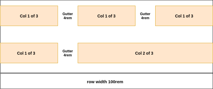
The image above illustrates the first row. It has a max-width of 100 rem. And the gutter between both (col 1 of 2) columns is 4rem. To get the width of each of these columns, we subtract the horizontal gutter ($gutter-horizontal) from 100% of the width of the row. This gives us the width of both (col 1 of 2) columns then we divide our result by two to get the width of each (col 1 of 2) column like this:
.col-1-of-2 {
  width: calc((100% - $gutter-horizontal) / 2);
}

This is similar to our previous calculation. But from the image above we have two horizontal gutters and this needs to be factored into our calculation.
Subtracting both horizontal gutters (2 * $gutter-horizontal) from the 100% of the width of the row will give us the width of all three columns. Then dividing this result by three will give us the width of each col 1 of 3 column:
.col-1-of-3 {
  width: calc((100% - 2 * $gutter-horizontal) / 3);
}

As seen in the image above, this is also similar to our first two calculations. However, we have three horizontal gutters in this case.
By subtracting these horizontal gutters (3 * $gutter-horizontal) from 100% of the width of the row, we get the width of all four col-1-of-4 columns. Then we divide our result by four to get the width of each col 1 of 4 columns:
.col-1-of-4 {
  width: calc((100% - 3 * $gutter-horizontal) / 4);
}

From our image above, the width of the col-2-of-3 column is the width of two col-1-of-3 columns and the horizontal gutter. Since we know that this gives us the width of one col-1-of-3 column:
calc((100% - 2 * $gutter-horizontal) / 3)
We simply multiply this by two and add a horizontal gutter to our result to get the width of the col-2-of-3 column as seen below:
.col-2-of-3 {
  width: calc(2 * ((100% - 2 * $gutter-horizontal) / 3) + $gutter-horizontal);
}

From our image above we can see that the width of the col-2-of-4 columns is the width of two col-1-of-4 columns and the horizontal gutter.
We can get the width of one col-1-of-4 column using this:
calc((100% - 3 * $gutter-horizontal) / 4)
Now we simply multiply this by two and add the horizontal gutter to the result to get the width of the col-2-of-4 column like this:
.col-2-of-4 {
  width: calc(2 * ((100% - 3 * $gutter-horizontal) / 4) + $gutter-horizontal);
}

From the image above, we see that the width of the col-3-of-4 column is the width of three col-1-of-4 columns and the width of two horizontal gutters.
We can get the width of one col-1-of-4 column using the code below:
calc((100% - 3 * $gutter-horizontal) / 4)
Now we simply multiply this by three and add two horizontal gutters (2 * $gutter-horizontal) to the result like this:
.col-2-of-4 {
  calc(3 * ((100% - 3 * $gutter-horizontal) / 4) + 2 * $gutter-horizontal)
}
The final SCSS code is given below:
// GRID
$grid-width: 100rem;
$gutter-vertical: 4rem;
$gutter-horizontal: 4rem;

* {
  margin: 0;
  padding: 0;
  box-sizing: border-box;
}

html {
   font-size: 10px
}

.row {
    max-width: $grid-width;
    margin: 0 auto;
    &:not(:last-child) {
        margin-bottom: $gutter-vertical;
    }

    &::after {
        content: "";
        display: table;
        clear: both;
    }

    [class^="col-"] {
        float: left;
        background-color: orange;
        padding: 1rem;
        &:not(:last-child) {
            margin-right: $gutter-horizontal;
        }
    }

    .col-1-of-2 {
        width: calc((100% - #{$gutter-horizontal}) / 2);

    }

    .col-1-of-3 {
        width: calc((100% - 2 * #{$gutter-horizontal}) / 3);
    }

    .col-2-of-3 {
        width: calc(2 * ((100% - 2 * #{$gutter-horizontal}) / 3) + #{$gutter-horizontal});
    }

    .col-1-of-4 {
        width: calc((100% - 3 * #{$gutter-horizontal}) / 4);
    }

    .col-2-of-4 {
        width: calc(2 * ((100% - 3 * #{$gutter-horizontal}) / 4) + #{$gutter-horizontal});
    }

    .col-3-of-4 {
        width: calc(3 * ((100% - 3 * #{$gutter-horizontal}) / 4) + 2 * #{$gutter-horizontal});
    }

}
It is important to note that in SCSS we have to wrap our variables in #{ } before they can work with the CSS calc function.
You can get all of the code for this grid on CodePen or by cloning this repository.
Our grid above covers a lot of scenarios and more can be added as the need arises since it is custom-built. While building this grid, we touched on some advanced CSS which I hope you find interesting. And although we built this grid system using float, it is also possible to use flexbox or CSS grid.
Lastly, I hope that by building the custom grid above, you know how grid systems are configured, how they work, and can now build your own custom grid.
As web frontends get increasingly complex, resource-greedy features demand more and more from the browser. If you’re interested in monitoring and tracking client-side CPU usage, memory usage, and more for all of your users in production, try LogRocket.

LogRocket lets you replay user sessions, eliminating guesswork around why bugs happen by showing exactly what users experienced. It captures console logs, errors, network requests, and pixel-perfect DOM recordings — compatible with all frameworks.
LogRocket's Galileo AI watches sessions for you, instantly identifying and explaining user struggles with automated monitoring of your entire product experience.
Modernize how you debug web and mobile apps — start monitoring for free.

A side-by-side look at Astro and Next.js for content-heavy sites, breaking down performance, JavaScript payload, and when each framework actually makes sense.

AI-generated tests can speed up React testing, but they also create hidden risks. Here’s what broke in a real app.re

Why the future of DX might come from the web platform itself, not more tools or frameworks.

A hands-on test of Claude Code Review across real PRs, breaking down what it flagged, what slipped through, and how the pipeline actually performs in practice.
Would you be interested in joining LogRocket's developer community?
Join LogRocket’s Content Advisory Board. You’ll help inform the type of content we create and get access to exclusive meetups, social accreditation, and swag.
Sign up now