In app development, it’s common to show important messages to users based on their actions or conditions. Toast notifications are a great way to do this because they’re lightweight and don’t disrupt the user experience.

While you can create your own custom React toast notifications, using a pre-built library with a wide range of features and customization saves you time and effort.
In this article, we’ll learn about toast notifications, understand their significance, cover the problem with toast notifications, and compare some of the most popular React toast libraries. We will dive into their features and benefits, so you can choose the best option for your project.
This table provides a quick summary of what we’ll discuss in this article:
| Library | Bundle Size | Key Features | Best Use Cases | TypeScript Support | Status |
|---|---|---|---|---|---|
| React Hot Toast | 180KB unpacked size | Lightweight, promise API, headless Hooks, ARIA support, highly customizable | Minimal, stylish toasts with easy customization and no bloat | ✅ | ✅ Active |
| Sonner | 165KB unpacked size | Performance-focused, accessibility-first, rich colors, action support, headless mode, promise integration | Fast, accessible toasts with great DX and minimal setup | ✅ | ✅ Active |
| NotiStack | ~459KB unpacked size | Material UI integration, stackable notifications, smooth transitions, React Native support | Perfect for Material UI projects needing snackbars and toasts | ✅ | ✅ Active |
| React-Toastify | 536KB unpacked size | RTL support, swipe to close, animated toasts, dark mode, custom animations via cssTransition | Feature-rich, animated toasts with strong community support | ✅ | ✅ Active |
| React Toast Notifications | 50.7KB unpacked size | Framework-agnostic, minimalistic, simple API | Feature-rich, animated toasts with strong community support | ✅ | ❌ No longer maintained |
Editor’s note: This article was last updated by Chizaram Ken in June 2025 to include the Sonner toast library and inform readers that React Toast Notifications is no longer maintained.
Toast notifications are a type of UI element commonly used in app development, including React applications. They are used to display brief, unobtrusive messages or notifications to users. These messages typically appear on the screen for a short period of time and then disappear, similar to how a slice of toast pops up from a toaster and then disappears.
The significance of toast notifications in React and other app development contexts lies in their ability to effectively communicate important information to users without disrupting their overall experience. Here are some key points highlighting the importance of toast notifications:
Given that React is the most popular choice for app development, there is a wide range of options available for implementing toast notifications. In the rest of this article, we will list and compare a number of popular React toast libraries that offer a diverse set of features and customization options.
We will compare these React libraries based on their features, usage, variants, configuration, and style options, as well as the developer experience they provide. Each library comes with a working demonstration to help you kickstart the implementation.
React Hot Toast is a lightweight and high-performance toast notification library. It has a straightforward API that makes it easy to use, and it is customizable so that you can style and configure the notifications to match your needs: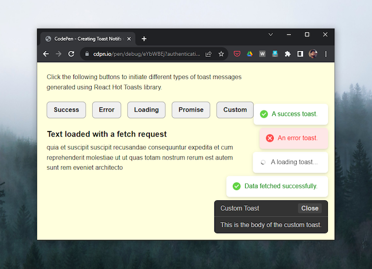
Setting up basic toast notifications with React Hot Toast is straightforward. The library provides a range of methods through its toast API, such as success(), error(), and more, to handle different toast variations.
The Toaster component serves as the container for all toast messages and is responsible for rendering them through the API.
Here’s how simple it is to display a simple toast message using the API. Just pass the message as an argument to the toast() method and attach it to the event modifier of a triggering element:
import toast, { Toaster } from "react-hot-toast";

const App = () => {
  return (
    <div>
      <button
        onClick={() => toast("This is a simple toast.")}>Show Toast</button>
      <Toaster />
    </div>
  );
};

export default App;
React Hot Toast offers five different toast variants: success, error, loading, custom, and promise. The success, error, and loading methods are used to show toast variations with a success message, an error message, or a message with a loading spinner icon, respectively:
import toast, { Toaster } from "react-hot-toast";

const successToast = () => toast.success("Success toast.");
const errorToast = () => toast.error("Error toast.");
const loadingToast = () => toast.loading("Loading toast...");

const App = () => {
  return (
    <>
      <button onClick={successToast}>Show Success Toast</button>
      <button onClick={errorToast}>Show Error Toast</button>
      <button onClick={loadingToast}>Show Loading Toast</button>
      <Toaster />
    </>
  );
};

export default App;
The toast.promise() method is useful when you want to update a toast after a promise has been resolved or rejected, such as after fetching data from an API has been completed. Below is a quick example to demonstrate this:
import {useState} from 'react';
import toast, { Toaster } from "react-hot-toast";

const fetchData = async() => { ... }

const App = () => {
  const [title, setTitle] = useState("");
  const [body, setBody] = useState("");

  const promiseToast = async () => {
    toast.promise(fetchData(), {
      loading: "Fetching data",
      success: (data) => {
        setBody(data.body);
        return "Data fetched successfully.";
      },
      error: (error) => {
        return error.message; // Return the error message
      }
    });
  };

  return (
    <div>
      <p>
        Click the following buttons to initiate different types of toast
        messages generated using React Hot Toasts library.
      </p>
      <div className="btn-group">
        <button onClick={successToast}>Success</button>
        <button onClick={errorToast}>Error</button>
        <button onClick={loadingToast}>Loading</button>
        <button onClick={promiseToast}>Promise</button>
        <button onClick={customToast}>Custom</button>
      </div>
      {body && (
        <div className="post">
          <h1>Text loaded with a fetch request</h1>
          <p>{body}</p>
        </div>
      )}
      <Toaster />
    </>
  );
};

export default App;
The second argument of the toast method is an options object that allows you to customize the behavior of each toast. You can specify the toast’s duration, alter its style, provide custom icons from an icon library, define its accessibility properties, and modify the theme of its icon:
import { AiFillAndroid } from "react-icons/ai";

toast.error("error toast", {
  duration: 7000,

  //icon config
  iconTheme: {
    primary: "white",
    secondary: "black",
  },

  //ARIA config
  role: "status",
  ariaLive: "polite",

  //toast styles
  style: {
    background: "red",
    color: "whitesmoke",
    icon: <AiFillAndroid />,
  },
});
There are different ways to dismiss toasts with the React Hot Toast library. You can dismiss a single toast individually by using the toast.dismiss() method and passing the reference to the toast you want to close as an argument. If you don’t pass a specific toast reference to the dismiss method, it will dismiss all toasts simultaneously:
const successToast = toast.success('This is a successt toast');
toast.dismiss(successToast);

toast.dismiss() // this will dismiss all toasts at once
React Hot Toast offers simple yet extensive customization options that allow you to tailor your toasts based on your project’s requirements.
In addition to its high customizability, React Hot Toast also has well-structured documentation, which provides more information about API usage, other components like Toaster and ToastBar, custom Hook creation, and the internal API state, which is definitely worth exploring.
Sonner is an opinionated toast component for React created by Emil Kowalski. Built with performance and user experience in mind, it offers a clean API with minimal setup requirements while maintaining excellent accessibility standards: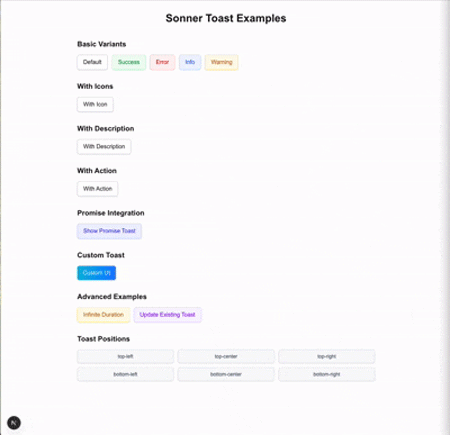
// Available positions:// top-left, top-center, top-right, bottom-left, bottom-center, bottom-right<Toaster position="top-center" />
Setting up Sonner requires minimal configuration. Add the Toaster component to your app root and start using the toast function anywhere in your application:
import { Toaster, toast } from 'sonner';

function App() {
  return (
    <div>
      <Toaster />
      <button onClick={() => toast('My first toast')}>
        Give me a toast
      </button>
    </div>
  );
}

export default App;
Sonner provides multiple toast variants for different use cases. Each of these variants comes with default styling and icons:
import { toast } from 'sonner';

// Basic variants
toast.success('Successfully saved!');
toast.error('Something went wrong');
toast.warning('Please check your input');
toast.info('New update available');
toast.loading('Saving changes...');

// With descriptions and actions
toast('Event created', {
  description: 'Sunday, December 03, 2023 at 9:00 AM',
  action: {
    label: 'Undo',
    onClick: () => console.log('Undo'),
  },
});
The toast.promise() method handles async operations by updating the toast state based on promise resolution:
const saveData = async () => {
  const promise = fetch('/api/save', { method: 'POST' });

  toast.promise(promise, {
    loading: 'Saving...',
    success: (data) => 'Data saved successfully!',
    error: 'Failed to save data',
  });
};
Sonner offers extensive customization options through the Toaster component and individual toast options:
// Global configuration
<Toaster
  position="top-center"
  richColors
  closeButton
  visibleToasts={5}
  expand={true}
/>

// Individual toast styling
toast.success('Success!', {
  duration: 5000,
  position: 'bottom-right',
  style: {
    background: 'green',
    color: 'white',
  },
  className: 'my-toast',
});
Sonner stands out with a simplified API that doesn’t require Hooks or any other setup. Unlike some toast libraries that tie notifications to React state, Sonner’s approach allows users to trigger toasts from anywhere in your application without additional configurations.
The library includes comprehensive TypeScript definitions and a well-structured documentation with live examples, making integration straightforward for both beginners and experienced developers.
The NotiStack library refers to the notifications it generates as “snackbars,” a term particularly fitting for mobile app contexts. However, the library offers a wide array of customization options, granting you the flexibility to decide whether to maintain the toast-like behavior for your notifications or elevate them further to full-fledged snackbars.
NotiStack excels in performance, efficiently handling numerous on-screen notifications, making it perfect for chat apps or social media apps. Its flexibility allows it to display a variety of notifications, with customization options for positioning, style, and animation: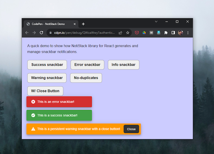
To use NotiStack, you first need to import the useNotistack Hook and the Notifier component from the library. Then, you can use the useNotistack Hook to get a reference to the NotiStack instance. This instance can be used to display notifications, close notifications, and manage the notification queue.
To display a notification, you can use the enqueueSnackbar method of the Notistack instance. This method tasks an object as a parameter, which contains the properties of the notification. The following code shows how to display a simple text notification:
import { useNotistack } from 'notistack';

const App = () => {
  const notistack = useNotistack();

  return (
    <button onClick={() => notistack.enqueueSnackbar('This is a notification.')}>
      Display notification
    </button>
  );
};
You can also use the enqueueSnackbar method to display more complex notifications, such as notifications with alerts or modals. For example, the following code shows how to display a notification with an alert:
import { useNotistack } from 'notistack';

const App = () => {
  const notistack = useNotistack();

  return (
    <button onClick={() => notistack.enqueueSnackbar('This is a notification with an alert.', {
      variant: 'error',
      action: (key) => {
        // Do something when the user clicks the action button.
      },
    })}>
      Display notification
    </button>
  );
};
NotiStack supports a variety of notification variants, which can be used to change the appearance of the notification, including notifications for success, info, warning, error, and the default one. The example below covers the implementation of each of the variants:
import { SnackbarProvider, useSnackbar } from "notistack";

const App = () => {
  const { enqueueSnackbar } = useSnackbar();

  const showSnackbar = (variant) => {
    enqueueSnackbar(`This is a ${variant} snackbar!`, {
      variant: variant,
    });
  };

  return (
    <div>
      <button onClick={() => showSnackbar("success")}>Show Success Snackbar</button>
      <button onClick={() => showSnackbar("info")}>Show Info Snackbar</button>
      <button onClick={() => showSnackbar("warning")}>Show Warning Snackbar</button>
      <button onClick={() => showSnackbar("error")}>Show Error Snackbar</button>
      <button onClick={() => showSnackbar("default")}>Show Default Snackbar</button>
    </div>
  );
};

export default App;
NotiStack provides versatile configuration options for notifications, applied globally via SnackbarProvider or individually with enqueueSnackbar(). Global settings standardize behavior and appearance. For example, anchorOrigin controls position, autoHideDuration sets display time, and maxSnackbars limits concurrent notifications:
import { SnackbarProvider, useSnackbar } from 'notistack';

const App = () => {
  const { enqueueSnackbar } = useSnackbar();

  return (
    <SnackbarProvider
      anchorOrigin={{ vertical: 'top', horizontal: 'right' }}
      autoHideDuration={3000}
      maxSnack={3} // Updated to maxSnack
    >
      <button onClick={() => enqueueSnackbar('This is a notification!')}>
        Show notification
      </button>
    </SnackbarProvider>
  );
};

export default App;
For specific notifications, customize with options like action, anchorOrigin, and autoHideDuration. Use dense to adjust the size for smaller screens and control animations through transition:
import { SnackbarProvider, useSnackbar } from 'notistack';

const App = () => {
  const { enqueueSnackbar } = useSnackbar();

  const showCustomSnackbar = () => {
    enqueueSnackbar('This is a custom notification!', {
      anchorOrigin: { vertical: 'bottom', horizontal: 'left' },
      autoHideDuration: 5000,
      dense: true,
    });
  };

  return (
    <div>
      <button onClick={showCustomSnackbar}>Show custom notification</button>
    </div>
  );
};

export default App;
The NotiStack library offers an uncomplicated and user-friendly API, facilitating an easy start. It features comprehensive documentation, complete with examples and tutorials, and is actively developed and maintained to address feedback and bug reports.
Here’s a quick demo for using the NotiStack library:
See the Pen
NotiStack Demo by Rahul (@c99rahul)
on CodePen.
React-Toastify offers unique features such as enhanced customization, bidirectional (RTL) language support, and additional mobile interactions.
These features empower users to finely customize animations, positions, and durations; display notifications in different languages; and enable actions such as swiping to dismiss and tapping to open: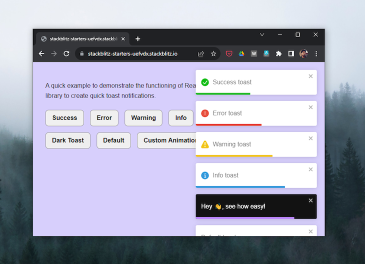
React-Toastify has a similar API to React Hot Toast that provides a toast method to access the different toast variants. The ToastContainer component is required to contain and render the toast notifications:
import { ToastContainer, toast } from "react-toastify";
import "react-toastify/dist/ReactToastify.css";

const App = () => {
  const successToast = () => toast.success("This is a success toast!");
  return (
    <div className="App">
      <button onClick={successToast}>show success toast</button>
      <ToastContainer />
    </div>
  );
}

export default App;
React-Toastify offers six toast variants: success, error, warn, info, dark, along with a default variant, all of which are self-explanatory. The following code shows their straightforward implementation in a React component:
import { toast } from "react-toastify";
import "react-toastify/dist/ReactToastify.css";

const App = () => {
  return (
    <>
      <button onClick={() => toast.success("Success toast")}>
        Show Success Toast
      </button>
      <button onClick={() => toast.error("Error toast")}>
        Show Error Toast
      </button>
      <button onClick={() => toast.warning("Warning toast")}>
        Show Warning Toast
      </button>
      <button onClick={() => toast.info("Info toast")}>Show Info Toast</button>
      <button onClick={() => toast.dark("Dark mode toast")}>
        Show Dark Mode Toast
      </button>
      <button onClick={() => toast("Default toast")}>Show Default Toast</button>
    </>
  );
};

export default App;
The dark-mode-powered toast sets the Toastify library apart from others in terms of toast UI and styling, providing you with an easy way to integrate it with your app’s dark mode.
Similar to React Hot Toast, we can pass an options object as the second argument to a React-Toastify toast to define different behaviors for it:
toast.dark("This is a success toast!", {
  position: toast.POSITION.BOTTOM_RIGHT,
  autoClose: 2000,
  pauseOnHover: true,
  draggable: true,
});
Additionally, we have the option to customize the default toast animation using the cssTransition method, which accepts an object where we can specify the enter and exit animations for the toast:
import "animate.css/animate.min.css";
import { ToastContainer, toast, cssTransition } from "react-toastify";

const bounce = cssTransition({
  enter: "animate__animated animate__bounceIn",
  exit: "animate__animated animate__bounceOut",
});

const customAnimationToast = () => {
  toast.dark("Hey 👋, see how easy!", {
    transition: bounce,
  });
};

const App = () => {
  return (
    <div className="App">
      <button onClick={customAnimationToast}>show bounce toast</button>
      <ToastContainer transition={bounce} />
    </div>
  );
}

export default App;
Unlike React Hot Toast, where we can store a reference to a toast in a variable, with React-Toastify, we need to use the useRef Hook to track the toast we want to update programmatically:
import { useRef } from "react";

export default function App() {
  let toastId = useRef(null);

  const successToast = () => {
    toastId = toast("Fetching data...", { autoClose: false });
  };

  const updateToast = () => {
    toast.update(toastId, { type: toast.TYPE.INFO, autoClose: 5000 });
  }

  return (
    <div>
      <button onClick={successToast}>show success toast</button>
      <Button onClick={updateToast}>update toast</Button>
      <ToastContainer ref={toastId} />
    </div>
  );
}
React-Toastify offers a greater variety of toast styles compared to other libraries, and it’s packed with many fantastic features. Its API shares similarities with both React Hot Toast and React Toast Notifications libraries, making it relatively easy to work with.
It’s worth noting that its developers have recently announced that React Toast Notifications is no longer maintained and recommend using other libraries such as React Hot Toast.
The React Toast Notifications library shares some similarities with React Hot Toast and React-Toastify, but it stands out as the simplest option, requiring minimal setup: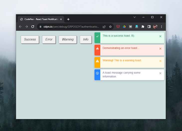
To use React Toast Notifications, simply wrap your app in the ToastProvider component, which provides context for its descendant Toast components:
// main.js

import React from "react";
import ReactDOM from "react-dom";
import App from "./App";
import { ToastProvider } from "react-toast-notifications";

ReactDOM.render(
  <React.StrictMode>
    <ToastProvider>
      <App />
    </ToastProvider>
  </React.StrictMode>,
  document.getElementById("root")
);
With the useToast Hook, you can use the addToast method. It takes two arguments: a string containing the toast message and a configuration object. Within the config object, you can specify the toast appearance as success and set autoDismiss to true:
import { useToasts } from "react-toast-notifications";

export default function App() {
  const { addToast } = useToasts();
  const successToast = () => {
    addToast("This is a success toast", {
      appearance: "success",
      autoDismiss: true,
    });
  };
  return (
    <div className="App">
      <button onClick={successToast}>show success toast</button>
    </div>
  );
}
The useToast Hook provides you with the following methods:
const {
  addToast,
  removeToast,
  removeAllToasts,
  updateToast
} = useToast();
You already know how the addToast method works. You can use the removeToast method to remove a specific toast, and the removeAllToasts method to remove all open toasts.
The updateToast method is useful when we want to update a toast after an operation has been completed, such as after some data has been fetched.
In React Toast Notifications, you can create different types of toast notifications to convey various messages, such as success, error, warning, and info. These notifications are styled differently to visually represent their respective meanings.
Here’s an improved code example that demonstrates how to use these toast types:
import { useToasts } from 'react-toast-notifications';

const App = () => {
  const { addToast } = useToasts();

  const showToast = (message, appearance) => {
    addToast(message, { appearance });
  };

  return (
    <div>
      <button onClick={() => showToast("Success toast", "success")}>
        Show Success Toast
      </button>
      <button onClick={() => showToast("Error toast", "error")}>
        Show Error Toast
      </button>
      <button onClick={() => showToast("Warning toast", "warning")}>
        Show Warning Toast
      </button>
      <button onClick={() => showToast("Info toast", "info")}>
        Show Info Toast
      </button>
    </div>
  );
}

export default App;
In React Toast Notifications, you can configure how toasts behave and appear by passing specific props to the ToastProvider. These configurations will be inherited by the descendant toast components within the provider:
<ToastProvider
  placement="top-center"
  transitionDuration={2000}
  autoDismiss="true"
 autoDismissTimeout={5000}>
  <App />
</ChakraProvider>
When configuring ToastProvider, the specified props, such as placement, transitionDuration, autoDismiss, and autoDismissTimeout are passed as configuration options. These options are then inherited by the descendant toast components, ensuring that all toasts created within the scope of the provider adhere to the specified configuration.
This centralized configuration simplifies the management of toast behavior and appearance across your React application.
Although the API is straightforward, React Toast Notifications may not be an easy library to work with. The documentation is lacking, particularly in explaining how to pass a user ID to a toast and how to remove and update toast messages.
I see two common issues with toast notifications in the wild that could negatively impact the user experience.
When you click a button in the center of your screen or at the top of the screen, seeing confirmation in a distant corner breaks the natural interaction flow.
Most toast libraries place notifications in the corner of the screen, where it is hard to locate. Gmail fails on this, too.
It shows this issue perfectly: delete an email on a large screen, and the “Conversation deleted” message appears in the bottom-left corner: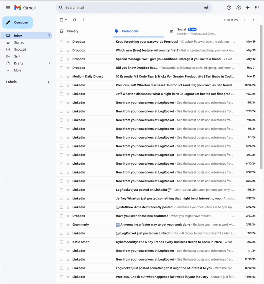
As users interact more with the application, they become more used to expecting toast notifications in the corners. But for a better user experience, the solution is straightforward: keep feedback close to where actions occur.
Another UX problem with toast notifications is the replacement of loading states or spinners with a toast. Some things do not require a toast notification at all.
Not every notification needs a toast; some should be displayed directly in the element that was interacted with. After a submission button is clicked, users remain focused on that button as it changes state from “Submit” to “Loading” to “Submitted.”
You can easily display the success message within the button itself, then redirect the user or proceed to the next step. If you must use toast notifications, position them close to where they can be seen and noticed. These approaches respect natural attention patterns while providing clear, accessible feedback that users actually notice.
This lightweight library is easy to customize and style, providing simple and elegant toast notifications by default. However, due to its high level of customization, it may lack some pre-built features found in other libraries.
React Hot Toast is a suitable choice for projects that require minimalistic and straightforward toast notifications.
This performance-focused library offers an excellent balance between simplicity and functionality. Its clean API requires minimal setup, and the ability to trigger toasts from anywhere without Hooks or complex configuration makes it particularly developer-friendly.
Sonner is an ideal choice for projects where developer experience, performance, and accessibility are priorities. It’s particularly well-suited for applications that need a clean, modern toast implementation without sacrificing customization options.
Specifically designed for Material UI users, NotiStack seamlessly integrates with this framework. It provides both global and per-toast configuration options, supports snackbars, and offers customization for both mobile and web apps. It works seamlessly with React Native and Next.js, too.
Note that it may unnecessarily increase the project’s weight (~20KB) if Material UI is not already being used, as it adds Material UI as an additional dependency.
NotiStack is an ideal solution for projects using Material UI, offering a well-integrated, customizable, and feature-rich toast/snackbar notification solution.
This versatile library offers a wide range of customization options and built-in animations, supporting various notification types and positions. It comes with good documentation and enjoys strong community support. Keep in mind that it’s slightly heavier compared to some of its alternatives and may make debugging more challenging in complex apps.
React-Toastify is a good choice for projects that demand feature-rich toast notifications with extensive customization options.
Because it is no longer being maintained, React Toast Notifications might not be the best choice on this list, but it still has some value.
This minimalistic, framework-agnostic library is highly customizable and allows you to create notifications from scratch. It’s lightweight and doesn’t enforce any specific styling. However, setting it up and styling it requires more manual work. Additionally, the library is no longer maintained and doesn’t support TypeScript.
Due to its small size, React Toast Notifications may still be suitable for projects where you need complete control over notification appearance and behavior, provided you’re comfortable with more hands-on customization.
After evaluating these five React toast libraries and gaining insight into their usage within our apps, I find myself favoring React Hot Toast above the others. Apart from its well-designed toasts and intuitive API, its promise feature simplifies a lot of the setup needed for asynchronous toast updates.
Feel free to share your favorites in the comments and also suggest other libraries you believe deserve a spot on the list.
Install LogRocket via npm or script tag. LogRocket.init() must be called client-side, not
server-side
$ npm i --save logrocket

// Code:

import LogRocket from 'logrocket';
LogRocket.init('app/id');
// Add to your HTML:

<script src="https://cdn.lr-ingest.com/LogRocket.min.js"></script>
<script>window.LogRocket && window.LogRocket.init('app/id');</script>
Hey there, want to help make our blog better?
Join LogRocket’s Content Advisory Board. You’ll help inform the type of content we create and get access to exclusive meetups, social accreditation, and swag.
Sign up now
Learn how to integrate MediaPipe’s Tasks API into a React app for fast, in-browser object detection using your webcam.

Integrating AI into modern frontend apps can be messy. This tutorial shows how the Vercel AI SDK simplifies it all, with streaming, multimodal input, and generative UI.

Interviewing for a software engineering role? Hear from a senior dev leader on what he looks for in candidates, and how to prepare yourself.

Set up real-time video streaming in Next.js using HLS.js and alternatives, exploring integration, adaptive streaming, and token-based authentication.

 Learn more →

3 Replies to "Comparing the top React toast libraries [2025 update]"
Well written, good comparison. Exactly what I was looking for. Thanks!
I’m glad it was helpful Marc!
It’s a perfect comparison.
Thank you for your time and effort.