
Most websites and interfaces are constrained to two dimensions, at most mimicking 3D-esque effects. Take your most common day-to-day interfaces: social media, mobile device apps, and perhaps productivity tools. All of these feature two-dimensional buttons with a smattering of two-dimensional animations. Using drop shadows and superimposed objects, these interfaces may mimic three-dimensional effects in two dimensions.
However, absent from a majority of these interfaces is true three-dimensional transformations. When CSS transforms were first introduced in 2009, lack of browser support or inefficient client-side rendering could justify adherence to two dimensions. However, CSS 3D transforms are now supported ubiquitously and per empirical tests, CSS transforms are hardware accelerated. Furthermore, per a TEDxBerkeley talk from ex-Microsoft creative Claudio Gulgieri, digital interfaces benefit when designers leverage the physical, three-dimensional world: familiarity with “interfaces” such as doorknobs, dials, playing cards, and more extend to analogs in a digital interface. However, mimicking effects such as shadows is only a start.
There are a number of three-dimensional properties to leverage, for one, users understand how many faces a three-dimensional object has. A flipping card implies only two sides exist. A box rotating along one axis implies four. Additionally, users know how to interface with different 3D objects. A dial should be rotated, and a top should be spun. Different interfaces have different opportunities to leverage familiarity with three-dimensional objects — some interfaces have no room at all.

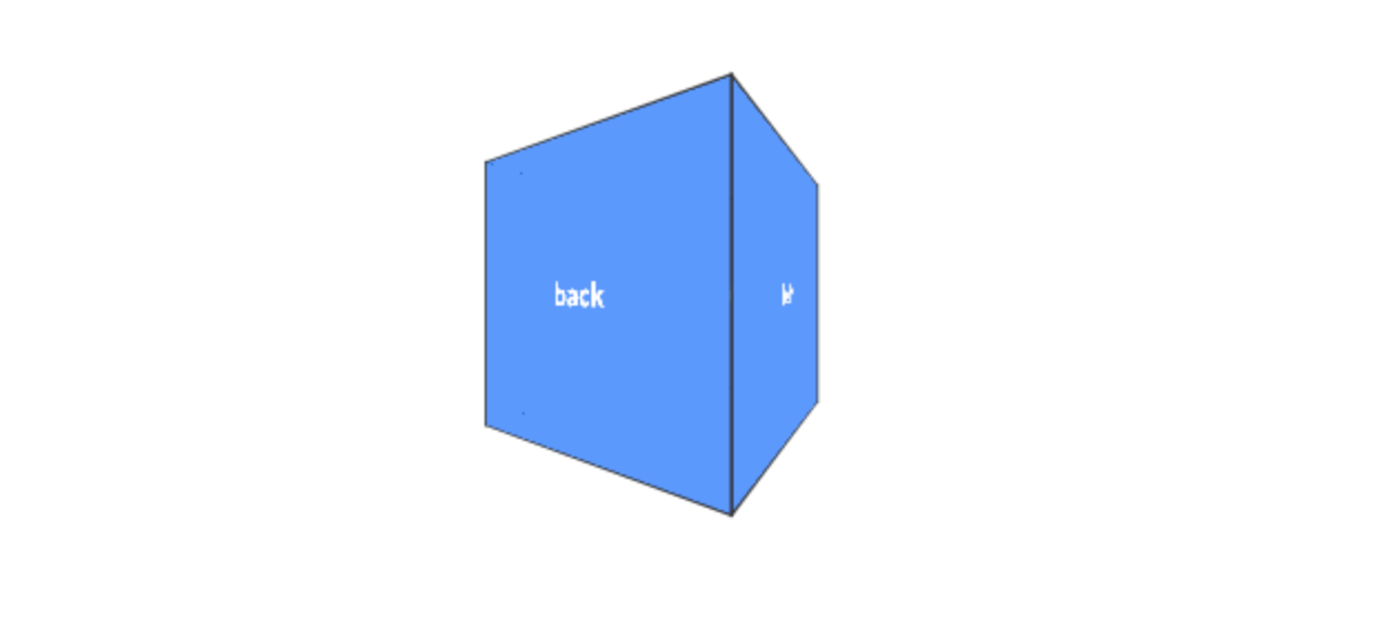
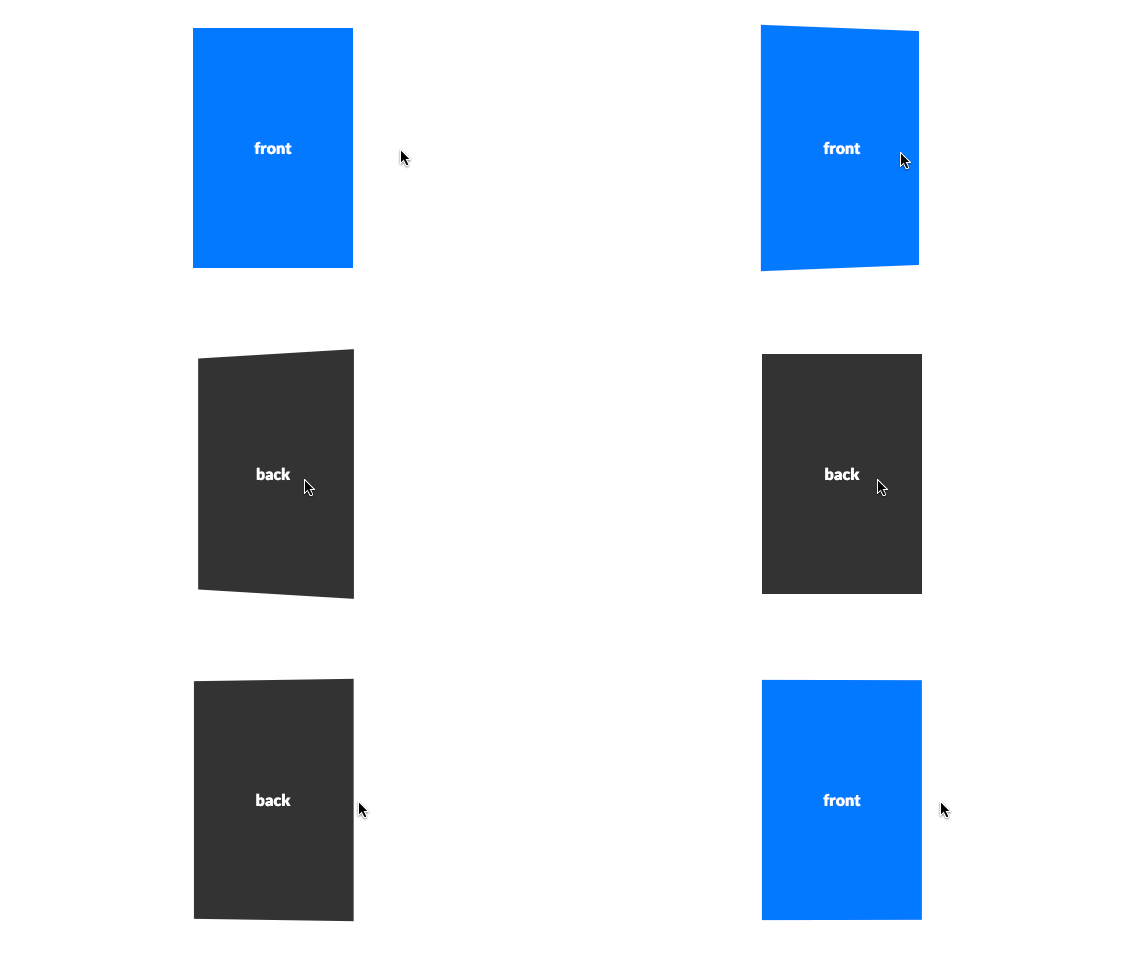
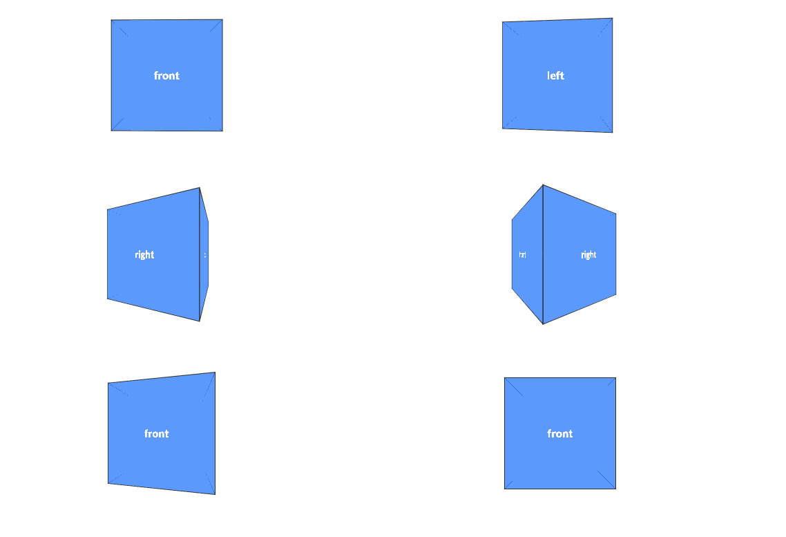
However, this introductory guide will give you enough of a taste test to understand 3D transforms. With this understanding, you can then determine for yourself whether 3D transforms are boon or a burden. In this guide, we’ll explore basic 3D transformations and a few use cases, discussing the necessary building blocks for further work in 3D with CSS. At the end of this guide, you’ll see sample code for the following flipping card and box, using concepts we discuss below.


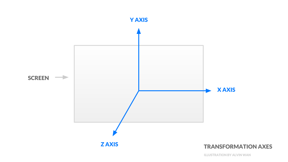
To start, we will use basic, two-dimensional squares to illustrate transformations in a three-dimensional space. Transformations include three basic operations — translation, rotation, and scaling — that control how an object is placed and oriented. All transformations are oriented around three axes:

The transformations we discuss below all operate on these three axes. There are a total of three transformations; the first is translation, or movement, along one or more axes. Use translateX, translateY, and translateZ, or use the shorthand translate3d to move an object around in three dimensions.
Here is a codepen demonstration of translation along each axis.

To facilitate rotation about one or more axes, use rotateX, rotateY, and rotateZ. As before, there exists a shorthand rotate3d.
.translated-square {
  transform:
    translateX(20px)  /* move right */
    translateY(-20px)  /* move down */
    translateZ(20px);  /* move closer to viewer */
}

.translated-square-shorthand {
  transform: translate3d(20px, -20px, 20px);
}
Rotation about the z-axis is identical to rotation in 2D. However, rotation about the x-axis and y-axis are vastly different effects. Here is a codepen demonstration of rotation about each axis.

The third and final transformation is scaling about one or more axes. Restated, scaling is simply resizing an object. Use scaleX, scaleY, scaleZ, or the shorthand scale3d. Since our demonstration square lies only in two-dimensions, scaling in the z dimension is meaningless. However, scaling x or y is equivalent to changing the width or height of your square.
.scaled-square {
  transform:
    scaleX(20deg)  /* flip "up" */
    scaleY(-20deg)  /* flip "right" */
    scaleZ(20deg);  /* rotate counter-clockwise */
}

.scaled-square-shorthand {
  transform: scale3d(20deg, -20deg, 20deg);
}
Note that transformations all operate with respect to a frame of reference. To best understand this concept, visualize the following scenario:
Notice that the frame of reference determines how we describe the apple’s motion. In the same way, take the following HTML snippet. We will see that each object’s reference frame is its parent object in the Document Object Model (DOM). In other words, for the example below, the parent is analogous to the train, and the child is analogous to the apple.
<div class="square parent">
  <div class="square child"></div>
</div>
Say we translate the parent by 20 pixels to the right and translate the child by 20 pixels upwards.
.parent {
  transform: translateX(20px);
}

.child {
  transform: translateY(20px);
}
The child’s translation upward is relative to the parent, meaning the child will be translated by a total of 20 pixels to the right and 20 pixels up.

Reference frames allow us to group different 3D objects together and use building blocks to assemble more complex 3D objects. To get a better understanding of reference frames, feel free toy with this codepen demonstration of reference frames. This concludes our discussion of transformations. In the next section, we will discuss properties of the camera.
Thus far in the CSS specification, perspective is an umbrella term for camera settings. One such setting is the distance between the viewer and the object. This is governed by the perspective property itself. A lower perspective value results in amplified 3D effects, and a higher perspective value results in muted 3D effects. In this codepen demonstration for perspective, perspective values increase moving to the right.
.square {
  transform: perspective(200px) rotateX(20deg);
}
The further away the object, the less drastic 3D effects are.

The Replay is a weekly newsletter for dev and engineering leaders.
Delivered once a week, it's your curated guide to the most important conversations around frontend dev, emerging AI tools, and the state of modern software.

There is a second way to set perspective — the first method is to set a property as we did above, and the other is to invoke a function, like this:
.scene.close {
  perspective: 10em;
}

.scene.medium {
  perspective: 20em;
}

.scene.far {
  perspective: 100em;
Note that the perspective function must be called before the rotateX function is invoked in order to take effect. This second method additionally only applies to perspective on a single object. In the below codepen demonstration of perspective groups, we see the difference between shared perspective (left) and individual perspective (right).

With distance set, we can also configure camera angle. Specifically, the perspective-origin property establishes the vanishing point’s location in the scene. Setting a vanishing point to the left is as if the viewer stepped to the left. Likewise, setting a vanishing point to the top is as if the viewer the object from a higher standpoint. Below is a codepen demonstration of varying perspective origins.

This concludes the camera settings. In this section, we discussed how to set camera distance and location. We will use these camera effects in addition to the transformations above in the next two sections to build simple geometric objects and 3D effects.
In 2012, Fantasy Interactive used flipping cards in their redesign of USAToday, with the headline on one side and the article’s preamble on the other. In this section, we will recreate this flipping card using the techniques we’ve touched on so far.
Create a new codepen at codepen.io. In the HTML section, define your card.
<div class="scene">
  <div class="card">
    <div class="face front">front</div>
    <div class="face back">back</div>
  </div>
</div>
In your CSS, define a scene, including its perspective.
.scene {
  width:10em;
  height:15em;
  perspective: 30em;
}
Next, style your card object. Here, add an additional property transform-style, which governs how child elements are rendered—this property will determine whether child elements are rendered in 2D or in 3D space. Use the value preserve-3d to ensure that the card’s two faces are rendered in 3D.
.card {
  width:100%;
  height:100%;
  position:relative;
  transition: transform 0.5s;
  transform-style: preserve-3d;
}
Next, style your card’s two faces. The most critical property is backface-visibility, which determines whether or not the backside of our card faces are rendered. Here, set the value to hidden, so that only the “front side” of both faces are rendered. Arbitrarily assign colors to each face.
.face {
  width:100%;
  height:100%;

  color:#FFF;
  line-height:15em;
  text-align:center;
  position:absolute;

  backface-visibility:hidden;
}

.front {
  background-color:#0379ff;
}

.back {
  background-color:#333;
  transform: rotateY(180deg);
}
Finally, rotate the card on hover.
.scene:hover .card {
  transform: rotateY(180deg);
}
You’ve now completed your first 3D transform effect purely in CSS! You can view the codepen demonstration with the above code here to test.

This concludes our flipping card example. At its core, this effect relies on the transformations and perspective discussed previously. However, there are a few quirks, per the sample above, that are needed for the desired effect. With these simple 2D faces as building blocks, we can construct more complex geometries, then assemble them to build yet more complex objects.
A 3D engine for the web, WebGL, defines an object as the combination of a geometry and a material. Loosely defined, a geometry defines the shape, such as a cube, sphere, or cylinder. The material defines appearances, such as reflective, purple, and 50% transparent. In this section, we will build one of the most simple geometries, a cube. This cube can then become the building block for future 3D creations in CSS.
As before, create a new Codepen at codepen.io. In the HTML section, type in the following setup for a cube. Again as before, define a scene, object, and faces.
    <div class="scene">
      <div class="cube">
        <div class="face front">front</div>
        <div class="face right">right</div>
        <div class="face left">left</div>
        <div class="face back">back</div>
        <div class="face top">top</div>
        <div class="face bottom">bottom</div>
      </div>
    </div>
In the CSS section, add perspective to the scene.
.scene {
  width:10em;
  height:10em;
  perspective:10em;
}
Style the cube so that all child elements are rendered in 3D space (transform-style), and add an infinitely spinning animation, so that we can see our 3D creation from all sides.
.cube {
  width:100%;
  height:100%;
  position:relative;
  animation: spinning 2s infinite;
  transform-style:preserve-3d;
}

@keyframes spinning {
  from  { transform: translateZ(-5em) rotateY(0deg);   }
  to    { transform: translateZ(-5em) rotateY(360deg); }
}
Next, style the faces so that they are visible.
.face {
  width:100%;
  height:100%;
  position:absolute;
  background-color:rgba(3, 121, 255, 0.5);

  color:#FFF;
  line-height:10em;
  text-align:center;
}
For this second-to-last step, rotate each face into position. Note that the front, back, right, and left faces are rotated along the y-axis, and the top and bottom faces are rotated along the x-axis.
.front  { transform: rotateY(0deg)   }
.right  { transform: rotateY(90deg)  }
.left   { transform: rotateY(-90deg) }
.back   { transform: rotateY(180deg) }
.top    { transform: rotateX(90deg)  }
.bottom { transform: rotateX(-90deg) }
Notice that all of the faces are centered at the origin. However, we would like all faces to have centers at the periphery of the cube. Since the cube is 10em x 10em x 10em, translate each face along the Z dimension to move them all outwards.
.front  { transform: rotateY(0deg) translateZ(5em); }
.right  { transform: rotateY(90deg) translateZ(5em);  }
.left   { transform: rotateY(-90deg) translateZ(5em); }
.back   { transform: rotateY(180deg) translateZ(5em); }
.top    { transform: rotateX(90deg) translateZ(5em); }
.bottom { transform: rotateX(-90deg) translateZ(5em); }
Your preview should now match the following, an infinitely-spinning cube with all 6 sides labeled. You can see the Codepen demonstration for our spinning cube.

This example did not require new machinery or logic; in fact, the quirks we encountered were identical to those in the flipping-card example. This concludes our second example, a basic building block for more complex 3D creations in CSS. In fact, you could create any 3D geometry by compositing a number of 2D faces, and in turn, be able to create arbitrary 3D models in CSS.
In this guide, we covered the basics of 3D Transforms using pure CSS. Specifically, transformations and perspective from the building blocks of 3D creations using CSS. However, at the end of the day, 3D engines more powerful and efficient than CSS’s exist; CSS’s role is simply to augment an interface. Armed with this guide, you can push CSS’s role further along, potentially leveraging the user’s familiarity with existing 3D interfaces, such as a card, box, or dial.
As web frontends get increasingly complex, resource-greedy features demand more and more from the browser. If you’re interested in monitoring and tracking client-side CPU usage, memory usage, and more for all of your users in production, try LogRocket.

LogRocket lets you replay user sessions, eliminating guesswork around why bugs happen by showing exactly what users experienced. It captures console logs, errors, network requests, and pixel-perfect DOM recordings — compatible with all frameworks.
LogRocket's Galileo AI watches sessions for you, instantly identifying and explaining user struggles with automated monitoring of your entire product experience.
Modernize how you debug web and mobile apps — start monitoring for free.

When should you move API logic out of Next.js? Learn when Route Handlers stop scaling and how ElysiaJS helps.

Explore how Dokploy streamlines app deployment with Docker, automated builds, and simpler infrastructure compared to traditional CI/CD workflows.

A side-by-side look at Astro and Next.js for content-heavy sites, breaking down performance, JavaScript payload, and when each framework actually makes sense.

AI-generated tests can speed up React testing, but they also create hidden risks. Here’s what broke in a real app.re
Hey there, want to help make our blog better?
Join LogRocket’s Content Advisory Board. You’ll help inform the type of content we create and get access to exclusive meetups, social accreditation, and swag.
Sign up now