Building forms in React can quickly lead to a lot of code repetition and complexity if done without a good strategy. Because of this, developers manage forms with libraries like the popular React Hook Form. But, how does TanStack Form (a newer form library) compare to React Hook Form, and should you consider using it?

This guide aims to make a fair comparison of the two libraries. At the end, I’ll give you a recommendation on which one to use based on the criteria. To follow along, you will need basic knowledge of React and TypeScript.
The Replay is a weekly newsletter for dev and engineering leaders.
Delivered once a week, it's your curated guide to the most important conversations around frontend dev, emerging AI tools, and the state of modern software.
TanStack Form is a form management library from the team behind other popular tools like React Query (now TanStack Query), TanStack Router, and TanStack Start. TanStack Form prioritizes type safety, flexible form validation, and render speed. The library also makes it easy to build reusable form segments and is framework-agnostic. It works with React, Vue, Angular, Solid, Lit, and Svelte.
This section shows how to use TanStack Form in a React Project. It features two tutorials: building a simple form with the library, and then a more complex form.
To use TanStack Form, the documentation recommends having TypeScript v5.4 or higher installed. You also need to install the TanStack Form package. Because this tutorial will use TanStack Form for React, install the appropriate package, which is @tanstack/react-form.
We’ll also use the npm package manager, but feel free to use whatever you want:
npm install --save-exact @tanstack/react-form
The reason for the --save-exact flag is because of a noteworthy quirk TanStack Form has. Changes in the API types of the library are considered as patches in its semantic versioning. For this reason, it is important to lock an install to a particular patch as an upgrade could cause breaking changes in types.
After installing the package, you can now use TanStack Form in React.
The final source code for this tutorial can be found here on StackBlitz.
To create a simple form, you need the useForm API. This API is a hook used to create a new form instance. According to the documentation, “A form instance is an object that represents an individual form and provides methods and properties for working with the form.”
This hook is used to define fields (or data options) that the form will accept. The hook is also used to define an onSubmit function that it calls whenever the form is submitted. The onSubmit function that the hook accepts will have access to the form’s responses. It is inside the onSubmit function that the developer can do whatever they want with the form responses.
This tutorial uses Tailwind CSS for styling, so here is a guide to set it up.
Import the useForm Hook into your project:
import { useForm } from '@tanstack/react-form';
Next, define the default values of data from the form, and then create the onSubmit function:
// ...
function App() {
  const form = useForm({
    defaultValues: { username: '', passowrd: '' },

    onSubmit: ({ value }) => {
      // Handle the form input
      alert(JSON.stringify(value, null, 4));
    },
  })

  return (/* The Component's JSX */)
}

export default App;
After that, set up the page where the form will reside:
// ...
function App() {
  const form = useForm({
    defaultValues: { username: '', passowrd: '' },

    onSubmit: ({ value }) => {
      // Handle the form input
      alert(JSON.stringify(value, null, 4));
    },
  })

  return (
    <main className="mx-auto px-5 max-w-xl">
      <h1 className="font-semibold my-6 text-xl">Login Form</h1>
        <form
          method="post"
          onSubmit={(e) => {
            e.preventDefault();
            e.stopPropagation();
          }}
        >
        {/* Add field Items here */}
          <button
            type="submit"
            className="text-white bg-blue-700 hover:bg-blue-800 focus:ring-4 focus:outline-none focus:ring-blue-300 font-medium rounded-lg text-sm w-auto px-5 py-2.5 text-center cursor-pointer"
            onClick={() => form.handleSubmit()}
          >
            Submit
          </button>
        </form>
      </main>
  )
}
//...
Next, add the TanStack Form Fields (note the capital F). A TanStack Form Field is a React component that comes from a form instance and manages a single form input. The component receives props like name (which must be one of the defined form options in useForm ) and validators (which contain functions for validating the field).
The Field component also accepts children, which it passes a field object to. In TanStack Form, a field object helps to control the state of an input field.
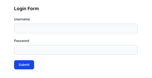
Because this simple form needs two inputs (username and password), it will need two form.Field components:
// App.tsx

// ...
<form.Field name="username">
  {(field) => (
     <div className="mb-6">
        <label
          htmlFor={field.name}
          className="block mb-2 text-sm font-medium text-gray-900"
        >
          Username
        </label>
        <input
          id={field.name}
          name={field.name}
          className="bg-gray-50 border border-gray-300 text-gray-900 text-sm rounded-lg focus:ring-blue-500 focus:border-blue-500 block w-full p-2.5"
          autoComplete="off"
          required
          value={field.state.value}
          onBlur={field.handleBlur}
          onChange={(e) => field.handleChange(e.target.value)}
        />
    </div>
  )}
</form.Field>
  <form.Field
    name="passowrd"
  >
    {(field) => (
      <div className="mb-6">
        <label
          htmlFor={field.name}
          className="block mb-2 text-sm font-medium text-gray-900"
        >
          Password
        </label>
        <input
          id={field.name}
          name={field.name}
          className="bg-gray-50 border border-gray-300 text-gray-900 text-sm rounded-lg focus:ring-blue-500 focus:border-blue-500 block w-full p-2.5"
          type="password"
          autoComplete="off"
          required
          value={field.state.value}
          onBlur={field.handleBlur}
          onChange={(e) => field.handleChange(e.target.value)}
        />
      </div>
    )}
</form.Field>
//...
Now this is what the simple form looks like:
In the useForm Hook, you can also write functions for validating the form in an option called validators:
const form = useForm({
  //...
  validators: ({value}) => {/**/}
})
However, for this example, the validation will be on the Field level:
<form.Field
  name="username"
  validators={{
  onChange: ({ value }) =>
    value.includes(' ') ? 'Username cannot contain space' : undefined,
  }}
>
  {(field) => (
    <div className="mb-6">
      <label
        htmlFor={field.name}
        className="block mb-2 text-sm font-medium text-gray-900"
      >
        Username
      </label>
      <input
        id={field.name}
        name={field.name}
        className="bg-gray-50 border border-gray-300 text-gray-900 text-sm rounded-lg focus:ring-blue-500 focus:border-blue-500 block w-full p-2.5"
        autoComplete="off"
        required
        value={field.state.value}
        onBlur={field.handleBlur}
        onChange={(e) => field.handleChange(e.target.value)}
      />
      {!field.state.meta.isValid && (
        <em role="alert" className="text-xs text-red-600">
          {field.state.meta.errors.join(', ')}
        </em>
        )}
      </div>
    )}
</form.Field>
<form.Field
  name="passowrd"
  validators={{
    onBlur: ({ value }) =>
      value.length < 5 ? 'Password is too short' : undefined,
  }}
>
  {(field) => (
    <div className="mb-6">
      <label
        htmlFor={field.name}
        className="block mb-2 text-sm font-medium text-gray-900"
      >
        Password
      </label>
      <input
        id={field.name}
        name={field.name}
        className="bg-gray-50 border border-gray-300 text-gray-900 text-sm rounded-lg focus:ring-blue-500 focus:border-blue-500 block w-full p-2.5"
        type="password"
        autoComplete="off"
        required
        value={field.state.value}
        onBlur={field.handleBlur}
        onChange={(e) => field.handleChange(e.target.value)}
      />
      {!field.state.meta.isValid && (
        <em role="alert" className="text-xs text-red-600">
          {field.state.meta.errors.join(', ')}
        </em>
      )}
    </div>
  )}
</form.Field>
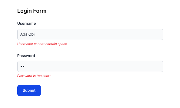
Notice how flexible the form validation is. The first field validates onChange while the second validates onBlur. Custom error messages should now be visible if a user tries to submit the form:
With that, you have created a simple form.
While you can create simple forms with the useForm Hook, TanStack Form has much more functionality and can accommodate more complex forms. As mentioned earlier, these forms will easily fit into an existing design system. Also, TanStack Form’s APIs ultimately aim to reduce boilerplate code in the long run for large projects.
The following tutorial shows how to use TanStack Form in an advanced use case. The final source code for this section can also be found on StackBlitz here.
TanStack Form integrates seamlessly with schema validation libraries like Zod or Valibot; this example uses Zod for validation.
Set up a new React project. After that, install Zod:
npm i zod
Set up Tailwind CSS, as that is the styling framework for this example.
TanStack Form recommends creating your own form hook that will have its own contexts and custom form UI components. In React, a context is a way to pass data deeply through a component tree without prop drilling. In this case, TanStack form requires an extra step in creating contexts, then adding them to the form hook.
Inside the src folder of the project, create a utilsfolder. Inside utils, create a formContext.tsfile. Inside that file, import createFormHookContexts from @tanstack/react-form. This function will be used to create the necessary form contexts:
// utils/formContext.ts
import { createFormHookContexts } from '@tanstack/react-form';

export const { formContext, fieldContext, useFieldContext } =
  createFormHookContexts();
Next, inside the utils folder, create a formOpts.ts file. This is where you will define default values for these form fields. This file will use the formOptions helper function from @tanstack/react-form to achieve this:
//utils/formOpts.ts
import { formOptions } from '@tanstack/react-form';

interface RegisterData {
  fullname: string;
  age: number;
  email: string;
  username: string;
  password: string;
  acceptTerms: boolean;
}

const defaultValues: RegisterData = {
  fullname: '',
  age: 0,
  email: '',
  username: '',
  password: '',
  acceptTerms: false,
};

export const formOpts = formOptions({ defaultValues });
Inside the utils folder, create a new file called useAppForm.ts. Inside the file, import createFormHook from @tanstack/react-form. This function will create a form hook with earlier defined contexts and custom form components. Also import the fieldContext and formContext from the src/utils/formContext.ts file:
import { createFormHook } from '@tanstack/react-form';
import { fieldContext, formContext } from './formContext';
import TextField from '../components/TextField';
import CheckField from '../components/CheckField';

const { useAppForm } = createFormHook({
  fieldContext,
  formContext,
  fieldComponents: {
    TextField,
    CheckField,
  },
  formComponents: {},
});

export default useAppForm;
Notice the imported TextField and CheckField added to fieldComponents. They are custom React UI components that are now bound to the useAppForm Hook.
Next, create those imported UI components. Inside the src folder, create a folder called components. The folder will contain all the reusable components in the project. Inside the components folder, create a Label.tsx file and add the following:
// components/Label.tsx
interface LabelProps extends React.ComponentProps<'label'> {}

function Label(props: LabelProps) {
  const { className, ...restProps } = props;

  return (
    <label
      className={`block mb-2 text-sm font-medium text-gray-900 ${className}`}
      {...restProps}
    />
  );
}
export default Label;
The above creates a reusable label element with the form’s UI.
Next, in the same folder, create an Input.tsx file and add the following:
// components/Input.tsx
interface InputProps extends React.ComponentProps<'input'> {}

function Input(props: InputProps) {
  return (
    <>
      <input
        className="bg-gray-50 border border-gray-300 text-gray-900 text-sm rounded-lg focus:ring-blue-500 focus:border-blue-500 block w-full p-2.5"
        autoComplete="off"
        {...props}
      />
    </>
  );
}

export default Input;
The above is a styled and reusable input element for the form.
Next, create the TextField component referenced in utils/useAppForm.ts. This component will have access to the TanStack Form field object:
// components/TextField.tsx

import { useFieldContext } from '../utils/formContext';
import Label from './Label';
import Input from './Input';
import FieldError from './FieldError';

function TextField({ label, inputType }: { label: string; inputType: string }) {
  const field = useFieldContext<string>();
  return (
    <>
      <Label htmlFor={field.name}>{label}</Label>
      <Input
        id={field.name}
        type={inputType}
        name={field.name}
        value={field.state.value}
        onBlur={field.handleBlur}
        onChange={(e) => field.handleChange(e.target.value)}
      />
      <FieldError field={field} />
    </>
  );
}
export default TextField;
The useFieldContext Hook is used to access the field object that belongs to the earlier created contexts in utils/formContext.ts. The imported FieldError component is a React component that accepts the field object and displays any error message associated with the field.
Also, create a Field component for a checkbox. This is the form field users will check to accept terms and conditions (for the tutorial form):
// components/CheckField.tsx

import { useFieldContext } from '../utils/formContext';
import FieldError from './FieldError';
import Label from './Label';

function CheckField({ label }: { label: string }) {
  const field = useFieldContext<boolean>();

  return (
    <>
      <input
        type="checkbox"
        id={field.name}
        name={field.name}
        checked={field.state.value}
        onBlur={field.handleBlur}
        onChange={(e) => field.handleChange(e.target.checked)}
      />
      <Label htmlFor={field.name} className="inline-block ml-2">
        {label}
      </Label>
      <FieldError field={field} />
    </>
  );
}

export default CheckField;
For the last reusable component, create the FieldError component:
// components/FieldError.tsx

import { type AnyFieldApi } from '@tanstack/react-form';

function FieldError({ field }: { field: AnyFieldApi }) {
  return (
    <span className="block mb-5">
      {!field.state.meta.isValid && (
        <em className="text-red-600 text-xs">
          {field.state.meta.errors.map((err) => err.message).join(', ')}
        </em>
      )}
    </span>
  );
}

export default FieldError;
Now, navigate to src/App.tsx and create the form with the useAppForm Hook. When using the useAppForm Hook, instead of form.Field component, use the form.AppField component to create the input fields:
// App.tsx

import useAppForm from './utils/useAppForm';
import { formOpts } from './utils/formOpts';

function App() {
  const form = useAppForm({
    ...formOpts,
    validators: {},
    onSubmit: ({ value }) => {
      alert(JSON.stringify(value, null, 4));
    },
  });
  return (
    <main className="mx-auto px-5 max-w-xl">
      <h1 className="font-semibold my-6 text-xl">Register Form</h1>
      <form
        method="post"
        onSubmit={(e) => {
          e.preventDefault();
          e.stopPropagation();
          form.handleSubmit();
        }}
      >
        <form.AppField
          name="fullname"
          children={(field) => (
            <field.TextField label="Full Name" inputType="text" />
          )}
        />
        <form.AppField
          name="email"
          children={(field) => (
            <field.TextField label="Email" inputType="email" />
          )}
        />
        <form.AppField
          name="age"
          children={(field) => (
            <field.TextField label="Age" inputType="number" />
          )}
        />
        <form.AppField
          name="username"
          children={(field) => (
            <field.TextField label="Username" inputType="text" />
          )}
        />
        <form.AppField
          name="password"
          children={(field) => (
            <field.TextField label="Password" inputType="password" />
          )}
        />
        <form.AppField
          name="acceptTerms"
          children={(field) => (
            <field.CheckField label="I accept all terms and conditions" />
          )}
        />
        <button
          type="submit"
          className="block text-white bg-blue-700 hover:bg-blue-800 focus:ring-4 focus:outline-none focus:ring-blue-300 font-medium rounded-lg text-sm w-auto px-5 py-2.5 text-center cursor-pointer"
        >
          Submit
        </button>
      </form>
    </main>
  );
}
export default App;
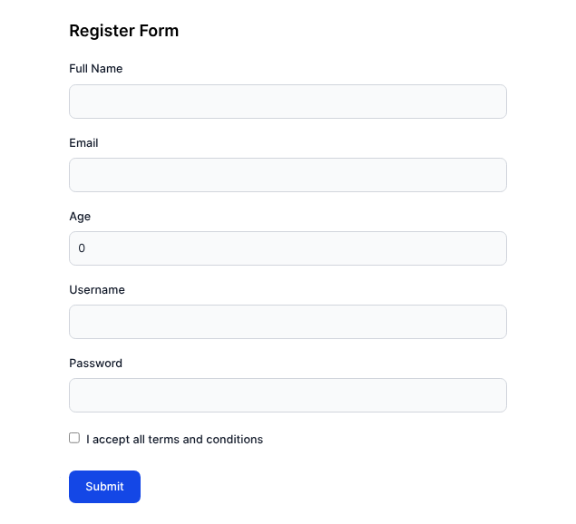
And now you get to see the form:
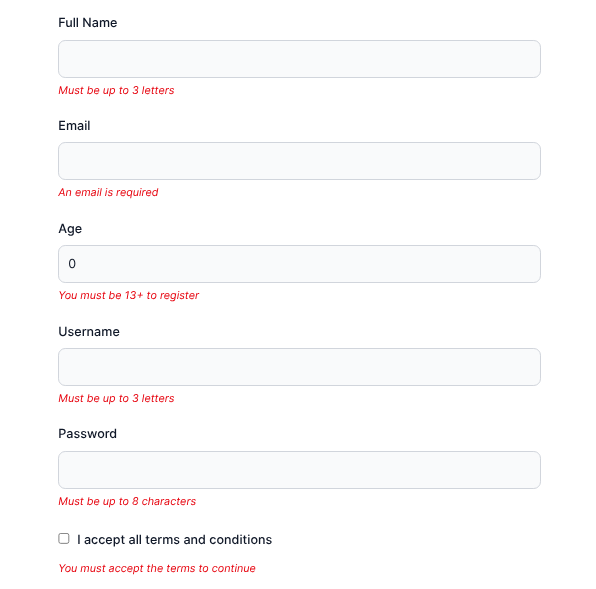
Finally, for this tutorial, validate the input using Zod and the validators property of useAppForm. Notice how the project also uses Zod to write custom error messages. The form will validate only onSubmit:
// App.tsx

import { z } from 'zod';
// Other imports

const registerSchema = z.object({
  email: z.string().email('An email is required'),
  fullname: z.string().min(3, 'Must be up to 3 letters'),
  age: z.number().min(13, 'You must be 13+ to register'),
  username: z.string().min(3, 'Must be up to 3 letters'),
  password: z.string().min(8, 'Must be up to 8 characters'),
  acceptTerms: z
    .boolean()
    .refine((value) => value, 'You must accept the terms to continue'),
});

function App() {
  const form = useAppForm({
    // ...
    validators: {
      onSubmit: registerSchema,
    }
  });
  return (/* JSX to render */);
}
export default App;
Now the form validates on submit. Below is what a user will see when they try to submit an empty form:
And that is how to create a complex form with TanStack Form. For even more advanced features, check out the TanStack Form documentation.
In order to access up-to-date form values or reactive states of a form, the TanStack Form documentation recommends subscribing to the form’s states using either of two options.
The first option is with the useStore Hook. This hook is useful when you need the form states for React component logic operations. The hook accepts two arguments: the form instance’s store (which is form.store), and a function that returns the property of the form’s state to expose (or subscribe to).
Here’s an example:
const fullname = useStore(form.store, (state) => state.values.fullname)
const isFormValud = useStore(form.store, (state) => state.isFormValid)
The second method is by using the form.Subscribe component. This component has a prop called selector, which, like the second argument of useStore, accepts a function that returns what property of the form’s state to expose:
<form.Subscribe selector={(state) => state.values.fullname}>
    {(fullname) => (
      <form.Field>
        {(field) => (
          <input
            name="email"
            value={field.state.email || `${fullname.replaceAll(' ', '').toLowerCase()}@neomail.com`}
            onChange={field.handleChange}
          />
        )}
      </form.Field>
    )}
</form.Subscribe>
According to the documentation, form.Subscribe is best suited for when you need to react to a form state within the UI of your app. From the above example, notice how state.values.fullname is selected and passed on to the children components of form.Subscribe.
For more information on reactivity in TanStack Form, here is a more detailed explanation.
React Hook Form (RHF) is a React form management library that emphasizes simplicity. It is the most popular form management library in React, and it also works with React Native.
Just like in TanStack Form, a developer can “subscribe” to needed form state changes in RHF, minimizing the need for re-rendering. RHF can also handle both controlled and uncontrolled form input, unlike TanStack Form.
Here is a more detailed guide to the features and capabilities of React Hook Form.
The two libraries ultimately aim to solve the same problems, but they have different approaches. This section compares the libraries in categories such as developer experience (DX), features, and more.
TanStack Form requires more code to set up than React Hook Form, especially in large applications and projects. However, it comes with the tradeoff of reducing boilerplate code down the line. Both tools are typesafe and have IDE IntelliSense support.
For basic form management, they both get the job done excellently. However, TanStack Form appears to have an edge over React Hook Form in accommodating larger-scale projects.
@tanstack/react-form ships with a few dependencies but still remains compact. The most consequential dependency is @tanstack/form-core (which is the main TanStack Form engine), and @tanstack/store (which is a state management library from the TanStack team used to implement the useStore functionality).
According to Bundlephobia, TanStack Form v1.11 (the latest version at the time of writing) has a size of 36.4kB when minified or 9.6kB when minified and gzipped:
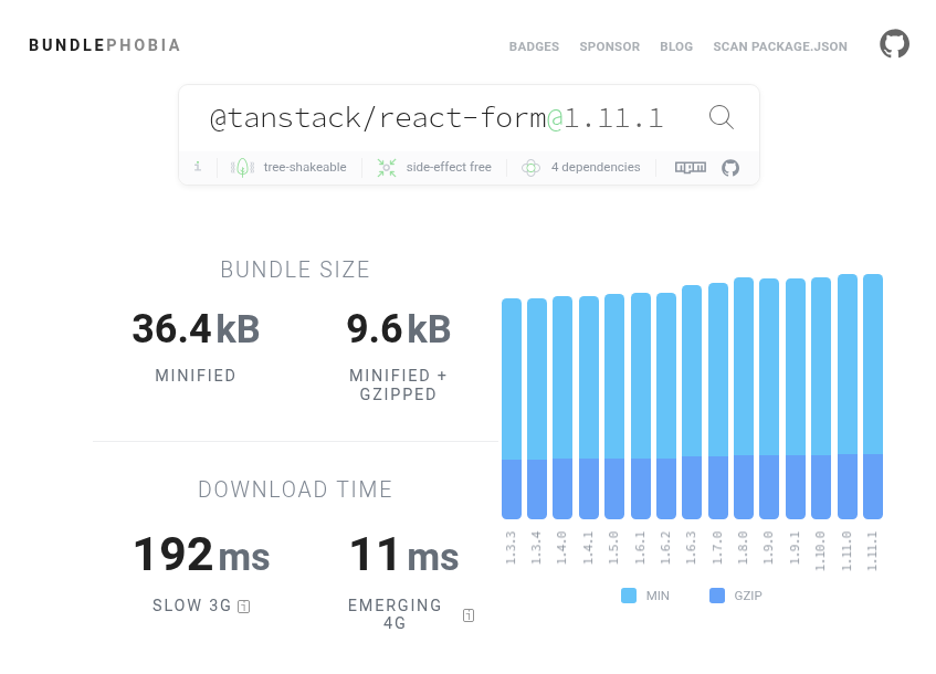
Source: https://bundlephobia.com/package/@tanstack/[email protected]
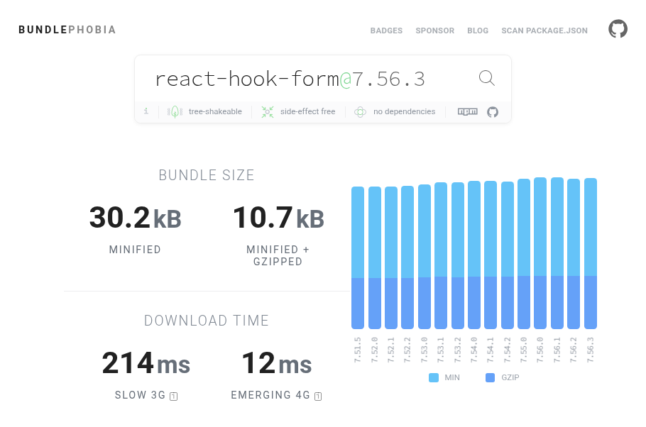
React Hook Form, on the other hand, doesn’t ship with any dependencies. According to Bundlephobia, at v7.56 (the latest version at the time of writing), the package weighs 30.2KB when minified or 10.7 KB when minified and gzipped:
React Hook Form beats TanStack Form in popularity. Currently, React Hook Form has more stars on GitHub and more downloads on npm. TanStack Form has a smaller (but growing) community, so it might be a little harder to find support when you run into a problem.
Below is an npmtrends chart comparing both libraries over the past year:
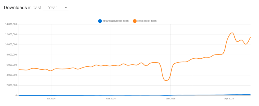
Source: https://npmtrends.com/@tanstack/react-form-vs-react-hook-form
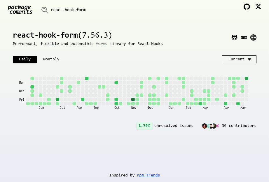
Both packages are very highly maintained. Featured below are heat maps showing contributions both packages have received over the past year.
Here is one for @tanstack/react-form:
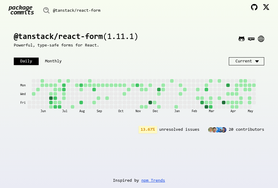
Source: https://pkco.vercel.app/package/@tanstack/react-form
And for react-hook-form:
| TanStack Form (v1.11) | React Hook Form (v7.56) | |
|---|---|---|
| Bundle size (minified) | 36.4 KB | 30.2 KB |
| Bundle size (minified + gzipped) | 9.6 KB | 10.7 KB |
| GitHub repo stars | ~ 5.4K | ~ 43.1K |
| npm downloads (weekly) | ~ 11 million | ~ 219K |
| Supported frameworks | React, Angular, Vue, Svelte, Lit, Solid | React |
| Async form validation | Yes | Yes |
| Built-in async validation debounce | Yes | Not clear |
| Schema-based validation | Yes | Yes |
| Supports React Native | Yes | Yes |
| Supports uncontrolled form input | No | Yes |
| Supports reactive subscriptions | Yes | Yes |
It depends!
If you want to build a simple form with easy-to-use APIs but less verbosity, then React Hook Form is the go-to. But for more complex forms, TanStack Form will be a better and more comprehensive solution.
It’s important to note that React Hook Form is more mature than TanStack Form. Because of this, if stability is a priority for you, go for React Hook Form (at least for now).
Which works better for your project?
Install LogRocket via npm or script tag. LogRocket.init() must be called client-side, not
server-side
$ npm i --save logrocket

// Code:

import LogRocket from 'logrocket';
LogRocket.init('app/id');
// Add to your HTML:

<script src="https://cdn.lr-ingest.com/LogRocket.min.js"></script>
<script>window.LogRocket && window.LogRocket.init('app/id');</script>

AI-generated tests can speed up React testing, but they also create hidden risks. Here’s what broke in a real app.re

Why the future of DX might come from the web platform itself, not more tools or frameworks.

A hands-on test of Claude Code Review across real PRs, breaking down what it flagged, what slipped through, and how the pipeline actually performs in practice.

CSS art once made frontend feel playful and accessible. Here’s why it faded as the web became more practical and prestige-driven.
Hey there, want to help make our blog better?
Join LogRocket’s Content Advisory Board. You’ll help inform the type of content we create and get access to exclusive meetups, social accreditation, and swag.
Sign up now

 Learn more →
