
OpenAI has introduced GPTs, a way for anyone to customize ChatGPT without having to code. Here are 34 you can use in your design workflow.

Dialogs, bottom sheets, and toast notifications all provide user feedback. These seemingly simple elements play crucial roles in UI design.

Working on user experience can be difficult, even in a team — this is doubly true when you have to work through UX challenges alone.

Let’s journey back to Adobe Spectrum’s pioneering days and delve into the enhancements that Spectrum 2 brings to the table.
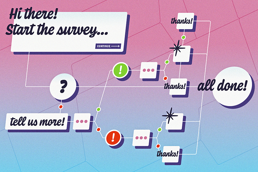
Conditional logic empowers you, the surveyor, with the ability to create dynamic surveys that respond intelligently to respondents’ answers.

Let’s talk about why user onboarding matters and some best practices to follow when designing a mobile app onboarding flow.
The best way to address design cohesiveness and consistency is to create, maintain, and share ongoing UX documentation.

Here are some real-life examples of AI-generated image descriptions and some tips and tricks for generating effective descriptions with AI.
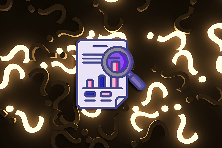
Learn what survey fatigue is, what causes it, and what you can do to prevent it, netting you more survey responses and quality insights.

Explore the importance of age-inclusive design, the best principles to follow, and some tips for testing interfaces for age-inclusivity.

Here are some clear definitions of the most commonly conflated UI design elements: the pop-up, popover, and popper.
Wondering what a CMS is? Here are the pros and cons of a CMS, how to use it, and how it simplifies UX design.