Banner blindness is an increasingly common phenomenon in digital product design, and it poses a serious threat, especially to products driven by advertising revenue. Let’s get you on the right track to advertise your products and services and avoid the dreaded banner blindness.

Banner blindness is a form of selective attention bias. In short, most users tend to ignore page elements that resemble advertisements — regardless if they are actually advertisements or not:
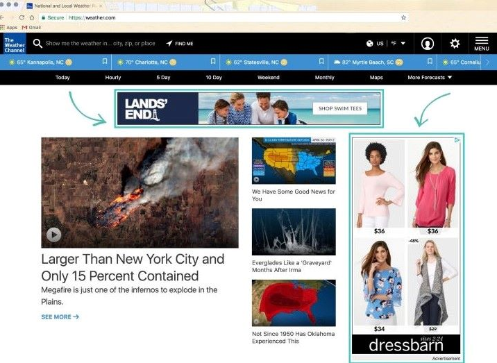
Since most advertisements, especially web ones, look similar and are shown in similar places, users unintentionally ignore things shown in a specific format and location. But it doesn’t concern only advertisements, per se. It might also harm other product metrics if your call to action or other page elements appear in places where users are accustomed to advertisements.
Take this example, for instance:
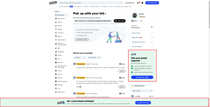
These are exactly where you’d expect ad placement; your users may be glossing over these CTAs.
Let’s cover the main reasons banner blindness occurs to understand better how to avoid it. Users avoid banners that follow these conventions: location, format and style, and volume.
There’s a set of most common locations of promotional banners:
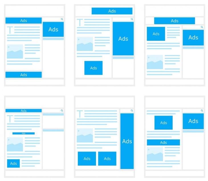
Chances are you’d distinguish an advertisement on a wireframe even if it wasn’t labeled.
People are used to seeing various banners in these places, and they filter them out.
Most advertisements share similar characteristics:
Users tend to filter out things that match these characteristics. For example, if they spot something contrasting on the side of the page and standing out from other design elements, they’ll often assume it’s an advertisement, and they’ll often be right.
The more various banners you use on the website, the faster users will learn the patterns and start filtering these banners out. Think of popular news sites or recipe sites that bombard your senses with ads — do any of them work? How do they compare to a site with a singular, well-positioned ad? Sometimes less is better.
Now that we understand what causes banner blindness and why it’s problematic let’s cover how to design our products to avoid it.
There are three main solutions to banner blindness:
There are also some more strategic micro-tactics that’ll we cover in a later section, but these are the basics. Keep in mind that although I focus my examples on advertisements, most of these practices can be reused for different content, such as your internal call to action or announcements.
If I were to create a list of the hottest digital trends in the last decade, the rise of native advertising would definitely make the list. The idea of a native ad is to make the advertisement blend with the native content the app provides.
For example, a hefty chunk of Instagram’s revenue comes from sponsored partnerships. It’s basically the same thing as standard user-generated content:
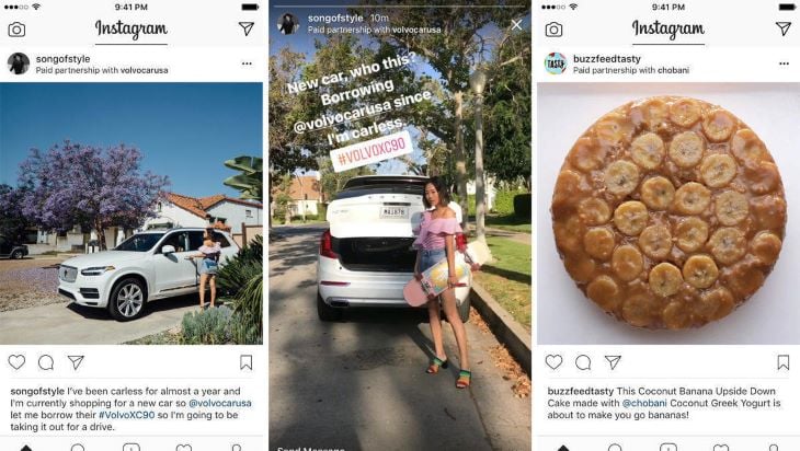
Since users are intentionally scrolling the page or swiping stories, they won’t automatically filter out ads. And since the advertisement is basically native content (a story of a picture created by an Instagram user), it’s often hard to realize it’s even an advertisement. It’s happened to me more than once that I’ve engaged with an Instagram story just to realize after a few seconds that I was actually watching an ad.
Another common example is various online magazines and journals, such as Entrepreneur:
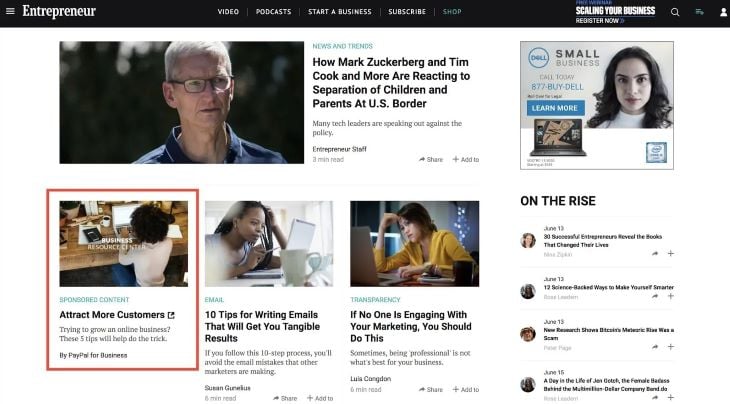
There isn’t any separate section for sponsored articles, nor do they differ in format. They blend perfectly with the product as a whole. The additional benefit of going native is that, as long as the content matches users’ search intent, it often doesn’t really matter to them if it’s sponsored or not.
If your placement has a different format than your native content, you should still consider placing it between your native content. Let’s take a look at YouTube:
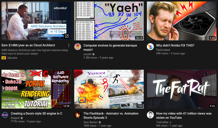
The very first position on this screen is a paid advertisement. Although it’s not a video — but rather a redirect link — the fact it’s placed in between the content and looks similar to native content makes it hard to ignore.
However, it’s still important to leave clear cues that it’s something different from native content (in the YT example, it’s a small yellow “Ad” block, a redirect icon on the preview, and a slightly different description box). You don’t want to trick users into accidentally clicking ads.
Rewarded advertisements are one of the most invasive types of ad positioning, yet also one of the most effective. The general idea here is to incentivize users to watch open and watch an ad on their own. It’s a common tactic in games when users watch ads to receive extra points and other bonuses:

However, it’s also applicable beyond just games. For example, Brainly allows you to unlock additional answers by watching ads even if you don’t have a premium subscription:
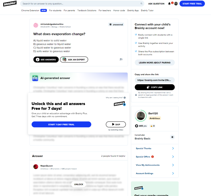
Consider using reward mechanics if you:
Native ads and in-between placements are the main strategies for avoiding banner blindness. In some cases, rewarded advertisements can also help you boost ads discoverability and engagement. But you can also combat banner blindness with smaller, more tactical actions; let’s get into those.
Just slightly repositioning your placements can do the trick. Understand how your users scan your pages (e.g., whether it’s F-pattern or Z-pattern) and use it to find the most optimal space for your ads. The more you avoid standard advertisement placements, the better.
Interactive ads are an interesting way to boost both discoverability and app engagement. It can be a micro-game to play or even just a dynamic copy that changes as the user moves an inbuilt slider:
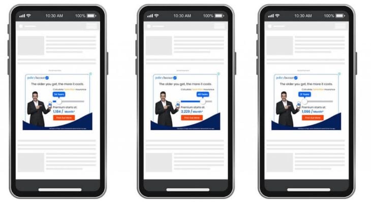
Many users will stop scrolling and engage with the advertisement simply because they are curious about what happens if they interact with the ad.
If a particular element stands out from the rest of the content, we often perceive it as an unwanted advertisement. For example, if you use primarily gray, yellow, and blue colors on your website, try to have your ads and banners fit that color palette. The more contrasting the placement is, the more it seems like an ad, and the higher the chance the users will simply ignore it.
The more ads you use, the faster users will learn to ignore them. Experiment with various volumes and see how your rates and CTR rates improve. Sometimes reducing the number of ad exposure can lead to an increase in engagements.
With various ads and banners having similar characteristics, such as location, contrast, and copy, users learn how to instinctively filter them out when browsing your website, leading to low banner effectiveness.
There are three main strategies to combat banner blindness. One of the most prominent ones is to embrace native advertisements — that is, ads that look and behave like native content in the product. They usually come in the form of paid partnerships and sponsored content.
If you can’t make your advertisement fit your native type of content, you should still consider blending it together by putting these ads in between native content. It makes the banners hard to ignore when browsing the content.
In some specific cases, you might also experiment with various incentives and rewards, such as giving users extra points or content for watching an ad. Apart from these strategies, you can also try smaller, more tactical improvements:
Although these micro-tactics won’t be as effective as native in-between content advertising, they might still move the needle. The more you rely on advertisements or various in-product banners, the more seriously you should treat and plan against the banner blindness effect.
Header image source: IconScout
LogRocket's Galileo AI watches sessions and understands user feedback for you, automating the most time-intensive parts of your job and giving you more time to focus on great design.
See how design choices, interactions, and issues affect your users — get a demo of LogRocket today.

Discover how to craft UX-friendly hero sections with examples, design tips, and strategies that drive engagement and conversion.

While Apple’s Liquid Glass can’t yet be perfectly recreated with CSS or Figma, we can still think about how to adopt the effect thoughtfully in our designs.

Figma Make is here to automate your design-to-code workflow. I tested it. Let’s talk about the good, the bad, and the straight-up weird.

After designing AI search systems, I’ve seen what builds trust — and what kills it. Here’s my take on what really works.