On the surface, the role letter casing plays in shaping user experience might seem insignificant. But what if we told you that letter casing could significantly affect your content readability and overall user experience? And no, we’re not kidding.

Studies have shown that up to 90 percent of readers will be more inclined to read your text if it is in lowercase. Now you see why you can’t afford to trivialize letter casing.
And just in case you’re curious about this letter casing concept, you’ve come to the right place! This article is all about casing letters. We’ll show you how to harness the power of letter casing by discussing the various casing options and how they shape the user experience.
So if you’re ready to grasp the full impact of using “A” or “a,” let’s dive right in! But first, let’s clarify: what is letter casing?
In typography and design, letter casing is the act of using different capitalization styles in writing. The major capitalization styles are:
Next, we’ll look at the purpose and appropriate usage of the various letter cases.
Uppercase letters (CAPITAL LETTERS) have a high visual impact. Therefore, they are perfect for drawing attention. Here’s an example:

Interesting, right? Let’s look at some scenarios where uppercase letters shine, such as emphasizing key points, creating attention-grabbing headlines, using acronyms, and establishing a brand identity.
This statement SHOWS how you can use capitalization for emphasis. And so does THIS statement. But THIS STATEMENT is JUST CONFUSING because CAPITALIZATION is used without caution.
Uppercase letters are great for emphasizing key points in your content. However, when used in excess, it can lead to visual clutter and affect readability. Therefore, finding the right balance is the key to an engaging reading experience.
Headings and titles are like signposts that guide users through your content. Therefore, they need to be easy to spot. And as we’ve already established, ALL CAPS are great for drawing attention. This high visual impact makes all caps particularly effective in creating headings that are hard to miss.
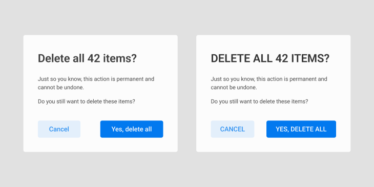
However, you should use all caps cautiously as it can give the impression of shouting when used in digital spaces (websites, apps, etc.).
TL;DR: Uppercase letters are conventionally used in acronyms and abbreviations to make them stand out from other text.
Notice how the logos of brands like Netflix, Chanel, Tesla, etc., look bold, authoritative, and easy to spot? That’s the power of all caps in branding. Uppercase letters work great for creating logos that stand out.
Lowercase (small letters) are like the more laid back sibling of uppercase letters. They offer a softer visual style, exuding warmth and informality. Add that to their inherent legibility and you have an obvious choice for long pieces of text and informal communication.

Let’s examine some scenarios where lowercase letters can be beneficial, such as body text, paragraphs, and casual communication.
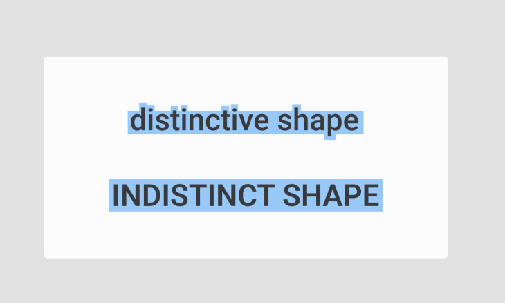
As we stated earlier, lowercase words have varying shapes, which makes them easier to read. This inherent legibility makes lowercase letters perfect for extended reading, such as body text in digital copies and paragraphs in articles, essays, and books.
THIS STATEMENT COMMANDS AUTHORITY. but this one comes across as more relaxed.
The relaxed look of lowercase letters brings a sense of informality and warmth to written communication. This quality makes them perfect for when you want to convey an informal tone with your text.
If uppercase and lowercase letters had a baby, that baby would be Title Case. By capitalizing only the first letters of every major word, title case text reads that thin line between commanding authority and offering a conversational style. As a result, this capitalization style is perfect for headings, titles, subheadings, and proper nouns.

Let’s look at some scenarios where title case text comes in handy, shall we? Here we go:
Title-case text offers more visual prominence and exudes more authority than lowercase text. Therefore, it works well for headings, titles, and subtitles when you want to convey professionalism.
In English writing, it’s good practice to use title case for proper nouns such as names of people, places, or organizations. This practice conveys professionalism and respect for the entities they represent.
But here’s the thing. You Have to Exercise Caution When Using Title Case as Excessive Use Can Act Like Speed Bumps During Reading.
See what we did there? That wasn’t so easy to read, was it? So it’s best to stick to short sentences when using title case.
Sentence case takes the crown for the most widely used capitalization style. And with good reasons, too — it’s how your English teacher taught you to write in school.
By capitalizing only the first letter of the sentence and any proper nouns, sentence case offers a cleaner, more casual look. Also, remember what we said about lowercase letters being easier to read? That applies here. Here’s an example:

Now let’s explore some applications of sentence case text.
Because text written in sentence case is smooth-flowing, it’s commonly used for sentence-level text, i.e., those chunks of text that make up written content. In UX, this can include error messages, confirmation messages, or other areas involving descriptive text.
One other area where sentence case shines is in labels. Because the text labels in an interface are essential in guiding and providing context to various elements, it’s important to use a legible and approachable style.
Having discussed the types of letter casing and their purpose, let’s take things up a notch. It’s time to explore some key factors to consider when casing letters.
Typography and letter casing go hand in hand. That is, the way letters are styled (typography) and the choice of letter casing work together to determine the overall look, feel, and readability of content.
You can’t make informed decisions regarding letter casing without knowing their typographical considerations. So, let’s unpack these considerations. First, we’ll look at the factors to consider when selecting a typeface.
Let’s start with serif fonts (i.e., the ones with small lines or extenders). You’ll mostly find lowercase serif fonts as body text in printed materials because they lend more legibility in smaller sizes.
But with their uppercase siblings, the reverse is the case. Serif fonts in all caps, especially the ones with intricate details, can become less readable at smaller sizes. So they’re mainly used in larger sizes for headings, titles, and logos that call for a touch of sophistication.
How about sans serif?
Lowercase sans serifs (the ones without extenders) are perfect for body text in digital interfaces due to their excellent on-screen legibility. Their uppercase siblings also score high on legibility, even in smaller sizes. They are typically used for headings, banners, and designs aiming for a modern look.
So, what’s the verdict?
Both serif and san serif fonts are effective, depending on how you use them. As a rule of thumb, sans serif fonts work best on digital interfaces regardless of the casing options.
With some letter casing options, you may need to tweak the letter spacing to maintain readability and balance. What do we mean? We’ll get to that in a moment. But first, let’s define some basic letter-spacing terms:
With definitions out of the way, let’s look at how letter spacing works with letter casing to ensure maximum readability.
Next, let’s examine the role letter casing plays in visual hierarchy and contrast.
Imagine hearing your name from all the corners of a room. You wouldn’t know where to turn to. As a result, no one gets your attention. That’s what it feels like to read content without any visual hierarchy. Nothing stands out.
But with a well-established visual hierarchy, it’s easy to figure out what’s most important. And one way to establish visual hierarchy and contrast is with letter casing. How? That’s what we’re about to discuss.
Capital letters are bold and demand attention. Therefore, they can be used to direct users to what’s most important on a page.
In terms of contrast, you can use all caps sparingly to highlight keywords and phrases. This technique helps to guide the readers’ focus, thus preventing content overload.
Despite not being as authoritative as uppercase, title case still commands attention. Therefore, titles and subheadings in title case stand out gracefully.
This casing style doesn’t exactly scream importance. But it shines when it comes to readability. That’s why it’s most commonly used for body text and any areas that involve extended reading.
So far, we’ve covered the ins and outs of letter casing. But of what use are all these techniques if members of your target audience can’t access your content? So let’s explore accessibility and inclusivity for a moment, shall we?
Once your content is out in the wild, it becomes available to diverse people. Therefore, It’s imperative that you ensure everyone gets a chance at understanding your intended message. This means that your choice of letter casing should consider people with diverse abilities, including neurodivergent people, those with visual impairments, etc.
But what exactly does this mean? To understand that, let’s discuss how letter casing options can affect accessibility and inclusion.
Writing in all caps can pose a problem for people with dyslexia. In uppercase letters, words have uniform shapes, which makes it harder for people with dyslexia to understand them. But that’s only one of the problems with uppercase letters.
Another issue is in the way screen readers often interpret capital letters. Because all caps are usually associated with acronyms, screen readers can often read them out letter by letter instead of as complete words. Not a good experience for visually impaired people.
Now, let’s look at some ways to avoid inclusion and accessibility issues:
Always choose fonts with well-defined letterforms and clear distinctions between uppercase and lowercase letters. The clearer the distinction between letter cases, the easier the words are to perceive.
As we’ve already discussed, letter spacing is crucial. So always remember to add the right amount of space so your letters don’t appear cramped. You’ll be doing your readers a lot of favors, especially those with low vision.
You can use uppercase for stylistic purposes but with caution. Excessive use can hinder comprehension, especially for visually impaired people because screen readers may misinterpret them.
Of all the letter casing options, sentence case is the most friendly for neurodivergent people (and basically everyone else). So lean more toward this letter style to ensure inclusion and accessibility.
Now let’s wrap this all up, shall we?
In typography, letter casing plays a significant role in readability and user experience. From uppercase’s authoritative feel to the warmth and elegance of lowercase, each casing option helps shape the user experience.
However, this interplay goes beyond aesthetics. Designers, UX professionals, and writers can use letter casing to enhance communication, readability, and user experience. By applying the insights uncovered in this article, you can create content that hits the right notes and is accessible to all.
Header image source: IconScout
LogRocket's Galileo AI watches sessions and understands user feedback for you, automating the most time-intensive parts of your job and giving you more time to focus on great design.
See how design choices, interactions, and issues affect your users — get a demo of LogRocket today.

Optimization fatigue is real. Here’s why designing only for metrics drains creativity, and how to bring the human back into UX.

Let’s explore why and when to use drag and drop, discussing real-world examples, platform-specific considerations, and accessibility tips.

We’re told to reduce friction, but sometimes friction builds value. This blog explores how scarcity, when designed well, sharpens focus and strengthens user trust.

Discover how to craft UX-friendly hero sections with examples, design tips, and strategies that drive engagement and conversion.