
Build dynamic, AI-generated UI safely with Vercel’s JSON Render using structured JSON, validated components, and React.

Security requirements shouldn’t come at the cost of usability. This guide outlines 10 practical heuristics to design 2FA flows that protect users while minimizing friction, confusion, and recovery failures.

2FA failures shouldn’t mean permanent lockout. This guide breaks down recovery methods, failure handling, progressive disclosure, and UX strategies to balance security with accessibility.

Two-factor authentication should be secure, but it shouldn’t frustrate users. This guide explores standard 2FA user flow patterns for SMS, TOTP, and biometrics, along with edge cases, recovery strategies, and UX best practices.
2FA has evolved far beyond simple SMS codes. This guide explores authentication methods, UX flows, recovery strategies, and how to design secure, frictionless two-factor systems.

Designing for background jobs means designing for uncertainty. Learn how to expose job states, communicate progress meaningfully, handle mixed outcomes, and test async workflows under real-world conditions.

There’s no universally “best” design language. This section breaks down when Linear-style design works well, how to build beyond it (or start from Radix UI), why it felt overused in SaaS marketing, and why conversion claims still need real testing.
Minimal doesn’t always mean usable. This comparison shows how Linear-style UI keeps contrast, affordances, and structure intact, unlike brutalism’s extremes or neumorphism’s low-clarity depth effects.
Linear-style UIs look simple, but the theming system has to do real work. Here’s how to meet WCAG 2.2 contrast requirements across light, dark, and high-contrast modes — whether you’re using a UI library or rolling your own tokens.
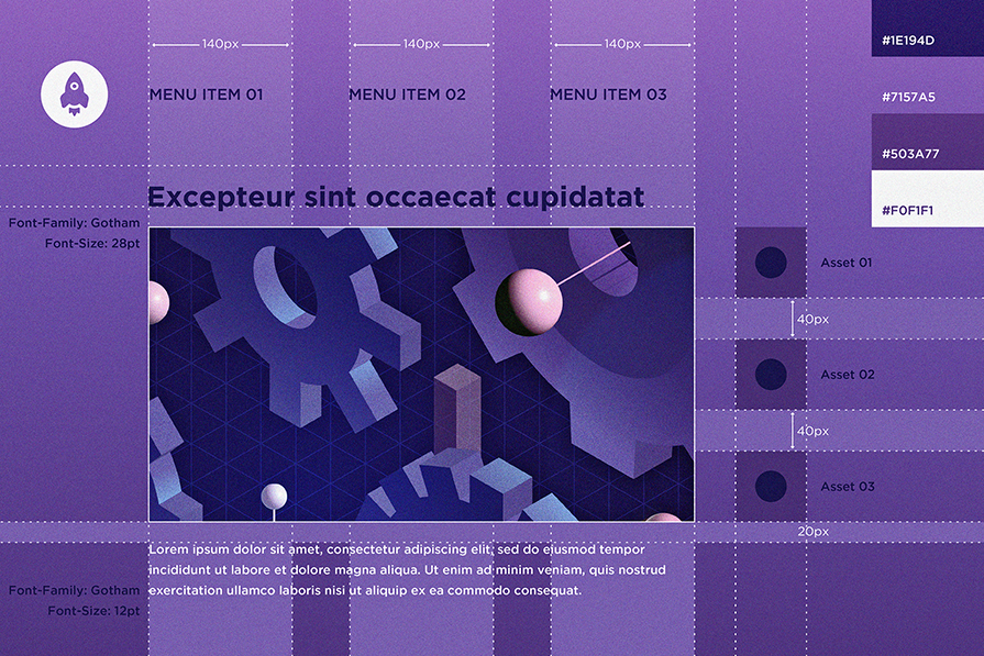
Linear design is a minimalist SaaS aesthetic inspired by Linear. Here’s what to use to recreate it — from Radix UI + shadcn/ui ecosystems to Linear-style Figma kits — plus how to structure pages using modular components and an 8px spacing scale.

A well-designed multi factor authentication system enhances security without slowing users down. Let’s explore how to make authentication feel effortless.
Most design specs break down in development because they’re built for designers, not developers. This article shows how to write specs that reflect real-world logic, states, constraints, and platform behavior — not just pixels.