Despite being a somewhat hidden rule in design, the rule of thirds is everywhere you look. Name any website, and you can easily spot the rule of thirds. See any billboard ad, and most likely the rule of thirds is present. Browse any marketing poster, and it’s probably there too.

The rule of thirds goes all the way back to artists in the 1700s. And yet, its simple application still holds true in modern designs as humans are naturally drawn to the center of a composition. But that doesn’t mean just putting an image in the center of everything.
In this article, I’ll take a deep dive into the rule of thirds. We’ll see where this design theory came from, how it’s used, and how brands such as Nike, Amazon, and Apple use this rule.
It’s more than a handy-dandy trick on your phone. Ready? Let’s dive in.
Editor’s note: This article was updated by the author on 16 June 2025 to expand on the original to include common mistakes, explain when not to use the rule of thirds, and discuss how you might break it.
Have you ever heard of the rule of three? This happens when things come in three — sentences, sayings, and stories. Think about how it’s always the three little pigs, or three bears, in old fairytales right? Never four or two.
When we hear or read a list of three things, our brain sees a pattern in it. For example, the famous quote by Julius Caesar upon seeing Rome: “I came, I saw, I conquered” is a list of three.
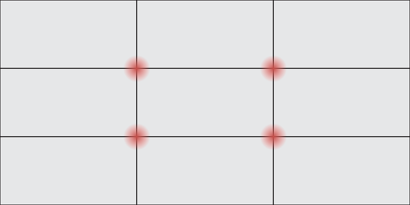
It’s the same in art. The rule of thirds divides the image into nine composite parts, splitting the image in three vertically and horizontally. The four meeting points of the lines are the image’s important aspects to focus on:
Although we’re discussing UX design, you can find recent applications of the rule of thirds everywhere you look. All you need is a grid that breaks an image into nine little boxes and has important aspects that meet at the intersection of these lines.
Take a look at an iPhone, for example. Open the camera options, and under composition, turn on the grid option. The grid that overlays the image on your camera’s screen is based on the rule of thirds theory:
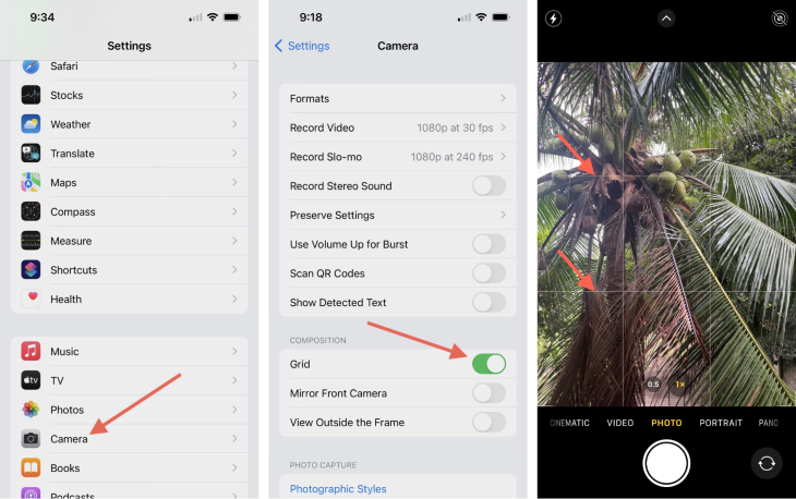
In photography, even in something as simple as your phone, once you turn on the grid, you’ll be able to use the rule of thirds. The rule of thirds is something that anyone can use, to make their photos aesthetically pleasing, even without extensive training.
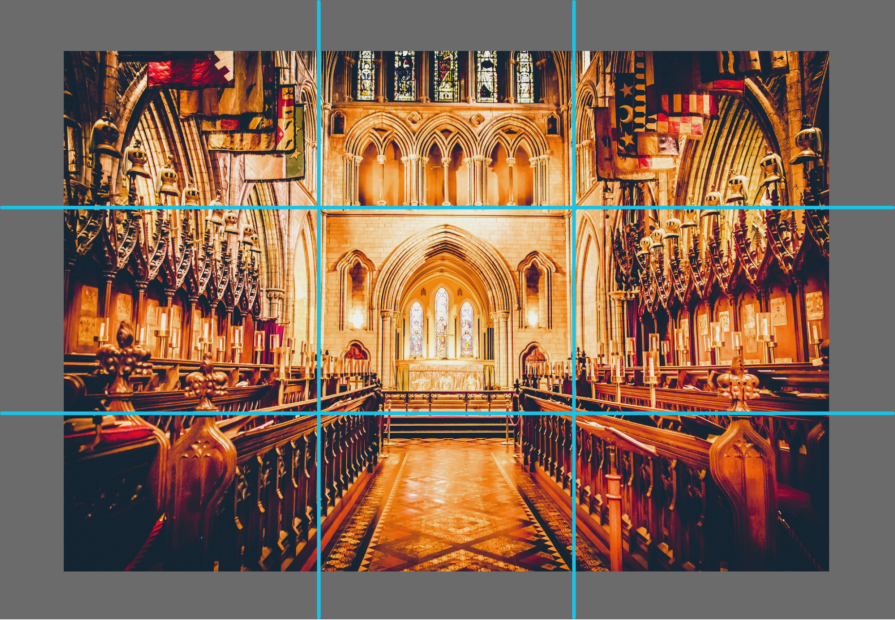
In architecture, the rule of thirds is applied when viewing a building. A church on the inside is often viewable through the rule of thirds. When walking down the center of the church, the aisle is usually flanked by seats on the left and the seats on the right, while at the center front is the altar:
By understanding the rule of thirds, you can create more visually appealing and readable webpages.
The rule of thirds helps create balance within the images or other elements of the landing page. Its main principle is that if elements on the page reside within a third of the page, then it’s more aesthetically pleasing to viewers than if it was zoomed-in and centered.
To do this, you can break the landing page into two lines both horizontally and vertically, forming a grid-like pattern of intersections. The grid cuts the landing page into thirds, with three even horizontal columns and three even vertical rows. The grid is then made up of nine even boxes, made from the horizontal columns and the vertical rows.
Then, place your relevant image or text at every intersection of these columns and rows. Or, alternatively, you can also use each of the nine boxes to place your image or your text.
For example, if your landing page has an image, a call-to-action button, and contact information, you’d want to place the image over two horizontal columns, the call-to-action button on the bottom right intersection, and the contact information on the bottom left intersection:

For the rule of thirds to work for your benefit in web design, as a UX designer, you need to keep in mind a few things:
It’s been proven that pages that use the rule of thirds see higher conversion rates amongst web users. So as a rule, the more you use the rule of thirds, the more striking your image is, and the more you can convert your users!
If you’re here, you’ve learned about the rule of thirds already. Now, here’s how to convert viewers into leads with this design rule.
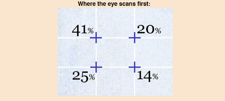
Say you’re creating a landing page. For that, you would use a grid design. Remember that the grid design is overlaid on top of the entire image. But, not each intersection has the same effect on the viewer.
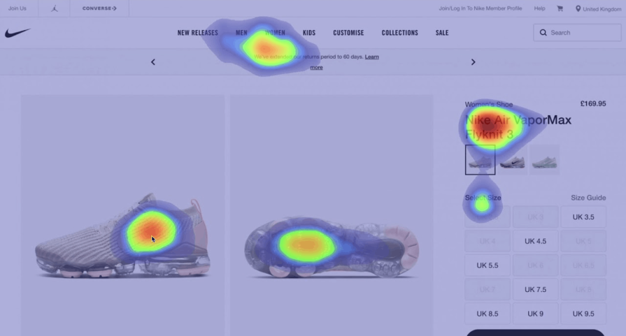
The eye scans the top left intersection first, which gets 41 percent of the scan, while the button left intersection gets 25 percent. The top right intersection gets 20 percent in the eye scan, while the bottom right gets 14 percent. Thus, your viewer will most likely look at the top left corner first, while they will look at the bottom right corner last.
Knowing this information about the rule of thirds will get you ahead of the game when it comes to gridding the most important information on your page or image first, middle, and last.
Here’s a guide from Design Web Kit:
To get your images to the next level, you’ll want to draw attention to the intersections of the grid layout.
If you have a catchy headline/slogan and you want that seen first, put it directly at the top left intersection. If you want to overlay an image, put the center of the image directly on the 20 percent intersection.
Then, place your call-to-action at the 25 percent mark. And your description is at the 14 percent mark.
You now have a headline, an image, a description, and a call-to-action directly where visitors to your site will scan. You can drag around the elements as much as you can.
UX designers use the rule of thirds to balance their images, including their subject and the negative space around it. White space or negative space is necessary for every image, because it’s usually the spaces around a subject:

Say you’re taking a picture of a vase of flowers on a kitchen table for a product launch. You’ll focus on the vase, but you’ll still capture the space around it, such as the kitchen table or the walls. This creates a background for the vase that makes it stand out better.
The important thing here is to not overload your image with more than one subject, especially at different intersections. This can confuse your target audience, causing them to struggle to determine what to focus on.
Asymmetry is everything that’s not symmetrical. It plays an important part of the rule of thirds. The rule of thirds naturally encourages asymmetry, as it asks for a focal point of one subject.
By carefully and intentionally placing asymmetry in your image, you’ll be able to create a visual flow that trains the viewer’s eyes to find your intended subject.
Asymmetry makes images more dynamic, moving the viewer’s eye from background to foreground. In constant, symmetrical or centered images feel too formal, as if frozen without the energy brought about by asymmetry.
By using the rule of thirds to enhance asymmetry, you’ll encourage the viewer to move either from left to right or right to left, and create a more dynamic visual flow.
To help further unpack the rule of thirds, this section examines examples in different fields of design.
Ansel Adams, a renowned photographer known for his breathtaking landscapes, uses the rule of thirds in this infamous photograph. It’s called “The Tetons and the Snake River, Grand Teton National Park, Wyoming” (1942):

Thing to note: You can emulate Ansel Adams using the rule of thirds in your graphics used for any marketing campaigns to give it that stunning photography look.
Adidas’ redesigned logo greatly encapsulates the rule of thirds, with three diagonal lines for its logo:
Why it works: It makes for a logo that changes with the times, and has a modern look to it, all while using the rule of thirds.
Amazon uses the rule of thirds strictly on its homepage. This is because, as a mass marketplace, it wants its consumers to be able to connect with its brand:
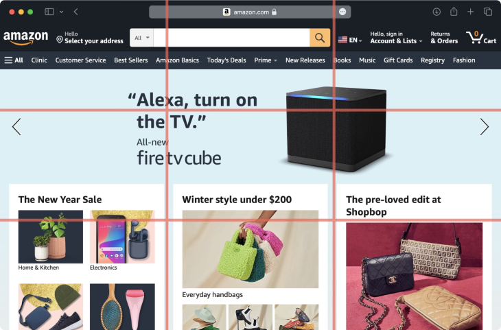
Lessons learned: By being able to show its consumers all the hottest products it offers in an organized and visually-appealing design, Amazon can grow its authority as a mass marketplace that caters to all. And, by being able to click in detail on each offering as it zooms by on the page, consumers can more conveniently personalize their experience
Apple has consistently used the rule of thirds everywhere, making it a force to be reckoned with in marketing.
Just take a look at this iconic photo from January 16, 1984, with Steve Jobs, then the Chairman of Apple Computers, and John Sculley, the then-President of Apple, posing with the newly unveiled Macintosh computer:

See how the image is divided in three?
And it doesn’t stop there. Apple has consistently used the rule of thirds in its website and advertisements. Look at how Apple is advertising its new iPhone line. See anything familiar?

Before the age of digital photography, photographers were already using the rule of thirds by trusting their natural eye. Using the logic of the rule of thirds is easy — you compose an image where you have the meeting points of the vertical and horizontal lines because it makes the image look and feel complete.
That said, here are some key things to avoid:
As you can see, the rule of thirds is very reliable. It’s a tried-and-true way to create readability for a webpage and visibility for brands. And because of its predominance, it’s already trained visitors to expect different elements in the same place on a visual level. As we scroll, we expect things to be in more or less the same places with every page we scan.
If the page itself has elements that are incompatible with the rule of thirds, you can let go of it. For example, if you want to showcase your film, it might be better if you use two horizontal rows only. For your photography website, maybe you want a centered image. Maybe you just want to experiment and have enough knowledge for it.
While the rule of thirds is generally best to follow, there are times when it might make sense to break the rule. In the movie “Mission Impossible,” the lead is seen in the vertical center of the frame, as shown in the image below, which breaks the rule of thirds:

Instead of placing the important parts of the image in the points where the lines meet, the center vertical line of this frame becomes the important part — the first on the left is the shot of the surrounding buildings, the center is the shot of the protagonist running, and the third on the right is the shot of the building where the protagonist is coming from.
By breaking up the rule of thirds, the viewer sees that the manhunt is focused on one person’s interaction with their surroundings. On the left and right are their surroundings, and on the center is the protagonist, as we are using his point of view when we are viewing the film.
By not using the rule of thirds in this film, the frame also makes the viewer more sympathetic to the point of view of a certain character.
The camera in film usually trails the character, so by breaking the rule of thirds, the viewer sees a depiction of the character amidst their surroundings.
So, if you have a good grasp of design, go ahead and do what you feel fits the medium. Just make sure to use the other principles of design, such as proportions or even the golden ratio.
Here are three takeaways I hope you’ve learned by browsing through this:

LogRocket's Galileo AI watches sessions and understands user feedback for you, automating the most time-intensive parts of your job and giving you more time to focus on great design.
See how design choices, interactions, and issues affect your users — get a demo of LogRocket today.

I was working with an intern on a UX research project, and before we even started, we both had private […]

AI has accelerated design execution, but speed can come at the expense of intentionality. Learn how UX teams can preserve product thinking and judgment.

UX testing is not limited to layouts, copy, and visual design. Full-stack and server-side experiments help teams evaluate how backend logic, APIs, algorithms, and product flows affect the overall user experience.

In A/B, A/B/n, or multivariate testing scenarios, using p-value with traditional null-hypothesis-based statistical analysis is so common, and most designers […]

 Learn more →
