
Inline <style> tags offer a modern HTML styling pattern, but this mechanism has a known scoping issue in vanilla CSS and HTML: the traditional <style> tag typically needs to be placed within the head tag, so all styling rules within a particular <style> tag affect the whole HTML page by default. This makes it difficult if you need to scope a <style> tag for a specific HTML element because the native CSS @scope tag is still experimental and doesn’t have good browser support yet.

Using a unique DOM identifier, following BEM, or using frontend frameworks are possible workarounds for inline <style> tag scoping. In this article, however, we’ll cover the css-scope-inline library, which offers a simple JavaScript code snippet to scope your inline <style> tags without adding a build step to your vanilla CSS/HTML project.
I’ll explain practical use cases of inline <style> tag scoping, describe how the css-scope-inline project works internally, list highlighted features, and demonstrate how to use it practically with your web projects to simplify inline <style> tag scoping.
The Replay is a weekly newsletter for dev and engineering leaders.
Delivered once a week, it's your curated guide to the most important conversations around frontend dev, emerging AI tools, and the state of modern software.
<style> tag scoping?Almost all web developers use CSS to design webpages with responsive grid systems, JavaScript-free animations, and dynamic styles. There are two predominant methods for adding CSS definitions to HTML pages:
<head> sections using <link> tags<style> tags within the HTML document body and inside HTML elements to keep both element structures and styling definitions in the same place for better readabilityBefore we discuss the inline <style> tag scoping requirements, we need to understand the Locality of Behavior (LoB) principle. When practicing LoB, you place action-oriented code as close as possible to the related action element, which gives readers of your code a better understanding of its behavior.
For example, suppose you write the implementation of a specific click action and place a <script> tag closer to the related action button without writing the implementation in a separate JavaScript file. In that case, you’ll implement the LoB principle with the specific action button.
Many popular frontend frameworks adhere to the LoB principle by letting developers write JavaScript and HTML in the same component source file.
Similarly, we can implement the LoB principle for CSS and HTML by writing our CSS styling definitions within the HTML segment we want to style. Then, child elements of the primary element can also be styled within the same <style> tag using traditional or modern nested selectors.
This technique helps us instantly browse styling definitions for a particular element without navigating to a separate CSS stylesheet or scrolling to another section of the same page. This CSS writing strategy is known as inline <style> tag scoping.
Below, we create a scope for CSS definitions based on an HTML element:
<div>
  <style>
     /* Isolated styles for the parent div and its child elements */
  </style>
  <div>
    <span></span>
  <div>
</div>
<style> tag scopingThe inline <style> tag scoping technique is recommended in any scenario where you implement LoB-based styling. In other words, this scoping method is necessary in situations where you need to set styles for specific HTML elements with the standard <style> tag by avoiding global styling collisions (i.e., styling a specific <div>‘s <button> elements using the tag name without affecting other buttons on your webpage).
You may need LoB-based styling and inline <style> tag scoping in the following practical use cases:
<style> tag scoping solutionsThe following are solutions for inline <style> tag scoping, but they have considerable drawbacks, as we’ll explain in each section.
We can write a scoped <style> tag with a unique DOM identifier, as follows:
<div id="element-1">
  <style>
    #element-1 {
      background-color: #eee;
    }
    #element-1 .title {
      padding: 10px;
      background-color: #bbb;
    }
    #element-1 .content {
      padding: 10px;
    }
  </style>
  <div class="title">Lorem ipsum dolor sit amet</div>
  <div class="content">
    Lorem ipsum dolor sit amet, consectetur adipiscing elit.
  </div>
</div>
Also, it’s possible to use the BEM method and use only CSS classes, as shown in the following code snippet:
<div class="element-1">
  <style>
    .element-1 {
      background-color: #eee;
    }
    .element-1__title {
      padding: 10px;
      background-color: #bbb;
    }
    .element-1__content {
      padding: 10px;
    }
  </style>
  <div class="element-1__title">Lorem ipsum dolor sit amet</div>
  <div class="element-1__content">
    Lorem ipsum dolor sit amet, consectetur adipiscing elit.
  </div>
</div>
The drawback is that you have to add manual unique identifiers or class names for each scoped CSS element with this approach. Manual unique identifiers or class names are needed to apply unique styles via CSS selectors regardless of the DOM element order. For example, using element-1 class name twice applies the same .element-1 selector-based styles to both elements, so we need element-2 to make the second element unique.
@scopeThe @scope at-rule, the successor of the deprecated HTML scoped attribute, offers an inbuilt, native browser feature for writing scoped <style> tags, according to the official specification:
<div>
  <style>
    @scope {
      :scope {
        background-color: #eee;
      }
      .title {
        padding: 10px;
        background-color: #bbb;
      }
      .content {
        padding: 10px;
      }
    }
  </style>
  <div class="title">Lorem ipsum dolor sit amet</div>
  <div class="content">
    Lorem ipsum dolor sit amet, consectetur adipiscing elit.
  </div>
</div>
Here, we styled the parent element using the :scope pseudo-selector and child elements with normal CSS class selectors.
However, the CSS @scope feature is still experimental, and browser support is immature. According to MDN, only the latest Chromium-based browsers support this feature.
It takes some time to stabilize a new browser feature since not all users actively download every browser release, so it isn’t recommended to use this feature in production at the time of writing this article.
<style> tag scopingMost frontend frameworks, like Riot and Vue, implement inbuilt, scoped CSS features. For example, look at the following Riot component:
<app>
    <div class="title">Lorem ipsum dolor sit amet</div>
    <div class="content">
      Lorem ipsum dolor sit amet, consectetur adipiscing elit.
    </div>
  <style>
    :host {
      background-color: #eee;
    }
    .title {
      padding: 10px;
      background-color: #bbb;
    }

    .content {
      padding: 10px;
    }
  </style>
</app>
If you choose this approach, you should use a frontend framework that triggers a build step even if you plan to use vanilla CSS and HTML, which don’t require a build step.
css-scope-inline offer a better CSS scoping solution?css-scope-inline offers a simple script that you can easily include in any webpage to enable scoped inline <style> tags. The script doesn’t force you to add unique CSS classes or DOM identifiers, and doesn’t include a build step to generate scoped CSS.
Instead, this script monitors <style> tag changes via the MutationObserver and query selector APIs and adds scoping to styles using unique, auto-generated CSS class names. It also automates the manual <style> tag scoping method, which uses unique CSS classes, with a pre-developed script.
The Web APIs used in this script have very good browser support (see CanIUse for MutationObserver), especially as compared to the native @scope experimental feature. Moreover, this script has just 16 lines of code, so it won’t cause bundle bloat.
The standard experimental @scope CSS at-rule offers the same scoping feature that css-scope-inline offers. Other existing CSS scoping solutions come with various critical drawbacks, but the standard @scope at-rule may affect the popularity of css-scope-inline in the future because @scope is an inbuilt browser feature that comes with better performance.
However, @scope‘s browser support is not production-friendly yet and it doesn’t offer developer-friendly CSS naming like me, this, or self.
Take a look at the following comparison table to identify differences before selecting one for your next web project:
| Comparison factor | css-scope-inline | Native CSS @scope |
|---|---|---|
| Internal implementation method | JavaScript-based implementation with standard web APIs | Native CSS feature from the browser |
| Browser support | Works on all modern browsers that support MutationObserver (see CanIUse) | Work on only the latest Chromium browsers at this moment (see CanIUse) |
| Production usage | Possible | Discouraged at the time of writing due to browser support limitations |
| Performance | Depends on the MutationObserver and query selector API performance | Depends on the internal browser implementation. Offers better performance since the implementation runs on the browser’s CSS parser — not on a JavaScript interpreter like css-scope-inline |
| Developer-friendly aliases for selecting the parent element | Yes, this and self |
No |
| Possibility of customizing the scoping logic | Yes, by modifying the script source | No |
| Offers inbuilt responsive design shortcuts | Yes | No |
css-scope-inlineThe following features should motivate web developers to choose css-scope-inline for writing scoped CSS:
@scope feature@scope and other methods for writing scoped CSSNow that we’ve covered inline <style> tag scoping and the theoretical concepts of the css-scope-inline project, let’s use this library practically to write scoped CSS.
This is a simple library with only a few lines of code, so you can copy-paste it into your web projects productively. For better maintainability in somewhat large multi-page projects, you can place this library in a separate JavaScript file.
It’s also possible to use a cloud CDN service to load this script, as shown in the following code snippet that uses the JsDelivr CDN:
<script src="https://cdn.jsdelivr.net/gh/gnat/css-scope-inline/script.js"></script>
In this tutorial, we’ll use the JsDelivr-based approach.
<style> tagsLet’s use css-scope-inline to build a simple HTML card element. Create an HTML file with the following content and drag-and-drop it to the web browser:
<!DOCTYPE html>
<html lang="en">
<head>
  <meta charset="UTF-8" />
  <meta name="viewport" content="width=device-width,initial-scale=1" />
  <script src="https://cdn.jsdelivr.net/gh/gnat/css-scope-inline/script.js"></script>
</head>
 <body>
   <div>
     <style>
       me {
         background-color: #eee;
       }
       me .title {
         padding: 10px;
         background-color: #bbb;
       }
       me .content {
         padding: 10px;
       }
     </style>
     <div class="title">Lorem ipsum dolor sit amet</div>
     <div class="content">
       Lorem ipsum dolor sit amet, consectetur adipiscing elit.
     </div>
   </div>
</body>
</html>
Here, the custom me selector refers to the parent div element that holds the style segment. You can use this and self aliases instead of me according to your naming preference.
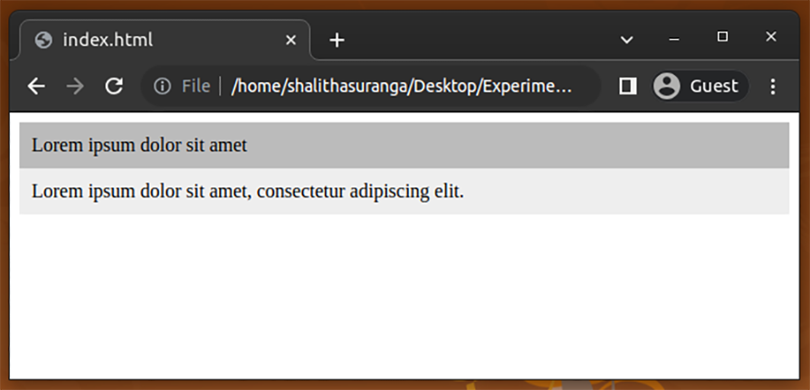
When you run the above HTML document on the browser, you’ll see a styled card element:
Let’s add a button to the page. Add another scoped CSS-styled segment with the following HTML code:
<div>
   <style>
     me {
       background-color: #ffedad;
       text-align: center;
       padding: 12px 0px;
       margin-top: 8px;
     }
     me button {
       color: #fff;
       border: none;
       background-color: #111;
       padding: 8px;
       font-size: 14px;
     }
     me button:hover {
       background-color: #333;
     }
   </style>
   <button>Action button</button>
 </div>
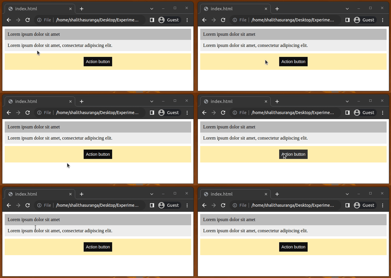
Even though we use the custom selector me again, it won’t create styling collisions and affect the previous card. Look at the following preview:
What do you think about DOM changes after scoping with the library? It’s not possible to scope a CSS source snippet with only one unique class name in vanilla CSS and HTML.
Let’s understand the process under the hood with DevTools. Inspect both HTML segments and see the dynamically generated content by the library:
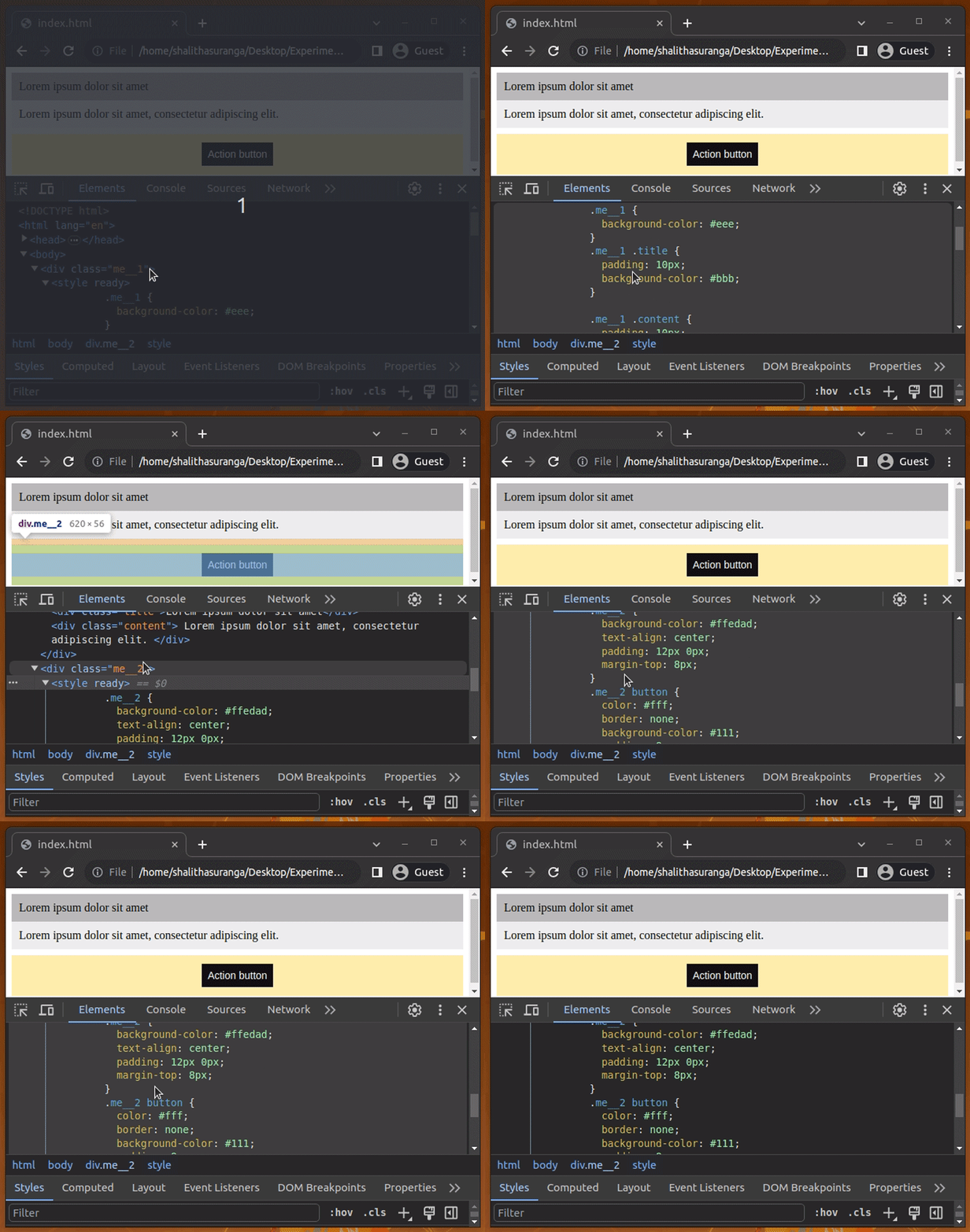
As you can see, the library accomplished the scoping process with the following steps:
<style> tagme with the dynamically generated class name in the CSS source segmentready attribute to each scoped <style> tagThe native CSS nesting feature offers a way to write organized CSS documents avoiding repetitive selector prefixes by nesting CSS definitions inside parent CSS selectors. In the previous example, we used the me prefix for styling child elements, but we can avoid repetitive me prefix with native CSS nesting, as follows:
<style>
   me {
      background-color: #ffedad;
      text-align: center;
      padding: 12px 0px;
      margin-top: 8px;
      & button {
        color: #fff;
        border: none;
        background-color: #111;
        padding: 8px;
        font-size: 14px;
      }
      & button:hover {
        background-color: #333;
      }
   }
 </style>
At the moment of writing this article, only Firefox fully implements CSS nesting according to MDN documentation, so be careful with production usage.
The native CSS variables (custom properties) feature often helps developers implement dynamic global color schemes without switching CSS class names or loading additional stylesheets. Also, we can use CSS variables to eliminate repetitive, hardcoded CSS property values.
With css-scope-inline, you can create scoped CSS variables that don’t affect other global CSS variables, as shown in the following code snippet:
<div>
   <style>
     me {
       background-color: #eee;
       --border-color: #999;
     }
     me .title {
       padding: 10px;
       background-color: #bbb;
       border-top-color: var(--border-color);
       border-top-width: 2px;
       border-top-style: solid;
     }
     me .content {
       padding: 10px;
       border-bottom-color: var(--border-color);
       border-bottom-width: 2px;
       border-bottom-style: solid;
     }
   </style>
   <div class="title">Lorem ipsum dolor sit amet</div>
   <div class="content">
     Lorem ipsum dolor sit amet, consectetur adipiscing elit.
   </div>
 </div>
The above code snippet defines the scoped --border-color CSS variable to set the border colors for two HTML elements. This variable won’t be exposed beyond the parent div since we defined it within the me scope. This is a great way to overcome repetitive CSS property issues while working with scoped inline <style> tags.
Writing scoped CSS <style> tags is a great way to achieve the LoB principle in HTML pages, but it may create repetitive CSS code even when you use scoped CSS variables.
Assume that you need to create two versions of the card element we just created above: one with a grey color scheme and one with a yellow color scheme. We’ll only use each version once on the web page.
We can add common CSS code using the following strategies:
<style> tag within the <head> section<style> tagThe first approach offers a better way to add global styles without invalidating the LoB principle. Look at the following HTML document that renders two card elements with two color schemes:
<!DOCTYPE html>
<html lang="en">
<head>
  <meta charset="UTF-8" />
  <meta name="viewport" content="width=device-width,initial-scale=1" />
  <script src="https://cdn.jsdelivr.net/gh/gnat/css-scope-inline/script.js"></script>
  <style>
    .card {
      margin-bottom: 10px;
    }
    .card .title {
      padding: 10px;
    }
    .card .content {
      padding: 10px;
    }
  </style>
</head>
 <body>
   <div class="card">
     <style>
       me {
         background-color: #eee;
       }
       me .title {
         background-color: #bbb;
       }
     </style>
     <div class="title">Lorem ipsum dolor sit amet</div>
     <div class="content">
       Lorem ipsum dolor sit amet, consectetur adipiscing elit.
     </div>
   </div>
   <div class="card">
     <style>
       me {
         background-color: #ffe8b3;
       }
       me .title {
         background-color: #f5bf42;
       }
     </style>
     <div class="title">Lorem ipsum dolor sit amet</div>
     <div class="content">
       Lorem ipsum dolor sit amet, consectetur adipiscing elit.
     </div>
   </div>
</body>
</html>
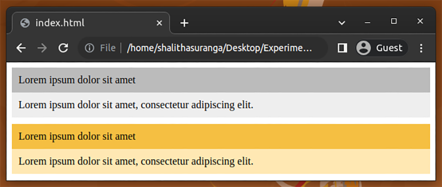
Here, we define global positional-adjustments-specific styles for card elements within the <head> tag and used scoped styles for color-specific styling. The above source code will render two card elements as follows:
Popular CSS frameworks like Bootstrap and Tailwind implement inbuilt responsive media query breakpoints for each pre-developed component. If you don’t use a CSS framework that supports responsive design, you’ll need to add media query breakpoint values manually, as shown in the following CSS source snippet:
@media only screen and (max-width: 639px) {
    me button {
      display: block;
      width: 100%;
    }
}
The css-scope-inline library lets you use Tailwind responsive breakpoints within scoped <style> tags as follows:
<div>
  <style>
    me {
      background-color: #ffedad;
      text-align: center;
      padding: 12px;
      margin-top: 8px;
    }
    me button {
      color: #fff;
      border: none;
      background-color: #111;
      padding: 8px;
      font-size: 14px;
    }
    me button:hover {
      background-color: #333;
    }
    @media xs- {
      me button {
        display: block;
        width: 100%;
      }
    }
  </style>
  <button>Action button</button>
</div>
The library will expand xs- to a responsive breakpoint (@media (max-width: 639px)) during the CSS scoping process and activate the nested CSS style for smaller viewpoints:

We can create keyframe-based animations in CSS using the @keyframes <identifier> at-rule. This at-rule requires a unique identifier, so scoping is required to use the same keyframe identifier within multiple <style> tags.
The library supports keyframe scoping and lets you create scoped animation definitions as follows:
<div>
  <style>
    me {
      background-color: #ffedad;
      text-align: center;
      padding: 12px;
      margin-top: 8px;
    }
    me button {
      color: #fff;
      border: none;
      background-color: #111;
      padding: 8px;
      font-size: 14px;
      animation: me-button 5s linear infinite;
    }
    @keyframes me-button {
      from {
        transform: rotate(0deg);
      }
      to {
        transform: rotate(360deg);
      }
    }
  </style>
  <button>Action button</button>
</div>
Here, we defined a keyframe set with the me- prefix, so the library will scope it accordingly using a unique dynamic identifier. As a result, you can use me-button as a keyframe set identifier in another scoped <style> tag. The above code snippet renders a scoped animation as follows:

css-scope-inline with other JavaScript librariesThe css-scope-inline library scopes <style> tags using the MutationObserver API, so it will detect and scope dynamically added <style> tags with JavaScript libraries like HTMX, Surreal, and JQuery.
Look at the following HTMX code snippet:
<script src="https://unpkg.com/htmx.org"></script>
<button data-action hx-get="./index.html" hx-select="button[data-action]" hx-swap="afterend">
<style>
  me {
      color: #fff;
      border: none;
      background-color: #111;
      padding: 8px;
      font-size: 14px;
      animation: me-button 5s linear infinite;
  }
</style>
Action button
</button>
The above code snippet clones a button that contains a scoped style by making an HTTP request to the same HTML file itself. The css-scope-inline seamlessly works with HTMX and creates new elements without FOUC (Flash Of Unstyled Content).
Look at the following preview:

In this article, we explored the minimal css-scope-inline library and practically implemented several scoped CSS examples. This library helps you scope inline <style> tags with no build steps. It offers a simple custom CSS selector me (and two aliases) to select the scoped element without asking developers to add unique CSS classes or DOM identifiers manually.
css-scope-inline also offers productivity-focused features, such as responsive design shortcuts, using custom scoping logic. So, css-scope-inline is the most suitable method for writing scoped CSS for vanilla HTML webpages at this time.
As web frontends get increasingly complex, resource-greedy features demand more and more from the browser. If you’re interested in monitoring and tracking client-side CPU usage, memory usage, and more for all of your users in production, try LogRocket.

LogRocket lets you replay user sessions, eliminating guesswork around why bugs happen by showing exactly what users experienced. It captures console logs, errors, network requests, and pixel-perfect DOM recordings — compatible with all frameworks.
LogRocket's Galileo AI watches sessions for you, instantly identifying and explaining user struggles with automated monitoring of your entire product experience.
Modernize how you debug web and mobile apps — start monitoring for free.

useEffect breaks AI streaming responses in ReactSee why useEffect breaks AI streaming in React, and how moving stream state outside React fixes flicker and stale updates.

A real-world debugging session using Claude to solve a tricky Next.js UI bug, exploring how AI helps, where it struggles, and what actually fixed the issue.

CSS wasn’t built for dynamic UIs. Pretext flips the model by measuring text before rendering, enabling accurate layouts, faster performance, and better control in React apps.

Why do real-time frontends break at scale? Learn how event-driven patterns reduce drift, race conditions, and inconsistent UI state.
Hey there, want to help make our blog better?
Join LogRocket’s Content Advisory Board. You’ll help inform the type of content we create and get access to exclusive meetups, social accreditation, and swag.
Sign up now