
You know that awkward moment when your web app is doing something in response to a user action, but the user is waiting with no idea that it’s doing something? That’s one of the reasons your users run to find alternatives — as well as one of the reasons why the importance of loading or progress indicators cannot be overstated.
Progress indicators are instrumental in telling the user that a requested action is being processed. We often use generic loading indicators to indicate actions for which the user doesn’t have to concern themselves with the details. For example, “An account is being created for you” or “Your file is being deleted.”
Then there are progress indicators where you should give the user some idea of the progress. A common example is for file downloads, where you might see a message like “Your file is downloading” along with the download percentage.
For these reasons and many more, progress indicators are preferred for effective page transitions in today’s world.
Most React routers — like Next.js and Remix React Router — perform routing between pages without causing a full page reload, unlike traditional anchor tags <a>. As a result, based on the kind of rendering you perform, you may end up with that awkward moment when the user has clicked a link to another page, but it seems like nothing is happening:
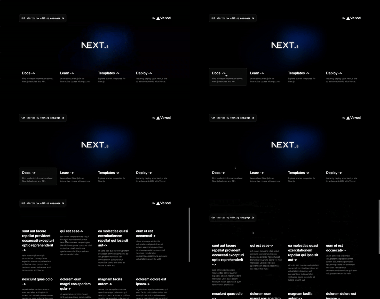
Well, we know something is happening — the contents of the next page are being fetched and rendered — but the user has no clue. This is what we hope to solve in this article.
By the end of this article, you’ll be able to build a fully functional progress indicator for Next.js page transitions, and your users won’t be tempted to run to other websites to get what they need.
The Replay is a weekly newsletter for dev and engineering leaders.
Delivered once a week, it's your curated guide to the most important conversations around frontend dev, emerging AI tools, and the state of modern software.
If you are new to Next.js or unfamiliar with the concepts of server-side rendering for the Pages Router and React Server Components for the App Router, you might wonder, “Why the delay?” SSR and RSCs both allow you to render your page from the server, and as such you can fetch the data for that page before it opens up.
Maybe you’re used to using client-side data fetching to get the information needed for a page. The difference here is that the page renders without all the necessary information, so you’d have to add loading indicators to indicate that the data is being fetched.
In the case of server-side data fetching, all the information is fetched first before the page is rendered. As a result, there’s a delay when a user clicks a link.
We can use getServerSideProps to make use of server-side data fetching on the Pages Router:
export default function Page({ data }) {  /* Render data... */ }

export async function getServerSideProps() {
  const res = await fetch(`https://.../data`)
  const data = await res.json();

  return {
    props: { data }
  }
}
Meanwhile, on the App Router, we can just write any simple fetch function in any of the pages or layouts:
async function getData() {
  const res = await fetch(`https://.../data`)
  const data = await res.json();

  return data;
}

export default function Page() {
  const data = await getData()

  // render data
}
The first step to implementing a progress indicator for page transitions on your Next.js application is to build a progress bar component and make it global. Create a new Next.js application from scratch:
npx create-next-app@latest
For most of this tutorial, we’ll stick with the App Router for the sake of this tutorial, as it’s the option Next.js recommends. But before the end of this article, I’ll explain how you can get it done for the Pages Router as well.
Now we have our Next.js app installed, the next thing we should do is to create a hooks folder inside the app directory. In this hooks folder, we need a custom Hook file called useProgress.js.
useProgress HookThe useProgress Hook will be responsible for creating and managing a progress value within a certain limit — e.g., 0 to 100. Once you’ve created the file, go ahead and paste the code below:
"use client";
import { useEffect, useState } from "react";

export const useProgress = () => {
  const [state, setState] = useState("initial"); // initial, in-progress, complete
  const [value, setValue] = useState(0);

  const start = () => {
    setState("in-progress");
  };

  useEffect(() => {
    let t = setInterval(
      () => {
        if (state === "in-progress") {
          if (value >= 60 && value < 80) {
            setValue(value + 2);
          } else if (value >= 80 && value < 95) {
            setValue(value + 0.5);
          } else if (value >= 95) {
            setValue(95);
          } else {
            setValue(value + 5);
          }
        } else if (state === "complete") {
          setValue(100);
          clearInterval(t);
        }
      },
      state === "in-progress" ? 600 : null
    );

    return () => clearInterval(t); // cleanup
  }, [state, value]);

  const done = () => {
    setState("complete");
  };

  const reset = () => {
    setValue(0)
    setState("initial");
  };

  useEffect(() => {
    let t;
    if (value === 100) {
      t = setTimeout(() => {
        reset();
      }, 300);
    }

    return () => clearTimeout(t); // cleanup
  }, [value]);

  return {
    state,
    value,
    start,
    done,
    reset,
  };
};
The code above will result in the following:
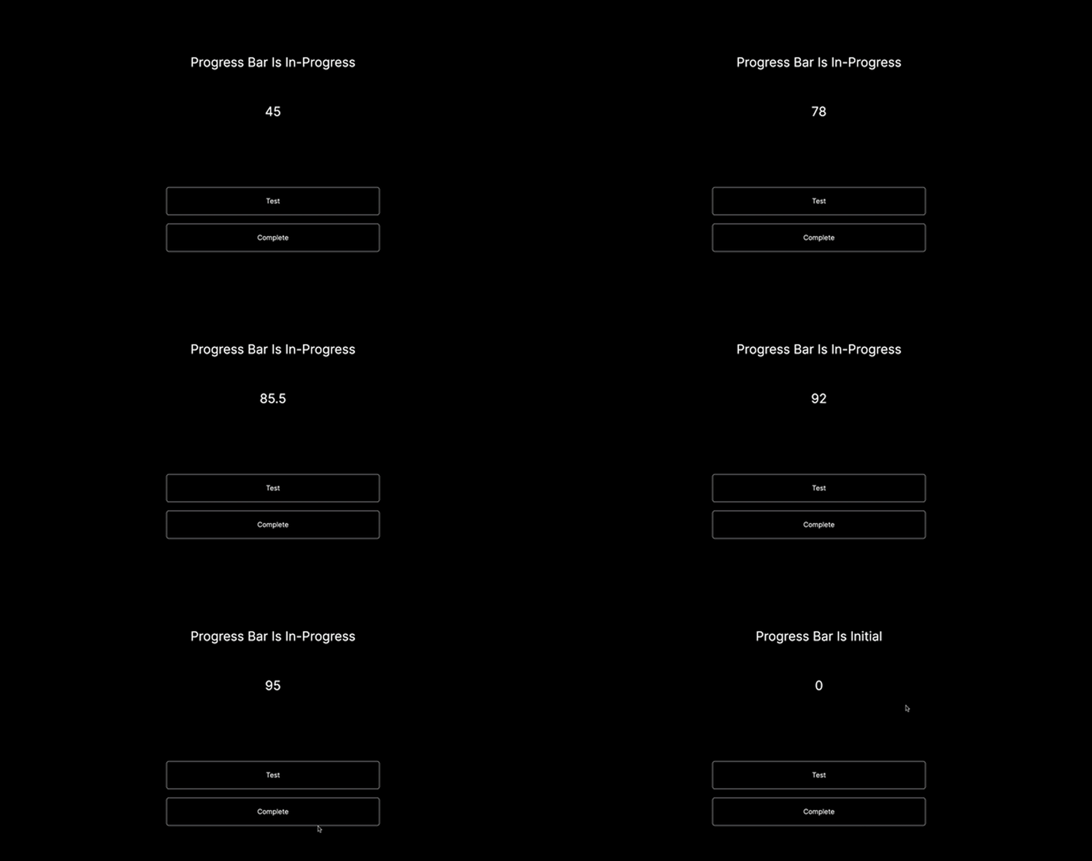
The useProgress Hook is a form of a countdown — or in this case, a count-up that does not go beyond 95. The first useEffect Hook does this count, and to optimize and organize the count, the Hook only does it when the start function has been triggered.
Once the function is triggered and the count starts, the speed of the count from 0 to 95 reduces gradually. When the counter gets to 95, it stays there. This is because we don’t ever want the value to go beyond 100, so no matter how long loading a page might take, the useProgress Hook is optimized to go on within that certain limit.
This count setup is all based on preferences. You can always adjust yours to fit what you want.
There is another useEffect Hook that resets the progress value. The delay of 300ms gives time for the progress bar — which we will see next — to count to 100 before being cut back to 0.
Also, notice that there is a cleanup for each useEffect Hook used. This is important because you don’t want the states being changed when the component has been unmounted.
Now, as you may have deduced from the code above, the progress value is not based on the content being downloaded. Since we can’t get the size of the loading page’s contents to give a real progress value, we instead created a limited progress value whereby the value doesn’t go beyond 100.
Keep in mind that it is possible to give a real progress value — however, getting the size of the loading page’s contents is complicated and often not worth the effort. Since our count setup adequately communicates to users that their page is loading, we won’t implement anything more complex in this tutorial.
ProgressBar componentNow that we have the useProgress Hook set up, let’s go ahead and create a components folder. In this folder, create a ProgressBar.js file. We’ll use the ProgressBar component as a wrapper for the pages where we intend to have a progress indicator.
In this case, we want the progress indicator for the whole app, which means we should wrap it around the app/layout.js file. This is because we want to use the properties of the useProgress Hook across any of the pages and components within the app/layout.js layout.
You might wonder, aren’t we going to call the useProgress Hook for each page or component that requires it? No. That would cause inconsistency because the progress bars of each page would work independently of each other.
So, assuming you trigger the start function on page-1, the ProgressBar — which has its useProgress Hook — would not have access to the current value of the useProgress Hook triggered on page-1:
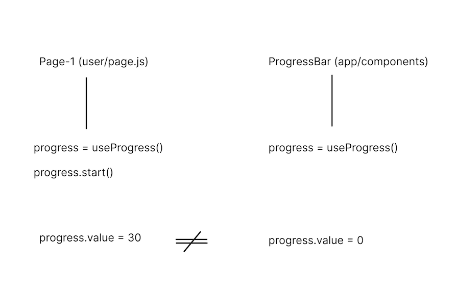
Instead, what we want to do is call the useProgress Hook in a parent component (the layout now) and find a way of passing it to each child component that needs access to it:
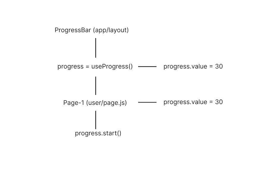
The easiest way to do this is with React Context. Once you’ve created the ProgressBar file, go ahead and paste the code below into it:
"use client";
import React, { createContext } from "react";
import { useProgress } from "../hooks/useProgress";

export const ProgressBarContext = createContext(null);

const ProgressBar = ({ children }) => {
  const progress = useProgress();

  return (
    <ProgressBarContext.Provider value={progress}>
      {progress.state !== "initial" && (
      <div
        className="fixed top-0 z-50 h-1 bg-gradient-to-r from-blue-500 to-blue-300 duration-300 transition-all ease-in-out"
        style={{ width: `${progress.value}%` }}
      />
      )}
      {children}
    </ProgressBarContext.Provider>
  );
};
export default ProgressBar;
In the code above, we created a ProgressBarContext and set a value of progress to its provider. Whenever we need the properties of the useProgress Hook, we can just call the useContext Hook and pass in the ProgressBarContext.
Now, let’s head to the app/layout.js file to wrap the ProgressBar component around it like so:
export default function RootLayout({ children }) {
  return (
    <html lang="en">
      <body className={inter.className}>
        <ProgressBar>{children}</ProgressBar>
      </body>
    </html>
  );
}
Save your files and run the app — everything should work just fine.
Now that we’ve succeeded in making the progress bar global, there is one more thing we can do to avoid duplicates. Create a new file named useProgressBar under the hooks folder and paste this code:
'use client'
import { useContext } from "react";
import { ProgressBarContext } from "../components/ProgressBar";

export const useProgressBar = () => {
  const progress = useContext(ProgressBarContext);

  if (progress === null) {
    throw new Error(
      "useProgressBar must be used within the ProgressBarProvider"
    );
  }

  return progress;
};
This Hook uses the useContext Hook and the ProgressBarContext we created earlier to give access to the progress value for any page or component that needs it.
Let’s take a look at an example usage of this useProgressBar Hook. Create a new file called ProgressLink under the components folder and paste the code below in it:
"use client";
import { useProgressBar } from "../hooks/useProgressBar";

const ProgressLink = ({ children, rest }) => {
  const progress = useProgressBar();

  return (
    <button onClick={() => progress.start()} {...rest}>
      {children}
    </button>
  );
};

export default ProgressLink;
It’s called ProgressLink because it’s going to replace the Link component for all of our page transitions. But before that, let’s test out what we’ve been doing so far to make sure everything works as expected.
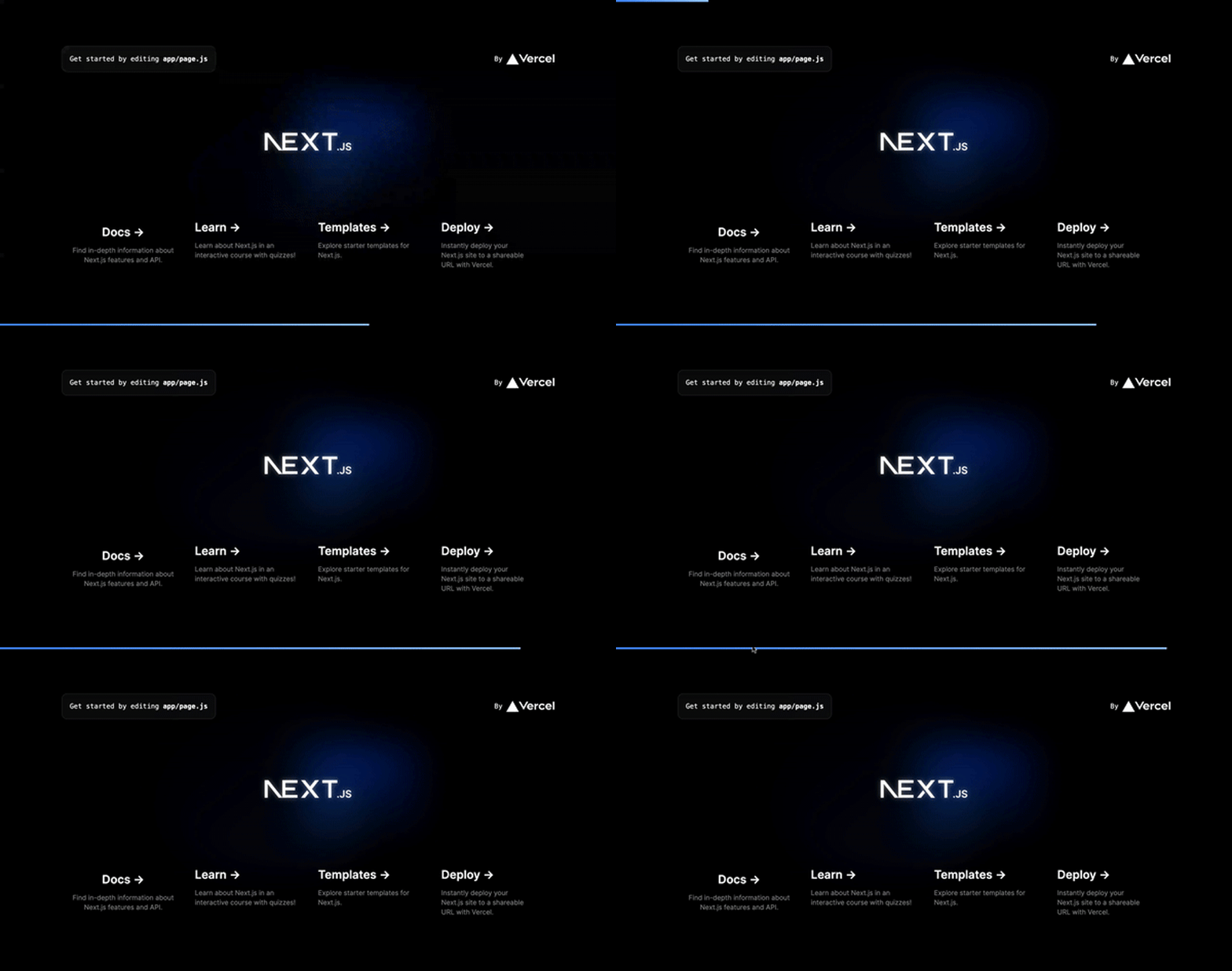
Head to app/page.js and replace any of the a tags to the ProgressLink component. Save the file and click the link you changed. You should have something like this:
startTransition APIThe startTransition API is an API from React that lets you make updates without blocking the UI. It’s designed to prioritize rendering updates related to user interactions, such as clicks or keyboard inputs, over other background updates, ensuring a smoother and more responsive UI.
For our use case, we need it to perform updates to the router as well as to indicate to our progress object when the page has fully loaded. Thus, let’s update our components/ProgressLink component to the following:
"use client";
import Link from "next/link";
import { useRouter } from "next/navigation";
import React, { startTransition } from "react";
import { useProgressBar } from "../hooks/useProgressBar";

const ProgressLink = ({ href, children, ...rest }) => {
  const router = useRouter();
  const progress = useProgressBar();

  const navigateToDestination = (e) => {
    e.preventDefault();
    progress.start(); // show the indicator

    startTransition(() => {
      router.push(href);
      progress.done(); // only runs when the destination page is fully loaded
    });
  };

  return (
    <Link href="" onClick={navigateToDestination} {...rest}>
      {children}
    </Link>
  );
};

export default ProgressLink;
Let’s add some content to the app. Create a posts folder inside the app directory and in it a page.js file. Paste the code below:
import Image from "next/image";
import React from "react";
const getPosts = async () => {
const res = await fetch(
"https://jsonplaceholder.typicode.com/posts?_limit=10"
);
if (res.ok) {
return new Promise((resolve, reject) => {
setTimeout(async () => {
resolve(await res.json());
}, 1000); // create a custom delay
});
} else {
[];
}
};
const page = async () => {
const posts = await getPosts();
return (
<main className="flex min-h-screen flex-col items-center justify-between p-24">
<div className="mb-32 z-10 max-w-5xl w-full items-center justify-between font-mono text-sm lg:flex">
<p className="fixed left-0 top-0 flex w-full justify-center border-b border-gray-300 bg-gradient-to-b from-zinc-200 pb-6 pt-8 backdrop-blur-2xl dark:border-neutral-800 dark:bg-zinc-800/30 dark:from-inherit lg:static lg:w-auto lg:rounded-xl lg:border lg:bg-gray-200 lg:p-4 lg:dark:bg-zinc-800/30">
Get started by editing
<code className="font-mono font-bold">app/page.js</code>
</p>
<div className="fixed bottom-0 left-0 flex h-48 w-full items-end justify-center bg-gradient-to-t from-white via-white dark:from-black dark:via-black lg:static lg:h-auto lg:w-auto lg:bg-none">
<a
className="pointer-events-none flex place-items-center gap-2 p-8 lg:pointer-events-auto lg:p-0"
href="/"
>
By{" "}
<Image
src="/vercel.svg"
alt="Vercel Logo"
className="dark:invert"
width={100}
height={24}
priority
/>
</a>
</div>
</div>
<div className="mb-32 grid text-center lg:max-w-5xl lg:w-full lg:mb-0 lg:grid-cols-4 lg:text-left">
{posts.map((post) => (
<a
href={`https://jsonplaceholder.typicode.com/posts/${post.id}`}
className="group rounded-lg border border-transparent px-5 py-4 transition-colors hover:border-gray-300 hover:bg-gray-100 hover:dark:border-neutral-700 hover:dark:bg-neutral-800/30"
target="_blank"
rel="noopener noreferrer"
key={post.id}
>
<h2 className={`mb-3 text-2xl font-semibold`}>
{post.title}
<span className="inline-block transition-transform group-hover:translate-x-1 motion-reduce:transform-none">
->
</span>
</h2>
<p className={`m-0 max-w-[30ch] text-sm opacity-50`}>{post.body}</p>
</a>
))}
</div>
</main>
);
};
export default page;
Now head back to the app/page.js file. Where you had the ProgressLink component, change the href to /posts. Now save and run it, and that’s it! You’ve created your first progress bar indicator in Next.js. Here is the GitHub repo for what we’ve seen so far.
The reason we had to create the ProgressLink was to be able to use the startTransition function for each transition. Meanwhile, the reason we needed the startTransition is because the Next.js App Router doesn’t have router events like its Pages Router does.
If you’re working with the Pages Router, all you have to do is listen for the routeChangeStart and routeChangeComplete event to be able to start and finish the progress bar indicator.
You also wouldn’t need to use React Context because everything would take place in a single _app.js file. This includes listening to the events and triggering the useProgress Hook.
Here is a GitHub repo for using progress indicators in the Pages Router. You can explore the code and check out how it differs from the tutorial we went through above.
There are also some good packages that provide progress indicators for page transitions, like Nextjs-toploader and nProgress. But there are some drawbacks to using these packages.
For example, nProgress only provides a progress bar, and you’d still have to use startTransition in the App Router or router events in the Pages Router to trigger the start and end of the progress bar.
Meanwhile, Nextjs-toploader makes use of nProgress and handles all progress indicators for page transitions. All you’d have to do is import it on your global layout and it would handle the rest.
While this sounds good, it is possible your codebase cannot afford the luxury of installing a package that depends on others to provide a simple progress indicator for your app. In such cases, creating it yourself — as we’ve seen how to do in this article — would be your best option.
Progress indicators provide a crucial function in your Next.js application that can’t be overemphasized. It’s important to create a smooth UX that doesn’t leave users wondering, “Is this link working?” or “Did I click it?”. You can easily do that with a progress indicator.
In this tutorial, we looked at creating a custom Hook that provides a value the progress bar we created, which it then uses to indicate the progress of the page transition. Also, we used the startTransition function to update the router and progress without blocking the UI performance.
Lastly, we looked at a couple of different Next.js progress bar package options, when to use them, and drawbacks to consider.
That brings this article to a close. Thanks for reading and happy hacking.
Debugging Next applications can be difficult, especially when users experience issues that are difficult to reproduce. If you’re interested in monitoring and tracking state, automatically surfacing JavaScript errors, and tracking slow network requests and component load time, try LogRocket.
LogRocket captures console logs, errors, network requests, and pixel-perfect DOM recordings from user sessions and lets you replay them as users saw it, eliminating guesswork around why bugs happen — compatible with all frameworks.
LogRocket's Galileo AI watches sessions for you, instantly identifying and explaining user struggles with automated monitoring of your entire product experience.
The LogRocket Redux middleware package adds an extra layer of visibility into your user sessions. LogRocket logs all actions and state from your Redux stores.

Modernize how you debug your Next.js apps — start monitoring for free.

Learn how AI-assisted development governance uses rules, agents, hooks, and protocols to help AI coding tools produce safer, more consistent code.

A step-by-step guide to building your first MCP server using Node.js, covering core concepts, tool design, and upgrading from file storage to MySQL.

Using security headers in your Next.js apps is a highly effective way to secure websites from common security threats.

A deep dive into May 2026’s AI model and tool rankings. We break down performance, usability, pricing, and real-world capabilities across 50+ features to help you pick the right tools for your development workflow.
Would you be interested in joining LogRocket's developer community?
Join LogRocket’s Content Advisory Board. You’ll help inform the type of content we create and get access to exclusive meetups, social accreditation, and swag.
Sign up now