We’ve all seen the impressive text generated by large language models (LLMs), but simply displaying that raw output isn’t always user-friendly. The real challenge is turning those responses into clean, structured, and interactive interfaces that enhance the user experience.

This tutorial introduces llm-ui, a flexible React library that helps you build rich UIs around your LLM’s streaming output.
You’ll learn how to:
llm-ui in your projectllm-ui with similar toolsTo bring it all together, we’ll build a Code Viewer App that streams code output from Google’s Gemini API, detects syntax, and renders it using syntax-highlighted code blocks.
By the end, you’ll be able to create your own interactive LLM-powered interface, fully customized, cleanly styled, and ready for production.
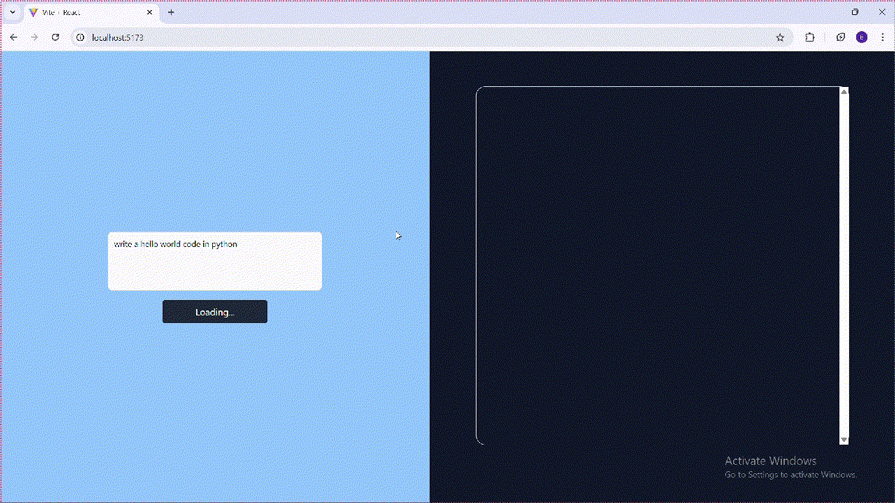
Here’s what it will look like:
Before you get started, make sure you have the following:
If you’re evaluating LLM options for production, this guide comparing OpenAI and open-source models offers a helpful breakdown of trade-offs.
The Replay is a weekly newsletter for dev and engineering leaders.
Delivered once a week, it's your curated guide to the most important conversations around frontend dev, emerging AI tools, and the state of modern software.
llm-ui natively handles Markdown, JSON, and CSV out of the boxllm-ui operates on streamed output, it’s compatible with any LLM provider, including OpenAI and GeminiWe’ll initialize our React app using Vite, a fast build tool optimized for modern frontend development. For styling, we’ll use Tailwind CSS.
To get started, open your terminal, navigate to your project directory, and run:
npm create vite@latest
Next, install Tailwind CSS with:
npm install tailwindcss @tailwindcss/vite
Next, change the content of the vite.config.js file to this:
import { defineConfig } from "vite";
import react from "@vitejs/plugin-react";
import tailwindcss from "@tailwindcss/vite";

export default defineConfig({
  plugins: [react(), tailwindcss()],
});
Finally, delete the content of the index.css file and paste the following:
@import "tailwindcss";
To install llm-ui, run the following:
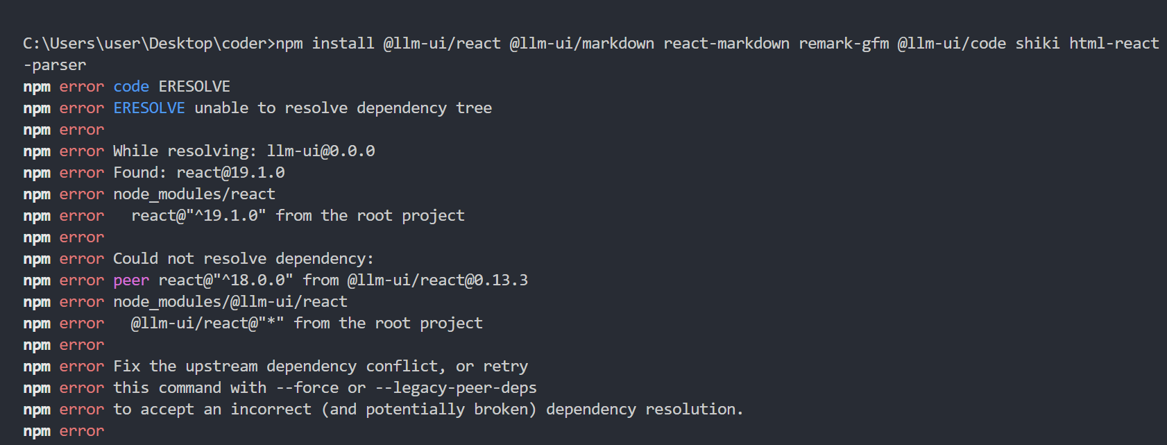
npm install @llm-ui/react @llm-ui/markdown react-markdown remark-gfm @llm-ui/code shiki html-react-parser
NB: When running the above command, if you get an error like below, just downgrade your React version to version 18.0.0:
To understand how llm-ui works, it’s important to first grasp a few key concepts:
Block – Defines how llm-ui should detect and render a specific type of LLM output, such as code, markdown, or JSONLLMOutputComponent – A React component responsible for rendering the output of a matched block. It receives structured data (blockMatch) from the useLLMOutput Hook. Common examples include CodeBlock and MarkdownuseLLMOutput hook – Listens to the LLM’s streaming output, matches patterns based on defined blocks, and returns structured data for renderingblockMatch – An object containing the parsed output from the LLM stream. This is passed to the output component to determine how the content should be displayedfallbackBlock – A fallback strategy used when the stream doesn’t match any defined block. Typically renders the unmatched content as Markdown using a lookBack function.lookBack function – Processes previously streamed content to determine what should be displayed and how much of it should be visible during the streamthrottle – Controls the pacing of the stream animation, simulating a more natural, character-by-character output experienceTo keep our project well-organized, we’ll separate concerns into three main folders:
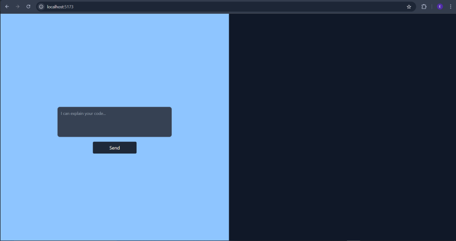
We have a simple user interface that we will use in this tutorial:
function App() {
  return (
    <div className="flex h-screen">
      <div className="flex-1/2 bg-blue-300 flex justify-center items-center">
        <form className="flex flex-col justify-between items-center w-full">
          <textarea
            rows={4}
            id="prompt"
            placeholder="I can explain your code..."
            className="block p-2.5 w-1/2 text-sm text-gray-900 bg-gray-50 rounded-lg border border-gray-300 focus:ring-blue-500 focus:border-blue-500 dark:bg-gray-700 dark:border-gray-600 dark:placeholder-gray-400 dark:text-white dark:focus:ring-blue-500 dark:focus:border-blue-500 resize-none text-justify"
          />
          <button
            type="submit"
            className="bg-gray-800 text-amber-50 px-14 py-2 rounded-[4px] mt-4 cursor-pointer"
          >Send</button>
        </form>
      </div>
      <div className="flex-1/2 flex justify-center items-center text-gray-100 bg-gray-900 p-20"></div>
    </div>
  );
}
export default App;
Below is the output:
We will later move it to another file and integrate it with our app.
Now that the project is scaffolded, let’s define the blocks that will handle different types of LLM output.
For this tutorial, we’ll create two blocks:
The Markdown block will serve as the default display format when no specific match is found.
Inside the blocks folder, create a new file named codeBlockBlock.jsx, and start by importing the required utilities:
import {
  codeBlockLookBack,
  findCompleteCodeBlock,
  findPartialCodeBlock,
} from "@llm-ui/code";
In the above, we imported the LookBack function and the matchers that we will use in the codeBlockBlock configuration object.
Next, we create the codeBlockBlock configuration object:
export const codeBlockBlock = {
  findCompleteMatch: findCompleteCodeBlock(),
  findPartialMatch: findPartialCodeBlock(),
  lookBack: codeBlockLookBack(),
};
The codeBlockBlock configuration object above contains the matcher functions and the lookback function. We then parse the configurations to these functions, respectively.
We’ll use Shiki, a powerful syntax highlighter that supports over 100 languages and themes, including GitHub Dark and Light. It helps render beautifully styled code blocks with minimal configuration.
We need to create shikiBlockComponent for Shiki syntax highlighting in our code block.
Get into the utils folder and create a shikiBlockComponent.jsx file and paste the below code:
import { parseCompleteMarkdownCodeBlock } from "@llm-ui/code";
export const ShikiBlockComponent = ({ blockMatch }) => {
  const { code, language } = parseCompleteMarkdownCodeBlock(blockMatch.output);
  if (!code) {
    return undefined;
  }
  return (
    <CodeBlock
      className="my-4"
      code={code}
      codeToHtmlOptions={{ lang: language }}
    />
  );
};
The ShikiBlockComponent is the presentation layer for the codeBlockBlock definition, taking the code content and rendering it using the Shiki syntax highlighter.
Let’s get back to the codeBlockBlock.jsx file and import the shikiBlockComponent.jsx file.
We will also add shikiBlockComponent to the codeBlockBlock object.
codeBlockBlock.jsx will now look like this:
import {
  codeBlockLookBack,
  findCompleteCodeBlock,
  findPartialCodeBlock,
} from "@llm-ui/code";
import { CodeBlock } from "../ui/codeBlockUi";

export const codeBlockBlock = {
  findCompleteMatch: findCompleteCodeBlock(),
  findPartialMatch: findPartialCodeBlock(),
  lookBack: codeBlockLookBack(),
  component: CodeBlock,
};
In summary, codeBlockBlock provides the useLLMOutput Hook with the rules it needs to detect, parse, and render code blocks from an ongoing text stream.
Next, we will set up the Markdown block, which serves as the fallback block
Create a markdownBlock.jsx file and paste the following code:
import ReactMarkdown from "react-markdown";
import remarkGfm from "remark-gfm";

const MarkdownComponent = ({ blockMatch, ...props }) => {
  const markdown = blockMatch.output;
  return (
    <ReactMarkdown
      {...props}
      remarkPlugins={[...(props.remarkPlugins ?? []), remarkGfm]}
    >
      {markdown}
    </ReactMarkdown>
  );
};
In the code above, we imported ReactMarkdown, a React library that converts Markdown into HTML, and remark-gfm, a plugin that enables GitHub-flavored Markdown support such as tables, strikethroughs, and task lists.
We then created a MarkdownComponent, which accepts a blockMatch prop (from the useLLMOutput hook) and renders the Markdown content using ReactMarkdown.
Next, let’s look at the second part of the code, a wrapper component that customizes how certain elements, like <pre>blocks, are rendered:
export const Markdown = (props) => {
  return (
    <MarkdownComponent
      {...props}
      components={{
        pre: ({ children }) => <pre>{children}</pre>,
      }}
    />
  );
};
The Markdown component acts as a wrapper around MarkdownComponent. It forwards all incoming props and allows you to customize how specific Markdown elements are rendered. In this case, it overrides the default rendering of <pre> tags(used for preformatted text like code blocks) to enable syntax highlighting and apply consistent styling.
In the util folder, create a shikiConfig.js file and paste the following code:
import { allLangs, allLangsAlias, loadHighlighter } from "@llm-ui/code";
import { getHighlighterCore } from "shiki/core";
import { bundledLanguagesInfo } from "shiki/langs";
import githubDark from "shiki/themes/github-dark.mjs";
import githubLight from "shiki/themes/github-light.mjs";
import getWasm from "shiki/wasm";

export const shikiConfig = {
  highlighter: loadHighlighter(
    getHighlighterCore({
      langs: allLangs(bundledLanguagesInfo),
      langAlias: allLangsAlias(bundledLanguagesInfo),
      themes: [githubLight, githubDark],
      loadWasm: getWasm,
    }),
  ),
  codeToHtmlOptions: { themes: { light: "github-light", dark: "github-dark" } },
};
In the above, we imported all the necessary files for configuring Shiki.
We then use the highlighter: loadHighlighter(...) property to define and set the configuration for Shiki.
Navigate to the ui folder and create a codeBlockUi.jsx file. Then copy and paste the code below:
import { shikiConfig } from "../utils/shikiConfig";
import { useCodeBlockToHtml } from "@llm-ui/code";
import parseHtml from "html-react-parser";

export const CodeBlock = ({ blockMatch }) => {
  const { html, code } = useCodeBlockToHtml({
    markdownCodeBlock: blockMatch.output,
    highlighter: shikiConfig.highlighter,
    codeToHtmlOptions: {
      ...shikiConfig.codeToHtmlOptions,
    },
  });

  if (!html) {
    return (
      <pre className="shiki">
        <code>{code}</code>
      </pre>
    );
  }

  return <>{parseHtml(html)}</>;
};
This component is responsible for rendering and syntax highlighting of the code block.
It receives a blockMatch, then it uses the useCodeBlockToHtml hook and shikiConfig to generate syntax-highlighted HTML.
Block display componentNext, create a blockToShow.jsx file, and then get the imports like so:
import { codeBlockBlock } from "./blocks/codeBlock";
import { Markdown } from "./blocks/markdownBlock";
import { markdownLookBack } from "@llm-ui/markdown";
import { throttleBasic, useLLMOutput } from "@llm-ui/react
In the above imports, we made the necessary imports, notably the code block and Markdown block we created earlier.
Next, create a BlockToShow function like below:
export const BlockToShow = ({ stream, isStreamFinished }) => {
const { blockMatches } = useLLMOutput({
  llmOutput: stream,
  fallbackBlock: {
    component: Markdown,
    lookBack: markdownLookBack(),
  },
  blocks: [codeBlockBlock],
  isStreamFinished,
  throttle: throttleBasic({ targetBufferChars: 60 }),
});
In the code above, we created a functional component that receives two props: stream and isStreamFinished. We then destructure blockMatches from the useLLMOutput hook, passing the LLM stream to the llmOutput property.
The fallbackBlock defines how to render any unmatched text, in this case, using the Markdown component. The blocksarray includes our custom codeBlockBlock, which handles code-specific output.
The isStreamFinished prop indicates whether the streaming is complete, while the throttle option controls the animation speed of the rendered text, simulating a more natural typing effect.
Here’s the final part of the component, where we map over each blockMatch and render its corresponding component:
  return (
    <div className="flex flex-1 flex-col min-w-0 b border-gray-200  border-1 h h-10/12 rounded-2xl p-4">
      {blockMatches.map((blockMatch, index) => {
        const Component = blockMatch.block.component;
        return <Component key={index} blockMatch={blockMatch} />;
      })}
    </div>
  );
};
Now let’s set up the API call to Gemini to fetch streaming output from the LLM.
First, install the Gemini SDK by running:
npm i @google/generative-ai
Next, let’s set up the environmental variable. Create a .env file in the root folder of this project and paste the following:
VITE_GOOGLE_API_KEY=My-Environmental-Variable
Now, let’s set up the API request. In the “utils” folder, create a geminiApi.jsx component, then import the following:
import { useState } from "react";
import { GoogleGenerativeAI } from "@google/generative-ai";
Inside the component, create a GeminiApi function passing in setResponseText as props.
Thereafter, declare states like below:
 const [prompt, setPrompt] = useState("");
 const [isLoading, setIsLoading] = useState(false);
We will use the prompt state to hold our LLM input and isLoading for the button.
Next, we import the API key from the environmental variable we created earlier:
  const GEMINI_API_KEY = import.meta.env.VITE_GOOGLE_API_KEY;
  const genAI = new GoogleGenerativeAI(GEMINI_API_KEY)
We then create an instance of the GoogleGenerativeAI SDK, passing in the API key.
Next, create the handleSubmit function like so:
const handleSubmit = async (e) => {
  e.preventDefault();
  setResponseText("");
  setIsLoading(true);

  console.log("Sending prompt:", prompt);

  try {
    const model = genAI.getGenerativeModel({ model: "gemini-1.5-flash" });
    const result = await model.generateContentStream(prompt);

    let text = "";
    for await (const chunk of result.stream) {
      const chunkText = chunk.text();
      text += chunkText;
      setResponseText(text);
    }
  } catch (error) {
    console.error("Error generating content:", error);
    setResponseText(
      "Error: " + (error.message || "An unknown error occurred.")
    );
    if (error.response) {
      console.error("API Error Response:", error.response);
    }
  } finally {
    setIsLoading(false);
  }
};

}
The handleSubmit function sends the user’s prompt to the Gemini 1.5 Flash model and streams the response back. As the output arrives, it updates the setResponseText state passed in via props. The function also handles errors gracefully and manages a loading state to provide feedback in the UI.
Next, we’ll integrate the form-based user interface we created earlier into the main app component.
To learn more about Google’s Gemini and its evolving capabilities, check out this deep dive on Gemini 2.5 and how it compares to other LLMs for frontend use cases.
Now, let’s integrate the UI we created earlier into the app.
Move the form element from the App.js component to be returned by the GeminiApi function, like so:
return (
  <form
    className="flex flex-col justify-between items-center w-full"
    onSubmit={handleSubmit}
  >
    <textarea
      rows={4}
      value={prompt}
      id="prompt"
      onChange={(e) => setPrompt(e.target.value)}
      placeholder="I can explain your code..."
      className="block p-2.5 w-1/2 text-sm text-gray-900 bg-gray-50 rounded-lg border border-gray-300 focus:ring-blue-500 focus:border-blue-500 dark:bg-gray-700 dark:border-gray-600 dark:placeholder-gray-400 dark:text-white dark:focus:ring-blue-500 dark:focus:border-blue-500 resize-none text-justify"
    />
    <button
      type="submit"
      className="bg-gray-800 text-amber-50 px-14 py-2 rounded-[4px] mt-4 cursor-pointer"
      disabled={isLoading}
    >
      {isLoading ? "Loading..." : "Send"}
    </button>
  </form>
);
We also connected the form’s onSubmit event to the handleSubmit function and used an onChange handler to keep the input field in sync with the prompt state.
Finally, update the content of App.jsx to the following:
import { useState } from "react";
import GeminiApi from "./utils/geminiApi";
import { BlockToShow } from "./blockToShow";

function App() {
  const [responseText, setResponseText] = useState("");

  return (
    <div className="flex h-screen">
      <div className="flex-1/2 bg-blue-300 flex justify-center items-center">
        <GeminiApi setResponseText={setResponseText} />
      </div>
      <div className="flex-1/2 flex justify-center items-center text-gray-100 bg-gray-900 p-20">
        <BlockToShow stream={responseText} />
      </div>
    </div>
  );
}
export default App;
We use setResponseText to get the API response from the Gemini API.
Next, the response is sent through responseText to the BlockToShow component.
We can run the code with npm run dev.
There you have it; our app recognizes code in an LLM stream and displays it using the code block. It then displays the rest of the stream using the markdown block:
Let’s quickly take a look at a brief comparison of similar tools to llm-ui:
| Tool | Description | Key Features | Ideal For |
|---|---|---|---|
| llm-ui | A React-based UI framework for building custom LLM-powered generative interfaces |
|
|
| NLUX | Open-source React & JS library for adding conversational AI to web apps |
|
|
| Vercel’s AI SDK UI | A set of framework-agnostic hooks for building chat and generative UIs |
|
|
| LangChain UI | A no-code, open source chat AI toolkit built on top of LangChain with Next.js, Chakra UI, Prisma
and NextAuth |
|
|
llm-ui makes it easy to transform raw LLM output into clear, structured, and user-friendly interfaces. In this tutorial, we walked through how to get started with llm-ui, explored its core concepts, and demonstrated how to customize the LLM stream, set up a fallback block, connect to a real LLM API like Gemini, and handle streaming responses in real time. We also compared llm-ui to other alternatives in the space.
If you’re building an LLM-powered application, llm-ui is a powerful tool to help you add structure, flexibility, and polish to your AI interfaces.
Install LogRocket via npm or script tag. LogRocket.init() must be called client-side, not
server-side
$ npm i --save logrocket

// Code:

import LogRocket from 'logrocket';
LogRocket.init('app/id');
// Add to your HTML:

<script src="https://cdn.lr-ingest.com/LogRocket.min.js"></script>
<script>window.LogRocket && window.LogRocket.init('app/id');</script>
This post walks through a complete six-step image optimization strategy for React apps, demonstrating how the right combination of compression, CDN delivery, modern formats, and caching can slash LCP from 8.8 seconds to just 1.22 seconds.

Learn what vinext is, how Cloudflare rebuilt Next.js on Vite, and whether this experimental framework is worth watching.

Memory leaks in React don’t crash your app instantly, they quietly slow it down. Learn how to spot them, what causes them, and how to fix them before they impact performance.

Build agent-ready websites with Google Web MCP. Learn how to expose reliable site actions for AI agents with HTML and JavaScript.
Would you be interested in joining LogRocket's developer community?
Join LogRocket’s Content Advisory Board. You’ll help inform the type of content we create and get access to exclusive meetups, social accreditation, and swag.
Sign up now

 Learn more →
