People don’t avoid reading your product documentation because they’re lazy. They avoid it because it wasn’t written for them. It was written to be written.
In every product team, well-intentioned documentation is buried under version history, forgotten tabs, and digital dust. Docs that were supposed to align cross-functional teams become relics of a kickoff meeting long past. Meanwhile, the team rehashes decisions, rebuilds features, and wonders where things went wrong.
However, the reason no one reads your documentation isn’t because it’s not important, it’s because it wasn’t designed to be useful.
This isn’t a content problem — it’s a usability problem. The same way a product fails when it’s built without the user in mind, documentation fails when it’s written without the reader in mind.
The good news? Docs can work. Docs can align, inspire, and streamline but only when they’re treated like what they are: internal products. You just need to think of them as products with users, use cases, and measurable outcomes.
When product managers write documentation, they often default to what’s familiar: dense feature specs, templated PRDs, and Wiki dumps that resemble a Wikipedia entry written under deadline. These are optimized for the writer’s comfort, not the reader’s comprehension.
There’s an unspoken assumption: “If I wrote it, they’ll read it.”
But like a poorly designed UI, unclear docs trigger friction, not engagement.
Most teams face three core documentation failures:
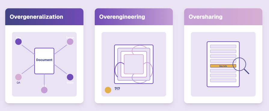
It’s like handing someone a 90-slide deck when they asked for the agenda.
A major reason your product docs get ignored? You’re trying to speak to too many people at once.
Trying to write a one-size-fits-all document leads to a fragmented reading experience. It’s like giving everyone the same onboarding walkthrough, regardless of their role.
Instead, opt for a document with layers that correspond to individual roles so that the document makes sense and integrates into your team member’s day to day work.
Great docs offer multiple zoom levels:
Think of your doc like an interactive product: People should be able to quickly navigate to what matters to them.
Information architecture matters just as much as information itself. Use headers as navigational cues, whitespace for breathing room, and summaries, callouts, and bolding to guide the reader.
This is where most technical writers and PMs fall short. They assume clarity is inherent in the words. But clarity is a design output, not just a writing output.
Here’s a simple framework to start treating docs like usable interfaces:
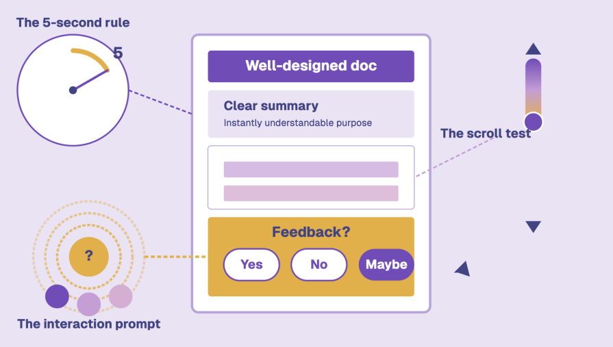
If your doc is just a static info dump, don’t be surprised when it collects dust.
Even seasoned PMs fall into traps. Let’s walk through some of the classics:
A static file sent over Slack or email that no one revisits. Static docs die fast. Use living, shareable, and comment-enabled tools like Notion, Coda, or Linear Docs.
Picture for yourself a beautiful doc that looks like a Behance portfolio. The problem? It’s hard to parse, impossible to scan, and painful to update. Formatting should serve readability, not steal focus.
Everything, including the Jira ticket, Slack thread summary, lunch order, and roadmap, is in one document. Focus breeds clarity. Separate reference from decision.
Docs without owners age poorly. If no one owns updates, context dies. Use versioning, changelogs, and last-reviewed timestamps to give docs lifecycle hygiene.
Documentation is evolving. From cold technical artifacts to narrative-driven collaboration tools. The best teams now embrace:
Storytelling meets systems thinking. Walk the reader through the problem, the user journey, the rationale. Build empathy before listing specs.
Outline the tradeoffs, the options considered, and the rationale. These are gold for future teams trying to understand why V1 looked the way it did.
Living Wikis
Evolving documentation hubs that grow with the product. Easily searchable, collaborative, and structured around clarity. Think Notion, Confluence, Coda.
These new forms respect reader attention. They’re contextual. Actionable. Self-explanatory. And they feel like tools, not homework.
You can’t fix unreadable docs with new tools alone. But good tools make it easier to build clarity if used intentionally:
| Tool | Best for |
| Notion | Internal knowledge bases, living docs |
| Coda | Modular specs, interactive tables |
| Google Docs | Quick collaboration, comments |
| Linear Docs | Project-focused documentation |
| Confluence | Enterprise-grade knowledge wikis |
Whatever you decide on, don’t mix tools mid-project. Fragmentation kills visibility. And if possible, keep documentation and execution (tickets, timelines, reviews) tightly coupled.
Now, let’s get tactical for a moment. You wrote a great doc. It’s clean, clear, and structured. Now what?
Start with a doc kickoff. Don’t just share the doc, walk people through it. Make them part of its creation. Ask for input before the final draft.
Schedule documentation sprints. Just like code, carve out time for planning and cleanup. Make it part of the process.
Use comment rituals. Ask every reviewer to leave one question, suggestion, or clarification. This builds a culture of reading and engaging.
Run doc retros. After a launch, ask: Did the docs help? What was missing? Then revise them.
Promote documentation equity. Everyone should contribute, not just PMs. Designers, engineers, and QA have valuable context. Rotate authorship where possible.
Most documentation doesn’t die from bad intent, but from bad structure. You sit down to write, and without realizing it, you start creating a doc that’s either too long, too vague, or too confusing for anyone to actually use.
Good templates fix that.
They give you just enough scaffolding to focus on clarity instead of formatting. They help you build repeatable patterns, speak to different audiences, and reduce the friction that usually kills good writing.
Here are five documentation templates and examples that actually work. They’re practical, human-friendly, and built with readers in mind, not compliance checklists.
LogRocket’s own PRD template is one of the cleanest, most practical takes out there.
It’s not bloated. It doesn’t assume you’re writing a PhD thesis. It includes:
Think of this as your open-source toolbox. The Good Docs project offers vetted templates for just about any kind of internal or technical doc:
Each one is written with the reader in mind. They’re great if you want to scale doc writing without scaling doc fatigue.
Swimm’s template pack focuses on documentation that lives next to your code, which is great if your audience is mostly engineers. These aren’t marketing gloss. They’re:
The goal? Stop gatekeeping knowledge. Start writing docs that save engineering hours (and Slack messages).
Wrike provides project management templates, but a few are fantastic for product teams looking to align fast and early:
Not every doc needs a Notion aesthetic. Sometimes, simple tables and bullet points do the job better.
Yes, it’s API documentation but Stripe’s docs are a lesson in how to structure complexity with empathy, clean navigation, interactive examples, and a friendly tone.
No, you’re probably not building an API this week. But if you’re writing for a technical audience, devs, QA, or even data teams, study this.
Don’t just use these templates. Adapt and evolve them to fit your team’s language and pace.
Good documentation isn’t just a knowledge artifact. It’s a leverage engine. It makes onboarding faster, decision-making clearer, project scope tighter, and trust deeper.
Remember:
Treat your product docs like part of the product. Make sure to test and iterate them. And most importantly, design them for the humans who use them. Because unread docs cost more than time, they cost momentum.
Featured image source: IconScout
LogRocket identifies friction points in the user experience so you can make informed decisions about product and design changes that must happen to hit your goals.
With LogRocket, you can understand the scope of the issues affecting your product and prioritize the changes that need to be made. LogRocket simplifies workflows by allowing Engineering, Product, UX, and Design teams to work from the same data as you, eliminating any confusion about what needs to be done.
Get your teams on the same page — try LogRocket today.

Explore how urban planning helps product managers think in systems, strengthen foundations, and build products that scale well.
Learn how product managers can move from output tracking to outcome-driven product management with metrics tied to user impact.

Learn how to spot PMF erosion early, diagnose the cause, and help your product recover before decline turns into panic.
Introducing Ask Galileo: AI that answers any question about your users’ experience in seconds by unifying session replays, support tickets, and product data.


