Tamara Pluviose is Head of Digital Products at West Marine, a national retailer of supplies and accessories for boating enthusiasts. She began her career in ecommerce and marketing in the travel sector before transitioning to consulting at PwC, where she focused on digital strategy and innovation for Fortune 500 clients spanning multiple industries. Most recently, she served in a digital strategy leadership position at Virgin Group’s latest startup, Virgin Voyages, before joining West Marine.
In our conversation, Tamara discusses her approach to creating and facilitating design thinking workshops to promote problem-solving, brainstorming, and customer-centricity. She talks about a specific exercise called visualizing the vote to democratically surface the best ideas. Tamara also shares how usability testing and survey data uncovered a surprising factor that impacted the completion of online purchases.
Planning is the best and most important component of designing workshops. You have to make sure you have a strongly defined topic, an outline of your objectives, and a designated scope of the workshop.
Recently, I designed and facilitated a design thinking workshop with my team to come up with test ideas for a roadmap. We just relaunched an A/B testing initiative after four years with almost no testing. We ran little tests here and there, but we wanted to really scale the program. Ideas came in from all over, but I thought it would be more impactful to brainstorm as a group with the people who will actually build the tests. They’re the most familiar with the website and the different pain points a customer might have, so I wanted to get their input as well.
An important part of planning is making sure you have the right audience. I wanted people who had ownership of various places on the website. That was big. In terms of scope, I mean figuring out what you’re trying to get out of this. Scope is an output from the workshop itself, which could be X amount of test ideas that span the entire website coming from different people. From that, what are the top 10 or 20 that we want to be able to deliver on?
One critical aspect of planning is making the workshop activities as real as possible for participants. The activities have to be grounded in the user and in the problem you’re solving.
An activity that I love and presented at a conference recently has to do with customer journey mapping. First, you map out whatever the customer journey is. It should be very specific to the brand, client, or whatever you’re trying to solve. Depending on how complex your business is, you can have many journeys across the way of doing something.
This particular exercise helps you step into the mind of the customer. What should naturally fall out of this is how you would solve the pain points that customers experience during their journey. In that recent conference A/B testing workshop, I used customer journey mapping across the various areas of our retail site, assigned people to each step, and then asked them to identify the pain points.
Then, we switch it around and say, “OK, we have the pain points. How would we solve this? Should we remind the customer that they have these additional savings? Or is this an opportunity to collect their information so that we can market to them later?”
I like doing a specific activity called “visualizing the vote.” This can be done in-person using Post-its or online if you have a hybrid team. I give the team about two minutes — because you can’t give people too long, or else they’ll overthink. They get three Post-its — one to vote for their initial idea because everyone wants to upvote their own, and then there are two extras to use for other ideas.
From this, we end up with X amount of sticky note votes for the ideas. The top 10 or 15 ideas bubble up to the top, depending on how many participants you have. It’s like democratizing the process, because everyone has a say in it, and it’s very clear to everyone what we’ll be focused on.
In this instance, we ended up with nearly 100 test ideas for our A/B workshop, but then we did the visualizing the vote exercise to get the top 20 to focus on. We set parameters around factors that will drive revenue and engagement, and what will highlight the biggest customer problem. If you box it in to focus on those things, that’s when you see the winners.
This is where it’s especially important to have a strong facilitator. The facilitator should be looking out for if people are getting stuck, aren’t engaging as much, etc. It’s nice when you can see if someone’s board is filled because even if they’re quiet, you can ask about certain ideas on their board. That’s a great way to get them talking.
I also try not to make things title-heavy on the participant’s side. If I’m working across multiple teams and have breakout groups, I’m not going to throw a VP in with an associate or a senior manager. Even though the VP means well, they’re probably going to end up being the loudest in the room, and the rest of the group may be intimidated. The audience mix is super important in this respect. You have to make sure people feel comfortable being vocal.
I hold a firm balance between creativity and customer data. It’s easy to get hung up on one or the other, especially if the people in the workshop are either really creative or really technical. I make a point to set the context before starting the workshop itself. Usually, I’ll have some form of an insight or data point to start with.
For example, say in the past three months, we’ve seen an 80 percent increase in people dropping out of a step during the signup process. We’re hearing the top five reasons for why users drop off. In our session or workshop, we first establish why we’re here today, and then we set the context around why the user says they do this thing or have this problem.
It’s not a data point, it’s an insight coming directly from the customer. If the discussion falls off track, the facilitator’s role is to say, “Alright, remember, these were the top five reasons.” Hopefully, these exercises are all grounded in empathy. That’s the key to design thinking that you should always bring the team back to.
To me, the most important measure of success is participation and engagement. I always have this angst that I’m going to bring people together for these workshops and nothing will come out of them. Sometimes I worry people will be uninterested, disengaged, or will lean into the preconceived notions they had before coming into the room. Or, I worry that people will just be very quiet.
The first sign of success is when you start to see people really engaging. Maybe those who don’t normally contribute are doing so, or people who tend to be super vocal are listening and trying to get more out of the folks who are usually less vocal. With that said, the output has to be good too. We need to ask, “Did we meet the objective?”
We held a workshop to completely revamp the FAQ section of our website. We noticed that we were getting an influx of service calls. At the same time, we noticed that people were not really engaging with the FAQ section of our website even though that’s where all the content was.
We wanted to take a low-effort to high-effort approach, also because we knew that people who interacted with our FAQs had a higher likelihood of converting on their own. This was a complex workshop because it wasn’t just our digital team — we had people from marketing, branding, customer service, revenue management, etc.
We wanted an audience that was a good mix of functions and levels of seniority to get good insights across the board. We were able to do that by bringing everyone together, getting the less vocal people to speak up, tying in customer insights around the top factors driving these calls, etc. Also, we put a critical eye on the existing information we had and looked at it all from a customer standpoint. There was even a lane of thinking to offer a site search in addition to an FAQ session.
First, we focused on designing the page. This changed the structure of how content was presented, etc. What came out of that was an upgrade to our current solution that better fits our needs, revamping that section altogether, and using AI to serve up the content. This first phase launched within three months. When the next iteration came in we started to see the calls drop. Our costs of support calls dropped by 10 or 15 percent — it was really impactful.
Something that I’m a huge fan of and that I’m hoping to bring into my current role is usability testing. Even just testing clickable prototypes before launch is really huge. Throwing up those prototypes can significantly shape how you move forward, specifically regarding things that you would’ve never have thought about during the process. I find usertesting.com to be a great resource because as long as the parameters of your audience aren’t too specific, you can get a lot of testers and get initial findings quickly.
We had just launched a post-purchase survey to try to gauge user satisfaction with a particular experience. After the user told us their satisfaction level, we asked a few questions: what was good about your experience, what was bad about your experience, and what almost kept you from buying? We grouped these almost like a rose-thorn-bud exercise — the rose is the positives, the thorn is the negatives, and the bud is the potential of the opportunity. They were all open-ended.
Something we never expected to see was what almost stopped people from purchasing with us: they weren’t able to add the additional passenger that they were booking with. We had made a design decision to streamline the process that’s standard within the industry. We’d tell them, “Don’t worry, you can add your first mate after you book,” but people liked having the choice to add the passenger either now or later, and not default to later. It drove so much angst and we didn’t find that out until we ran the survey and looked at usability.
That was crazy to me. If those people said that almost stopped them from purchasing, imagine the number of people who didn’t purchase because of that same issue.
It was a harder lift to build in that add, but we thought of a plan for an MVP. We decided to message users to let them know that they could add a passenger, and in the meantime we worked on developing that functionality. Just adding the messaging significantly reduced the number of customers who selected that as a reason for almost not purchasing. By the time we rolled out the functionality, it was a non-issue for users. We saw about a 12 percent average increase in conversion from this change.
This is going to sound corny, but I want them to be customer-obsessed. That should be the core focus in anything that they’re doing, whether it’s improving a current experience, building a new one, etc.
Another really important piece that I look for is being data-driven. This can be either an inherent ability or a skill that someone builds up, but the desire to understand the story behind the data needs to be there. Just recently, I sat in on a 20-minute conversation where someone reported that an experience was looking wonky on mobile. It did look crazy and made certain components hard to access. We said, “How do we treat this?” In this case, addressing the issue meant we’d have to redesign and build things, and I was sitting there thinking, “How many people actually see this screen like this?”
We dug deeper and saw that only three people in six months viewed that specific page. It was a good discussion and exercise, but if you consider the math, it was a waste for three people to spend 20 minutes talking about a redesign. You should design for as many people as possible, but you can’t design for all. It’s impossible. In my current role, I keep that at the forefront. We don’t have to be data scientists, but analytics need to ground our efforts.
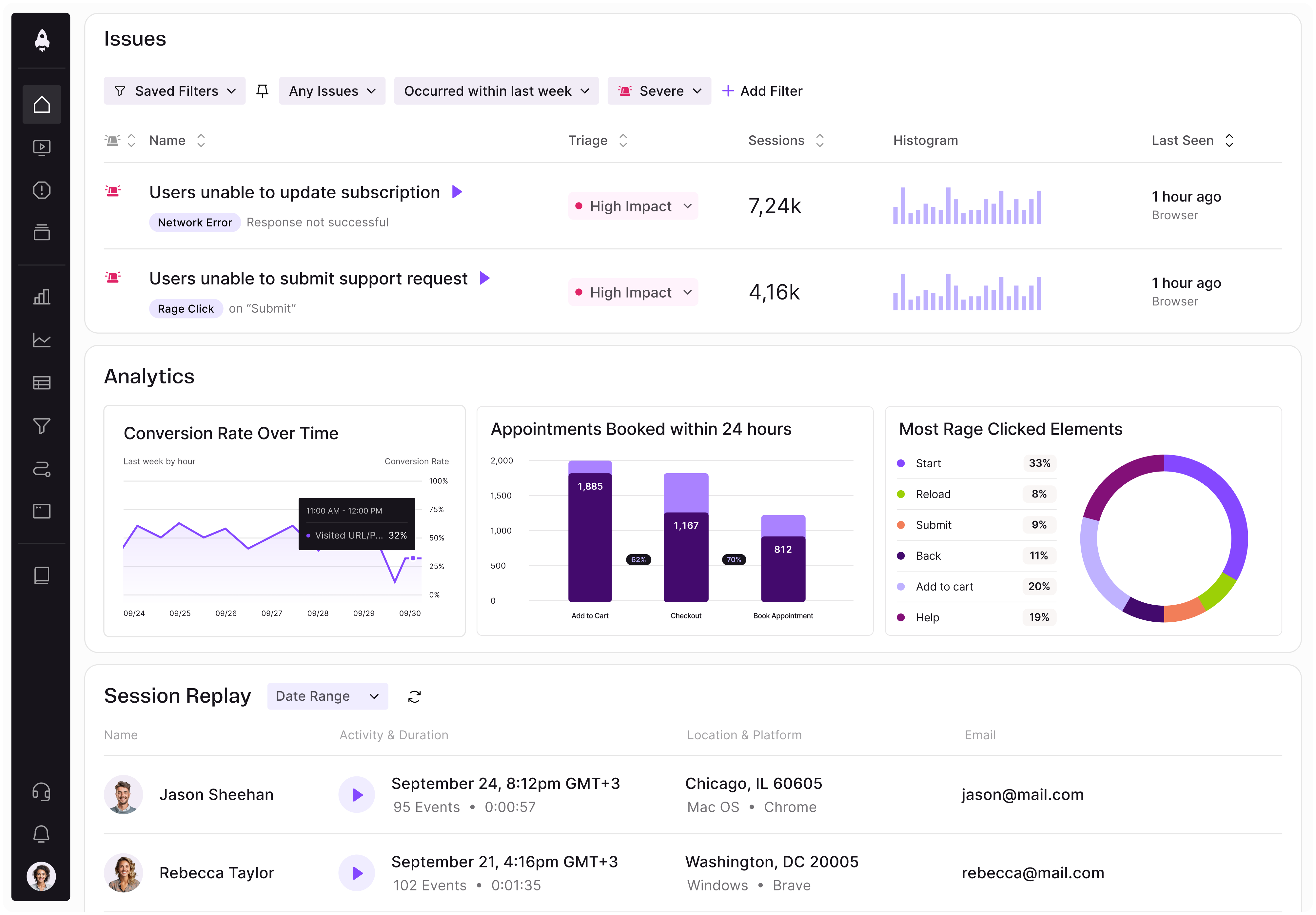
LogRocket identifies friction points in the user experience so you can make informed decisions about product and design changes that must happen to hit your goals.
With LogRocket, you can understand the scope of the issues affecting your product and prioritize the changes that need to be made. LogRocket simplifies workflows by allowing Engineering, Product, UX, and Design teams to work from the same data as you, eliminating any confusion about what needs to be done.
Get your teams on the same page — try LogRocket today.

Map AI data risks, vet vendors, run safer pilots, and build legal buy-in for AI tools without creating security gaps.
SVP of Product Sriram Iyer visits to chat about how he uses AI to launch the “thinnest slice of pizza” product and shift mindsets around AI.

Controlled scope creep can help PMs use capacity buffers, AI tools, and clear guardrails to turn new ideas into better outcomes.
According to SVP Julia Dalton, managing humans at scale and managing AI agents have a lot more in common than most people realize.