Stephanie Drago is Vice President of Ecommerce and Digital Transformation at Navitor, a private graphic communications and printing company. She started her career managing fleet finance at Zipcar, where she later transitioned to compliance and insurance. At Navitor, Stephanie helped lead double-digit revenue growth as Marketing Director. Her title has since grown to Vice President and expanded to oversee ecommerce and digital transformation efforts as well.

In our conversation, Stephanie talks about a pilot program she launched that unlocked new, data-backed insights into how shipping costs impact revenue. She discusses how she specifically leverages control groups to surface meaningful learnings from experiments, as well as her methods for displaying effective data visualizations.
There are two modes of thought: the creative side and the analytics side.
Some teams may view the creative side as marketing, design, and incorporating beauty and cleverness, but it also encompasses problem-solving and uniqueness. Those are really important aspects of our creative piece.
The other side is analytics, which is numbers, questioning, and curiosity. Using data analytics to enhance user experience is really about bringing creativity and analytics together.
When I think of how I use these two components to drive different decisions, it’s sometimes about comparing different user groups or products. When I boil it all down, what is different about the two? I’ll start to see where people deviate in that user experience. That’s usually where I like to start.
Then, it always goes back to asking questions and being curious. You don’t have to be a data scientist to do great analysis — if you can articulate the questions you have and the issues you’re trying to solve, you’ll get better results.
Yes — you need to picture the data you want. What is the table you’re actually looking for? If you only write up three questions that you want to answer, I find that leaves too much to interpretation. In your data, there are a few best practices I recommend:
Though these elements are very basic, they’re extremely important.
One of the things my team found early on is that if a customer bought one solution, they would spend X numbers of dollars per year. However, if they bought two solutions, their spend was 2X. If they bought three solutions, it was 4X, and so forth. This is correlation, not necessarily causation, but it’s a great place to start for new business ideas.
For us, our hypothesis became that if we could get customers to buy into their second solution, revenue should grow.
This led us deeper into what solutions people were more likely to buy into. I call it “propensity to buy.” It was basically a cross-selling technique to create a roadmap and a visual of what customers buy first, then second, and so on. For example, think of the power of sharing with your sales teams that 50 percent of your customers who bought product A would also buy product B, versus only 20 percent who bought product C. It helps people know where to put their energy that’s more likely to lead to results.
Our first “propensity to buy” campaign pilot exceeded projections by 10 percent. We have continued to utilize these metrics to increase advertising spends and sales initiatives to keep targeting the right second products.
We have a matrixed organization, which means we have quite a few stakeholders leading different companies but from a single brand perspective; aligning these groups is a part of the process. My favorite example is related to shipping. Shipping prices are a common issue across ecommerce, and we’re no different.
We’d hear from customers that if we lowered our shipping prices, they’d buy more products. OK, is that a good gamble? How do we prove this? How do we mitigate the risk of the lost shipping revenue? First, we set up a shipping committee. This included some of the program’s most vocal critics. To be very clear, they weren’t being negative to be malicious or difficult — they were realistic about the financial risk and the history. They knew the stakes the best.
Second, we committed to the largest pilot in our history. We took 3,000 accounts to use, as well as 1,000 other accounts to act as a control group, and created four major segments. Each segment had two levels of communication plus the four segmented controls. This gave us a total of 12 segments.
The major segments were active buyers, lapsed buyers, new users, and high-spend buyers, and the communication levels varied. Half of the users getting the discount were told about it, while the other half were not. This would help us find out how much communication would be necessary when we did a full launch.
12 segments was a lot to analyze, but it was critical. We reviewed the results carefully and transparently as a committee. Right away, we saw that new accounts were performing better than the control group. Further, the new accounts receiving communication were doing better than those not getting communication. These first month’s overall results were barely visible — it took about 45 days to see positive results across all segments. It was really stressful, but we stuck with it.
Lastly, we had to know if the profit margins made sense. In analyzing the data, we were able to show that for every $1 we gave away in shipping discounts, we were bringing in $4 in product revenue. That was huge and it met our breakeven requirements.
I started leveraging control groups early in my career working on direct mail campaigns. Controls mitigate risk and provide a baseline to compare to, especially where factors like seasonality can come into play.
For control groups, I follow a few rules of thumb:
As a best practice, for every segment in your campaign, you should have a matching control. For example, if you have 3,000 accounts as your active buyers, then you should have 300 in your control who are also active buyers. You choose the control accounts randomly.
You can leverage a control to calculate a marketing return on investment (MROI). This is really helpful for measuring specific campaigns and activities. For example, if a group received a mailing or campaign and received a 30 percent response rate but the control only got 20 percent, then you can calculate incremental revenue, i.e., what sales would the mailing group have brought in if they performed at that 20 percent response rate? Then, to get an MROI, you’d put incremental sales over your expenses.
This is so powerful because you’re saying, “For every $1 I spent, I brought in X dollars in incremental revenue.” MROI should be a minimum of $3–$5. If I spend $1 (or give it away as a discount), I should get about $5 back. My typical programs often result in between $10 and $20 MROI, and then we have to layer in gross margin and administrative and selling costs, etc.
You want to have enough room to show that profitability. It depends on your campaign though. For example, new users are likely more expensive or have a lower ROI than active users. Missing ROI metrics is the number one plague to marketing and ecommerce leaders. Having a control more easily connects you to incremental revenue, which directly connects you to MROI.
We learned a lot, including how to leverage this into a loyalty program and how to minimize risk by applying to only certain types of shipping options.
My particular favorite was how to show all aspects of analysis. One employee was bold and started to teach herself Power BI. She was quickly able to show huge data tables in much more visual ways. Her work showed that even without the discounts, we had a couple of products whose shipping prices weren’t correctly reflecting the costs! We could also show the weights, the distances shipped, and the biggie was truly connecting the trifecta — product and shipping sales with accounts with actual expenses.
Those were the kinds of ideas we then brought to the committee, but we had to work through all the critiques of the pilot to get there. It was a difficult but powerful journey using data for alignment.
You can always say, “I got this many impressions and this many clicks,” but if you can’t prove that the campaign did better than doing nothing at all, then what’s the point? Controls offer a baseline — a way to show that your efforts truly paid off.
For example, I remember when a colleague ran an experiment with paid search ads. Instead of doing advertisement A versus B, where B is a different product of theirs, they’d do A versus B versus C, where A and B are their products but C had nothing to do with the products or company at all. Specifically, a company ran their control advertisement using Smokey the Bear — the cartoon that raises awareness for preventing forest fires.
With that type of control, they could compare all three versions. We all assume our content is so great but tests like this really show if you’re hitting the mark — you should always beat Smokey! It was a fantastic and clever way to use a control.
It’s important to get messy at the beginning, regardless of which tool you’re using. Start using your pivot tables, get messy, dig in, ask every question you can think of, try to point out every flaw, and go through it. Don’t worry about formatting or telling your story. On the side, write down your conclusions with each learning. That way, you see your progression over time as your story starts to develop.
To tell a visual story, I think of four main points that could either go on PowerPoint slides or points on a paper:
Lastly, when you present, keep your tone neutral — especially when going through the data portions. Show your energy as you get to the projections and what you want to do next.
With projections, it’s important to have two of them: an optimistic one and a conservative one. If you’re too optimistic, people will think you’re too green. If you’re too conservative, there may not be a big enough benefit to do the program at all. Pointing out both an optimistic and conservative projection is important.
Then, with next steps, I like to be very purposeful about what I’m asking for. Do I need approval or am I looking for feedback? There’s a huge distinction here. If you do need approval, you can end with, “These are my next steps. Are there tweaks that you’d like to make?” Essentially, assume that you’re in charge and moving forward. You’re taking the leadership, and that’s huge.
I know it can feel scary to be so bold, but I’ve always found that people appreciate your leadership and initiative. I would also say that it’s assumed this presentation is not a surprise to your decision maker. They’ve known you’re working on it and they show positivity to your leadership.
There’s always this element of wanting more — whether it’s market data, company data, product data, etc. At some point, you need to be able to trust your experience and those around you. I have had to back off projects because the data was too unknown, but I tend to think in a couple years, someone else will take the ball and run with it! In today’s age, it’s more common to have too much data to know what to do with, aka that dang analysis paralysis!
A better spreadsheet isn’t digital transformation. We can all get excited about that better spreadsheet, sure, but that doesn’t make it a digital transformation.
In my role specifically, I’ve defined digital transformation as the three A’s: AI, automation, and analytics. It has to be a big enough step that it is truly a transformation.
This is a really fun question to think about. I think we’re going to get to true, one-to-one communication. Over the next 20 years, we’ll achieve genuine individual journeys and paths — will not just be variable fields in a mass email.
I think every customer will have their own journey, and the journey will be lifted by the company and messaging. Campaigns will be so much smarter and they will understand those nuances — those tiny hints within the customer journey about what they’re looking for or ready to buy. Those developments are going to be pretty powerful.

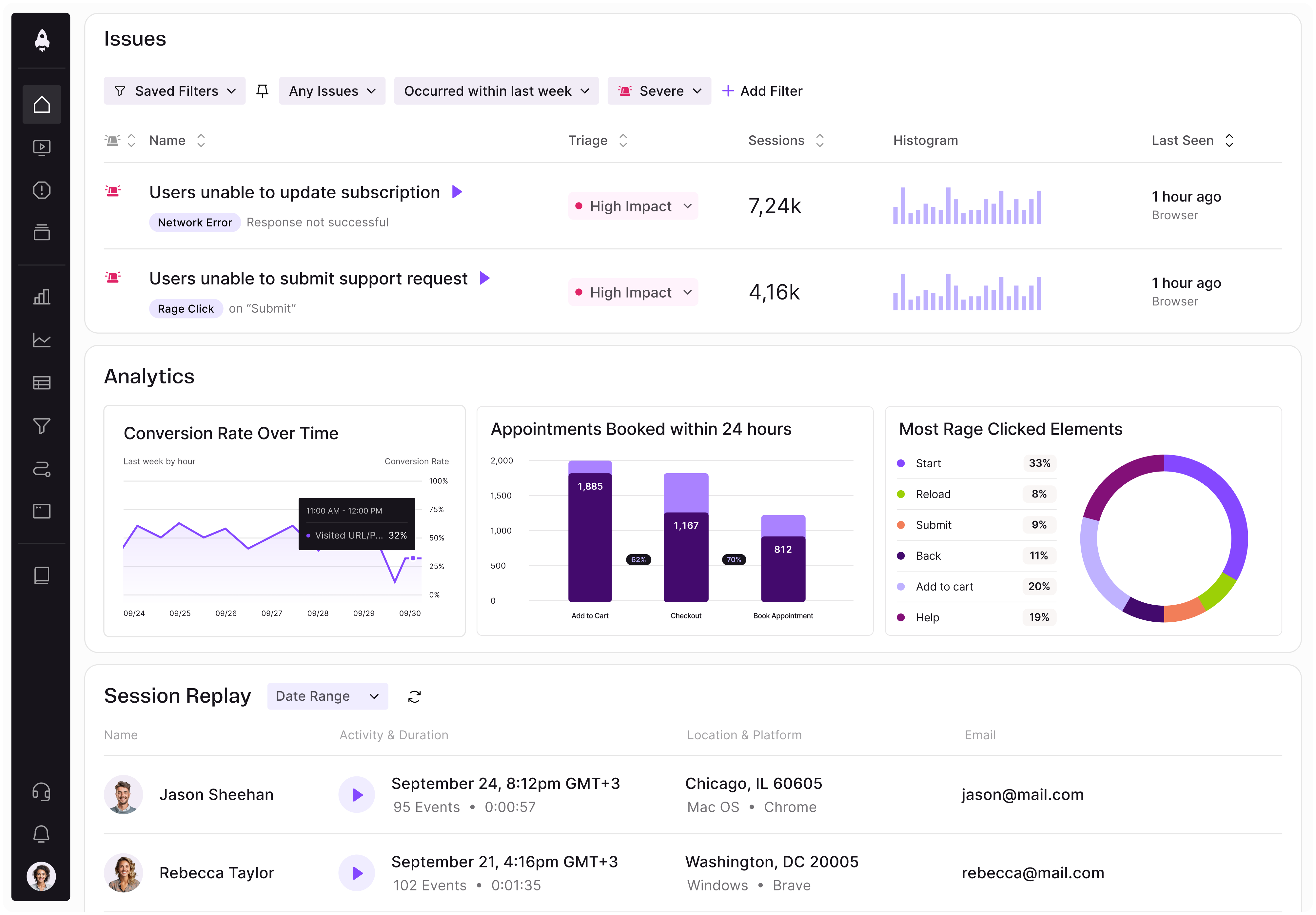
LogRocket identifies friction points in the user experience so you can make informed decisions about product and design changes that must happen to hit your goals.
With LogRocket, you can understand the scope of the issues affecting your product and prioritize the changes that need to be made. LogRocket simplifies workflows by allowing Engineering, Product, UX, and Design teams to work from the same data as you, eliminating any confusion about what needs to be done.
Get your teams on the same page — try LogRocket today.

Learn how code-style reasoning helps product managers make sharper decisions, surface edge cases, and write clearer requirements.

A practical framework for product leaders to prioritize better, reduce noise, and focus teams on what matters most.

Explore how urban planning helps product managers think in systems, strengthen foundations, and build products that scale well.
Learn how product managers can move from output tracking to outcome-driven product management with metrics tied to user impact.