Elizabeth Van Bergen is Lead Product Manager, Experience at Phillips, a global platform for buying and selling 20th and 21st-century works. She began her career in the art industry as a gallery assistant in London before transitioning to a public relations role at Christie’s. After spending four years working in communications in fine art and later in hospitality, Elizabeth joined Phillips. In the last seven years at Phillips, she’s worked in social media, digital content management, and product management.

In our conversation, Elizabeth talks about how Phillips has created an omnichannel strategy to bridge the in-person and digital experience of buying luxury art. She also discusses the two types of Phillips’ client accounts — individual and corporate — and how the user journey is curated to each one.
One of the biggest things we’ve done is merging the in-person experience with our digital one. In 2020, there was a huge shift away from the traditional in-person business. The client experience used to be very much in-person at the galleries. In terms of a relationship-based business, we had to create something that would service our clients at the very ultra-high net worth level and find new clients. That was a big part of the transition into offering more digital features.
For example, we’re bringing the experience from the gallery to our site and app. If you go into a gallery in New York, the in-person experience and branding carry over into what we offer on responsive web and our iOS app. Our goal is to provide anything that our client needs digitally — whether that’s logging interest by favoriting a lot, following an artist, or being able to contact a specialist whenever they need.
We’re making sure we’re offering all the possible information to our clients in a very easy-to-navigate way. That’s one of our biggest initiatives to merge the in-person experience with digital.
When the pandemic happened, we couldn’t have people visiting the gallery to experience paintings, jewelry, or other art in person. But, it’s really important to see the facets of a diamond, the paint strokes, or where bronze has aged on a piece. Making clients feel that they could still experience the work without having to be in front of it is a really important part of our business.
A huge part of that is also ensuring that all of our assets are up to the same standards as if you were viewing them in the gallery. With screens, there are some differences from looking in person, but we do a lot of work to ensure that all of our assets are color-checked. One of the things that we launched is object videos, which are very detailed, high-resolution videos of all of our works. Whether it’s flat art or a 3D sculpture, we want to focus on the user experience regardless of whether you’re viewing it on an iPad, at your desk, or on your phone.
For our evening sales, for example, everything gets an object video because these listings are higher in value. If you’re looking at a canvas, the object video allows you to see all the details in the paint strokes. Or if it’s a sculpture, you can see the texture of whatever material the artist uses. These things are really important to our buyers.
In a very visual, luxury business, we’re always trying to find the best way to show something. During the pandemic, we implemented things that other businesses were doing, such as VR walkthroughs of our space. For private sales, this goes into a different type of buying. With auctions, you have a bidding mechanism where you’re placing a maximum bid. Private sales are much different. You typically have a set price. Auctions are transparent in nature, so there is always a public record available on the site. Private sales don’t have the same requirement, so sold prices are not shared.
We use Shopify for our ecommerce, and the great part about private sales being on this platform is that we’re offering it to a much wider audience. It’s also possible that our team might have a client who wants something that we know another client has, and we can broker a sale that way too.
It’s a different way to do things than we’ve done since the mid-1700s. It’s a newer way of selling. There are challenges there, but I think it’s offered a lot of positives in terms of what we can do, such as the amount of data that we get behind it and the ease of checkout.
When you are bidding in an auction and you win, there’s an invoicing period, a payment period, and a shipping period. This seamlessly integrates all of that. You check out and organize shipping. It’s a lot more aligned with how we are used to shopping. We’re offering ease of use and, because it’s so easy to buy, add to cart, and checkout, we can remove the barrier to entry.
The barrier to entry is a big presumed challenge for auction houses — the thought is that it’s not accessible to everyone. That’s not necessarily true, however. It is accessible to everyone, but bidding in an auction if you’ve never done it before is quite intimidating. There’s a lot of jargon used. We’re working to make it something that everybody can understand. The ecommerce aspect of private sales is great because that also opens the door to an entirely new group of buyers who maybe wouldn’t be inclined to bid on a sale.
Yes — we have different squads that work on each one. My colleague works on the pre-and post-sale, as well as ecommerce. Pre- and post-sale involves things like our client portal, shipping, and checkout. I work very closely with her because ecommerce, no matter what buying platform it is, is still part of the overall Phillips experience. I work with her to seamlessly integrate anything that we’re doing with ecommerce across our site and app, regardless of the channel the user comes in from.
Additionally, we have a team that works specifically on our app, and we also have an internal tools team. Because everything touches the experience, I’m lucky in that I get to partner with all of my colleagues to bring those aspects together. At the end of the day, the experience is what the client is using, and that’s been a really interesting part of our work lately — working cross-functionally to make sure the native app works with responsive web, the client portal works on responsive web, etc. All of this has parity. Alignment is the theme of the year for me.
Our constant goal is that the navigation and exploration on our site are clear to users. We always want a client to have a next step, regardless of whether they enter via a sales page or our home page. We always want to offer people further exploration, whether it’s registering to bid or an exit gate into learning more about the work through editorial or video. Also, people who don’t want that high-touch experience like to be in control of their own destiny, if you will, so that’s an important option for us to create.
Also, we want to offer people a seamless experience that allows them to go further into the Phillips world, but without sending people off the platform. We want people to stay within the Phillips ecosystem. If they come, look at the homepage, and watch a video or read an editorial, that’s great. That is building awareness. We want to create onward journeys on our site, as well as our app, to keep people within that Phillips world and wanting to learn more.
We’re always iterating on this and this is constantly in progress. We have different types of client accounts: individual and corporate. Corporate accounts consist of trade, estates, and advisors. Let’s say you’re a gallery that is looking to buy or sell on the secondary market. The gallery director isn’t necessarily going to be the one engaging with that transaction. They might be telling somebody else, such as an assistant director. With that in mind, we have a journey for each type of client.
Offering people a journey based on which type of client they are is very important. With that said, our goal is to have online tools tailored to those people, but not so different that if someone was a trade client and then also an individual client, they wouldn’t be able to understand the differences between those two account experiences.
A lot of it is how people are using our site and the channels people are coming from. Are they coming from social? Are they coming from email? Is it paid media? Is it organic search? Seeing how people are coming to us and finding us is big.
We have various data setups for this. We need to be able to look at those results, draw conclusions, and tailor our next campaign or product update to what the results are telling us. For example, say people are coming to our site from organic search. They’re looking to register in a sale, but we’re seeing a downturn in people registering. Why is that? Is the registration button clear? Is it above the fold? Are we making people scroll to look for something? Or is the CTA clear?
We also need to ensure that the data is set up to tell us whatever that story is, even if the story isn’t positive. We want to know if something is not working so we’re able to iterate on that and improve it. We have a great user research and data analytics team. Our lead user researcher comes from luxury ecommerce, so she has a lot of experience in terms of discerning preferences and behaviors when a survey is not an option.
Many product leaders encourage their teams to be fully data-driven. Can you talk about how the data your team uses has changed, especially as you developed a heavier online experience?
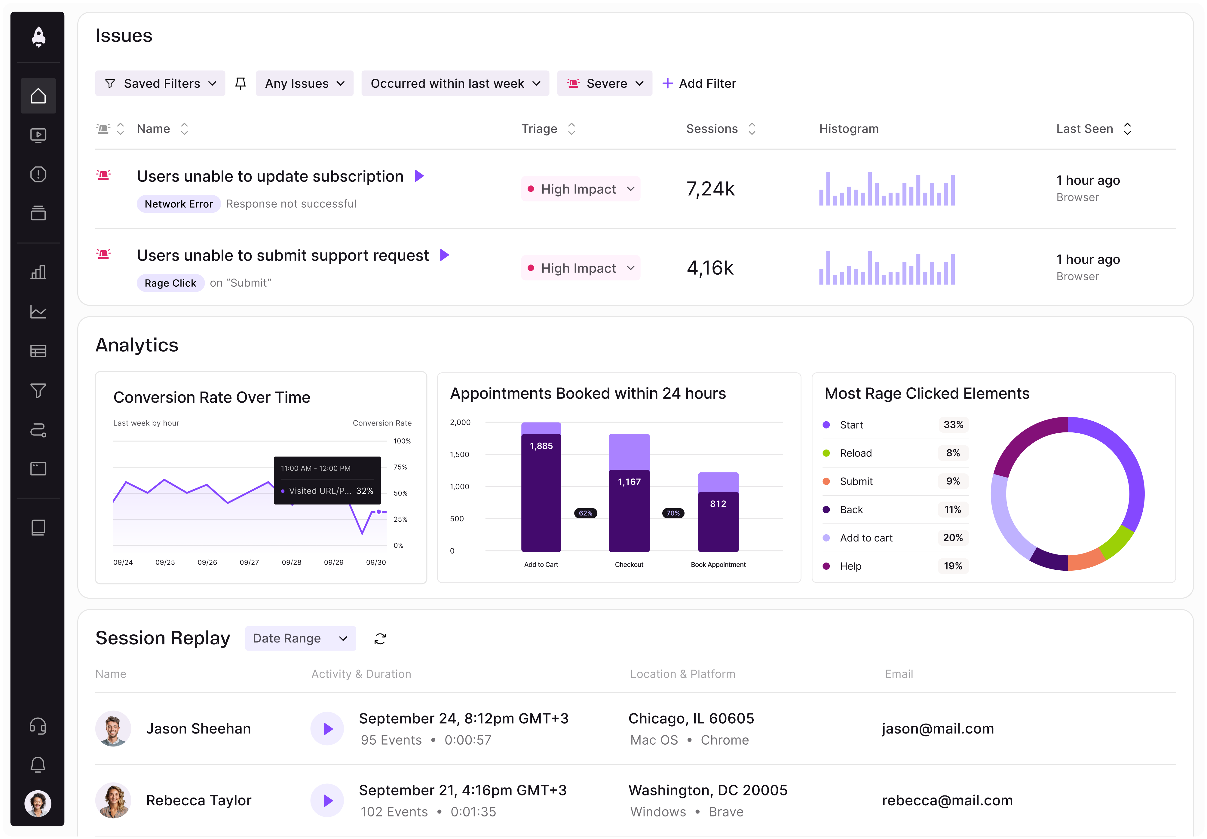
Data is a huge part of what we do, so we’re always trying to improve that as well. The business before the pandemic was quite analog in that we used to print catalogs. Having more robust data and a more robust digital presence has been helpful, even in the absence of being able to send a survey. We use session replay tools to see how people are interacting with our site and app. There are a lot of inferences that we can discern, but by watching sessions, we actually see what people are clicking on.
A lot of it comes from data analytics and seeing how people are using the site. We work very closely with specialists, who are experts in their field. We ask them what their clients need. For example, what does a watch client want? What does a jewel client want to see? For watch clients, specific cataloging is necessary for everything. What do we need to provide? Well, we need a reference number. We need to know the color of the metal. Is there a strap and, if so, what type? What about the dial? We need to be very, very specific because all of these individual parts of a watch make it more valuable.
In terms of product strategy, we’re always making sure that we’re offering the information the clients need to make a purchase. A huge part of art is provenance. Where did this work come from? Was it in a very high-profile collection? It’s super important to track provenance in general, in terms of where the painting was before. How did the current collector acquire the painting? On what exhibitions was the painting and was it in a major museum show for the artists? That can also add value to things as well.

LogRocket identifies friction points in the user experience so you can make informed decisions about product and design changes that must happen to hit your goals.
With LogRocket, you can understand the scope of the issues affecting your product and prioritize the changes that need to be made. LogRocket simplifies workflows by allowing Engineering, Product, UX, and Design teams to work from the same data as you, eliminating any confusion about what needs to be done.
Get your teams on the same page — try LogRocket today.

Controlled scope creep can help PMs use capacity buffers, AI tools, and clear guardrails to turn new ideas into better outcomes.

According to SVP Julia Dalton, managing humans at scale and managing AI agents have a lot more in common than most people realize.

AI can make PM thinking generic. Learn how to use it without losing judgment, user nuance, or product differentiation.

Learn a 3-lens framework that helps product managers shift stakeholder requests from feature ideas to real problems and outcomes.