
Malina.js is a frontend compiler inspired by Svelte. It compiles your web application to JavaScript, meaning your app uses no framework on the frontend side.
In this article, you’ll be looking at what Malina.js is all about, how to build applications with it, and its syntax. In order to follow along, you should have a basic understanding of HTML, CSS, JavaScript, and the use of npm.
The Replay is a weekly newsletter for dev and engineering leaders.
Delivered once a week, it's your curated guide to the most important conversations around frontend dev, emerging AI tools, and the state of modern software.
Bindings are mechanisms used to pass data from parent components to child components. They are also used to bind (i.e., attach) data to properties and values. Like Svelte, there are two types of bindings: one-way binding and two-way binding.
In one-way binding, information flows in only one direction, typically from a data source to the control. In essence, data is read-only in one-way bindings.
Here’s an example of a one-way binding:
<script>
let name="LogRocket";
</script>

<input name={name} />
In the code block above, name in the input tag is the attribute whereby {name} is the value bounded. To reduce code repetition, the input can be rewritten as <input {name} — the shorthand method only applies if the name of the attribute and the value to be bounded is exactly the same.
The one-way binding is useful when building helper components to render data from a source.
In two-way bindings, data flows in both directions: from the data source to the control, and from the control to the data source. This is particularly useful in setting up forms. An example of a two-way binding is:
<script>
    let name = '';
    let checked = false;
</script>

<input type="text" :value={name} />
<input type="checkbox" :checked />
In the code block above, the name value is filled when a user types in a value in the text box.
Styling in Malina.js can be done by either creating separate stylesheet files, styling directly in the HTML files inside the <style></style> via in-line. To perform inline styling, either of the below can be used:
class:className="{value ? 'blue' : 'red'}"

<style>

</style>
The above is used to set a class value depending on a condition passed to it. For the class value to be set, class names must be defined in the <style></style> tag.
style:color={'blue'}
The above is used to set a style value. The style binding is more convenient when performing inline operations.
Events are integral components in building applications — especially on the frontend. Malina listens to events via either on:eventName={handler} or @eventName={handler}. The eventName can be click, hover, etc., and like every other library, you can define inline event functions.
Fragments in Malina.js serve as reusable code. An example from the docs:
<div>
    {#fragment:button text}
        <div class="col-sm-6 smallpad">
            <button @click type="button" class="btn">{text}</button>
        </div>
    {/fragment}

    <fragment:button text='Left' @click:left />
    <fragment:button text='Right' @click:right />
</div>
In the example above, you have a defined button fragment that allows you to declare the value of the button when defining it, like a prop. The fragment above reduces the stress of having to style the button again. Let’s take a look at components in the next section.
Components are essential, as they help reduce repetition. In Malina.js, components are defined by exporting a value in the script tag from the component file in HTML. The components are also imported to use in another file by the traditional ES6 style. An example component might be:
//Name.html

<script>
export let name;
</script>

<p>Hello {name}, you have invoked a component! </p>
In the component above, the prop handler is the exported variable name. If the value isn’t exported, nothing will be rendered.
To use this component in another component:
//App.html

<script>
import Name from './Name.html';

let myName = "Abdulazeez";

</script>

<Name name={myName} />
The above code will render “Hello Abdulazeez, you have invoked a component!” It’s pretty straightforward.
In the next section, you’ll be combining all that you’ve learned to build a simple application.
In this section, you’ll be building a simple application to keep track of plans you intend to carry out. You’ll start by scaffolding a starter application using the create-malina-app tool:
npx create-malina plans-app
The tool takes care of the scaffolding and post-installation process. Once the installation process is complete, run the application:
npm run dev
It loads up a webpage at http://localhost:7000:
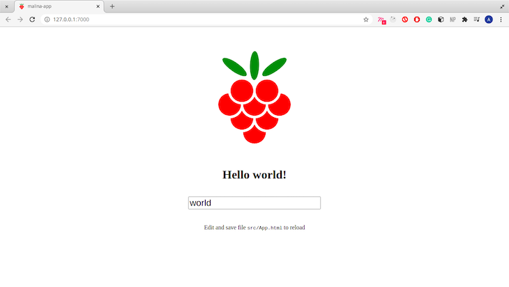
The plans application you’ll be building will be made up of three components: Header, Plans, and Plan. Create a new folder in src named components, and add the three aforementioned files to it.
In this section, you’ll be building the components for the plans application. You’ll start with the Header component:
Header.htmlThis is a simple component that displays the application’s name:
<header>
  <h4> My Plans </h4>
</header>
Next, import the component in the main component located in src/App.html.
App.htmlReplace the entire code in the file with:
<script>
  import Header from './components/Header.html';
</script>

<Header />
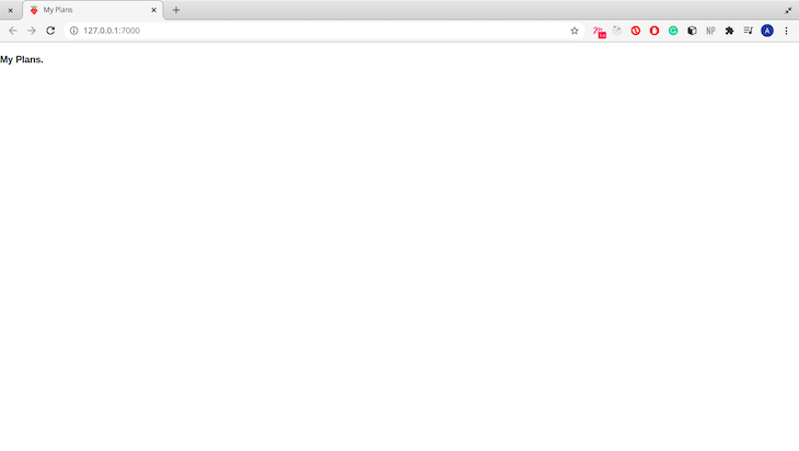
In the above code block, you have imported the Header component in the script tag and rendered it on line 5. The live app reloads immediately after you save the file:
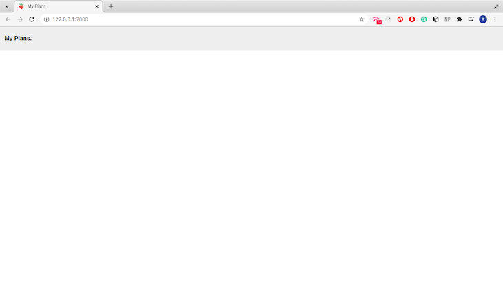
The header looks bland. Let’s add a little style:
<style>
    header {
        background-color: #EEEEEE;
        border: solid 2px transparent;
        display: inline-block;
        font-size: 1rem;
        padding-left: 10px;
        position: fixed;
        top: 0%;
        width: 100%;
     }
</style>
This looks a bit better:
Now let’s build the Plans component, as it is responsible for listing your plans.
Plans.htmlThis component will render all the plans you set. You will also be able to add new plans in this component. Start by adding dummy plans in your script tag:
<script>

let plans = [
        {
            title: 'Go to Mars',
            description: 'I'd love to visit Mars once it is safe to visit.'
        },
        {
            title: 'Go to the Gym',
            description: 'Spend more time working my calves and thighs.'
        },
        {
            title: 'Read a novel',
            description: 'I have been procrastinating on reading some novels. I should read the Native Son and Things Fall Apart.'
        }
    ]

</script>
Iterate over the list of plans and render them:
{#each plans as plan}
  {plan.title}
  {plan.description}
  <br>
{/each}
In Malina, iterating through lists is done with the {#each}..{/each} tag.
In the block of code above, you are iterating over each plan in the plans array and displaying both the title and the description. Import the Plans component in App.html:
<script>
  import Header from './components/Header.html';
  import Plans from './components/Plans.html';
</script>

...
<Plans />
The application looks like this:
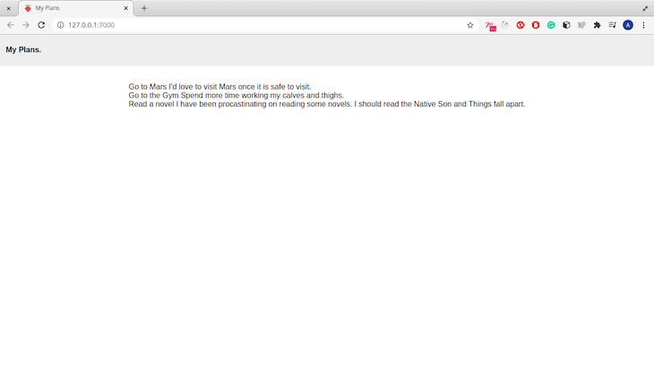
The list is rendered well, but without styles. Next, you’ll write a helper component that helps render the plans.
Plan.htmlIn this component file, you’ll be defining a helper component that takes two prop values: title and description. Begin by exporting the props:
<script>
  export let title;
  export let description;
</script>
Components only receive exported variables as prop values. Unexported variables are used for local bindings and support. Next, write the component body:
<div class="box">
  <b>{title}>
  <hr>
  <p>
    {description}
  </p>
</div>
In the code block above, you render the title as a bold element and the description as a paragraph. The plan is rendered under a class box. Add the style for the box class:
<style>
  .box {
      margin: 20px 20px;
      text-decoration: none;
      padding: 50px 40px;
      border-radius: 4px;
      border: solid 1px rgba(189, 189, 189, 0.747);
      text-align: center;
  }

  @media only screen and (min-width: 780px) {
    .box {
        width: 200px;
        height: 150px;
        padding: 25px;
        border-radius: 4px;
        border: thin 3px #000;
        overflow: auto;
    }
</style>
Let’s use the helper component in the Plans component.
First, import the P``lan component under the script tag:
import Plan from './Plan.html';
Next, modify the code block that renders the plans from the array:
{#each plans as plan}
  <Plan title={plan.title} description={plan.description} />
{/each}
Reloading the application gives another screen:
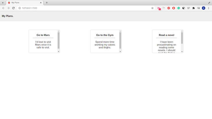
The application looks much better with the styling! Now let’s add some extra features.
Description visibilityThis feature will enable you to hide and show the plan description. It’s also a nice feature to solidify the concepts you learned earlier about events.
In the script tag, define a function showDescription that handles the visibility state:
<script>
...
  let show = false; // Our state handler.
  const showDescription = (e) => {
    show != show // change state
    return show
  }
</script>
Next, modify the p tag to show the description only when the show variable is set to true:
<p>
{show ? description: ''}
</p>
Next, add a button to toggle the visibility:
<div>
...
<button @click:showDescription>{show ? 'Hide' : 'Show'} </button>
</div>
In the code above, you have added a click listener on the button. The click event triggers the showDescription function. Now, your plans app shows and hide the description on clicking the button:
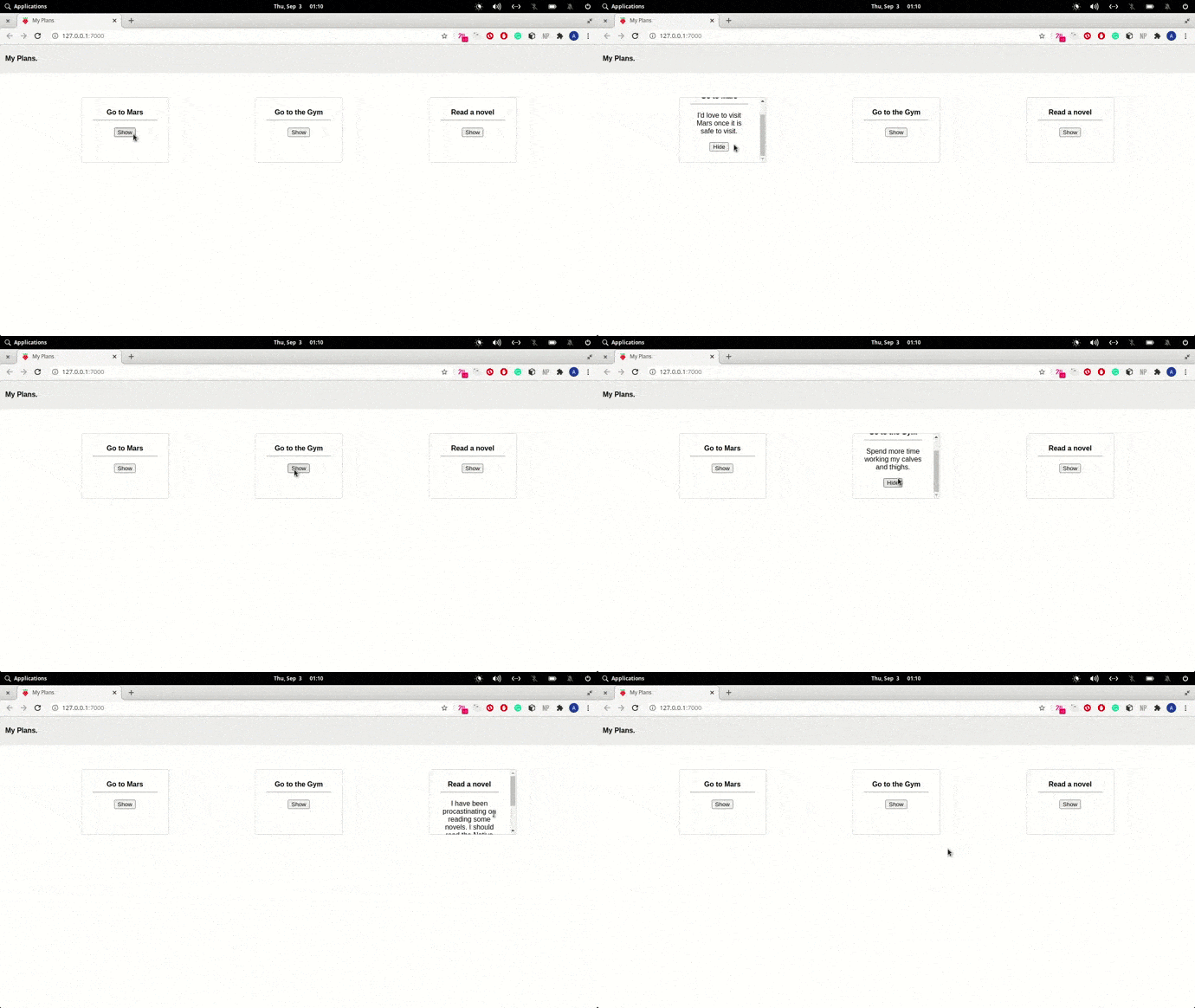
The next feature you’ll be adding is a section for adding new plans. In your Plans component, define a function addPlan in your script tag:
let title = '';
let description = '';

const addPlan = () => {
        let newPlan = {
            title: title,
            description: description
        }
        title = description = '';
        return plans.push(newPlan)
    }
In the code block above, you defined two variables that will be bound to the input tags. The function addPlan creates an object using the value from the title and description variable before pushing it into the array.
Next, type the code below after the main tag in the same file:
<div class="box">
    <h4>Add A New Plan</h4>
    <input type="text" name="title" :value={title}>
    <br><br/>
    <textarea cols="50" rows="5" :value={description}></textarea>
    <button @click:addPlan>Add Plan</button>
</div>
In the code block above, you have bound the title and description variable in a two-way bind. That means you are updating the variable whenever you write texts in either of the text boxes. You have also created a click event listener that triggers the addPlan function.
To top it off, add the code for the box class from the Plan component:
<style>
  .box {
      margin: 20px 20px;
      text-decoration: none;
      padding: 50px 40px;
      border-radius: 4px;
      border: solid 1px rgba(189, 189, 189, 0.747);
      text-align: center;
  }

  @media only screen and (min-width: 780px) {
    .box {
        width: 200px;
        height: 150px;
        padding: 25px;
        border-radius: 4px;
        border: thin 3px #000;
        overflow: auto;
    }
</style>
That wraps up the basic application you’re building 🙂.
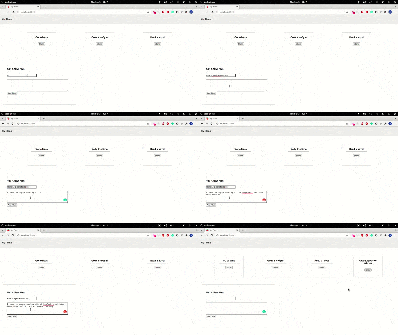
In this article, you learned the basic concepts of Malina.js and built a simple application to supplement the conceptual knowledge. You can read more about Malina.js in their official docs, and you can find the code used in this article on GitHub.
There’s no doubt that frontends are getting more complex. As you add new JavaScript libraries and other dependencies to your app, you’ll need more visibility to ensure your users don’t run into unknown issues.
LogRocket is a frontend application monitoring solution that lets you replay JavaScript errors as if they happened in your own browser so you can react to bugs more effectively.
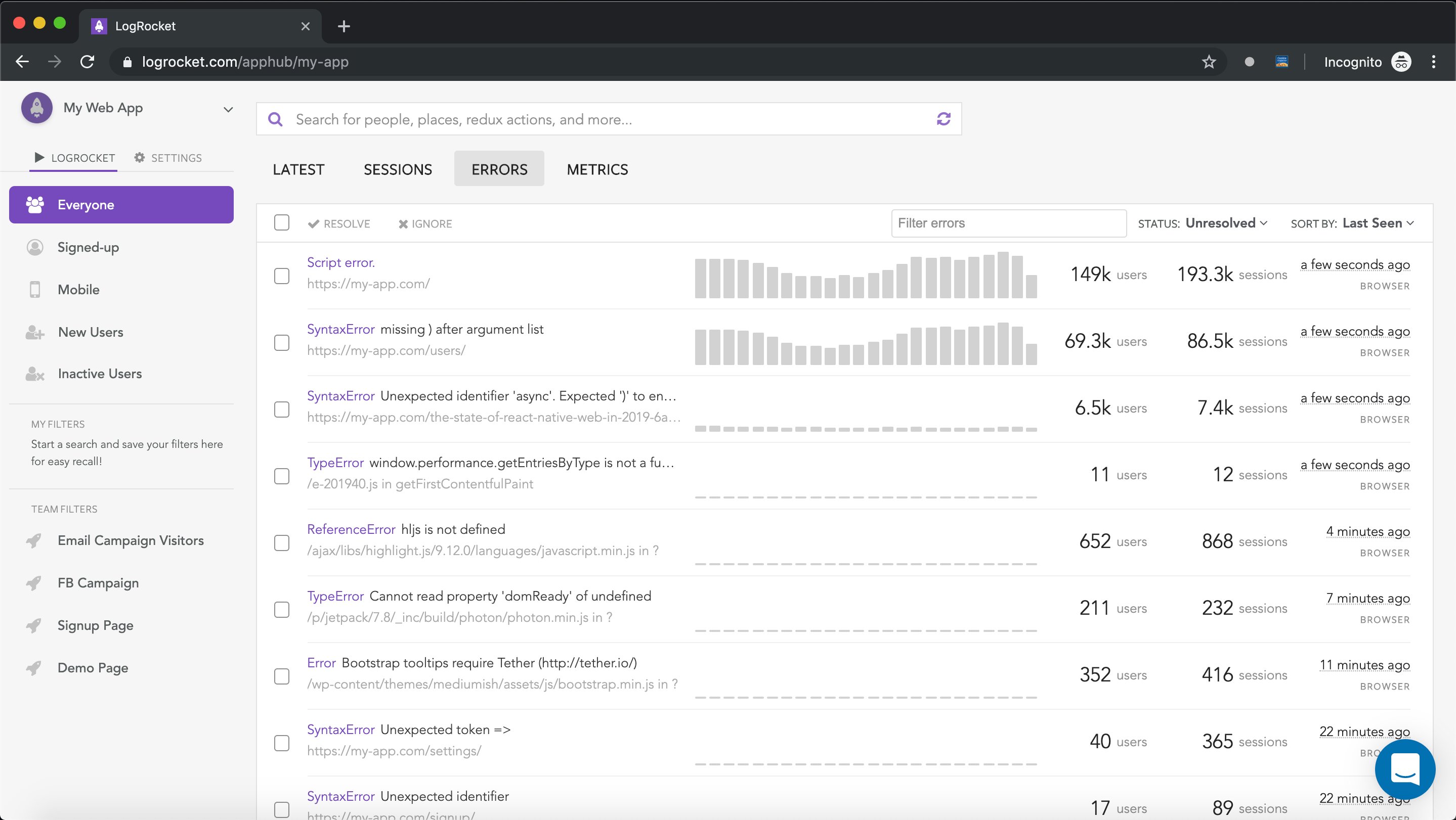
LogRocket works perfectly with any app, regardless of framework, and has plugins to log additional context from Redux, Vuex, and @ngrx/store. Instead of guessing why problems happen, you can aggregate and report on what state your application was in when an issue occurred. LogRocket also monitors your app’s performance, reporting metrics like client CPU load, client memory usage, and more.
Build confidently — start monitoring for free.

A step-by-step guide to building your first MCP server using Node.js, covering core concepts, tool design, and upgrading from file storage to MySQL.

Using security headers in your Next.js apps is a highly effective way to secure websites from common security threats.

A deep dive into April 2026’s AI model and tool rankings. We break down performance, usability, pricing, and real-world capabilities across 50+ features to help you pick the right tools for your development workflow.

A practical guide to Agent Browser CLI. Learn how AI agents navigate, snapshot, and interact with web pages using stable references, enabling efficient automation and exploratory testing.
Hey there, want to help make our blog better?
Join LogRocket’s Content Advisory Board. You’ll help inform the type of content we create and get access to exclusive meetups, social accreditation, and swag.
Sign up now