Editor’s note: This post was last updated on 30 October, 2024 to enhance dropdown menu implementation with TypeScript and Tailwind CSS and to include accessibility improvements for keyboard navigation.

In this tutorial, we’ll guide you through creating a custom, accessible dropdown menu in React. We’ll use TypeScript and Tailwind CSS, but you only need a basic understanding of React to follow along. You can also stick to basic React code if you prefer to skip the TypeScript parts.
Dropdown menus and select dropdowns both offer lists of options but serve different purposes. A select dropdown is used in forms to let users choose one option from a list, typically created with a select element. In contrast, dropdown menus are mainly for navigation or quick actions.
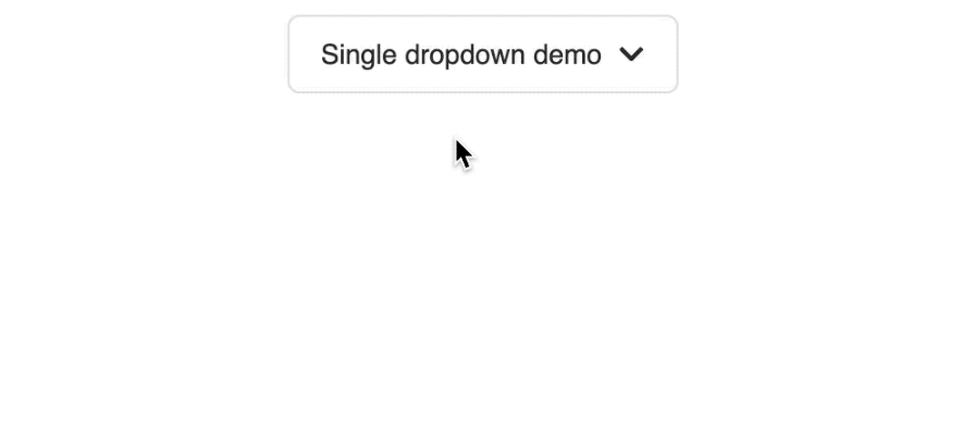
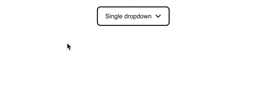
We’ll start by creating a single-level dropdown menu that looks like the demo below:
We’ll design our dropdown component to support both the link items for navigation and button elements for quick actions. The component structure will look like this:
<SingleLevelDropdownMenu
  buttonLabel="Single dropdown"
  items={[
    { title: "Edit Profile", url: "/edit", icon: <FaUserEdit /> },
    { title: "View Activity", url: "/view", icon: <FaHistory /> },
    {
      title: "Logout",
      icon: <FaSignOutAlt />,
      action: () => alert("Logged out!"),
    },
  ]}
/>
We’ve used icons from the react-icons library that you can import like so:
import { FaUserEdit, FaHistory, FaSignOutAlt } from "react-icons/fa";
In the SingleLevelDropdownMenu component, we can now correctly receive the props and implement basic functionality:
import { useState } from "react";
import { FaChevronDown, FaChevronUp } from "react-icons/fa";
interface SingleLevelDropdownMenuProps {
  buttonLabel: string;
  items: {
    title: string;
    url?: string;
    icon?: JSX.Element;
    action?: () => void;
  }[];
}
export const SingleLevelDropdownMenu = ({
  buttonLabel,
  items,
}: SingleLevelDropdownMenuProps) => {
  const [open, setOpen] = useState(false);
  const handleToggle = () => {
    setOpen((prev) => !prev);
  };
  return (
    <div className="relative">
      <button
        type="button"
        className="inline-flex items-center justify-center rounded-md text-sm border border-[#e4e4e7] h-10 px-4 py-2"
        onClick={handleToggle}
      >
        {buttonLabel}
        <span className="ml-2">
          {open ? <FaChevronUp /> : <FaChevronDown />}
        </span>
      </button>
      {open && (
        <div className="absolute left-1/2 -translate-x-1/2 top-12">
          <ul className="w-56 h-auto shadow-md rounded-md p-1 border bg-white">
            {items.map((item, index) => (
              <li
                key={index}
                className={`relative flex items-center gap-2 px-4 py-2 text-sm hover:bg-gray-100 rounded-md`}
              >
                {item.title}
              </li>
            ))}
          </ul>
        </div>
      )}
    </div>
  );
};
The SingleLevelDropdownMenu component receives a buttonLabel for the button text and an items array for the dropdown options. It uses the useState Hook to manage the open/close state, toggling it when the button is clicked.
When the dropdown opens, it displays a list of items, currently showing only the title. We’ve used Tailwind CSS to handle styling, including hover effects and positioning the dropdown below and centered relative to the button.
Here’s the result:
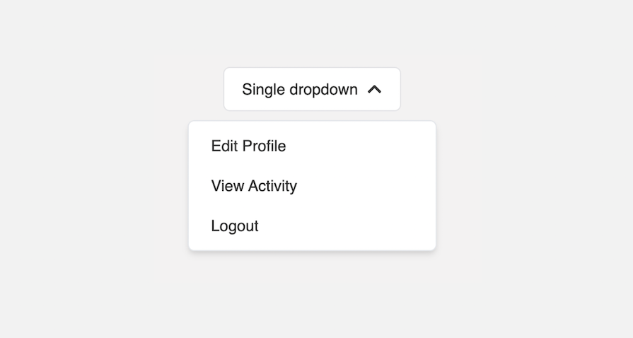
You should be able to toggle the dropdown box.
Let’s enhance the dropdown to support icons for each item and dynamically render either navigation links or action buttons. Update the li element as follows:
<li
  key={index}
  className={`relative flex items-center gap-2 px-4 py-2 text-sm hover:bg-gray-100 rounded-md`}
>
  {item.icon && <span>{item.icon}</span>}
  {item.url ? (
    <Link
      to={item.url}
      className="w-full text-left"
      onClick={() => setOpen(false)}
    >
      {item.title}
    </Link>
  ) : (
    <button
      className="w-full text-left"
      onClick={() => {
        item.action?.();
        setOpen(false);
      }}
      type="button"
    >
      {item.title}
    </button>
  )}
</li>
We’ve used the Link component from the react-router-dom that you can import like so:
import { Link } from "react-router-dom";
If an item has a URL, it displays as a clickable link. Otherwise, it renders as a button that triggers an optional action, adding flexibility and interactivity. This makes the dropdown more versatile for different use cases:
To improve user experience, we also ensure the dropdown closes after an item is clicked by calling setOpen(false).
To ensure the dropdown menu closes when users click outside of it, we will utilize the useEffect Hook to listen for mousedown and touchstart events. But first, we will use useRef to access the DOM elements of the dropdown by passing a reference object to the target node:
import { useEffect, useRef, useState } from "react";
// ...
export const SingleLevelDropdownMenu = (...) => {

  const menuRef = useRef<HTMLDivElement | null>(null);
  // ...
  useEffect(() => {
    const handler = (event: MouseEvent | TouchEvent) => {
      if (
        open &&
        menuRef.current &&
        !menuRef.current.contains(event.target as Node)
      ) {
        setOpen(false);
      }
    };
    document.addEventListener("mousedown", handler);
    document.addEventListener("touchstart", handler);
    return () => {
      document.removeEventListener("mousedown", handler);
      document.removeEventListener("touchstart", handler);
    };
  }, [open]);
  return (
    <div className="relative" ref={menuRef}>
      {/* ... */}
    </div>
  );
};
The event handler checks if the dropdown is open and whether the click occurred outside the dropdown (menuRef.current). If it did, setOpen(false) is called to close the menu. We also clean up the event listeners when the component unmounts to prevent memory leaks.
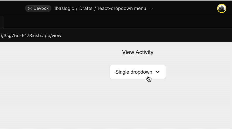
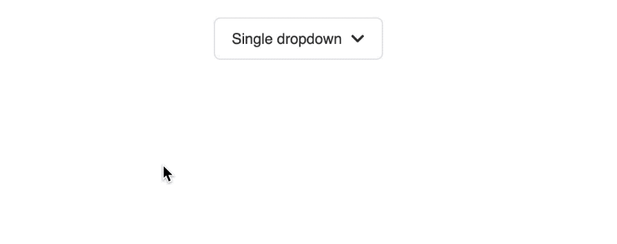
If you save the file, you should be able to close the dropdown box when you click outside of it.
To enhance accessibility for the dropdown menu, we will add critical attributes. The trigger button will include the following:
<button
  id="dropdown-button"
  aria-haspopup="true"
  aria-expanded={open}
  aria-controls="dropdown-menu"
  // ...
>
  {/* ... */}
</button>
Meanwhile, the dropdown and its items will include these attributes:
<ul
  role="menu"
  id="dropdown-menu"
  aria-labelledby="dropdown-button"
  // ...
>
  {items.map((item, index) => (
    <li
      role="menuitem"
      // ...
    >
      {/* ... */}
    </li>
  ))}
</ul>
The ARIA attributes like aria-haspopup, aria-expanded, and aria-controls provide a clear context for assistive technologies regarding the dropdown’s function and state.
The dropdown menu has the role of menu and an id that is linked to the button via aria-labelledby, clarifying their relationship.
Let’s enhance the dropdown menu component to improve keyboard navigation and overall accessibility. We will add support for arrow key navigation, allowing users to open the dropdown with the “Arrow Down” key and move between menu items using both the “Arrow Up” and “Arrow Down” keys. Users can select items with the Enter and Space keys.
To achieve this, we will introduce a focusedIndex state to track the currently focused item, enabling users to navigate through the menu items using the arrow keys:
const [focusedIndex, setFocusedIndex] = useState<number | null>(null);
Setting a default null value signifies that no item in the dropdown is focused initially.
Next, let’s define handlers for the onKeyDown event for both the button and menu items. Add the following code above the return statement:
const handleKeyDown = (event: React.KeyboardEvent<HTMLButtonElement>) => {
  if (event.key === "ArrowDown") {
    event.preventDefault();
    setOpen(true);
    setFocusedIndex(0); // Focus on the first item when the arrow is pressed
  } else if (event.key === "Enter" || event.key === " ") {
    event.preventDefault();
    handleToggle();
  } else if (event.key === "Escape") {
    setOpen(false);
    setFocusedIndex(null); // Reset focus when dropdown closes
  }
};

const handleItemKeyDown = (
  event: React.KeyboardEvent<HTMLLIElement>,
  index: number
) => {
  if (event.key === "ArrowDown") {
    event.preventDefault();
    setFocusedIndex((prevIndex) =>
      prevIndex! < items.length - 1 ? prevIndex! + 1 : 0
    );
  } else if (event.key === "ArrowUp") {
    event.preventDefault();
    setFocusedIndex((prevIndex) =>
      prevIndex! > 0 ? prevIndex! - 1 : items.length - 1
    );
  } else if (event.key === "Enter" || event.key === " ") {
    event.preventDefault();
    const selectedItem = items[index];
    if (selectedItem.url) {
      navigate(selectedItem.url);
    } else if (selectedItem.action) {
      selectedItem.action();
    }
    setOpen(false);
    setFocusedIndex(null);
  } else if (event.key === "Escape") {
    setOpen(false);
    setFocusedIndex(null);
  }
};
Keep in mind that we utilized navigate from the react-router-dom in the handleItemKeyDown function. Make sure to import useNavigate and define it as follows:
const navigate = useNavigate();
Next, we can attach the handler to the appropriate elements, starting with the menu button:
<button
  // ...
  // onClick={handleToggle}
  onKeyDown={handleKeyDown}
>
Now, let’s attach the onKeyDown event to the dropdown item:
{items.map((item, index) => (
  <li
    // ...
    onKeyDown={(event) => handleItemKeyDown(event, index)}
  >
    {/* ... */}
  </li>
))}
These handlers help manage keyboard interactions, enabling users to navigate through options using the keyboard. While the functionality is not fully implemented yet, this is a step towards providing full keyboard navigation support for the dropdown menu.
Next, modify the li element to include both the tabIndex and id attributes. Also, adjust the className to apply styles based on the focused state:
<li
  // ...
  id={`dropdown-item-${index}`}
  className={`relative flex items-center gap-2 px-4 py-2 text-sm hover:bg-gray-100 rounded-md ${
    focusedIndex === index ? "bg-gray-100" : ""
  }`}
  tabIndex={focusedIndex === index ? 0 : -1}
>
We’ve assigned a unique id based on its index so that we can programmatically set focus on the specific menu item when the user navigates the dropdown using keyboard arrow keys.
The className includes a logic to apply a background color when the current item is focused. Then, the tabIndex value is dynamically set based on whether the current item is focused.
In a useEffect Hook, we need to locate the menu item corresponding to the focusedIndex and set keyboard focus on that specific item:
useEffect(() => {
  if (open && focusedIndex !== -1) {
    const focusedItem = document.getElementById(
      `dropdown-item-${focusedIndex}`
    );
    focusedItem?.focus();
  }
}, [focusedIndex, open]);
This logic ensures keyboard navigation and proper focus management, enabling users to move through the menu items using the arrow keys:
We’ve added a custom focus outline to the menu button to ensure a clear visual indication during keyboard navigation. This is important for accessibility, as users need to see which element is focused on:
/* Remove the default outline */
:focus {
  outline: none;
}
button:focus-visible {
  outline: 2px solid black;
}
The default outline is removed, and a solid black border is added.
A well-designed dropdown menu guarantees that focus is restored to the dropdown button after a selection is made or the menu is closed during keyboard navigation. To achieve this, we can utilize useRef:
const buttonRef = useRef<HTMLButtonElement>(null);
We can then link the reference object to the menu button:
<button
  ref={buttonRef}
  id="dropdown-button"
  // ...
>
  {/* ... */}
</button>
After that, update the handleItemKeyDown function to ensure the button receives focus when the user presses the “Enter”, “Space”, or “Escape” keys:
const handleItemKeyDown = (
  event: React.KeyboardEvent<HTMLLIElement>,
  index: number
) => {
  if (event.key === "ArrowDown") {
    // ...
  } else if (event.key === "Enter" || event.key === " ") {
    // ...
    // setOpen(false);
    // setFocusedIndex(null);
    buttonRef.current?.focus();
  } else if (event.key === "Escape") {
    // setOpen(false);
    // setFocusedIndex(null);
    buttonRef.current?.focus();
  }
};
This ensures that after the dropdown closes, the focus returns to the button as demonstrated in the GIF below:
For mouse users, it’s important to reset the focusedIndex to null when the dropdown closes. This ensures that no items remain highlighted when the dropdown is no longer visible. Update the handleToggle function as follows:
const handleToggle = () => {
  setOpen((prev) => {
    if (!prev) setFocusedIndex(null);
    return !prev;
  });
};
The dropdown should now function as intended. You can view the project’s source code in the GitHub repository.
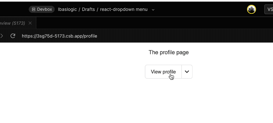
A split button dropdown menu differs from a standard menu button by combining two actions into a single control. It typically consists of a primary button that triggers a default action and a secondary button, often represented as an arrow, that opens a menu of additional options.
The GIF below illustrates the implementation of the split button dropdown:
In our previous implementation, we have already established most of the necessary logic; we will now enhance it to create a split button dropdown.
We will start by introducing a new prop called defaultAction to define a primary behavior that occurs when the main button of the split button is clicked:
<SplitButtonDropdown
  buttonLabel="View profile"
  defaultAction={() => navigate("/profile")}
  items={[
    { title: "Edit Profile", url: "/edit", icon: <FaUserEdit /> },
    {
      title: "Delete profile",
      action: () => alert("Delete profile"),
      icon: <MdDelete />,
    },
  ]}
/>
As shown in the code, we are navigating to the "/profile" page, so make sure to import useNavigate and use it appropriately. Also, endeavor to import the MdDelete icon from the react-icons library.
Building on the SingleLevelDropdownMenu component, we will receive the newly added defaultAction prop as follows:
interface SplitButtonDropdownProps {
  buttonLabel: string;
  defaultAction?: () => void; // Action for the primary button
  items: {
    title: string;
    url?: string;
    icon?: JSX.Element;
    action?: () => void;
  }[];
}
export const SplitButtonDropdown = ({
  buttonLabel,
  defaultAction,
  items,
}: SplitButtonDropdownProps) => {
  // ...
};
After that, we’ll create a new handler called handlePrimaryAction to invoke the defaultAction like this:
const handlePrimaryAction = () => {
  if (defaultAction) {
    defaultAction();
    setOpen(false);
  }
};
We will then attach handlePrimaryAction to the onClick event of the primary button.
Below is the updated code that replaces the corresponding section in the SingleLevelDropdownMenu component. This configuration gives us two buttons: the first triggers the primary action when clicked, while the second remains unchanged from the SingleLevelDropdownMenu component, displaying the dropdown items when clicked:
<div className="inline-flex">
  {/* Primary Button */}
  <button
    type="button"
    className="inline-flex items-center justify-center rounded-l-md text-sm border border-[#e4e4e7] h-10 px-4 py-2"
    onClick={handlePrimaryAction}
    aria-label={`${buttonLabel} primary action`}
  >
    {buttonLabel}
  </button>
  {/* Dropdown Toggle Button */}
  <button
    id="dropdown-button"
    ref={buttonRef}
    type="button"
    className="inline-flex items-center justify-center rounded-r-md text-sm border border-l-0 border-[#e4e4e7] h-10 px-2"
    onClick={handleToggle}
    onKeyDown={handleKeyDown}
    aria-haspopup="true"
    aria-expanded={open}
    aria-controls="dropdown-menu"
  >
    {open ? <FaChevronUp /> : <FaChevronDown />}
  </button>
</div>
The Tailwind CSS styles applied here give the buttons an appearance that aligns with the design of a split button.
You can view the project’s source code in the GitHub repository.
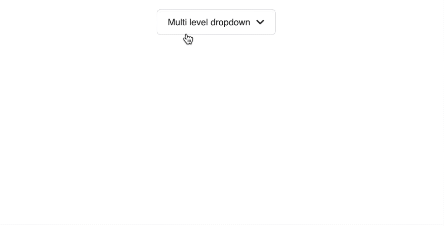
Multilevel dropdown menus allow users to access nested navigation options or actions when interacting with submenu items. The GIF below demonstrates how the multilevel dropdown works:
For the implementation, we will also enhance the existing SingleLevelDropdownMenu component by adding a submenu property. This property will be an array that contains the nested items:
<MultiLevelDropdownMenu
  buttonLabel="Multi level dropdown"
  items={[
    { title: "Edit Profile", url: "/edit", icon: <FaUserEdit /> },
    { title: "View Activity", url: "/view", icon: <FaHistory /> },
    {
      title: "Theme",
      icon: <MdMonitor />,
      submenu: [
        {
          title: "Light",
          icon: <MdLightMode />,
          action: () => setTheme("light"),
        },
        {
          title: "Dark",
          icon: <MdDarkMode />,
          action: () => setTheme("dark"),
        },
        {
          title: "System",
          icon: <MdMonitor />,
          action: () => setTheme("system"),
        },
      ],
    },
    {
      title: "Logout",
      icon: <FaSignOutAlt />,
      action: () => alert("Logged out!"),
    },
  ]}
/>
In the code, we introduced a custom setTheme action. For demonstration purposes, you can create a state variable to display the selected theme on the screen:
const [theme, setTheme] = useState('system'); // Initial theme state
Then, in the JSX, you can show the current theme like this:
<h1>Current Theme: {theme}</h1>
Next, in the MultiLevelDropdownMenu, let’s incorporate the newly added submenu property from the items prop:
interface MultiLevelDropdownMenuProps {
  buttonLabel: string;
  items: {
    title: string;
    url?: string;
    icon?: JSX.Element;
    action?: () => void;
    submenu?: {
      title: string;
      icon?: JSX.Element;
      action?: () => void;
    }[];
  }[];
}
export const MultiLevelDropdownMenu = ({
  buttonLabel,
  items,
}: MultiLevelDropdownMenuProps) => {
  //   ...
};
Referring to the SingleLevelDropdownMenu component, we previously used the open and focusedIndex state to control the visibility of the dropdown and track the currently focused item using the following lines:
const [open, setOpen] = useState(false);
const [focusedIndex, setFocusedIndex] = useState<number | null>(null);
In the MultiLevelDropdownMenu, we will enhance the state to include submenu management, resulting in the following:
const [open, setOpen] = useState(false);
const [focusedIndex, setFocusedIndex] = useState<number | null>(null);
const [openSubmenuIndex, setOpenSubmenuIndex] = useState<number | null>(null);
const [focusedSubmenuIndex, setFocusedSubmenuIndex] = useState<number | null>(
  null
);
In this updated state, openSubmenuIndex will track which submenu is currently open, while focusedSubmenuIndex will keep track of the focused item within that open submenu.
Let’s start by identifying the action button as it was used in the SingleLevelDropdownMenu component:
<button
  className="w-full text-left"
  onClick={() => {
    item.action?.();
    setOpen(false);
  }}
  type="button"
>
  {item.title}
</button>
We will replace it with the following updated version:
<>
  <button
    className="w-full text-left flex justify-between items-center"
    onClick={() => {
      if (item.submenu) {
        handleSubmenuToggle(index);
      } else if (item.action) {
        item.action();
        setOpen(false);
      }
    }}
  >
    {item.title}
    {item.submenu && <IoIosArrowForward />}
  </button>
  {item.submenu && openSubmenuIndex === index && (
    <ul className="absolute left-full top-0 mt-0.5 shadow-md rounded-md p-1 bg-white border">
      {item.submenu.map((subitem, subindex) => (
        <li
          key={subindex}
          id={`submenu-item-${subindex}`}
          onKeyDown={(event) =>
            handleSubmenuKeyDown(
              event,
              item.submenu!,
              subindex
            )
          }
          className={`flex items-center gap-2 px-4 py-2 text-sm hover:bg-gray-100 rounded-md ${
            focusedSubmenuIndex === subindex
              ? "bg-gray-100"
              : ""
          }`}
          tabIndex={focusedSubmenuIndex === subindex ? 0 : -1}
        >
          {subitem.icon && <span>{subitem.icon}</span>}
          <button
            onClick={() => {
              subitem.action?.();
              setOpen(false);
            }}
          >
            {subitem.title}
          </button>
        </li>
      ))}
    </ul>
  )}
</>
Import the IoIosArrowForward icon from the react icons library.
The updated code allows the submenu to open or close when clicked, provided the item contains a submenu. If no submenu exists, the item’s action is triggered, and the main menu closes.
To manage this behavior, we’ve added two functions: handleSubmenuToggle and handleSubmenuKeyDown which are implemented below. Place them above the return statement:
const handleSubmenuToggle = (index: number) => {
  setOpenSubmenuIndex((prevIndex) => (prevIndex === index ? null : index));
};

const handleSubmenuKeyDown = (
  event: React.KeyboardEvent<HTMLLIElement>,
  submenu: { title: string; action?: () => void }[],
  index: number
) => {
  console.log(index);
  if (event.key === "ArrowDown") {
    event.preventDefault();
    setFocusedSubmenuIndex((prevIndex) =>
      prevIndex! < submenu.length - 1 ? prevIndex! + 1 : 0
    );
  } else if (event.key === "ArrowUp") {
    event.preventDefault();
    setFocusedSubmenuIndex((prevIndex) =>
      prevIndex! > 0 ? prevIndex! - 1 : submenu.length - 1
    );
  } else if (event.key === "ArrowLeft") {
    event.preventDefault();
    setFocusedSubmenuIndex(null);
    setOpenSubmenuIndex(null);
    setFocusedIndex(openSubmenuIndex);
    const triggerElement = document.getElementById(
      `dropdown-item-${openSubmenuIndex}`
    );
    triggerElement?.focus(); // Set focus to the submenu trigger
  } else if (event.key === "Enter" || event.key === " ") {
    event.preventDefault();
    const selectedSubItem = submenu[focusedSubmenuIndex!];
    selectedSubItem.action?.();
    setOpen(false);
  } else if (event.key === "Escape") {
    setFocusedSubmenuIndex(null);
    setFocusedIndex(openSubmenuIndex);
    setOpenSubmenuIndex(null);
  }
};
The handleSubmenuToggle function is responsible for toggling the open state of the submenu based on the clicked item using its index. Meanwhile, the handleSubmenuKeyDown function handles keyboard navigation within the submenu, allowing users to move between items with the arrow keys, select an item, or close the submenu with the escape key.
To further enhance the keyboard navigation, we need to update the handleItemKeyDownfunction, which handles keyboard interactions within the primary dropdown. Specifically, we’ll enhance it by adding support for the “Arrow Right” key and updating the behavior for the Enter and Space keys to open submenus when available:
const handleItemKeyDown = (
  event: React.KeyboardEvent<HTMLLIElement>,
  index: number
) => {
  const currentItem = items[index];
  if (event.key === "ArrowDown") {
    event.preventDefault();
    setFocusedIndex((prevIndex) =>
      prevIndex! < items.length - 1 ? prevIndex! + 1 : 0
    );
  } else if (event.key === "ArrowUp") {
    event.preventDefault();
    setFocusedIndex((prevIndex) =>
      prevIndex! > 0 ? prevIndex! - 1 : items.length - 1
    );
  } else if (event.key === "ArrowRight" && currentItem.submenu) {
    event.preventDefault();
    setOpenSubmenuIndex(index);
    setFocusedSubmenuIndex(0);
  } else if (event.key === "Enter" || event.key === " ") {
    event.preventDefault();
    if (currentItem.submenu) {
      setOpenSubmenuIndex((prev) => (prev === index ? null : index));
    } else if (currentItem.url) {
      navigate(currentItem.url);
      setOpen(false);
      buttonRef.current?.focus();
    } else if (currentItem.action) {
      currentItem.action();
      setOpen(false);
    }
  } else if (event.key === "Escape") {
    setOpen(false);
    setFocusedIndex(null);
    setOpenSubmenuIndex(null);
    buttonRef.current?.focus();
  }
};
In this update, pressing the “Arrow Right” key opens the submenu (if it exists), while the Enter and Space keys toggle the submenu or trigger the item’s action as appropriate.
Next, we will locate the submenu item element by its id and set focus on that submenu item, enabling users to navigate through the submenus using their keyboard. We can add the following code above the return statement to achieve this during keyboard navigation while the submenu is open:
useEffect(() => {
  if (openSubmenuIndex !== null && focusedSubmenuIndex !== null) {
    document.getElementById(`submenu-item-${focusedSubmenuIndex}`)?.focus();
  }
}, [focusedSubmenuIndex, openSubmenuIndex]);
We can improve the dropdown menu experience by also adding hover interactions for submenus.
By implementing onMouseEnter and onMouseLeave event handlers, the submenu will open and close dynamically as users hover over the menu item.
Additionally, we will modify the background color of the menu item to highlight only when it is focused and no submenu is open, ensuring clearer visual feedback for users.
To achieve this, we’ll update the primary li element to include the onMouseEnter and onMouseLeave events, along with an updated className:
<li
  // ...
  className={`relative flex items-center gap-2 px-4 py-2 text-sm hover:bg-gray-100 rounded-md ${
    focusedIndex === index&& openSubmenuIndex === null
      ? 'bg-gray-100'
      : ''
  }`}
  onMouseEnter={() => handleSubmenuToggle(index)}
  onMouseLeave={() => handleSubmenuToggle(index)}
>
We will improve the dropdown management by ensuring a complete reset of the focus and submenu states when the dropdown is closed. Let’s update the handleToggle function so we have the following:
const handleToggle = () => {
  setOpen((prev) => {
    if (!prev) {
      setFocusedIndex(null);
      setOpenSubmenuIndex(null);
      setFocusedSubmenuIndex(null);
    }
    return !prev;
  });
};
These enhancements provide a more predictable user experience by maintaining the intended state of the dropdown and its submenus upon toggling.
You can view the project’s source code in the GitHub repository.
Creating a custom, accessible dropdown menu in React allows you to fit specific requirements. This tutorial has provided you with the skills to create a visually appealing and keyboard-navigable menu using TypeScript and Tailwind CSS.
Feel free to leave any questions or contributions in the comments section. If you enjoyed this tutorial, please consider sharing it!
Install LogRocket via npm or script tag. LogRocket.init() must be called client-side, not
server-side
$ npm i --save logrocket

// Code:

import LogRocket from 'logrocket';
LogRocket.init('app/id');
// Add to your HTML:

<script src="https://cdn.lr-ingest.com/LogRocket.min.js"></script>
<script>window.LogRocket && window.LogRocket.init('app/id');</script>

Learn how to protect full-stack projects from NPM supply chain attacks with a practical security checklist.

Explore 15 essential MCP servers for web developers to enhance AI workflows with tools, data, and automation.

Learn how contrast-color() automatically picks accessible text colors using native CSS, without JavaScript.

Learn how to build a harness-style AI workflow using Claude Code with specialized Dev, QE, and Ops subagents, gated handoffs, MCP telemetry, and LEARNING.md.
Hey there, want to help make our blog better?
Join LogRocket’s Content Advisory Board. You’ll help inform the type of content we create and get access to exclusive meetups, social accreditation, and swag.
Sign up now

 Learn more →
