Stack widget
If there’s one thing Flutter is known for, it’s the incredible amount of widgets it comes with. All these widgets help developers get the exact look they’re after with as little effort as possible.
In this post, we’ll look at a widget that every Flutter developer should be aware of: the Stack widget.
Through effective use of the Stack widget in an application, we can communicate depth to users and create some fairly complex layouts without a lot of work.
The Replay is a weekly newsletter for dev and engineering leaders.
Delivered once a week, it's your curated guide to the most important conversations around frontend dev, emerging AI tools, and the state of modern software.
Stack widget look like?Here, we can see a sample of what kind of layout we can achieve with a Stack widget in our Flutter app.
For this app, we see an image in the center, and then two other images on either side. The images to the left and right are sized a little bit smaller and are placed behind the image in the middle.
Essentially, these widgets stack on top of each other, giving the user a clear sense of what we want them to focus on.
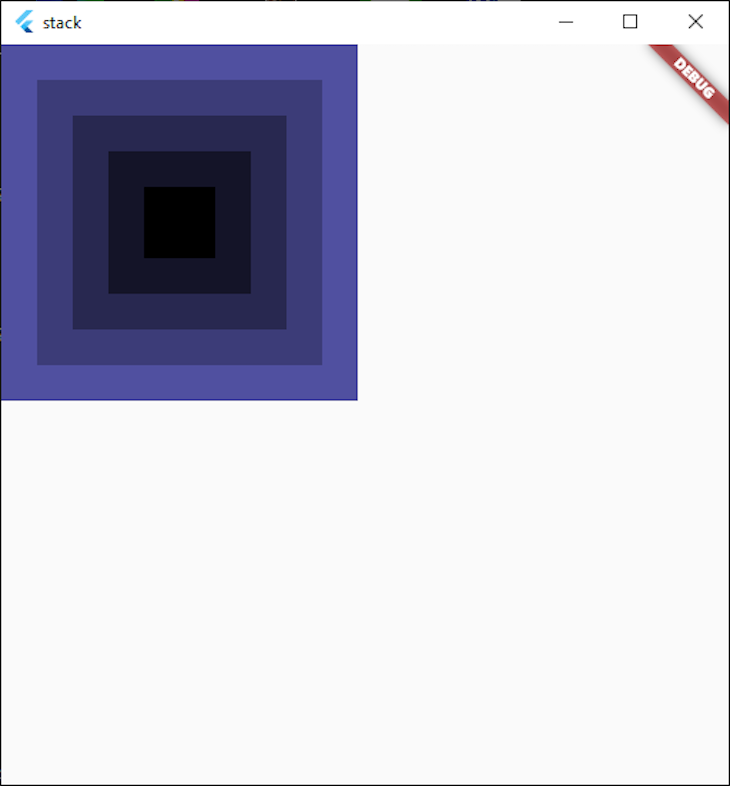
Stack widget work?To demonstrate what a Stack widget does, let’s first look at how a Column lays out its children. In this simple example, we have five containers that are laid out with progressively higher widths and heights:
Widget build(BuildContext context) {
  return Scaffold(
    body: Column(
      children: [
        ...List.generate(
          5,
          (index) => Container(
            width: index * 50 + 50,
            height: index * 50 + 50,
            color: Color.fromRGBO(index * 20, index * 20, index * 40, 1.0),
          ),
        ).reversed
      ],
    ),
  );
}
This code results in the following:
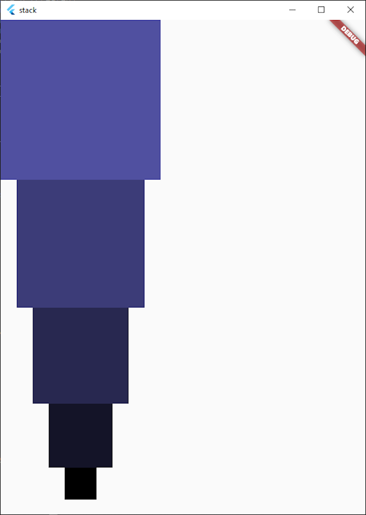
Now, if we replace the Column widget with a Stack widget, it becomes this instead:
Instead of the widgets laid out on the vertical axis, they stack on top of each other. This is beneficial when we want our widgets on top of each other, and not top-to-bottom or left-to-right.
We can also see that widgets render from the bottom up. In our example, the biggest widget renders at the bottom of the stack, and the smaller widget renders on top, and so on and so forth.
Child widgets are aligned to the top left by default, and the Stack resizes to fit all the children, meaning it will be as big as our biggest child widget.
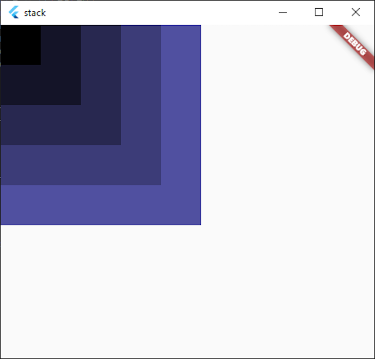
Sometimes, if we place a smaller widget inside a bigger widget, it’s more aesthetically pleasing to align all the children to the center.
If we want to align our widgets to the center for visual appeal, we can align our child widgets within the Stack to the center. To accomplish this, it’s as easy as setting the alignment property in our Stack to Alignment.center, like so:
  Widget build(BuildContext context) {
    return Scaffold(
      body: Stack(
        alignment: Alignment.center, // Center children in the Stack
        children: [
          ...List.generate(
            5,
            (index) => Container(
              width: index * 50 + 50,
              height: index * 50 + 50,
              color: Color.fromRGBO(index * 20, index * 20, index * 40, 1.0),
            ),
          ).reversed,
        ],
      ),
    );
  }
This centers all the children in the Stack to the relative center, like so:
Because we haven’t centered the Stack yet, it remained in the top left corner. Instead, we just centered the widgets that are inside the Stack.
We can also use the fit parameter to define whether our stack should expand to fill the parent widget, or whether it should pass through the fit of child objects directly to the children in the Stack.
Broadly speaking, these only apply in more advanced layout scenarios, so we should be fine leaving the fit as StackFit.loose, which is the default.
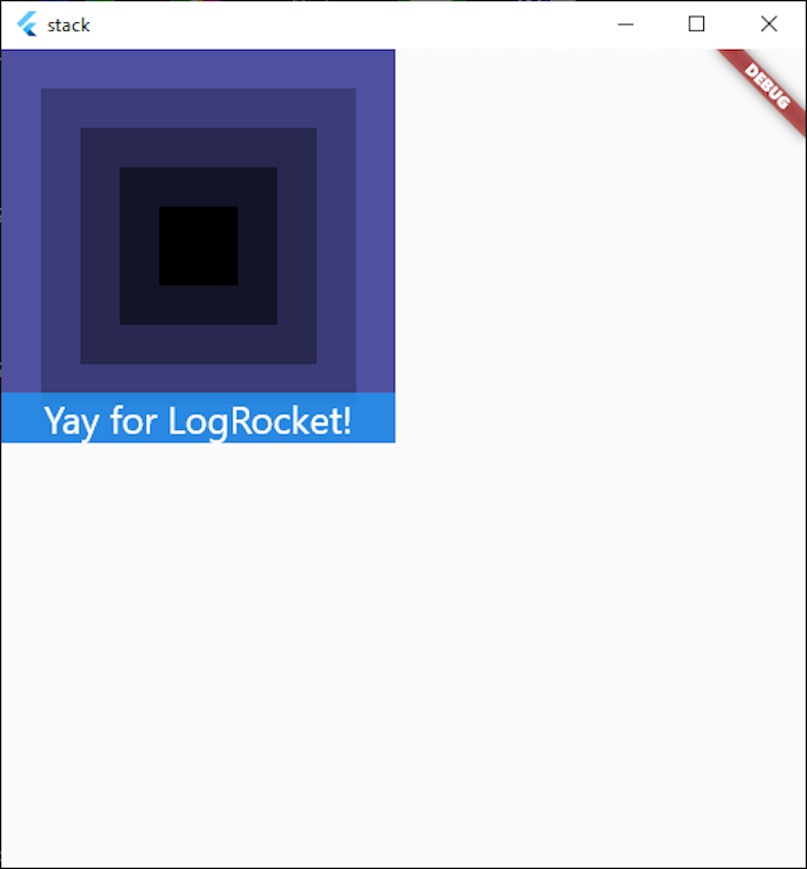
We can also position widgets within the stack itself by using Positioned. If we add a Container with a blue background, place some text in it, and position it at the bottom center, the widget lays out accordingly within the bounds of the Stack.
Our code then becomes this:
  Widget build(BuildContext context) {
    return Scaffold(
      body: Stack(
        alignment: Alignment.center, // Center children in the Stack
        children: [
          ...List.generate(
            5,
            (index) => Container(
              width: index * 50 + 50,
              height: index * 50 + 50,
              color: Color.fromRGBO(index * 20, index * 20, index * 40, 1.0),
            ),
          ).reversed,
          // The second child positions the container at the very bottom
          // of the parent Stack.
          Positioned(
            left: 0,
            right: 0,
            bottom: 0,
            child: Container(
              color: Colors.blue.withOpacity(0.8),
              child: Text(
                "Yay for LogRocket!",
                textAlign: TextAlign.center,
                style: Theme.of(context).textTheme.headline5!.copyWith(
                      color: Colors.white,
                    ),
              ),
            ),
          )
        ],
      ),
    );
  }
This gives us the following result, where the children within the Stack are centered, and our Container is aligned to the very bottom, as per the padding we specified in the left, top, and right parameters.
A complete demo of the code used to lay out the above Stack can be found here.
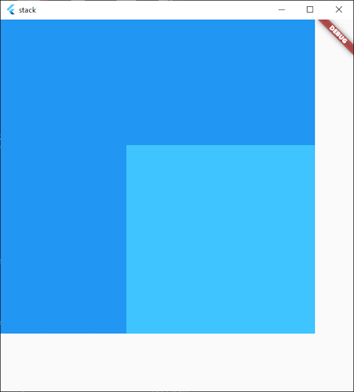
We can also use Stack to accomplish some great-looking layouts of our application without using the lower-level drawing functions.
We can do this by positioning our widgets outside of our Stack by using a Position widget, and then specifying a negative number for the appropriate direction (such as bottom or right).
If we place a container outside of the Stack, we can see that the Stack clips our overflowing widget by default.
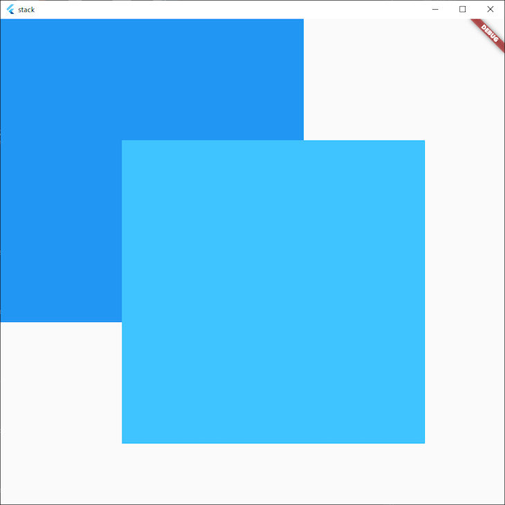
We can also tell our Stack not to clip the overflowing widgets by specifying clipBehaviour: Clip.none, in case we want the widgets to continue rendering outside the bounds of the Stack.
Stack usagesIt’s great to see colored boxes on top of each other, but when would we actually use a Stack in your Flutter app?
Stacking widgets on top of each other has a variety of usages, but two main areas where they are used are when specifying a widget’s position within a container or showing another widget that must be in the foreground.
To demonstrate this, let’s make an app that shows us pictures of cats and gives us the option to add or remove them from our favorites. It will also always show us the total of how many cats we have in our favorites list.
Here’s what the finished product looks like:
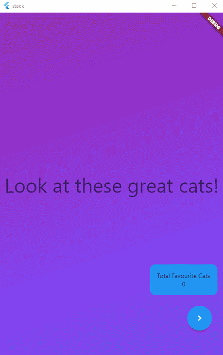
Our app above has a Stack that contains both a PageView and a Container. The PageView contains five pictures of cats and a styled cover sheet while the Container shows how many favorited cats there are, and gives the user the option of clicking next instead of swiping.
The Container is also nested within a Positioned widget to make it appear down the bottom right of the screen. It also has the appropriate padding, so when the SnackBar shows, it doesn’t overlap the buttons.
As we can see, the two buttons and the total amount of cats that we favorited remain visible even when we interact with the PageView directly underneath:
Stack(
        children: [
          PageView(
            onPageChanged: (page) {
              setState(() {
                showFavouriteButton = page > 0;
              });
            },
            controller: _controller,
            children: [
              Container(
                decoration: BoxDecoration(
                    gradient: LinearGradient(
                  begin: Alignment.topLeft,
                  end: Alignment.bottomCenter,
                  colors: [
                    Colors.purple,
                    Colors.deepPurpleAccent,
                  ],
                )),
                child: Center(
                    child: Text(
                  "Look at these great cats!",
                  style: Theme.of(context).textTheme.headline3,
                )),
              ),
              ...catImages.map(
                (e) => Image.network(
                  e,
                ),
              )
            ],
          ),
          Positioned(
            bottom: 50,
            right: 0,
            child: Column(
              children: [
                Padding(
                  padding: const EdgeInsets.all(16.0),
                  child: Container(
                    padding: EdgeInsets.all(16),
                    decoration: BoxDecoration(borderRadius: BorderRadius.circular(12), color: Colors.blue),
                    child: Column(
                      children: [
                        Text("Total Favourite Cats"),
                        Text(
                          favourites.length.toString(),
                        ),
                      ],
                    ),
                  ),
                ),
                Row(
                  children: [
                    Padding(
                      padding: const EdgeInsets.all(8.0),
                      child: AnimatedOpacity(
                        duration: Duration(milliseconds: 500),
                        opacity: showFavouriteButton ? 1 : 0,
                        child: FloatingActionButton(
                          onPressed: () {
                            setState(() {
                              if (favourites.contains(catImages[_controller.page!.floor() - 1])) {
                                favourites.remove(catImages[_controller.page!.floor() - 1]);
                                ScaffoldMessenger.of(context).showSnackBar(
                                  SnackBar(
                                    content: Text("You removed this cat from your favorites."),
                                  ),
                                );
                              } else {
                                favourites.add(catImages[_controller.page!.floor() - 1]);
                                ScaffoldMessenger.of(context).showSnackBar(
                                  SnackBar(
                                    content: Text("You added this cat to your favorites."),
                                  ),
                                );
                              }
                            });
                          },
                          child: Icon(Icons.favorite),
                        ),
                      ),
                    ),
                    Padding(
                      padding: const EdgeInsets.all(8.0),
                      child: FloatingActionButton(
                        onPressed: () {
                          _controller.nextPage(duration: Duration(milliseconds: 500), curve: Curves.fastOutSlowIn);
                        },
                        child: Icon(Icons.navigate_next),
                      ),
                    )
                  ],
                ),
              ],
            ),
          )
        ],
      ),
We also see that the widgets in the foreground, like the buttons and the favorites counter, respond to the tap events and don’t pass them through to the widgets underneath.
Where there are no widgets in the foreground, our touch events pass through to the PageView behind.
You can view the full code for this project here.
IndexedStackA close relative to the Stack widget is the IndexedStack widget. This widget is the same as the Stack widget, but it allows us to specify what item in the Stack we actually want to show.
This makes it a great fit for apps where we want to show one widget at a time, as it maintains the state for each child.
If we have an app that has a home screen, a settings screen, and a favorites screen, we can set the current widget to show in our setState method and easily change between widgets as we need.
The Stack widget is an essential widget in any Flutter developers’ toolkit, and I hope this article has helped you get started with it 🙌.
Install LogRocket via npm or script tag. LogRocket.init() must be called client-side, not
server-side
$ npm i --save logrocket

// Code:

import LogRocket from 'logrocket';
LogRocket.init('app/id');
// Add to your HTML:

<script src="https://cdn.lr-ingest.com/LogRocket.min.js"></script>
<script>window.LogRocket && window.LogRocket.init('app/id');</script>

Write agent-friendly API documentation with OpenAPI, clear schemas, workflow guidance, and llms.txt for safer AI automation.
Local AI proxy tutorial for detecting, masking, and rehydrating PII before prompts reach cloud LLMs.

Learn how Graph RAG uses connected knowledge structures to improve retrieval beyond simple text similarity.
Learn how sibling-index() enables clean, JavaScript-free stagger animations using native CSS.
Hey there, want to help make our blog better?
Join LogRocket’s Content Advisory Board. You’ll help inform the type of content we create and get access to exclusive meetups, social accreditation, and swag.
Sign up now

 Learn more →
