In this article, we’ll see how to build responsive layouts in React Native, and build on that knowledge to build a split view mail application while relying on a library from Shopify called Restyle.

To follow along with this tutorial, you’ll need:
To get started with building our React Native application, install the Expo CLI globally.
yarn global add expo-cli
Run the following commands to create a new React Native project, which we’ll call ResponsiveProject.
expo init ResponsiveProject
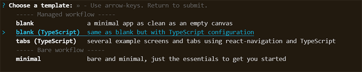
After initializing the project, we have a few key choices to make here. The Restyle library that we’ll be using in this project provides a type-enforced system for building UI components in React Native with TypeScript. As such, my preference is to use TypeScript for this project for the overall type safety that it enforces as we build out the theme of our project.
For readers that aren’t familiar with TypeScript but are familiar with JavaScript, I encourage you to read on, as we will not be diving too deeply into TypeScript in this project.
cd ResponsiveProject
yarn start
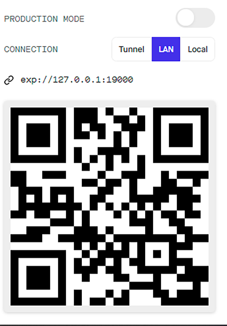
Install the Expo client app on your iOS or Android phone and make sure your phone and computer are connected to the same wireless network.
On Android, use the Expo app to scan the QR code from the terminal and on iOS, use the inbuilt QR code scanner in the Camera app.
The Restyle library draws upon Styled System by offering theming (such as light and dark modes) and works off React Native’s default styling.
With Restyle, we can create UI libraries in React Native. The theme we create is connected to a component’s styles by their props, allowing consumers of the UI library to alter the styles of their components easily using these “utility-style props”. The props are easy to make responsive according to breakpoints set in the theme.
Setting up Restyle is quite simple. First, install the library into our project, ResponsiveProject.
yarn add @shopify/restyle
Copy and run the commands below to create an src folder in our root directory. Within the src folder, create a components folder to hold our index.ts and Theme.ts files in the components directory.
mkdir src
mkdir src/components
touch src/components/index.ts
touch src/components/Theme.ts
Open up the Theme.ts file in our components folder, and here, create our custom theme. The Restyle library comes with predefined functions to create both Box and Text components.
code src/components/Theme.ts
In Theme.ts, we are going to define our global theme object. It specifies set values for spacing, colors, and breakpoints.
TypeScript enforces the marginTop property to only accept margins that have been defined in our theme. When using our Restyle components, we can write marginTop="xl" to use the named spacing specified in our theme. If we want to customize our spacing, we can do it as I’ve outlined in the below code block.
import {
  BaseTheme,
  createBox,
  createText,
  createTheme,
  useTheme as useReTheme,
} from "@shopify/restyle";

export const theme: BaseTheme = createTheme({
  colors: {
    secondary: "#2CB9B0",
    text: "rgba(12,12,52,0.5)",
    white: "#F0F2F3",
  },
  spacing: {
    s: 8,
    m: 16,
    l: 24,
    xl: 75,
  },
  borderRadii: {
    s: 4,
    m: 10,
    l: 25,
    xl: 75,
  },
 breakpoints: {
    phone: 0,
    tablet: 768
   },
 textVariants: {
    hero: {
      fontSize: 80,
      lineHeight: 80,
      color: "white",
      textAlign: "center",
    },
     title1: {
      fontSize: 24,
      lineHeight: 30,
      color: "text",
    },
    body: {
      fontSize: 16,
      lineHeight: 24,
      color: "text",
    },
  },
});

export type Theme = typeof theme;
export const Text = createText<Theme>();
export const Box = createBox<Theme>();
export const useTheme = () => useReTheme<Theme>();
Open up the index.ts file in our components folder and export our theme.
export { Text, Box, useTheme} from "./Theme";
If you decide not to use TypeScript, you can remove the export type and the theme should work in vanilla JavaScript. But as we mentioned earlier, it’s highly recommended to use TypeScript with the Restyle library.
Install the following packages:
react-native-safe-area-context: provides a flexible way to handle safe areas in our mobile appreact-navigation/native: used to create a navigation structure in our mobile applicationreact-navigation/stack: provides a way for our app to transition between screens where each new screen is placed on top of a stackreact-navigation/drawer: This is a component that renders a navigation drawer that can be opened and closed via gesturesyarn add @react-navigation/native @react-navigation/stack @react-navigation/drawer react-native-screens react-native-safe-area-context react-native-reanimated
In our App.tsx file, we wrap the application in the ThemeProvider component. The theme we create will be passed to a ThemeProvider at the top of our React tree:
import * as React from "react";
import { ThemeProvider } from "@shopify/restyle";
import { SafeAreaProvider } from "react-native-safe-area-context";
import { createStackNavigator } from "@react-navigation/stack";
import { NavigationContainer } from "@react-navigation/native";
import {
  HomeNavigator,
} from "./src/Home";
import { theme } from "./src/components/Theme";
const AppStack = createStackNavigator();

export default function App() {
  return (
      <ThemeProvider theme={theme}>
            <SafeAreaProvider>
              <NavigationContainer>
                    <AppStack.Navigator
                screenOptions={{
                    headerMode: "screen",
                    headerShown: false,
                 }}
                    >
                <AppStack.Screen name="Home" component={HomeNavigator} />
                    </AppStack.Navigator>
            </NavigationContainer>
          </SafeAreaProvider>
 </ThemeProvider>
  );
}
In this section, we’ll rely on breakpoints to build our responsive components. Breakpoints in React Native and Restyle are minimum widths for different target screen sizes where we desire to apply differing styles.
Using breakpoints, we can specify different styles for different screen sizes. To demonstrate this, we are going to create an example card that maintains styling on both widescreen devices and mobile screens.
In the src directory, create a folder called Home.
mkdir src/Home
In the Home folder, create an index.tsx file and input the code block below.
touch src/Home/index.tsx
code src/Home/index.tsx
import * as React from "react";
import { createDrawerNavigator } from "@react-navigation/drawer";
import HomeScreen from "./HomeScreen";

const Drawer = createDrawerNavigator();
export const HomeNavigator = () => (
  <Drawer.Navigator
    screenOptions={{
      headerShown: true,
    }}
    initialRouteName="Home"
  >
    <Drawer.Screen name="Home" component={HomeScreen} />
  </Drawer.Navigator>
);
In our Home folder, we’ll create the following:
HomeScreenindex.ts fileHomeScreen.tsx filemkdir src/Home/HomeScreen touch src/Home/HomeScreen/index.ts touch src/Home/HomeScreen/HomeScreen.tsx
Open the index.ts file in our subfolder HomeScreen and export the HomeScreen component.
code src/Home/HomeScreen/index.ts
export { default } from "./HomeScreen";
Now, open up the HomeScreen.tsx file.
code src/Home/HomeScreen/HomeScreen.tsx
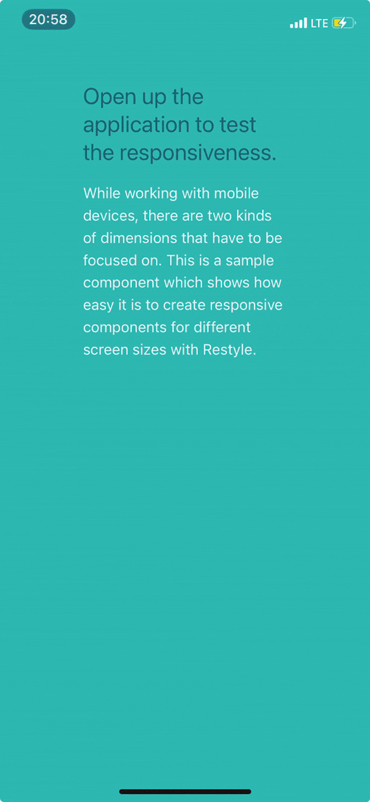
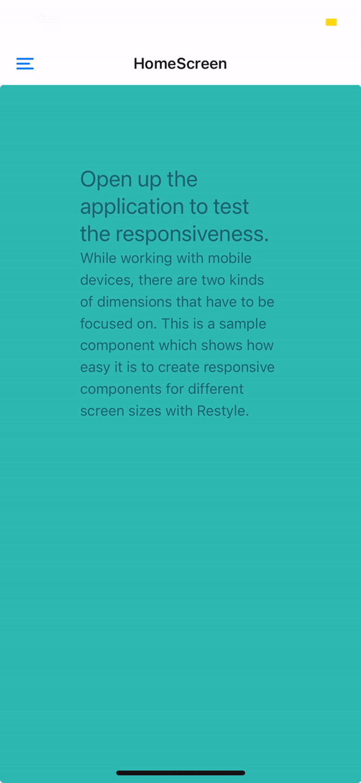
In the HomeScreen.tsx, we create a card example that will fit on widescreen devices and mobile devices.
We’ll rely on the defined breakpoints to determine whether the detected screen is a phone or tablet size. If it’s a phone, we use the justifyContent property to center the box. If the detected screen is a tablet, we select the space-around property.
import React from "react";
import { Box, Header, Text } from "../../components";

const HomeScreen = () => {
  return (
 <Box
    flex={1}
    backgroundColor="secondary"
    justifyContent={{ phone: "center", tablet: "space-around" }}
    padding="xl"
    elevation={4}
    flexDirection={{ phone: "column", tablet: "row" }}
    borderRadius="s"
 >
       <Box flex={1} alignItems="flex-start" flexWrap="wrap" margin="s">
         <Text variant="title1">
           Open up the application to test the responsiveness.
         </Text>
        <Text variant="body">While working with mobile devices, there are two kinds of dimensions that have to be focused on. This is a sample component which shows how easy it is to create responsive components for different screen sizes with Restyle.
        </Text>
      </Box>
   </Box>
)
}
export default HomeScreen;
In order to test out the responsiveness in landscape and portrait mode, we have to go into our app.json file and make some changes.
code app.json
We add a change to the orientation property in app.json.
"orientation": "portrait || landscape",
In this next section, we are going to explore some other properties of React Native that enable us to improve the responsiveness of our application.
React Native provides the useWindowDimensions Hook, which automatically updates width and height of components when the screen size changes. We can also detect the platform on which the app is launched.
To achieve this, we’ll use the Platform module.
import React from "react";
import { useWindowDimensions, Platform } from "react-native";
import Constants from "expo-constants";
import { Text } from "../../components";

const { width, height: wHeight } = useWindowDimensions();

const Container = ({children}) => {
      return (
     <Box
        height={
          wheight + (Platform.OS === "android" ? Constants.statusBarHeight : 0)
        }
        backgroundColor="primary"
      >
        <Box
            borderRadius="xl"
            borderTopLeftRadius={0}
            backgroundColor="white"
            flex={1}
            justifyContent="center"
            padding="l"
          >
            {children}
          </Box>
     </Box>
   ):
};
export default Container;
Per Apple’s Human Interface Guidelines, a split view:
manages the presentation of hierarchical content at the top level of our application. A split view can consist of a two- or three-column interface showing a primary column, and a secondary pane of content. Changes in the primary column drive changes in the secondary pane of content.
Let’s implement one. First, create a folder called navigation in our src folder and create the following three files:
index.ts filesideNav.ts fileNavigator.ts filemkdir.exe src/navigation touch src/navigation/index.ts touch src/navigation/sideNav.ts touch src/navigation/Navigator.ts code src/navigation/Navigator.ts
In the Navigator.ts file, we import the CommonActions and StackOptions objects from the @react-navigation/native library.
We use StackOptions and CommonActions to generate actions specific to stack-based navigators; StackOptions expands upon the actions available in the CommonActions reference and creates a Navigator class.
import { StackActions, CommonActions } from "@react-navigation/native";

class Navigator {
  navigator = null;
  setNavigator = (navigatorInstance: any) => {
    this.navigator = navigatorInstance;
  };
  isMounted = () => Boolean(this.navigator);
  dispatch = (action: any) => {
    this.navigator.dispatch(action);
  };
  navigate = (screenName: string, params: object) =>
    this.dispatch(CommonActions.navigate({ name: screenName, params }));
  push = (screenName: string, params: object) =>
    this.dispatch(StackActions.push(screenName, params));
}
export default Navigator;
Open up the sideNav.ts file and initialize the functions in our Navigator class.
import Navigator from "./Navigator";

export const {
  isMounted: isSideNavigatorMounted,
  push: sidePush,
  navigate: sideNavigate,
  setNavigator: setSideNavigator,
} = new Navigator();
To complete our Navigator component, we export the component.
code src/navigation/index.ts
import Navigator from "./Navigator";

export const { push, setNavigator: setIndexNavigator } = new Navigator();
In our app.tsx file, we pass our indexNavigator as a reference to our NavigationContainer from the React Native Navigation library.
import { setIndexNavigator } from "./src/navigation";
const AppStack = createStackNavigator();

export default function App() {
  return (
    <ThemeProvider theme={theme}>
      <SafeAreaProvider>
        <NavigationContainer ref={setIndexNavigator}>
          <AppStack.Navigator
            screenOptions={{
              headerMode: "screen",
              headerShown: false,
            }}
          >
            <AppStack.Screen name="Home"  component={HomeNavigator} />
          </AppStack.Navigator>
        </NavigationContainer>
      </SafeAreaProvider>
    </ThemeProvider>
  );
}
Now, we’ll move on to creating our Split.tsx component in our component folder.
We’ll do this in the src directory, which should contain a main component and a side component.
touch src/components/Split.tsx
code src/components/Split.tsx
import * as React, {ReactNode} from "react";
import { Box } from "./Theme";

interface SplitProps {
  main: ReactNode;
  side: ReactNode;
}

const Split = ({ main, side }: SplitProps) => {
  return (
    <Box style={{ flex: 1, flexDirection: "row" }}>
      <Box
        style={{
          flex: 1,
          maxWidth: 400,
          borderWidth: 1,
          borderColor: "secondary",
        }}
      >
        {main}
      </Box>
      <Box
        style={{
          flex: 1,
          overflow: "hidden",
          borderWidth: 1,
          borderColor: "text",
        }}
      >
        {side}
      </Box>
    </Box>
  );
};

export default Split;
Export the Split.tsx component from the index file of the components folder.
code src/components/index.ts
export { Text, Box, useTheme } from "./Theme";
export { default as Split } from "./Split";
The next step is the creation of our mail screens and adding some mock data. To generate mock data, we’ll use the Faker library and Lorem Ipsum Generator.
Install the Faker library and its type declarations to enable it in our TypeScript application.
yarn add faker
yarn add --dev @types/faker
Create the folder that contains our Mail components and the mock data file.
mkdir src/Mail
mkdir src/Mail/Screens
touch src/Mail/Screens/Mails.tsx
touch src/Mail/Screens/Mail.tsx
touch src/Mail/data.ts
code src/Mail/data.ts
Copy the mock data from this GitHub Gist I created, and paste it into the data.ts file.
We’ll create an enum to strongly type our navigation between the different column screens.
touch src/Mail/enums.ts
code src/Mail/enums.ts
Define our mail screen like so:
export enum MailStatus {
  MAILS_SCREEN = "MAILS",
  MAIL_SCREEN = "MAIL",
}
In our Mail folder, create a navigation.ts file and create the pushMailScreen function to control the mounting of the selected screen on the main column interface.
touch src/Mail/mailNavigation.ts
code src/Mail/mailNavigation.ts
import { isSideNavigatorMounted, sideNavigate } from "../navigation/detailsNav";
import { push } from "../navigation";
import { MailStatus } from "./enums";
interface MailNavigationProps {
  userId: string;
}
export const pushMailScreen = ({ userId }: MailNavigationProps) => {
  const args = [MailStatus.MAIL_SCREEN, { userId }];
  if (isSideNavigatorMounted()) {
    return sideNavigate(...args);
  }
  return push(...args);
};
Next, we move on to creating the screen component for our first column, which will hold the names of the email senders.
code src/Mail/Screens/Mails.tsx
import * as React from "react";
import { FlatList, Image } from "react-native";
import { TouchableOpacity } from "react-native-gesture-handler";
import { pushMailScren } from "../mailNavigation";
import { usersById, userIds } from "../data";
import { Box, Text } from "../../components";

interface MailsProps {
  userId: string;
  item: any;
}

const renderItem = ({ item: userId }: MailsProps) => {
  const { name } = usersById[userId];
  const onPress = () => pushMailScreen({ userId });

  return (
    <TouchableOpacity onPress={onPress}>
      <Box
        style={{
          flexDirection: "row",
          alignItems: "center",
          borderTopWidth: 1,
          marginBottom: 10,
          paddingTop: 10,
        }}
      >
        <Text style={{ marginLeft: 10, fontSize: 20 }}>{name}</Text>
      </Box>
    </TouchableOpacity>
  );
};
const keyExtractor = (id: string) => id;
const Mails = () => (
  <FlatList
    data={userIds}
    keyExtractor={keyExtractor}
    renderItem={renderItem}
  />
);

export default Mails;
The next step is creating the side column, which we’ll call Mail.tsx.
import * as React from "react";
import { FlatList, Image } from "react-native";
import { Box, Text } from "../../components";
import { usersById } from "../data";

interface MailProps {
  body: string;
  item: any;
  id: string;
  route: any;
}

const renderItem = ({ item: { body } }: MailProps) => (
  <Text
    style={{
      borderBottomWidth: 1,
      padding: 10,
    }}
  >
    {body}
  </Text>
);

const keyExtractor = ({ id }: MailProps) => id;

const Mail = ({ route }: MailProps) => {
   const userId = route.params === undefined ? 1 : route?.params?.userId;
  const { messages = [], name, email } = usersById[userId | 1];

  const ListHeaderComponent = () => (
    <>
      <Box
        style={{
          alignItems: "center",
          borderBottomWidth: 1,
          marginBottom: 20,
          paddingTop: 20,
        }}
      >
        <Text style={{ fontSize: 20, marginBottom: 10 }}>{name}</Text>
        <Text style={{ fontSize: 16 }}>E-mail: {email}</Text>
      </Box>
      <Text style={{ fontSize: 20, paddingLeft: 10 }}>Messages: </Text>
    </>
  );
  return (
    <FlatList
      keyExtractor={keyExtractor}
      data={messages}
      renderItem={renderItem}
      ListHeaderComponent={ListHeaderComponent}
    />
  );
};

export default Mail;
createStackNavigation functionThe next step is the creation of two stack navigators — a main stack and a side stack.
mkdir src/Mail
mkdir src/Mail/stack
touch src/Mail/stack/MainStack.tsx
touch src/Mail/stack/SideStack.tsx
code src/Mail/stack/MainStack.tsx
We’ll use @react-navigation/stack to enable us to transition between screens.
import * as React from "react";
import { createStackNavigator } from "@react-navigation/stack";
import { MailStatus } from "../enums";
import Mail from "../Screens/Mail";
import Mails from "../Screens/Mails";

const MainStack = createStackNavigator();

const screens = [
  {
    name: MailStatus.MAILS_SCREEN,
    component: Mails,
  },
  {
    name: MailStatus.MAIL_SCREEN,
    component: Mail,
  },
];

const MainMailStack = () => (
  <MainStack.Navigator initialRouteName={MailStatus.MAIL_SCREEN}>
    {screens.map((props) => (
      <MainStack.Screen key={props.name} {...props} />
    ))}
  </MainStack.Navigator>
);
export default MainMailStack;
To complete our side-column interface, we create a SideStack.tsx file.
code src/Mail/stack/SideStack.tsx
import * as React from "react";
import { createStackNavigator } from "@react-navigation/stack";
import { NavigationContainer } from "@react-navigation/native";

import { setSideNavigator } from "../../navigation/sideNav";

import Mail from "../Screens/Mail";
import { MailStatus } from "../enums";

const SideStack = createStackNavigator();

const screenProps = [
  {
    name: MailStatus.MAIL_SCREEN,
    component: Mail,
  },
];

const SideMailStack = () => (
  <NavigationContainer independent ref={setSideNavigator}>
    <SideStack.Navigator initialRouteName={MailStatus.MAIL_SCREEN}>
      {screenProps.map((props) => (
        <SideStack.Screen key={props.name} {...props} />
      ))}
    </SideStack.Navigator>
  </NavigationContainer>
);

export default SideMailStack;
The last piece of the puzzle is the MailScreen. Let’s create an index.tsx file in our Mail folder.
code src/Mail/index.tsx
import * as React from "react";
import { Split } from "../components";
import MainMailStack from "./stack/MainStack";
import SideMailStack from "./stack/SideStack";
const MailScreen = () => {
  return <Split main={<MainMailStack />} side={<SideMailStack />} />;
};
export default MailScreen;
To complete our split view email screen, open up the root file of our Home folder, import the MailScreen, and add it to our Drawer navigator.
code src/Home/index.tsx
import * as React from "react";
import { createDrawerNavigator } from "@react-navigation/drawer";
import HomeScreen from "./HomeScreen";
import MailScreen from "../Mail";

const Drawer = createDrawerNavigator();
export const HomeNavigator = () => (
  <Drawer.Navigator
    screenOptions={{
      headerShown: true,
    }}
    initialRouteName="HomeScreen"
  >
    <Drawer.Screen name="Home" component={HomeScreen} />
    <Drawer.Screen name="Mail" component={MailScreen} />
  </Drawer.Navigator>
);

Here is the final gif of our split view mail screen.
In this tutorial, we implemented a simple component that adapted its content to any screen size, showed a technique for adjusting screen width and height using the useWindowsDimensions Hook, and created a simple split view application.

LogRocket's Galileo AI watches sessions for you and and surfaces the technical and usability issues holding back your React Native apps.
LogRocket also helps you increase conversion rates and product usage by showing you exactly how users are interacting with your app. LogRocket's product analytics features surface the reasons why users don't complete a particular flow or don't adopt a new feature.
Start proactively monitoring your React Native apps — try LogRocket for free.
Hey there, want to help make our blog better?
Join LogRocket’s Content Advisory Board. You’ll help inform the type of content we create and get access to exclusive meetups, social accreditation, and swag.
Sign up now
This guide walks you through creating a web UI for an AI agent that browses, clicks, and extracts info from websites powered by Stagehand and Gemini.

This guide explores how to use Anthropic’s Claude 4 models, including Opus 4 and Sonnet 4, to build AI-powered applications.

Which AI frontend dev tool reigns supreme in July 2025? Check out our power rankings and use our interactive comparison tool to find out.

Learn how OpenAPI can automate API client generation to save time, reduce bugs, and streamline how your frontend app talks to backend APIs.

 Learn more →
