Apple’s Liquid Glass UI for iOS 26 is getting a lot of attention. Beyond the visual hype, it is also raising questions about accessibility and usability. Developers, however, are already trying to recreate the effect for the web and mobile interfaces.
On iOS, Liquid Glass is backed by a rendering engine designed to generate high-fidelity, physics-like glass patterns efficiently. Web browsers do not expose this kind of native abstraction, but we do have SVG filters, which are powerful enough to approximate the same effect.
In this tutorial, we will:
You should be comfortable with React, CSS, and basic SVG. Some familiarity with Figma will help when constructing the displacement and specular maps.
The Replay is a weekly newsletter for dev and engineering leaders.
Delivered once a week, it's your curated guide to the most important conversations around frontend dev, emerging AI tools, and the state of modern software.
Liquid Glass is a modern UI pattern introduced in iOS 26 that extends Glassmorphism with more physically plausible optical effects. At a high level, you can think of it as “glassmorphism plus refraction and reflection”:
In Apple’s examples, widgets and buttons appear to bend and distort the background along their edges, similar to how real glass or fluid materials behave:
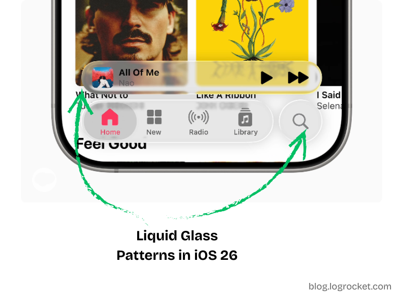
The primary visual cue is how the content behind a component appears subtly warped near its curved edges, as if light were passing through a material with a different index of refraction.
To recreate this effect in the browser, we lean on SVG filter primitives, layered composition, and some careful asset design.
Liquid Glass builds on two physical ideas:
Refraction describes how light bends when passing through a medium such as glass, water, or acrylic. When you look at objects through a glass of water, the background appears shifted or distorted. That is the effect we want on the edges of our components.
In SVG, we can simulate refraction by:
feDisplacementMap to warp the background through that mapReflection is the light that bounces off the surface of the material and reaches your eye. For glossy materials, this shows up as specular highlights along the edges or where light hits at a grazing angle.
In SVG, we can approximate this by:
Together, refraction and reflection give the element a more realistic liquid glass appearance.
We will implement Liquid Glass for a CTA button using:
@theme usage) for layout and stylingThe basic structure is:
backdrop-filter<svg> with <defs> that defines the filter pipelineWe will first scaffold the button and theme tokens, then wire in the filters.
We start by declaring some CSS custom properties using Tailwind’s @theme directive:
@theme {
  --btn-radius: 60px;
  --btn-content-bg: hsl(0 100% 100% / 15%);
  --btn-filters: blur(4px) brightness(150%);
}
These variables control:
--btn-radius: Corner radius for the button--btn-content-bg: Semi-opaque background for the content layer--btn-filters: Initial backdrop filter configurationWe will later replace the generic blur defined in --btn-filters with our Liquid Glass SVG filter.
Next, we define our component props and structure. We want:
children prop for the button label// Type definition for component props
type LiquidGlassBtnProps = React.ButtonHTMLAttributes<HTMLButtonElement> & {
children: React.ReactNode;
ref?: React.Ref<HTMLButtonElement>;
};
const BTN_WIDTH = 300;
const BTN_HEIGHT = 56;
// The liquid glass button component
export default function LiquidGlassBtn({
children,
ref,
...props
}: LiquidGlassBtnProps) {
return (
<button
ref={ref}
className="relative overflow-hidden shadow-lg w-full rounded-[--btn-radius]"
style={{
maxWidth: `${BTN_WIDTH}px`,
minHeight: `${BTN_HEIGHT}px`,
}}
{...props}
>
{/* Filter layer */}
<div className="absolute inset-0 backdrop-filter-[--btn-filters]" />
{/* Content layer */}
<div className="absolute inset-0 inline-flex items-center justify-center font-bold text-white bg-[--btn-content-bg]">
{children}
</div>
</button>
);
}
This component:
BTN_WIDTH and BTN_HEIGHTPiecing the structuring and styling together, you should get a button that looks like the following:
See the Pen
Liquid Glass Button Structure by Rahul (@rahuldotdev)
on CodePen.
The CodePen also adds drag-and-drop behavior to demonstrate how the button adapts to different backgrounds. That behavior is optional and independent of the core component.
SVG filters are defined in an <svg> element inside a <defs> block:
<svg>
  <defs>
    <filter id="...">
      <!-- Filter primitives -->
    </filter>
  </defs>
</svg>
Each <filter>:
id used later with CSS filter or backdrop-filterfeGaussianBlur, feColorMatrix, feDisplacementMap, feImage, feBlend, and feCompositein, in2, and result attributes, forming a small image processing pipelineFor example:
<svg>
  <defs>
    <filter id="blurred-and-saturated">
      <!-- Gaussian blur -->
      <feGaussianBlur
        in="SourceGraphic"
        stdDeviation="6"
        result="blurred"
      />

      <!-- Increase saturation -->
      <feColorMatrix
        in="blurred"
        type="saturate"
        values="5.4"
        result="saturated"
      />
    </filter>
  </defs>
</svg>
We will use the same pattern for Liquid Glass, combining:
The core of the refraction effect is feDisplacementMap. It warps pixels based on color channel values from a secondary image.
Key parameters:
in: Main source, often SourceGraphic or a blurred variantin2: Displacement map imagescale: Intensity of distortionxChannelSelector: Which channel (R, G, B, A) to use for horizontal displacementyChannelSelector: Which channel to use for vertical displacementColor channels are interpreted in the range [0, 255]:
128 is neutral (no displacement)128 shift pixels in a positive direction (right or down)128 shift pixels in a negative direction (left or up)To construct a usable displacement map:
BTN_WIDTH × BTN_HEIGHT).Gradient bg and wrap it in a group called Distortion.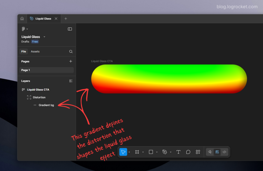
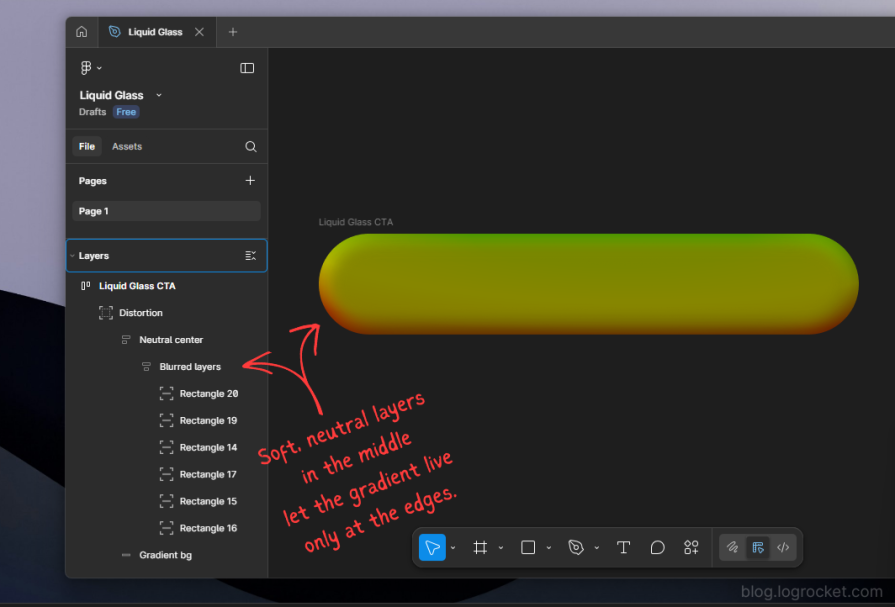
Export the entire Distortion group as a PNG. This asset becomes the displacement map, with a transparent background and a color gradient that encodes how pixels will warp:
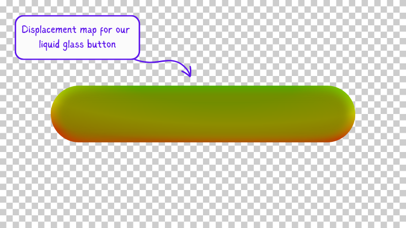
If you are feeling lost, you can follow this Figma file, which contains all the graphical elements used in this effect.
We now embed our SVG filter alongside the button component. We will:
feImagefeDisplacementMap using the blurred source and the mapfunction LiquidGlassBtn({
children,
ref,
...props
}: LiquidGlassBtnProps) {
return (
<>
<button
ref={ref}
className="relative overflow-hidden shadow-lg w-full rounded-[--btn-radius]"
style={{
maxWidth: `${BTN_WIDTH}px`,
minHeight: `${BTN_HEIGHT}px`,
}}
{...props}
>
{/* Filter layer */}
<div className="absolute inset-0 backdrop-filter-[--btn-filters]" />
{/* Content layer */}
<div className="absolute inset-0 inline-flex items-center justify-center font-bold text-white bg-[--btn-content-bg]">
{children}
</div>
</button>
{/* Hidden SVG defining the liquid glass filter */}
<svg style={{ display: "none" }}>
<defs>
<filter id="liquid-glass-button">
{/* Slight blur of the source */}
<feGaussianBlur
in="SourceGraphic"
stdDeviation="1"
result="blurred_source"
/>
{/* Displacement map image */}
<feImage
href="/path/to/displacement-map.png"
x="0"
y="0"
width={BTN_WIDTH}
height={BTN_HEIGHT}
result="displacement_map"
/>
{/* Apply displacement */}
<feDisplacementMap
in="blurred_source"
in2="displacement_map"
scale="55"
xChannelSelector="R"
yChannelSelector="G"
result="displaced"
/>
</filter>
</defs>
</svg>
</>
);
}
To apply this SVG filter as a backdrop filter, update your Tailwind theme:
@theme {
  /* Other settings... */

  --liquid-glass-filters: url(#liquid-glass-button) brightness(150%);
}
Then adjust the filter layer to use the new token:
<div className="absolute inset-0 backdrop-filter-[--liquid-glass-filters]" />
At this point, the button should start taking on a Liquid Glass character, especially when moved over complex backgrounds. You can see the refraction effect in action here:
See the Pen
Liquid Glass Refraction by Rahul (@c99rahul)
on CodePen.
Refraction alone gives us edge distortion, but Liquid Glass is also defined by its reflective rim lighting.
To approximate this:
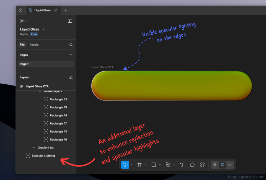
Export this as a PNG named something like specular.png. This image will be used as a mask that only affects the edges.
We extend the filter pipeline to include:
feImage)function LiquidGlassBtn({
children,
ref,
...props
}: LiquidGlassBtnProps) {
return (
<>
<button
ref={ref}
className="relative overflow-hidden shadow-lg w-full rounded-[--btn-radius]"
style={{
maxWidth: `${BTN_WIDTH}px`,
minHeight: `${BTN_HEIGHT}px`,
}}
{...props}
>
{/* Filter layer */}
<div className="absolute inset-0 backdrop-filter-[--liquid-glass-filters]" />
{/* Content layer */}
<div className="absolute inset-0 inline-flex items-center justify-center font-bold text-white bg-[--btn-content-bg]">
{children}
</div>
</button>
<svg style={{ display: "none" }}>
<defs>
<filter id="liquid-glass-button">
{/* Base blur */}
<feGaussianBlur
in="SourceGraphic"
stdDeviation="1"
result="blurred_source"
/>
{/* Displacement map */}
<feImage
href="/path/to/displacement-map.png"
x="0"
y="0"
width={BTN_WIDTH}
height={BTN_HEIGHT}
result="displacement_map"
/>
{/* Refraction */}
<feDisplacementMap
in="blurred_source"
in2="displacement_map"
scale="55"
xChannelSelector="R"
yChannelSelector="G"
result="displaced"
/>
{/* Saturate the displaced layer */}
<feColorMatrix
in="displaced"
type="saturate"
values="50"
result="displaced_saturated"
/>
{/* Specular rim image */}
<feImage
href="/path/to/specular.png"
x="0"
y="0"
width={BTN_WIDTH}
height={BTN_HEIGHT}
result="specular_layer"
/>
{/* Soften the rim */}
<feGaussianBlur
in="specular_layer"
stdDeviation="1"
result="specular_layer_blurred"
/>
{/* Mask saturated content by the blurred specular rim */}
<feComposite
in="displaced_saturated"
in2="specular_layer_blurred"
operator="in"
result="specular_saturated"
/>
{/* Final blend of refraction and reflection */}
<feBlend
in="specular_saturated"
in2="displaced"
mode="normal"
/>
</filter>
</defs>
</svg>
</>
);
}
Summary of what is happening:
feImage and feDisplacementMap create the warped background (refraction)feColorMatrix increases saturation for a stronger visual impactfeImage provides the specular edge shapefeGaussianBlur softens the rim so it looks like glow rather than a hard linefeComposite uses the rim as a mask on the saturated layerfeBlend merges the specular layer with the displaced baseThe result is a button that appears to be a piece of curved, glossy glass sitting on top of the page. You can see the full refraction plus reflection effect here:
See the Pen
Liquid Glass Refraction + Reflection by Rahul (@c99rahul)
on CodePen.
A static Liquid Glass button looks interesting, but state changes matter for usability. You can express hover, focus, and active states by slightly adjusting:
scale in feDisplacementMap for more or less distortionstdDeviationThere are two common approaches:
<animate> inside filter primitivesBecause the filter graph is already fairly complex, many teams prefer using GSAP or similar libraries to keep timing and easing logic in one place while only mutating a handful of parameters, such as scale or a CSS custom property.
An implementation of animated Liquid Glass states with GSAP is shown in the following demo:
See the Pen
Animated Liquid Glass with GSAP by Rahul (@rahuldotdev)
on CodePen.
If you just need the aesthetic and do not care about customizing the underlying maps, you can reach for a library such as rdev’s Liquid Glass for React, which wraps similar ideas in a higher-level API for buttons and card components.
Tradeoffs include the following:
This tutorial focuses on the lower-level approach so you can tune the visuals to your brand and layout.
A key constraint when working with SVG and backdrop-filter is browser support and GPU behavior.
backdrop-filter.backdrop-filter and restrict it to built-in CSS filter functions to avoid instability and excessive GPU usage.Implications include:
backdrop-filter can be expensive, especially on low-power devices. Each filter instance reserves GPU and compositing resources.From a progressive enhancement perspective, it is useful to:
Liquid Glass can be visually appealing but also risky if misused. To keep it accessible:
BTN_WIDTH and BTN_HEIGHT. Applying the same map to elements whose size changes constantly is difficult to manage and may break the visual illusion.<button> with appropriate labeling and roles.In this guide, we decomposed Apple’s Liquid Glass UI into a set of composable web primitives:
feGaussianBlur, feDisplacementMap, feImage, feColorMatrix, feComposite, and feBlendWe used these building blocks to implement a reusable Liquid Glass button in React, complete with refraction and reflection, and discussed how to animate it and integrate it responsibly into a production interface.
Liquid Glass is visually striking, but it comes with performance and accessibility costs. Restrict it to high-impact, limited surface areas, and always preserve readable content and semantic structure beneath the effect.
From here, you can:
Why the future of DX might come from the web platform itself, not more tools or frameworks.

A hands-on test of Claude Code Review across real PRs, breaking down what it flagged, what slipped through, and how the pipeline actually performs in practice.
CSS art once made frontend feel playful and accessible. Here’s why it faded as the web became more practical and prestige-driven.
Learn how inline props break React.memo, trigger unnecessary re-renders, and hurt React performance — plus how to fix them.
Hey there, want to help make our blog better?
Join LogRocket’s Content Advisory Board. You’ll help inform the type of content we create and get access to exclusive meetups, social accreditation, and swag.
Sign up now

 Learn more →
