Last quarter, my team decided to move from Mantine to Shadcn. At first, I was excited because the developer’s experience felt amazing. There was solid documentation, clean APIs, components that just worked, and shipping new features felt faster and smoother. But after a few months, the excitement began to fade. We weren’t struggling with the library itself so much as with everything around it: keeping designs consistent, trying to manage overrides, and making sure that everyone was aligned. That’s when it hit me: a great DX alone doesn’t always guarantee great product delivery.
Scrolling through r/reactjs recently, I noticed the same story playing out everywhere around Shadcn vs Mantine, or some other UI kit swap. Developers rave about how smooth Mantine or Shadcn feels, then a few months later, they’re switching kits again. I could relate; I was in that cycle myself.
While a good DX makes the day-to-day building feel easier, it doesn’t solve the harder, long-term challenges: scaling a design system, maintaining consistency, and keeping a team on the same page. Without tackling those, you just end up in the same cycle of swapping libraries, chasing new kits, burning time, and wearing down your team.
In this article, we’ll explore why good DX alone isn’t enough, what really causes design systems and component libraries to fail teams over time, and how organizations can build systems that actually scale.
The Replay is a weekly newsletter for dev and engineering leaders.
Delivered once a week, it's your curated guide to the most important conversations around frontend dev, emerging AI tools, and the state of modern software.
The term “good DX” in the context of component libraries refers to the stuff that makes our day-to-day workflow smoother. These include painless installations, solid documentations, intuitive APIs, and a theming system that doesn’t fight. It’s also a bonus point if the library has a playground to tweak props and instantly see how things behave. Those little details add up; they make you feel like the library was built with you in mind.
That was definitely my experience the first time I tried Mantine. The documentation was clean, the components were easy to drop in, and I could get something working in minutes.
When we moved over to Shadcn, I had the same feeling, but differently; this time, the flexibility in styling and the freedom to own the components felt empowering. Suddenly, I wasn’t just stuck with a fixed set of design decisions; I could shape the system around our needs.
And honestly, that’s why developers (myself included) get excited about DX. It boosts morale, and you feel productive. Also, onboarding new teammates becomes easier because they don’t have to wrestle with clunky APIs or poorly explained props. You make fewer mistakes because the library helps guide you toward the “happy path.” In short, good DX feels like having a supportive co-pilot while you code.
But here’s the catch; as I learned the hard way, that good feeling only takes you so far.
When we first moved to Shadcn, I thought the flexibility was a blessing. We could shape the components however we wanted, but that freedom came at a cost: consistency. Different teammates would implement the same button slightly differently, and before long, our UI felt fragmented. I learned quickly that multiple designers and engineers need more than just flexible components; they need shared tokens, responsive rules, and a strong agreement on style. Without that, consistency erodes fast. Let’s consider some of them below:
Maintainability was another wake-up call. It’s easy to get excited about how fast you can ship today, but what happens after a few upgrades? I’ve dealt with API changes and missing backwards compatibility that forced painful refactors. And once we started forking components to patch gaps, the hidden cost became obvious. Suddenly, we were maintaining our own shadow version of the library on top of the product itself.
Performance was a quieter issue, but just as real. A beautiful UI kit doesn’t mean much if it bloats your bundle and slows down load times, especially on mobile. I remember testing a build and realizing our slick new components were dragging down the app’s performance. No amount of “good DX” can make up for a sluggish experience.
Accessibility was another place where good DX didn’t cover us. Sure, it was easy to drop in components, but were they keyboard-friendly? Did they work with screen readers out of the box? Often, the answer was no. And fixing that usually meant rolling up our sleeves and building custom workarounds.
Theming sounded like a dream at first, but while overriding styles is one thing, having a robust, predictable, scalable theming system is another. I learned that when theming isn’t well thought out, you end up hacking around the system. Those hacks that usually feel small at first pile up and create long-term pain.
What worked fine when we were a small team started to buckle as more engineers joined. Larger teams need stronger governance and clearer ownership. Without rules and guardrails, people make design decisions in isolation, and the system starts to splinter into multiple “mini systems.”
I also saw how ownership plays a huge role. Who decides how the design system evolves? How do contributions get reviewed and merged? Without a governance model, the system drifts, and everyone ends up frustrated.
Finally, even perfect documentation can’t fix cultural gaps. I’ve watched new teammates struggle, not exactly because the documentation was bad, but because the team never invested in onboarding or building a culture of using the system properly. Culture, not just code, decides whether a design system actually sticks. Safe to conclude that to really win, teams need structure, consistency, and buy-in that goes far beyond smooth APIs.

I’ve started to notice a familiar pattern: most dev teams, mine included, keep hopping from one UI kit to another, always chasing the “perfect” solution. On the surface, it looks like a technical choice: better docs, cleaner APIs, faster components. But underneath, the constant switching usually stems from deeper pressures: shifting product goals, evolving design directions, or a growing gap between what a library promises and what it actually delivers at scale.
Before jumping into a new kit, it’s worth pausing to unpack those pressures and the trade-offs quietly steering the decision. Let’s break it down:
One of the first things I noticed with UI kits is how polished they look on the surface. The documentations promise fast builds, sleek styling, and endless flexibility. And to be fair, those promises hold up in the first few sprints, but once we went deeper, the cracks showed. The things that looked easy in examples weren’t always so smooth in the real product code. That gap between promise and reality is often what pushes teams (mine included) to start looking over the fence at the next shiny kit.
When we adopted Mantine, it was perfect for our early product. Lightweight, fast, easy to ship. But as our product grew, so did the demands: more complex layouts, heavier customization, and stricter accessibility needs. Suddenly, what worked beautifully at version one didn’t scale as well. I’ve seen this happen with almost every library: what feels like a perfect fit at the beginning starts to buckle as your app matures.
Every library comes with its own trade-offs. While Mantine gave us a ton of ready-to-use components, we still hit walls when we needed deep customization. On the other hand, Shadcn gave us flexibility and ownership, but that freedom meant more responsibility for consistency. Neither approach was “wrong”, but in practice, each mismatch forced us to rethink whether we’d chosen the right tool for our product’s evolving needs.
Another curveball was changing priorities, either as a result of new leadership or new design directions, which completely shifted the requirements of the UI. I remember one quarter where the product manager wanted a new design language rolled out fast, and suddenly the system we’d invested in felt like it was working against us. This time, it wasn’t that the library was bad; it was that our priorities had moved on.
The hidden killer, though, was technical debt. Over time, small overrides piled up, forks of components started living in different corners of the codebase, and styles drifted just enough to be noticeable. Before long, we weren’t just using a library; we were propping up a Frankenstein system of patches and inconsistencies. At that point, it was tempting to just start over with something new.
And finally, fatigue. I’ve lost count of how many times I’ve heard groans about yet another breaking change, or a dependency update that forced us into hours of refactoring. Even the most enthusiastic devs will get tired of wrestling with over-engineered systems or constantly changing APIs. At some point, morale dips, and switching kits feels like the easier path, even if it isn’t.
After bouncing between multiple UI kits, I began to ask myself a bigger question: what would it take for a team to stop switching and actually commit? Because the truth is, no library is perfect. Every choice comes with trade-offs. The trick is making those trade-offs intentional instead of letting them blindside you later. For me, it started with being really clear about our goals, and then there’s governance, as well as some other factors, as we’d see below:
A clear-cut goal makes it easier to weigh in on some available options and factor in their trade-offs upfront, as a good fit or not, from an informed decision standpoint. Did we care most about performance? About having a flexible theme engine? About shipping fast with ready-made components? Once we spelled those out, it was easier to decide what we were willing to compromise on instead of being surprised later by limitations.
Early on, our “design system” was a loose collection of components owned by whoever touched them last. You can imagine how that played out, lots of style drift and arguments about which button was the “real” button. Once we defined ownership and set up a lightweight process for contributions and changes, everything got calmer. Decisions stopped being personal and started being procedural.
The mindset shift that helped us the most was treating the design system like a product in its own right. That meant versioning, tracking bugs, keeping a roadmap, and even doing UX reviews of components before rolling them out. When we thought of it as “just tooling,” it always ended up neglected, but as a product, it got the care it deserved.
Adoption was another lesson. Our worst mistake was a “big bang” switch. In one sprint, we decided to rip out everything and migrate to a new kit; it was brutal. What I feel would have worked better was incremental adoption: start with one or two screens, allow fallbacks, and give people time to adjust. That’s how you build confidence without burning out the team.
Tooling and automation were lifesavers, too. Linting for consistent tokens, UI tests, and even visual regression tests, they caught issues early and kept us honest. Combine that with solid documentation, proper training, and internal champions who advocated for the system, and the friction began to disappear.
The balance, I’ve learned, is protecting consistency without strangling flexibility. With clear tokens, predictable APIs, and rules for when it’s okay to go custom, teams can innovate without tearing the system apart. That’s the sweet spot: not chasing the mythical “perfect DX,” but building something sustainable that grows with the team instead of wearing them down.
Finally, feedback loops became the glue. We made a point to ask devs, designers, and QA about pain points regularly. We tracked metrics like “how long does it take to build a new screen?” or “how many overrides are we seeing?” Those numbers told us when something was slipping.
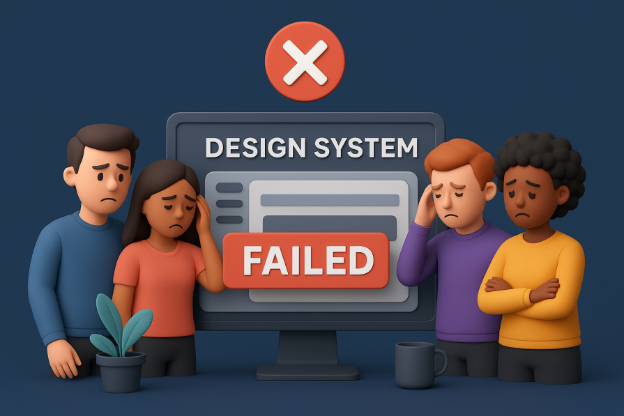
Over time, I started to notice that design systems don’t fail overnight. They usually give you signals, quiet warnings that things are going off the rails. I’ve seen them firsthand, and they all point to the same conclusion: the system isn’t working the way it should. Some of these signals include, but are not limited to:
The first red flag for me was duplication. When I started seeing multiple versions of the same component floating around (i.e. three different buttons, two slightly different modals) it was clear the system wasn’t doing its job. A healthy system should reduce duplication, not multiply it.
Another big sign was the rise of one-off styles. Every time we needed to tweak something, someone added an override or patched the CSS in a local file. At first, it seemed harmless, just one more exception, but soon those exceptions became the rule, and we were drowning in inconsistent patterns.
I also saw how the system impacted new hires. If a new developer or designer struggled for weeks just to understand which components to use (or when not to use them), that was a pretty loud signal that the system wasn’t intuitive. A good system should accelerate onboarding, not slow it down.
Then came the technical headaches: breaking changes, unexpected regressions, or performance drops after updates. I remember shipping a minor release and watching our app’s load time spike because of one bloated dependency in the library. That kind of fragility makes teams lose confidence fast.
Nothing drove me crazier than opening our product and seeing three different button styles in three different places. Spacing off here, typography mismatched there, it didn’t matter how good the individual components were if the overall product felt stitched together. That’s a clear sign the system isn’t enforcing cohesion.
And finally, the killer metric: adoption. If teams are consistently bypassing the system and rolling their own components, it means they don’t see value in it. I’ve been on teams where the design system was technically “there,” but nobody actually used it, which made it dead weight instead of an asset.
Looking back, I realize that good DX was never the whole story. While it provided speed, comfort, and momentum in the short term, it didn’t solve the deeper issues that actually make or break a design system. Consistency, governance, performance, accessibility, those were the things that decided whether the system scaled with the product or collapsed under its own weight.
If you’re in the middle of yet another library switch, or feeling the pull toward the “next shiny kit,” I’d encourage you to pause and run an audit of your current system.
Ask the tough questions: where are the trade-offs, what matters most to our team, and what’s non-negotiable? Make those decisions explicit and commit to them, even when the temptation of an easier DX pops up on X or Reddit.
For me, the biggest shift is investing in product delivery. That’s where the real payoff is, not just how quickly I can drop in a button, but how reliably the entire team can deliver consistent, accessible, performant features over the long haul.
So here’s the question I’ll leave you with: are you investing in your team’s product delivery, or just their day-to-day comfort?

Learn how inline props break React.memo, trigger unnecessary re-renders, and hurt React performance — plus how to fix them.
This article showcases a curated list of open source mobile applications for Flutter that will make your development learning journey faster.
Discover what’s new in The Replay, LogRocket’s newsletter for dev and engineering leaders, in the April 1st issue.
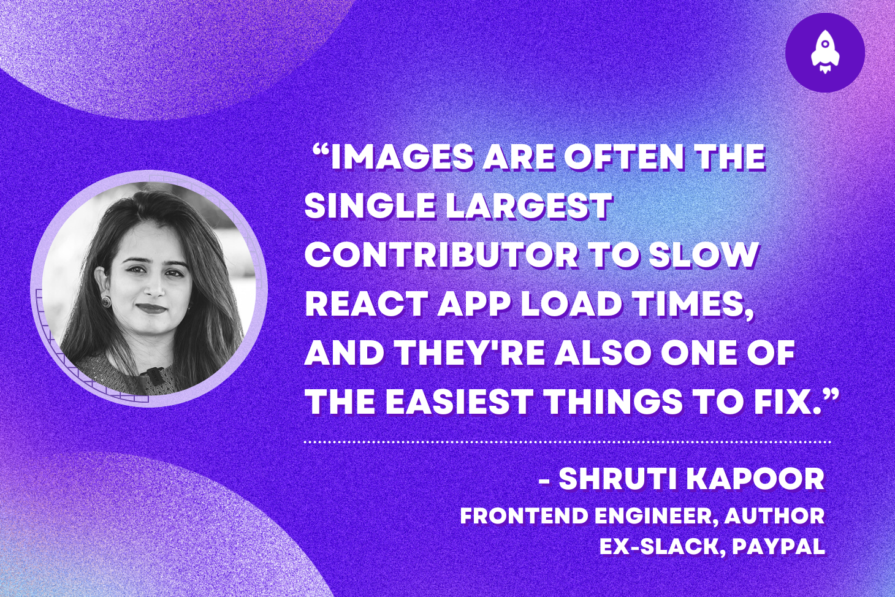
This post walks through a complete six-step image optimization strategy for React apps, demonstrating how the right combination of compression, CDN delivery, modern formats, and caching can slash LCP from 8.8 seconds to just 1.22 seconds.
Would you be interested in joining LogRocket's developer community?
Join LogRocket’s Content Advisory Board. You’ll help inform the type of content we create and get access to exclusive meetups, social accreditation, and swag.
Sign up now

 Learn more →
