The FullScreen API allows you to make an element on your page have a full-screen view. Normally, you see this in use with different graphical or media resources — for example, videos or images — but you can actually make any element on your page have a full-screen view.

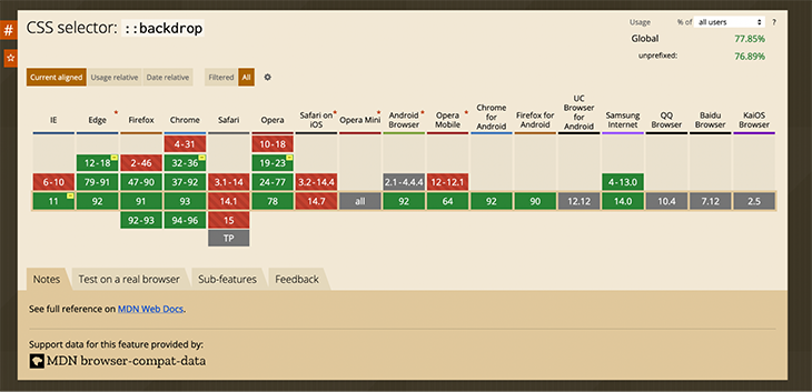
The FullScreen API is currently well supported in Chrome, Firefox, Opera, and Edge. There is supposed to be partial support in Safari using vendor prefixes, but I have not attempted to make that work.

If you need cross-platform support for the FullScreen API, there are a number of them out there, such as fscreen or screenfull. There is also a React Hooks implementation and a higher-order component that makes children into full-screenable areas.
But this article will solely focus on using the specified FullScreen API, so you should be aware that things are only going to work in the listed browsers.
The Replay is a weekly newsletter for dev and engineering leaders.
Delivered once a week, it's your curated guide to the most important conversations around frontend dev, emerging AI tools, and the state of modern software.
To enable a full-screen view on a user’s browser, you will first need to ask for permission to do so with the Element.requestFullScreen function. This is not the same as requesting access to location data — the browser determines if the request is accepted basically by determining whether the user has performed a specific action to approve or deny full-screen access, like clicking an Allow button.
If a user wants to exit the full-screen view, they can use all the ways they normally use to exit a full-screen window, as well as pressing the escape key, assuming they are in an environment that provides them with one.
Now, let’s move on to some examples.
The FullScreen API is most commonly used to embiggen images and videos, but each of them has their own little issues to consider, so I will start us off with something simpler: an HTML5 section with a button to turn the section into a full-screen view.
See the Pen
full screen section by Bryan Rasmussen (@bryanrasmussen)
on CodePen.
My button styling in the example is reused from the LogRocket CSS Reference Guide to button styling.
The page looks sort of like the following:

When you click the Fullscreen button, it toggles the full-screen view for the section with the text “More Info Available in Full Screen Mode …”
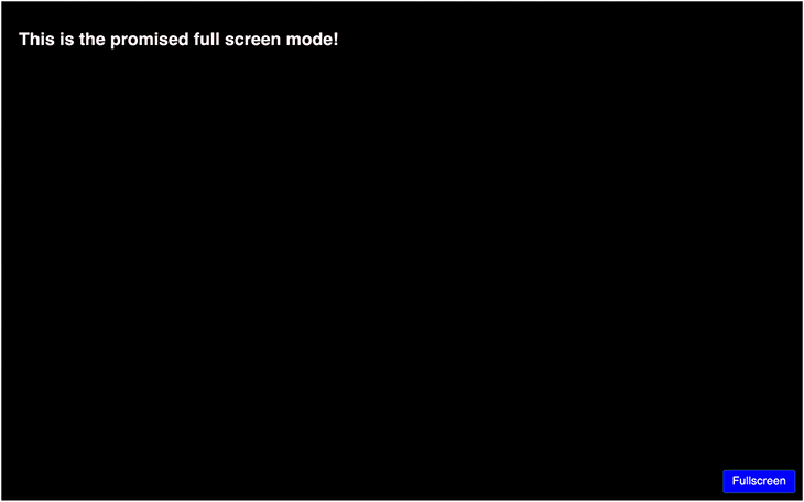
The full screen looks like this (the white border is still there, it’s just at the edge of the screen).

The text is different here because we have used the :fullscreen pseudo selector to switch the H2 text that reads “More Info Available in Full Screen Mode …” to display:none with another H2 text that reads “This is the promised full screen mode!” from display:none to display:block.
Take a look at this in the below code snippet:
.fullscreenMoreInfo {
  display: none;
}

.fullscreenEnabled:fullscreen
.fullscreenintro{
  display: none;
}

.fullscreenEnabled:fullscreen .fullscreenMoreInfo {
  display: block;
}
The thing to note here is that the :fullscreen pseudo selector has to be applied on the element that has been switched to full-screen mode; in this case, it’s the section with the class fullscreenEnabled.
There is also another potential pseudo selector that the FullScreen API specifies: the ::backdrop selector.

This is used for styling the rest of the content on the page that is not in the :fullscreenEnabled element. Now, you’re probably asking yourself, what? And why?
One potential use is to put a background color on the backdrop, which can then affect the full-screen display. MDN has an example of this with a fullscreen video element.
Another more important usage would be meeting accessibility requirements for the backdrop; however, this does not currently work. We’ll discuss this later in this document, in the section on using the FullScreen API with images.
The :fullscreen element is very similar to dialogs and modal windows in that it separates content from the rest of the page to place emphasis on it.
Naturally, it would be logical to make a modal-like use of the technique, and to do so, I will be reusing some of the code from the Pure CSS Lightbox from MDN for the Close button.
First, I will change some of the logic around click handlers, as I will want both a button to open the modal, and a button inside the modal to close it.
Take a look at the code below:
See the Pen
full screen Modal by Bryan Rasmussen (@bryanrasmussen)
on CodePen.
Our changes are mainly small ones, to add the makeFullScreen function to multiple elements (since it closes the :fullscreen element, if there is one, we can use it for our modal closer as well), and to add a keydown handler for the event key, like this:
const  buttons = document.querySelectorAll(".fullscreener");
buttons.forEach( (button) => {
  button.addEventListener("click", () => {
   makeFullScreen(document.querySelector(".fullscreenEnabled"))
  });
  button.addEventListener('keydown', (e) => {
    if (e.key === "Enter") {
    makeFullScreen(fullScreenEnabledEl);
    }
  });
});
Then we’ll add some structure in the modal area to enable nicer styling of our modal, including some focus styles for the modal opening button and the close button.
This is what it looks like with the modal closed:

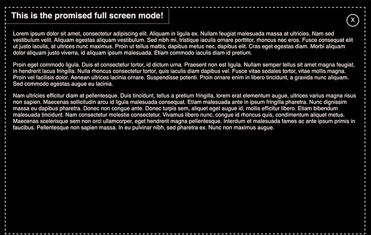
And this is what it looks like when the modal is shown:

For accessibility purposes, it was tested with VoiceOver and keyboard navigation in Firefox. Obviously, as this is a proof of concept, and written inside of CodePen’s nested frames, there may be accessibility issues on other browser/screen reader combinations.
As we mentioned before, there are basically two common uses for the :fullscreen element that people focus on, these being the ability to give either a video or an image a full-screen view.
I’ve decided not to make a full-screen video example, as to make a pleasing one would require too many parts for me to do it justice as a minor part of this article. Instead, I will focus on the image, as I believe we can make some interesting additions to it.
In this example, I have some images laid out in a grid. In order for the images to be worth looking at in a full-screen view, I’ve used some examples from Little Nemo downloaded from the Internet Archive.
Here is the example grid:
See the Pen
Images Grid by Bryan Rasmussen (@bryanrasmussen)
on CodePen.
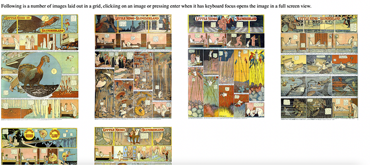
The first line of images looks something like the following:

We’re doing a similar thing with our makeFullScreen function as we did before: each image is inside a span with a button role for accessibility and the class fullscreenEnabled. We add click and keydown event handlers to our spans and make the span itself full-screen.
The reason for this is in our CSS for the full-screen span and its child image, which allows us to scroll through the image in all its full-screen glory.
span:fullscreen {
  overflow: auto;
}

span:fullscreen img {
  object-fit: contain;
  border: 0;
}
This is of course because if the image is full-screen, it will be shrunk to fit into whatever screen you are viewing it on (assuming that the screen area is smaller than the image) whereas if the element wrapping the image is full screen we can allow it overflow and then the user can scroll through the image as they wish.
For accessibility purposes, rather than putting an aria-label attribute on each span and telling the user they can click to view it in full-screen mode, which may seem overly verbose, we added a notice above in a paragraph.
However, this is not the only accessibility problem that you might encounter with this solution. If you are using a screen reader, how does it handle the parts of the page that are not shown in the full screen view, or, in other words, remain in the backdrop?
In the FullScreen API specification, it says the following about the backdrop:
“The ::backdrop pseudo-element can be used to create a backdrop that hides the underlying document for an element in a top layer (such as an element that is displayed fullscreen).”
This implies that you should be able to do the following:
span::backdrop {
  display: none;
}
But that does not work.
In my experience using Chrome, you cannot access the backdrop content with your screen reader. You can get to the browser address bar, but you have to really try to do that.
In Firefox, however, you will end up being able to read all the content that is not in the full screen when you make an element full screen. I have entered a bug about this, but cannot at this time say what the response will be.
Currently, if you make an element full-screen, the solution for accessibility would probably be to set all elements outside of the :fullscreen element to have an aria-hidden element set to true. Hopefully, Firefox will fix this soon.
I have not tested the ::backdrop pseudo selector behavior or the accessibility of a :fullscreen element on other browsers, so be wary.
This starts out looking similar to our last example with the image grid, where you click an image and it opens in full-screen mode. In fact, aside from seeing four items in the grid now, you might think it was the same example. That is because I am using the SVG image element to embed the Little Nemo jpegs inside of the SVG.
The difference looks something like the below. There will be extra code in the final SVG, but this shows us the same image.
<div role="button"
   class="fullscreenEnabled"
>
  <svg version="1.1" xmlns="http://www.w3.org/2000/svg">
    <title>Little Nemo ThanksGiving Day Dream embedded in SVG</title>
    <image
      href="https://assets.codepen.io/1281712/little-nemo-19051126-l.jpeg"
    />
  </svg>
</div>
When you’re playing around with images embedded in SVGs, you have to consider what the actual sizes of those images are (generally, that is, if you want a good visual experience). This is because SVG has a different way of handling images that don’t fit in their container than HTML does.
When I first tried making this, it threw me for a loop because I tried to just guess at the dimensions of the image instead of calculating it, and was very far off. This created a bunch of leading blank space at the top of the SVG because the SVG parser tried to resize the image so the aspect ratios were maintained.
This led me to waste an hour or two, as I was not in the right state of mind to see where I was mistaken — so, it’s a good time to remind ourselves to figure out our dimensions with SVGs first.
The sizes of the images we embedded inside the SVG are width 1738px and height 2378px, so picking a size combination of the same aspect ratio (dropping the decimal places, of course) I chose width 250px and height 345px. So, to make everything look nice in the SVG, we can do:
.fullscreenEnabled {
  width: 250px;
  height: 345px;
}

.fullscreenEnabled > svg {
  width: 100%;
  height: 100%;
}

.fullscreenEnabled image {
  width: 100%;
  height: 100%;
}
Then we set the grid-template-columns value to follow our image width:
grid-template-columns: repeat(auto-fill, minmax(250px, 1fr));
Then we end up with something that looks like the following:

But we’re going to want to replace all of these values, so maybe we should use CSS variables, like so:
:root {
  --grid-item-width: 250px;
  --grid-item-height: 345px;
  --svg-width: 100%;
  --svg-height: 100%;
}

.fullscreenEnabled {
  width: var(--grid-item-width);
  height: var(--grid-item-height);
}

.fullscreenEnabled > svg {
  width: var(--svg-width);
  height: var(--svg-height);
}

.fullscreenEnabled image {
  width: var(--svg-width);
  height: var(--svg-height);
}
And, of course, the grid-item-width variable will be used in the grid-template-columns property.
Then, when we enable full-screen mode, we can simply do:
.fullscreenEnabled:fullscreen {
  --grid-item-width: 1738px;
  --grid-item-height: 2378px;
  --svg-width: var(--grid-item-width);
  --svg-height: var(--grid-item-height);
  overflow: auto;
}
This is because we can change the values of our variables in full-screen mode and have them be inherited the same way we might in any other class or virtual selector.
This can be seen below.
See the Pen
Images Grid With SVG by Bryan Rasmussen (@bryanrasmussen)
on CodePen.
The main benefit of the SVG in the context of the FullScreen API would be that you could then have animations and other effects inside the SVG (at a higher z-index than the image, of course) that would become visible and activated when the .fullscreenEnabled div was actually in the full-screen view.
The Fullscreen API is pretty simple, but with some creativity, you can have interesting results. We’ve seen how we can toggle the full screen for various types of elements, providing a large image view and a full-screen modal. Obviously, these examples could be extended to make full screen slideshows or similar effects.
However, there are definitely drawbacks with the Fullscreen API as currently implemented where accessibility is concerned, and one should take this into account when building a solution using it.
As web frontends get increasingly complex, resource-greedy features demand more and more from the browser. If you’re interested in monitoring and tracking client-side CPU usage, memory usage, and more for all of your users in production, try LogRocket.

LogRocket lets you replay user sessions, eliminating guesswork around why bugs happen by showing exactly what users experienced. It captures console logs, errors, network requests, and pixel-perfect DOM recordings — compatible with all frameworks.
LogRocket's Galileo AI watches sessions for you, instantly identifying and explaining user struggles with automated monitoring of your entire product experience.
Modernize how you debug web and mobile apps — start monitoring for free.

AI companies are buying developer tools as coding agents turn runtimes, package managers, and linters into strategic infrastructure.

Learn how AI-assisted development governance uses rules, agents, hooks, and protocols to help AI coding tools produce safer, more consistent code.

A step-by-step guide to building your first MCP server using Node.js, covering core concepts, tool design, and upgrading from file storage to MySQL.

Using security headers in your Next.js apps is a highly effective way to secure websites from common security threats.
Hey there, want to help make our blog better?
Join LogRocket’s Content Advisory Board. You’ll help inform the type of content we create and get access to exclusive meetups, social accreditation, and swag.
Sign up now