The web landscape has undergone a dramatic transformation in recent years. Today, building interfaces that seamlessly blend visual appeal and functionality is essential. This need for captivating experiences drives the ever-growing demand for dynamic and responsive layouts.

Compositional frameworks like React have become the go-to tools for building modern web applications. As a result, the need for layouts that adapt and interact flawlessly across devices has reached an all-time high.
In this comprehensive guide, we’ll delve into the importance of implementing dynamic panel layouts in your React applications. We’ll also explore various tools in the React ecosystem that will help you create these versatile and user-friendly interfaces.
The Replay is a weekly newsletter for dev and engineering leaders.
Delivered once a week, it's your curated guide to the most important conversations around frontend dev, emerging AI tools, and the state of modern software.
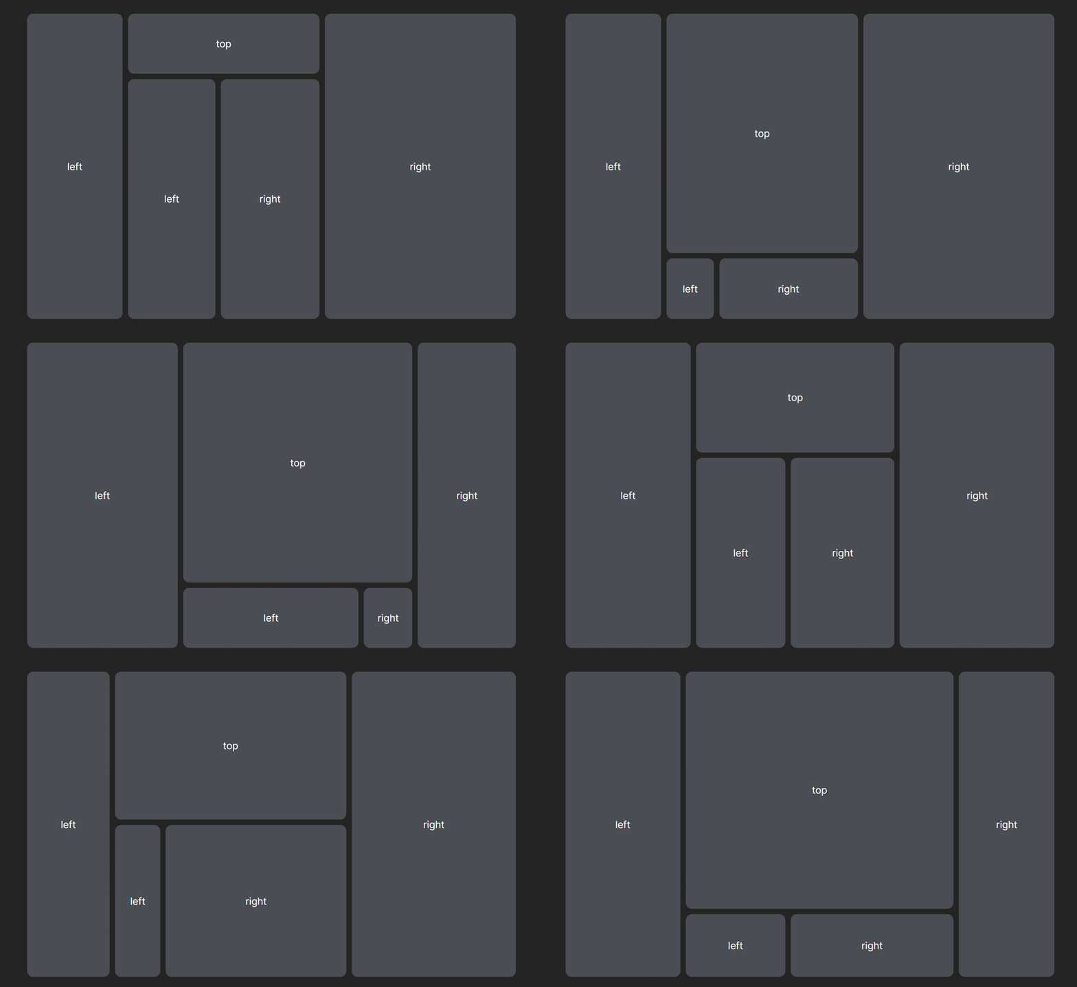
Dynamic panel layout, also known as responsive panel layout, is a responsive and flexible method of arranging user interface elements in web applications. These layouts allow components to resize, reorder, or adjust based on user interactions, creating a more dynamic and interactive experience:

Their adaptability makes them ideal for designing interfaces that adapt to different screen sizes and user preferences. This ensures usability and visual appeal across devices, from desktops to tablets and smartphones, optimizing your application’s accessibility. But the benefits of dynamic layouts go beyond just responsiveness.
Dynamic panel layouts shine in scenarios with specific layout requirements, like dashboards where information prioritization is crucial. Resizable elements, draggable components, and real-time updates can become essential tools for users to navigate and manipulate data effectively.
The ability to resize elements with precision enables users to customize screen space according to their preferences. Whether they prioritize the visibility of content, navigation, or data visualization, dynamic layouts provide the versatility to achieve their desired focus. A practical example of this is a code editor where panels resize and collapse seamlessly, adapting the view to the user’s current task:

Although these complex layout structures can significantly improve the intuitive and interactive user experience of your application, creating them from the ground up can be time-consuming, even with React’s compositional approach.
While React helps manage complexity to some extent, efficiency is often compromised. Fortunately, the React ecosystem offers tools like react-resizable-panels and react-resizable-layout, which provide pre-built components and hooks specifically designed for creating resizable panel groups and layouts, saving you development time and effort.
react-resizable-panels is an open source package that allows you to create panel group layouts that can either be resized horizontally or vertically. The package provides three primary predefined container components that let you render data in resizable panels within a group layout:
PanelGroupPanelPanelResizeHandlePanelGroupThe PanelGroup component is the primary component within the react-resizable-panels package. It is responsible for managing the behavior of a group of resizable, dynamic panels within a layout.
It acts as a wrapper around individual Panel components, providing a centralized control mechanism for resizing, maintaining the size and position of each panel, and arranging them accordingly:
<PanelGroup ... >
  ...
</PanelGroup>
Essentially, the panelGroup component creates a flexible container layout with resizable panels that can be arranged either horizontally or vertically based on the specific needs of the application. It achieves this through the use of various props, which allow you to customize and configure various aspects of the layout.
This includes the panels’ directions and styles, resizing events triggered when the group layout changes, and a custom storage API for storing and retrieving details about the resizable panels’ state, such as their size and position.
Here is a list of some of the PanelGroup properties:
direction: Sets panel’s direction (horizontal, vertical)onLayout: Triggers a callback in response to layout changesstorage: Sets a custom storage solution to save and retrieve panel states for persistent layoutsFeel free to explore the react-resizable-panels documentation for additional information about these properties.
PanelThe Panel component is the fundamental building block for creating dynamic panel layouts with react-resizable-panels. Each panel represents a distinct section of the panel layout, which is often instantiated with a container component such as the PanelGroup component. Users can interact with, resize, and rearrange these panels as needed.
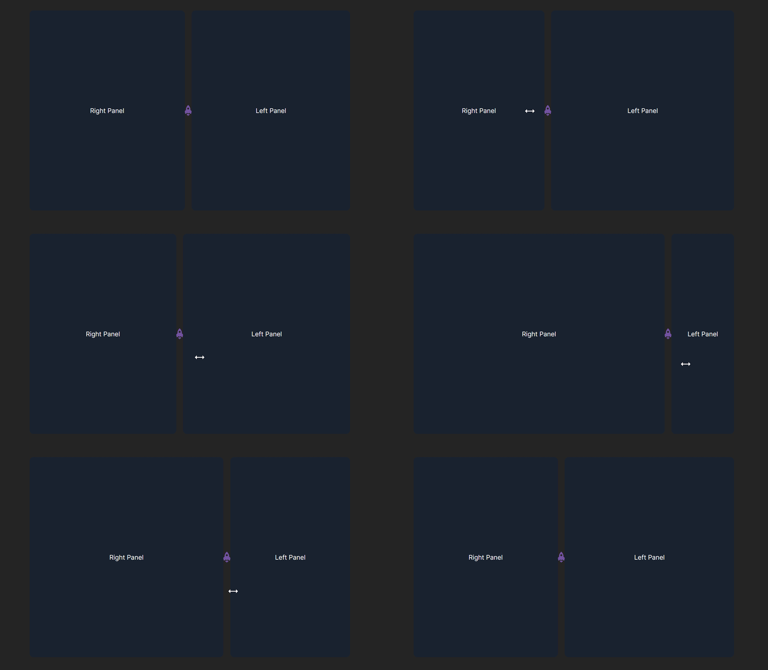
Panel components are nested within PanelGroup container components and can accommodate a variety of content types, including text, images, forms, charts, and other React components, as its children. Below is a code example of a panel layout with a 2-row PanelGroup:
<PanelGroup direction="horizontal">
  <Panel>Right Panel</Panel>
  <Panel>Left Panel</Panel>
</PanelGroup>
Just like PanelGroup, the Panel component provides props that enable you to customize the initial size, resizing constraints (such as minimum and maximum size limits), order, and event handlers that invoke callbacks upon resizing actions.
Here is a list of some of the Panel properties:
defaultSize: Defines the panel’s initial sizemaxSize: Sets the maximum size limitminSize: Sets the minimum size limitorder: Sets the panel’s sequenceonResize: Triggers a callback on resizing actionsonCollapse: Triggers a callback when panel collapsesFeel free to explore the react-resizable-panels documentation for more information about these properties.
PanelResizeHandleBy default, Panel components aren’t resizable. This is because they lack the “handlebar” that lets users grab and resize them horizontally or vertically.
That’s where the PanelResizeHandle component comes in. It adds these interactive handlebars to your dynamic panel layout, allowing users to adjust the size of individual panels.
Typically, you’ll nest the PanelResizeHandle component within a PanelGroup. Place it before or after a panel declaration to position the handlebars at the edges or corners of the panel:
<PanelGroup direction="horizontal">
  <Panel defaultSize={30} minSize={20}>
    left
  </Panel>
  <PanelResizeHandle />
  <Panel minSize={30}>middle</Panel>
  <PanelResizeHandle />
  <Panel defaultSize={30} minSize={20}>
    right
  </Panel>
</PanelGroup>;
The PanelResizeHandle component provides various properties for customizing its behavior and appearance:
hitAreaMargins: Defines the margin around the handle for easier grabbingstyle: Applies custom styles to the handle for visual branding or to match your UIdisabled: Disables the handle to prevent resizing for specific panelsonDragging: Integrates an event handler that triggers when the user drags the handle, allowing you to react to layout changes in real timeAdditionally, the PanelResizeHandle component accepts an optional children property that customizes the handle’s look and feel. This can be any arbitrary React element, i.e., any valid React element, such as JSX, or a custom component to render as the handle:

In the example above, we rendered the LogRocket starship logo icon as a custom handlebar for the panel layout.
Integrating the react-resizable-panels package into your React application is relatively straightforward. You can start using it by running either of the following commands in your terminal, within the same directory as your application:
npm install react-resizable-panels
yarn add react-resizable-panels
After installing the package, you can incorporate it into any of your project’s components by importing the highlighted components at the module’s top level, as demonstrated below:
import { Panel, PanelGroup, PanelResizeHandle } from "react-resizable-panels";
Then, you can construct the panel layout according to your preferences:
import { Panel, PanelGroup, PanelResizeHandle } from "react-resizable-panels";

function App() {

  return (
    <>
      <div className="layout">
        <PanelGroup autoSaveId="test" direction="horizontal">
          <Panel defaultSize={25} minSize={20}>
            Right Panel
          </Panel>
          <PanelResizeHandle className="handle">
            {/* custom handlebar */}
            <img className="handleLogo" src="/log.png" alt="LogRocket Logo" />
          </PanelResizeHandle>
          <Panel minSize={20}>
            Left Panel
          </Panel>
        </PanelGroup>
      </div>
    </>
  );
}

export default App;
react-resizable-layout is another excellent tool for creating dynamic panel layouts in React. This package is a lightweight alternative to the react-resizable-panels package and offers the same functionalities.
However, unlike react-resizable-panels, react-resizable-layout is headless, meaning it provides the functionality of a dynamic panel layout without any predefined UI or styles. In simpler terms, it gives you the core logic and behavior with the flexibility to build your preferred UI around it.
The package exposes two key components: the Resizable component and the useResizable Hook. Both components serve as standalone building blocks and are used individually. This versatility allows you to select the one that best aligns with your preferences and development approach.
ResizableThe Resizable component allows you to make any component resizable by wrapping it and making it its child component. However, instead of directly wrapping the component, it uses a render prop pattern.
In this pattern, the component receives its children as an object and renders them using a function:
<Resizable>
  {({ position, separatorProps }) => (
        ...
  )}
</Resizable>
The function receives an object parameter containing information about the current position of the resizable component and properties for the separator component through the position and separatorProps props.
The render function typically comprises a wrapper element containing blocks of resizable components and a custom separator positioned between the blocks. The position value is set as inline styles for the nested blocks and the separatorProps are passed as props to the custom separator component:
<Resizable>
  {({ position, separatorProps }) => (
    <div className="wrapper">
      <div className="left-block" style={{ width: position }} />
      <customSeparatorComponent {...separatorProps} />
      <div className="right-block" />
    </div>
  )}
</Resizable>
The Resizable component offers various props for customization, allowing you to control aspects such as the initial size of the component, minimum and maximum size limits, resize direction, and more. Below is a list of some of these props:
axis: Defines the resizing direction (horizontal, vertical, or both)initial: Set the starting size of your componentreverse: Flips the resizing behavior (e.g., resize left instead of right)min and max: Set size limitsstep: Defines how much the resizing jumps per actionYou can find additional information about these properties in the react-resizable-layout repository.
useResizableThe useResizable Hook offers similar functionality to the Resizable component. However, it allows you to separate concerns by encapsulating and managing the resizable logic within a React component:
const Component = () => {
  const { position, separatorProps } = useResizable();

  return (
    <div className="wrapper">
      <div className="left-block" style={{ width: position }} />
      <YourSeparatorComponent {...separatorProps} />
      <div className="right-block" />
    </div>
  )
}
This approach lets you separate the resizable logic from the render function, making it modular and reusable across various components as needed.
The useResizable Hook uses the same props as the Resizable component and is applied by passing them to the hook as properties of an object argument:
const { position, separatorProps } = useResizable({
  axis: "y",
  initial: 20,
  step: 20,
});
You can explore more information about the useResizable Hook in the react-resizable-layout repository.
To integrate react-resizable-layout into your React application, you have to install the package as a dependency using the following command:
npm i react-resizable-layout
After the installation is complete, you can start using the package by importing either of the Resizable or useResizable components and Hook at the top level of any component in your application, and put them to use using any of the highlighted methods in the previous sections:
import Resizable from 'react-resizable-layout';

<Resizable axis={'x'}>
  {({ position, separatorProps }) => (
    <div className="wrapper">
      <div className="left-block" style={{ width: position }} />
      <YourSeparatorComponent {...separatorProps} />
      <div className="right-block" />
    </div>
  )}
</Resizable>
Or
import Resizable from 'react-resizable-layout';

const Component = () => {
  const { position, separatorProps } = useResizable({
    axis: 'x',
  })

  return (
    <div className="wrapper">
      <div className="left-block" style={{ width: position }} />
      <YourSeparatorComponent {...separatorProps} />
      <div className="right-block" />
    </div>
  )
}
While react-resizable-panels and react-resizable-layout are popular choices, they represent just a fraction of the many packages available for crafting resizable layouts in the React ecosystem. This section introduces additional options you might consider when building dynamic panel layouts within your applications.
First on the list is React-Grid-Layout. This open source package offers a myriad of features that give you the flexibility of creating draggable and resizable grid layouts, making it an ideal choice for building dashboards, content management systems (CMS), and dynamic user interface layouts.
To use React-Grid-Layout in your React application, run the following command to install it as a dependency:
npm i react-grid-layout
You can find additional information about the React-Grid-Layout in the repository and documentation.
react-tabluator is an open source table library based on the Tabulator library, a powerful JavaScript data grid and table library. The package allows you to manage complex tabular data within your React application, leveraging the extensive features provided by Tabular.
To get started with react-tabular, run the following command to install and integrate it with your React applications:
npm i react-tabulator
React Sortable HOC is a popular open source package for creating draggable and re-arrangeable lists in a React application. It uses a higher-order component approach, which makes it easy to add sorting functionality to existing components.
Note: Before opting for the React Sortable HOC package, it is important to know that the package is no longer being maintained.
To start with React Sortable HOC, run the following command to install it as a dependency in your project:
npm i react-sortable-hoc
In this article, we’ve outlined some of the best tools available in the React ecosystem for creating dynamic panel layouts. These tools provide robust solutions that can significantly enhance the user experience and streamline the interface design of your React application while maintaining efficiency and effectiveness.
Many of the libraries mentioned here have garnered large user bases, as shown by their GitHub star counts and weekly npm downloads. This popularity speaks to their ability to improve productivity and meet the needs of developers working with React.
Install LogRocket via npm or script tag. LogRocket.init() must be called client-side, not
server-side
$ npm i --save logrocket

// Code:

import LogRocket from 'logrocket';
LogRocket.init('app/id');
// Add to your HTML:

<script src="https://cdn.lr-ingest.com/LogRocket.min.js"></script>
<script>window.LogRocket && window.LogRocket.init('app/id');</script>

useEffect breaks AI streaming responses in ReactSee why useEffect breaks AI streaming in React, and how moving stream state outside React fixes flicker and stale updates.

A real-world debugging session using Claude to solve a tricky Next.js UI bug, exploring how AI helps, where it struggles, and what actually fixed the issue.

CSS wasn’t built for dynamic UIs. Pretext flips the model by measuring text before rendering, enabling accurate layouts, faster performance, and better control in React apps.

Why do real-time frontends break at scale? Learn how event-driven patterns reduce drift, race conditions, and inconsistent UI state.
Would you be interested in joining LogRocket's developer community?
Join LogRocket’s Content Advisory Board. You’ll help inform the type of content we create and get access to exclusive meetups, social accreditation, and swag.
Sign up now