When designing elements for a design system or a user interface, providing the user with useful feedback is a very important consideration. The feedback can give the user a sense of focus, direction, responsiveness, progress, or completion of an action, among many other things. This is usually achieved using micro-interactions.

For a moment, let’s consider feedback that can be provided for a button element. First, when the user hovers or focuses on the button, style adjustments can be made: you could change the color or background of the button, or you could add or remove borders, outlines, and/or box shadows, etc.
While these visible changes in the appearance of the button element help to provide feedback on the state of the button, most of the time, they are not quite enough. Also, when interacting with these elements on a mobile viewport, it is very impractical to capture an element in hover state. This is where micro-interactions come into play.
In this tutorial, we will learn how to create a simple micro-interaction for the popular ripple effect to provide users with touch feedback. This effect was made popular by Google’s Material Design and can be used on virtually any kind of surface users can interact with.

To begin, let’s set some expectations for the ripple effect we intend to create. Here are some guidelines as to how the ripple should be contained within its container (i.e., the target element), its size and position, as well as its spread behavior and spread boundaries within its container.
border-box of the target element. Thus, it should not spread beyond the boundaries of its container.With the above guidelines in mind, we can proceed with a step-by-step approach to adding the ripple effect to a very typical button element.
Here is a demo of what we will be creating in this article:

Let’s begin with a very simple markup for a target element, say a button element:
<button type="button" class="btn">
  <i class="btn__icon">
    <!-- svg icon here -->
  </i>
  <span class="btn__label">Change Language</span>
</button>
In order to add the ripple effect to the above button element, we will have to first make a couple of modifications to its initial markup (layout) as follows:
.ripple class to the target element or container to effectively mark the target element as a ripple container. This allows us to control its appearance and behavior as such..ripple__inner class to this new element.Here is the new markup structure with those changes applied:
<button type="button" class="ripple btn">
  <i class="btn__icon">
    <!-- svg icon here -->
  </i>
  <span class="btn__label">Change Language</span>
  <div class="ripple__inner"></div>
</button>
The markup structure we have chosen to use doesn’t have to be followed strictly. Your design might require a slightly different or more involved markup structure.
That said, our markup structure has the following benefits:
::before and ::after pseudo-elements of the container element, making them available for use when needed. Also, the dedicated ripple layer element can be used to further scope and enhance the ripple effect.With the markup ready, we can go ahead and start writing the required styles for the ripple container and inner layer elements.
.ripple {
  z-index: 0;
  position: relative;

  & > &__inner:empty {
    top: 0;
    left: 0;
    width: 100%;
    height: 100%;
    z-index: -9999;
    overflow: hidden;
    position: absolute;

    &::after {
      content: '';
      position: absolute;
      border-radius: 50%;
      background: lighten(#000, 92.5%);

      top: var(--ripple-center-y, 0);
      left: var(--ripple-center-x, 0);
      width: var(--ripple-diameter, 0);
      height: var(--ripple-diameter, 0);
      opacity: var(--ripple-opacity, 0);
      transform: scale(var(--ripple-scale, 0));
    }
  }
}
Although the above code snippet doesn’t look like much, a lot can be said about it.
The .ripple container element has two major requirements. First, it has to be positioned so that it can serve as the containing block for its content boxes and the ripple layer as well. Second, it has to create an atomic stacking context for its content boxes.
Here, we are using z-index to create that stacking context, but you can create a stacking context by several other means.
/*
 * ============================================================
 * CREATING STACKING CONTEXT
 * ============================================================
 *
 * Here are a few style declarations that can create an atomic
 * stacking context for an element with little alterations to
 * the appearance of the element.
 *
 * For opacity, a stacking context is only created when value
 * is any valid value from 0 to 1 (not-inclusive). So you can
 * use 0.9999999 to be as close to 1 as possible.
 *
 * ============================================================
 */

element { z-index: 0 }
element { opacity: 0.9999999 }
element { perspective: 300px }
element { transform: scale(1) }
element { filter: grayscale(0) }
element { will-change: opacity }
The .ripple__inner layer element is absolutely positioned out of the normal flow and spans the full extent of the ripple container. The layer element hides all overflow to effectively provide clear boundaries for the ripple effect.
Also, the layer element creates an atomic stacking context for its content, while it is stacked just above the background (reasonably low) in the stacking context created by its containing block.
The ::after pseudo-element of the layer element creates the actual ripple effect. It is absolutely positioned, fully rounded using border-radius, and has a very light gray background created using the Sass lighten() color function.
It is important to notice that the position, dimension, opacity, and scale of the ripple effect will be set programmatically on the designated CSS custom properties.
Finally, the styles defined for the layer element only apply as long as the element is empty. The :empty pseudo-class on the layer element effectively ensures that.
At the moment, it seems as though we’ve not been able to achieve anything, but in reality, we’ve been able to successfully lay the foundation for the ripple effect. What remains now is creating the ripple effect programmatically.
Let’s start with a helper function that allows us to initialize a ripple element and get its geometric and position properties. To achieve this, we will create some kind of registry for all ripple elements using a WeakMap.
function getRippleElementProps (elem) {
  // Initialize the ripple elements registry (first call only)
  const rippleElems = new WeakMap();

  getRippleElementProps = function (elem) {
    if (elem instanceof HTMLElement) {
      if (!rippleElems.has(elem)) {
        // Get the dimensions and position of the element on the page
        const { width, height, y: top, x: left } = elem.getBoundingClientRect();
        const diameter = Math.min(width, height);
        const radius = Math.ceil(diameter / 2);

        // Configure functions to set and remove style properties
        const style = elem.style;
        const setProperty = style.setProperty.bind(style);
        const removeProperty = style.removeProperty.bind(style);

        // Function to remove multiple style properties at once
        function removeProperties (...properties) {
          properties.forEach(removeProperty);
        }

        // Set the diameter of the ripple in a custom CSS property
        setProperty('--ripple-diameter', `${diameter}px`);

        // Add the element and its geometric properties
        // to the ripple elements registry (WeakMap)
        rippleElems.set(elem, {
          animations: [],
          width, height, radius, top, left, setProperty, removeProperties
        });
      }

      // Return the geometric properties of the element
      return rippleElems.get(elem);
    }
  }

  return getRippleElementProps(elem);
}
The intent of the getRippleElementProps() function is pretty straightforward, with comments added to the body of the function to highlight the important lines.
The code snippet describes the initialization sequence to be carried out for ripple elements that have not yet been added to the rippleElems registry. The sequence of operations is as follows:
elem.getBoundingClientRect() to get the position and dimensions of the ripple element in the viewport. With these dimensions, compute the diameter and, of course, the radius of the ripple.elem.style object for setting and removing style properties for the ripple element. Create an additional removeProperties() function for removing multiple style properties for the ripple element at once.animations array (stack) to the ripple element on the rippleElems registry (WeakMap) created earlier. The animations array will be used later as a simple stack of animations for the ripple element.Please note that our logic so far does not account for changes in the dimensions or position of the ripple element at a later time. In reality, you should consider monitoring those changes and updating the properties of the ripple element in the registry.
We will utilize the concept of event delegation to attach a click event listener to the document object. This listener will be called for every click that happens in the document, even though we are only interested in clicks happening inside a ripple element.
Here are a few things we will be doing inside the event listener for every click that happens inside a ripple element:
evt.clientX and evt.clientY as well as the left and top positions of the ripple element in the document.Here is the event listener registration:
document.addEventListener('click', function _rippleClickHandler (evt) {
  // Capture clicks happening inside a ripple element
  const target = evt.target.closest('.ripple');

  if (target) {
    // Get ripple element geometric properties from registry
    const {
      width, height, radius, top, left, setProperty
    } = getRippleElementProps(target);

    // Get the half width and height of the ripple element
    const width_2 = width / 2;
    const height_2 = height / 2;

    // Get the x and y offsets of the click within the ripple element
    const x = evt.clientX - left;
    const y = evt.clientY - top;

    // Compute the scale factor using Pythagoras' theorem
    // and dividing by the ripple radius
    const scaleFactor = Math.ceil(
      Math.sqrt(
        Math.pow(width_2 + Math.abs(x - width_2), 2) +
        Math.pow(height_2 + Math.abs(y - height_2), 2)
      ) / radius
    );

    // Set the ripple center coordinates on the custom CSS properties
    // Notice the ripple radius being used for offsets
    setProperty('--ripple-center-x', `${x - radius}px`);
    setProperty('--ripple-center-y', `${y - radius}px`);

    // Run the ripple spreading animation
    runRippleAnimation(target, scaleFactor);
  }
}, false);
We have successfully registered the click event listener. However, an important piece is still missing: the runRippleAnimation() function that is supposed to animate the ripple has not yet been defined. Let’s go ahead and see how we can bring the ripple to life.
We will be defining a sequence of animations for the ripple effect in the runRippleAnimation() function. Each animation in the sequence should have these properties:
These seem like a lot to set up for each piece of animation we intend to create, and as such, we will write a createAnimation() helper function to handle that aspect for us.
In line with the animation properties we saw earlier, here is a simple createAnimation() function to assist with creating animations.
The underlying principle is that it creates a progression sequence from 0 to 1 based on the defined duration for the animation. This progression sequence can then be hooked into via an update() callback function in order to change or control the behavior of something else.
Here is an implementation of the createAnimation() function:
function createAnimation ({ duration = 300, update, done }) {
  let start =  0;
  let elapsed = 0;
  let progress = 0;
  let aborted = false;
  let animationFrameId = 0;

  // Ensure the `update` and `done` callbacks are callable functions
  done = (typeof done === 'function') ? done : function () {};
  update = (typeof update === 'function') ? update : function () {};

  // Function to effectively cancel the current animation frame
  function stopAnimation () {
    cancelAnimationFrame(animationFrameId);
    animationFrameId = 0;
  }

  // Start a new animation by requesting for an animation frame
  animationFrameId = requestAnimationFrame(
    function _animation (timestamp) {
      // Set the animation start timestamp if not set
      if (!start) start = timestamp;

      // Compute the time elapsed and the progress (0 - 1)
      elapsed = timestamp - start;
      progress = Math.min(elapsed / duration, 1);

      // Call the `update()` callback with the current progress
      update(progress);

      // Stop the animation if `.abort()` has been called
      if (aborted === true) return stopAnimation();

      // Request another animation frame until duration elapses
      if (timestamp < start + duration) {
        animationFrameId = requestAnimationFrame(_animation);
        return;
      }

      // If duration has elapsed, cancel the current animation frame
      // and call the `done()` callback
      stopAnimation();
      done();
    }
  );

  // Return an object with an `.abort()` method to stop the animation
  // Returns: Object({ abort: fn() })
  return Object.defineProperty(Object.create(null), 'abort', {
    value: function _abortAnimation () { aborted = true }
  });
}
Now that’s a lot of code for a helper function. Usually in your project, you should consider using any of the popular animation libraries to reduce a lot of boilerplate code.
That said, I am working on an animation library for orchestrating animation sequences based on the same underlying principle as with the createAnimation() function we just saw. I will be tweeting a lot about it — you should be on the lookout for it.
Glad on Twitter: “Currently working on a new #javascript library for building smooth and simple micro interactions and animations. Watch out for it.Here is something I was able to do with it:- touch ripple- svg icon animation- element size animation pic.twitter.com/SIZMfyTZJy / Twitter”
Currently working on a new #javascript library for building smooth and simple micro interactions and animations. Watch out for it.Here is something I was able to do with it:- touch ripple- svg icon animation- element size animation pic.twitter.com/SIZMfyTZJy
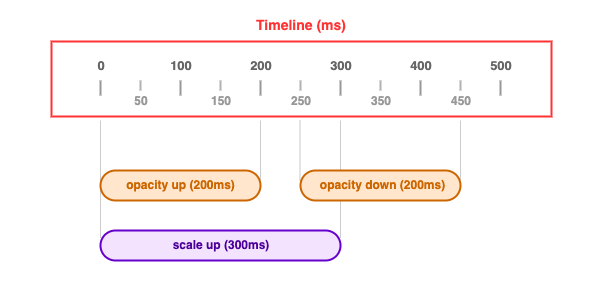
Finally, we have all the pieces we need to create our ripple animation sequence. Here is what our animation sequence will look like:

From the sequence, it can be observed that both the scale up and opacity up animations start at the same time. However, the opacity up animation finishes 100ms before the scale up animation. Also, the opacity down animation waits for at least 50ms after opacity up is complete before it begins.
Before we implement the runRippleAnimation() function, let’s answer two important questions:
.abort() method of the object returned from createAnimation() is for.progress value to add some easing to the resulting animation. For the runRippleAnimation() function, we will be using a quadratic easeOut() easing function.function easeOut (x) {
return 1 - (1 - x) * (1 - x);
}
Here comes the runRippleAnimation() function:
function runRippleAnimation (elem, scaleFactor) {
  const { animations, setProperty, removeProperties } = getRippleElementProps(elem);

  // Abort all animations in the current sequence
  while (animations.length) {
    animations.pop().abort();
  }

  // Start the "scale up" animation and add it to the animation sequence
  animations.push(createAnimation({
    duration: 300,
    update: progress => {
      setProperty('--ripple-scale', progress * scaleFactor);
    }
  }));

  // Start the "opacity up" animation and add it to the animation sequence
  animations.push(createAnimation({
    duration: 200,
    update: progress => {
      setProperty('--ripple-opacity', Math.min(1, easeOut(progress) + 0.5));
    },

    done: () => {
      // Wait for at least 50ms
      // Start the "opacity down" animation and add it to the animation sequence
      setTimeout(() => {
        animations.push(createAnimation({
          duration: 200,
          update: progress => {
            setProperty('--ripple-opacity', easeOut(1 - progress));
          },

          done: () => {
            // Remove all the properties at the end of the sequence
            removeProperties(
              '--ripple-center-x',
              '--ripple-center-y',
              '--ripple-opacity',
              '--ripple-scale'
            );
          }
        }));
      }, 50);
    }
  }));
}
Having implemented the runRippleAnimation() function, we have been able to successfully create the ripple effect from scratch. You don’t necessarily have to follow the exact animation sequence we used here. You can make a few tweaks here and there on the animations sequence and the easings as well.
You can check out the sample project I created for this article on Codepen.
See the Pen
Ripple Effect by Glad Chinda (@gladchinda)
on CodePen.
For UI components like buttons or links that users can interact with by click or touch, the ripple effect is one micro-interactions that can be used to provide feedback, helping users understand they just interacted with a component.
The styling and animation decisions that we made in creating the ripple effect in this article are cool, but they don’t have to be followed strictly.
The underlying concept used in this article to animate the ripple can be used to create different kinds of animations, ranging from the simple to the more complex. In order to reduce the amount of boilerplate code required for creating such animations, as I mentioned before, I am currently building an animation library that is based on the same concept — watch out for it.
I’m glad that you made it to the end of this article. It was a lengthy one, and I do hope it was worth the while. Like always, please remember to:
HAPPY CODING!!!
Install LogRocket via npm or script tag. LogRocket.init() must be called client-side, not
server-side
$ npm i --save logrocket

// Code:

import LogRocket from 'logrocket';
LogRocket.init('app/id');
// Add to your HTML:

<script src="https://cdn.lr-ingest.com/LogRocket.min.js"></script>
<script>window.LogRocket && window.LogRocket.init('app/id');</script>
Hey there, want to help make our blog better?
Join LogRocket’s Content Advisory Board. You’ll help inform the type of content we create and get access to exclusive meetups, social accreditation, and swag.
Sign up now
Discover how the Interface Segregation Principle (ISP) keeps your code lean, modular, and maintainable using real-world analogies and practical examples.

<selectedcontent> element improves dropdowns

Learn how to implement an advanced caching layer in a Node.js app using Valkey, a high-performance, Redis-compatible in-memory datastore.

Learn how to properly handle rejected promises in TypeScript using Angular, with tips for retry logic, typed results, and avoiding unhandled exceptions.
2 Replies to "Designing a ripple effect for UI feedback"
Thank you so much written this blog. Nice blog.
Thanks for sharing your detailed review on this article.