
daisyUI is an open source component library built on top of Tailwind CSS. It’s designed to enhance the development experience for web designers and developers.
In this adoption guide, we’ll explore the origins of daisyUI, its purpose, and how it addresses common challenges faced by frontend developers. This information should help you judge whether daisyUI is the right tool for your next project.
The Replay is a weekly newsletter for dev and engineering leaders.
Delivered once a week, it's your curated guide to the most important conversations around frontend dev, emerging AI tools, and the state of modern software.
daisyUI is a Tailwind CSS plugin that provides a collection of pre-designed components, semantic color classes, and typography enhancements. Unlike traditional UI libraries, daisyUI integrates seamlessly with Tailwind, so you can create customizable and visually appealing interfaces without sacrificing its utility-first approach.
To understand the background of daisyUI and why it was created, let’s take a brief history on the background of the library it’s built on (Tailwind) and the need to build a component library around it.
Before Tailwind CSS, developers relied on traditional libraries like Bootstrap and YUI to speed up website and web application styling during development. However, these libraries offered default styles that were difficult to override and customize.
As a result, many websites built with these tools ended up looking similar, lacking uniqueness and brand identity. This lack of flexibility encouraged developers to seek alternatives that provided more granular control over website appearance.
For this reason, Tailwind CSS was created as a utility-first library with predefined classes that lets developers design websites directly in their markup. Tailwind’s flexibility and granular control addressed the limitations of traditional libraries, but a new challenge arose: bloated markups.
While Tailwind gave developers the flexibility to create custom designs, the use of utility classes sometimes led to lengthy and repetitive markup. Styling even simple elements required multiple class names, resulting in larger HTML files. Developers needed a way to balance customization with maintainability.
Pouya Saadeghi, a software engineer from Turkey, created daisyUI with the goal of balancing two common developer concerns: maintainability and customizability. Tailwind CSS offered improved customizability over traditional UI libraries, but had limited reusability and generated excessive code, which made maintaining projects challenging.
Pouya was able to use Tailwind’s @apply directives a couple of times to combine multiple utility classes into a single class. The result was similar to how Bootstrap or other libraries work, but with the flexibility of Tailwind. So, Pouya decided to create a collection of these directives to reuse in future projects.
Using his collection of @apply directives on a couple of personal projects showed Pouya how great and efficient it was. He decided to package his collection of @apply directives alongside pre-designed components to create a component library that combined the best of both worlds: the efficiency of utility classes and the reusability of components.
And thus, daisyUI was born.
At its core, daisyUI leverages Tailwind’s @apply directives to combine basic utility classes for specific webpage elements into a single class. For example, to style a button element, daisyUI combines utility classes for padding, background color, text color, and other properties into a btn class:
.btn {
    @apply py-2 px-5 bg-violet-500 text-white font-semibold rounded-full shadow-md hover:bg-violet-700 focus:outline-none focus:ring focus:ring-violet-400 focus:ring-opacity-75;
  }
Assigning this class to a button element applies all the specified styles, with the flexibility to easily override default styles while maintaining consistency across your projects.
daisyUI uses this foundation to offer a collection of pre-designed components that can be easily customized and integrated into any project using Tailwind CSS. This further improves DX and ensures consistencies across different parts of the application.
We’ll learn more about these components later in this guide.
Adopting daisyUI as a frontend developer is a no-brainer, considering how it significantly improves DX. This is particularly advantageous if you’re already familiar with UI component libraries and styling with Tailwind utility classes.
But let’s cut through the hype – every UI library in the frontend scene seems like an obvious choice. So, how do you decide if dasiyUI is the right fit for you? The answer lies in considering its pros and cons, focusing on factors crucial for project success in both the short term and long term.
Well, there are countless reasons why daisyUI stands out among the pack. But here are a few I think make dasiyUI a compelling choice:
While daisyUI offers undeniable advantages in terms of developer experience, it’s not a one-size-fits-all solution and comes with its own set of drawbacks. Here are some of daisyUI cons you should be aware of before adopting it:
By weighing these factors and their benefits, you can make an informed decision about whether daisyUI is the right fit for your project.
daisyUI offers two fairly straightforward methods for setting it up in your projects. You can either set it up as a Node package using popular package managers like npm, pnpm, yarn, and bun, or opt to use a CDN.
There are a few things to note based on the method you choose to set up dasiyUI in your project. We’ll go over them in a bit. For now, let’s look at how you can use these methods to integrate dasiyUI into your projects.
To install daisyUI as a Node package, you need to fulfill the following prerequisites:
Once you have completed these prerequisites, you can proceed to run the following command in your project’s directory:
npm i -D daisyui@latest
If you’re not using npm, you can replace npm with your preferred package manager.
After the installation is complete, navigate to the tailwind.config.js file in your project’s directory and make the following updates:
module.exports = {
    //...
    plugins: [require('daisyui')],
 }
This will add daisyUI as a plugin to your project’s Tailwind package. With that, you can start using dasiyUI classes and components in your project.
To set up daisyUI using a CDN, simply copy the link and script tags below and paste them into the head section of your HTML file:
<link href="https://cdn.jsdelivr.net/npm/[email protected]/dist/full.min.css" rel="stylesheet" type="text/css" />

<script src="https://cdn.tailwindcss.com"></script>
That’s all you have to do install Tailwind and integrate daisyUI into your project via a CDN.
As you may have noticed earlier, when we installed daisyUI as a Node package, we included it as a plugin. However, with the CDN method, daisyUI is automatically included. This is just one of the key differences between these two installation methods.
Let’s explore some other differences between using daisyUI as a Tailwind plugin and using a CDN:
Both methods have their advantages, but using daisyUI as a plugin is more beneficial overall. The most significant advantage is the ability to purge unused styles, which the plugin approach offers but the CDN method doesn’t. That’s why the documentation recommends using the CDN method only for development to avoid excessively large file sizes in production.
As I’ve already emphasized multiple times in this guide, it’s clear that daisyUI offers a wide range of customizable prebuilt components. However, the library offers a lot more than that. Let’s look at some of the standout features that you should pay attention to when working with daisyUI.
daisyUI offers a variety of ready-made components that are essential to its feature set. These components cover a wide range of categories, from simple action components to complex data display, layout, data input, and mockup components that are essential in everyday use.
The documentation is comprehensive enough to give you in-depth knowledge about these components. However, if you want to assess the categories and functionalities of these components, let’s explore some of the component categories and the components they include.
The action category contains a collection of simple components that facilitate user interactions and trigger specific behaviors. These components include a button, modal, dropdown, swap, and theme controller components.
The structures of these components are simple enough that they can be created by simply adding daisyUI utility classes to element declarations instead of copying them from the documentation.
Take the button component, for instance. At the base level, it’s styled with just the btn utility class. Instead of going back and forth to the documentation, you can simply declare a button element and assign the required utility class:
<button className="btn">Button</button>
To create different variants of the button component, you can assign any of the following utility classes:
<button className="btn btn-active">Default</button>
<button className="btn btn-active btn-neutral">Neutral</button>
<button className="btn btn-active btn-primary">Primary</button>
<button className="btn btn-active btn-secondary">Secondary</button>
<button className="btn btn-active btn-accent">Accent</button>
<button className="btn btn-active btn-ghost">Ghost</button>
<button className="btn btn-active btn-link">Link</button>
Here’s how each button class looks:

Every other component included in the action category follows this simple structure, except for the modal component. Due to its slightly more complex functionality, the modal component requires a significant amount of boilerplate code and a small amount of JavaScript:
<button className="btn" onClick={()=>document.getElementById('my_modal_1').showModal()}>Hello daisyUI</button>
<dialog id="my_modal_1" className="modal">
  <div className="modal-box">
    <h3 className="font-bold text-lg">Hello!</h3>
    <p className="py-4">Press ESC key or click the button below to close</p>
    <div className="modal-action">
      <form method="dialog">
        {/* if there is a button in form, it will close the modal */}
        <button className="btn">Close</button>
      </form>
    </div>
  </div>
</dialog>
Check out how opening and closing the modal looks:
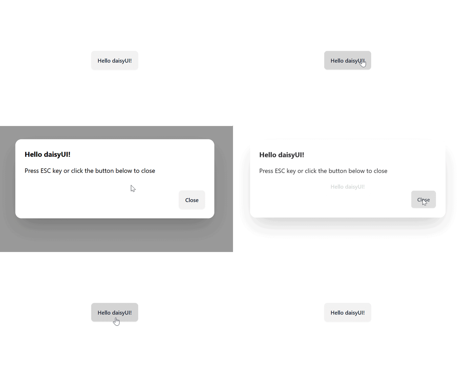
You might want to build on the markup provided in the documentation to save yourself the trouble and time.
The data display category contains a collection of components that present information to users. This category comprises a large portion of daisyUI’s components. Most of the components in this category are used to craft data-intensive components which would otherwise be difficult and time-consuming to build from scratch.
Some of these components include tables, cards, accordions, countdowns, carousels, and stats. Let’s see examples of each.
The Table component is used to display tabular data in rows and columns:

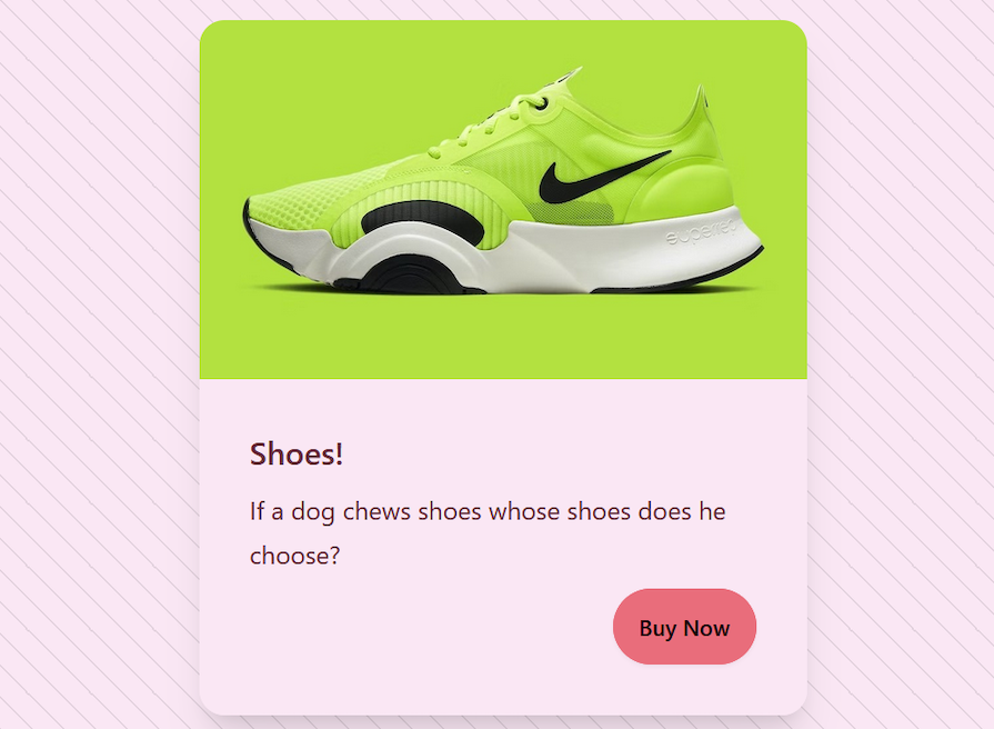
The Card component acts as a container for displaying summarized content (e.g., product cards, user profiles):
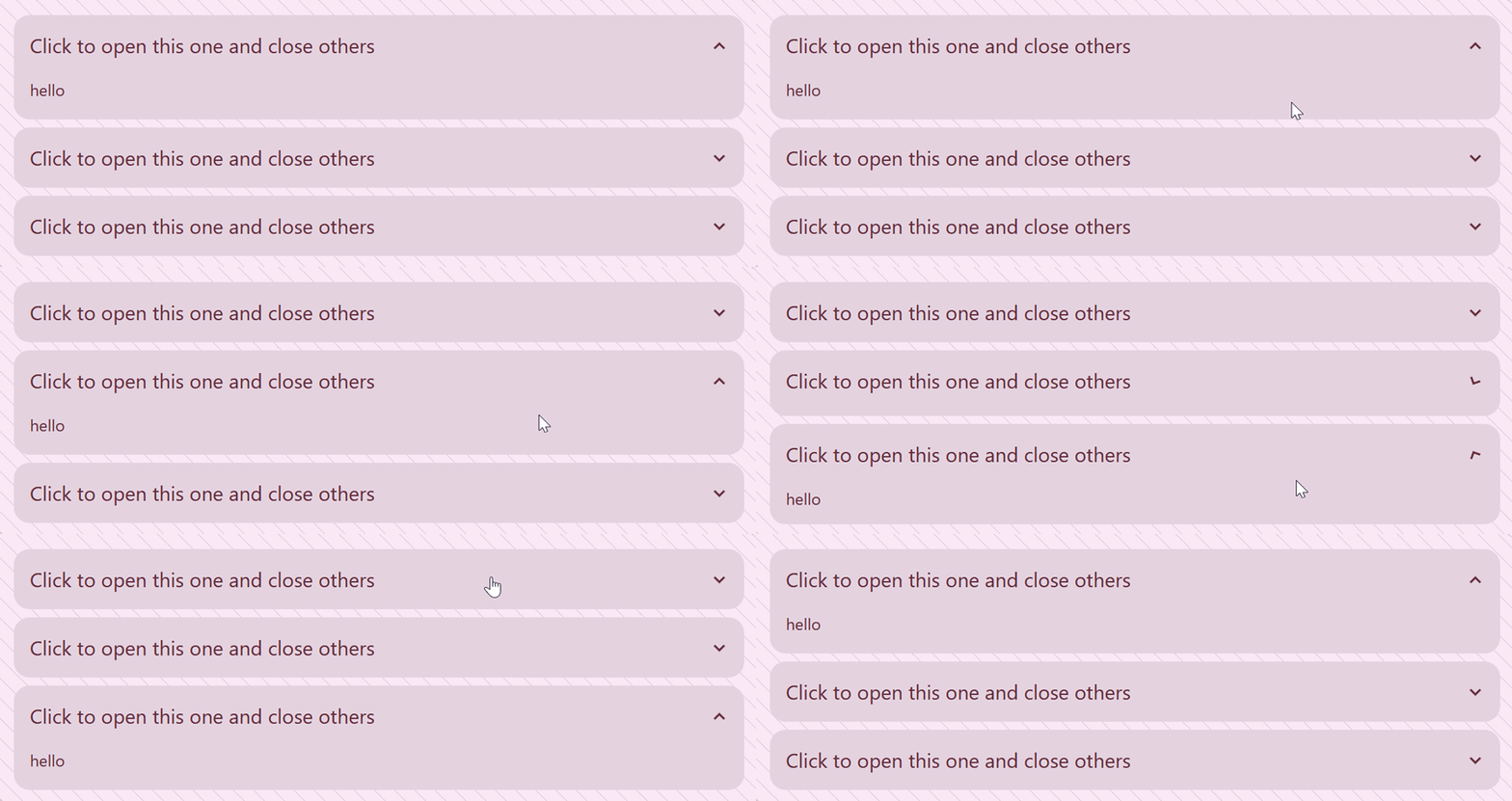
The Accordion component is used to show and hide content, but you can only expand one item at a time:
The Countdown component lets you set a custom countdown with transition effect of the changing numbers:

The Carousel component lets you easily create a carousel of images in a scrollable area:

The Stat component is used to display statistical data:

For more information about the components in the data display category and others, I recommend checking out daisyUI’s documentation.
The feedback category contains a collection of components that provide information about system’s status or the outcome of a user’s action. Some of the feedback components include alerts, loading, skeleton, and tooltips. Let’s see examples of these as well.
The Alert component is used to alert users about important events:

The Loading component is used to render an animation to indicate a loading state:

The Skeleton component‘s purpose is similar to the Loading component, but it shows the loading state of a component like this instead of as a loading circle:

The Tooltip component is used to display information about an element when hovering over it:

These are but a handful of the prebuilt components that daisyUI offers. Refer to the documentation to explore and learn more about the available components.
In the previous section, we discussed how variants help customize elements. While they offer flexibility, they come with preset styles. Luckily, daisyUI offers multiple ways to customize components to match your design system.
The most straightforward and intuitive method is using Tailwind utility classes. Let’s suppose you want to customize the button component from earlier without using any of the preset variations provided by daisyUI, you can customize it using Tailwind utility classes as follows:
<button class="btn rounded-full px-16">Two</button>
Another way would be to use the @apply directive to create your own styling rules. Here’s the same style using the @apply directive:
.custom-btn {
    @apply btn rounded-full px-16;
  }
Additionally, you can opt for the unstyled version of daisyUI and tailor it to your preference or design your own theme.
daisyUI provides a collection of semantic color utility classes that it encourages for usage instead of Tailwind’s color shades. These collections have names with specific meanings that make them more intuitive for designers and developers.
Examples of daisyUI semantic color names include:
Why should you use daisyUI’s semantic color names? Here are a few reasons:
primary and secondary. So it makes sense to use descriptive color names provided by daisyUI to simplify our workdaisyUI’s out-of-the-box theming capability is one of the features I find pretty exciting. Beyond offering the ability to change your app’s color state from light to dark mode, daisyUI also provides the option to properly theme your application using various color themes, which you can use on all your elements with no extra effort:
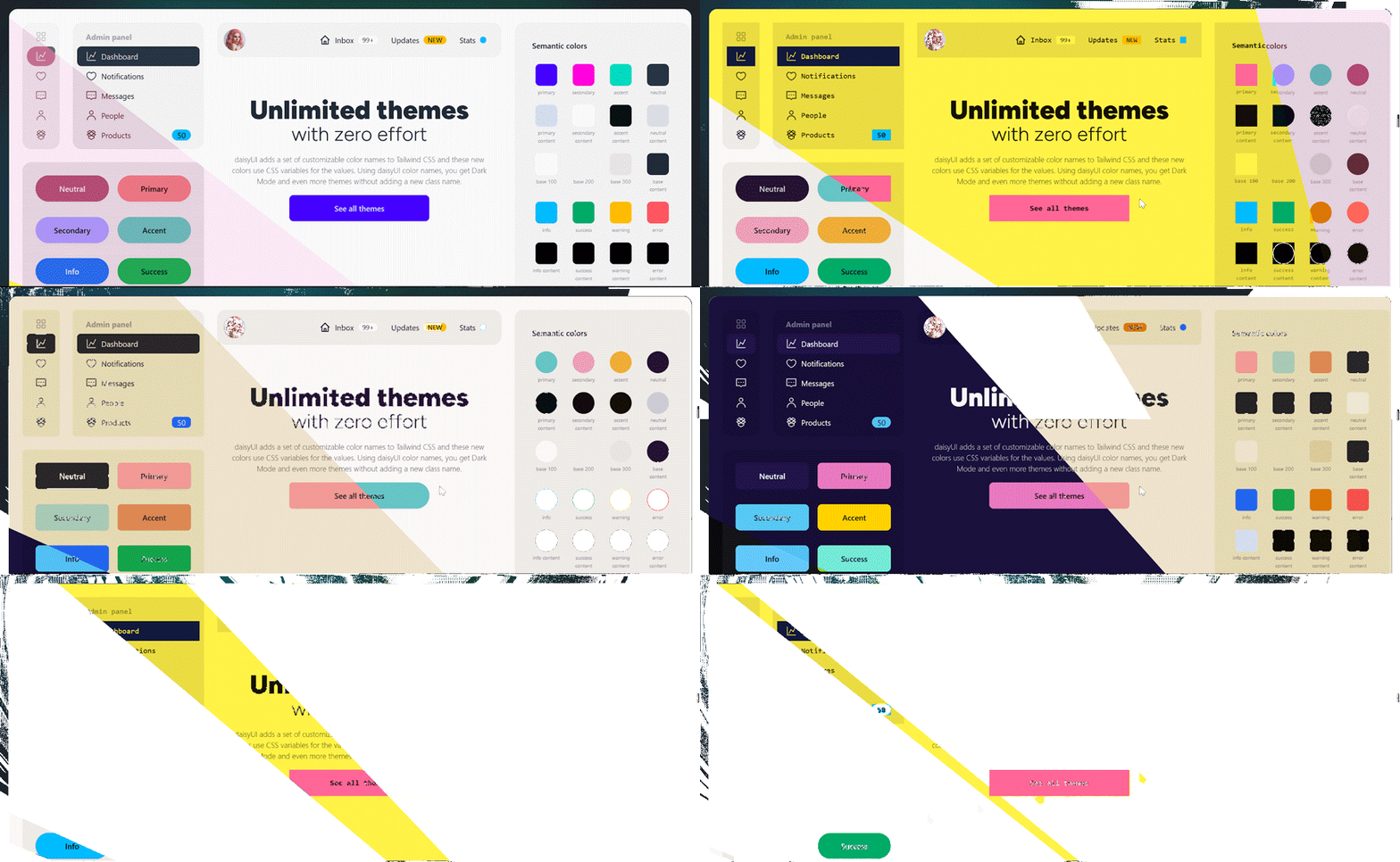
daisyUI takes the phrase “with zero effort” quite literally when it comes to theming. Adding a theme to your application is as simple as adding its name to the themes array in the tailwind.config.js as follows:
module.exports = {
    //...
    daisyui: {
      themes: ["light", "dark", "dracula"],
    },
  }
You can then activate it by adding a data-theme attribute with your preferred theme name to the HTML tag:
<html data-theme=dracula"></html>
The best part is that you can add multiple themes and use a utility tool like css theme change (made by the same creator of daisyUI) to switch themes and save selected themes in local storage.
Here are some of daisyUI’s themes:

Note that I included a screenshot from the docs to give you a visual representation of the themes. Refer directly to the documentation to see the complete list of themes available.
daisyUI approaches layout and typography features differently. For layouts, it relies on Tailwind’s default utility classes, while for typography, it uses the @tailwindcss/typography plugin to tackle common challenges faced by developers when designing web interfaces.
The most prevalent of these issues is that of unexpected typography behavior, which stems from the removal of the user agent’s default styles or resets.
It’s generally advised to reset or remove these styles before starting UI development to avoid future problems. Tailwind does this by default, and as a result, stylings applied on content from external sources such as text editors in a CMS or Markdown files tend to appear differently than anticipated.
The @tailwindcss/typography plugin fixes this issue by providing a set of prose classes that enhance typography for content you don’t directly control. You can apply these prose classes to your HTML content and add beautiful typography defaults, ensuring consistent styling even for content you didn’t create directly:
<article class="prose">
  <!-- Your content here -->
</article>
Additionally, daisyUI adds some styles to @tailwindcss/typography so it can tailor the typography to the current theme. This way, your typography can stay consistent across boards:

To use @tailwindcss/typography in your project, require it in your tailwind.config.js file like so:
  module.exports = {
    //...
    plugins: [require("@tailwindcss/typography"), require("daisyui")],
  };
Given daisyUI’s framework-agnostic nature, it can be used for a wide range of practical and business purposes. Here is a list of some of the use cases for daisyUI:
Card, Button, and Form make it easy to create engaging shopping experiences. They can be easily customized to reflect a unique brand identity, all while ensuring consistent designKeep in mind that this is just an example list. daisyUI offers a seamless DX, attractive design, and high performance for anything from basic websites to complex business applications.
There are many UI libraries in the frontend ecosystem, each claiming to be the ultimate solution to common developer pain points. Many of these libraries offer similar advantages to daisyUI, so choosing between them can be a chore.
The key is identifying the library that best aligns with your project’s specific needs and your development team’s skill sets. To help you with that, we’ve prepared a table comparing daisyUI to some of its leading competitors in the frontend ecosystem:
| Feature | daisyUI | MUI | Bootstrap | Shadcn UI | Chakra UI |
|---|---|---|---|---|---|
| Supported frameworks | Framework-agnostic | React | Vanilla JS, React, Vue.js | Framework-agnostic | React |
| Community | Growing community, good documentation | Large, active community | Very large community | Smaller community | Moderate, active community |
| Bundle size | 39.5kB minified | 93.7kB minified | 38.7kB minified | 35.3 kB minified | 205.9kB minfied |
| Prestyled components | Yes | Yes | Yes | Yes | Yes |
| Customization options | Extensive, through Tailwind CSS | Moderate | Moderate | Extensive, through Theming | Extensive |
| Scalability | Scales well | Scales well | Scales well | Scales well | Scales well |
| Learning curve | Moderate (if familiar with Tailwind) | Steeper | Moderate | Moderate (if familiar with Tailwind) | Moderate |
| Theming | Extensive theming capabilities and options | Extensive theming capabilities | Extensive theming capabilities | Advanced theming capabilities | Extensive theming capabilities |
You can use this table to quickly compare daisyUI at a glance to other libraries in terms of important aspects such as versatility, bundle size, feature set, and community support.
daisyUI bridges the gap between utility-first styling and component reusability. Due to its seamless integration with Tailwind CSS, it gives developers the flexibility to create efficient, customizable, and visually appealing interfaces.
Whether you’re building a simple website, a complex application, or anything in between, daisyUI offers a valuable toolkit for frontend development.
Install LogRocket via npm or script tag. LogRocket.init() must be called client-side, not
server-side
$ npm i --save logrocket

// Code:

import LogRocket from 'logrocket';
LogRocket.init('app/id');
// Add to your HTML:

<script src="https://cdn.lr-ingest.com/LogRocket.min.js"></script>
<script>window.LogRocket && window.LogRocket.init('app/id');</script>

When should you move API logic out of Next.js? Learn when Route Handlers stop scaling and how ElysiaJS helps.

Explore how Dokploy streamlines app deployment with Docker, automated builds, and simpler infrastructure compared to traditional CI/CD workflows.

A side-by-side look at Astro and Next.js for content-heavy sites, breaking down performance, JavaScript payload, and when each framework actually makes sense.

AI-generated tests can speed up React testing, but they also create hidden risks. Here’s what broke in a real app.re
Hey there, want to help make our blog better?
Join LogRocket’s Content Advisory Board. You’ll help inform the type of content we create and get access to exclusive meetups, social accreditation, and swag.
Sign up now