:modal pseudo-selector
The word “pseudo” is defined as something that is false and superficially appears to be one thing but behaves like something else. So, when we refer to pseudo-elements or pseudo-classes (pseudo-selectors), we mean something that acts like an HTML element or class but is not in the markup.

Consequently, there is more to HTML than meets the eye. There are parts of the UI that we can style with CSS that do not exist in our markup.
A simple example is seen in the styling of the placeholder attribute on a form input element, as seen below:
<form>
   <input placeholder="Enter Email">
   <input placeholder="Enter Password">
</form>
Since the placeholder exists as an attribute of the input, it is not an HTML element. However, we can style the placeholder by targeting a pseudo-element in our CSS, as seen below:
input::placeholder {
  color: red
}
Here’s an interactive example of the code:
See the Pen
Untitled by Lawrence Eagles (@Lawrenceagles)
on CodePen.
So, a pseudo-element represents an actual part of the DOM, and it can make your code much more efficient.
In this article, our focus is on the :modal CSS pseudo-selector. However, before delving into that, we will lay the groundwork by learning more about pseudo-elements and pseudo-classes, and, building upon our knowledge, we will learn about the :modal pseudo-selector.
Let’s get started by learning more about pseudo-elements and pseudo-classes in the next section.
Jump ahead:
The Replay is a weekly newsletter for dev and engineering leaders.
Delivered once a week, it's your curated guide to the most important conversations around frontend dev, emerging AI tools, and the state of modern software.
In this section, we will learn more about pseudo-elements and pseudo-classes. And we will further our knowledge by elaborating with code examples involving different pseudo-elements and pseudo-classes.
Let’s start by looking at pseudo-elements.
Pseudo-elements always have a double column — ::pseudo-element-name to differentiate them from pseudo-classes — :pseudo-class-name. As seen below:
// psuedo-element
input::placeholder {
  color: red
}

// psuedo-class
input:focus {
  color: red
}
As noted above, pseudo-elements represent a part of the DOM but are not visible in the markup. We also mentioned that they make your code more efficient since they provide a simple and efficient way to target and style the DOM.
Let’s elaborate by looking at some pseudo-elements and how they enable us to target and style elements in the DOM.
The ::file-selector-button is a CSS pseudo-element that represents the button of an HTML — <input> element of type="file", which seems impossible to style.
However, with the ::file-selector-button pseudo-element, we can style this file upload button easily, as seen below:
<!-- HTML -->
<form>
   <label for="avatar">Choose a profile picture:</label><br>
   <input type="file"
       name="avatar"
       accept="image/png, image/jpeg">
</form>
//CSS
body {
  display: grid;
  place-items: center;
  min-height: 100vh;
  background-color: #eee;
}

input[type="file"] {
  margin-top: 1rem;
  padding: 1.5em;
  border: 2px dashed grey;
  background-color: #fff;
}

input[type="file"]::file-selector-button {
  padding: 1em 1.5em;
  border-width: 0;
  border-radius: 1rem;
  background-color: dodgerblue;
  color: #FFFFFF;
  font-weight: bold;
  transition: all .25s ease-in-out;
  cursor: pointer;
  margin-right: 1em;
}
Here, we get the following styled file upload button:

You can check out the code live below:
See the Pen
file-upload by Lawrence Eagles (@Lawrenceagles)
on CodePen.
The::before and ::after are by far the most powerful and arguably the most popular pseudo-elements. These pseudo-elements enable us to insert contents before or after HTML other elements, which is handled entirely from the CSS code.
Consider the code below:
<!-- HTML -->
<div class="summary" id="text">
   Lorem Ipsum is simply dummy text of the printing and typesetting industry. Lorem Ipsum has been the industry's standard dummy text ever since the 1500s, when an unknown printer took a galley of type and scrambled it to make a type specimen book. It has survived not only five centuries, but also the leap into electronic typesetting, remaining essentially unchanged. It was popularised in the 1960s with the release of Letraset sheets containing Lorem Ipsum passages, and more recently with desktop publishing software like Aldus PageMaker including versions of Lorem Ipsum.
</div>
// CSS
body {
   padding: 20px;
}

.summary::before, .summary::after {
   content: "";
   padding: 4px;
   margin: 10px auto;
   width: 100%;
   height: 10px;
   display: inline-block;
}

#text::before {
   background: red;
}

#text::after {
   background: blue;
}
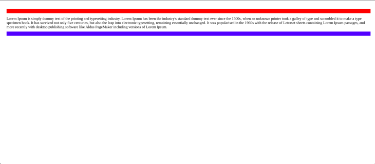
In the code above, we targeted the div with the summary class and inserted an empty string before its contents.
We inserted these contents using the ::before and ::after pseudo-elements:

A pseudo-class or pseudo-selectors allows us to style a DOM element based on its state. For example, the :first-child represents the first child among a list of siblings — child elements and can be styled using the :first-child pseudo-class. On the other hand, the :last-child represents the last child among a list of siblings — child elements. The element in this state can be styled using the last-child pseudo-class.
Pseudo-classes behave as if we had added extra classes to our markup. This allows us to cut down on the number of classes we use in our markup. Consequently, they help us to write cleaner, more flexible, and maintainable code.
Consider the HTML code below:
<ul>
  <li>😍</li>
  <li>🥳</li>
  <li>🥸</li>
  <li>😇</li>
  <li>🤩</li>
  <li>😎</li>
  <li>🥰</li>
</ul>
In the HTML code above, we can selectively target the first li content and the last li content because of their state, and style them as seen below:
ul {
  list-style-type: none;
   font-size: 2rem;
   text-align: center;
}

ul>li {
   margin: 0.5rem;
}

ul>li:first-child {
   font-size: 4rem;
}

ul>li:last-child {
   font-size: 4rem;
}
Here, we get:

Since an element’s state changes because of a user’s interaction, pseudo-classes enable us to style DOM elements as users interact with them. These pseudo-classes — also called dynamic pseudo-classes — behave as if a class that represents the state of the element had been added to the element because of the user’s action.
The :hover element is a button in a hover state when the user hovers over the element with the mouse pointer. We can select and style that element during that hover state with the :hover pseudo-class. The :focus element has a form input in the focus state when the user focuses on the element by selecting it. We can select and style that element during the focus state with the :focus pseudo-class.
In this article, however, our primary focus is the :modal pseudo-selector, and we will start learning about it in the next section.
:modal pseudo-selectorThe awesome and powerful :modal is a CSS pseudo-selector or pseudo-class that provides an intrinsic way to detect modal elements. This enables developers to style these elements without requiring extra CSS classes.
So, in a nutshell, the :modal pseudo-selector selects an element that is in a state in which it does not interact with other DOM elements outside it until the state changes — the modal is closed.
:modal pseudo-selector in actionSome examples of elements that can pop-open a modal and exclude all interaction with other elements outside that modal are:
dialog: The dialog element opened with the showModal() API:fullscreen: The :fullscreen pseudo-class when opened with the requestFullscreen() APILet’s learn more about the :modal pseudo-selector with some code examples. Consider the code below:
<!-- HTML -->
<section id="container">
  <dialog>
    <p>Lorem Ipsum is simply dummy text of the printing and typesetting industry.</p>
    <button id="close-modal-btn" class="modal-btn">Close</button>
  </dialog>
  <button id="open-modal-btn" class="modal-btn">Open Modal</button>
</section>
/* CSS */
*,
*:after,
*:before {
  box-sizing: border-box;
}

body {
  display: grid;
  place-items: center;
  min-height: 100vh;
  background: gray;
  font-family: "Google Sans", sans-serif, system-ui;
}

:modal {
  padding: 8rem;
  border: 1px solid black;
  border-radius: 2rem;
  gap: 3rem;
  background: orange;
  overflow: hidden;
}

:modal::backdrop {
  background: hsl(0 0% 10% / 0.5);
}

:modal[open] {
  display: grid;
}

.modal-btn {
  padding: 0.8rem 1.5rem;
  border: 1px solid black;
  border-radius: 1rem;
}
// JavaScript
const Container = document.querySelector("#container");
const DIALOG = document.querySelector("dialog");

Container.addEventListener(
  "click",
  function (event) {
    let modalStyle;
    if (event.target.matches("#open-modal-btn")) {
      modalStyle = "showModal";
    }

    if (event.target.matches("#close-modal-btn")) {
      modalStyle = "close";
    }

    DIALOG[modalStyle]();
  },

  false
);
In the code examples above, we created a modal in our markup using the dialog element. And we targeted and styled this modal using the :modal pseudo-class in the CSS. In the JavaScript, we used event-delegation to listen for click events. Then we set modalStyle to showModal — to open the modal or close — to close the modal.
You can see this in action and play with the code live:
See the Pen
Dialog-modal by Lawrence Eagles (@Lawrenceagles)
on CodePen.
In this article, we learned about pseudo-elements and pseudo-selectors, which are the CSS counterpart of pseudo-elements. They are classes that seem to be added intrinsically to elements, often as users interact with the DOM. And we also saw how they enable us to cut down on the number of classes we use and write cleaner and more maintainable code.
Lastly, we learned about the :modal CSS pseudo-selector that gives us a way to target and style modals without requiring extra CSS classes.
After going through this article, I hope you have learned enough to start writing cleaner and more maintainable markup and styles by using pseudo-selectors and pseudo-elements.
As web frontends get increasingly complex, resource-greedy features demand more and more from the browser. If you’re interested in monitoring and tracking client-side CPU usage, memory usage, and more for all of your users in production, try LogRocket.

LogRocket lets you replay user sessions, eliminating guesswork around why bugs happen by showing exactly what users experienced. It captures console logs, errors, network requests, and pixel-perfect DOM recordings — compatible with all frameworks.
LogRocket's Galileo AI watches sessions for you, instantly identifying and explaining user struggles with automated monitoring of your entire product experience.
Modernize how you debug web and mobile apps — start monitoring for free.

When should you move API logic out of Next.js? Learn when Route Handlers stop scaling and how ElysiaJS helps.

Explore how Dokploy streamlines app deployment with Docker, automated builds, and simpler infrastructure compared to traditional CI/CD workflows.

A side-by-side look at Astro and Next.js for content-heavy sites, breaking down performance, JavaScript payload, and when each framework actually makes sense.

AI-generated tests can speed up React testing, but they also create hidden risks. Here’s what broke in a real app.re
Would you be interested in joining LogRocket's developer community?
Join LogRocket’s Content Advisory Board. You’ll help inform the type of content we create and get access to exclusive meetups, social accreditation, and swag.
Sign up now