grid-template-columns property
The grid-template-columns property is just a small part of the CSS Grid Layout specification. To understand this property in particular, you first need to have an understanding of what the CSS Grid is.

To bring you up to speed, the Grid layout essentially defines a two-dimensional grid-based layout system that lets you design pages or templates using rows and columns, instead of using older techniques like float: right;.
In this article, we’ll explore grid-template-columns in CSS, understand what it is, and how to best use it. Let’s get started!
The Replay is a weekly newsletter for dev and engineering leaders.
Delivered once a week, it's your curated guide to the most important conversations around frontend dev, emerging AI tools, and the state of modern software.
grid-template-columns?Simply put, grid-template-columns is a CSS property that defines the number and size of columns in a grid layout. This property can accept multiple values, separated by spaces, with each value defining the width of its respective column. The values can be fixed lengths (e.g., 100px), percentages (e.g., 20%), fractions (e.g., 1fr), or content-based using values and functions such as auto, minmax, or repeat.
Here is a basic demo of how to use grid-template-columns:
grid-template-columns: auto auto auto;
grid-template-columns: auto auto;
grid-template-columns: 20% 20% 20% 20%;
The three auto separated values represent three columns with the same width. The same applies to the following two auto values. The four 20% values tell us that the columns will have a width that is 20 percent of the parent element.
The syntax is pretty simple, but there are more values than just percentages and auto. Consider the following code:
grid-template-columns: none|auto|max-content|min-content|length|initial|inherit;
Each value separated by the pipe is a potential value you can use for the template-columns property. Each has its purpose, which we’ll go over in the next section.
The grid-template-columns property is also animatable. If there’s a need for animations and transitions, the column values can be changed gradually to create a seamless transition in the grid layout:
<!DOCTYPE html>
<html>
<head>
<style>
.grid-container {
display: grid;
grid-template-columns: auto auto auto auto;
grid-gap: 10px;
background-color: black;
padding: 10px;
animation: mymove 5s infinite;
border-radius: 2vw;
}
.grid-container > div {
background-color: white;
text-align: center;
padding: 20px 0;
font-size: 30px;
border-radius: 1.5vw;
}
@keyframes mymove {
20% {grid-template-columns: auto}
40% {grid-template-columns: auto auto}
50% {grid-template-columns: auto auto auto;}
60% {grid-template-columns: auto auto}
80% {grid-template-columns: auto}
}
</style>
</head>
<body>
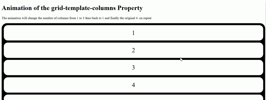
<h1>Animation of the grid-template-columns Property</h1>
<p>The animation will change the number of columns from 1 to 3 then back to 1 and finally the original 4. on repeat </p>
<div class="grid-container">
<div class="item1">1</div>
<div class="item2">2</div>
<div class="item3">3</div>
<div class="item4">4</div>
<div class="item5">5</div>
<div class="item6">6</div>
<div class="item7">7</div>
<div class="item8">8</div>
</div>
</body>
</html>
This is just a simple demo of how you can use this property with animations and transitions:
Here’s a quick summary of the values we’ll cover in this article:
| Value | Description |
|---|---|
none |
Default value. Creates implicit columns if needed |
auto |
Automatically sets column size based on content and available space |
min-content |
Columns are sized to fit the smallest content in the column |
max-content |
Columns are sized to fit the largest content in the column |
minmax() |
The column size is constrained between a minimum and maximum value |
fit-content() |
Adjusts columns to fit its content but won’t exceed the specified size |
percentage |
Defines the column size as a percentage of the grid container’s width |
repeat() |
Creates a pattern of columns |
length |
Sets the column size using any valid length value |
subgrid |
The column inherits its sizing from the parent grid container |
initial |
Resets the property to its default behavior |
inherit |
Inherits grid-template-columns from the parent element |
Before diving into the details, it’s worth noting that grid-template-columns, like most CSS properties, accept global values:
grid-template-columns: inheritgrid-template-columns: initialgrid-template-columns: revertgrid-template-columns: unsetThese values generally manage inheritance or browser-specific defaults. For example, the initialvalue resets the property to its default value (none). They are most useful when you need to reset or override inherited grid properties.
Now, let’s look at the syntax with values you’re more likely to use when working with grid-template-columns:
grid-template-columns: none|auto|max-content|min-content|length|flex|percentage|repeat();
These values fall into two main categories: <track-list> and <auto-track-list>.
Track-list values
<track-list> values are non-negative explicit values (i.e., directly specified values) that define exactly how many columns you want and their sizes.
Here are the available track-list values:
noneThe none value is the default for grid-template-columns. It means no explicit grid tracks (columns) are defined, so the browser automatically generates implicit columns as needed.
Even though none allows implicit (auto-generated) columns, it’s not considered a <track-list> or <auto-track-list> value. Instead, it’s a keyword value that removes explicit columns while still permitting implicit grid behavior.
This is similar to how none works in other CSS properties like border: none; or outline: none;. It’s a deliberate keyword choice that means “remove this property’s effect” rather than “set this property to zero or empty.”
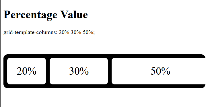
percentageThe percentage value defines a track size relative to the grid container’s inline size (width in horizontal writing modes). Each percentage directly represents a portion of the container’s total width.
For example:
/ CSS
.grid-container {
  display: grid;
  grid-template-columns: 20% 30% 50%;
  gap: 10px;
  background-color: black;
  padding: 10px ;
  border-radius: 2vw;
}

// HTML
<div class="grid-container">
  <div class="grid-item">Item 1</div>
  <div class="grid-item">Item 2</div>
  <div class="grid-item">Item 3</div>
</div>
In this example, the first item Item 1 will occupy 20% of the grid container’s width, Item 2 will take up 30%, and Item 3 will use the remaining 50%.
However, if you look at the result of our little example, you’ll notice that the third item in the container is overflowing:
This example demonstrates a common issue with percentage values in which they are calculated based on container width without accounting for gaps. So what’s actually happening is:
20% of container width (first column)10px gap30% of container width (second column)10px gap50% of container width (third column)The percentage values add up to 100% of the width plus 20px from the gaps, which causes the overflow. To fix this, either adjust the percentage values to account for the gaps or use fr units instead.
lengthLength values don’t refer to the literal word “length,” but rather any valid, non-negative CSS length that defines a track’s width. These can include:
px, cm, mmvw, vhem, remfrbody {
background-color: white;
padding: 10vw;
}
#testdiv{
height: auto;
display: grid;
border-radius: 1vw;
gap: 1vw;
background-color: black;
padding: 1vw;
grid-template-columns: 10vw 25vw 40vw;
}
#test-div div {
background-color: white;
text-align: center;
padding: 20px 0;
font-size: 30px;
border-radius: 0.5vw;
}
The code above will give the first column a width of 10vw, the second a width of 25vw, and the third a width of 40vw. The output is shown below:
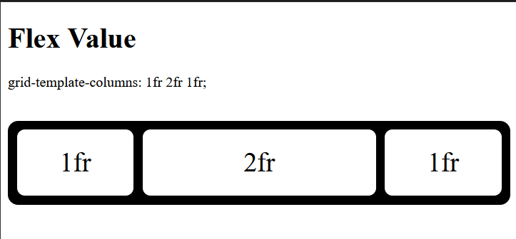
flexFlex values allow you to create flexible grid columns using fractional units or fr units. It specifies the column’s size as a fraction of the remaining space in the grid container after accounting for all fixed-size tracks and gaps. They provide flexible sizing that automatically adjusts to the container’s width:
grid-template-columns: 1fr 2fr 1fr;
This creates three columns where the middle column gets twice the space of the others:
Flex values are often mixed with fixed values, and it’s important to understand their behavior in such cases. The grid first allocates space for the fixed columns. Since gaps are also considered, it will allocate space for defined gaps too. Whatever space is left will be shared between the flex columns according to the number of fractions they get.
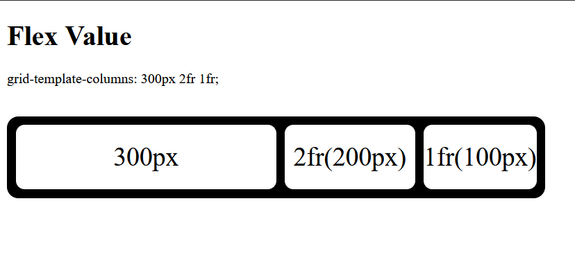
For example, let’s say the first column in the example above has a fixed width of 300px, and the grid container’s width is 600px:
.grid-container {
  display: grid;
  width: 600px;
  grid-template-columns: 300px 2fr 1fr;
  gap: 10px;
  ...
}
In this example, the available space will be 300px, which is what you get when you subtract 300px from the grid container’s width of 600px. The second column will get two fractions (2fr) of the available space, while the third column will get one fraction (1fr).
To calculate the width of 1fr, we can use the following formula:
1fr = (Grid container width - Fixed column width) / Sum total of column count
    = (600px - 300px) / 3
    = 300px / 3
1fr of 600px = 100px
Therefore, 1fr in this example is 100px. This means the second column will get 200px (2fr), and the third column will get 100px (1fr):
To include gaps in the calculation, simply subtract the gap size from the remaining space along with the fixed column widths. The formula will be as follows:
1fr = (Grid container width - Gap - Fixed column width) / Sum total of column count
<auto-track-list values><auto-track-list> values are implicit values set using keywords that automatically create a flexible number of columns that adapt or adjust to the column’s content or the container size. These values include:
autoThe auto value is an auto-track-list keyword value that automatically sizes tracks based on available space and content. When multiple auto tracks are specified, they share the available space equally after accounting for any fixed-width tracks.
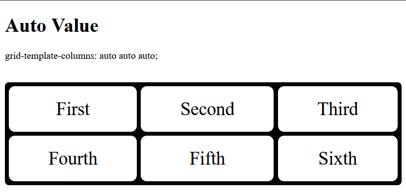
In the code below, take note that the value of the grid-template-columns property uses auto three times. Therefore, you’ll have three columns of equal width:
body {
  background-color: white;
  padding: 10vw;
}
#test-div {
  height: auto;
  display: grid;
  border-radius: 1vw;
  gap: 1vw;
  background-color: black;
  padding: 1vw;
  grid-template-columns: auto auto auto;
}
#test-div div {
  background-color: white;
  text-align: center;
  padding: 20px 0;
  font-size: 30px;
  border-radius: 0.5vw;
}
The output:
With the auto value, you can dive a little deeper. If you have another value for the property, say, grid-template-columns: auto 200px auto 250px;, the UI will have four columns. The first one will have the same width as the third, while the second and fourth will have uniquely specified widths:
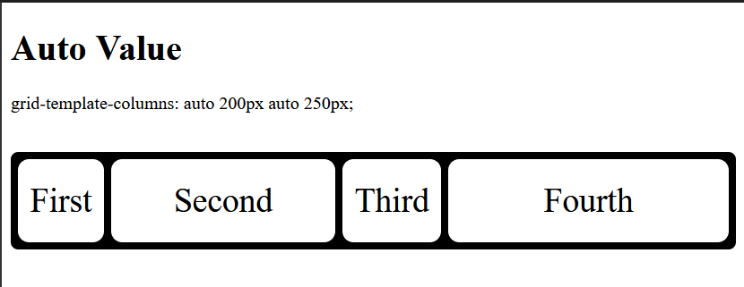
Now, this should tell you that auto takes whatever space is available and divides it equally among any column with said value.
minmax(min, max)This is a function value that defines a size range for specifying the minimum and maximum size of a grid column. The function takes two arguments: a minimum length value and a maximum length value:
grid-template-columns: minmax(min, max);
The min and max arguments basically define the size of a column on the grid, but instead of explicitly defining the column’s width, minmax lets you flexibly size the column based on its content. In other words, you are essentially telling the grid that you don’t know how large or small the content of this column is going to be. You’re also saying that you don’t want the content to be smaller than the min argument, and that it should be wider than the max argument.
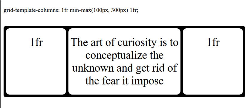
For example:
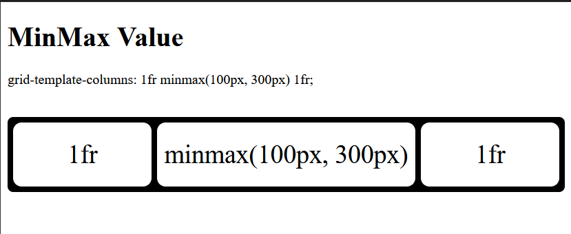
grid-template-columns: 1fr minmax(100px, 300px) 1fr;
In this example, there are three columns. The first and third columns will take up equal fractions (1fr) of the available space. The middle column will be at least 100px wide but can expand up to 300px if there’s enough room:
min-contentThis is a keyword value that defines the smallest possible size a column can be while still fitting its content without causing overflow. This applies to various content types, including text, images, and videos.
For example, if a column contains a long line of text, instead of setting the column’s width to accommodate the entire line (as its counterpart max-content would), min-content will wrap the text and set the column’s width to the width of the longest word in the content.
Take the following example:
 <div class="grid-container">
      <div class="item1">1fr</div>
      <div class="item2">The art of working is to conceptualize the unknown aaand get rid of the fear it introduces</div>
      <div class="item3">1fr</div>
 </div>
By default, the column will wrap the content based on the responsive value assigned to it. If the column has a fixed width, the content will either wrap or overflow, depending on the fixed width and the content’s size.
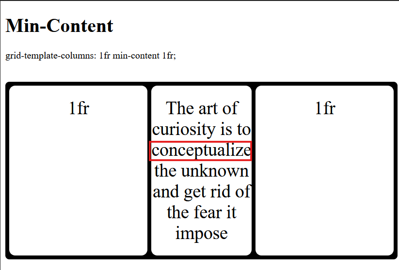
However, if the column is given a minmax() value, as in the previous example, the output will be as follows:
In this case, the content in the second column will stretch beyond 300px, which is the maximum width specified by minmax(). Hence, its content is wrapped.
If we use the min-content keyword instead, the content would wrap further. The word “conceptualize” would be considered the min-content because it’s the longest word in the text, and the column’s width would be set accordingly:
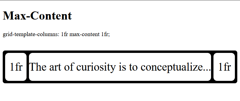
max-contentThe max-content value defines the ideal size required for a column to fit all of its content without any line breaks or wrapping. Essentially, it allows the column to expand to the maximum length of its content.
If we revisit the previous example and apply max-content, the column will expand until its entire content fits on a single line. However, this will often cause an overflow in the grid container, as there may not be enough space to accommodate the column’s increased size. To demonstrate, we’ll shorten the content:
It’s important to understand that when multiple items are in the grid, every item within the column where max-content is defined will behave similarly. However, the item with the longest content will determine the width of all other items in that column, not their individual content lengths.
For example, if we add six more items to the grid container in this example:
 <div class="grid-container">
      <div class="item1">1fr</div>
      <div class="item2">The art of curiosity is to conceptualize...</div>
      <div class="item3">1fr</div>
      <div class="item3">1fr</div>
      <div class="item3">1fr</div>
      <div class="item3">1fr</div>
      <div class="item3">1fr</div>
      <div class="item3">1fr</div>
      <div class="item3">1fr</div>
 </div>
The result will look something like this:
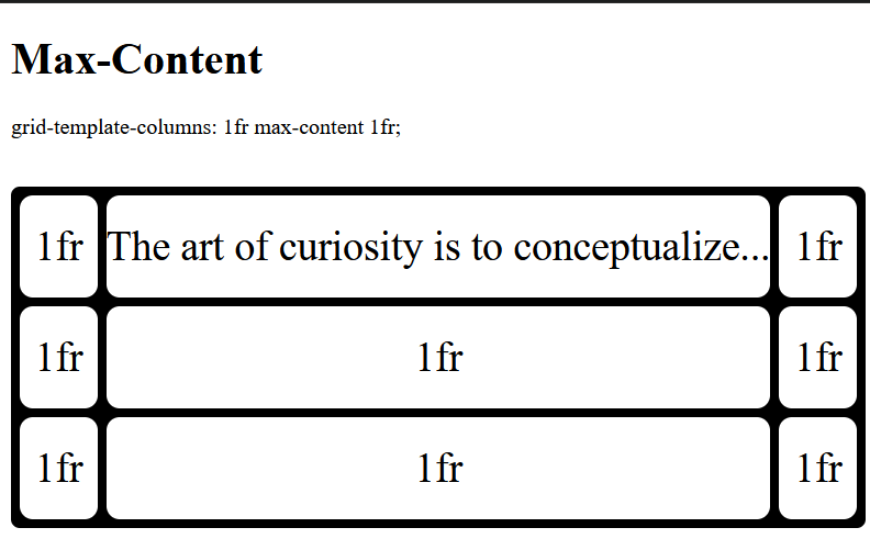
The second column, due to its longer content, determines the width of the fifth and eighth columns. This same principle applies to min-content. However, using max-content often leads to overflows, as demonstrated.
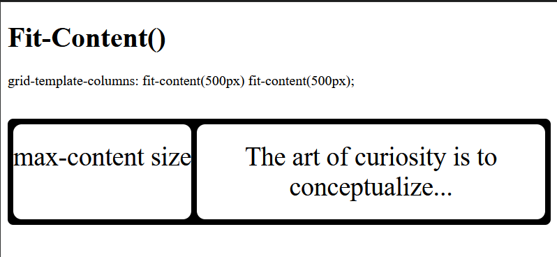
fit-content()The fit-content() function behaves similarly to max-content, but it provides an additional constraint. It takes a single percentage or length value argument, which it uses to limit the column’s maximum size. This allows the column to adapt to the size of its content while preventing it from growing beyond a specified maximum:
// CSS
.grid-container{
  ...
  grid-template-columns: 1fr fit-content(500px);
}

// HTML
<div class="grid-container">
  <div class="item1">max-content size</div>
  <div class="item2">The art of curiosity is to conceptualize...</div>
</div>
In this example, both columns will adapt to their content. However, the first column will not expand beyond its max-content size because its content’s maximum length does not exceed 500px. The second column, on the other hand, will expand until it reaches a width of 500px because its content is longer than that limit:
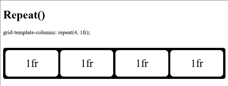
repeat()repeat() is a commonly used value for the grid-template-columns property. It is a function that allows you to create repeating patterns of columns with the same size. This function takes two arguments: the repetition count, and the column size to repeat:
grid-template-columns: repeat( [ <positive-integer> | auto-fill | auto-fit ] , track size);
The repeat() function makes creating repeated columns or rows convenient. Instead of defining a grid-template-columns property with multiple identical column sizes, like so:
grid-template-columns: 1fr 1fr 1fr 1fr 1fr;
You can use the repeat() function to specify the number of columns you need and the size you want them to have. In this case, four columns of size 1fr:
grid-template-columns: repeat(4,1fr);
The output would be as expected: four columns of equal width, each taking up a fraction of the available space:
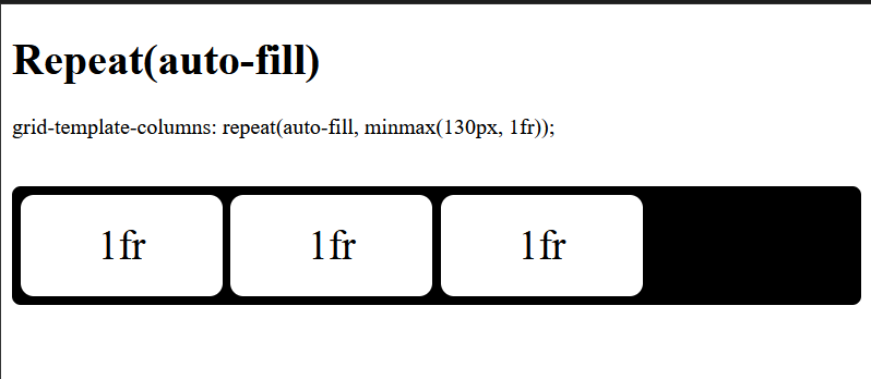
auto-fill and auto-fitAs indicated in the previous section, The repeat() function not only takes integer values for the first argument (i.e. the repetition count), but also the auto-fill or auto-fit keywords. These keywords create as many columns as can fit into a row of a grid container.
While both keywords automatically fit and fill as many columns as possible into a grid row before wrapping to a new line, they behave slightly differently.
The auto-fill keyword leaves any remaining space in the grid container after creating the necessary columns. It treats this space as a gap. This is because auto-fill creates empty columns, even if there’s no content to populate them:
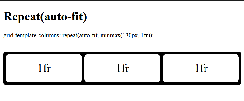
The auto-fit keyword, on the other hand, adjusts the columns to fit the container size if there’s extra room. This eliminates gaps and makes the grid more responsive.
The example above, when using auto-fit, will look like this:
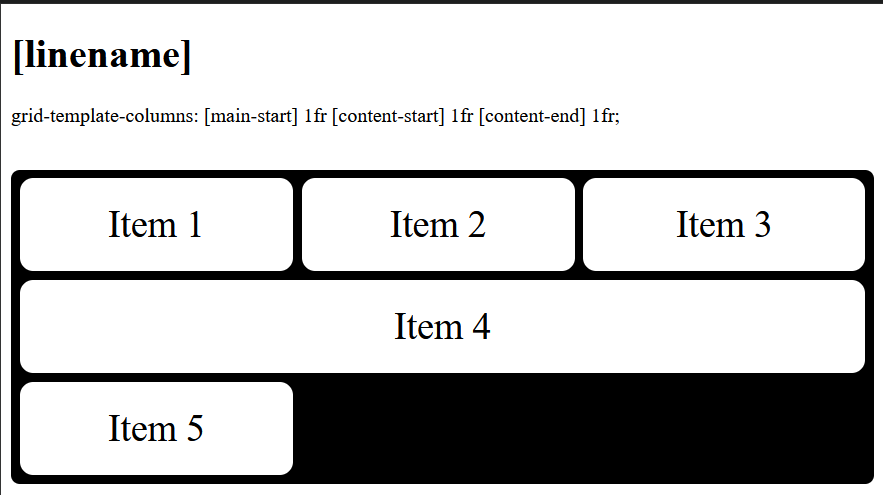
[linename]Named grid lines, also known as [linename], are not a grid-template-columns value in themselves. Instead, they provide a way to assign custom names to the lines that define the boundaries of the grid column, instead of the usual numerical way of identifying them. This makes it easier to reference and position grid items within the grid layout, especially in complex designs.
Grid lines can be assigned names using square brackets. Here’s the basic syntax:
grid-template-columns: [line-name] track-size [line-name];
Consider the following example:
grid-template-columns: [main-start] 1fr [content-start] 1fr [content-end] 1fr [main-end];
This defines three columns with named lines at the start and end of each track.
With the [linename] defined, you can position grid items more intuitively within the grid container instead of using numerical values:
.grid-item:nth-child(1) {
  grid-column-start: main-start;
  grid-column-end: content-start;
}

.grid-item:nth-child(2) {
  grid-column-start: content-start;
  grid-column-end: content-end;
}

.grid-item:nth-child(3) {
  grid-column-start: content-end;
  grid-column-end: main-end;
}

.grid-item:nth-child(4) {
  grid-column-start: main-start;
  grid-column-end: main-end;
}
The result will be as you’d expect:
You can also assign multiple names to a grid line by separating them with spaces inside the square brackets:
grid-template-columns: [sidebar-end main-start] 1fr [content-start] 1fr [content-end] 1fr [main-end];
In this case, the grid line has two names: sidebar-end and main-start. You can refer to this line by either name when placing grid items.
Line names provide a powerful way of creating flexible and maintainable grid layouts. However, it’s important to note that they are <custom-ident> keywords, a CSS data type identifier that represents any valid CSS name that you create, as long as it doesn’t conflict with any predefined CSS keywords.
For example, keywords such as span, auto, inherit, initial have specific meanings in CSS, and using them as custom identifiers could lead to unexpected behavior.
Understanding these values will give you leverage when creating dynamic, flexible, and responsive grid layouts. The auto-track-list values are particularly suitable for such use cases. When combined with track-list values such as fractional units and keywords like auto, they make for a powerful and adaptable grid system.
grid-template-columns with grid-auto-flowThe grid-template-columns property is not a one-size-fits-all solution for creating fully responsive and flexible grid layouts. There are instances where you’ll need more granular control over column sizes and item placements than grid-template-columns alone can provide.
In these cases, you might need to combine grid-template-columns with other grid properties to achieve the desired layout. One such property is the grid-auto-flow property that controls how auto-placed items are inserted into the grid. It determines the flow of items when they are not explicitly positioned using grid lines or areas.
Combining these properties means grid-template-columns defines the columns and their sizes, while grid-auto-flow determines how they are added to the grid, provided the items have not been explicitly placed.
grid-auto-flow has four primary values:
row — Places items in rows (default)column — Places items in columnsrow dense — Fills in gaps in rowscolumn dense — Fills in gaps in columnsThe default item flow in a grid container is row, meaning items are arranged horizontally in each row. When a row is full, the placement continues on the next row:
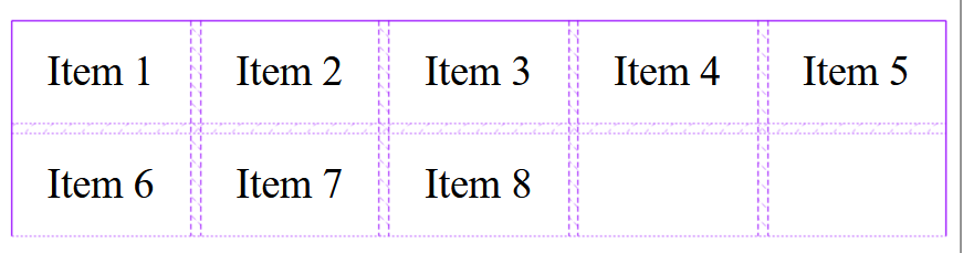
As you can see, the item placement is in rows and it breaks when there is no more space left in the first row and continues in the next row.
With the combination of the grid-auto-flow property, we have control over the flow of the item placement. Instead of the default row placement, we can use column flow, which arranges the items in each column vertically. Where there is no space left in a column, the placement continues in the next column:
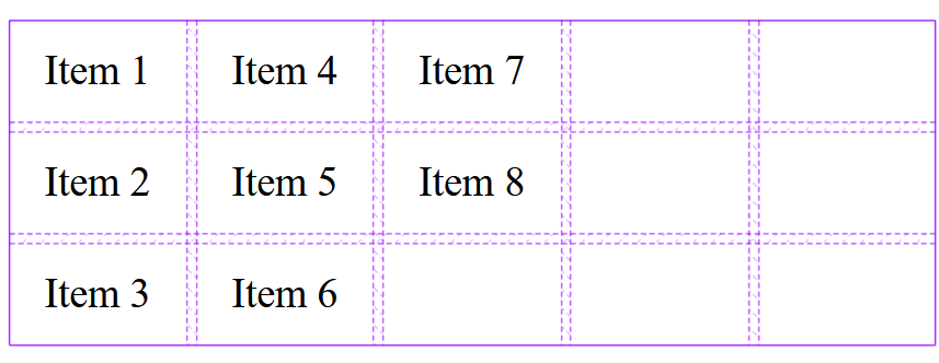
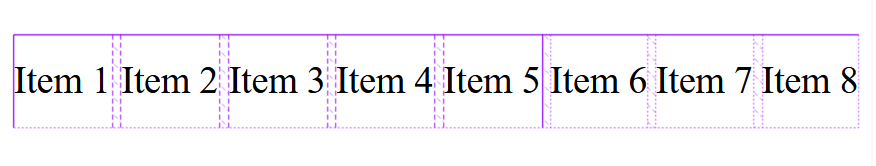
It is important to note that using the grid-auto-flow: column; value requires you to add the grid-template-rows property into the mix. This will help create more rows for the items to occupy in each column. Without defining grid-template-rows, the items would stack horizontally within a single row, leading to an undesirable layout:
Combining these properties allows you to create complex and dynamic grid layouts with greater control over item placement.
Working with the grid-template-columns property can be straightforward, but there are some common mistakes that developers often make. Here are a few of them along with tips on how to avoid these pitfalls.
repeat() functionJust as the repeat() function is the most commonly used value of the grid-template-columns property, it also tends to be the most commonly misused.
One of the most common errors when using repeat() with auto-fit or auto-fill is attempting to use flexible values like 1fr for the column track size:
grid-template-columns: repeat(auto-fit, 1fr);
This is invalid because repeat() with auto-fit or auto-fill requires an explicit column track size to accurately calculate the number of columns that can fit within the grid container. 1fr is a flexible size, not an explicit one.
However, it’s acceptable to use an intrinsic value as the function’s second argument, as long as the initial argument is a positive number:
grid-template-columns: repeat(3, 1fr);
Some units are by default incompatible, and when mixed incorrectly can lead to invalid expressions that are most likely to break the layout. However, unit incompatibility isn’t limited to syntax errors. Even units that function together syntactically can be incompatible in terms of responsiveness and flexibility.
The most common incompatibility occurs when mixing fixed-length units (like px, em, rem, etc.) with flexible units (fr) without a clear strategy.
Consider the following example:
.grid-container {
  display: grid;
  grid-template-columns: 100px 1fr 200px 1fr;
}
While this might seem valid, it can lead to unpredictable behavior. The browser will allocate 100px and 200px to the first and third columns, respectively. Then, it will divide the remaining space equally between the two 1fr columns.
The issue arises because the fr units are dependent on the space remaining after the pixel-based columns are placed. This can become unpredictable as the container size changes (e.g., on different screen sizes).
The best approach is generally to stick to either fixed units (if you need precise control) or flexible units (fr) for the majority of your columns. If you need certain columns to have a minimum size but also expand, use minmax(). This enhances responsive behavior significantly:
.grid-container {
  display: grid;
  grid-template-columns: minmax(100px, 1fr) 1fr minmax(200px, 1fr);
}
While CSS allows you to mix these units, it often results in unpredictable and difficult-to-maintain layouts. Therefore, it’s important to carefully consider your sizing strategy and use min-max () and auto where applicable.
You might encounter unexpected extra space in your grid layout, even without explicitly defining one. This can stem from various reasons, but one common reason is using the auto-fill keyword with the repeat() function.
Remember that auto-fill preserves any remaining space in the grid container after creating the necessary columns. If this is the case, you can rectify it by using auto-fit instead, which stretches the columns to fill the container.
Another potential solution is to verify that the gap property is not being unintentionally applied to the grid container. Regardless, explicitly setting gap: 0; can be a proactive measure to prevent such issues and save debugging time.
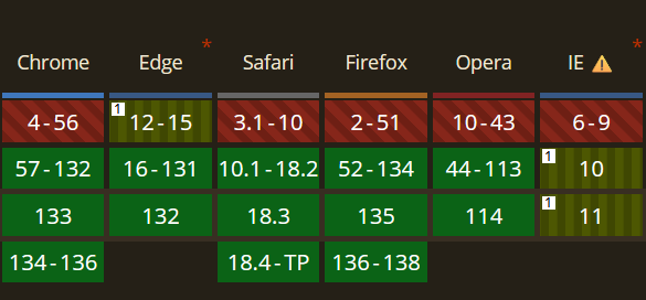
The grid-template-columns property has been around for quite some time. It was initially proposed as a candidate recommendation by the W3C in 2011. However, it gained full browser support in 2017 when all major browsers (Chrome, Firefox, Safari, Edge) adopted the standard CSS Grid specification.
Here’s a caniuse browser compatibility chart for the grid-template-columns properties:
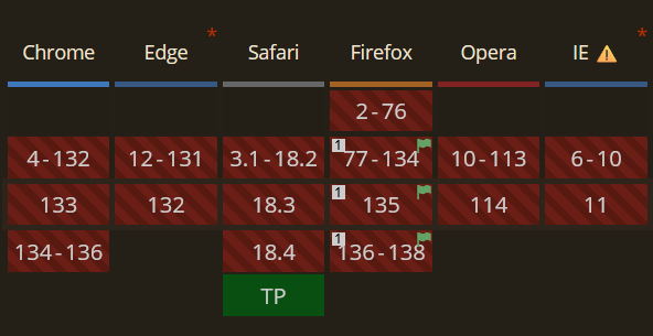
However, certain values, such as the [masonry] keyword, which is currently in Editor’s Draft status, remain experimental and lack full browser support. it can only be enabled behind the layout.css.grid-template-masonry-value.enabled flag in Firefox and the technology preview in Safari or using a polyfill:
 Conclusion
As I said at the very beginning of this post, grid-template-columns is just one aspect of the whole grid system. In this article, we learned how to manipulate column widths using the none, auto, max-content, min-content, and length values.
If this gets you excited, then you can dive deep into everything that comes with the display: grid line in your CSS. The possibilities are endless. Happy coding!
As web frontends get increasingly complex, resource-greedy features demand more and more from the browser. If you’re interested in monitoring and tracking client-side CPU usage, memory usage, and more for all of your users in production, try LogRocket.

LogRocket lets you replay user sessions, eliminating guesswork around why bugs happen by showing exactly what users experienced. It captures console logs, errors, network requests, and pixel-perfect DOM recordings — compatible with all frameworks.
LogRocket's Galileo AI watches sessions for you, instantly identifying and explaining user struggles with automated monitoring of your entire product experience.
Modernize how you debug web and mobile apps — start monitoring for free.

Build a CRUD REST API with Node.js, Express, and PostgreSQL, then modernize it with ES modules, async/await, built-in Express middleware, and safer config handling.

Discover what’s new in The Replay, LogRocket’s newsletter for dev and engineering leaders, in the March 25th issue.

Discover a practical framework for redesigning your senior developer hiring process to screen for real diagnostic skill.

I tested the Speculation Rules API in a real project to see if it actually improves navigation speed. Here’s what worked, what didn’t, and where it’s worth using.
Hey there, want to help make our blog better?
Join LogRocket’s Content Advisory Board. You’ll help inform the type of content we create and get access to exclusive meetups, social accreditation, and swag.
Sign up now

