There are plenty of third-party React Native libraries that provide dropdowns for your app, which offer functionality that allows users to select one item from a list of items to populate a form field.

But most of these third-party libraries are actually what are called “spinners” in mobile terminology. On Android, they resemble a dropdown, and, in iOS, they could look like either a spinning wheel at the bottom of the screen or have other configurations, depending on the props within the components and the version of iOS you use.
In this article, we are going to build the type of dropdown that you are likely used to in web development: a basic select form field that will look generally the same on both Android and iOS phones.
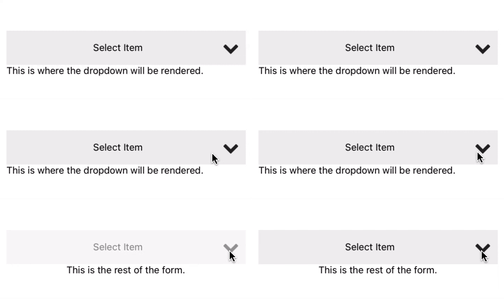
I created this project using create-react-native-app. You can find the GitHub repo here and an Expo Snack here. This is the starting point for the dropdown component.
It has a TouchableOpacity you can touch to make the dropdown visible or not, but right now, the function to display the dropdown only displays some text. The only third-party library I used is react-native-elements, which made adding an icon to the dropdown simple.
Notice there is only one state variable for toggling the visibility, and the position of the dropdown element is absolute, so it opens over the rest of the form.
import React, { FC, useState } from 'react';
import { StyleSheet, Text, TouchableOpacity } from 'react-native';
import { Icon } from 'react-native-elements';

interface Props {
  label: string;
}

const Dropdown: FC<Props> = ({ label }) => {
  const [visible, setVisible] = useState(false);

  const toggleDropdown = () => {
    setVisible(!visible);
  };

  const renderDropdown = () => {
    if (visible) {
      return (
          <Text style={styles.dropdown}>
            This is where the dropdown will be rendered.
          </Text>
      );
    }
  };

  return (
    <TouchableOpacity
      style={styles.button}
      onPress={toggleDropdown}
    >
      {renderDropdown()}
      <Text style={styles.buttonText}>{label}</Text>
      <Icon type='font-awesome' name='chevron-down'/>
    </TouchableOpacity>
  );
}

const styles = StyleSheet.create({
  button: {
    flexDirection: 'row',
    alignItems: 'center',
    backgroundColor: '#efefef',
    height: 50,
    width: '90%',
    paddingHorizontal: 10,
    zIndex: 1,
  },
  buttonText: {
    flex: 1,
    textAlign: 'center',
  },
  dropdown: {
    position: 'absolute',
    backgroundColor: '#fff',
    top: 50,
  },
});

export default Dropdown;
Here, I modified the App.tsx file that create-react-native-app generated to include both the dropdown component and some text it can cover when it is opened, but left the rest of the file the same:
export default function App() {
  return (
    <View style={styles.container}>
      <Dropdown label={'Select Item'} />
      <Text>This is the rest of the form.</Text>
      <StatusBar style="auto" />
    </View>
  );
}
Here is it in action:

This is where it gets interesting. We need a few more props for our component: one for the data that will populate the dropdown’s items, as well as a function to fire when an item is selected.
Here is the new interface for the props on the dropdown:
interface Props {
  label: string;
  data: Array<{ label: string; value: string }>;
  onSelect: (item: { label: string; value: string }) => void;
}
In order to create the list for the dropdown, we are going to use a Flatist. It is handy for things like this and has built-in functionality, making it more performant than a ScrollView.
We could use solely FlatList, except for one reason. When you click outside of the dropdown, it won’t automatically close and will force users to select an item to make it go away.
So, to get the functionality we want, we have to change the renderDropdown function to this:
const renderDropdown = (): ReactElement<any, any> => {
    return (
      <Modal visible={visible} transparent animationType="none">
        <TouchableOpacity
          style={styles.overlay}
          onPress={() => setVisible(false)}
        >
          <View style={[styles.dropdown, { top: dropdownTop }]}>
            <FlatList
              data={data}
              renderItem={renderItem}
              keyExtractor={(item, index) => index.toString()}
            />
          </View>
        </TouchableOpacity>
      </Modal>
    );
  };
There’s a minimal amount of available props in use on the FlatList:
data: the data used to build the listrenderItem: returns the component for each itemkeyExtractor: this sets the keys on the items so they can be identified. Most of the time, you can copy and paste this same functionIn the code block, we set the transparent prop on the Modal. This means that the Modal will fill the screen but any part without content will have a transparent overlay.
Inside of Modal, we add a TouchableOpacity with 100% width and height to cover the entire overlay so that when it is clicked, we can set visible to false and hide the Modal.
The View that wraps the FlatList sets the styles for the visible part of the modal and has the most style attributes of any of the elements:
dropdown: {
    position: 'absolute',
    backgroundColor: '#fff',
    width: '100%',
    shadowColor: '#000000',
    shadowRadius: 4,
    shadowOffset: { height: 4, width: 0 },
    shadowOpacity: 0.5,
  },
You may have noticed in the view we just examined that the top value in the style is set with a variable.
Because the modal is covering the entire screen and the dropdown has an absolute position inside of it, we have to measure where the button is located on the screen and set this top value to the height of the button plus its distance from the top of the screen.
So, we need a few more constants:
const DropdownButton = useRef();
const [dropdownTop, setDropdownTop] = useState(0);
And add the reference we created to the button:
<TouchableOpacity
  ref={DropdownButton}
  style={styles.button}
  onPress={toggleDropdown}
>
When we set the dropdown’s visibility to false, the functionality doesn’t change. But when we make the dropdown visible, we get the current instance of the button from the reference and use the element’s measure method to find its height and its vertical position on the screen. We then set the dropdownTop state variable to the sum of the height and vertical position.
const toggleDropdown = (): void => {
  visible ? setVisible(false) : openDropdown();
};

const openDropdown = (): void => {
  DropdownButton.current.measure((_fx, _fy, _w, h, _px, py) => {
    setDropdownTop(py + h);
  });
  setVisible(true);
};
Remember the renderItem prop of the FlatList? Here is the function that does that:
const renderItem = ({ item }): ReactElement<any, any> => (
  <TouchableOpacity style={styles.item} onPress={() => onItemPress(item)}>
    <Text>{item.label}</Text>
  </TouchableOpacity>
);
There is not much to it. We need to show the label and do something when the item is pressed.
Here is the onItemPress function:
 const onItemPress = (item): void => {
    setSelected(item);
    onSelect(item);
    setVisible(false);
  };
The first line sets a state variable to track the selected item.
const [selected, setSelected] = useState(undefined);
Then we use that selected item to replace the button label when it exists:
<Text style={styles.buttonText}>
  {(selected && selected.label) || label}
</Text>
The next line in the function calls the onSelect prop to set the item. Then, we hide the dropdown. There is a minimal amount of style applied to each item in the list to give them some padding and separate them.
item: {
  paddingHorizontal: 10,
  paddingVertical: 10,
  borderBottomWidth: 1,
},
App.tsx fileHere’s the new App.tsx function:
const App: FC = () => {
  const [selected, setSelected] = useState(undefined);
  const data = [
    { label: 'One', value: '1' },
    { label: 'Two', value: '2' },
    { label: 'Three', value: '3' },
    { label: 'Four', value: '4' },
    { label: 'Five', value: '5' },
  ];

  return (
    <View style={styles.container}>
      {!!selected && (
        <Text>
          Selected: label = {selected.label} and value = {selected.value}
        </Text>
      )}
      <Dropdown label="Select Item" data={data} onSelect={setSelected} />
      <Text>This is the rest of the form.</Text>
    </View>
  );
};
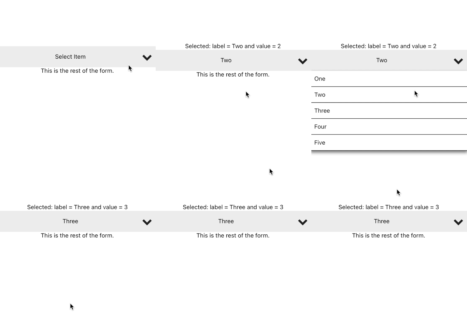
We added a state variable for the selected item in the dropdown, some data to play with, a Text element to display the selected Item, and the new props for the dropdown component. Here are the results:

The dropdown component we created will generally look the same on either Android or iOS. It is pretty basic right now, but with the main functionality worked out, you can add better styles and more features.
It does use one external library for the dropdown icon, which can be easily replaced with an image if you want a self-contained component. You can find the code for this tutorial at this GitHub repo. Feel free to fork it and add features! You can also see it in action in this Expo Snack.

LogRocket's Galileo AI watches sessions for you and and surfaces the technical and usability issues holding back your React Native apps.
LogRocket also helps you increase conversion rates and product usage by showing you exactly how users are interacting with your app. LogRocket's product analytics features surface the reasons why users don't complete a particular flow or don't adopt a new feature.
Start proactively monitoring your React Native apps — try LogRocket for free.
Hey there, want to help make our blog better?
Join LogRocket’s Content Advisory Board. You’ll help inform the type of content we create and get access to exclusive meetups, social accreditation, and swag.
Sign up now
<selectedcontent> element improves dropdowns

Learn how to implement an advanced caching layer in a Node.js app using Valkey, a high-performance, Redis-compatible in-memory datastore.

Learn how to properly handle rejected promises in TypeScript using Angular, with tips for retry logic, typed results, and avoiding unhandled exceptions.

AI’s not just following orders anymore. If you’re building the frontend, here’s how to design interfaces that actually understand your agent’s smarts.
One Reply to "Creating a custom React Native dropdown"
Please update to latest version of expo