Acting as the middleman between your users and your website, cursors can either limit or greatly enhance the way your users experience your site. This is why sleek, intentionally designed, custom cursors have become a significant part of UI and UX today.

Custom cursors are an opportunity to give your users direction in an engaging way and create a memorable, immersive experience for them on your website.
In this tutorial, we’ll take a look at what custom cursors are and learn how to use CSS (and JavaScript) to create custom cursors that will give your website a creative edge. To follow along with this tutorial, you should have some knowledge of HTML, CSS, and JavaScript.
Editor’s note: This article was last updated by Saleh Mubashar in May 2025 to provide more targeted advice on building custom cursors.
The Replay is a weekly newsletter for dev and engineering leaders.
Delivered once a week, it's your curated guide to the most important conversations around frontend dev, emerging AI tools, and the state of modern software.
We already interact with custom cursors every day. When you hover over buttons and the pointer cursor changes to a hand, or you hover over some text and the cursor changes to a text cursor, this interactivity is achieved through custom cursors.
However, there are many other creative experiences we can provide to our users with cursors. Before we dive into creating custom cursors, you should know that CSS provides you with cursors out of the box for some frequently performed tasks.
These cursors show you what can be done at the exact location you are hovering over. Examples include cursors indicating that you should click links, drag and drop elements, zoom in and out on things, and more.
All you have to do is specify the type of cursor you want using the CSS property. Some of the available cursors in CSS include:
| Cursor value | Description |
|---|---|
alias |
An alias or shortcut can be created |
all-scroll |
Scroll in any direction |
auto |
Default value – the browser pick a cursor |
cell |
Select a table cell |
col-resize |
Resize columns |
context-menu |
Opens a menu |
copy |
Copy an item |
crosshair |
Cross cursor indicating precise selection |
default |
Standard cursor |
e-resize / w-resize |
Resize to the right / left |
grab |
Drag an item |
grabbing |
Item is being dragged |
help |
Help info is available |
move |
An item can be moved |
n-resize / s-resize |
Resize upwards/downwards |
ne-resize / nesw-resize / sw-resize |
Resize top right diagonally |
no-drop |
Can’t drop an item |
none |
Hidden cursor |
not-allowed |
Action not allowed |
nw-resize / nwse-resize / se-resize |
Resize top left diagonally |
pointer |
Clickable item |
progress |
Loading but interactive |
row-resize |
Resize rows |
text |
Select text |
vertical-text |
Select vertical text |
wait |
Loading, not interactive |
zoom-in/ zoom-out |
Zoom in / zoom out |
Hover over the boxes below to see the cursors in action:
See the Pen
Untitled by Samson Omojola (@Caesar222)
on CodePen.
Check out the complete list of CSS cursors here.
While these cursors are useful and have some basic styling, we can certainly get more creative with custom cursors.
Creating a custom cursor with CSS is a pretty straightforward process. The first step is to find the image you want to use to replace the default cursor. You can either design one yourself or get a free PNG that suits your needs from an icon library such as FontAwesome.
Next, to create the custom cursor, use the cursor property with the url() function. We will pass the image location to the cursor using the url function:
body {
      cursor: url('path-to-image.png'), auto;
}
To ensure that this cursor is used on all parts of your website, the best place to use the cursor property is in the body tag of your HTML. However, if you want, you can assign custom cursors to specific elements instead of the whole website.
You can also add a fallback value to your cursor property. When using custom CSS properties, this value ensures that if the image that serves as your custom property is missing or cannot be loaded, then your users will have another option.
In this case, auto is the fallback descriptor for your custom cursor property. Your users will see the regular cursor if the custom one is unavailable.
You can also provide more than one custom cursor (multiple fallbacks) for your website. All you have to do is add their paths to the cursor property:
body {
      cursor: url('path-to-image.png'), url('path-to-image-2.svg'), url('path-to-image-3.jpeg'), auto;
}
There are three fallback cursors in the code above.
Because they draw attention to elements you want to highlight on your website, custom cursors are best used in specific scenarios, such as:
A few tips to keep in mind while creating custom cursors include:
.png or .svg images for transparencySay you have a table and you’d like the mouse cursor to change to a pointer (i.e., the hand icon) whenever a user hovers over a row in the table. You can use the CSS cursor property to achieve this.
Here’s an example:
<style>
  /* Style the table */
  table {
    font-family: arial, sans-serif;
    border-collapse: collapse;
    width: 100%;
  }

  /* Style the table cells */
  td, th {
    border: 1px solid #dddddd;
    text-align: left;
    padding: 8px;
  }

  /* Style the table rows */
  tr:hover {
    cursor: pointer;
  }
</style>

<table>
  <tr>
    <th>Name</th>
    <th>Age</th>
    <th>City</th>
  </tr>
  <tr>
    <td>John</td>
    <td>30</td>
    <td>New York</td>
  </tr>
  <tr>
    <td>Jane</td>
    <td>25</td>
    <td>Chicago</td>
  </tr>
  <tr>
    <td>Bill</td>
    <td>35</td>
    <td>Los Angeles</td>
  </tr>
</table>
In the above code, we use the tr:hover selector to apply the cursor property to all table rows when the mouse hovers over them. The cursor property is set to pointer, which changes the mouse cursor to a hand icon.
To hide the mouse cursor with CSS, you can use the cursor property and set its value to none.
Here’s an example:
<style>
  /* Style the body element */
  body {
    cursor: none;
  }
</style>

<body>
  <!-- Your content goes here -->
</body>
This will hide the mouse cursor throughout the entire webpage. If you only want to hide the mouse cursor for a specific element, you can apply the cursor property to that individual element instead of the body element.
There are several situations in which hiding the mouse cursor might be useful, such as:
Remember that hiding the mouse cursor can be confusing or disorienting for some users, depending on the use case. This strategy should be used carefully and only when necessary.
While custom cursors can be created using CSS, JavaScript offers additional advantages. Before we discuss that, let’s look at the advantages and disadvantages of creating custom cursors with CSS and JavaScript.
There are numerous reasons why it is preferable to create cursors with CSS:
The primary drawback of using CSS for custom cursors is the limited ability to add animations or advanced customizations.
This is where JavaScript comes in. JavaScript allows for more advanced interactions when users engage with the cursor—for example, hovering, clicking, or moving over specific elements. By listening to specific events, the cursor’s movements can then be updated and also be easily animated.
Creating a custom cursor with JavaScript involves manipulating DOM elements. We’ll create some DOM elements, which will serve as our custom cursor, and then use JavaScript to manipulate them. Then, as we move our cursor around, those custom elements will move around as our cursor.
Instead of using or downloading an image, we’ll design an animated cursor using CSS to make it more engaging. Move your cursor around the box below to see an example:
See the Pen
Untitled by Samson Omojola (@Caesar222)
on CodePen.
As you can see, the cursor consists of two elements: a large circle and a small circle. We’ll create two div elements and assign them class names:
<div class="cursor small"></div>
<div class="cursor big"><div>
Next, we’ll style the circles using CSS. The big circle will have a width and height of 50px and will be shaped into a circle using border-radius: 50%.
The small circle will be hollow, so we’ll define a border with a border-radius of 50% and set its width and height to 6px each. We also disable the default cursor by setting cursor: none so that our custom cursor can take its place.
To animate the big circle, we’ll use @keyframes. The animation lasts 2s, starting with a background-color of green and an opacity of 0.2. At the midpoint, the color changes to orange, and by the end, it turns red. We set animation-iteration-count to infinite to make the animation loop continuously:
body {
  background-color: #171717;
  cursor: none;
  height: 120vh;
}

.small {
  width: 6px;
  height: 6px;
  border: 2px solid #fff;
  border-radius: 50%;
}

.big {
  width: 50px;
  height: 50px;
  border-radius: 50%;
  animation-name: stretch;
  animation-duration: 2s;
  animation-timing-function: ease-out;
  animation-direction: alternate;
  animation-iteration-count: infinite;
}

@keyframes stretch {
  0% {
    opacity: 0.2;
    background-color: green;
    border-radius: 100%;
  }
  50% {
    background-color: orange;
  }
  100% {
    background-color: red;
  }
}
Now, to make the elements follow the mouse movement, we’ll use JavaScript. The script below listens for mouse movement on the webpage. When the user moves their mouse, the function retrieves the x and y coordinates and updates the position of both div elements accordingly:
const cursorSmall = document.querySelector('.small');
const cursorBig = document.querySelector('.big');

const positionElement = (e) => {
  const mouseX = e.clientX;
  const mouseY = e.clientY;

  cursorSmall.style.transform = `translate3d(${mouseX}px, ${mouseY}px, 0)`;
  cursorBig.style.transform = `translate3d(${mouseX}px, ${mouseY}px, 0)`;
};

window.addEventListener('mousemove', positionElement);
See the complete code alongside the interactive cursor in the below CodePen:
See the Pen
Untitled by Samson Omojola (@Caesar222)
on CodePen.
Here’s how it works:
querySelector to access the two div elementspositionElement function retrieves the current mouse x and y coordinatestransform: translate3d() property for both cursor elements, moving them accordinglytransform repositions elements in both horizontal and vertical directions, while translate3d adjusts their position in 3D spaceCustom cursors can make a website feel unique, but they can also be annoying or distracting if overused. Many people find them frustrating, especially if they make navigation harder. A cursor should help users, not get in their way.
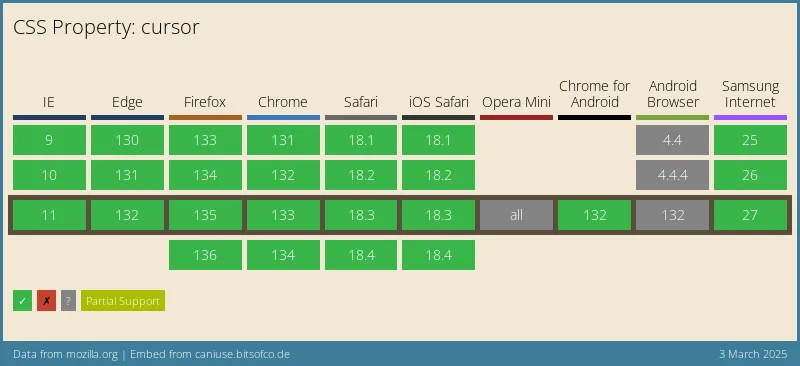
Before adding a custom cursor, ask yourself if it actually improves the experience or if it’s just for looks. Also, keep in mind that not all browsers support fancy cursor effects, especially older ones. Here’s the browser compatibility data for the cursor property from CanIUse:

To keep things user-friendly, use custom cursors sparingly and make sure they fit the design. If possible, give users the option to turn them off so they can stick with the default system cursor if they want.
Custom cursors might seem like a fun way to personalize a website, but they can cause serious accessibility issues. Many people rely on built-in OS features to modify their cursors, such as increasing size or using high-contrast colors. These changes help users with low vision or motor impairments navigate their devices more easily.
When a website overrides these modifications with a custom CSS cursor, it can make the experience frustrating—or even unusable—for some users.
If you must use a custom cursor, make sure to:
prefers-reduced-motion to disable custom cursors for users who find them distracting:@media (prefers-reduced-motion: reduce) {
*{
cursor: auto; /* Reverts to the default cursor */
}
}
aria-hidden="true" to the cursor elements to prevent them from being picked upAt the end of the day, a cursor should enhance usability, not get in the way. If there’s any chance a custom cursor could make a website harder to use, it’s best to avoid it altogether. I would also suggest reading this excellent article by Eric Bailey on the drawbacks of custom cursors. He makes a bunch of really good points.
In this tutorial, we discussed built-in CSS cursors, creating custom cursors with CSS, using multiple cursors, and adding animations with CSS and JavaScript. We also covered the pros and cons of using CSS vs. JavaScript for custom cursors, when to go beyond default options and accessibility factors to keep in mind.
As web frontends get increasingly complex, resource-greedy features demand more and more from the browser. If you’re interested in monitoring and tracking client-side CPU usage, memory usage, and more for all of your users in production, try LogRocket.

LogRocket lets you replay user sessions, eliminating guesswork around why bugs happen by showing exactly what users experienced. It captures console logs, errors, network requests, and pixel-perfect DOM recordings — compatible with all frameworks.
LogRocket's Galileo AI watches sessions for you, instantly identifying and explaining user struggles with automated monitoring of your entire product experience.
Modernize how you debug web and mobile apps — start monitoring for free.

A step-by-step guide to building your first MCP server using Node.js, covering core concepts, tool design, and upgrading from file storage to MySQL.

Using security headers in your Next.js apps is a highly effective way to secure websites from common security threats.

A deep dive into April 2026’s AI model and tool rankings. We break down performance, usability, pricing, and real-world capabilities across 50+ features to help you pick the right tools for your development workflow.

A practical guide to Agent Browser CLI. Learn how AI agents navigate, snapshot, and interact with web pages using stable references, enabling efficient automation and exploratory testing.
Would you be interested in joining LogRocket's developer community?
Join LogRocket’s Content Advisory Board. You’ll help inform the type of content we create and get access to exclusive meetups, social accreditation, and swag.
Sign up now