Creating visually appealing and responsive designs is critical in modern web development. One popular design element is the masonry layout, which is often used on platforms like Pinterest. This grid-like layout can significantly improve the aesthetic appeal of your website, optimizing the vertical use of space by positioning elements based on height.

You can create a masonry layout using pure CSS, however, if you’re using React, you can follow a more streamlined approach.
By utilizing a dedicated library like react-responsive-masonry, you can easily and efficiently construct masonry layouts with features like responsive breakpoints and dynamic height adjustments. The combination of functionality and ease of use makes react-responsive-masonry a powerful tool for enhancing your React applications’ design and UX.
In this article, we’ll demonstrate how to use the react-responsive-masonry package to create a responsive masonry layout in a React application. Whether you’re a seasoned React developer or just starting out, this tutorial should provide you with the knowledge you need to implement this unique layout style. Let’s get started!
Jump ahead:
The Replay is a weekly newsletter for dev and engineering leaders.
Delivered once a week, it's your curated guide to the most important conversations around frontend dev, emerging AI tools, and the state of modern software.
A masonry layout is a grid layout based on the masonry or brickwork concept, where items are arranged first vertically and then horizontally according to a grid.
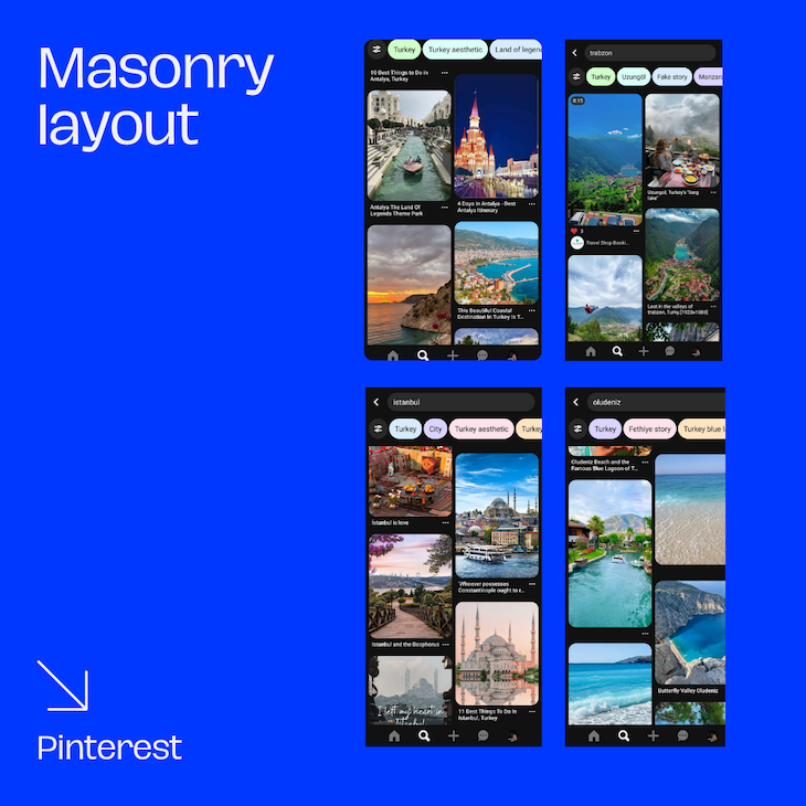
The main characteristic of the masonry layout is that it optimizes space by filling in empty gaps. This is particularly useful for handling elements of different heights. Pinterest is a popular example of this layout, leveraging masonry to display a variety of content in a visually engaging way:

Let’s start by setting up a new React project. Open your terminal and run the following command:
npx create-react-app masonry-layout
We’ll use Create React App to create a new React app with a single command. Once the command finishes, navigate into the new directory:
cd masonry-layout
To install the react-responsive-masonry package, run the following command in your terminal:
npm install react-responsive-masonry
Now that we have our React project set up and the react-responsive-masonry package installed, let’s create a masonry layout. Start by importing the Masonry component from the package in your App.js file:
import React from "react";
import Masonry from "react-responsive-masonry";
We’ll create a simple masonry layout with colored divs. But, in a real-world application, you’d use images, cards, or other components:
import React from "react";
import Masonry from "react-responsive-masonry";

function App() {
  const items = Array.from({ length: 20 }).map((_, index) => (
    <div
      key={index}
      style={{
        height: index % 2 ? "200px" : "250px",
        background: "#" + Math.floor(Math.random() * 16777215).toString(16),
        margin: "10px",
        borderRadius: "8px"
      }}
    />
  ));

  return (
    <div className="App">
      <Masonry columnsCount={3} gutter="10px">
        {items}
      </Masonry>
    </div>
  );
}
In the code above, we generate an array of 20 divs, each with a random color, a height of either 200px or 250px, a margin of 10px, and a border radius of 8px. Then, we pass these items to the Masonry component, which takes two props:
columnsCount: Determines the number of columns in the masonry layoutgutter: Sets the space between the items in the layoutTo start your React app and see the masonry layout in action, you can run npm start in your terminal. You should see the following:

While the Masonry component allows for a basic masonry layout, it lacks responsiveness. Here, the ResponsiveMasonry component comes in handy. The real power of react-responsive-masonry is its ability to create responsive layouts, meaning that the number of columns in the layout will change based on the viewport’s width.
The ResponsiveMasonry component accepts the columnsCountBreakPoints prop, where you provide an object that maps the browser width in pixels to the number of columns. The keys in the object are the viewport widths, and the values are the number of columns.
We can modify the previous example to use ResponsiveMasonry as follows:
import React from "react";
import Masonry, { ResponsiveMasonry } from "react-responsive-masonry";

function App() {
  const items = Array.from({ length: 100 }).map((_, index) => (
    <img
      key={index}
      src={`https://picsum.photos/200/${Math.floor(
        Math.random() * (300 - 200 + 1) + 200
      )}`}
      style={{ width: "100%", borderRadius: "8px" }}
    />
  ));
  return (
    <div className="App">
      <ResponsiveMasonry
        columnsCountBreakPoints={{ 300: 2, 500: 3, 700: 4, 900: 5 }}
      >
        <Masonry>{items}</Masonry>
      </ResponsiveMasonry>
    </div>
  );
}
In the code above:
You can customize these breakpoints based on your specific design requirements. This will look like the following:

When working with the masonry layout, you might have items with different heights. You’ll want your layout to adjust to accommodate these different heights and maintain a balanced view. For this, we can combine react-responsive-masonry with React Measure.
The React Measure library allows you to measure the dimensions of a React element, including the element’s width, height, and position relative to the viewport or another element.
First, import both libraries into your component file:
import Masonry from 'react-responsive-masonry';
import Measure from 'react-measure';
Next, wrap each of your masonry items with the Measure component:
<Masonry columnsCount={3}>
    {items.map((item, i) => (
        <Measure key={i}>
            {({ measureRef }) => (
                <div ref={measureRef}>
                    {/* content of the item */}
                </div>
            )}
        </Measure>
    ))}
</Masonry>
In this example, items is an array of your masonry items. For each item, we’re creating a Measure component with a unique key. measureRef is a function provided by the Measure component that you can use to measure the dimensions of the wrapped element.
measureRef to the item’s root elementThe Measure component uses a function as its child, also known as a function as a child component, or FaCC. The FaCC receives an object that contains the measureRef function. In the root element of the item you want to measure, you should pass the measureRef function to the ref prop.
Therefore, React Measure can keep track of the height of each item and re-measure it whenever it changes. When the height of an item changes, it triggers a re-render of the masonry layout, ensuring that the layout stays balanced and responsive.
When React Measure detects a change in an item’s height, it will trigger a re-measure of the item. react-responsive-masonry will then adjust the layout accordingly, ensuring that items are properly aligned and that the overall layout maintains a balanced and aesthetic look.
This combination of react-responsive-masonry and React Measure allows you to create a truly responsive masonry layout that adjusts to different screen sizes and items of different heights. This is particularly useful when dealing with content that can change size dynamically, like images that load at different times or text that changes based on user interaction.
Creating a responsive masonry layout in a React application can significantly enhance your app’s visual appeal and user experience. The flexibility and responsiveness of the masonry layout make it an excellent choice for showcasing diverse and dynamic content.
When combined with other libraries like React Measure, you can further enhance the dynamism of your layouts. By measuring the height of each item and adjusting the layout accordingly, you can create a layout that responds to screen size and the size of the content itself.
Hopefully, this guide has given you a clear understanding of how to leverage these tools to create responsive and dynamic masonry layouts in your React applications. Whether you’re building a photo gallery, a product grid, or a blog post layout, these techniques will help you to deliver a seamless and visually pleasing user experience.
Install LogRocket via npm or script tag. LogRocket.init() must be called client-side, not
server-side
$ npm i --save logrocket

// Code:

import LogRocket from 'logrocket';
LogRocket.init('app/id');
// Add to your HTML:

<script src="https://cdn.lr-ingest.com/LogRocket.min.js"></script>
<script>window.LogRocket && window.LogRocket.init('app/id');</script>

Learn how to use Gemini CLI subagents to delegate frontend, backend, testing, and docs tasks to specialized agents with guardrails and clear ownership.

Learn how next-browser gives AI agents runtime context for debugging Next.js apps, including React props, hydration, PPR, forms, and performance.

Build dynamic LLM routing in Next.js with OpenRouter, TanStack AI, task classification, model fallbacks, and cost-aware routing.

TSRX adds first-class control flow, conditional hooks, and scoped styles to React via a TypeScript compiler extension — no new framework required.
Hey there, want to help make our blog better?
Join LogRocket’s Content Advisory Board. You’ll help inform the type of content we create and get access to exclusive meetups, social accreditation, and swag.
Sign up now

 Learn more →
