Developers know that the icons they use for their apps are of vital importance, especially when rendering icons on different platforms. These are referred to as launcher icons, and, thanks to the Flutter package flutter_launcher_icons, it’s easier than ever to create them. In this tutorial, you’ll learn how to create Flutter launcher icons using this package.
The Replay is a weekly newsletter for dev and engineering leaders.
Delivered once a week, it's your curated guide to the most important conversations around frontend dev, emerging AI tools, and the state of modern software.
Before we get into development, make sure that you first have an image. I pulled a heart icon (included on GitHub) from Google Images. When you make your own, use a 1:1 ratio (mine is 714×714), as this will ensure your icon looks best and most evenly centered. The max is 1024×1024.
Now that you have an image, create a directory in your Flutter app called assets if you do not have one already. After you’ve created your assets directory, move your icon image into it.
![]()
The next thing you need to do is head over to your pubspec.yaml file, and, under dependencies, add flutter_launcher_icons. There is a slight issue here that I will get to in a moment. For now, let’s move on to the next part.
Next, you will need to add the flutter_icons property to pubspec.yaml just above dev_dependencies. Underneath this property, you will have three properties: image_path, android, and ios.
Image_path: this is where you include a reference to /assets/icon.png.Android: this is where you can specify a different file for Android. Otherwise, put true to default to image_pathiOS: this is where you can specify a different file for iOS. Otherwise, set true to default to image_path (I ran into an issue here too. I’ll cover that later on)Put the below code into pubspec.yaml to start.
flutter_icons:
 image_path: "assets/icon.png"
 android: true
 ios: true
Perfect. Now you can run flutter pub get to get and update all mentioned dependencies in pubspec.yaml. The next step is to run the command.
flutter pub run flutter_launcher_icons:main
If you follow the instructions under the installation on pub.dev, you will see it tells you to reference the latest version. Normally, this is fine, and for some of you, this will be sufficient. But for some reason, when I got the below error.
![]()
This is the issue I mentioned earlier, and this stumped me for a while. I followed the README and tried to follow this tutorial, cleared cache, etc. It would appear that there might be an issue with conflicting Flutter versions and the latest version of flutter_launcher_icons (0.9.2). It looks like the issue appears to be related to minSdkVersion, which basically specifies a minimum Android SDK version needed to work with the package.
N.B., flutter_launcher_icons released a new version in June 2022 (0.9.3) that appears to incorporate the solution I will outline below. You can see the merge request on GitHub. If for whatever reason you’re unable to upgrade to 0.9.3 then continue reading about the workaround.
If you’re still planning on using 0.9.2, I found a solution here. The workaround is to directly depend on the package by referencing the Git repository. We can do this by adding the below code to pubspec.yaml under dependencies.
flutter_launcher_icons:
   git:
     url: https://github.com/Davenchy/flutter_launcher_icons.git
     ref: fixMinSdkParseFlutter2.8
Here, we are referencing the Git repository for the package directly, as well as a specific commit, branch, or tag. It would appear that the solution is depending directly on a forked Git repo and branch of flutter_launcher_icons. See here.
Now that we have that in place, let’s run flutter_clean, then re-rerun flutter pub get && flutter pub run flutter_launcher_icons:main.

Perfect! It looks like there are no outstanding issues. Now we can try to see if our icons are reflected on their respective platforms.
To do this, run the app on whatever simulator or device you’d like to use and wait for it to open. Then, you can exit the app and see what the app icon looks like. If this worked correctly, the default Flutter icon should be replaced with your specified icon.
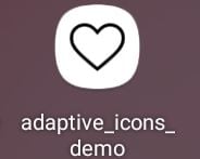
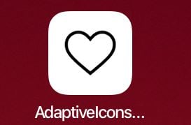
Here is our app with its new launcher icon.


As you can see, the two icon layouts look different based on the operating system and physical device, but our icon is reflected correctly! This is a great start. Now, let’s try to make our icons a bit more interesting.
To do this, we can experiment with a few more properties that belong to flutter_launcher_icons. Let’s say you’re developing for Android and you want to create a custom background color for your icon that is also transparent. You would use adaptive_icon_foreground and adaptive_icon_background to do it.
For adaptive_icon_foreground, you would make the image path the same as the image_path property. For adaptive_icon_background, you would add the background color you want, such as "#ed1e79". You can also make this property reference an image, but to keep it simple, let’s stick to a solid color.
Below is your updated flutter_icons pubspec.yaml code.
flutter_icons:
 image_path: "assets/icon-ios.png"
 adaptive_icon_foreground: "assets/icon-android.png"
 android: true
 ios: true
 adaptive_icon_background: "#ed1e79"
Here is the result on our Samsung Galaxy Tab A 8”.
![]()
As you can see, the icon image does not fit the launcher space as well as it did previously on this device. This is because when we use the adaptive_icon_foreground property, we also need to account for padding.
We were, however, able to change the icon’s background color and still use the original image. The padding issue should be resolved when you are first creating your icon. You can do this by utilizing various tools to style your icons specifically with this padding in mind.
This post goes over how to design these icons to account for adaptive sizing and padding requirements. It consists of three fundamentals: size and shape, keylines, and layers.
For size and shape, adaptive icons are 108dp by 108dp in size but are masked to a maximum of 72dp by 72dp. Different devices can supply different masks which must be convex in shape and may reach a minimum of 33dp from the center in places.
Because of the minimum reach of the mask, you can consider a centered 66dp diameter circle as a safe zone, guaranteed not to be clipped.
Keyline shapes are the foundation of the icon grid helping your icon’s visual proportions be consistent with other apps’ icons.
The keyline shapes are:
If you remember from earlier, adaptive icons can consist of two layers, a foreground and a background. The background needs to be opaque, whereas the foreground can have transparency. Including a separate background and foreground can allow more flexibility for icon animations or interactive effects.
There are templates available online (such as this Abode XD one) where you can use the .xd to view and refine your icon’s size, padding, and overall display and see how it looks with various masks. For more information on designing your adaptive icons, check out the post cited earlier by Nick Butcher. You can also use online tools such as the templates already shared or Figma to generate icons for your apps for both iOS and Android.
Something to note about platform differences is that iOS does not allow icons with alpha channel. An alpha channel is essentially a color component to show transparency for an image.
Some images with the background removed include an alpha channel to show how your image will look with the background removed. If your icon has an alpha channel and you try to run the command, you will get the following warning:
    WARNING: Icons with alpha channel are not allowed in the Apple App Store.
    Set "remove_alpha_ios: true" to remove it.
If you’re not developing for iOS, then this is negligible. If, however, you want your icons to be adaptive and to work well on multiple platforms, then you need to account for these differences.
I would like to note that adding remove_alpha_ios: true didn’t help resolve the issue of the launcher icon appearing as a black square on iOS. All this does is remove the logged warning above.
iOS does not like images that have transparency and prefers icons that are opaque. To resolve the black square launcher icon, I simply changed the background of my icon image to match the background color on iOS, then made use of the image_path_ios property. This property allows you to specify a separate path specifically for the iOS launcher icon.
Originally, I thought I could just specify the path in the ios property as the documentation said. But when I specified the path in ios instead of simply adding true, I would get an XCode error saying that the app could not be built.
I found this odd because I was not using the XCode editor and I wasn’t changing any XCode project settings.
As it turns out, I could get around this by setting the ios property to true and by specifying the ios image path in the image_path_ios property. Below is my updated flutter_icons code in pubspec.yaml.
flutter_icons:
 image_path: "assets/icon-ios.png"
 adaptive_icon_foreground: "assets/icon-android.png"
 android: true
 ios: true
 image_path_ios: "assets/icon-ios.png"
 adaptive_icon_background: "#ed1e79"
Here, we need to specify either image_path with image_path_ios or specify separately image_path_android and image_path_ios instead of image_path.
After finalizing these configurations, the new iOS launcher icon can render properly on an iPad. It also includes the properties related to the Android adaptive launcher icon. See below.
![]()
flutter_launcher_icons takes care of a lot of configurations when trying to use an adaptive icon as your launcher icon. It offers several properties to allow you to reference assets based on platform, as well as properties to allow for multiple layers on Android.
With that said, I did run into some issues that aren’t clearly addressed or addressed at all, particularly with minSdkVersion, style, and property conflicts.
The community, however, has offered a bevy of solutions and workarounds, and, as long as you can account for icon styling beforehand, you should be able to implement your respective platform icons with relative ease.
The accompanying code for this post is on GitHub.

AI companies are buying developer tools as coding agents turn runtimes, package managers, and linters into strategic infrastructure.

Learn how AI-assisted development governance uses rules, agents, hooks, and protocols to help AI coding tools produce safer, more consistent code.

A step-by-step guide to building your first MCP server using Node.js, covering core concepts, tool design, and upgrading from file storage to MySQL.

Using security headers in your Next.js apps is a highly effective way to secure websites from common security threats.
Would you be interested in joining LogRocket's developer community?
Join LogRocket’s Content Advisory Board. You’ll help inform the type of content we create and get access to exclusive meetups, social accreditation, and swag.
Sign up now