
Burndown charts have revolutionized product and project management. Every product person is using them in some way.
But not everyone knows that a burndown chart has a twin — a burnup chart. Although less popular, burnups are invaluable tools for monitoring work and drawing comprehensive improvement conclusions. In many cases, they provide more comprehensive insights than burndowns, making them a powerful asset in your project management toolkit.
In this blog, I explore burnup charts in more detail. Read on!
As the name suggests, burnup charts are opposites of the burndown charts.
A burndown chart tracks how much scope we “burn” over time — going from planned scope to zero. Burnup charts track how much scope we’ve completed by building a “completed” line that tries to catch up with the planned scope:
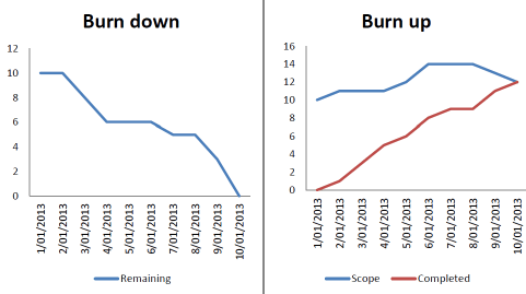
In theory, burnup and burndown charts are great tools for tracking the team’s overall progress, usually on a sprint-to-sprint basis. By observing the trends, we can easily see if the team is on track and react accordingly.
However, I find them most valuable for retrospectives. Burnup charts provide a comprehensive view of the sprint, allowing you to analyze how the sprint went well, what anomalies occurred, and what you can learn from them. This retrospective analysis can lead to actionable insights for future sprints.
A burnup chart has three main components:
1. Scope
The first line of the burnup chart is the planned scope. Ideally, it should be a flat line throughout the sprint, but this is often a living metric that can increase (scope creep) or decrease (scope cut) over time.
2. Point in time
The burnup chart tracks changes over time, so we must be able to associate planned and completed scope to an exact date, which helps understand trends and pinpoint specific periods when some anomalies happened.
3. Completed
The completed metric tracks the number of units of work (usually story points) completed at a given time. It helps monitor progress and the difference between the plan and completion:
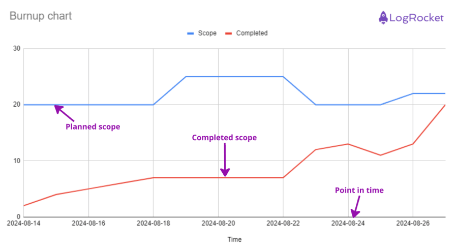
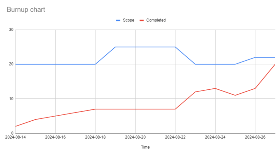
I’ll explain the process of interpreting a burnup chart with an example for a two-week sprint:
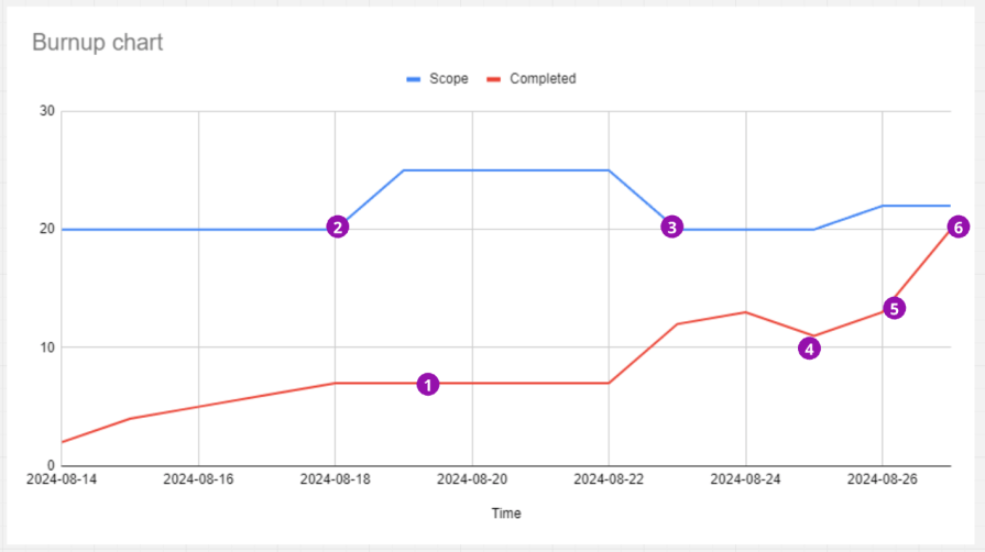
I start by thinking of two things — what anomalies do you notice? What next steps should you take based on the chart? Through these questions, I have derived these six insights which I would take away to ponder:
1. Flatline:
The first thing that grabbed my attention was the flatline between 08-18 and 08-22. Ideally, the burnup should continuously go up. We should investigate what slowed the team down.
2. Scope creep:
I notice a sizeable scope creep a few days after a sprint start. Why was the initial planning insufficient? Did the team even agree to add 25 percent more scope mid-sprint? How can we avoid it?
3. Descoping:
Five points disappeared from the plan on 08-23. Is this the same scope that was added a couple of days earlier? If yes, why?
Adding and removing the same scope is a wasteful distraction. Of course, the chances are that the product owner removed the scope that was no longer needed or valuable, which could be a good sign. But further investigation is necessary.
4. Completion drop:
Some work was moved back from “done” — why is that? Were some bugs found after testing? Was the initial scope not implemented properly?
5. End-of-sprint spike:
A spike at the end of the sprint is typical for both burndowns and burnups. It usually indicates a poor QA process — tickets are moved to QA at the very end of the sprint, resulting in rushed testing and moving many tickets to be done on the very last day.
These spikes are risky, and we should investigate ways to deliver scope sooner rather than later.
6. Initial plan completion:
Even though the scope and completed lines didn’t meet, the team finished exactly the amount of work they initially planned, which is a good sign from a capacity planning perspective.
The next obvious question you’d have is likely about which one of the two — burnup or burndown — is better to use. I’ll answer this now.
Burndown charts are more straightforward to set up and easier to track. However, they underperform when it comes to monitoring scope changes. I’ll explain this with an example chart:
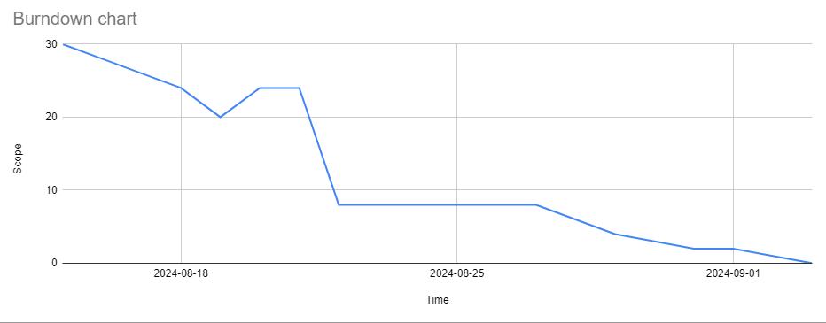
This burndown chart led me to multiple doubts:
Even though burnup charts are slightly more complex because you have to track two metrics rather than one, they give you much more insight.
I recommend using burndown charts only when the scope is very stable and doesn’t change throughout the sprint. But if you experience scope changes regularly, go with burnup charts.
Most product management and delivery software has a built-in burnup chart option.
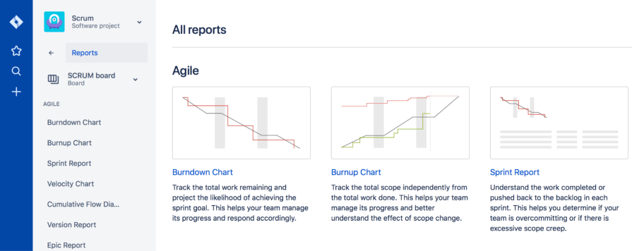
If you are using Jira, for example, go to Reports and then the Agile section, and you’ll be able to generate the burnup with one click:
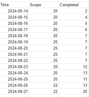
If you need to create one from scratch, Excel is your friend. You’ll need three columns:
For example:
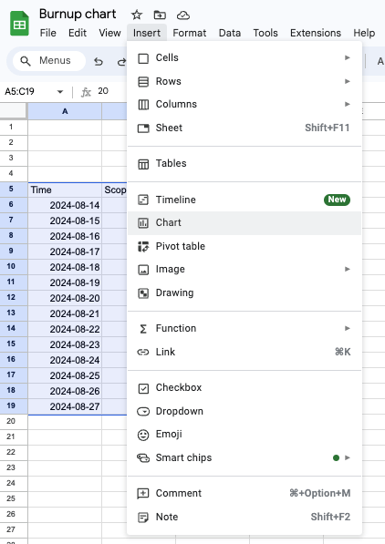
Then, just create a line chart by going to Insert and then Chart:
You have your very own burnup chart now. To edit visual details such as the title, ranges to display, etc., right-click on the chart and go to Chart Style:
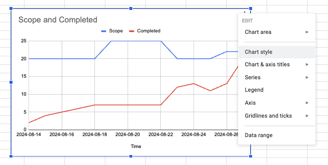
I like manually setting the maximum amount of the chart range to give the top area more breathing room, but the aesthetics are purely up to you. Here’s what my final burnup chart looked like:
I’ll now share a few of the best practices I’ve realized when it comes to burnup charts. These are applicable for burndown charts, too:
Burnups themselves don’t generate value. To get the most out of them, review them regularly. They become a valuable tool only with continuous inspection and adoption cycles.
If your estimates are sloppy, so will your charts.
Don’t get me wrong, you don’t have to be overly precise — that would be a waste of time, and we all know precision is often impossible. But something is wrong if your team delivers 20 story points in one sprint, 50 in another, and then back to 30. Fix that first before using burnups.
Burnups are just a tool to monitor and improve your teams’ performance. They provide great insight, but I would treat them as just that — a data point to learn from.
Agile development is too complex to predict and execute work perfectly, and your charts will never look perfect. And that’s okay. It’s all about the value we deliver to customers, not how pretty our charts are.
I firmly believe that burnup charts are heavily underappreciated and forgotten tools, while burndown charts are simply overhyped. I understand where this comes from, though. Agile literature tends to talk mostly about burndown charts.
But the problem is that most books and theories about agile and scrum assume that the scope of the sprint doesn’t change much — that we are able to plan for the sprint and protect the team from scope changes.
Any seasoned product manager knows that it’s slightly idealistic. Not only do the market, and thus priorities, change all the time, but we also make mistakes. We’ve all, at least once, forgotten to let the team know about an extra requirement during the sprint planning.
With scope changing over time, burndowns become extremely noisy. They do their job of tracking how much work is left to do, but without offering insight into whether the trends come from completion changes or scope changes, the insights they give are limited.
Burnups, on the other hand, can help pinpoint specific problems at specific points in time.
With this in mind, I see very few scenarios where burndown could be a better option than burnup. In short, go with burnup charts over burndown charts whenever in doubt.
LogRocket identifies friction points in the user experience so you can make informed decisions about product and design changes that must happen to hit your goals.
With LogRocket, you can understand the scope of the issues affecting your product and prioritize the changes that need to be made. LogRocket simplifies workflows by allowing Engineering, Product, UX, and Design teams to work from the same data as you, eliminating any confusion about what needs to be done.
Get your teams on the same page — try LogRocket today.

Companies don’t agree on the definition of a product manager. However, the essence remains to drive value for customers and the business.

Sowmya Sundararagavan shares best practices for maintaining a strong long-term vision while also remaining flexible.
A feasibility study template is a document that serves as a guide to evaluate whether a project or initiative is practical and worth pursuing.

Julie Swanke talks about the importance of prioritizing intuition and user-friendliness while building internal tools.