Editor’s note: This post was updated by Elijah Agbonze on 24 May 2023 to add information about the hover, focus, and active states in Tailwind CSS tables. For more information, check out “Building reusable React components using Tailwind CSS.”

Tailwind CSS comes with a default set of utility classes that help developers build good-looking components in a simple way.
In this tutorial, we will learn how easy it is to build components using Tailwind CSS by creating a table component and using Tailwind to design a better variant of it.
We’ll cover:
The Replay is a weekly newsletter for dev and engineering leaders.
Delivered once a week, it's your curated guide to the most important conversations around frontend dev, emerging AI tools, and the state of modern software.
We’ll start by building a sample card component, like the one below:
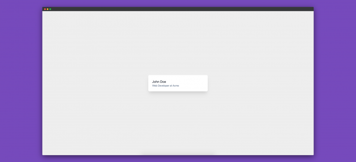
To create this card component, we need the following HTML:
<div class="card">
  <div class="card-content">
    <h4 class="card-title">John Doe</h4>
    <p class="card-message">Web Developer at Acme</p>
  </div>
</div>
<style>
  .card {
    display: flex;
    width: 25%;
    margin: 0 auto;
    padding: 1.5rem;
    border-radius: 0.5rem;
    background-color: #fff;
    box-shadow: 0 20px 25px -5px rgba(0, 0, 0, 0.1),
      0 10px 10px -5px rgba(0, 0, 0, 0.04);
  }
  .card-content {
    padding-top: 0.25rem;
  }
  .card-title {
    color: #1a202c;
    font-size: 1.25rem;
    line-height: 1.25;
  }
  .card-message {
    color: #718096;
    font-size: 1rem;
    line-height: 1.5;
  }
</style>
The equivalent of the above HTML and CSS using Tailwind is the following:
<div class="w-1/4 mx-auto flex p-6 bg-white rounded-lg shadow-xl">
  <div class="pt-1">
    <h4 class="text-xl text-gray-900 leading-tight">John Doe</h4>
    <p class="text-base text-gray-600 leading-normal">
      Web Developer at Acme
    </p>
  </div>
</div>
As we can see, when using Tailwind, we can create components much faster and using far less code.
Utility classes provide functions or methods that are generally used throughout an application. They perform specific functions and are independent of other classes. In CSS, these classes can be with the usual class selectors or any other selectors:
.flex {
  display: fex;
}
The declaration above is an example of a CSS utility class or, as it’s popularly called, functional CSS. Its only job is to convert any element it is used on to a flex element.
Utility classes have existed in CSS for a long time, but they received more attention from the dev community when Tailwind CSS was released. Since then, utility classes have become a go-to for developers working on both large-scale and small-scale applications.
Semantic CSS, which involves naming your class names using the separation of concerns approach, doen’t provide reusable CSS. Coming up with unique names for each class, even with BEM, can be challenging.
With utility classes, you can easily create a table component with styles from a fixed set. This way, your styles remain reusable and independent of your markup.
A framework that prioritizes the use of small, single-purpose and reusable utility classes is a utility-first framework. Each class usually targets a specific property, like color, alignment, and typography, and they are combined to achieve a desired styling without writing custom CSS for every element.
Apart from TailwindCSS, there are other utility-first frameworks like Tachyons, Bootstrap (with utilities), and more.
To begin crafting our table component, let’s first create our project directory:
mkdir build-components-using-tailwind && cd build-components-using-tailwind
This creates an empty build-components-using-tailwind directory, as well as changes our current working directory.
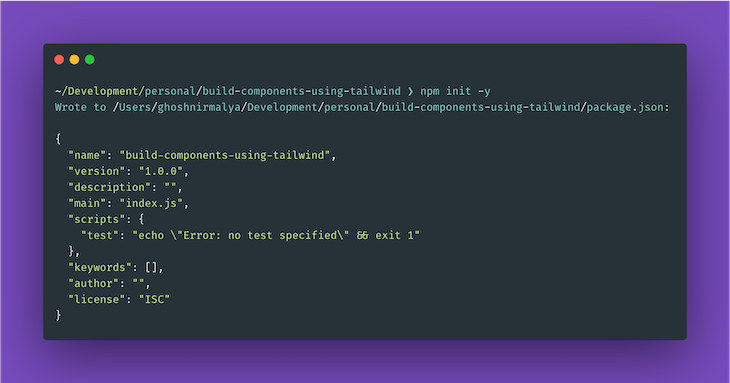
Next, let’s initialize our project with npm:
npm init -y
This command creates a package.json file inside our current working directory:
We can install Tailwind from npm:
# Using npm
npm install tailwindcss

# Using Yarn
yarn add tailwindcss
This adds tailwindcss to our list of dependencies.
Next, we’ll create an HTML file with some default contents:
// index.html

<!DOCTYPE html>
<html lang="en">
  <head>
    <meta charset="utf-8" />
    <meta
      name="viewport"
      content="width=device-width, initial-scale=1, shrink-to-fit=no"
    />
    <link rel="stylesheet" href="styles.css" />
    <title>Tailwind</title>
  </head>
  <body>
  </body>
</html>
We also need to create an empty styles.css file where our used styles will be compiled to using the Tailwind CLI tool later on.
Next, we’ll use the @tailwind directive to inject Tailwind’s base, components, and utilities styles into the CSS:
// tailwind.css

@tailwind base;
@tailwind components;
@tailwind utilities;
If we want to, we can also create a Tailwind configuration file to customize our Tailwind installation:
npx tailwindcss init
The above command creates a minimal tailwind.config.js file:
// tailwind.config.js

module.exports = {
  content: ['./*.html'],
  theme: {
    extend: {},
  },
  plugins: [],
}
Next, let’s use the Tailwind CLI tool to process our CSS:
npx tailwindcss -i tailwind.css -o styles.css
We can also use PostCSS to configure our Tailwind installation. To do that, install the necessary dependencies to the project:
# Using npm
npm install postcss-cli --save-dev

# Using Yarn
yarn add postcss-cli -D
This adds postcss-cli to our devDependencies. We’ll compile our styles only during development; while deploying to production, we’ll ship our compiled styles. As a result, we need postcss-cli only during development.
We must also create a postcss.config.js file to configure PostCSS:
// postcss.config.js

module.exports = {
  plugins: [require("tailwindcss")]
};
Next, we need to add a script in our package.json file for compiling our Tailwind styles:
// package.json

"scripts": {
  "tailwind:watch": "postcss tailwind.css -o styles.css -w"
},
This script compiles the styles present in the tailwind.css file and generates the styles you make use of in the styles.css file. So, let’s run our script:
# using npm
npm run tailwind:watch

# using yarn
yarn tailwind:watch
Now, let’s build our first component using Tailwind.
In this section, we’ll create a table using HTML and use the Tailwind utility classes to give it a better look.
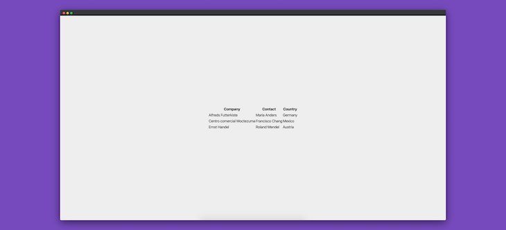
So, let’s write a table component in HTML:
// index.html

<table>
  <tr>
    <th>Company</th>
    <th>Contact</th>
    <th>Country</th>
  </tr>
  <tr>
    <td>Alfreds Futterkiste</td>
    <td>Dante Sparks</td>
    <td>Italy</td>
  </tr>
  <tr>
    <td>Centro comercial Moctezuma</td>
    <td>Neal Garrison</td>
    <td>Spain</td>
  </tr>
  <tr>
    <td>Ernst Handel</td>
    <td>Maggie O'Neill</td>
    <td>Austria</td>
  </tr>
</table>
The above HTML creates the following basic table component:
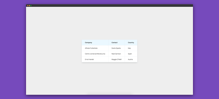
Now, let’s add some Tailwind utility classes to improve our component:
// index.html

<table class="shadow-lg bg-white">
  <tr>
    <th class="bg-blue-100 border text-left px-8 py-4">Company</th>
    <th class="bg-blue-100 border text-left px-8 py-4">Contact</th>
    <th class="bg-blue-100 border text-left px-8 py-4">Country</th>
  </tr>
  <tr>
    <td class="border px-8 py-4">Alfreds Futterkiste</td>
    <td class="border px-8 py-4">Dante Sparks</td>
    <td class="border px-8 py-4">Italy</td>
  </tr>
  <tr>
    <td class="border px-8 py-4">Centro comercial Moctezuma</td>
    <td class="border px-8 py-4">Neal Garrison</td>
    <td class="border px-8 py-4">Spain</td>
  </tr>
  <tr>
    <td class="border px-8 py-4">Ernst Handel</td>
    <td class="border px-8 py-4">Maggie O'Neill</td>
    <td class="border px-8 py-4">Austria</td>
  </tr>
</table>
After adding the above classes to the HTML, our table component looks like this:
border-separateCurrently, each cell in our table component shares a common border:
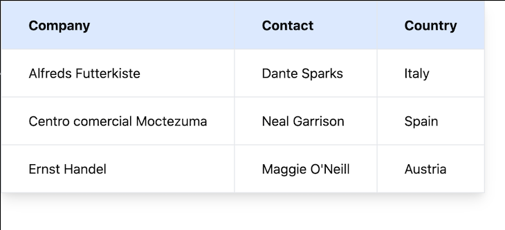
Here, each cell borrows some of its borders from either the adjacent, top, or bottom cells. For example, the rightmost cells share their left, top, and bottom borders with their sibling cells.
Now, we can force each cell in the table to have its own borders. To do that, we use the Tailwind CSS property border-separate. Let’s add border-separate to the table element:
<table class="shadow-lg bg-white border-separate">
  <tr>
    <th class="bg-blue-100 border text-left px-8 py-4">Company</th>
    <th class="bg-blue-100 border text-left px-8 py-4">Contact</th>
    <th class="bg-blue-100 border text-left px-8 py-4">Country</th>
  </tr>
  <tr>
    <td class="border px-8 py-4">Alfreds Futterkiste</td>
    <td class="border px-8 py-4">Dante Sparks</td>
    <td class="border px-8 py-4">Italy</td>
  </tr>
  <tr>
    <td class="border px-8 py-4">Centro comercial Moctezuma</td>
    <td class="border px-8 py-4">Neal Garrison</td>
    <td class="border px-8 py-4">Spain</td>
  </tr>
  <tr>
    <td class="border px-8 py-4">Ernst Handel</td>
    <td class="border px-8 py-4">Maggie O'Neill</td>
    <td class="border px-8 py-4">Austria</td>
  </tr>
</table>
Our table component now looks like this:
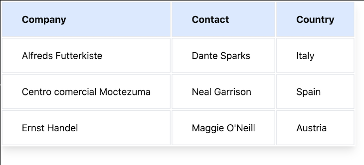
Each cell has its own border, and some padding was added to depict the separation. border-separate is the same as border-collapse: separate in CSS.
border-collapse to our table componentInversely, we can make the cells of our table component share a common border with their adjacent cells using border-collapse.
Let’s add border-collapse on the top-level table element:
<table class="shadow-lg bg-white border-collapse">
  <tr>
    <th class="bg-blue-100 border text-left px-8 py-4">Company</th>
    <th class="bg-blue-100 border text-left px-8 py-4">Contact</th>
    <th class="bg-blue-100 border text-left px-8 py-4">Country</th>
  </tr>
  <tr>
    <td class="border px-8 py-4">Alfreds Futterkiste</td>
    <td class="border px-8 py-4">Dante Sparks</td>
    <td class="border px-8 py-4">Italy</td>
  </tr>
  <tr>
    <td class="border px-8 py-4">Centro comercial Moctezuma</td>
    <td class="border px-8 py-4">Neal Garrison</td>
    <td class="border px-8 py-4">Spain</td>
  </tr>
  <tr>
    <td class="border px-8 py-4">Ernst Handel</td>
    <td class="border px-8 py-4">Maggie O'Neill</td>
    <td class="border px-8 py-4">Austria</td>
  </tr>
</table>
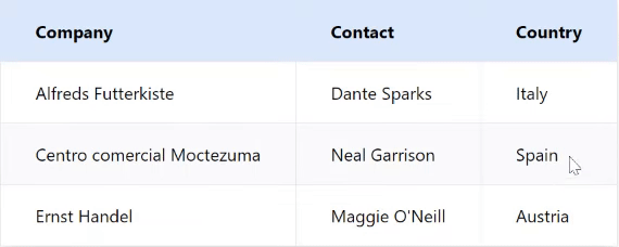
Our table component now looks like this:

Note that using border-collapse in Tailwind CSS is the same as using the border-collapse: collapse property in CSS.
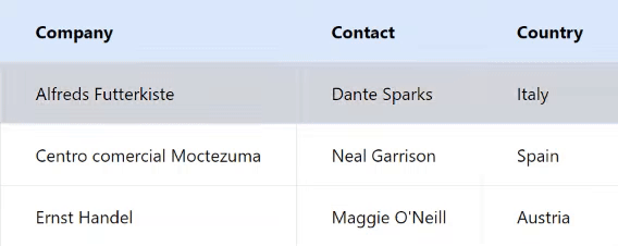
In this section, we will add some interactivity to our existing table design using the hover, focus, and active variants.
hover variantWhen a cursor moves over a row, you can use the hover variant to style that row. The TailwindCSS hover variant is the hover pseudo-class in CSS:
<table class="shadow-lg bg-white border-collapse">
  <tr>
    <th class="bg-blue-100 border text-left px-8 py-4">Company</th>
    <th class="bg-blue-100 border text-left px-8 py-4">Contact</th>
    <th class="bg-blue-100 border text-left px-8 py-4">Country</th>
  </tr>
  <tr class="hover:bg-gray-50">
    <td class="border px-8 py-4">Alfreds Futterkiste</td>
    <td class="border px-8 py-4">Dante Sparks</td>
    <td class="border px-8 py-4">Italy</td>
  </tr>
  <tr class="hover:bg-gray-50">
    <td class="border px-8 py-4">Centro comercial Moctezuma</td>
    <td class="border px-8 py-4">Neal Garrison</td>
    <td class="border px-8 py-4">Spain</td>
  </tr>
  <tr class="hover:bg-gray-50">
    <td class="border px-8 py-4">Ernst Handel</td>
    <td class="border px-8 py-4">Maggie O'Neill</td>
    <td class="border px-8 py-4">Austria</td>
  </tr>
</table>
focus variantWhen a user focuses on a row using the tab keypad or simply clicks the row, you can use a focus variant to style it. The Tailwind CSS focus variant is the focus pseudo-class in CSS.
By default, tr is not focusable in HTML, but when you set the tabIndex attribute to 0, it becomes focusable:
<table class="shadow-lg bg-white border-collapse">
  <tr>
    <th class="bg-blue-100 border text-left px-8 py-4">Company</th>
    <th class="bg-blue-100 border text-left px-8 py-4">Contact</th>
    <th class="bg-blue-100 border text-left px-8 py-4">Country</th>
  </tr>
  <tr
    class="hover:bg-gray-50 focus:bg-gray-300"
    tabindex="0"
  >
    <td class="border px-8 py-4">Alfreds Futterkiste</td>
    <td class="border px-8 py-4">Dante Sparks</td>
    <td class="border px-8 py-4">Italy</td>
  </tr>
  <tr
    class="hover:bg-gray-50 focus:bg-gray-300"
    tabindex="0"
  >
    <td class="border px-8 py-4">Centro comercial Moctezuma</td>
    <td class="border px-8 py-4">Neal Garrison</td>
    <td class="border px-8 py-4">Spain</td>
  </tr>
  <tr
    class="hover:bg-gray-50 focus:bg-gray-300"
    tabindex="0"
  >
    <td class="border px-8 py-4">Ernst Handel</td>
    <td class="border px-8 py-4">Maggie O'Neill</td>
    <td class="border px-8 py-4">Austria</td>
  </tr>
</table>
active variantWhen a row is actively clicked, it can be styled using the active variant. The Tailwind CSS active variant is the active pseudo-class in CSS:
<table class="shadow-lg bg-white border-collapse">
  <tr>
    <th class="bg-blue-100 border text-left px-8 py-4">Company</th>
    <th class="bg-blue-100 border text-left px-8 py-4">Contact</th>
    <th class="bg-blue-100 border text-left px-8 py-4">Country</th>
  </tr>
  <tr
    class="hover:bg-gray-50 focus:bg-gray-300 active:bg-red-200"
    tabindex="0"
  >
    <td class="border px-8 py-4">Alfreds Futterkiste</td>
    <td class="border px-8 py-4">Dante Sparks</td>
    <td class="border px-8 py-4">Italy</td>
  </tr>
  <tr
    class="hover:bg-gray-50 focus:bg-gray-300 active:bg-red-200"
    tabindex="0"
  >
    <td class="border px-8 py-4">Centro comercial Moctezuma</td>
    <td class="border px-8 py-4">Neal Garrison</td>
    <td class="border px-8 py-4">Spain</td>
  </tr>
  <tr
    class="hover:bg-gray-50 focus:bg-gray-300 active:bg-red-200"
    tabindex="0"
  >
    <td class="border px-8 py-4">Ernst Handel</td>
    <td class="border px-8 py-4">Maggie O'Neill</td>
    <td class="border px-8 py-4">Austria</td>
  </tr>
</table>
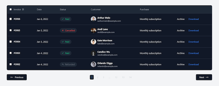
You don’t have to build a table component from scratch if you don’t want to. tailwindcomponents provides an extensive list of table templates for different purposes. All you have to do is download the template and add to your code.
Below is an example of a responsive invoice table template by Khatabwedaa:
Tailwind makes it easy to develop beautiful components in our project. And through the use of utility classes, we can build components in very few lines of code. The table component that we built here is available on GitHub.
As web frontends get increasingly complex, resource-greedy features demand more and more from the browser. If you’re interested in monitoring and tracking client-side CPU usage, memory usage, and more for all of your users in production, try LogRocket.

LogRocket lets you replay user sessions, eliminating guesswork around why bugs happen by showing exactly what users experienced. It captures console logs, errors, network requests, and pixel-perfect DOM recordings — compatible with all frameworks.
LogRocket's Galileo AI watches sessions for you, instantly identifying and explaining user struggles with automated monitoring of your entire product experience.
Modernize how you debug web and mobile apps — start monitoring for free.

Learn what context rot is, why AI agent sessions degrade over time, and how to fix it with compaction, prompt anchoring, context files, plan files, and RAG.

Learn about TypeScript v6’s breaking changes, new ES2025 features, and deprecated options. A complete migration guide from v5 to prepare for v7.

Learn how Vite+ unifies Vite, Vitest, Oxlint, Oxfmt, Rolldown, and Node.js management in one CLI.

AI companies are buying developer tools as coding agents turn runtimes, package managers, and linters into strategic infrastructure.
Hey there, want to help make our blog better?
Join LogRocket’s Content Advisory Board. You’ll help inform the type of content we create and get access to exclusive meetups, social accreditation, and swag.
Sign up now

 Learn more →
