Long, complex forms can easily overwhelm your users, leading to frustration and potential abandonment. In the apps you build, you may continuously find yourself needing to collect a significant amount of information through forms — whether for onboarding, checkout, or survey processes.
After making this once, I decided to create a reusable multi-step form component that I can reuse in all my React projects.
In this guide, I’ll walk through the process of building a reusable multi-step form component in React using React Hook Form and Zod for validation. This component will handle input validation, track form progress, and persist the form data in storage to prevent data loss and provide a smooth user experience.
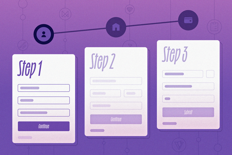
You can download the source code from the project’s repository or view the live demo here. Here’s a look at what we’ll be creating:
The Replay is a weekly newsletter for dev and engineering leaders.
Delivered once a week, it's your curated guide to the most important conversations around frontend dev, emerging AI tools, and the state of modern software.
To follow along, you should have:
React.ContextLet’s get to the meat!
Here’s a summary of the packages we’ll be using to create this application:
Open up your terminal in your preferred directory and run this command to create a new React app with Vite and TypeScript:
pnpm create vite@latest multi-step-form
# Select React + TypeScript & SWC to follow along
Next, move into the project folder and install the packages mentioned earlier:
cd multi-step-form
pnpm install && pnpm add react-hook-form react-router-dom zod @mantine/hooks framer-motion lucide-react
This will create our foundation. Next, let’s install Tailwind and initialize shadcn in our project.
As mentioned above, we’ll be using shadcn, an open source collection of components, to design the form layout. This will allow us to focus more on implementing the form’s logic. If you need help, refer to the official documentation for guidance.
Install and initialize Tailwind with the following command:
pnpm add -D tailwindcss postcss autoprefixer
Then generate the tailwind.config.js and postcss.config.js files with the following command:
pnpm tailwindcss init -p
With the configuration files in place, add the Tailwind directives to your main stylesheet (e.g., src/index.css):
@tailwind base;
@tailwind components;
@tailwind utilities;

/* your custom css here */
Next, update your tailwind.config.js file to specify the paths to your content files. This ensures Tailwind can purge unused styles in production:
/** @type {import('tailwindcss').Config} */
module.exports = {
  content: ["./index.html", "./src/**/*.{ts,tsx,js,jsx}"],
  theme: {
    extend: {},
  },
  plugins: [],
};
For better module resolution, configure tsconfig.json with an alias for the src directory. This will simplify imports throughout the project:
// tsconfig.json
{
  "compilerOptions": {
    "baseUrl": ".",
    "paths": {
      "@/*": ["./src/*"]
    }
  }
}
Vite also comes with a tsconfig.app.json in which we’ll do the same thing:
// tsconfig.app.json
{
  "compilerOptions": {
    "baseUrl": ".",
    "paths": {
      "@/*": ["./src/*"]
    }
  }
}
Next, update your Vite configuration to recognize this alias. Open vite.config.ts and add the following:
// vite.config.ts
import path from 'path'
import { defineConfig } from 'vite'
import { fileURLToPath } from 'url'
import react from '@vitejs/plugin-react-swc'

const __dirname = fileURLToPath(new URL('.', import.meta.url))

export default defineConfig({
  plugins: [react()],
  resolve: {
    alias: {
      '@': path.resolve(__dirname, './src'),
    },
  },
})
With Tailwind configured, it’s time to set up shadcn. Initialize it by running the following:
pnpm dlx shadcn@latest init -d
During initialization, shadcn will perform checks, validate your framework, set up Tailwind, and update your project files. Once the process is complete, you’ll see an output like this:
✔ Preflight checks.
✔ Verifying framework. Found Vite.
✔ Validating Tailwind CSS.
✔ Validating import alias.
✔ Writing components.json.
✔ Checking registry.
✔ Updating tailwind.config.ts
✔ Updating app\app.css
✔ Installing dependencies.
✔ Created 1 file:
  - app\lib\utils.ts

Success! Project initialization completed.
You may now add components.
Great! Now we have Tailwind and shadcn fully set up in your Vite + React + TypeScript project.
Let’s install a few components we’ll need for this project — input, button, form, toast, and label. Run the following:
pnpm dlx shadcn@latest add input button form label toast
N.B., Installing shadcn’s form library installs the React Hook Form package.
FormStep type, schema, and dataRemember that reusability is our design goal here. We’ll start by defining the FormStep type, which will hold the properties required in a new step. This includes the title, position, validation schema, and component amongst others — you can expand this how you creatively see fit.
Start by creating the FormStep type in src/types.ts. This represents a single step in the form:
// src/types.ts
import { ZodType } from 'zod';
import { CombinedCheckoutType } from './validators/checkout-flow.validator';
import { LucideIcon } from 'lucide-react';

type FieldKeys = keyof CombinedCheckoutType;

export type FormStep = {
  title: string;
  position: number;
  validationSchema: ZodType<unknown>;
  component: React.ReactElement;
  icon: LucideIcon;
  fields: FieldKeys[];
};
Here’s what each property represents:
title: The title of the stepposition: The step’s order in the sequencevalidationSchema: A Zod schema for validating the form fields within the stepcomponent: A React component to render for the stepicon: A Lucide icon for visual representationfields: This is an array of strings in which each element matches a key (i.e., an input field) from the provided schema, making the form strongly typed and less error-proneYou’ll understand it fully when you see the implementation.
Since we’re simulating a checkout process, let’s define validation schemas for each step in src/validators/checkout-flow.validator.ts:
// src/validators/checkout-flow.validator.ts
import { z } from 'zod'

export const step1Schema = z.object({
  email: z.string().email({ message: 'Please enter a valid email address' }),
  firstName: z.string().min(3, 'First name must be at least 3 characters'),
  lastName: z.string().min(3, 'Last name must be at least 3 characters'),
})
export const step2Schema = z.object({
  country: z
    .string()
    .min(2, 'Country must be at least 2 characters')
    .max(100, 'Country must be less than 100 characters'),
  city: z
    .string()
    .min(2, 'City must be at least 2 characters')
  /* ... more fields ... */
})
export const step3Schema = z.object({
  /* ... cardNumber, carrdHolder, cvv ... */
})
To keep the form type-safe and make the schemas reusable, we merge the individual schemas into a single schema:
export const CombinedCheckoutSchema= step1Schema
  .merge(step2Schema)
  .merge(step3Schema)

export type CombinedCheckoutType = z.infer<typeof CombinedCheckoutSchema>
By merging the schemas, we combine the field definitions from all steps into one master schema. This allows us to infer a unified CombinedCheckoutSchema type that includes all fields in the multi-step form — this combined schema will also come in handy when using React Hook Form.
Finally, define the checkoutSteps array in src/pages/home.tsx to represent the form steps:
import { FormStep } from '@/types'
import Step1 from './checkout/step1'
import Step2 from './checkout/step2'
import Step3 from './checkout/step3'
import {
step1Schema,
step2Schema,
step3Schema,
} from '@/validators/checkout-flow.validator'
import MultiStepForm from '@/components/stepped-form/stepped-form'
import { HomeIcon, UserIcon, CreditCardIcon } from 'lucide-react'
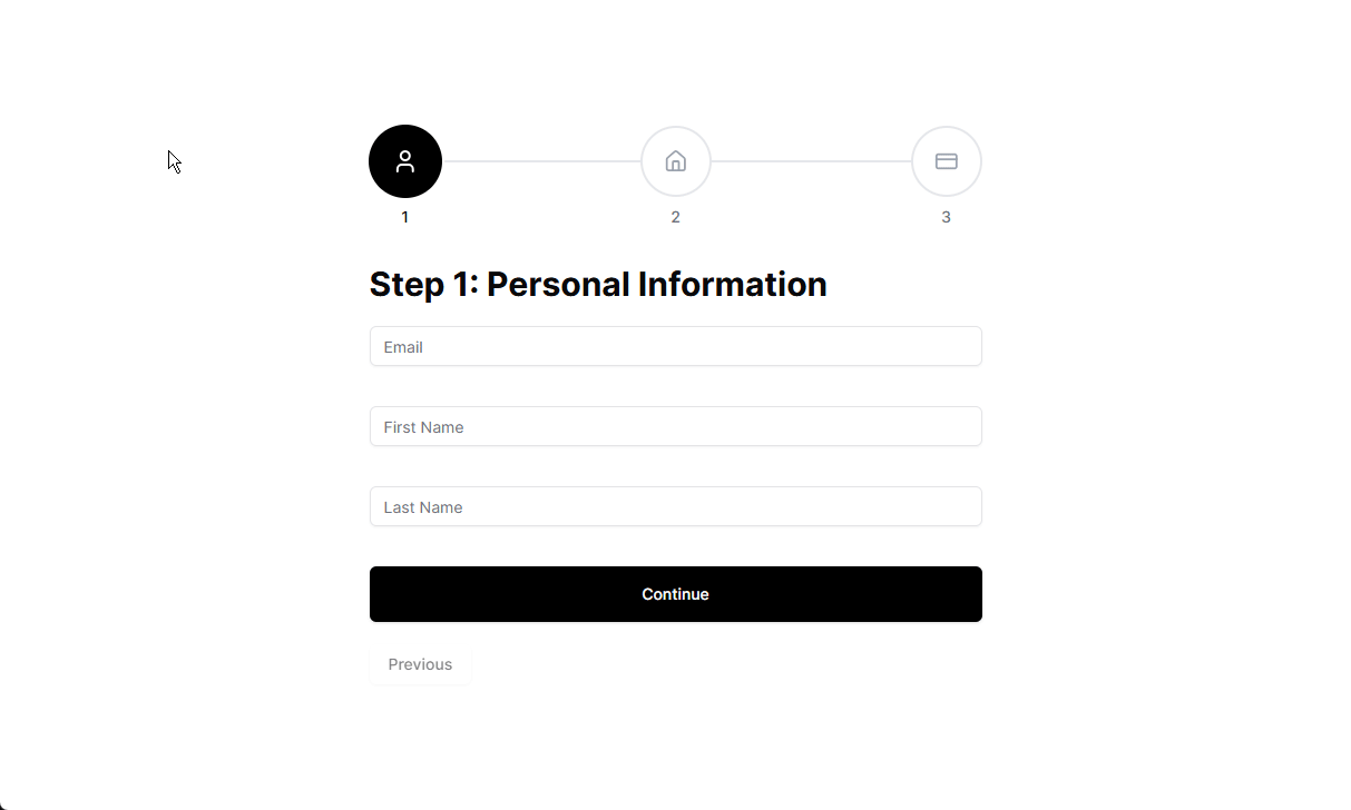
export const checkoutSteps: FormStep[] = [
{
title: 'Step 1: Personal Information',
component: <Step1 />,
icon: UserIcon,
position: 1,
validationSchema: step1Schema,
fields: ['email', 'firstName', 'lastName'],
},
{
title: 'Step 2: Address Details',
component: <Step2 />,
icon: HomeIcon,
position: 2,
validationSchema: step2Schema,
fields: ['country', 'city', 'shippingAddress'],
},
{
title: 'Step 3: Payment Details',
component: <Step3 />,
icon: CreditCardIcon,
position: 3,
validationSchema: step3Schema,
fields: ['cardNumber', 'cardholderName', 'cvv'],
},
]
export default function Home() {
return (
<div>
<MultiStepForm steps={checkoutSteps} />
</div>
)
}
With that done, we can now create the SteppedForm component to dynamically handle the form rendering, state, logic, and validation with the data in checkoutSteps.
SteppedForm componentThe SteppedForm component is the backbone of our multi-step form design. It contains the form’s logic, tracks the current step, validates inputs, and provides functions for navigation.
When making this, I asked myself a few questions:
Values like currentStep ,isFirstStep, isLastStep, and controller functions like nextStep and previousStep came to mind, and are pieces we’d need to make the multi-step form work.
React Hook Form uses the React Context, allowing us to share form state across components by having a parent <FormProvider /> component. This allows any child component to access the form state without needing to pass props manually.
We also want to have a custom hook to manage the form state — something like this:
const { isFirstStep, isLastStep, nextStep } = useMultiStepForm();
The simplest way I found to do this is by leveraging two context values: one from React Hook Form’s API and another from our custom useMultiStepForm Hook.
This separation keeps the form logic clear while maintaining easy access to both React Hook Form’s form state and our step-based navigation.
React’s Context API makes it easy to share state and logic while eliminating the need to pass props through multiple layers. The context holds all essential states and methods required by the form steps, navigation buttons, and progress indicator components.
Here’s what we’re currently tracking in the context:
export interface MultiStepFormContextProps {
  currentStep: FormStep;
  currentStepIndex: number;
  isFirstStep: boolean;
  isLastStep: boolean;
  nextStep: () => void;
  previousStep: () => void;
  goToStep: (step: number) => void;
  steps: FormStep[];
}
currentStep: The current form step being renderedcurrentStepIndex: The index of the current step in the steps arrayisFirstStep / isLastStep: Booleans to determine if the user is at the start or end of the formnextStep / previousStep: Functions to navigate between stepsgoToStep: A function to jump to a specific stepsteps: The full list of FormStep objectsBy exposing these properties and methods, the context makes the form highly configurable and accessible to any child component.
SteppedForm componentIn this section, we’ll walk through the process of building the SteppedForm component. We’ll start by defining the context for managing the form’s state and navigation, then set up the form structure using React Hook Form.
By the end of this section, you’ll have a functional multi-step form component that’s ready to be extended with additional features like navigation buttons, progress indicators, and anything else you choose to implement.
Now, let’s move on to creating the SteppedForm component:
// components/stepped-form/stepped-form.tsx
import { z } from 'zod';
import { createContext, useState } from 'react';
import { FormProvider, useForm } from 'react-hook-form';
import { FormStep, MultiStepFormContextProps } from '@/types';
import { zodResolver } from '@hookform/resolvers/zod';
import { CombinedCheckoutSchema } from '@/validators/checkout-flow.validator';
import PrevButton from '@/components/stepped-form/prev-button';
import ProgressIndicator from './progress-indicator';

export const MultiStepFormContext = createContext<MultiStepFormContextProps | null>(null);

const MultiStepForm = ({ steps }: { steps: FormStep[] }) => {
  const methods = useForm<z.infer<typeof CombinedCheckoutSchema>>({
    resolver: zodResolver(CombinedCheckoutSchema),
  });

  // Form state
  const [currentStepIndex, setCurrentStepIndex] = useState(0);
  const currentStep = steps[currentStepIndex];

  // Navigation functions
  const nextStep = () => {
    if (currentStepIndex < steps.length - 1) {
      setCurrentStepIndex(currentStepIndex + 1);
    }
  };

  const previousStep = () => {
    if (currentStepIndex > 0) {
      setCurrentStepIndex(currentStepIndex - 1);
    }
  };

 const goToStep = (position: number) => {
    if (position >= 0 && position - 1 < steps.length) {
      setCurrentStepIndex(position - 1)
      saveFormState(position - 1)
    }
  }

  /* Form submission function */
  async function submitSteppedForm(data: z.infer<typeof CombinedCheckoutSchema>) {
    try {
      // Perform your form submission logic here
      console.log('data', data);
    } catch (error) {
      console.error('Form submission error:', error);
    }
  }

  // Context value
  const value: MultiStepFormContextProps = {
    currentStep: steps[currentStepIndex],
    currentStepIndex,
    isFirstStep: currentStepIndex === 0,
    isLastStep: currentStepIndex === steps.length - 1,
    goToStep,
    nextStep,
    previousStep,
    steps,
  };

  return (
    <MultiStepFormContext.Provider value={value}>
      <FormProvider {...methods}>
        <div className="w-[550px] mx-auto">
          <ProgressIndicator />
          <form onSubmit={methods.handleSubmit(submitSteppedForm)}>
            <h1 className="py-5 text-3xl font-bold">{currentStep.title}</h1>
            {currentStep.component}
            <PrevButton />
          </form>
        </div>
      </FormProvider>
    </MultiStepFormContext.Provider>
  );
};

export default MultiStepForm;
A lot is going on here so let’s go over the important details one after the other:
FormProvider and multi-step contextAs mentioned earlier, React Hook Form’s FormProvider is used to provide form methods to all child components. This allows us to manage form state and validation across multiple steps by using the useFormContext Hook in place of useForm.
The MultiStepFormContext provides the necessary state and navigation functions we discussed to all child components, ensuring that buttons and progress indicators can interact with the form’s state.
form elementThe form element should wrap up all the steps of your multi-step form. This is crucial because nesting separate form elements inside individual steps can cause issues.
Any <button> inside the form with type="submit" (which is the default) will trigger form submission. To prevent premature submissions, only the button in the final step should have this attribute. More on this soon.
The appropriate step is rendered through the currentStep.component component value.
We also initialize the form using useForm from React Hook Form and pass it the schema (CombinedCheckoutSchema) for validation. The zodResolver ensures the form data is validated against the schema before submission.
The submitSteppedForm function handles the form submission. For now, it simply logs the form data to the console, but you can replace this with your actual submission logic (e.g., sending data to an API).
The nextStep, previousStep, and goToStep functions allow users to navigate between steps. These functions are provided to the context, making them accessible to components like PrevButton, NextButton, and ProgressIndicator.
With this base structure, we’re confident that our SteppedForm component is reusable and well encapsulated, only sharing state with the components that need it. Now, we can define and export a useMultiStep function for use within child components:
// src/hooks/use-stepped-form.ts
import { MultiStepFormContext } from '@/components/stepped-form/stepped-form'
import { useContext } from 'react'

export const useMultiStepForm = () => {
  const context = useContext(MultiStepFormContext)
  if (!context) {
    throw new Error(
      'useMultiStepForm must be used within MultiStepForm.Provider'
    )
  }
  return context
}
nextStep functionThe nextStep function will handle step transitions. However, we’re going to modify this function further as we want to trigger validation on every step before transitioning to the next one:
const nextStep = async () => {
  const isValid = await methods.trigger(currentStep.fields);

  if (!isValid) {
    return; // Stop progression if validation fails
  }

  // grab values in current step and transform array to object
  const currentStepValues = methods.getValues(currentStep.fields)
  const formValues = Object.fromEntries(
    currentStep.fields.map((field, index) => [
      field,
      currentStepValues[index] || '',
    ])
  )

  // Validate the form state against the current step's schema
  if (currentStep.validationSchema) {
    const validationResult = currentStep.validationSchema.safeParse(formValues);

    if (!validationResult.success) {
      validationResult.error.errors.forEach((err) => {
        methods.setError(err.path.join('.') as keyof SteppedFlowType, {
          type: 'manual',
          message: err.message,
        });
      });
      return; // Stop progression if schema validation fails
    }
  }

  // Move to the next step if not at the last step
  if (currentStepIndex < steps.length - 1) {
    setCurrentStepIndex(currentStepIndex + 1);
  }
};
Here’s a breakdown of its flow:
1. Trigger field validation
The first step in this function is to validate the input fields related to the current step. This is done using React Hook Form’s methods.trigger function.
2. Grab current step values and transform into an object
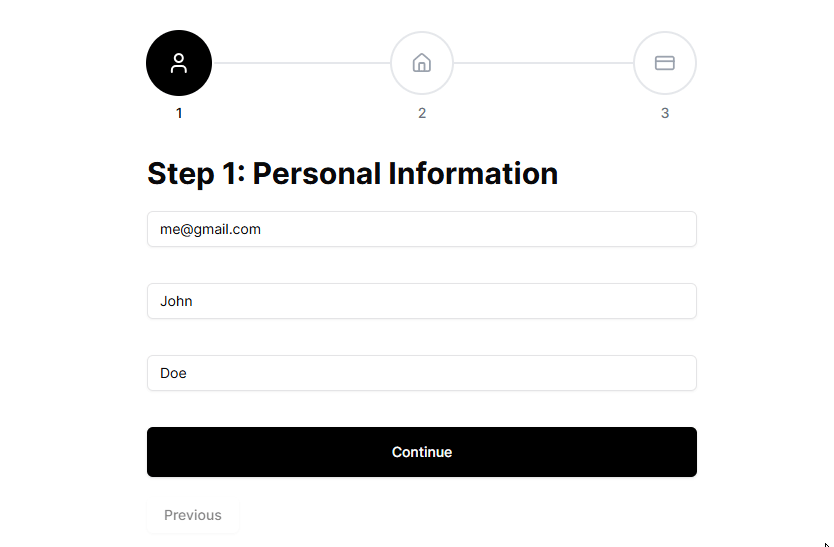
Next, we retrieve the values of the fields in the current step and transform them into an array for further validation. Because methods.getValues(currentStep.fields) returns the values as an array — ['[email protected]', 'John', 'Doe'] — we use Object.fromEntries to transform this array into an object where the keys are the field names and the values are the corresponding input values (e.g., { email: '[email protected]', firstName: 'John', lastName: 'Doe' }).
3. Schema validation
Once the values are in the correct format, we validate them against the schema defined at currentStep.validationSchem. Errors are reported using methods.setError.
4. Lastly, if all validations pass, we move on to the next step.
Now that we’ve set up SteppedForm with the correct navigation functions, we can start to use them in custom buttons like a NextButton and PreviousButton or the progress indicator component. Let’s start with PrevButton:
// prevbutton.tsx
import { useMultiStepForm } from '@/hooks/use-stepped-form'
import { Button } from '../ui/button'

const PrevButton = () => {
  const { isFirstStep, previousStep } = useMultiStepForm()

  return (
    <Button
      variant='outline'
      type='button'
      className='mt-5'
      onClick={previousStep}
      disabled={isFirstStep}
    >
      Previous
    </Button>
  )
}
export default PrevButton
Now for NextButton:
// nextbutton.tsx
const NextButton = ({
  onClick,
  type,
  ...rest
}: React.ButtonHTMLAttributes<HTMLButtonElement>) => {
  const { isLastStep } = useMultiStepForm()

  return (
    <Button
      className="text-white bg-black hover:bg-slate-950 transition-colors w-full py-6"
      type={type ?? 'button'}
      onClick={onClick}
      {...rest}
    >
      {isLastStep ? 'Submit' : 'Continue'}
    </Button>
  )
}
Remember that our form layout design enforces us to have only one button with the type="submit" attribute. NextButton above acts plays two roles here — acting as type='button' that says Continue for all steps up until the last where it says Submit and triggers a form submit.
Each step in our form is a standalone component that follows a consistent pattern:
nextStep from useMultiStepForm to move to the next stepLet’s take a look at Step1:
const Step1 = () => {
  const {
    register,
    getValues,
    setError,
    formState: { errors },
  } = useFormContext<z.infer<typeof SteppedFlowSchema>>()

  const { nextStep } = useMultiStepForm()

  const handleStepSubmit = async () => {
    const { email } = getValues()

    // Simulate check for existing email in the database
    if (email === '[email protected]') {
      setError('email', {
        type: 'manual',
        message: 'Email already exists in the database. Please use a different email.',
      })
      return
    }

    // move to the next step
    nextStep()
  }

  return (
    <div className="flex flex-col gap-3">
      <div>
        <Input {...register('email')} placeholder="Email" />
        <ErrorMessage message={errors.email?.message} />
      </div>
      <NextButton onClick={handleStepSubmit} />
    </div>
  )
}
Here, we decide to make a (mock) query to the database before calling nextStep. This would be the same pattern up until your last step, in this case, Step3, where you explicitly assign a submit type to the navigation button:
const Step3 = () => {
  /* ... */
  const handleStepSubmit = async () => {
    return
  }

  return (
    <div className="flex flex-col gap-3">
      {/* Form fields here */}
      <NextButton type="submit" onClick={handleStepSubmit} />
    </div>
  )
}
It is generally good practice to give visual feedback to your users on their progress so they don’t feel lost or overwhelmed. We will achieve this with the progress indicator component below — generated by v0!
// progress-indicator.tsx
export default function ProgressIndicator() {
  const { currentStep, goToStep, currentStepIndex } = useMultiStepForm()

  return (
    <div className="flex items-center w-full justify-center p-4 mb-10">
      <div className="w-full space-y-8">
        <div className="relative flex justify-between">
          {/* Progress Line */}
          <div className="absolute left-0 top-1/2 h-0.5 w-full -translate-y-1/2 bg-gray-200">
            <motion.div
              className="h-full bg-black"
              initial={{ width: '0%' }}
              animate={{
                width: `${(currentStepIndex / (checkoutSteps.length - 1)) * 100}%`,
              }}
              transition={{ duration: 0.3, ease: 'easeInOut' }}
            />
          </div>
          {/* Steps */}
          {checkoutSteps.map((step) => {
            const isCompleted = currentStepIndex > step.position - 1
            const isCurrent = currentStepIndex === step.position - 1

            return (
              <div key={step.position} className="relative z-10">
                <motion.button
                  onClick={() => goToStep(step.position)}
                  className={`flex size-14 items-center justify-center rounded-full border-2 ${
                    isCompleted || isCurrent
                      ? 'border-primary bg-black text-white'
                      : 'border-gray-200 bg-white text-gray-400'
                  }`}
                  animate={{
                    scale: isCurrent ? 1.1 : 1,
                  }}
                >
                  {isCompleted ? (
                    <Check className="h-6 w-6" />
                  ) : (
                    <step.icon className="h-6 w-6" />
                  )}
                </motion.button>
              </div>
            )
          })}
        </div>
      </div>
    </div>
  )
}
The component uses currentStepIndex to calculate the width of the progress line and highlight the current step.
localStorageOne of the most frustrating experiences in web forms is losing your progress. It’s annoying enough to make a user abandon the process — this often translates to leaving money on the table. Let’s address this by persisting the form state to localStorage.
First, what does the structure of the data we’re storing look like?
type StoredFormState = {
  currentStepIndex: number
  formValues: Record<string, unknown>
}
In addition to saving the form state, we also want to save the current step (or step index) to ensure they continue exactly where they left off.
localStorage stateWe start by initializing the stored form state from localStorage in MultiStepForm. To ensure reusability, we’ll require our component to collect the localStorageKey prop. This prevents conflicts when multiple multi-step forms exist in the same application.
Using Mantine’s useLocalStorage Hook, we create a stateful local storage item that holds the form’s progress:
// stepped-form.tsx
const [savedFormState, setSavedFormState] = useLocalStorage<SavedFormState | null>({
  key: localStorageKey,
  defaultValue: null,
})
If there’s an existing saved form state, we restore it when MultiStepForm mounts using React Hook Form’s methods.reset():
// stepped-form.tsx
useEffect(() => {
  if (savedFormState) {
    setCurrentStepIndex(savedFormState.currentStepIndex)
    methods.reset(savedFormState.formValues)
  }
}, [methods, savedFormState])
This ensures that if a user refreshes the page or revisits the form, they pick up exactly where they left off.
Next, we define a function to save the form state to localStorage:
// stepped-form.tsx
const saveFormState = (stepIndex: number) => {
  setSavedFormState({
    currentStepIndex: stepIndex ?? currentStepIndex,
    formValues: methods.getValues(),
  });
};
In React, state updates are asynchronous. When a user navigates to a new step, currentStepIndex is updated after the navigation occurs. If we save the form state using the old currentStepIndex, we will store the wrong step index.
For example:
currentStepIndex = 0)Next to move to Step 2currentStepIndex is still 0 until the state update completesTo avoid this, we explicitly pass the next step’s index when saving.
When the form is successfully submitted, or the user wants to start over, we should clear localStorage:
const clearFormState = () => {
  methods.reset();
  setCurrentStepIndex(0);
  setSavedFormState(null);
  window.localStorage.removeItem(localStorageKey);
};
Pretty straightforward. We also delete the local storage item entirely.
Now we can use these functions in the navigation functions, right before the navigation takes place:
// stepped-form.tsx
const nextStep = async () => {
  /* ... */
  if (currentStepIndex < steps.length - 1) {
    saveFormState(currentStepIndex + 1)
    setCurrentStepIndex(currentStepIndex + 1)
  }
}

const previousStep = () => {
  /* ... */
  if (currentStepIndex > 0) {
    saveFormState(currentStepIndex - 1)
    setCurrentStepIndex(currentStepIndex - 1)
  }
}

const goToStep = (position: number) => {
  if (position >= 0 && position - 1 < steps.length) {
    saveFormState(position - 1)
    setCurrentStepIndex(position - 1)
  }
}
This guarantees that whenever the user moves between steps, their progress is saved immediately.
And there you have it! We’ve built a reusable, type-safe multi-step form component that handles validation, and persistent form data prevents data loss and provides a smooth user experience. The component’s architecture makes it easy to add new steps or modify existing ones without touching the core logic.
I’ve needed a component like this a few times, so I decided to make a reusable one. Personally, I’d say a multi-step component should exist in a component library like shadcn! 🙂
The complete source code is available in the repository. Contributions are welcome and feel free to adapt it to your needs or use it as inspiration for your own form implementations.
Install LogRocket via npm or script tag. LogRocket.init() must be called client-side, not
server-side
$ npm i --save logrocket

// Code:

import LogRocket from 'logrocket';
LogRocket.init('app/id');
// Add to your HTML:

<script src="https://cdn.lr-ingest.com/LogRocket.min.js"></script>
<script>window.LogRocket && window.LogRocket.init('app/id');</script>

Learn how next-browser gives AI agents runtime context for debugging Next.js apps, including React props, hydration, PPR, forms, and performance.

Build dynamic LLM routing in Next.js with OpenRouter, TanStack AI, task classification, model fallbacks, and cost-aware routing.

TSRX adds first-class control flow, conditional hooks, and scoped styles to React via a TypeScript compiler extension — no new framework required.

Learn how to build a full React Native auth system using Better Auth and Expo — with email/password login, Google OAuth, session persistence, and protected routes.
Would you be interested in joining LogRocket's developer community?
Join LogRocket’s Content Advisory Board. You’ll help inform the type of content we create and get access to exclusive meetups, social accreditation, and swag.
Sign up now

 Learn more →
