Editor’s note: This article was last updated by Carlos Mucuho on 29 February 2024 to cover how to style Swiper sliders using CSS, how to monitor slide progress using Swiper’s watchSlideProgress feature, and to provide an overview of the Swiper API’s advanced slider features, including autoplay and sliding to a specific slide.

Sliders are functional user interface units that organize pieces of information in a condensed and cyclical manner within a limited space. Sliders consist of the following components:
In addition, sliders are built with transition effects to avoid abrupt changes from one block of content to another. Building these sliders from scratch, and covering their components and transitions, can be intimidating. That is why in this article we will use Swiper to create modern, fast, responsive, and native (mobile-first) touch sliders with amazing transitions.
Swiper is a JavaScript library that creates modern touch sliders with hardware-accelerated transitions (utilizing GPU to offload graphic-intensive transitions and create smoother visuals) and excellent native behavior. Swiper is available for vanilla JavaScript, Angular, React, Vue.js, and Svelte.
Check out these examples of websites that use Swiper.
Swiper is a completely free and open source library with over 38.2k stars and 9.7k forks on GitHub. Some key features of Swiper include:
At the time of writing, Swiper is currently on v.11; however, check for the respective migration guide to upgrade from Swiper 10 to Swiper 11 or from Swiper 9 to Swiper 10.
There are three options for importing Swiper into your project:
<link
  rel="stylesheet"
  href="https://cdn.jsdelivr.net/npm/swiper@11/swiper-bundle.min.css"
/>

<script src="https://cdn.jsdelivr.net/npm/swiper@11/swiper-bundle.min.js"></script>
$ npm install swiperFor this article, we will be using option two.

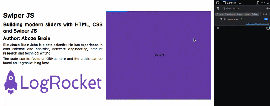
The HTML markup to structure our project webpage, layout, and contents is shown in the image above. The HTML markup is as follows:
<!DOCTYPE html>
<html lang="en">
<head>
  <meta charset="UTF-8">
  <meta http-equiv="X-UA-Compatible" content="IE=edge">
  <meta name="viewport" content="width=device-width, initial-scale=1.0">
  <title>Swiper Article</title>
  <link rel="stylesheet" href="style.css">
  <link rel="stylesheet" href="https://cdn.jsdelivr.net/npm/swiper@11/swiper-bundle.min.css" />
</head>
<body>
  <div class="container">
    <!-- Project content container -->
    <div class="project_content">
      <h1>Swiper JS</h1>
      <h2>Building modern sliders with HTML, CSS and Swiper JS</h2>
      <h2>Author: Aboze Brain</h2>
      <p>Bio: Aboze Brain John is a data scientist. He has experience in data science and analytics, software
        engineering, product research and technical writing</p>
      <p>The code can be found on GitHub <a href="#">here</a> and the article can be found on Logrocket blog <a
          href="#">here</a></p>
      <p></p>
      <img src="https://cdn.freelogovectors.net/wp-content/uploads/2021/09/logrocket-logo-freelogovectors.net_.png"
        alt="logrocket logo">
    </div>
    <!-- Slider main container -->
    <div class="swiper mySwiper">
      <div class="swiper-wrapper">
        <div class="swiper-slide slide_1">Slide 1</div>
        <div class="swiper-slide slide_2">Slide 2</div>
        <div class="swiper-slide slide_3">Slide 3</div>
        <div class="swiper-slide slide_4">Slide 4</div>
        <div class="swiper-slide slide_5">Slide 5</div>
      </div>
    </div>
  </div>

  <script src="https://cdn.jsdelivr.net/npm/swiper@11/swiper-bundle.min.js"></script>
  <script src="script.js"></script>
</body>
</html>
In the HTML markup, you can see that our project consists of five slides. Next, let’s style the default HTML markup using CSS as shown below:
/* Import google font (Balsamiq Sans) */
@import url('https://fonts.googleapis.com/css2?family=Balsamiq+Sans:ital,wght@0,400;0,700;1,400;1,700&display=swap');

/* Box sizing rules */
*,
*::before,
*::after {
  box-sizing: border-box;
}

/* Remove default padding and margin */
* {
  padding: 0;
  margin: 0;
}

/* Default anchor tag styling */
a {
  text-decoration: none;
  color: black;
}

a:hover {
  cursor: pointer;
}

/* Body styling */
html,
body {
  position: relative;
  height: 100%;
}

body {
  font-family: 'Balsamiq Sans', cursive, "Roboto Mono";
  font-size: 1.1rem;
  text-align: justify;
}

.container {
  padding-top: 10vh;
  display: grid;
  grid-template-columns: 1fr 1fr;
  grid-gap: 1rem;
}

.container>div {
  height: 80vh;
}

.project_content {
  justify-items: center;
  align-items: center;
}

.project_content h1,
h2,
p {
  padding: 0.2rem 1rem;
}

.project_content img {
  height: 35%;
  max-width: 100%;
}

/* Swiper container stylng */
.swiper {
  right: 1rem;
  width: 100%;
  height: 100%;
}

.swiper-slide {
  text-align: center;
  /* Center slide text vertically */
  display: flex !important;
  align-items: center;
  justify-content: center;
}

.swiper-slide img {
  display: block;
  width: 100%;
  height: 100%;
  object-fit: cover;
}

.slide_1 {
  background-color: #643ca3;
}

.slide_2 {
  background-color: #e38364;
}

.slide_3 {
  background-color: #faf47a;
}

.slide_4 {
  background-color: #64e3c1;
}

.slide_5 {
  background-color: #9e6ffd;
}
Next, we initialize Swiper in this project with JavaScript. The JavaScript is as follows:
//  Initialize Swiper
let swiper = new Swiper(".mySwiper", {});
Note that the class in the Swiper container ".mySwiper" is used to create a Swiper object in the JavaScript file.
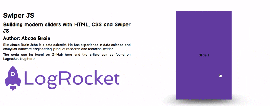
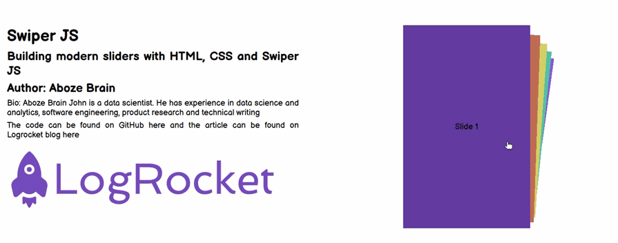
For the default webpage, we can see that the five slides are overlapping each other, and there’s no way to view the slides one at a time except by using the mouse to swipe over.
This is not the most intuitive or clear way to communicate information. Swipers are supposed to be tools for displaying lots of information in a small space, so let’s see how we can improve this system with Swiper.
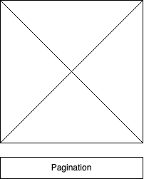
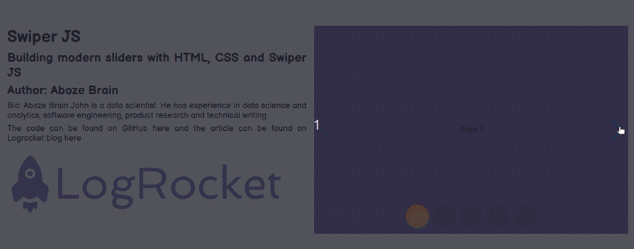
As we learned earlier, pagination is just a set of traditional bullets or numbers placed on the bottom of the container (in this case, the box that covers the slides). The pagination shows how many sliders are overlapping in the container:
It can easily be implemented on our default files by making some changes. On the HTML file, we need to add the pagination container under the sliders container as follows:
<div class="swiper mySwiper">
  <div class="swiper-wrapper">
    <div class="swiper-slide slide_1">Slide 1</div>
    <div class="swiper-slide slide_2">Slide 2</div>
    <div class="swiper-slide slide_3">Slide 3</div>
    <div class="swiper-slide slide_4">Slide 4</div>
    <div class="swiper-slide slide_5">Slide 5</div>
  </div>
  <div class="swiper-pagination"></div>
</div>
The CSS remains the same, but we need to make changes to our JavaScript file to initiate the pagination effect:
//  Initialize Swiper
let swiper = new Swiper(".mySwiper", {
   pagination: {
     el: ".swiper-pagination",
   },
 });
Now, our slider indicates how many slides we have in total, and which slide we are viewing at the moment:

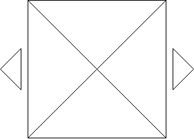
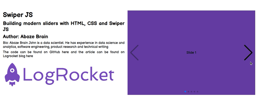
Navigation, just like pagination, serves as a tool to guide through the slides with a click rather than swiping with the mouse. It consists of a left and right arrow located on the sides of the slides container:
Let’s make the respective changes to our default files. On our HTML file, just like the pagination, we need to add the navigation containers under the sliders container as follows:
<div class="swiper mySwiper">
  <div class="swiper-wrapper">
    <div class="swiper-slide slide_1">Slide 1</div>
    <div class="swiper-slide slide_2">Slide 2</div>
    <div class="swiper-slide slide_3">Slide 3</div>
    <div class="swiper-slide slide_4">Slide 4</div>
    <div class="swiper-slide slide_5">Slide 5</div>
  </div>
  <div class="swiper-button-next"></div>
  <div class="swiper-button-prev"></div>
</div>
Next, we need to add some styling to our CSS for arrow positioning (at the center of the slides container):
div.swiper-button-next, div.swiper-button-prev {
  top: 50%
}
Then, we initiate the navigation effect on our JavaScript file as follows:
//  Initialize Swiper
let swiper = new Swiper(".mySwiper", {
   navigation: {
     nextEl: ".swiper-button-next",
     prevEl: ".swiper-button-prev",
   },
 });
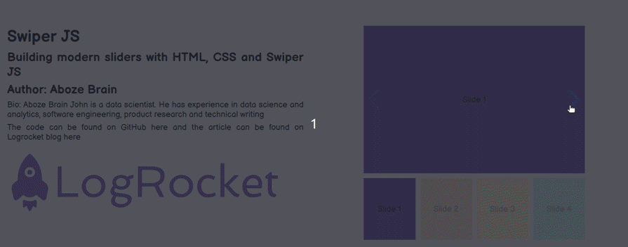
Here is what our slides look like now:

Scroll aids simple horizontal scrollable sliders moving from left to right. It can easily be implemented by making the following changes to the default settings.
First, on the HTML markup, we will be making changes to the Swiper container as follows:
<div class="swiper mySwiper">
  <div class="swiper-wrapper">
    <div class="swiper-slide slide_1">Slide 1</div>
    <div class="swiper-slide slide_2">Slide 2</div>
    <div class="swiper-slide slide_3">Slide 3</div>
    <div class="swiper-slide slide_4">Slide 4</div>
    <div class="swiper-slide slide_5">Slide 5</div>
  </div>
  <div class="swiper-scrollbar"></div>
</div>
Next, using the default CSS, let’s initiate the scroll effect on the JavaScript file as follows:
//  Initialize Swiper
let swiper = new Swiper(".mySwiper", {
  scrollbar: {
    el: ".swiper-scrollbar",
    hide: true,
  },
});
Now, you can see a scroll bar at the bottom of our slides:

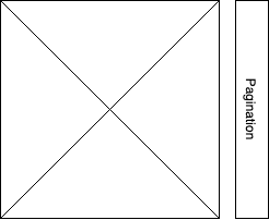
Vertical means vertical pagination, which is just like the regular pagination we covered previously, but with the bullet points in a vertical orientation:
The HTML markup is the same as the horizontal pagination, we just need to specify the orientation in our JavaScript file as follows:
//  Initialize Swiper
let swiper = new Swiper(".mySwiper", {
 direction: "vertical",
 pagination: {
   el: ".swiper-pagination",
   clickable: true,
   hide: true,
 },
});
Now, we can see the slides moving up and down instead of side to side:

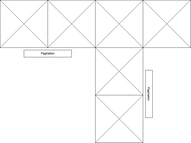
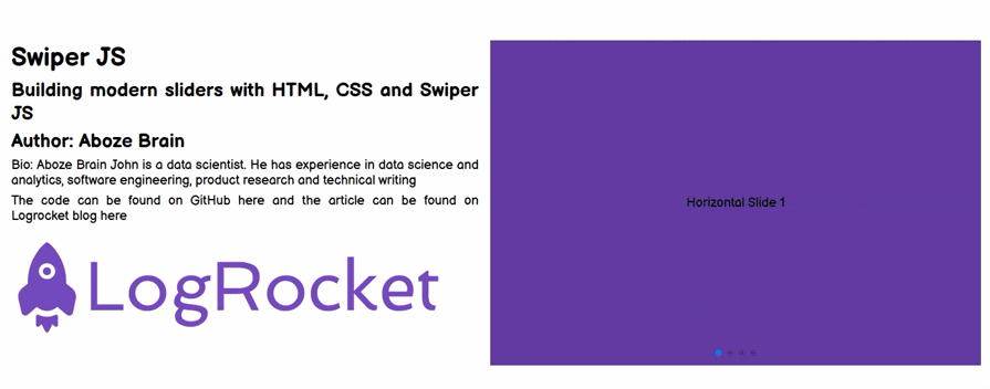
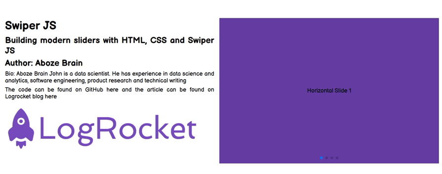
Nested sliders are a bit trickier. They are a combination of both the horizontal and vertical display of sliders with pagination to give you more information about the number of slides on each axis:
Let’s implement this using the default settings, on our HTML markup. The following changes should be made to the swiper container as follows:
<div class="swiper mySwiper swiper-h">
<div class="swiper-wrapper">
  <div class="swiper-slide slide_1">Horizontal Slide 1</div>
  <div class="swiper-slide slide_2">Horizontal Slide 2</div>
  <div class="swiper-slide">
    <div class="swiper mySwiper2 swiper-v">
      <div class="swiper-wrapper">
        <div class="swiper-slide slide_3">Horizontal Slide 3 & Vertical Slide 1</div>
        <div class="swiper-slide v_slide_2">Vertical Slide 2</div>
        <div class="swiper-slide v_slide_3">Vertical Slide 3</div>
      </div>
      <div class="swiper-pagination"></div>
    </div>
  </div>
  <div class="swiper-slide slide_4">Horizontal Slide 4</div>
</div>
<div class="swiper-pagination"></div>
</div>
Next, we need to specify some changes in our default CSS file to accommodate the vertical slide color as follows:
.v_slide_2 {
   background-color: #c164e3;
}

.v_slide_3 {
   background-color: #e3c164;
}
Then, we have to initiate both the vertical and horizontal sliders with pagination on our JavaScript script:
let swiper = new Swiper(".mySwiper", {
  spaceBetween: 50,
  pagination: {
    el: ".swiper-pagination",
    clickable: true,
  },
});

let swiper2 = new Swiper(".mySwiper2", {
  direction: "vertical",
  spaceBetween: 50,
  pagination: {
    el: ".swiper-pagination",
    clickable: true,
  },
});

In addition to the standard navigation and pagination features, Swiper offers the ability to monitor slide progress, providing visual feedback for users as they navigate through the slider. This can be achieved by implementing the watchSlideProgress feature and, optionally, creating a custom progress bar using Swiper pagination.
On the HTML file, just like we did in the previous section, we need to add the pagination container under the sliders container:
<div class="swiper mySwiper">
  <div class="swiper-wrapper">
    <div class="swiper-slide slide_1">Slide 1</div>
    <div class="swiper-slide slide_2">Slide 2</div>
    <div class="swiper-slide slide_3">Slide 3</div>
    <div class="swiper-slide slide_4">Slide 4</div>
    <div class="swiper-slide slide_5">Slide 5</div>
  </div>
  <div class="swiper-pagination"></div>
</div>
Next, we need to revert the CSS code to the following:
/* Swiper container stylng */
.swiper {
  right: 1rem;
  width: 100%;
  height: 100%;
}

.swiper-slide {
  text-align: center;
  /* Center slide text vertically */
  display: flex !important;
  align-items: center;
  justify-content: center;
}

.swiper-slide img {
  display: block;
  width: 100%;
  height: 100%;
  object-fit: cover;
}

.slide_1 {
  background-color: #643ca3;
}

.slide_2 {
  background-color: #e38364;
}

.slide_3 {
  background-color: #faf47a;
}

.slide_4 {
  background-color: #64e3c1;
}

.slide_5 {
  background-color: #9e6ffd;
}
Implementing watchSlideProgress allows you to track the progress of each slide as it transitions in and out of view. This can be useful for creating dynamic effects or triggering actions based on the slide’s position in the slider. To enable watchSlideProgress, add the following code to your Swiper initialization in the JavaScript file:
// Initialize Swiper
let swiper = new Swiper(".mySwiper", {
  watchSlidesProgress: true,
});
With watchSlidesProgress enabled, you can now access the progress of each slide using the progress property of the slide object. For example, this is the code to log the progress of each slide as it transitions:
swiper.on("progress", (ev) => {
  console.log("Slide progress:", ev.progress);
});
To create a more interactive user experience, you can use the slide progress to update a progress bar. Swiper’s pagination feature can be customized to display a progress bar that reflects the current slide’s position. Here’s how you can create that:
// Initialize Swiper with pagination
let swiper = new Swiper(".mySwiper", {
  watchSlidesProgress: true,
  pagination: {
    el: ".swiper-pagination",
    type: "progressbar",
  },
});
In this configuration, Swiper’s pagination is set to display a progress bar (type: "progressbar") instead of the default bullets or numbers. The progress bar will visually indicate the progress of the current slide relative to the total number of slides:
Customizing your sliders’ appearance can greatly enhance your website’s visual appeal. With CSS, you can easily modify the colors, sizes, and positions of various slider components to match your design aesthetic. In this section, we’ll explore some common CSS techniques to style sliders created using Swiper.
We’re going to be using a Swiper container with pagination and navigation buttons. Open your HTML file and edit your Swiper container to look like the following:
<div class="swiper mySwiper">
  <div class="swiper-wrapper">
    <div class="swiper-slide slide_1">Slide 1</div>
    <div class="swiper-slide slide_2">Slide 2</div>
    <div class="swiper-slide slide_3">Slide 3</div>
    <div class="swiper-slide slide_4">Slide 4</div>
    <div class="swiper-slide slide_5">Slide 5</div>
  </div>
  <div class="swiper-pagination"></div>
  <div class="swiper-button-next"></div>
  <div class="swiper-button-prev"></div>
</div>
And the following JavaScript code, which enables pagination and navigation buttons:
let swiper = new Swiper(".mySwiper", {
  pagination: {
    el: ".swiper-pagination",
    clickable: true,
  },
  navigation: {
    nextEl: ".swiper-button-next",
    prevEl: ".swiper-button-prev",
  },
});
The slider container is the outermost element that contains all the slider components. You can style it using CSS to adjust its size, position, and background color. For example, to make the slider container half its container width and give it a red background, you can use the following CSS:
.swiper{
  width: 50%;
  padding: 10% !important;
  background-color: red;
}
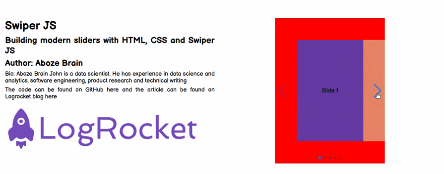
Slides are the individual content blocks within the slider. You can style them to change their size, position, and appearance. For example, to make the slides less opaque and add a green border around them, you can use the following CSS:
.swiper-slide {
  opacity: 0.4;
  border: 10px solid green;
}
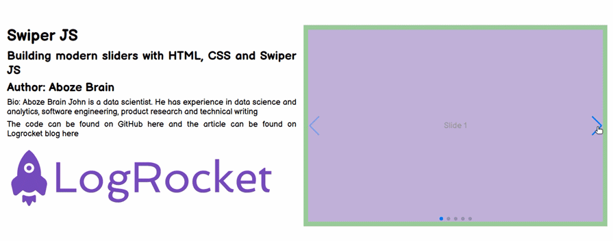
Navigation icons are the buttons used to navigate between slides. You can style them to change their size, color, and position. For example, to make the navigation icons larger and change their color to black, you can use the following CSS:
.swiper-button-next,
.swiper-button-prev {
  --swiper-navigation-size: 85px;
  --swiper-navigation-color: black;
}
You can also change the pagination indicators’ size, color, and position. For example, to make the pagination bullets larger and change their color to orange, you can use the following CSS:
.swiper-pagination-bullet {
  --swiper-pagination-bullet-width: 50px;
  --swiper-pagination-bullet-height: 50px;
  --swiper-pagination-color: orange;
}
These are just a few examples of how you can customize the appearance of your sliders. Feel free to experiment with different styles to create a slider that complements your website’s design.
Sliders in web designs are incorporated with a range of transition effects to avoid overwhelming and abrupt shifts between blocks of information. For the context of this article, we will be focusing on the cube effect and the cards effect.
The cube effect transition makes the slides look like they are sides on a rotating cube. Changing from one slide to the next spins the cube to bring the desired slide to the front.
To implement the cube effect on our default files, we will make the following changes. First, in our HTML markup, we will update the swiper container as follows:
<div class="swiper mySwiper">
  <div class="swiper-wrapper">
    <div class="swiper-slide slide_1">Slide 1</div>
    <div class="swiper-slide slide_2">Slide 2</div>
    <div class="swiper-slide slide_3">Slide 3</div>
    <div class="swiper-slide slide_4">Slide 4</div>
    <div class="swiper-slide slide_5">Slide 5</div>
  </div>
</div>
In the CSS, we have to make some changes to the swiper container selector by reducing the slide size to accommodate the effect transition, like so:
.swiper {
  width: 280px;
  height: 100%;
}
Next, we have to initiate a cube effect on our JavaScript file:
//  Initialize Swiper
let swiper = new Swiper(".mySwiper", {
 effect: "cube",
 grabCursor: true,
 cubeEffect: {
   shadow: true,
   slideShadows: true,
   shadowOffset: 20,
   shadowScale: 0.94,
 },
 pagination: {
   el: ".swiper-pagination",
 },
});
Here is the resulting cube transition:
This is a transition effect for shifting between slides, similar to the cube above. With the cards effect, each slide looks like a card being shuffled in a deck to bring the desired slide to the front.
The HTML and CSS are the same as the cube effect, just change the effect to cards as follows:
//  Initialize Swiper
let swiper = new Swiper(".mySwiper", {
  effect: "cards",
  grabCursor: true,
});
In this section, we will look at some sliders that are ideal for images or galleries. In my opinion, two great options for gallery sliders are thumb galleries and lazy loading, which we will learn how to implement in the following sections.
This slider consists of a compressed preview image of the original that is used as a placeholder. The thumbnail image should be smaller than the original, but the exact size is up to you. This slider creates a simple thumbnail gallery module to hold content and also functions as a means of navigation.
Using the default settings, we can implement this by making changes to our default HTML markup as follows:
<div class="swiper-container">
           <div class="swiper mySwiper2">
               <div class="swiper-wrapper">
                   <div class="swiper-slide slide_1">Slide 1</div>
                   <div class="swiper-slide slide_2">Slide 2</div>
                   <div class="swiper-slide slide_3">Slide 3</div>
                   <div class="swiper-slide slide_4">Slide 4</div>
                   <div class="swiper-slide slide_5">Slide 5</div>
               </div>
               <div class="swiper-button-next"></div>
               <div class="swiper-button-prev"></div>
           </div>


           <div thumbsSlider="" class="swiper mySwiper">
               <div class="swiper-wrapper">
                   <div class="swiper-slide slide_1">Slide 1</div>
                   <div class="swiper-slide slide_2">Slide 2</div>
                   <div class="swiper-slide slide_3">Slide 3</div>
                   <div class="swiper-slide slide_4">Slide 4</div>
                   <div class="swiper-slide slide_5">Slide 5</div>
               </div>
           </div>
 </div>
Next, we need to make changes to our CSS to add the slider and thumbnails inside our swiper container as follows:
.swiper {
  width: 480px;
}

.mySwiper2 {
  width: 480px;
  height: 320px;
}

.mySwiper {
  height: 30%;
  box-sizing: border-box;
  margin: 10px;
}

.mySwiper .swiper-slide {
  opacity: 0.4;
}

.swiper-slide {
  background-position: center;
  display: flex !important;
  align-items: center;
  justify-content: center;
}

.mySwiper .swiper-slide-thumb-active {
  opacity: 1;
}
Then, we initiate the thumb gallery sliders on our default JavaScript file:
//  Initialize Swiper
let swiper = new Swiper(".mySwiper", {
  spaceBetween: 10,
  slidesPerView: 4,
  freeMode: true,
  watchSlidesProgress: true,
});

let swiper2 = new Swiper(".mySwiper2", {
  spaceBetween: 10,
  navigation: {
    nextEl: ".swiper-button-next",
    prevEl: ".swiper-button-prev",
  },
  thumbs: {
    swiper: swiper,
  },
});
Lazy loading is a strategy that delays the loading or initialization of resources until they are needed to reduce page load time and save system resources. Just imagine a user downloading the entire gallery in the previous use case, but the user leaves after viewing only the first slide; it results in wasted memory and bandwidth.
Lazy loading occurs in some users’ interactions such as navigation and scrolling. To see the lazy loading effect, we will be using images from Pexels.
To begin, in the default HTML file, make the following changes on the slider container:
<div class="swiper mySwiper">
  <div class="swiper-wrapper">
    <div class="swiper-slide">
      <img
        src="https://images.pexels.com/photos/1824273/pexels-photo-1824273.jpeg?cs=srgb&dl=pexels-victor-miyata-1824273.jpg&fm=jpg"
        loading="lazy" />
      <div class="swiper-lazy-preloader swiper-lazy-preloader-white"></div>
    </div>
    <div class="swiper-slide">
      <img
        src="https://images.pexels.com/photos/3219549/pexels-photo-3219549.jpeg?cs=srgb&dl=pexels-engin-akyurt-3219549.jpg&fm=jpg"
        loading="lazy" />
      <div class="swiper-lazy-preloader swiper-lazy-preloader-white"></div>
    </div>
    <div class="swiper-slide">
      <img
        src="https://images.pexels.com/photos/1579240/pexels-photo-1579240.jpeg?cs=srgb&dl=pexels-stas-knop-1579240.jpg&fm=jpg"
        loading="lazy" />
      <div class="swiper-lazy-preloader swiper-lazy-preloader-white"></div>
    </div>
    <div class="swiper-slide">
      <img
        src="https://images.pexels.com/photos/14553715/pexels-photo-14553715.jpeg?cs=srgb&dl=pexels-bibek-ghosh-14553715.jpg&fm=jpg"
        loading="lazy" />
      <div class="swiper-lazy-preloader swiper-lazy-preloader-white"></div>
    </div>
  </div>
  <div class="swiper-button-next"></div>
  <div class="swiper-button-prev"></div>
  <div class="swiper-pagination"></div>
</div>
On the default CSS file, remove all stylings related to the swiper class and add the following styling:
.swiper {
  right: 1rem;
  width: 100%;
  height: 100%;
}
.swiper-slide {
  text-align: center;
  font-size: 18px;
}
.swiper-slide img {
  width: auto;
  height: auto;
  max-width: 100%;
  max-height: 100%;
  -ms-transform: translate(-50%, -50%);
  -webkit-transform: translate(-50%, -50%);
  -moz-transform: translate(-50%, -50%);
  transform: translate(-50%, -50%);
  position: absolute;
  left: 50%;
  top: 50%;
}
Next, we need to initiate the lazy loading effect on our JavaScript file like so:
let swiper = new Swiper(".mySwiper", {
  lazy: true,
  pagination: {
    el: ".swiper-pagination",
    clickable: true,
  },
  navigation: {
    nextEl: ".swiper-button-next",
    prevEl: ".swiper-button-prev",
  },
});
Here is the lazy loading in action:

These controls are just a few ways to navigate through the slides. They are relatively simple to implement, we just need to specify them in the JavaScript file to take effect. Let’s look at three of the most popular.
First is keyboard control. This control utilizes the navigation keys on the keyboard (arrows keys or WASD) to control the shifting of slides. It can be initiated by adding the following to the swiper object:
    keyboard: {
       enabled: true,
     },
Second is mousewheel control: This control aids the navigation of slides via scrolling the mouse. This is ideal for vertical sliders, as the mousewheel can quickly scroll through the content. It can be initiated by adding the following to the swiper object in the JavaScript:
mousewheel: true,
The final custom control is the grab cursor. This is an intuitive control that allows the mouse cursor to grab content and move it in different directions to navigate through the slides. It can be initialized on the JavaScript as follows:
grabCursor: true,
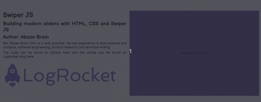
The Swiper API offers advanced features that can enhance the functionality and interactivity of your sliders. In this section, we will explore some powerful features of the Swiper API, such as autoplay, and its ability to handle complex navigation scenarios.
Swiper allows you to create autoplay sliders that automatically advance to the next slide at a specified interval. This can be useful for creating interactive presentations or showcasing content.
For this demonstration, you will use the nested navigation example’s HTML, CSS, and JS code. On the JavaScript file, add the autoplay property to the first swiper:
let swiper = new Swiper(".mySwiper", {
  autoplay: {
    delay: 1000, // Delay between slides in milliseconds
    disableOnInteraction: false, // Disable autoplay on user interaction
  },
  spaceBetween: 50,
  pagination: {
    el: ".swiper-pagination",
    clickable: true,
  },
});

let swiper2 = new Swiper(".mySwiper2", {
  direction: "vertical",
  spaceBetween: 50,
  pagination: {
    el: ".swiper-pagination",
    clickable: true,
  },
});
The autoplay property added to the first swiper allows you to create an autoplay slider, which automatically advances to the next slide at a specified interval (1 second):
You can use the slideTo method to navigate to a specific slide programmatically. This can be useful for creating custom navigation controls or implementing navigation based on user interactions.
On the JavaScript file, remove the autoplay property from the first swiper instance and add the code below the second swiper instance:
let swiper = new Swiper(".mySwiper", {
  spaceBetween: 50,
  pagination: {
    el: ".swiper-pagination",
    clickable: true,
  },
});

let swiper2 = new Swiper(".mySwiper2", {
  direction: "vertical",
  spaceBetween: 50,
  pagination: {
    el: ".swiper-pagination",
    clickable: true,
  },
});

setTimeout(() => {
  swiper.slideTo(2);
}, 1500);

setTimeout(() => {
  swiper.slideTo(0);
}, 3000);
Here the code uses the slideTo method to control the first swiper and navigate to the slide with index 2 (third slide) after 1.5 seconds and then navigate to the slide with index 0 (first slide )after 3 seconds:

Swiper also provides the slideNext and slidePrev methods to navigate to the next or previous slide. On the JavaScript file, add the following code below the Swiper instances:
let swiper = new Swiper(".mySwiper", {
  spaceBetween: 50,
  pagination: {
    el: ".swiper-pagination",
    clickable: true,
  },
});

let swiper2 = new Swiper(".mySwiper2", {
  direction: "vertical",
  spaceBetween: 50,
  pagination: {
    el: ".swiper-pagination",
    clickable: true,
  },
});

setTimeout(() => {
  swiper.slideNext();
}, 1500);

setTimeout(() => {
  swiper.slidePrev();
}, 3000);
Here the code uses the slideNext method to control the first swiper and navigate to the next slide after 1.5 seconds and then uses the slidePrev method to navigate to the previous after 3 seconds:
If you have multiple Swiper instances on a page, you can control them independently using their respective methods. On the JavaScript file, add the following code below the Swiper instances:
let swiper = new Swiper(".mySwiper", {
  spaceBetween: 50,
  pagination: {
    el: ".swiper-pagination",
    clickable: true,
  },
});

let swiper2 = new Swiper(".mySwiper2", {
  direction: "vertical",
  spaceBetween: 50,
  pagination: {
    el: ".swiper-pagination",
    clickable: true,
  },
});

setTimeout(() => {
  swiper.slideTo(2);
}, 1500);

setTimeout(() => {
  swiper2.slideNext();
}, 3000);
In the code above, you used the slideTo method to control the first swiper (with horizontal slides) and navigate to the slide with index 2 (the third horizontal slide and also the first vertical slide) after 1.5 seconds. Next, you used the slideNext method to control the second swiper (with vertical slides) and navigate to the next vertical slide after 3 seconds:
Sliders are important web design units that deserve special attention. Despite their pros in managing content in a space, they have some cons such as inhibiting SEO strategies and creating UX blunders. Sliders are a matter of personal preference, but when implemented efficiently, can produce a favorable impression of your web design. Should you decide to include them in your next project, Swiper is a great tool to consider.
As web frontends get increasingly complex, resource-greedy features demand more and more from the browser. If you’re interested in monitoring and tracking client-side CPU usage, memory usage, and more for all of your users in production, try LogRocket.

LogRocket lets you replay user sessions, eliminating guesswork around why bugs happen by showing exactly what users experienced. It captures console logs, errors, network requests, and pixel-perfect DOM recordings — compatible with all frameworks.
LogRocket's Galileo AI watches sessions for you, instantly identifying and explaining user struggles with automated monitoring of your entire product experience.
Modernize how you debug web and mobile apps — start monitoring for free.

A guide for using JWT authentication to prevent basic security issues while understanding the shortcomings of JWTs.

Discover how to build, render, and automate product demo videos with Remotion, replacing traditional screen recordings with reusable React code.

Chrome’s Modern Web Guidance embeds modern web platform skills into AI coding agents, helping them choose native HTML, CSS, and browser APIs over legacy patterns.

Learn how to use Fallow to analyze AI-generated code, detect dead code, duplicate logic, and complexity issues, and integrate automated code quality checks into your AI-assisted development workflow.
Would you be interested in joining LogRocket's developer community?
Join LogRocket’s Content Advisory Board. You’ll help inform the type of content we create and get access to exclusive meetups, social accreditation, and swag.
Sign up now

 Learn more →
