In this article, we’ll learn how to use CustomScrollView and Slivers to create a custom scrolling screen with multiple scrollable components scrolling horizontally, vertically, or simply putting a non-scrollable widget inside CustomScrollView.

This widget is especially useful if you want to create custom scrolling effects or have more control over ScrollView’s scrolling content.
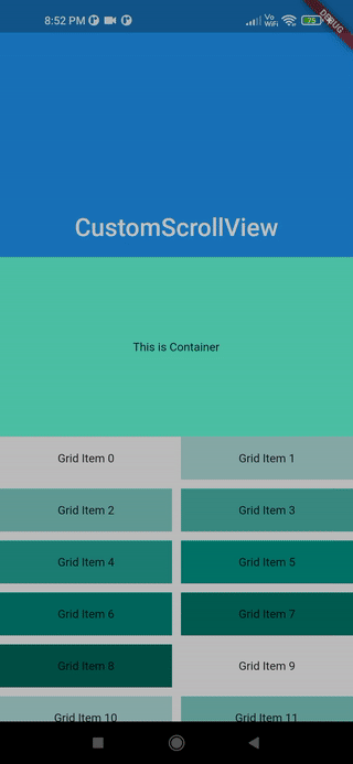
If you build a custom ScrollView like mine, you should end up with this result:
A sliver is a portion of a scrollable area that you can configure to behave differently.
As the official docs state, a sliver is a small portion of a scrollable area inside a CustomScrollview that can be configured accordingly to behave in a certain way. Using Flutter’s Slivers, we can easily create a plethora of fantastic scrolling effects. Slivers are used by all scrollable views in Flutter; for example, ListView uses SliverList and GridView uses SliverGrid.
Because Slivers lazily build their views when the widgets come into the viewport, it is really useful to show a great number of children without worrying about memory issues. Moreover, we can easily make lots of fantastic scrolling effects by using Flutter Slivers.
CustomScrollView is a widget that uses multiple Slivers rather than just one, as we saw with ListView and GridView. It enables you to directly utilize Slivers to create scrolling effects such as lists, grids, and expanding headers.
The implementation is straightforward; simply place all of the Slivers inside the CustomScrollView as shown:
CustomScrollView(
    slivers: [
      SliverAppBar(...),
    SliverToBoxAdapter(...),
      SliverGrid(...),
        SliverToBoxAdapter(...),
    SliverFixedExtenrList(...),
    ],
    controller: ScrollController(),
)
Give CustomScrollView a ScrollController to control the initial scroll offset or to handle scroll behavior in general.
As previously stated, a Sliver is a portion of a scrollable area that can be used inside a CustomScrollView. There are numerous Slivers available, and we’ll select a few to demonstrate how to use them later.
AppBars by setting both the flexibleSpace and expandedHeight parametersSliverChildListDelegate specifies the fixed list of children that are created all at once, whereas a SliverChildBuilderDelegate specifies how they are built lazilygridDelegate, which determines the location of the children widget within the gridEnough talking; now it’s time to dive into the code and apply all we’ve learned about CustomScrollView and Slivers. We’ll build an example app with multiple scrollable/non-scrollable widgets aligned vertically in a scroll view that functions as a single scrollable area.
Here’s the structure of our CustomScrollView:
pinned, floating, and snap parameters to control how and when the SliverAppBar collapses, expands, or becomes pinned to the top as we scroll furtherContainer with height 200 and color tealAccent below the SliverAppBar to represent a non-Sliver widget that needs to be wrapped with SliverToBoxAdapter in order to be children of CustomScrollViewtealAccent. We used SliverGridDelegateWithMaxCrossAxisExtent, which selects the largest cross-axis extent for the tiles; if you want to create a layout with a fixed number of tiles in the cross axis, use SliverGridDelegateWithFixedCrossAxisCountSliverGrid, we have a Container widget again with amberAccent colorListView inside a SliverToBoxAdapter. The reason is that we wanted to make a list that scrolls horizontally, which is not possible with SliverList, and since we had to place this `ListView` inside CustomScrollView, we need to add this inside SliverToBoxAdapterSliverFixedExtentList to generate a vertically scrolling list with a fixed itemExtent, which means that each child will have a fixed height, which will help us improve scrolling performance:import 'package:flutter/material.dart';
void main() => runApp(const MyApp());
class MyApp extends StatelessWidget {
const MyApp({Key? key}) : super(key: key);
static const String _title = 'Flutter Code Sample';
@override
Widget build(BuildContext context) {
return const MaterialApp(
title: _title,
home: CustomScrollingWidget(),
);
}
}
class CustomScrollingWidget extends StatefulWidget {
const CustomScrollingWidget({Key? key}) : super(key: key);
@override
State createState() => _CustomScrollingWidgetState();
}
class _CustomScrollingWidgetState extends State {
@override
Widget build(BuildContext context) {
return Scaffold(
body: CustomScrollView(
slivers: [
const SliverAppBar(
pinned: true,
expandedHeight: 250.0,
flexibleSpace: FlexibleSpaceBar(
title: Text('CustomScrollView'),
centerTitle: true,
),
),
SliverToBoxAdapter(
child: Container(
color: Colors.tealAccent,
alignment: Alignment.center,
height: 200,
child: const Text('This is Container'),
),
),
SliverGrid(
gridDelegate: const SliverGridDelegateWithMaxCrossAxisExtent(
maxCrossAxisExtent: 200.0,
mainAxisSpacing: 10.0,
crossAxisSpacing: 10.0,
childAspectRatio: 4.0,
),
delegate: SliverChildBuilderDelegate(
(BuildContext context, int index) {
return Container(
alignment: Alignment.center,
color: Colors.teal[100 * (index % 9)],
child: Text('Grid Item $index'),
);
},
childCount: 20,
),
),
SliverToBoxAdapter(
child: Container(
color: Colors.amberAccent,
alignment: Alignment.center,
height: 200,
child: const Text('This is Container'),
),
),
SliverToBoxAdapter(
child: SizedBox(
height: 100.0,
child: ListView.builder(
scrollDirection: Axis.horizontal,
itemCount: 10,
itemBuilder: (context, index) {
return SizedBox(
width: 100.0,
child: Card(
color: Colors.cyan[100 * (index % 9)],
child: Text('Item $index'),
),
);
},
),
),
),
SliverFixedExtentList(
itemExtent: 50.0,
delegate: SliverChildBuilderDelegate(
(BuildContext context, int index) {
return Container(
alignment: Alignment.center,
color: Colors.lightBlue[100 * (index % 9)],
child: Text('List Item $index'),
);
},
),
),
],
),
);
}
}
In this article, you learned how to make a ScrollView with numerous scrolling components and now you can design any type of complicated scrollable screen using Slivers and CustomScrollView in this article. I hope you continue to explore new things.
Now that we’ve got everything ready, all you have to do is start the application and enjoy.
Best wishes! Have fun fluttering!
If you have any questions, please post them here. Any and all feedback is appreciated.
Install LogRocket via npm or script tag. LogRocket.init() must be called client-side, not
server-side
$ npm i --save logrocket

// Code:

import LogRocket from 'logrocket';
LogRocket.init('app/id');
// Add to your HTML:

<script src="https://cdn.lr-ingest.com/LogRocket.min.js"></script>
<script>window.LogRocket && window.LogRocket.init('app/id');</script>

Learn how to protect full-stack projects from NPM supply chain attacks with a practical security checklist.

Explore 15 essential MCP servers for web developers to enhance AI workflows with tools, data, and automation.

Learn how contrast-color() automatically picks accessible text colors using native CSS, without JavaScript.

Learn how to build a harness-style AI workflow using Claude Code with specialized Dev, QE, and Ops subagents, gated handoffs, MCP telemetry, and LEARNING.md.
Hey there, want to help make our blog better?
Join LogRocket’s Content Advisory Board. You’ll help inform the type of content we create and get access to exclusive meetups, social accreditation, and swag.
Sign up now

 Learn more →
