Commenting on threads and messages used to be pretty messy prior to the introduction of @mention functionalities. Though you could send a message in a thread, there was often no way of knowing who the message was for, and there was no way to engage those who weren’t already involved in the conversation.

With the introduction of @mention, you can mention friends (or well-meaning social media experts) and invite them to join the discussion.
You also can find forms with @mention functionalities in various applications like Facebook, Dropbox, WhatsApp, and Gmail.
This article will look at building a form with the @mention functionality included in React. We will specifically be working with the react-mentions package.
You can find the complete code for this tutorial in my Github repo. Let’s get started!
react-mentionsMentionsInput and Mention componentsreact-mentions componentsreact-mentions
@mention functionalityThe Replay is a weekly newsletter for dev and engineering leaders.
Delivered once a week, it's your curated guide to the most important conversations around frontend dev, emerging AI tools, and the state of modern software.
react-mentionsLet’s start by creating a new React app with the command below:
npx create-react-app react-mentions
If you are using Yarn, run the following command:
yarn create react-app react-mentions
I’ll be using Yarn for the rest of this tutorial.
Next, install the react-mentions package as follows:
yarn add react-mentions
The react-mentions package exports two React components for rendering mentions: the MentionsInput component and the Mention component. MentionsInput is the main component used to render the text area control and can take one or more Mention components as children.
The Mention component represents a data source for a class of mentionable objects, including users, issues, and more.
MentionsInput and Mention componentsLet’s implement react-mentions into our application. Head over to the App.js file and replace the entire code with the code block below:
import { Mention, MentionsInput } from "react-mentions";
function App() {
return (
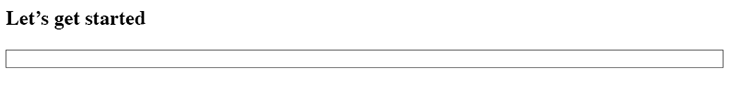
<div>
<h2>Let's get started</h2>
<MentionsInput>
<Mention />
</MentionsInput>
</div>
);
}
export default App;
When we start up the development server with yarn start, we should get an input box like in the image below:
Next, we will create an array of dummy data that’ll be provided to the Mention component. The data must have id and display as specific keys.
We also need to create a state event. This will be used to bind the state of our application to the values coming from the data and then pass it to the MentionsInput component.
Copy and paste the code below into the App.js file:
function App() {
  const [value, setValue] = useState("");

  const users = [
    {
      id: "isaac",
      display: "Isaac Newton",
    },
    {
      id: "sam",
      display: "Sam Victor",
    },
    {
      id: "emma",
      display: "[email protected]",
    },
  ];

  ...
}
We created a state variable and user array based on the code block above. The user array contains objects with id and display parameters. These are the parameters needed to populate the react-mentions component.
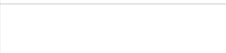
Now, let’s update the return() statement with the code below:
  return (
    <div className="App">
      <MentionsInput
        value={value}
        onChange={(e) => setValue(e.target.value)}>

        <Mention
          data={users} />
      </MentionsInput>
    </div>
  );
We are using the MentionsInput tag that takes in the value prop. We’re then setting the state value with the onChange prop. With all this done, we should be able to achieve this:
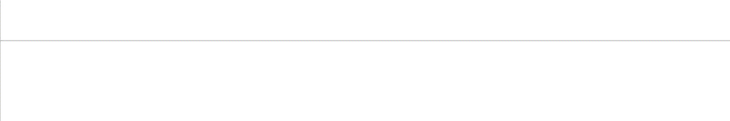
react-mentions componentsLooking at our progress above, you may notice that our component looks a bit out of place. We can fix it by customizing with styles.
Create a mentionStyles.js file in the src folder and paste the code below:
export default {
  backgroundColor: "#cee4e5",
};
Create a mentionsInputStyles.js file in the src folder as well and paste the code block below into it:
export default {
  control: {
    backgroundColor: '#fff',
    fontSize: 16,
    // fontWeight: 'normal',
  },
  '&multiLine': {
    control: {
      fontFamily: 'monospace',
      minHeight: 63,
    },
    highlighter: {
      padding: 9,
      border: '1px solid transparent',
    },
    input: {
      padding: 9,
      border: '1px solid silver',
    },
  },
  '&singleLine': {
    display: 'inline-block',
    width: 180,
    highlighter: {
      padding: 1,
      border: '2px inset transparent',
    },
    input: {
      padding: 1,
      border: '2px inset',
    },
  },
  suggestions: {
    list: {
      backgroundColor: 'white',
      border: '1px solid rgba(0,0,0,0.15)',
      fontSize: 16,
    },
    item: {
      padding: '5px 15px',
      borderBottom: '1px solid rgba(0,0,0,0.15)',
      '&focused': {
        backgroundColor: '#cee4e5',
      },
    },
  },
}
Head back to App.js and import the style:
import mentionStyle from "./mentionStyle";
import mentionsInputStyle from "./mentionsInputStyle";
Now, update the components:
    <div className="App">
      <MentionsInput
        style={mentionsInputStyle}
        value={value}
        onChange={(e) => setValue(e.target.value)}>

        <Mention
          style={mentionStyle}
          data={users}
        />
      </MentionsInput>
    </div>
We’ve updated our components by adding the style prop and setting it to the imported style.
With our progress so far, we’ve achieved a nice, customized Mention functionality in our app!
react-mentionsThe react-mentions package comes with many customizable features, so let’s take a look into some of them!
singleLine inputsingleLine input is called when we want our input to be a single line of text rather than the default text area. You can see this in the code below:
return (
 <div className="App">
  ...
  <h2>Using a Single line Input</h2>
      <MentionsInput
        singleLine  //this sets the single line input to true
        style={mentionsInputStyle}
        value={value}
        onChange={(e) => setValue(e.target.value)}
      >

    </div>
  );

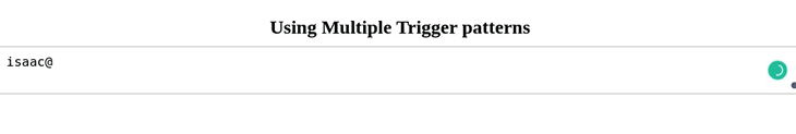
We can also decide to use more than one trigger pattern instead of the default @ trigger pattern. Luckily, the react-mention package supports this.
Let’s initiate a second trigger pattern. Import the useCallback hook in the App.js file. The useCallback hook is used to stop the Mention component from rerendering without need:
import { useState, useCallback } from "react";
Next, create an email validation regex. This will act as an additional trigger that detects if the input is an email. It will then highlight it as a mention.
function App() {
  const [value, setValue] = useState("");
  const emailRegex = /(([^\s@]+@[^\s@]+\.[^\s@]+))$/;

  ...
  return (
    <div className="App">
      <h2>Using Multiple trigger patterns</h2>
      <MentionsInput
        style={mentionsInputStyle}
        value={value}
        onChange={(e) => setValue(e.target.value)}
        >

        <Mention style={mentionStyle} data={users} />

        <Mention
          trigger={emailRegex}
          data={(search) => [{ id: search, display: search }]}
          onAdd={useCallback((...args) => {
            console.log(...args);
          }, [])}
          style={{ backgroundColor: "#d1c4e9" }}
        />
      </MentionsInput>
    </div>
  );
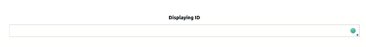
idThe react-mentions library also allows us to change the default displaying id to our preferred one. We can achieve this by using the displayTransform parameter.
   <h2>Displaying ID</h2>
      <MentionsInput
        style={mentionsInputStyle}
        value={value}
        onChange={(e) => setValue(e.target.value)}
      >
        <Mention
          displayTransform={(id) => `<!--${id}-->`}
          style={mentionStyle}
          data={users}
        />
      </MentionsInput>
In the code block above, we return the id from the user object and render it.
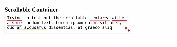
Text areas are responsive input fields that adjust in height based on multiple user inputs. This feature can result in a distorted UI and applies to our react-mentions component. We’ll be making our text area scrollable to avoid this distortion and create a nicer UI instead.
First, we’ll import the merge function from the lodash library into the App.js file:
import merge from 'lodash/merge';
The merge function will be responsible for merging our mentionsInputStyle with our new custom style.
function App() {
  let customStyle = merge({}, mentionsInputStyle, {
    input: {
      height: 80,
      overflow: "auto",
    },
    highlighter: {
      height: 80,
      overflow: "hidden",
      boxSizing: "border-box",
    },
  });

  ...
  return (
      <MentionsInput
        value={value}
        onChange={(e) => setValue(e.target.value)}
        style={customStyle}
        placeholder={"Mention people using '@'"}
        a11ySuggestionsListLabel={"Suggested mentions"}
      >
        <Mention
          trigger="@"
          data={users}
          style={mentionStyle}
        />
  );
}
In the code block above, we’re merging the mentionsInputStyle to our newly updated style. We’re also setting the height and width of the text area to a fixed value and automatically setting the overflow.
With that done, we will have a nicer UI with a scrollable component, as shown below:
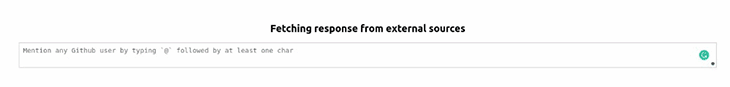
In this section, we’ll look at how we can use data from an API in our form. In many cases, our data may be coming from an external source. Let’s see how we handle our responses and add them to the react-mentions data property.
We’ll be working with and fetching users from the JSON Placeholder API for this demo. Copy and paste the code block below into the App.js file:
  function fetchUsers(query, callback) {
    if (!query) return;
    fetch(`https://jsonplaceholder.typicode.com/users?q=${query}`, {
      json: true,
    })
      .then((res) => res.json())
      // Transform the users to what react-mentions expects
      .then((res) =>
        res.map((user) => ({ display: user.username, id: user.name }))
      )

      .then(callback);
  }
Based on the code block above, we’re making an API call to the jsonplaceholder server. We passed two arguments into the fetch function: query and callback.
The query argument holds the input from the mentionInput, while the callback argument is called when we have the response ready.
Next, we are returning a list of users, looping through it, and returning the user’s name and username as an object of display and id.
Finally, we’re calling our function in the data property of the MentionsInput component and displaying the id:
   <MentionsInput
        value={value}
        onChange={(e) => setValue(e.target.value)}
        style={mentionsInputStyle}
        placeholder="Mention any JsonPlaceholder username by typing `@` followed by at least one character"
        a11ySuggestionsListLabel={"Suggested JsonPlaceholder username for mention"}
      >
        <Mention
          displayTransform={(id) => `@${id}`}
          trigger="@"
          data={fetchUsers}
          style={mentionStyle}
        />
      </MentionsInput>
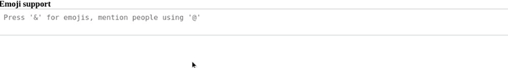
With the react-mentions package, not only can names be referenced and mentioned, emojis can be mentioned too!
Let’s take a look at how to fetch emojis from an external API and display them in the input field when they’re searched.
function App() {
  const [emojiValue, setEmojiValue] = useState([]);
  const notMatchingRegex = /($a)/;

  useEffect(() => {
    fetch(
      "https://gist.githubusercontent.com/oliveratgithub/0bf11a9aff0d6da7b46f1490f86a71eb/raw/d8e4b78cfe66862cf3809443c1dba017f37b61db/emojis.json"
    )
      .then((data) => {
        return data.json();
      })
      .then((jsonData) => {
        setEmojiValue(jsonData.emojis);
      });
  }, []);
  const queryEmojis = (query, callback) => {
    if (query.length === 0) return;
    const filterValue = emojiValue
      .filter((emoji) => {
        return emoji.name.indexOf(query.toLowerCase()) > -1;
      })
      .slice(0, 10);
    return filterValue.map(({ emoji }) => ({ id: emoji }));
  };

  ...
  return (
      <h3>Emoji support</h3>
      <MentionsInput
        value={value}
        onChange={(e) => setValue(e.target.value)}
        style={mentionsInputStyle}
        placeholder={"Press '&' for emojis, mention people using '@'"}
      >
        <Mention
          trigger="@"
          displayTransform={(username) => `@${username}`}
          markup="@__id__"
          data={users}
          regex={/@(\S+)/}
          style={mentionStyle}
          appendSpaceOnAdd
        />
        <Mention
          trigger="&"
          markup="__id__"
          regex={notMatchingRegex}
          data={queryEmojis}
        />
      </MentionsInput>
  );
}
Based on the code block above, we’re fetching and storing the emojis from our API in our emojiValue as soon as the page loads. We do this using the useEffect hook and displaying the emojis whenever the user searches specific keywords.
Here, we’re using a double trigger pattern using the & symbol for emojis and the @ symbol for the users array. The notMatchingRegex serves as a filter for non-matching emojis.
@mention functionalityIn this section, we will be putting together everything we’ve learned about the react-mentions library to build a comment form.
First, create a CustomForm.jsx file in the src directory and paste in the code below:
// CustomForm.jsx

import { useState } from 'react';
import { Mention, MentionsInput } from 'react-mentions';
import styles from './FormInputStyle.module.css';
import mentionsInputStyle from './mentionsInputStyle';
import mentionStyle from './mentionStyle';
const CustomForm = () => {
  const [formState, setFormState] = useState({
    username: '',
    comment: '',
  });
  const [comments, setComments] = useState([]);
  const users = [
    {
      id: 'isaac',
      display: 'Isaac Newton',
    },
    {
      id: 'sam',
      display: 'Sam Victor',
    },
    {
      id: 'emma',
      display: '[email protected]',
    },
  ];
  const submit = () => {
    if (formState.username === '' || formState.comment === '') {
      alert('Please fill in all fields');
      return;
    }
    setComments((comments) => [
      ...comments,
      {
        username: formState.username,
        comment: formState.comment,
      },
    ]);
    setFormState({
      username: '',
      comment: '',
    });
  };
  const current = new Date();
  const date = `${current.getDate()}/${
    current.getMonth() + 1
  }/${current.getFullYear()}`;
In the code above, we’re importing the package that we will be using from react-mentions as well as the useState hook for handling the comments and state of the forms.
The form and comment state have also been set and are providing the dummy data for the application. Our submit function checks if the fields are filled and sets the comment state. We now have a date variable that gets the date of the comment.
Now, update the return value with the code below:
return (
<div className={styles.form}>
<section className={styles.formCard}>
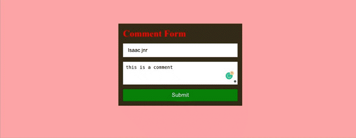
<h2 className={styles.formTitle}>Comment Form</h2>
<input
type="text"
value={formState.username}
onChange={(e) =>
setFormState({ ...formState, username: e.target.value })
}
placeholder="Input Your Name"
/>
<MentionsInput
placeholder="Add Comment. Use '@' for mention"
value={formState.comment}
onChange={(e) =>
setFormState({ ...formState, comment: e.target.value })
}
style={mentionsInputStyle}
>
<Mention style={mentionStyle} data={users} />
</MentionsInput>
<button onClick={submit}>Submit</button>
</section>
{comments.length === 0 ? (
null
) : (
<section>
{comments.map((comment, i) => (
<div className={styles.commentCard} key={i}>
<p className={styles.username}>
{comment.username} on {date}
</p>
<h2>{comment.comment}</h2>
</div>
))}
</section>
)}
</div>
);
};
export default CustomForm;
We are passing the appropriate props to the Mention and MentionInput components and displaying the comments below the form (if there are any).
Great! Next, create a FormInputStyle.module.css for styling and paste the following code into it:
* {
  margin: 0;
  padding: 0;
  box-sizing: border-box;
}
.form {
  display: flex;
  flex-direction: column;
  align-items: center;
  justify-content: center;
  width: 100%;
  height: 100vh;
  background-color: #ffa5a5;
}
.formTitle {
  font-size: 2rem;
  color: red;
  margin-bottom: 1rem;
}
input {
  height: 3rem;
  width: 25rem;
  margin-bottom: 1rem;
  padding: 1rem;
  font-size: 18px;
  border: 1px solid silver;
}
.formCard {
  width: 27rem;
  display: flex;
  flex-direction: column;
  background-color: rgb(54, 44, 24);
  padding: 1rem;
}
button {
  border: none;
  border-radius: 3px;
  color: white;
  background-color: green;
  font-size: 1.2rem;
  padding: 10px;
  margin-top: 1rem;
}
.commentCard {
  margin: 1.5rem;
  color: rgb(173, 173, 173);
  font-size: 1rem;
  background-color: #444;
  padding: 1rem;
  width: 27rem;
}
.username {
  color: white;
  font-size: 1.3rem;
}
With that, we are done creating the form! You should see something like this:
In this article, we’ve learned about react-mentions, an easy-to-use library for building forms with @mention functionalities. We also looked at the different functionalities of the react-mentions package and how we can use them. We also built a comment form with @mention functionality using the react-mention package.
Thanks for reading!
Install LogRocket via npm or script tag. LogRocket.init() must be called client-side, not
server-side
$ npm i --save logrocket

// Code:

import LogRocket from 'logrocket';
LogRocket.init('app/id');
// Add to your HTML:

<script src="https://cdn.lr-ingest.com/LogRocket.min.js"></script>
<script>window.LogRocket && window.LogRocket.init('app/id');</script>

I tested the Speculation Rules API in a real project to see if it actually improves navigation speed. Here’s what worked, what didn’t, and where it’s worth using.
How AGENTS.md and agent skills improve coding agents, reduce mistakes, and make AI IDE workflows more reliable and project-aware.

Build a simple, framework-free Node.js app, and then deploy it to three different services that offer a free tier, Render, Railway, and Fly.io.

Understand best practices for structuring Node.js projects, such as separating roles using folder structures and practicing modular code.
Hey there, want to help make our blog better?
Join LogRocket’s Content Advisory Board. You’ll help inform the type of content we create and get access to exclusive meetups, social accreditation, and swag.
Sign up now

 Learn more →

2 Replies to "Build a React comment form with @mention functionality"
nice article
useful content