Mobile apps typically offer various GUI elements for users to perform actions. For example, you click a button to log in to a particular app after entering login credentials via input fields. Mobile apps usually respond to user actions in one of two ways, when we consider response time:

React Native offers ActivityIndicator to display a circular loading indicator for longer action-response times. The ActivityIndicator plays the platform-specific, infinite circular loading animation, so you can use it anywhere you need to indicate a delayed response.
We can customize ActivityIndicator in several ways to fit into any app. In this tutorial, I will explain how to customize and use it in various ways with practical examples. Also, I will show you some alternative ways to display customized cross-platform activity indicators with several third-party libraries and inbuilt APIs.
Jump ahead:
ActivityIndicator customizationActivityIndicator exampleActivityIndicator customizationWe’ll build a simple app that lists some fruit names to demonstrate ActivityIndicator customization. The app loads the data with an asynchronous function that creates an artificial two-second delay to simulate network latency. We will display the activity indicator during that two-second delay to indicate the loading state.
You can either create a new project or use the following code in your existing projects. If you would like to try out the upcoming code snippets with a new project, create one with the following command:
npx react-native init ActivityIndicatorExample
cd ActivityIndicatorExample
After the project setup, run the app to make sure that everything works fine:
npx react-native run-android
# --- or ---
npx react-native run-ios
ActivityIndicator exampleWe planned to create an app to conditionally show/hide the loading indicator, but how about continuously showing the loading indicator first to see what it is? Paste the following code in your App.js file:
import React from 'react';
import {
  SafeAreaView,
  ActivityIndicator,
} from 'react-native';

function App() {
  return (
    <SafeAreaView>
      <ActivityIndicator/>
    </SafeAreaView>
  );
};

export default App;
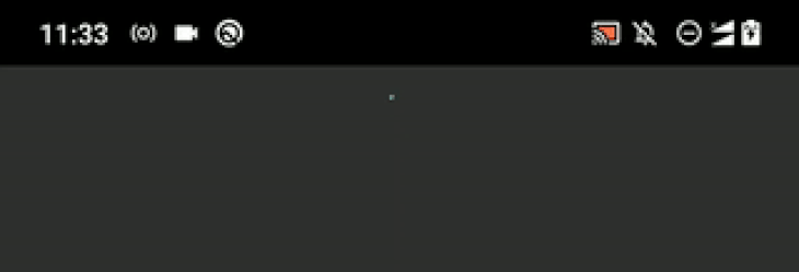
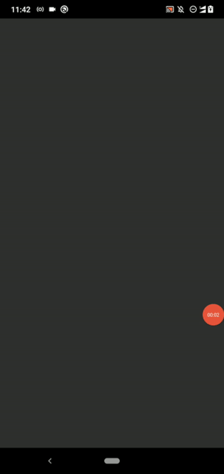
The above code always renders a circular indicator. If possible, check out the app on both Android and iOS platforms. You will see a circular indicator element that is styled based on your current operating system. See how it looks on Android:
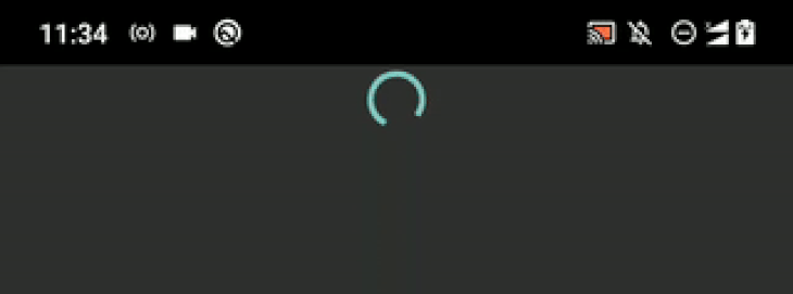
The indicator looks a bit small, right? By default, React Native displays a small activity indicator, but you can enlarge it as follows:
<ActivityIndicator size="large"/>
Now, you will see a somewhat enlarged indicator animation as follows:
If you check the official documentation, you will notice that we can use the animating prop to show and hide the indicator, but it doesn’t remove the space you’ve allocated for the activity indicator in the viewport. Therefore, displaying the indicator component conditionally — either with an if statement, && operator, or ternary operator — is a great option.
Let’s build the app I mentioned before to understand conditional rendering. Update your App.js file with the following code:
import React, { useState, useEffect } from 'react';
import {
  SafeAreaView,
  FlatList,
  ActivityIndicator,
  StyleSheet,
  Text,
  View,
} from 'react-native';

async function getItems() {
  await new Promise((resolve) => setTimeout(resolve, 2000));
  return ['Apple', 'Banana'];
}

function Item({ name }) {
  return (
    <View style={styles.item}>
      <Text style={styles.itemText}>{name}</Text>
    </View>
  );
}

function App() {
  const [items, setItems] = useState([]);
  const [loading, setLoading] = useState(true);

  useEffect(() => {
    getItems().then((items) => {
      setItems(items);
      setLoading(false);
    });
  }, []);

  const renderItem = ({ item }) => (
    <Item name={item}/>
  );
  return (
    <SafeAreaView style={styles.container}>
     { loading ?
      <ActivityIndicator size="large"/> :
      <FlatList
        data={items}
        renderItem={renderItem}
      /> }
    </SafeAreaView>
  );
};

const styles = StyleSheet.create({
  container: {
    flex: 1,
  },
  item: {
    backgroundColor: '#888',
    padding: 12,
    marginBottom: 12
  },
  itemText: {
    color: '#fff',
    fontSize: 24,
  }
});

export default App;
As mentioned earlier, we’re using a two-second delay to simulate network latency, so after displaying the activity indicator for two seconds, we will display the fruit list.
Look at what we return from the App component:
<SafeAreaView style={styles.container}>
     { loading ?
      <ActivityIndicator size="large"/> :
      <FlatList
        data={items}
        renderItem={renderItem}
      /> }
</SafeAreaView>
Here, we show the ActivityIndicator if the loading state variable is true; otherwise, we display the FlatList component because the loading state has finished. We use the same SafeAreaView wrapper for both conditional components, as usual.
Run the project. You will see the fruit list after the circular loading animation, as shown in the following preview:
You can improve your mobile apps’ UI/UX qualities by positioning GUI elements accordingly — that’s why every mobile developer strives to arrange buttons, input fields, and other GUI elements in apps the best way they can. The activity indicator is also a GUI element, so correctly positioning it is essential.
The ActivityIndicator component accepts View props, so we don’t need to wrap our ActivityIndicator with another View, as we typically would to apply positional styles to Button components.
You can use a fixed margin for the circular indicator as follows. Add the following styling object to your stylesheet:
indicator: {
  marginTop: 100
}
Next, use the newly added styling definition in your app layout:
<ActivityIndicator size="large" style={styles.indicator}/>
Now, users will notice the indicator immediately:

You can also center the circular indicator with the following setup:
indicator: {
  flex: 1
}
Now you will see the loading animation on the center of the screen:
Try to adjust the activity indicator position properly with View styles. If, for a complex app, you’re loading data for multiple lists simultaneously, you can use tight top-bottom margins for each indicator element to avoid unwanted blank spaces.
In some scenarios, users can’t predict why the app is displaying a loading animation for a long time. In our example, we didn’t show a title for our fruit list app, so our users can’t guess why we’re displaying the loading indicator. But if we show a title (i.e., Fruits) and display the activity indicator animation next to the title, users can intuit that the list of fruits is still loading.
Let’s add a status text to make it clear for our users! Add the following code to your App.js file:
import React, { useState, useEffect } from 'react';
import {
  SafeAreaView,
  FlatList,
  ActivityIndicator,
  StyleSheet,
  Text,
  View,
} from 'react-native';

async function getItems() {
  await new Promise((resolve) => setTimeout(resolve, 2000));
  return ['Apple', 'Banana', 'Orange', 'Pineapple', 'Mango', 'Kiwi'];
}

function Item({ name }) {
  return (
    <View style={styles.item}>
      <Text style={styles.itemText}>{name}</Text>
    </View>
  );
}

function LoadingAnimation() {
  return (
    <View style={styles.indicatorWrapper}>
      <ActivityIndicator size="large" style={styles.indicator}/>
      <Text style={styles.indicatorText}>Loading fruits...</Text>
    </View>
  );
}

function App() {
  const [items, setItems] = useState([]);
  const [loading, setLoading] = useState(true);

  useEffect(() => {
    getItems().then((items) => {
      setItems(items);
      setLoading(false);
    });
  }, []);

  const renderItem = ({ item }) => (
    <Item name={item}/>
  );

  return (
    <SafeAreaView style={styles.container}>
     { loading ?
      <LoadingAnimation/> :
      <FlatList
        data={items}
        renderItem={renderItem}
      /> }
    </SafeAreaView>
  );
};

const styles = StyleSheet.create({
  container: {
    flex: 1,
  },
  item: {
    backgroundColor: '#888',
    padding: 12,
    marginBottom: 12,
    marginLeft: 8,
    marginRight: 8,
  },
  itemText: {
    color: '#fff',
    fontSize: 24,
  },
  indicatorWrapper: {
    flex: 1,
    alignItems: 'center',
    justifyContent: 'center',
  },
  indicator: {},
  indicatorText: {
    fontSize: 18,
    marginTop: 12,
  },
});

export default App;
We wrapped the ActivityIndicator component with a View and also added a Text component. We’ve added these components to a new component, LoadingAnimation, so we can use it anywhere as a reusable component and the App component is clean too. Also, we’ve changed the font size and margin of the loading indicator text to improve the UI quality.
Run the app. Now, you can see a status text along with the circular loading animation, as shown in the following preview:

In this scenario, the activity indicator disappears after two seconds, but in some real-world scenarios, users with high network traffic conditions might have to wait for a few minutes. In those cases, you can dynamically change the status text to include a friendly message to keep the user updated. You can also display proper error messages for backend issues instead of showing the activity indicator continuously.
We already know how to change the size of the indicator element with the size prop. But ActivityIndicator accepts View styles, so it’s also possible to customize its background color, opacity, border, margin, padding, etc.
React Native lets you change the activity indicator element’s color too. For example, you can override the default system theme color as follows:
<ActivityIndicator size="large" color="#bb5533" style={styles.indicator}/>
Now, you can see a custom color for the indicator element:

Now, let’s adjust the background color, border, and padding. Use the following setup for indicator in the current stylesheet:
indicator: {
  padding: 12,
  backgroundColor: '#555',
  borderRadius: 12
},
Look at the app. Now, you will see an indicator with a background layer as follows:
Apply more View styles and try to create various customized activity indicators.
React Native apps typically support two system themes: dark and light. Some developers develop apps that support more than two themes. Nowadays, most React Native developers use the inbuilt Appearance module’s [useColorScheme](https://reactnative.dev/docs/usecolorscheme) Hook to handle dark and light theme-related styling.
Look at the following example code snippet:
import React from 'react';
import {
  SafeAreaView,
  ActivityIndicator,
  useColorScheme,
} from 'react-native';

const Colors = {
  light: {
    indicator: '#000',
    container: '#fff',
  },
  dark: {
    indicator: '#fff',
    container: '#000',
  },
};

function App() {
  const theme = useColorScheme();
  const colors = Colors[theme];

  return (
    <SafeAreaView style={{ flex: 1, backgroundColor: colors.container}}>
      <ActivityIndicator
        size="large"
        color={colors.indicator}/>
    </SafeAreaView>
  );
};

export default App;
Here, we change the activity indicator’s color based on the current theme, so once you run the app, you will see an inverted color for the activity indicator based on the current theme. For example, if you test the app on dark mode, you will see a white activity indicator, and vice versa.
You can learn more about dark/light themes from this article.
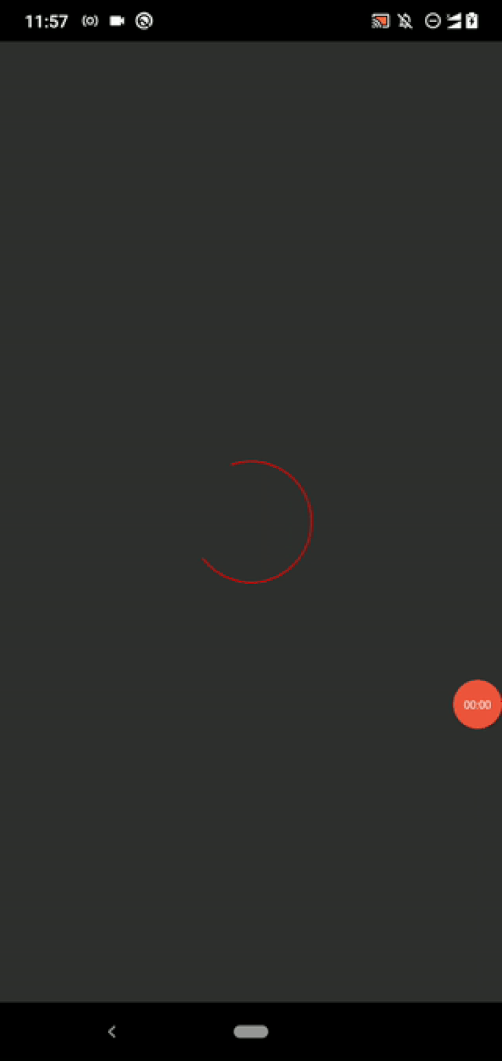
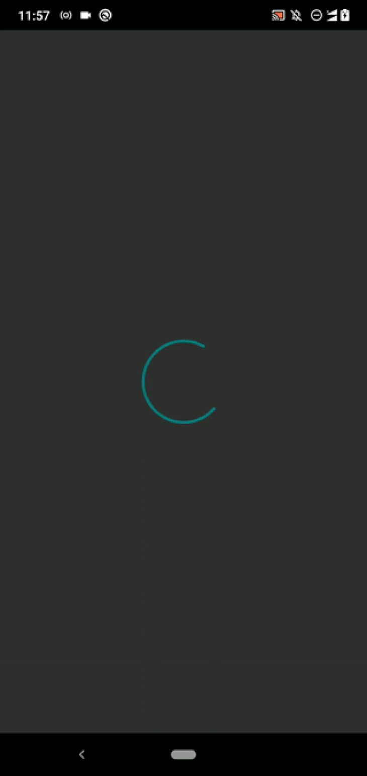
The ActivityIndicator component doesn’t let developers change its default animation because the underlying, platform-specific UI element always plays the system-defined circular loading animation. However, you can change the indicator’s size and color with setInterval to customize its default animation.
Let’s bring back our fruit list app again. See how it toggles the indicator’s color:
import React, { useState, useEffect } from 'react';
import {
  SafeAreaView,
  FlatList,
  ActivityIndicator,
  StyleSheet,
  Text,
  View,
} from 'react-native';

async function getItems() {
  await new Promise((resolve) => setTimeout(resolve, 3000));
  return ['Apple', 'Banana', 'Orange', 'Pineapple', 'Mango', 'Kiwi'];
}

function Item({ name }) {
  return (
    <View style={styles.item}>
      <Text style={styles.itemText}>{name}</Text>
    </View>
  );
}

function LoadingAnimation() {
  const [color, setColor] = useState('teal');
  useEffect(() => {
    const id = setInterval(() => {
      setColor((color) => color == 'teal' ? 'royalblue' : 'teal');
    }, 700);
    return () => clearInterval(id);
  }, []);

  return (
    <View style={styles.indicatorWrapper}>
      <ActivityIndicator size="large" color={color} style={styles.indicator}/>
      <Text style={styles.indicatorText}>Loading fruits...</Text>
    </View>
  );
}

function App() {
  const [items, setItems] = useState([]);
  const [loading, setLoading] = useState(true);

  useEffect(() => {
    getItems().then((items) => {
      setItems(items);
      setLoading(false);
    });
  }, []);

  const renderItem = ({ item }) => (
    <Item name={item}/>
  );

  return (
    <SafeAreaView style={styles.container}>
     { loading ?
      <LoadingAnimation/> :
      <FlatList
        data={items}
        renderItem={renderItem}
      /> }
    </SafeAreaView>
  );
};

const styles = StyleSheet.create({
  container: {
    flex: 1,
  },
  item: {
    backgroundColor: '#888',
    padding: 12,
    marginBottom: 12,
    marginLeft: 8,
    marginRight: 8,
  },
  itemText: {
    color: '#fff',
    fontSize: 24,
  },
  indicatorWrapper: {
    flex: 1,
    alignItems: 'center',
    justifyContent: 'center',
  },
  indicator: {},
  indicatorText: {
    fontSize: 18,
    marginTop: 12,
  },
});

export default App;
Here we toggled the indicator color with the setInterval function. Once you run the app, you will see a modified animation:

Try to create a custom activity indicator that supports configurable animation colors by extending the above code (i.e., using colors as a prop). You can dynamically change the size, background color, border, and other styling props to customize its animation. I will explain how to change styling props with React Native’s Animated API at the end of this article.
View OverlayIn some scenarios, we need to show activity indicators on top of other GUI elements. You can either use a View overlay or a Modal to implement such indicators.
First, let’s implement an activity indicator with a View overlay by modifying the previous fruit list app. Add the following code to your App.js file:
import React, { useState, useEffect } from 'react';
import {
  SafeAreaView,
  FlatList,
  ActivityIndicator,
  StyleSheet,
  Text,
  View,
} from 'react-native';

async function getItems() {
  await new Promise((resolve) => setTimeout(resolve, 3000));
  return ['Apple', 'Banana', 'Orange', 'Pineapple', 'Mango', 'Kiwi'];
}

function Item({ name }) {
  return (
    <View style={styles.item}>
      <Text style={styles.itemText}>{name}</Text>
    </View>
  );
}

function LoadingAnimation() {
  return (
    <View style={styles.indicatorWrapper}>
      <ActivityIndicator size="large"/>
      <Text style={styles.indicatorText}>Loading fruits...</Text>
    </View>
  );
}

function App() {
  const [items, setItems] = useState(['Pineapple', 'Mango', 'Kiwi']);
  const [loading, setLoading] = useState(true);

  useEffect(() => {
    getItems().then((items) => {
      setItems(items);
      setLoading(false);
    });
  }, []);

  const renderItem = ({ item }) => (
    <Item name={item}/>
  );

  return (
    <SafeAreaView style={styles.container}>
      <FlatList
        data={items}
        renderItem={renderItem}
      />
      { loading && <LoadingAnimation/> }
    </SafeAreaView>
  );
};

const styles = StyleSheet.create({
  container: {
    flex: 1,
  },
  item: {
    backgroundColor: '#888',
    padding: 12,
    marginBottom: 12,
    marginLeft: 8,
    marginRight: 8,
  },
  itemText: {
    color: '#fff',
    fontSize: 24,
  },
  indicatorWrapper: {
    position: 'absolute',
    left: 0,
    right: 0,
    top: 0,
    bottom: 0,
    alignItems: 'center',
    justifyContent: 'center',
    backgroundColor: 'rgba(100, 100, 100, 0.6)',
  },
  indicatorText: {
    fontSize: 18,
    marginTop: 12,
  },
});

export default App;
We have applied the following changes to the previous fruit list app:
FlatList component initially with some data and let it retrieve new data after three secondsView component to an overlay by applying a somewhat-transparent background color and making the position absoluteNow, you will see the activity indicator on an overlay, as shown in the following preview:

Previously, we implemented an overlay with various positional styling props, but we can achieve the same result with the prebuilt Modal component using less styling-related code. Let’s copy the previous code and use the Modal component.
First, add Modal to your imports:
import {
  SafeAreaView,
  FlatList,
  ActivityIndicator,
  StyleSheet,
  Text,
  View,
  Modal,
} from 'react-native';
Use the following styling code for indicatorWrapper:
indicatorWrapper: {
  flex: 1,
  alignItems: 'center',
  justifyContent: 'center',
  backgroundColor: 'rgba(100, 100, 100, 0.6)',
},
Next, use the following implementation for LoadingAnimation:
function LoadingAnimation() {
  return (
    <Modal transparent={true}>
      <View style={styles.indicatorWrapper}>
        <ActivityIndicator size="large"/>
        <Text style={styles.indicatorText}>Loading fruits...</Text>
      </View>
    </Modal>
  );
}
Once you run the app, you will see the same result as the View-based overlay implementation. View-based overlay and Modal-based one looked the same, but you can do a lot more with Modal, such as adding transition animations or attaching callbacks.
Learn more about React Native Modal with this article.
Inbuilt framework components sometimes come with limitations, so the developer community tends to create libraries for specific use cases. The inbuilt ActivityIndicator component uses an Intermediate Progress GUI element on Android. On iOS, it uses the [UIActivityIndicatorView](https://developer.apple.com/documentation/uikit/uiactivityindicatorview) Apple SDK element. These platform-specific GUI elements show circular loading indicators according to the operating system’s UI/UX definitions, and they won’t offer flexible customizations for app developers.
For example, you can’t create a three-dot loading indicator with the inbuilt activity indicator. Therefore, if you don’t like the platform-specific activity indicator, you will have to use a third-party library or build your own custom activity indicator.
Let’s discuss how to create modern, custom activity indicators with community libraries.
The react-native-progress library offers modern, cross-platform progress indicators like circular and bar loaders. Each progress indicator supports various props for customization, and the library renders custom activity indicator elements on the app screen using the react-native-svg library.
Create a new React Native project to try out our chosen progress indicator libraries:
npx react-native init ProgressIndicatorLibs
cd ProgressIndicatorLibs
Next, install the library:
npm install react-native-progress
# --- or ---
yarn add react-native-progress
Now, add the following code to your App.js file to implement a simple circular activity indicator:
import React from 'react';
import {
  SafeAreaView,
} from 'react-native';
import * as Progress from 'react-native-progress';

function App() {
  return (
    <SafeAreaView style={{ flex: 1, alignItems: 'center', justifyContent: 'center' }}>
      <Progress.Circle
        size={100}
        color="red"
        indeterminate={true}
        endAngle={0.7} />
    </SafeAreaView>
  );
};

export default App;
Run the app. You will see a different circular loading indicator compared to the inbuilt platform-specific ActivityIndicator:
Try setting a lower value for the endAngle prop — then you will see a shorter circle circumference segment.
This library offers another three progress indicator types: Bar, CircleSnail, and Pie. For example, you can use the CircleSnail component to create a futuristic multi-color activity indicator. Look at the following code snippet:
<Progress.CircleSnail
  size={100}
  color={['teal', 'royalblue']}
/>
Once you use the above code snippet with the previous project source, you will see the following result:
You can display a preferred progress value with the progress prop. Check the library’s GitHub Readme to see all supported props and indicator types.
Earlier, we displayed an indicator element along with a View overlay and Modal by writing some implementation code. You can use a pre-implemented Modal-based overlay with the react-native-loading-spinner-overlay library.
First, install the library to get started:
npm install react-native-loading-spinner-overlay
# --- or ---
yarn add react-native-loading-spinner-overlay
Now, use the library with the previous fruit list app:
import React, { useState, useEffect } from 'react';
import {
  SafeAreaView,
  FlatList,
  StyleSheet,
  Text,
  View,
} from 'react-native';
import Spinner from 'react-native-loading-spinner-overlay';

async function getItems() {
  await new Promise((resolve) => setTimeout(resolve, 2000));
  return ['Apple', 'Banana', 'Orange', 'Pineapple', 'Mango', 'Kiwi'];
}

function Item({ name }) {
  return (
    <View style={styles.item}>
      <Text style={styles.itemText}>{name}</Text>
    </View>
  );
}

function App() {
  const [items, setItems] = useState(['Pineapple', 'Mango', 'Kiwi']);
  const [loading, setLoading] = useState(true);

  useEffect(() => {
    getItems().then((items) => {
      setItems(items);
      setLoading(false);
    });
  }, []);

  const renderItem = ({ item }) => (
    <Item name={item}/>
  );

  return (
    <SafeAreaView style={styles.container}>
      <FlatList
        data={items}
        renderItem={renderItem}
      />
      { loading && <Spinner
        visible={true}
        textContent="Loading fruits..."
        /> }
    </SafeAreaView>
  );
};

const styles = StyleSheet.create({
  container: {
    flex: 1,
  },
  item: {
    backgroundColor: '#888',
    padding: 12,
    marginBottom: 12,
    marginLeft: 8,
    marginRight: 8,
  },
  itemText: {
    color: '#fff',
    fontSize: 24,
  },
});

export default App;
The above code will display a Modal-based indicator element, as we saw in the previous implementation.
Other alternative libraries to create custom indicators include
react-native-progress and react-native-loading-spinner-overlay, two popular libraries for creating custom activity indicators. Like any other npm package, we can find some alternative libraries for this scenario too. Look at the following alternative libraries:
Choose one according to your UI/UX requirements.
We’ve discussed how you can create custom activity indicators by modifying the inbuilt ActivityIndicator component, and we’ve checked out two third-party activity indicator libraries. In some rare situations, these approaches might not fulfill your UI/UX requirements due to their limitations. Then, you can create your own activity indicator according to your strict UI/UX principles with the React Native Animated API.
This example is about building an activity indicator component from scratch. I will share its source code with you and explain only the essential facts to keep this section brief.
Clone or download the custom activity indicator source from this GitHub repository.
Install dependencies:
npm install
# --- or ---
yarn install
Run the app. Now, you will see an animated circle as the activity indicator, as shown in the following preview:

Open the App.js file and look at the following essential facts:
CustomActivityIndicator component renders an animation with Animated.View via the Animated APIAnimated.timing, creates a frame sequence with Animated.sequence, and starts an animation loop with Animated.loopscaleX: scaleAnim, scaleY: scaleAnim styling definitionYou can make a coin-spinning animation by removing the scaleY: scaleAnim code segment. It’s also possible to make a coin-flipping animation by deleting the scaleX: scaleAnim code segment. Adjust the circle’s animation as you wish by using different easing measurements and configuring the start/end animation frame definition.
You can create your own activity indicator by animating View styles with the Animated API. If you need to draw more advanced animated shapes, and View styles don’t fulfill your design requirements , I recommend using the react-native-svg library.
We’ve discussed creating customized activity indicators with the inbuilt ActivityIndicator component and community libraries. I also showed you how to develop your own activity indicator with the Animated API.
Check out the alternative indicator libraries as well before selecting a third-party activity indicator package. Most developers use indeterminate animations since it’s hard to predict the completion time of a specific event. For example, if we load some data from a RESTful API, we can’t estimate when we’ll receive the response due to the uncertainty of the network traffic.
Despite this, it’s more user-friendly if you show the progress for determinate events. For example, almost all file manager apps display real-time progress with a progress bar element when we copy, move, or delete multiple files instead of indeterminate circular animations.
Most modern app events are typically completed immediately or after a few seconds, so using an indeterminate circular loading animation should be more than suitable for almost all use cases. Make sure to customize it based on your preference, as we learned in this tutorial.

LogRocket's Galileo AI watches sessions for you and and surfaces the technical and usability issues holding back your React Native apps.
LogRocket also helps you increase conversion rates and product usage by showing you exactly how users are interacting with your app. LogRocket's product analytics features surface the reasons why users don't complete a particular flow or don't adopt a new feature.
Start proactively monitoring your React Native apps — try LogRocket for free.
Hey there, want to help make our blog better?
Join LogRocket’s Content Advisory Board. You’ll help inform the type of content we create and get access to exclusive meetups, social accreditation, and swag.
Sign up now
Learn how to integrate MediaPipe’s Tasks API into a React app for fast, in-browser object detection using your webcam.

Integrating AI into modern frontend apps can be messy. This tutorial shows how the Vercel AI SDK simplifies it all, with streaming, multimodal input, and generative UI.

Interviewing for a software engineering role? Hear from a senior dev leader on what he looks for in candidates, and how to prepare yourself.

Set up real-time video streaming in Next.js using HLS.js and alternatives, exploring integration, adaptive streaming, and token-based authentication.

 Learn more →
