Modals are a great tool for improving user interfaces. Essentially, a modal is a screen that appears above another screen, directing a user’s attention towards critical information or guiding them to the next step in a process. An active modal disables the original screen, which is still visible, prompting the user to interact with the new one.

In this tutorial, we’ll look at some practical use cases for modals and improve our understanding of them by creating the following in React Native:
You can find the source code for this project on my GitHub.
First, to initialize the project, type the following code into your terminal:
expo init projectName && cd projectName && expo start
If you’re adding the modal to an existing project instead of starting from scratch, skip this step, add react-native-modal to your project, and select the title option.
Select the tabs (TypeScript) option, which should look like the code block below:
tabs (TypeScript) several example screens and tabs using react-navigation and TypeScript
A browser window will pop up with instructions for opening the Expo project. Now, you can open your favorite IDE. If you’re using VS Code, enter code . in your terminal to open it.
react-native-modalreact-native-modal is what you would get if you took React Native’s modal component to the beauty salon and asked for a full makeover. It builds on React Native’s modal component, providing beautiful animations and customizable styling options.
Run the following code to install react-native-modal:
yarn add react-native-modal
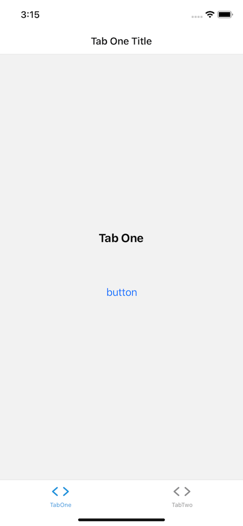
A modal is triggered by a preceding action, like navigating to/from a screen or clicking a button.
Open screens/TabOneScreen. Change the code to look like the code block below:
import * as React from "react";
import { Button, StyleSheet, Text, View } from "react-native";
import Modal from "react-native-modal";

export default function TabOneScreen() {

  const [isModalVisible, setIsModalVisible] = React.useState(false);

  const handleModal = () => setIsModalVisible(() => !isModalVisible);

  return (
    <View style={styles.container}>
      <Text style={styles.title}>Tab One</Text>
      <View style={styles.separator} />
      <Button title="button" onPress={handleModal} />
      <Modal isVisible={isModalVisible}>
        <View style={{ flex: 1 }}>
          <Text>Hello!</Text>
          <Button title="Hide modal" onPress={handleModal} />
        </View>
      </Modal>
    </View>
  );
}

const styles = StyleSheet.create({
  container: {
    flex: 1,
    alignItems: "center",
    justifyContent: "center",
  },
  title: {
    fontSize: 20,
    fontWeight: "bold",
  },
  text: {
    fontSize: 16,
    fontWeight: "400",
    textAlign: "center",
  },
  separator: {
    marginVertical: 30,
    height: 1,
    width: "80%",
  },
});
Let’s take a closer look.
useStateconst [isModalVisible, setIsModalVisible] = React.useState(false);
The React useState Hook returns isModalVisible, a stateful value, and setIsModalVisible, a function to update it.
The initial state is false, so we can’t see the modal until we change the state. In our case, we’ll use a button.
handleModalconst handleModal = () => setIsModalVisible(() => !isModalVisible);
Pressing the button will call handleModal and return the opposite state. True becomes false, and false becomes true.
<Modal /><Modal isVisible={isModalVisible}>
Modal has a property called isVisible that accepts a Boolean value. Because we pass isModalVisible to isVisible, the modal knows when it should appear.
Your finished modal will look like the image below:

The previous example created a modal and buttons for opening and closing it. Now that we know these steps, let’s build a custom modal and a button for booting it.
Let’s start with a simple button to open and close our modal. In the components folder, create a new file called Button.tsx and add the following code:
import React from "react";
import { StyleSheet, Text, TouchableOpacity, View } from "react-native";
export type ButtonProps = {
  title: string;
  onPress: () => void;
};
export const Button = ({ title, onPress }: ButtonProps) => {
  return (
    <TouchableOpacity style={styles.button} onPress={onPress}>
      <Text style={styles.text}>{title}</Text>
    </TouchableOpacity>
  );
};
const styles = StyleSheet.create({
  button: {
    backgroundColor: "blue",
    marginTop: 15,
    paddingVertical: 15,
    borderRadius: 25,
    width: "80%",
    alignItems: "center",
  },
  text: {
    color: "white",
    fontWeight: "700",
    fontSize: 18,
  },
});
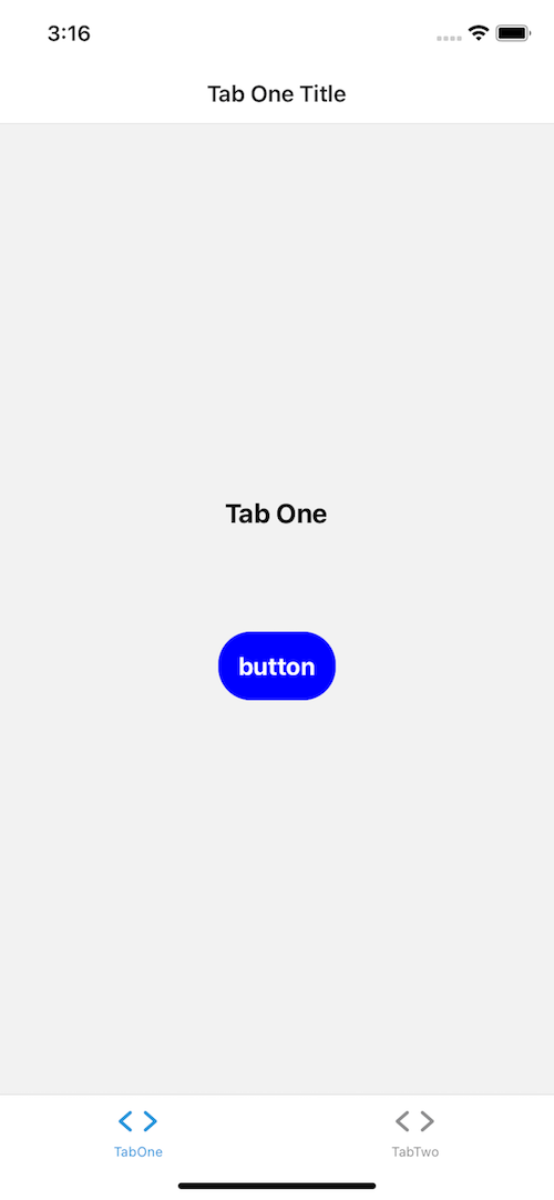
Your output should look like the image below:

Now that we’ve built a button, we’ll create our modal. In your components folder, create a file called Modal.tsx and add the following code:
import React from "react";
import { StyleSheet, View, Text, Button } from "react-native";
import RNModal from "react-native-modal";
type ModalProps = {
  isVisible: boolean;
  children: React.ReactNode;
  [x: string]: any;
};
export const Modal = ({
  isVisible = false,
  children,
  ...props
}: ModalProps) => {
  return (
    <RNModal
      isVisible={isVisible}
      animationInTiming={1000}
      animationOutTiming={1000}
      backdropTransitionInTiming={800}
      backdropTransitionOutTiming={800}
      {...props}>
      {children}
    </RNModal>
  );
};

const ModalContainer = ({ children }: { children: React.ReactNode }) => (
  <View style={styles.container}>{children}</View>
);

const ModalHeader = ({ title }: { title: string }) => (
  <View style={styles.header}>
    <Text style={styles.text}>{title}</Text>
  </View>
);

const ModalBody = ({ children }: { children?: React.ReactNode }) => (
  <View style={styles.body}>{children}</View>
);

const ModalFooter = ({ children }: { children?: React.ReactNode }) => (
  <View style={styles.footer}>{children}</View>
);

const styles = StyleSheet.create({
  container: {
    backgroundColor: "#ffffff",
    borderRadius: 25,
    borderWidth: 1,
    borderColor: "#000",
    borderStyle: "solid",
  },
  header: {
    alignItems: "center",
    justifyContent: "center",
  },
  text: {
    paddingTop: 10,
    textAlign: "center",
    fontSize: 24,
  },
  body: {
    justifyContent: "center",
    paddingHorizontal: 15,
    minHeight: 100,
  },
  footer: {
    justifyContent: "center",
    alignItems: "center",
    padding: 10,
    flexDirection: "row",
  },
});

Modal.Header = ModalHeader;
Modal.Container = ModalContainer;
Modal.Body = ModalBody;
Modal.Footer = ModalFooter;
We’ve exported the original modal component from the first example as Modal. Did you notice the animation and backdropTransitions props? These props are what give the native modal component that makeover I was talking about.
For a full list of available props, check out the documentation.
Using dot notation, we’ll export Modal as a module with child components. If you’d like to add a header, you can access the header component with Modal.Header.
ModalHeader accepts a string in the title prop. Modal.Container, Modal.Body, and Modal.Footer accept children. A child component can be anything you want it to be, like an image, some text, buttons, or a ScrollView.
Now that we have a modal and a button, head back over to screens/TabOneScreen. In just two steps, we’ll put it all together.
Import our new button and modal by changing the import statements from the code block above to the code block below, respectively:
import { Button, StyleSheet, Text, View } from "react-native";
import Modal from "react-native-modal";


import { StyleSheet, Text, View } from "react-native";
import { Button } from "../components/Button";
import { Modal } from "../components/Modal";
Do the same for the modal component in the return statement:
<Modal isVisible={isModalVisible}>
  <View style={{ flex: 1 }}>
    <Text>Hello!</Text>
    <Button title="Hide modal" onPress={handleModal} />
  </View>
</Modal>


<Modal isVisible={isModalVisible}>
  <Modal.Container>
    <Modal.Header title="LogRocket is fab!" />
    <Modal.Body>
      <Text style={styles.text}>Agree to continue with this guide</Text>
      </Modal.Body>
    <Modal.Footer>
      <Button title="I agree" onPress={handleModal} />
    </Modal.Footer>
  </Modal.Container>
</Modal>
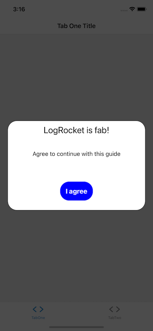
The result should look similar to the image below:

You can find all the changes on GitHub.
Now, we have a modal that appears when we tell it to. Let’s add pop-ups that appear when we want to prompt the user to see or do something. To start, we’ll create a call to action scenario.
Let’s pretend that a user must subscribe to have access to a particular screen. We want to create a call to action if the user lands on the screen but isn’t subscribed.
Head over to screens/TabTwoScreen and swap out the current code for the code below:
import React, { useEffect } from "react";
import { StyleSheet, Text, TextInput, View } from "react-native";
import { Button } from "../components/Button";
import { Modal } from "../components/Modal";

export default function TabTwoScreen() {
  const [isModalVisible, setIsModalVisible] = React.useState(false);

  useEffect(() => {
    const checkForSubscription = setTimeout(() => {
      setIsModalVisible(() => !isModalVisible);
    }, 1500);
    return () => clearTimeout(checkForSubscription);
  }, []);

  const handleSignUp = () => {
    // sign up the user and close the modal
    setIsModalVisible(() => !isModalVisible);
  };

  const handleDecline = () => setIsModalVisible(() => !isModalVisible);

  return (
    <View style={styles.container}>
      <Text style={styles.title}>Premium stuff here</Text>
      <View style={styles.separator} />
      <Modal isVisible={isModalVisible}>
        <Modal.Container>
          <View style={styles.modal}>
            <Modal.Header title="You're just one step away!" />
            <Modal.Body>
              <Text style={styles.text}>
                Want access? We just need your email address
              </Text>
              <TextInput
                style={styles.input}
                placeholder="email"
                keyboardType="email-address"
              />
            </Modal.Body>
            <Modal.Footer>
              <View style={styles.button}>
                <Button title="No thanks" onPress={handleDecline} />
                <Button title="Sign me up!" onPress={handleSignUp} />
              </View>
            </Modal.Footer>
          </View>
        </Modal.Container>
      </Modal>
    </View>
  );
}

const styles = StyleSheet.create({
  container: {
    flex: 1,
    alignItems: "center",
    justifyContent: "center",
  },
  title: {
    fontSize: 20,
    fontWeight: "bold",
  },
  text: {
    fontSize: 16,
    fontWeight: "400",
    textAlign: "center",
  },
  separator: {
    marginVertical: 30,
    height: 1,
    width: "80%",
  },
  input: {
    paddingTop: 10,
    borderColor: "grey",
    borderBottomWidth: 2,
  },
  button: {
    flexDirection: "row",
    flex: 1,
    justifyContent: "center",
  },
  modal: {
    width: "100%",
    height: "90%",
    alignItems: "center",
    justifyContent: "center",
  },
});
useEffect re-renders when the dependencies in the dependency array change, indicated by []. useEffect causes the Modal component to appear when you navigate to the screen.
Since we haven’t passed any dependencies, useEffect will only render once. setTimeout is used to simulate checking if the user is subscribed:
useEffect(() => {
    // fake check to see if user is subscribed
    const checkForSubscription = setTimeout(() => {
      setIsModalVisible(() => !isModalVisible);
    }, 1500);
    return () => clearTimeout(checkForSubscription);
    // dependancy array
  }, []);
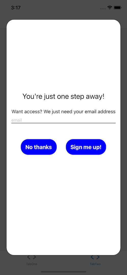
Your modal should look like the image below:

In this tutorial, we’ve learned what modals are and how they work. We then created three custom modals that can improve any React Native application.
As you can see, modals are a great tool for implementing calls to action. There are several other libraries that work similarly, like react-native-modal-datetime-picker, so it’s worth browsing on npm. Depending on your use case, you might save some time building a customized component!
I hope you’ve enjoyed learning about modals in this tutorial. Happy coding!

LogRocket's Galileo AI watches sessions for you and and surfaces the technical and usability issues holding back your React Native apps.
LogRocket also helps you increase conversion rates and product usage by showing you exactly how users are interacting with your app. LogRocket's product analytics features surface the reasons why users don't complete a particular flow or don't adopt a new feature.
Start proactively monitoring your React Native apps — try LogRocket for free.
Hey there, want to help make our blog better?
Join LogRocket’s Content Advisory Board. You’ll help inform the type of content we create and get access to exclusive meetups, social accreditation, and swag.
Sign up now
This guide walks you through creating a web UI for an AI agent that browses, clicks, and extracts info from websites powered by Stagehand and Gemini.

This guide explores how to use Anthropic’s Claude 4 models, including Opus 4 and Sonnet 4, to build AI-powered applications.

Which AI frontend dev tool reigns supreme in July 2025? Check out our power rankings and use our interactive comparison tool to find out.

Learn how OpenAPI can automate API client generation to save time, reduce bugs, and streamline how your frontend app talks to backend APIs.