The calendar that we use has evolved over the years. From a handwritten calendar to a printed calendar, we now all have a digital calendar in our hands that is extremely customizable and reminds us of our events at the precise moment we want a reminder.

We are going to see how we can build and customize the calendar widget in Flutter so we can provide our users with that experience.
Though Flutter provides a calendar widget in the form of a date and time picker that offers customizable colors, fonts, and usage, it is missing some features. You can use it to pick a date and time (or both) and add it to your application, but it needs to be combined with a button and a placeholder where the picked date or time can be saved.
So, I’m going to start with the native calendar provided by the Flutter architecture and then move on to TableCalendar, the most popular calendar widget on pub.dev. There are also many other popular calendar widgets you could use, but for this tutorial, we’ll cover one in depth.
The Replay is a weekly newsletter for dev and engineering leaders.
Delivered once a week, it's your curated guide to the most important conversations around frontend dev, emerging AI tools, and the state of modern software.
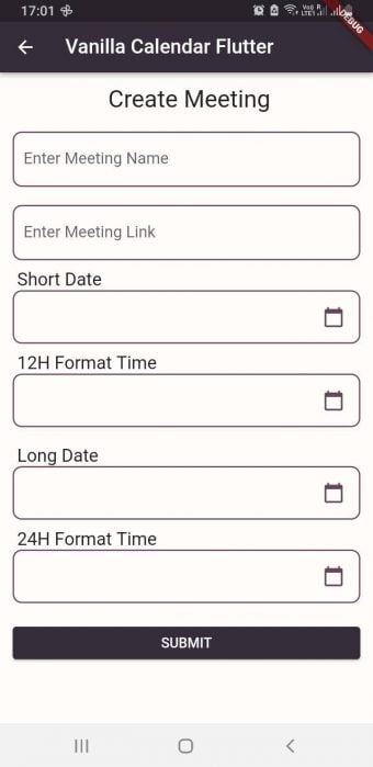
To explain the widget more thoroughly, I have created a single-screen application for online meetings. Users can enter the meeting name and link, then choose a date and time.
First, let’s go over the showDatePicker default constructor:
showDatePicker({
// it requires a context
  required BuildContext context,
// when datePicker is displayed, it will show month of the current date
  required DateTime initialDate,
// earliest possible date to be displayed (eg: 2000)
  required DateTime firstDate,
// latest allowed date to be displayed (eg: 2050)
  required DateTime lastDate,
// it represents TODAY and it will be highlighted
  DateTime? currentDate,
 // either by input or selected, defaults to calendar mode.
  DatePickerEntryMode initialEntryMode = DatePickerEntryMode.calendar or input,
// restricts user to select date from range to dates.
  SelectableDayPredicate? selectableDayPredicate,
// text that is displayed at the top of the datePicker
  String? helpText,
// text that is displayed on cancel button
  String? cancelText,
// text that is displayed on confirm button
  String? confirmText,
// use builder function to customise the datePicker
  TransitionBuilder? Builder,
// option to display datePicker in year or day mode. Defaults to day
  DatePickerMode initialDatePickerMode = DatePickerMode.day or year,
// error message displayed when user hasn't entered date in proper format
  String? errorFormatText,
// error message displayed when date is not selectable
  String? errorInvalidText,
// hint message displayed to prompt user to enter date according to the format mentioned (eg: dd/mm/yyyy)
  String? fieldHintText,
// label message displayed for what the user is entering date for (eg: birthdate)
  String? fieldLabelText,
})
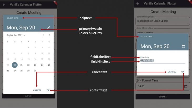
Regarding the above default constructor, you can refer to the image below where I have pointed out some important properties that can be customized according to your needs.
I am not going to post the whole code here but instead just going to show the implementation of it and explain it. The rest of the code for showDatePicker can be found here for your experimentation.
ValueNotifierI have implemented a ValueNotifier that will hold the date in the text field.
final ValueNotifier<DateTime?> dateSub = ValueNotifier(null);
datePicker dialogWith ValueListenerBuilder and an instance of DateTime, and with the help of the InkWell widget, when we click on the textField, a datePicker dialog will pop up. When a user taps on the desired date, it will show in the textField:
ValueListenableBuilder<DateTime?>(
   valueListenable: dateSub,
   builder: (context, dateVal, child) {
     return InkWell(
         onTap: () async {
           DateTime? date = await showDatePicker(
               context: context,
               initialDate: DateTime.now(),
               firstDate: DateTime.now(),
               lastDate: DateTime(2050),
               currentDate: DateTime.now(),
               initialEntryMode: DatePickerEntryMode.calendar,
               initialDatePickerMode: DatePickerMode.day,
               builder: (context, child) {
                 return Theme(
                   data: Theme.of(context).copyWith(
                       colorScheme:  ColorScheme.fromSwatch(
                         primarySwatch: Colors.blueGrey,
                         accentColor: AppColors.blackCoffee,
                         backgroundColor: Colors.lightBlue,
                         cardColor: Colors.white,
                       )
                   ),
                   child: child!,
                 );
               });
           dateSub.value = date;
         },
         child: buildDateTimePicker(
             dateVal != null ? convertDate(dateVal) : ''));
   }),
buildDateTimePicker is nothing but a listTile with a custom border and calendar icon as a trailing icon:
Widget buildDateTimePicker(String data) {
 return ListTile(
   shape: RoundedRectangleBorder(
     borderRadius: BorderRadius.circular(10.0),
     side: const BorderSide(color: AppColors.eggPlant, width: 1.5),
   ),
   title: Text(data),
   trailing: const Icon(
     Icons.calendar_today,
     color: AppColors.eggPlant,
   ),
 );
}
We also have a string method to convert the date to the desired format:
String convertDate(DateTime dateTime) {
 return DateFormat('dd/MM/yyyy').format(dateTime);
}
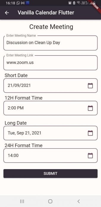
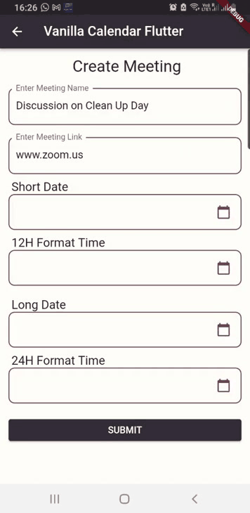
This is how it is going to look when the code is implemented:
Now, let’s come back to the TableCalendar I discussed before, how we’re going to implement it, and how we’re going to customize it to meet the demands of the application.
There are several customization possibilities, and discussing them all would exceed the scope of this article. So I’ll try to be as specific as possible and only address the most significant portions of it. Of course, there are code implementations that I have personally experimented with, as well as images to reference.
Installation is pretty straightforward: you need to copy and paste the dependency in your pubspec.yaml file for table_calendar from here.
The latest version is:
table_calendar: ^3.0.2
Now, I am going to split its constructor into three parts:
TableCalendar widgetThis is so you can understand the code easily and also know how to implement it successfully.
TableCalendar widgetI have used SingleChildScrollView as my parent widget and then added a Card widget inside a Column widget to give a little elevation to the calendar. Then, I added the TableCalendar widget inside the Card widget as its child:
SingleChildScrollView(
child: Column(
children: [
Card(
margin: const EdgeInsets.all(8.0),
elevation: 5.0,
shape: const RoundedRectangleBorder(
borderRadius: BorderRadius.all(
Radius.circular(10),
),
side: BorderSide( color: AppColors.blackCoffee, width: 2.0),
),
child: TableCalendar(
// today's date
focusedDay: _focusedCalendarDate,
// earliest possible date
firstDay: _initialCalendarDate,
// latest allowed date
lastDay: _lastCalendarDate,
// default view when displayed
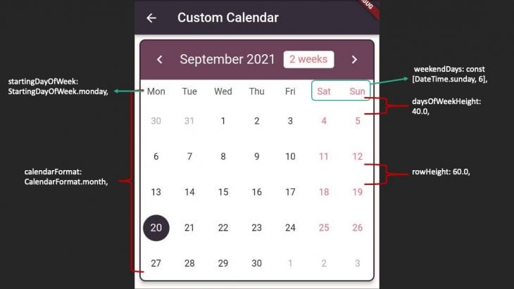
calendarFormat: CalendarFormat.month,
// default is Saturday & Sunday but can be set to any day.
// instead of day, a number can be mentioned as well.
weekendDays: const [DateTime.sunday, 6],
// default is Sunday but can be changed according to locale
startingDayOfWeek: StartingDayOfWeek.monday,
// height between the day row and 1st date row, default is 16.0
daysOfWeekHeight: 40.0,
// height between the date rows, default is 52.0
rowHeight: 60.0,
The above code is setting up the calendar that will be on the mobile screen with some default values and some customization according to locale. I have added comments before each property to understand what it does.
I know the explanation is already given in the class file of the TableCalendar widget, but sometimes it is easier to understand property in simpler terms. I have a habit of reading everything, understanding it, and then I try to simplify for my readers so that they do not have to go through every line before implementing the code.
TableCalendarAccording to the theme of the application, you can customize everything so that the look and feel of the calendar, basically the whole UI of the calendar, matches with the UI of your application.
Splitting code into 3 parts again:
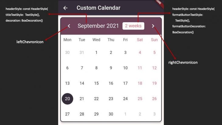
headerStyle// Calendar Header Styling
headerStyle: const HeaderStyle(
titleTextStyle:
TextStyle(color: AppColors.babyPowder, fontSize: 20.0),
decoration: BoxDecoration(
color: AppColors.eggPlant,
borderRadius: BorderRadius.only(
topLeft: Radius.circular(10),
topRight: Radius.circular(10))),
formatButtonTextStyle:
TextStyle(color: AppColors.ultraRed, fontSize: 16.0),
formatButtonDecoration: BoxDecoration(
color: AppColors.babyPowder,
borderRadius: BorderRadius.all(
Radius.circular(5.0),
), ),
leftChevronIcon: Icon(
Icons.chevron_left,
color: AppColors.babyPowder,
size: 28,
),
rightChevronIcon: Icon(
Icons.chevron_right,
color: AppColors.babyPowder,
size: 28,
),
),
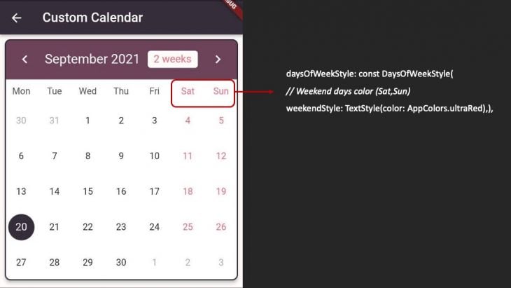
Here you can set a different color for weekends, weekdays, and also for holidays if you have set any:
// Calendar Days Styling
daysOfWeekStyle: const DaysOfWeekStyle(
 // Weekend days color (Sat,Sun)
 weekendStyle: TextStyle(color: AppColors.ultraRed),
),
In the above code, I have added color to the weekend days that I set initially when I implemented the TableCalendar widget.
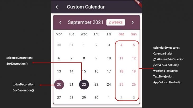
Here you can add color to the specific weekend dates or holiday dates. Additionally, the highlighted color for the current date and the selected date can be customized.
// Calendar Dates styling
calendarStyle: const CalendarStyle(
 // Weekend dates color (Sat & Sun Column)
 weekendTextStyle: TextStyle(color: AppColors.ultraRed),
 // highlighted color for today
 todayDecoration: BoxDecoration(
   color: AppColors.eggPlant,
   shape: BoxShape.circle,
 ),
 // highlighted color for selected day
 selectedDecoration: BoxDecoration(
   color: AppColors.blackCoffee,
   shape: BoxShape.circle,
 ),
),
The next block of code is from the official documentation provided by TableCalender. It is the default way to implement the selected day. This code highlights the current date and also the selected date based on the above customized colors. There is no better way to do this, and it is advised by the TableCalendar:
selectedDayPredicate: (currentSelectedDate) {
 // as per the documentation 'selectedDayPredicate' needs to determine current selected day.
 return (isSameDay(
     _selectedCalendarDate!, currentSelectedDate));
},
onDaySelected: (selectedDay, focusedDay) {
 // as per the documentation
 if (!isSameDay(_selectedCalendarDate, selectedDay)) {
   setState(() {
     _selectedCalendarDate = selectedDay;
     _focusedCalendarDate = focusedDay;
   });
 }
},
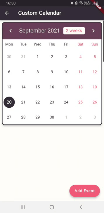
TableCalendarSo we’ve finished initializing the TableCalendar and stylized it to match our UI. The only thing remaining is to add events to our calendar, which is a vital feature. Without it, our calendar is simply a hard copy that we keep in our houses or on our refrigerators.
However, many of us tend to stick a Post-it Note on the calendar to indicate key events throughout the month, week, or even day. On our mobile phones, we have the ability to add reminders or events to our default calendar application.
I have created a model class named MyEvents and initialize two String variables eventTitle and eventDescp (description):
class MyEvents {
 final String eventTitle;
 final String eventDescp;

 MyEvents({required this.eventTitle, required this.eventDescp});

 @override
 String toString() => eventTitle;
}
In our CustomCalendarTable Dart file, I have added two TextEditingControllers, a Map, and a method where we will be holding our list of events and applying that to eventLoader property inside TableCalandar:
final titleController = TextEditingController();
final descpController = TextEditingController();

late Map<DateTime, List<MyEvents>> mySelectedEvents;

@override
void initState() {
 selectedCalendarDate = _focusedCalendarDate;
 mySelectedEvents = {};
 super.initState();
}

@override
void dispose() {
 titleController.dispose();
 descpController.dispose();
 super.dispose();
}

List<MyEvents> _listOfDayEvents(DateTime dateTime) {
 return mySelectedEvents[dateTime] ?? [];
}
Next, I have added a fab button to our Scaffold and on clicking the fab button, an AlertDialog will appear, where the user will be entering the event title and event description.
After clicking the Add button inside the AlertDialog, an event will be added under the calendar and a small colored dot will be seen on the date on which the event was added.
I have also added a SnackBar in case the user does not enter anything in the title text field or description text field. A SnackBar will pop up with a message to enter the title and description.
If the user has entered the title and description, in the setState method it is checking if the list of selected events is not null and then we are adding the title and description to the MyEvents model class and creating a list of MyEvents.
As soon as an event is added, we’re clearing the Controllers and closing the AlertDialog:
_showAddEventDialog() async {
 await showDialog(
     context: context,
     builder: (context) => AlertDialog(
           title: const Text('New Event'),
           content: Column(
             crossAxisAlignment: CrossAxisAlignment.stretch,
             mainAxisSize: MainAxisSize.min,
             children: [
               buildTextField(
                   controller: titleController, hint: 'Enter Title'),
               const SizedBox(
                 height: 20.0,
               ),
               buildTextField(
                   controller: descpController, hint: 'Enter Description'),
             ],           ),
           actions: [
             TextButton(
               onPressed: () => Navigator.pop(context),
               child: const Text('Cancel'),),
             TextButton(
               onPressed: () {
                 if (titleController.text.isEmpty &&
                     descpController.text.isEmpty) {
                   ScaffoldMessenger.of(context).showSnackBar(
                     const SnackBar(
                       content: Text('Please enter title & description'),
                       duration: Duration(seconds: 3),
                     ), );
                   //Navigator.pop(context);
                   return;
                 } else {
                   setState(() {
                if (mySelectedEvents[selectedCalendarDate] != null) {
                     mySelectedEvents[selectedCalendarDate]?.add(MyEvents(
                           eventTitle: titleController.text,
                           eventDescp: descpController.text));
                     } else {
                       mySelectedEvents[selectedCalendarDate!] = [
                         MyEvents(
                             eventTitle: titleController.text,
                             eventDescp: descpController.text)
                       ]; } });

                   titleController.clear();
                   descpController.clear();

                   Navigator.pop(context);
                   return;
                 }
               },
               child: const Text('Add'),
             ),
           ],
         ));}
I have built a custom text field that I have initialized inside the AlertDialog:
Widget buildTextField(
   {String? hint, required TextEditingController controller}) {
 return TextField(
   controller: controller,
   textCapitalization: TextCapitalization.words,
   decoration: InputDecoration(
     labelText: hint ?? '',
     focusedBorder: OutlineInputBorder(
       borderSide: const BorderSide(color: AppColors.eggPlant, width: 1.5),
       borderRadius: BorderRadius.circular(
         10.0,
       ),
     ),
     enabledBorder: OutlineInputBorder(
       borderSide: const BorderSide(color: AppColors.eggPlant, width: 1.5),
       borderRadius: BorderRadius.circular(
         10.0,
       ),
     ),
   ),
 );
}
Everything comes together when I add the eventLoader property that is under the TableCalendar widget and add the _listofDayEvents method to it:
// this property needs to be added to show events
eventLoader: _listOfDayEvents,
And that’s it, we have successfully implemented the method to add events to the calendar dates and show it in our application under the calendar. You can have a look at the whole code here.
As I mentioned earlier in this article, there are some excellent calendar libraries available, such as the flutter_calendar_carousel and syncfusion_flutter_calendar.
The fundamental implementation for all remains the same. Even the attributes and customization are very comparable to what I’ve mentioned about TableCalendar in this article. Even though the names of the properties differ, the functionality remains the same.
I attempted to include as many details as possible that will help anyone who wishes to integrate a calendar within their application, but as I often say, discovery requires experimentation, and that’s always been my motto. So play around with the code, and if you need more information, you can always refer to the official documentation available on the pub.dev website.
Thank you very much!
Install LogRocket via npm or script tag. LogRocket.init() must be called client-side, not
server-side
$ npm i --save logrocket

// Code:

import LogRocket from 'logrocket';
LogRocket.init('app/id');
// Add to your HTML:

<script src="https://cdn.lr-ingest.com/LogRocket.min.js"></script>
<script>window.LogRocket && window.LogRocket.init('app/id');</script>
When should you move API logic out of Next.js? Learn when Route Handlers stop scaling and how ElysiaJS helps.

Explore how Dokploy streamlines app deployment with Docker, automated builds, and simpler infrastructure compared to traditional CI/CD workflows.

A side-by-side look at Astro and Next.js for content-heavy sites, breaking down performance, JavaScript payload, and when each framework actually makes sense.

AI-generated tests can speed up React testing, but they also create hidden risks. Here’s what broke in a real app.re
Would you be interested in joining LogRocket's developer community?
Join LogRocket’s Content Advisory Board. You’ll help inform the type of content we create and get access to exclusive meetups, social accreditation, and swag.
Sign up now

 Learn more →
