When building business websites, there are many factors to consider:

…and so many more.
All these factors come together to define your users’ experience when they visit your website. In this article, we’ll use Buefy and Vue.js to build a simple website for a gym that covers all the factors stated above.
Vue.js is a JavaScript Model-View-ViewModel (MVVM) library used for building frontend applications and single-page applications (SPAs). It is one of the most popular JavaScript libraries for building frontend applications.
Companies like Grammarly, GitLab, Behance, and Louis Vuitton are examples of companies that use Vue.js in building their products and applications since its initial release in February 2014.
Vue.js is very simple to set up. Using npm, install from your terminal with:
$ npm install vue
To install the CLI:
$ npm install -g @vue/cli
Now that we have vue-cli, we need to create a Vue project. Run the following:
$ vue create gym-website
At the prompt, make sure you select the default preset. This will install Babel, ESLint, and other additional dependencies. Once that is done, switch into your project directory:
cd gym-website
And then serve the project on your localhost:
npm run serve
You should be presented with a user interface similar to the one below:
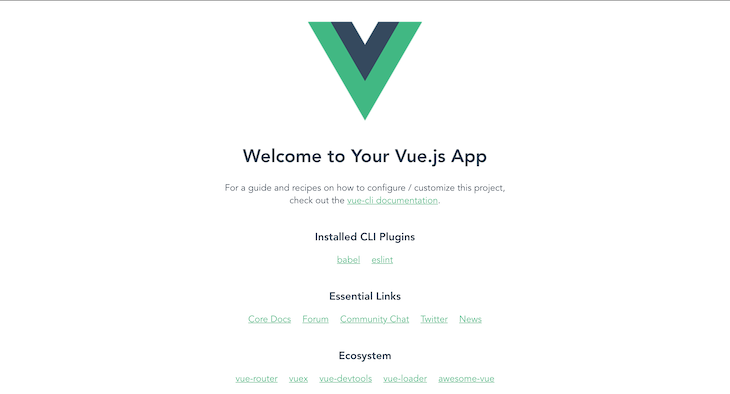
Now we’re set to start developing our gym business website.
Buefy is a lightweight UI component library for Vue.js based on Bulma. Used by over 200,000 developers with over 40K stars on GitHub at the time of writing, Bulma is a CSS framework that uses Flexbox as its core.
To install Buefy from your terminal, run:
$ npm install buefy
The Vue.js folder structure is quite easy to understand. For this tutorial, we’ll be working with the src folder.
The src folder contains the assets folder, which will hold our project assets, such as images, videos, audio, etc. Create a folder named img to house our images, then download the content in this link there.
The components folder serves as the directory where our project’s components will live. These include:
The public folder contains the HTML files that will be served. App.vue is the main component of our application, and main.js is the main entrance to our application.
Index.htmlThe index.html file is the entry point in HTML, providing an element for Vue.js to load into, and imports main.js to initialize your app. For this tutorial, modify your index.html to look like this:
<!DOCTYPE html>
<html lang="en">
  <head>
    <meta charset="utf-8">
    <meta name="viewport" content="width=device-width, initial-scale=1">
    <title>Gym Service</title>
    <link rel="stylesheet" href="styles.css">
     <script defer src="https://cdnjs.cloudflare.com/ajax/libs/font-awesome/5.11.2/js/all.js"></script>
  </head>
  <body>
    <div id="app"></div>
    <!-- built files will be auto injected -->
  </body>
</html>
From the code block above, we’ve given our webpage the title “Web Service” and have added the script tag to use Font Awesome on our page, which we’ll use to display icons on our page.
Styles.cssFor this tutorial, I’ve created styles needed for this project. You can copy and paste the below and save it as styles.css in your public folder:
.has-text-green {
    color: #1E4132 !important;
}
.has-text-white {
    color: #FFFFFF !important;
}
.has-company-bg {
    background-color: #009999;
}
.has-green-bg {
    background-color: #009999;
}
.has-white-company-gradient {
    background: rgb(255, 255, 255);
    background: -moz-linear-gradient(180deg, rgba(255, 255, 255, 1) 0%, rgba(255, 255, 255, 1) 50%, #006666 50%, #006666 100%);
    background: -webkit-linear-gradient(180deg, rgba(255, 255, 255, 1) 0%, rgba(255, 255, 255, 1) 50%, #006666 50%, #006666 100%);
    background: linear-gradient(180deg, rgba(255, 255, 255, 1) 0%, rgba(255, 255, 255, 1) 50%, #006666 50%, #006666 100%);
    filter: progid:DXImageTransform.Microsoft.gradient(startColorstr="#ffffff", endColorstr="#006666", GradientType=1);
}
@media(max-width: 1024px) {
    .has-white-company-gradient {
        background: rgb(255, 255, 255);
        background: -moz-linear-gradient(180deg, rgba(255, 255, 255, 1) 0%, rgba(255, 255, 255, 1) 25%, #006666 25%, #006666 100%);
        background: -webkit-linear-gradient(180deg, rgba(255, 255, 255, 1) 0%, rgba(255, 255, 255, 1) 25%, #006666 25%, #006666 100%);
        background: linear-gradient(180deg, rgba(255, 255, 255, 1) 0%, rgba(255, 255, 255, 1) 25%, #006666 25%, #006666 100%);
        filter: progid:DXImageTransform.Microsoft.gradient(startColorstr="#ffffff", endColorstr="#006666", GradientType=1);
    }
}
/*
Typography
*/
@import url('https://fonts.googleapis.com/css?family=Calistoga|Open+Sans&display=swap');
h1,
h2,
h3 {
    font-family: 'Calistoga';
    margin-bottom: 10px;
    color: #FFFFFF;
}
p,
a,
span {
    font-family: 'Open Sans', sans-serif;
    font-weight: 400;
}
@media(max-width: 767px) {
    p {
        max-width: 90%;
    margin: 0 auto;
    }
}


/*
Links
*/
.a-menu {
    letter-spacing: 3px;
    text-transform: uppercase;
    transition: opacity 1s ease;
    opacity: 0.8;
}
.a-menu:hover {
    opacity: 1;
    color: #009999 !important;
    text-decoration: none;
}
/*
Wrapper
*/
.section .container,
.hero .hero-body,
.hero .hero-head {
    width: 1200px;
    max-width: 100%;
    margin: 0 auto;
}
/*
Some aesthetic improvements
*/
nav {
    padding-top: 20px;
    max-height: 50px;
}
.paragraph {
    width: 600px;
    line-height: 1.5em;
}
/*
Hero
*/
.burger {
    position: absolute;
    top: 0;
    right: 0;
}
@media(min-width: 1024px) {
    .hero-body {
        background-image: url('../src/assets/img/gym.svg');
        background-size: 30%;
        background-position: 80% 50%;
        background-repeat: no-repeat;
    }
    .hero-body p {
        width: 600px;
    }
}
/*
Button
*/
.btn {
    margin-top: 20px;
    border-radius: 50px;
    border: none;
    padding: 10px 30px;
    -webkit-box-shadow: 0px 0px 15px 0px #006666;
    -moz-box-shadow: 0px 0px 15px 0px #006666;
    box-shadow: 0px 0px 15px 0px #006666;
    transition: opacity 1s ease;
    opacity: 1;
    cursor: pointer;
}
.btn:hover {
    opacity: 0.8;
}
/*
Twitter Feed
*/
#twitter-feed .columns {
    margin: 0px;
}
@media(max-width: 1024px) {
    margin: 0px 10px;
}
.box {
    padding-top: 30px;
    padding-bottom: 30px;
}
.box .icon {
    margin-top: -10px;
    color: #009999 !important;
    transition: color 0.5s ease;
}
.box .icon:hover {
    color: #009999 !important;
}
#twitter-feed .container .is-size-7 {
    padding: 20px;
}
/*
Features
*/
.feature-img {
    max-width: 60%;
    margin: 0 auto;
}
.column {
    display: flex;
    justify-content: center;
    flex-flow: column;
    text-align: center;
}
.column h3,
.column p {
    align-self: center;
}
@media(max-width: 1024px) {
    .reverse-row-order {
        flex-direction: column-reverse;
        display: flex;
    }
}
/*
Newsletter
*/
#newsletter {
    text-align: center;
}
#newsletter p {
    width: 600px;
    margin: 0 auto;
}
.social-link {
    padding: 15px;
    color: #FFFFFF !important;
}
.newsletter-input {
    border: none;
    border-bottom: 2px solid #009999;
    border-radius: 0% !important;
    box-shadow: none;
    text-align: center;
}
#newsletter .field {
    width: 400px;
    max-width: 80%;
    padding: 20px;
    margin: 0 auto;
}
/*
Footer
*/
#footer p {
    padding: 20px;
}
#footer a {
    color: #FFFFFF !important;
}
The styles.css contains multiple custom styling rules for the different sections of our website stated above in the project folder structure.
Main.jsThe main.js file is the main entrance to our application. It initializes the root component into an element on our page. It is also responsible for setting up plugins and third-party components that will be used in our app.
To use Buefy in our app, we need to import and specify that Vue.js uses Buefy. Copy and paste this inside your main.js file:
import Vue from 'vue'
import App from './App.vue'
import Buefy from 'buefy'
import 'buefy/dist/buefy.css'
Vue.config.productionTip = false
Vue.use(Buefy)
new Vue({
  render: h => h(App),
}).$mount('#app')
The buefy.css was recently moved to a new directory. If you happen to use an older version of Buefy and not the latest, you might find the buefy.css file in the buefy/lib/buefy.css path.
Create a folder called navbar inside the components folder, and paste the following code in a new file, navbar.vue:
<template>
    <section id="hero" class="hero is-medium">
        <div class="hero-head">
            <b-navbar>
                <template slot="brand">
                    <b-navbar-item tag="router-link" :to="{ path: '/' }">
                        <h3 class="logo has-text-green is-size-4">Gym Service</h3>
                    </b-navbar-item>
                </template>
                <template slot="end">
                    <b-navbar-item tag="div">
                        <div class="buttons">
                            <a class="a-menu is-size-7 navbar-item">
                                home
                            </a>
                            <a class="a-menu is-size-7 navbar-item">
                                about
                            </a>
                            <a class="a-menu is-size-7 navbar-item">
                                services
                            </a>
                            <a class="a-menu is-size-7 navbar-item">
                                contact
                            </a>
                        </div>

                    </b-navbar-item>
                </template>
            </b-navbar>
        </div>
        <div class="hero-body">
            <div class="container">
                <h1 class="has-text-green is-size-1 is-size-3-mobile">
                    Gym Service
                </h1>
                <p class="has-text-green">
                    Lorem ipsum dolor sit amet, consetetur sadipscing elitr, sed diam nonumy eirmod tempor invidunt ut
                    labore et dolore magna aliquyam erat, sed diam voluptua. At vero eos et accusam et justo duo dolores et ea rebum.
                </p>
                <button class="btn has-text-white has-company-bg is-size-7 a-menu">
                    Get started
                </button>
            </div>
        </div>
    </section>
</template>

<style>
@media(min-width: 1024px) {
    .hero-body {
        background-image: url('../../assets/img/gym.svg');
        background-size: 30%;
        background-position: 80% 50%;
        background-repeat: no-repeat;
    }
    .hero-body p {
        width: 600px;
    }
}
</style>

<script>
export default {
    name: 'Navbar',
}
</script>
You may have noticed the code above is divided into three parts using tags: the template, style, and scripts tags.
The template tag is used to render client-side content. All of our user interface code will be written inside this tag. The style tag contains scoped CSS styling specific to a particular component, and the script tag allows us to import other components that we may want to use within our current component, define the component’s name, and also hold data used in our component.
In the code block above, we’ve defined our component name within the script tag and also added a styling rule in our style tag. Make sure you create the image folder path img/ inside the assets folder. Place all the images you will use inside the folder, then you can go ahead and specify the full image path in the styling rule.
In the template tag — excluding b-navbar and b-navbar-item, which are Buefy UI components — other tags are just our regular HTML tags and CSS classes.
The b-navbar component allows us to define a navigation bar component, and the b-navbar-item allows us to specify a navigation bar item. In the code block above, we’ve used Buefy to create a navigation bar and used b-navbar-item to create the Home, About, Services, and Contact navigation bar items.
Create a folder called testimonials inside the components folder and paste the following code in a new file, testimonials.vue:
<template>
    <section id="twitter-feed" class="section has-white-company-gradient">
        <div class="container">
            <div class="columns">
                <div class="column">
                    <div class="box">
                        <article class="media">
                            <div class="media-left">
                                <figure class="image is-64x64 ">
                                    <img src="../../assets/img/007.png" alt="Image">
                                </figure>
                            </div>
                            <div class="media-content">
                                <div class="content">
                                    <p>
                                        <strong>James Bond</strong> <small>@007</small> <small>10m</small>
                                        <br>
                                        Gym Service is the best place to be if you're looking for gains and want to pump some muscles. I love it here!
                                    </p>
                                </div>
                                <nav class="level is-mobile">
                                    <div class="level-left">
                                        <a class="level-item" aria-label="reply">
                                                <b-icon
                                                    pack="fas"
                                                    icon="reply"
                                                    size="is-small">
                                                </b-icon>
                                        </a>
                                        <a class="level-item" aria-label="retweet">
                                            <b-icon
                                                pack="fas"
                                                icon="retweet"
                                                size="is-small">
                                            </b-icon>
                                        </a>
                                        <a class="level-item" aria-label="like">
                                            <b-icon
                                                pack="fas"
                                                icon="heart"
                                                size="is-small">
                                            </b-icon>
                                        </a>
                                    </div>
                                </nav>
                            </div>
                        </article>
                    </div>
                </div>
                <div class="column">
                    <div class="box">
                        <article class="media">
                            <div class="media-left">
                                <figure class="image is-64x64 ">
                                    <img src="../../assets/img/alice.png" alt="Image">
                                </figure>
                            </div>
                            <div class="media-content">
                                <div class="content">
                                    <p>
                                        <strong>Alice</strong> <small>@alice</small> <small>15m</small>
                                        <br>
                                        Looking to burn that belly fat? Gym Service diet plans and instructors help you to achieve that effectively in the shortest time possible.
                                    </p>
                                </div>
                                <nav class="level is-mobile">
                                    <div class="level-left">
                                        <a class="level-item" aria-label="reply">
                                                <b-icon
                                                    pack="fas"
                                                    icon="reply"
                                                    size="is-small">
                                                </b-icon>
                                        </a>
                                        <a class="level-item" aria-label="retweet">
                                            <b-icon
                                                pack="fas"
                                                icon="retweet"
                                                size="is-small">
                                            </b-icon>
                                        </a>
                                        <a class="level-item" aria-label="like">
                                            <b-icon
                                                pack="fas"
                                                icon="heart"
                                                size="is-small">
                                            </b-icon>
                                        </a>
                                    </div>
                                </nav>
                            </div>
                        </article>
                    </div>
                </div>
            </div>

        </div>
    </section>
</template>

<script>
export default {
    name: 'Testimonials'
}
</script>
The testimonial section is used to display testimonies by members who already use our gym service. This lets new visitors and potential customers see the benefits and efficacy of our service.
We’ve defined our component name in the script tag. Above, in the template tag, is our code for the testimonial section. We’re using cards to display the testimonials. We’ve also used the Buefy b-icon component to define icons rendered.
The pack property is used to define what icon pack we’re using — in our case, Font Awesome, but do note that Buefy supports multiple icon packs. The icon property is used to select the icon we want from the Font Awesome pack, and the size is used to specify the size of our icon. The options are is-small, is-medium, and is-large.
Create a folder called features inside the components folder and paste the following code in a new file, features.vue:
<template>
    <section id="features" class="section has-company-bg">
        <div class="container">
            <div class="columns reverse-row-order">
                <div class="column">
                    <h3 class="is-size-3">
                        Personal Instructors
                    </h3>
                    <p class="has-text-white paragraph">
                        Lorem ipsum dolor sit amet, consetetur sadipscing elitr, sed diam nonumy eirmod tempor invidunt ut labore et dolore magna aliquyam erat, sed diam voluptua. At vero eos et accusam et justo duo dolores et ea rebum.
                    </p>
                </div>
                <div class="column">
                    <img class="feature-img" src="../../assets/img/trainer.svg" alt="feature" />
                </div>
            </div>
        </div>
        <div class="container">
            <div class="columns">
                <div class="column">
                    <img class="feature-img" src="../../assets/img/equip.svg" alt="feature" />
                </div>
                <div class="column">
                    <h3 class="is-size-3">
                        State of the art equiptments</h3>
                    <p class="has-text-white paragraph">
                        Lorem ipsum dolor sit amet, consetetur sadipscing elitr, sed diam nonumy eirmod tempor invidunt ut labore et dolore magna aliquyam erat, sed diam voluptua. At vero eos et accusam et justo duo dolores et ea rebum.
                    </p>
                </div>
            </div>
        </div>
        <div class="container">
            <div class="columns reverse-row-order">
                <div class="column">
                    <h3 class="is-size-3">
                        Free diet plans</h3>
                    <p class="has-text-white paragraph">
                        Lorem ipsum dolor sit amet, consetetur sadipscing elitr, sed diam nonumy eirmod tempor invidunt ut labore et dolore magna aliquyam erat, sed diam voluptua. At vero eos et accusam et justo duo dolores et ea rebum.
                    </p>
                </div>
                <div class="column">
                    <img class="feature-img" src="../../assets/img/diet.svg" alt="feature" />
                </div>
            </div>
        </div>
    </section>
</template>
<script>
export default {
    name: 'Features'
}
</script>
The features section is used to display all core services we render to our current and potential customers. We’ve defined our component name in the script tag.
Create a folder called newsletter inside the components folder and paste the following code in a new file newsletter.vue:
<template>
    <section id="newsletter" class="section">
            <div class="container">
                <h3 class="has-text-green is-size-3">
                    Newsletter</h3>
                <p class="has-text-green">
                    Lorem ipsum dolor sit amet, consetetur sadipscing elitr, sed diam nonumy eirmod tempor invidunt ut labore et dolore magna aliquyam erat, sed diam voluptua. At vero eos et accusam et justo duo dolores et ea rebum.
                </p>
                <div class="field newsletter-field">
                    <div class="control">
                        <b-input v-model="email" placeholder='[email protected]'></b-input>
                    </div>
                </div>
                <button rounded class="button is-medium" @click="success">
                    Subscribe
                </button>
            </div>
        </section>
</template>
<script>
export default {
    name: 'Newsletter',
    methods: {
        success() {
            this.$buefy.toast.open({
                message: 'We have sent you a confirmation email!',
                type: 'is-success'
            })
        },
        fail() {
            this.$buefy.toast.open({
                duration: 5000,
                message: `Something went wrong`,
                position: 'is-bottom',
                type: 'is-danger'
            })
        }
    }
}
</script>
The newsletter section allows our visitors to further engage with the website, and this time, we will be requesting the visitor’s email address to stay in touch with us as a business.
We’ve defined our component name in the script tag. Above, in the template tag, is our code for the newsletter section. We will use the Buefy b-input component to get input from our visitors.
The b-input has a property called v-model, which allows us to bind a value of type email. We will also specify a placeholder using the placeholder property just to let the user know that we’re expecting an email address and the format the email address should be in.
The subscribe button is a Buefy component and is bound to the success() method in script. The success method uses the Buefy toast component to open a toast message window giving the visitor feedback of success or failure when they input their email. The Buefy toast component allows you to specify the message and the message type as well.
Create a folder called footer inside the components folder and paste the following code in a new file, footer.vue:
<template>
    <section id="footer" class="section has-green-bg">
        <div class="container has-text-centered">
            <a href="https://twitter.com" class="is-size-4 social-link">
                <i class="fab fa-twitter"></i>
            </a>
            <a href="https://github.com/" class="is-size-4 social-link">
                <i class="fab fa-github"></i>
            </a>
            <p class="has-text-white is-size-7">
                <i class="fas fa-copyright"></i> <b>{{msg}}, Gym Service</b>
            </p>
        </div>
    </section>
</template>
<script>
export default {
    name: 'Footer',
    props: {
        year: String
    }
}
</script>
The footer section is the final section of our page. This section contains external links and information.
We’ve defined our component name in the script tag. In the script, we’ve defined a prop. Props are custom attributes used in a component. When a value is passed to a prop attribute, it becomes a property on that component instance.
We’ve created a year prop with prop type String for us to easily change the copyright year. To render any value passed to the year props, we simply interpolated in our templates using {year}, and whatever value passed will be rendered accordingly.
App.vueApp.vue is the root of our application. It’s usually used to define the template for our page(s).
<template>
  <div>
    <Navbar/>
    <Testimonials/>
    <Features/>
    <Newsletter/>
    <Footer year="2020"/>
  </div>
</template>
<script>
import Navbar from './components/navbar/navbar'
import Testimonials from './components/testimonials/testimonials'
import Features from './components/features/features'
import Newsletter from './components/newsletter/newsletter'
import Footer from './components/footer/footer'
export default {
  name: 'App',
  components: {
    Navbar,
    Testimonials,
    Features,
    Newsletter,
    Footer,
  }
}
</script>
<style>
#app {
  font-family: Avenir, Helvetica, Arial, sans-serif;
  -webkit-font-smoothing: antialiased;
  -moz-osx-font-smoothing: grayscale;
  text-align: center;
  color: #2c3e50;
  margin-top: 60px;
}
</style>
In the code block above, we’ve imported all our components from the components folder and have rendered them accordingly in our templates. We’ve also registered all the imported components within our script tag.
In the footer component, we’re passing a value 2020 to our already-defined props in our footer.vue component. The value passed to the props will be interpolated and rendered in our footer component once our page is loaded.
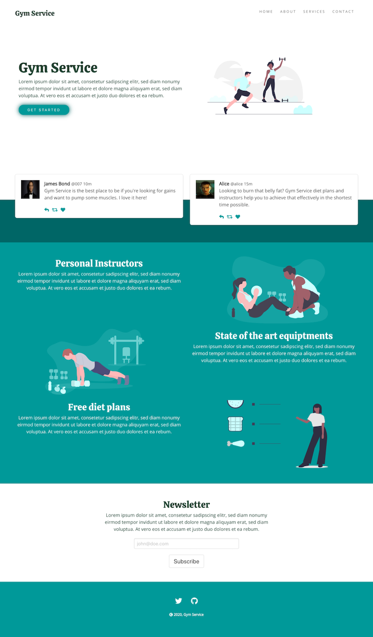
Now that we’re done building our simple business landing page for our gym, we can go ahead and see what it looks like now. In your terminal, type:
npm run serve
If all goes fine, go ahead and load up the local URL in your browser at http://localhost:8080. You should be presented with a website that looks like the image below:
Now that we’ve got everything working fine, we need to deploy our website and make it live:
npm run serve
This will create a folder called dist. The dist folder will contain the website ready to be deployed in a production environment. You can follow this guide to deploy on Netlify.
As you can see, using Buefy and Vue.js to build a business website is quite easy to do. Using Buefy’s UI components saves us time and helps us build websites with clean and modern designs. There are still a lot of Buefy components we didn’t review in this tutorial, but you can head over to the official documentation for Buefy components and build more amazing websites.
Debugging Vue.js applications can be difficult, especially when users experience issues that are difficult to reproduce. If you’re interested in monitoring and tracking Vue mutations and actions for all of your users in production, try LogRocket.
LogRocket lets you replay user sessions, eliminating guesswork by showing exactly what users experienced. It captures console logs, errors, network requests, and pixel-perfect DOM recordings — compatible with all frameworks.
With Galileo AI, you can instantly identify and explain user struggles with automated monitoring of your entire product experience.
Modernize how you debug your Vue apps — start monitoring for free.
Would you be interested in joining LogRocket's developer community?
Join LogRocket’s Content Advisory Board. You’ll help inform the type of content we create and get access to exclusive meetups, social accreditation, and swag.
Sign up now
Learn how OpenAPI can automate API client generation to save time, reduce bugs, and streamline how your frontend app talks to backend APIs.

Discover how the Interface Segregation Principle (ISP) keeps your code lean, modular, and maintainable using real-world analogies and practical examples.

<selectedcontent> element improves dropdowns

Learn how to implement an advanced caching layer in a Node.js app using Valkey, a high-performance, Redis-compatible in-memory datastore.

 Learn more →

2 Replies to "Why you should use Buefy and Vue.js for your next business website"
Really nice tutorial. Straight to the point and concise. I’ll be exploring more usage of Buefy and Vue. Thanks Samuel
Is this on Vue3 or is it on Vue2? I see a lot of issue in using Buefy with Vue3.