When building forms in React applications, React Select is a popular library that offers nearly everything you need to create customizable select inputs. Some key features include:

Read more about React Select and its features here.
Although React Select is great for many use cases, it may not be the best solution for every project. It can be too simplistic for more complex use cases, and it may cause performance or integration issues in certain cases. Consider these limitations:
React Select has been improving over time, so these might be fixed in newer versions. Check the latest docs and community feedback for more information.
In this article, we will look at React Select and alternative select libraries, diving into their features, pros/cons, and usage.
The Replay is a weekly newsletter for dev and engineering leaders.
Delivered once a week, it's your curated guide to the most important conversations around frontend dev, emerging AI tools, and the state of modern software.
The following libraries are some alternatives to React Select that are actively maintained and have sizable communities. Each offers advantages and thrives in specific use cases.

Downshift is a select component library designed to improve the accessibility and functionality of combobox or autocomplete inputs by following the ARIA accessibility pattern. It manages user interactions and state, enabling developers to create combobox/autocomplete and select components with a minimal API.
Downshift offers a set of React hooks that provide stateful logic for making components functional and accessible. These hooks include useSelect for custom select components, useCombobox for combobox/autocomplete inputs, and useMultipleSelection for selecting multiple items in select or comboboxes.
Downshift also provides logic for making components accessible and functional while giving developers complete freedom when building the UI.
ref to access input values when neededUse the command below to install Downshift:
npm install --save downshift
Then, import and make use of Downshift as shown:
import React, { useState } from 'react';
import Downshift from 'downshift';

const items = [
  {value: 'apple'},
  {value: 'pear'},
  {value: 'orange'},
  {value: 'grape'},
  {value: 'banana'},
]

function MySelect() {
  return (
  <Downshift
    onChange={selection =>
      alert(selection ? `You selected ${selection.value}` : 'Selection Cleared')
    }
    itemToString={item => (item ? item.value : '')}
  >
    {({
      getInputProps,
      getItemProps,
      getLabelProps,
      getMenuProps,
      isOpen,
      inputValue,
      highlightedIndex,
      selectedItem,
      getRootProps,
    }) => (
      <div>
        <label {...getLabelProps()}>Enter a fruit</label>
        <div
          style={{display: 'inline-block'}}
          {...getRootProps({}, {suppressRefError: true})}
        >
          <input {...getInputProps()} />
        </div>
        <ul {...getMenuProps()}>
          {isOpen
            ? items
                .filter(item => !inputValue || item.value.includes(inputValue))
                .map((item, index) => (
                  <li
                    {...getItemProps({
                      key: item.value,
                      index,
                      item,
                      style: {
                        backgroundColor:
                          highlightedIndex === index ? 'lightgray' : 'white',
                        fontWeight: selectedItem === item ? 'bold' : 'normal',
                      },
                    })}
                  >
                    {item.value}
                  </li>
                ))
            : null}
        </ul>
      </div>
    )}
  </Downshift>
  );
}

export default MySelect;

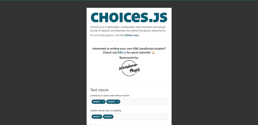
Choices.js is a JavaScript library for creating custom select boxes, text inputs, and multi-select inputs. It is popular for its flexibility and ability to handle complex select components without relying on jQuery. It is like Select2 and Selectize but written in vanilla JavaScript so it is lighter and more modern.
Choices.js allows developers to create dynamic select inputs, whether single or multi-select, while controlling behaviors like sorting, searching, placeholder text, and the ability to add custom options. Developers can customize the styling of select elements to match their app design. Additionally, Choices.js has callback functions for user interactions and extends text inputs with features like tagging, validation, and limiting entries.
Install Choices.js with the following command:
npm install choices.js
Then, import and make use of the Choices.js library as shown below:
import React, { useEffect, useRef } from 'react';
import Choices from 'choices.js';

function MySelect() {
  const selectRef = useRef(null);

  useEffect(() => {
    const choices = new Choices(selectRef.current, {
      choices: ['Apple', 'Banana', 'Cherry', 'Durian', 'Elderberry'],
      placeholder: 'Select an item',
      searchChoices: true,
    });

    return () => {
      choices.destroy();
    };
  }, []);

  return (
    <select ref={selectRef}>
      <option value="">Select an item</option>
      <option value="apple">Apple</option>
      <option value="banana">Banana</option>
      <option value="cherry">Cherry</option>
      <option value="durian">Durian</option>
      <option value="elderberry">Elderberry</option>
    </select>
  );
}

export default MySelect;

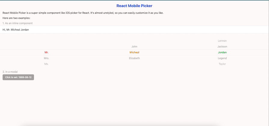
Not a direct alternative to React Select per se, React Mobile Picker is a lightweight component library that offers a customizable and user-friendly interface for selecting items from a list. It is useful for applications that require users to make selections from options like dates, times, or custom lists. It is inspired by iOS-style select boxes, and it provides a visually appealing and intuitive interface for selecting options.
Install the library using the following command:
npm install react-mobile-picker
Then, import and use React Mobile Picker as shown below:
import { useState } from 'react'
import Picker from 'react-mobile-picker'

const selections = {
  title: ['Mr.', 'Mrs.', 'Ms.', 'Dr.'],
  firstName: ['John', 'Micheal', 'Elizabeth'],
  lastName: ['Lennon', 'Jackson', 'Jordan', 'Legend', 'Taylor']
}

function MyPicker() {
  const [pickerValue, setPickerValue] = useState({
    title: 'Mr.',
    firstName: 'Micheal',
    lastName: 'Jordan'
  })

  return (
    <Picker value={pickerValue} onChange={setPickerValue}>
      {Object.keys(selections).map(name => (
        <Picker.Column key={name} name={name}>
          {selections[name].map(option => (
            <Picker.Item key={option} value={option}>
              {option}
            </Picker.Item>
          ))}
        </Picker.Column>
      ))}
    </Picker>
  )
}

rc-select is a select component library designed for React applications that provides various modes, including single-select, multi-select, tags, etc. It offers cross-browser compatibility with IE11+, Chrome, Firefox, and Safari, and ensures accessibility for all users.
rc-select also allows keyboard navigation, allowing users to open the select menu by focusing or clicking on the input field, and supports keyDown, keyUp, and enter keys for menu navigation, which makes it a popular choice for building advanced React form fields.
Install the library using the following command:
npm i rc-select
Then, import and use rc-select as shown below:
import React from 'react';
import Select, { Option } from 'rc-select';

const App = () => {
  function onChange(value) {
    console.log(`selected ${value}`);
  }
  return (
      <div>
        <div style={{ height: 150 }} />
        <h2>Single Select</h2>

        <div style={{ width: 300 }}>
          <Select
            allowClear
            placeholder="placeholder"
            defaultValue="lucy"
            style={{ width: '100%' }}
            animation="slide-up"
            showSearch
            onChange={onChange}
            dropdownStyle={{
              width: 'auto',
            }}
          >
            <Option value="jack">
              <b
                style={{
                  color: 'red',
                }}
              >
                jack
              </b>
            </Option>
            <Option value="lucy">lucy</Option>
            <Option value="disabled" disabled>
              disabled
            </Option>
            <Option value="yiminghe">yiminghe</Option>
          </Select>
        </div>
      </div>
  );
};

React dropdown select is a lightweight alternative to React Select that provides an easy-to-use and customizable dropdown select and multi-select component for React. It is configurable via props and allows for the total customization of components through render prop callbacks, with access to internal props, state, and methods. It can be styled using CSS or custom components and supports rendering the dropdown outside the local DOM tree using portal support. It also has auto-position functionality and a small bundle size of just 16.7kb.
React dropdown select is perfect for projects requiring a straightforward dropdown select component without the complexity of more feature-rich libraries, while still prioritizing performance.
Install the library with the following command:
npm install --save react-dropdown-select
Then, import and use the library as shown:
import Select from 'react-dropdown-select';

const items = ['Apple', 'Banana', 'Cherry', 'Durian', 'Elderberry'];

function MySelectDropdown() {

  return (
    <Select
      options={items}
      values={[]}
      dropdownHandleRenderer={({ state }) => (
              <span>{state.dropdown ? '–' : '+'}</span>
      )}
      onChange={(value) => console.log(value)}
    />
  )
}
Some libraries offer headless select components. These components focus on logic and behavior without imposing specific styles, making them suitable for integrating into your existing design systems. Popular options include Mantine, Radix UI, and MUI Select (part of Material-UI).
Mantine is a fully-featured library that includes headless components along with pre-styled options. It offers extensive UI components and a high level of customizability.
Radix UI provides headless components with a focus on accessibility and unstyled design, allowing developers to customize them freely.
MUI Select is part of the Material UI library, offering a built-in select component that adheres to Google’s Material Design principles.
These headless select components offer highly customizable, fully accessible UI components, allowing for the creation of modern, polished UIs with full control over appearance.
| Library | Lightweight | Customizable | Advanced features | Accessibility | Ideal use case |
|---|---|---|---|---|---|
| React Select | No | High | High | Good | Feature-rich, customizable selects |
| Choices | Yes | Moderate | Moderate | Good | High performance select component that doesn’t require extensive customization |
| Downshift | No | Very high | High | Excellent | Custom select components |
| React dropdown select | Yes | Low | Basic | Good | Simple dropdowns with minimal setup |
| React Mobile Picker | Yes | High | Moderate | Good | Select components targeting mobile applications |
| rc-select | No | High | High | Moderate | Feature-rich, customizable selects |
| Headless UI | Yes | Very high | Varies | Excellent | Custom design systems |
In this article, we explored some of the best React select component libraries, including React Select and its alternatives like Downshift, Choices.js, React Mobile Picker, rc-select, and headless UI libraries such as Mantine and Radix UI.
While React Select remains a popular choice because of its rich features, it has limitations in performance with large datasets and customization complexity. Alternatives like Downshift offer more customization, while Choices.js is lightweight and ideal for performance-focused projects. Each library serves specific use cases, making it important to choose the right one based on your project’s needs.
Install LogRocket via npm or script tag. LogRocket.init() must be called client-side, not
server-side
$ npm i --save logrocket

// Code:

import LogRocket from 'logrocket';
LogRocket.init('app/id');
// Add to your HTML:

<script src="https://cdn.lr-ingest.com/LogRocket.min.js"></script>
<script>window.LogRocket && window.LogRocket.init('app/id');</script>

Learn how Vite+ unifies Vite, Vitest, Oxlint, Oxfmt, Rolldown, and Node.js management in one CLI.

AI companies are buying developer tools as coding agents turn runtimes, package managers, and linters into strategic infrastructure.

Learn how AI-assisted development governance uses rules, agents, hooks, and protocols to help AI coding tools produce safer, more consistent code.

A step-by-step guide to building your first MCP server using Node.js, covering core concepts, tool design, and upgrading from file storage to MySQL.
Would you be interested in joining LogRocket's developer community?
Join LogRocket’s Content Advisory Board. You’ll help inform the type of content we create and get access to exclusive meetups, social accreditation, and swag.
Sign up now