Data grids help organize large amounts of web application data efficiently, making it easier for users to visualize the data. Many libraries are available to help developers incorporate data into their applications with simple and elegant data tables and data grids.

In this article, we’ll look into one such library, ag-grid-react. We’ll demonstrate how to use AG Grid to build a data grid in React and we’ll also consider other alternatives.
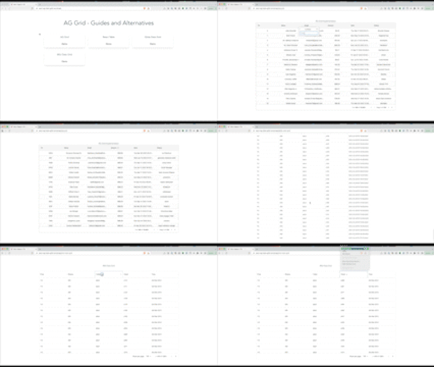
Before we get started, you can play with this data grid demo to get an idea of what we’ll build in this guide:
Jump ahead:
ag-grid-reactIt’s easy to confuse the data grids with data tables. Both have similar use cases of rendering rows and columns of data, but that’s where the similarities end. Data grids and data tables have different implementations under the hood.
A data table uses the <table> element as its underlying DOM to render tables. A data grid uses nested <div> to render a table, allowing it to efficiently implement functionalities such as grouping, filtering, and sorting.
A data table is generally more suitable for rendering static data that simply needs to be displayed in a table format. A data grid is more suitable for rendering data that has higher user interaction. In this article, we’ll focus on building interactive data grids.
ag-grid-reactIt’s easy to get started with AG Grid. We’ll start by installing the ag-grid-react and ag-grid-community packages like so:
npm install ag-grid-react ag-grid-community
Now, we can use the ag-grid-react library by importing the AgGridReact component:
import { AgGridReact } from "ag-grid-react";


 <AgGridReact
   rowData={mockTransactionData()}
   columnDefs={mockTransactionDataColumns()}
 />
AgGridReact requires two props, rowData and columnDefs. rowData represents the data itself; columnDefs represents the column names and properties.
To populate the data table, we’ll use @faker-js/faker to get mock data. Create a utils/data.ts file and add the following code to generate the mock data:
import { faker } from "@faker-js/faker";
export const mockTransactionData = () => {
  return Array.from({ length: 10000 }, (_, i) => ({
    id: i,
    name: faker.name.fullName(),
    email: faker.internet.email(),
    amount: faker.finance.amount(),
    date: faker.date.past(),
    status: faker.random.words()
  }));
};
export const mockTransactionDataColumns = () => {
  return [
    { field: "id", headerName: "ID", width: 100 },
    {
      field: "name",
      headerName: "Name",
      width: 200,
      sortable: true,
      filter: "agSetColumnFilter",
      filterParams: {
        caseSensitive: true
      }
    },
    { field: "email", headerName: "Email", width: 200 },
    { field: "amount", headerName: "Amount", width: 200 },
    { field: "date", headerName: "Date", width: 200 },
    { field: "status", headerName: "Status", width: 200 }
  ];
};
Here, we generate data as per the AgGridReact component. We have the following columns:
field: Represents the column name; when we pass rowData into the component, It should match the column nameheaderName: Represents an alias name to display in the UI; we can pass a different name to the field to show it in UIwidth: We can specify the width of each column individuallyOnce we create functions to generate the mock data, we can use it to populate the data grid:
import { FunctionComponent } from "react";
import { AgGridReact } from "ag-grid-react";
import { mockTransactionData, mockTransactionDataColumns } from "./utils/data";
import "ag-grid-community/styles/ag-grid.css";
import "ag-grid-community/styles/ag-theme-alpine.css";
interface TableProps {}
const Table: FunctionComponent<TableProps> = () => {
  return (
    <>
      <h2>AG Grid Implementation</h2>
      <div
        className="ag-theme-alpine"
        style={{
          height: "90vh",
          width: "100%"
        }}
      >
        <AgGridReact
          rowData={mockTransactionData()}
          columnDefs={mockTransactionDataColumns()}
        ></AgGridReact>
      </div>
    </>
  );
};
export default Table;
You can access a basic version of the AgGridReact component here.
ag-grid-react provides many configuration options; we’ll look at this in more detail during the tutorial portion of this article.
Now that we know how to build a data grid component with ag-grid-react, let’s use the library to build a fully functioning data grid.
Some common data grid functionalities are pagination, filtering, sorting, and searching. To implement these functionalities, we’ll need to enable them in the column configuration.
Start by creating a default column configuration enabling all the functionalities in a data grid:
 const defaultColDef = useMemo<ColDef>(() => {
    return {
      editable: true,
      enableRowGroup: true,
      enablePivot: true,
      enableValue: true,
      sortable: true,
      resizable: true,
      filter: true,
      flex: 1,
      minWidth: 100,
    };
  }, []);
Here, we use the editable property, which makes the column editable. We can also integrate sorting by adding the sortable Boolean property. Here’s a summary of the column properties:
editable: Enables the column to be editable by defaultsortable: Provides sorting functionality for each columnfilter: Provides filtering functionality if we pass the true/false filterresizable: Enables the column to resizeBelow, we can see these properties in action:
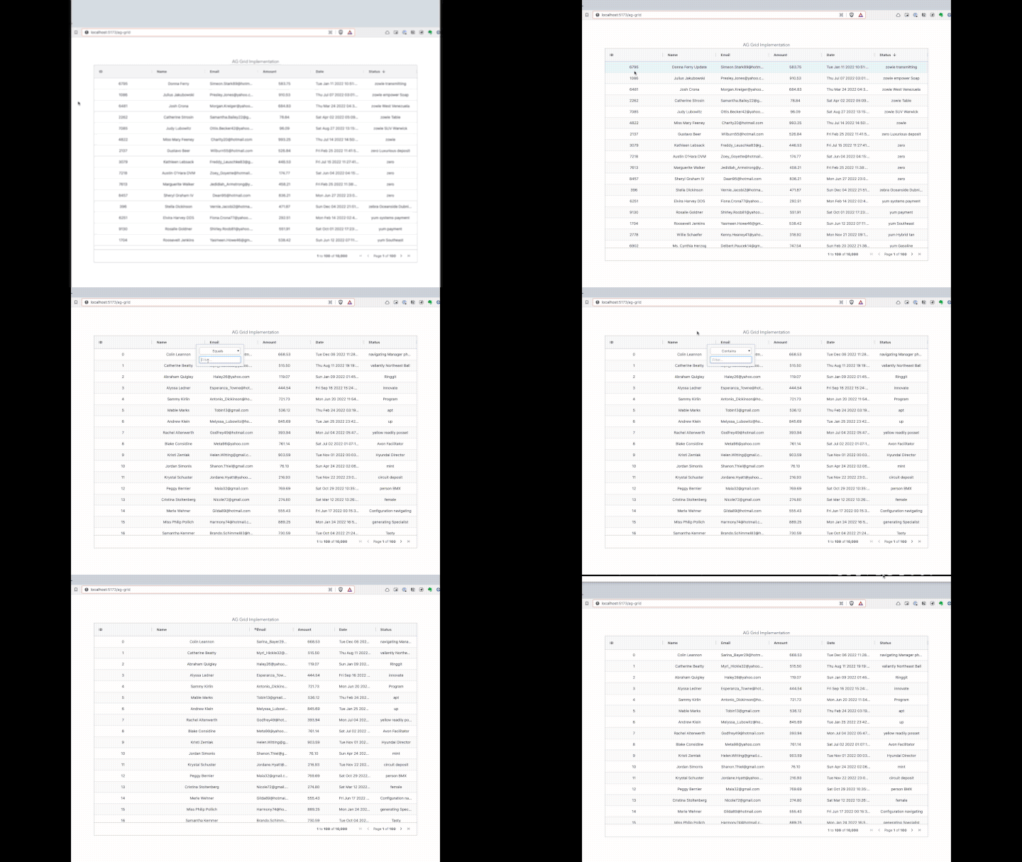
We can either configure each column with different properties or configure all the columns with the default configuration. Here, we pass the defaultColDef property, which applies configuration to all columns.
Once we create the defaultColDef property, we can configure it inside the AgGridReact component:
<AgGridReact
          rowData={mockTransactionData()}
          columnDefs={mockTransactionDataColumns()}
          defaultColDef={defaultColDef}
          pagination={true}
></AgGridReact>
We can also enable pagination by adding it to the component. It’s important to note that it enables client-side pagination, but not server-side pagination.
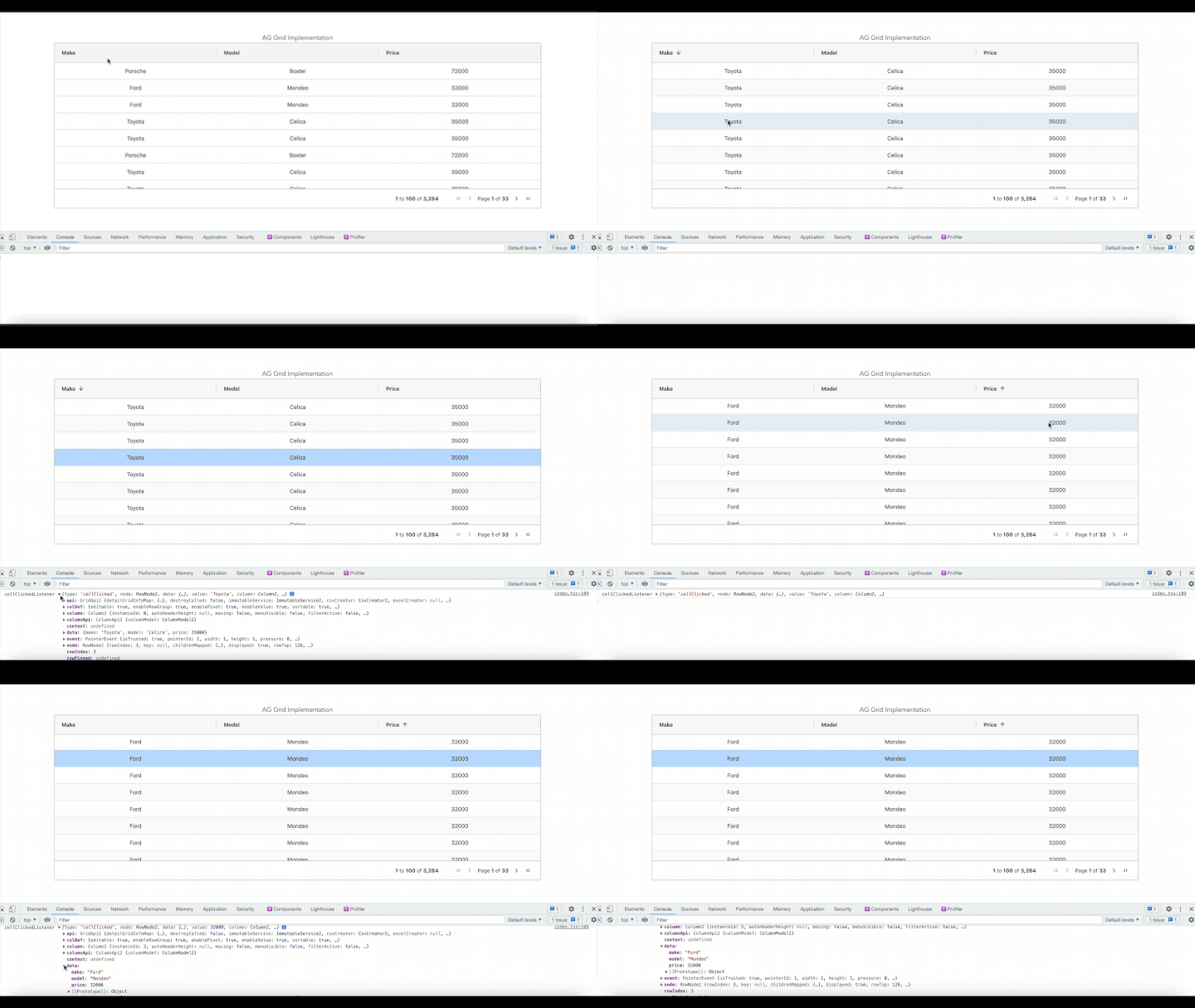
Some interesting and useful data grid options are rowSelection and animateRows. These properties set multiple row selections and animation while the user is filtering and sorting:
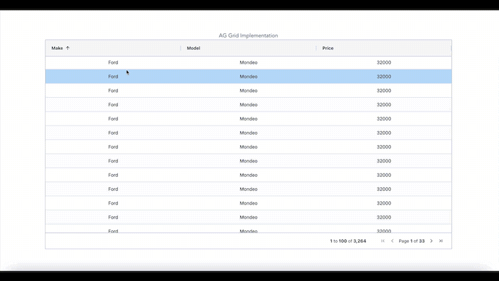
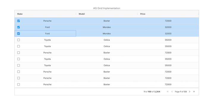
When we set multiple row selections, a checkbox is recommended for a better user experience. Enabling a checkbox is simple and easy. All we need to do is to add checkboxSelection to the column:
 const [columnDefs, setColumnDefs] = useState<any>([
    {
      field: "make",
      headerName: "Make",
      checkboxSelection: true,
      width: 150,
    },
    {
      field: "model",
      headerName: "Model",
      width: 150,
    },
    {
      field: "price",
      headerName: "Price",
      width: 150,
    },
  ]);
There are some best practices to follow when adding AG Grid to a React application to avoid unexpected behavior and ensure efficient performance.
We can implement AG Grid using the useState, useMemo, useCallback, or useEffect Hooks. Let’s take a look!
useStateAlways define rows and columns with useState to avoid having to redefine the rows and columns every time the parent component renders:
 const [rowData, setRowData] = useState([]);
 const [columnDefs, setColumnDefs] = useState<any>([
  {
    field: "make",
    headerName: "Make",
    width: 150,
  },
  {
    field: "model",
    headerName: "Model",
    width: 150,
  },
  {
    field: "price",
    headerName: "Price",
    width: 150,
  },
]);

return(
 <AgGridReact
    rowData={rowData}
    columnDefs={columnDefs}
    defaultColDef={defaultColDef}
    pagination={true}
  ></AgGridReact>
);
useMemoWhen we define the default column configuration, it’s always recommended to use useMemo, because this Hook’s default configuration doesn’t change once initialized:
const defaultColDef = useMemo<ColDef>(() => {
    return {
      editable: true,
      enableRowGroup: true,
      enablePivot: true,
      enableValue: true,
      sortable: true,
      resizable: true,
      filter: true,
      flex: 1,
      minWidth: 100,
    };
  }, []);
After defining the configuration for the default columns, we can integrate it into the AgGrid component:
<AgGridReact
    rowData={rowData}
    columnDefs={columnDefs}
    defaultColDef={defaultColDef}
    pagination={true}
  ></AgGridReact>
useCallbackThe AgGrid component provides props to listen to cell and row clicks. onCellClicked takes a callback function that gets called whenever a user clicks a cell in the grid.
Whenever a callback is defined with AgGrid (either with an event listener or with Grid options), we should wrap the callback function with useCallback to avoid unnecessary re-rendering and re-setting of the column and row definitions:
const cellClickedListener = useCallback(
  (e: CellClickedEvent<HTMLButtonElement>) => {
    console.log("cellClickedListener", e);
  },
  []
);

return (
 <AgGridReact
    rowData={rowData}
    columnDefs={columnDefs}
    defaultColDef={defaultColDef}
    pagination={true}
    rowSelection="multiple"
    animateRows={true}
    onCellClicked={cellClickedListener}
  ></AgGridReact>
)
useEffectWe can also use the useEffect Hooks to fetch data from the server and set it inside the component state, like so:
useEffect(() => {
    fetch("https://www.ag-grid.com/example-assets/row-data.json")
      .then((result) => result.json())
      .then((rowData) => setRowData(rowData));
  }, []);
AG Grid provides a set of pre-defined themes. Once we select a theme to configure, we can customize it by overriding the CSS variables.
Here, we’ll use ag-theme-alpine in the component:
import "ag-grid-community/styles/ag-grid.css";
import "ag-grid-community/styles/ag-theme-alpine.css";
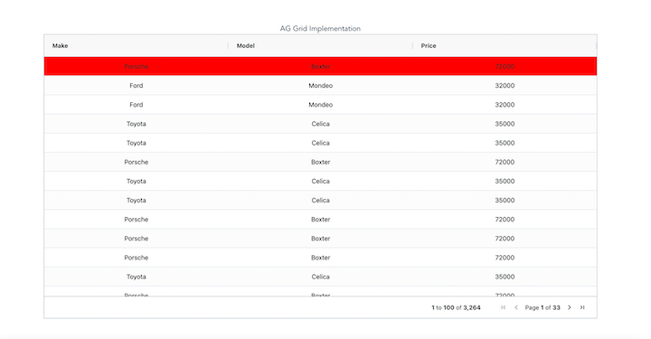
To customize it, we can override the CSS variable in the App.css file. For example, to change the background color of the selected row, we override the theme CSS variable in the App.css file:
 .ag-row-selected::before {
  background-color: #646cff !important;
}
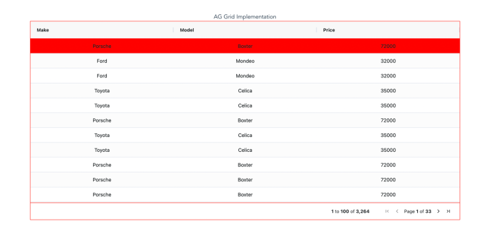
We can also change the data grid border color by overriding the CSS variable. Below, we change the border from gray to red:
.ag-theme-alpine {
  --ag-border-color: #ff0000 !important;
}
Below is the final version of our ag-grid-react data grid:

It’s important to understand a library’s advantages and disadvantages before integrating it into your application. Let’s take a look:
The ag-grid-react library offers serval advantages:
ag-grid-react in an application, we simply need to import its component and styles and use them in the application; defining rows and columns is simple compared to other data grid librariesAgGrid component comes with inbuilt features such as pagination, sorting, filtering, and searching. All we need to do is to enable them in the column and then configure them based on the requirementHere are a couple of limitations to keep in mind when considering the ag-grid-react library:
ag-grid-react library. It‘s also difficult to integrate styling frameworks such as Tailwind CSS or BulmaDetermining which data grid library to use is largely dependent on your particular use case. Let’s take a look at some popular alternatives to AG Grid. We’ll build a data grid with each and consider each library’s inbuilt features so that you can better compare each library.
Formerly called React Table, TanStack Table is a headless UI for building data tables and data grids.
To build a data grid with TanStack Table, we’ll start by installing the react-table dependency in our application by running the following command:
npm install react-table
Since react-table is headless, we can implement the functionality by integrating react-table Hooks, like so:
const {
    getTableProps,
    getTableBodyProps,
    headerGroups,
    prepareRow
    state: { pageIndex, pageSize },
  } = useTable(
    {
      columns,
      data,
      defaultColumn
    }
  );
Here’s a simple useTable Hook with columns and data we can pass to render the data. It provides properties that can be integrated into the DOM element. For example, all we need to do is to integrate getTableProps into <table> DOM to make it function like a data grid:
<table className="min-w-full divide-y divide-gray-200" {...getTableProps()}>
  <thead>
    {headerGroups.map((headerGroup) => (
      <tr {...headerGroup.getHeaderGroupProps()}>
        {headerGroup.headers.map((column) => (
          <th
            className="px-6 py-3 bg-gray-50 text-left text-xs leading-4 font-medium text-gray-500 uppercase tracking-wider"
            {...column.getHeaderProps()}
          >
            {column.render("Header")}
          </th>
        ))}
      </tr>
    ))}
  </thead>

  <tbody className="bg-white divide-y divide-gray-200" {...getTableBodyProps()}>
    {page.map((row, i) => {
      prepareRow(row);
      return (
        <tr {...row.getRowProps()}>
          {row.cells.map((cell) => {
            return (
              <td
                className="px-6 py-4 whitespace-no-wrap text-sm leading-5 font-medium text-gray-900"
                {...cell.getCellProps()}
              >
                {cell.render("Cell")}
              </td>
            );
          })}
        </tr>
      );
    })}
  </tbody>
</table>;
headerGroups contains information about the header and its properties. It contains a headers array with the required header information that we pass into columns into the useTable Hook.
Let’s look at an example. Here’s a column array that we pass into the useTable Hook:
 const columns = useMemo(
    () => [
      { Header: "Price", accessor: "price", show: true },
      { Header: "Shares", accessor: "shares", show: true },
      { Header: "Ticker", accessor: "ticker", show: true },
      { Header: "Ticket", accessor: "ticket", show: true },
      {
        Header: "Time",
        accessor: "time",
        Cell: (cellInfo: any) => {
          return (
            <Fragment>
              {moment(cellInfo.row.original.time).format("Do MMM YYYY")}
            </Fragment>
          );
        },
        show: true,
      },
    ],
    []
  );
Here, we can configure the column as needed. TanStack Table renders the column with the name that we specify. We can also format the data according to our preferences:
<th
  className="px-6 py-3 bg-gray-50 text-left text-xs leading-4 font-medium text-gray-500 uppercase tracking-wider"
  {...column.getHeaderProps()}
>
  {column.render("Header")}
</th>;
column.render mainly renders the column inside the <th> DOM element.
Now that we have a basic data table, we’ll need to add sorting and pagination functionality. To add sorting to TanStack Table, we simply import useSortBy from react-table:
import { useTable, useSortBy } from "react-table";
Next, we integrate it into the useTable Hook. Once we do that, sorting will be enabled in all the columns that need that functionality.
 const {
    getTableProps,
    getTableBodyProps,
    headerGroups,
    prepareRow,
    state: { pageIndex, pageSize },
  } = useTable(
    {
      columns,
      data,
      defaultColumn,
      manualSortBy: true,
    },
    useSortBy
  );
Implementing pagination can be a little trickier. But one of the benefits of TanStack Table is that we have complete control over the functionality. Let’s implement server-side pagination with TanStack Table and see how it works.
First, we’ll import pagination Hooks from react-table and integrate them into the useTable Hooks:
import { useTable, usePagination, useExpanded, useSortBy } from "react-table";
usePagination provides properties that we can use to implement the pagination functionality as required:
 const {
    getTableProps,
    getTableBodyProps,
    headerGroups,
    prepareRow,
    page,
    canPreviousPage,
    canNextPage,
    pageOptions,
    pageCount,
    gotoPage,
    nextPage,
    previousPage,
    setPageSize,
    setHiddenColumns,
    state: { pageIndex, pageSize },
  } = useTable(
    {
      columns,
      data,
      defaultColumn,
      initialState: {
        pageIndex: 0,
        pageSize: 15,
        hiddenColumns: columns
          .filter((column: any) => !column.show)
          .map((column: any) => column.id),
      },
      manualPagination: true,
      manualSortBy: true,
      autoResetPage: false,
      pageCount: controlledPageCount,
    },
    useSortBy,
    useExpanded,
    usePagination
  );
As you can see, usePagination provides several properties to implement pagination inside the TanStack Table data grid:
page: Contains all the data for the current page. It renders the data of the current pagecanPreviousPage: Represents whether a user can go to the previous page. If a user is on the first page, it will be falsecanNextPage: Similar to canPreviousPage; this will be false if a user is on the last page of the tablegotoPage: Allows the user to go to a specific page in the tablenextPage: Helps to navigate to the next pages in the tablepreviousPage: Allows users to navigate to previous pages in the tablesetPageSize: Sets the size of a page in the data tableNow, let’s integrate pagination into the component:
{
  Boolean(isPaginated) && (
    <Pagination>
      <PaginationIndex>
        page {pageIndex + 1} of {pageOptions.length}
      </PaginationIndex>{" "}
      <PagincationButtonContainer>
        {canPreviousPage ? (
          <PaginationButton onClick={() => previousPage()}>
            <LeftIconSpan>
              <BackButtonIcon />
            </LeftIconSpan>
            Back
          </PaginationButton>
        ) : null}
        {canNextPage ? (
          <PaginationButton onClick={() => nextPage()}>
            Next{" "}
            <RightIconSpan>
              <NextButtonIcon />
            </RightIconSpan>
          </PaginationButton>
        ) : null}
      </PagincationButtonContainer>
    </Pagination>
  );
}
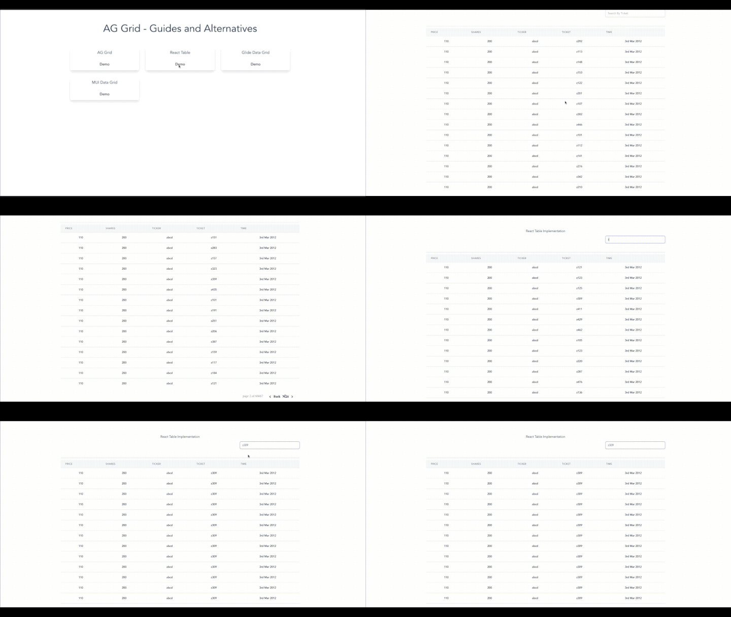
Now we have pagination in the table, we’ll need to implement functionality to fetch data when a user navigates to the next page or previous page based on the current page information. To do that, whenever pageIndex changes, we must fetch data from the server:
  React.useEffect(() => {
    fetchData && fetchData({ pageIndex, pageSize });
  }, [fetchData, pageIndex, pageSize]);
As you can see, when pageIndex changes, we invoke fetchData from the parent component:
You can find the complete code for this TanStack Table example here.
A Glide Data Grid is a React data grid component for building data tables and data grids. It offers full TypeScript support.
To build a data grid with Glide Data Grid, we’ll start by installing the @glideapps/glide-data-grid dependency in our application by running the following command:
npm install @glideapps/glide-data-grid
Now, we’ll create a component, GlideDataGrid/index.tsx, and import the package in the component:
import {
  DataEditor,
  GridColumn,
  GridCellKind,
  Item,
  GridCell
} from "@glideapps/glide-data-grid";
DataEditor is the component that will render data grids in our application. GridColumn represents a column in the data grid. Item and GridCell `represent types for column cell and cell items. We’ll addDataEditor` to our component, like so:
<DataEditor
  getCellContent={getData}
  columns={columns}
  rows={data.length}
  width={1000}
  getCellsForSelection={true}
  keybindings={{ search: true }}
/>;
columns represents columns and their properties. To create columns, we use an id, title, and other properties:
const columns: GridColumn[] = [
    { id: "price", title: "Price", width: 200 },
    { id: "shares", title: "Shares", width: 200 },
    { id: "ticker", title: "Ticker", width: 200 },
    { id: "ticket", title: "Ticket", width: 200 },
    { id: "time", title: "Time", width: 200 },
  ];
getData renders the data based on the column type. getCellContent provides column and row properties into the getData function:
 function getData([col, row]: Item): GridCell {
    switch (col) {
      case 0:
        return {
          kind: GridCellKind.Text,
          data: data[row].price ? data[row].price.toString() : "",
          allowOverlay: false,
          displayData: data[row].price ? data[row].price.toString() : "",
        };
      case 1:
        return {
          kind: GridCellKind.Text,
          data: data[row].shares ? data[row].shares.toString() : "",
          allowOverlay: false,
          displayData: data[row].shares ? data[row].shares.toString() : "",
        };
      case 2:
        return {
          kind: GridCellKind.Text,
          data: data[row].ticker ? data[row].ticker.toString() : "",
          allowOverlay: false,
          displayData: data[row].ticker ? data[row].ticker.toString() : "",
        };
      case 3:
        return {
          kind: GridCellKind.Text,
          data: data[row].ticket ? data[row].ticket.toString() : "",
          allowOverlay: false,
          displayData: data[row].ticket ? data[row].ticket.toString() : "",
        };
      case 4:
        return {
          kind: GridCellKind.Text,
          data: data[row].time ? data[row].time.toString() : "",
          allowOverlay: false,
          displayData: data[row].time ? data[row].time.toString() : "",
        };
      default:
        return {
          kind: GridCellKind.Text,
          data: "",
          allowOverlay: false,
          displayData: "",
        };
    }
  }
getData returns properties such as the following:
kind: Represents the type of the cell. For example, Text or Number, etc.data: Maps the data that we pass into the cell; stores data as valueallowOverlay: Enables the configuration to allow overlay on the specific celldisplayData: Similar to a label for the data that passes into the cell; this property displays the data based on the name we configureWe can manage the data in the component state. Here, we fetch the data and store it inside the component:
 useEffect(() => {
    fetchAPIData({ limit: 200, skip: 0, search: "" });
  }, []);
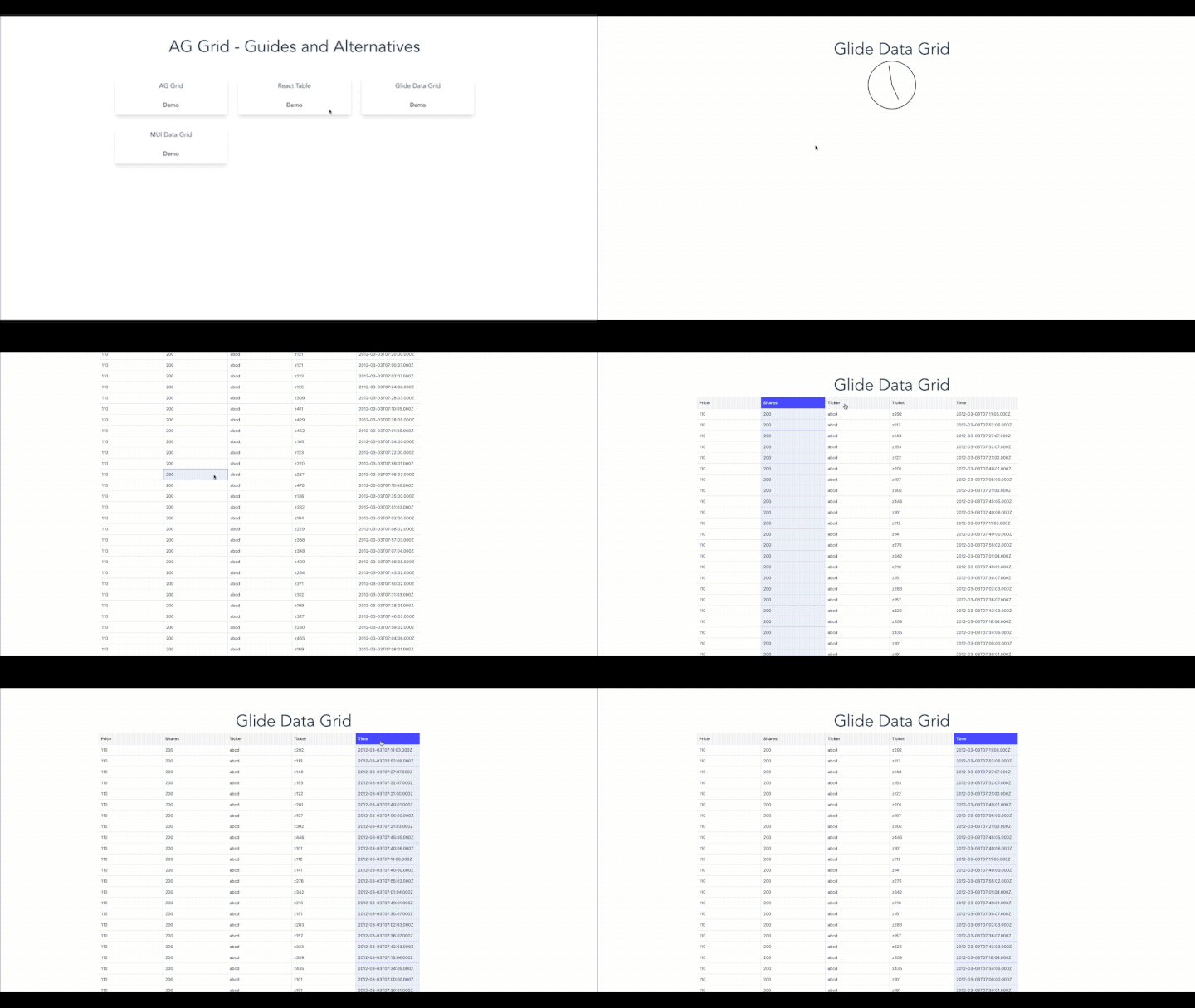
You can find the complete code for our Glide Data Grid example here.
MUI is a component library for building user interfaces faster and more efficiently. It also provides components for building data tables and data grids in an application.
To build a data table with MUI Data Grid start by installing the dependencies in the application, like so:
npm install @mui/x-data-grid
Next, create component MUIDataGrid/index.tsx and add the following code:
import { DataGrid, GridColDef } from "@mui/x-data-grid";
Now, import DataGrid into the component; it will render the data grid in the application:
import { FunctionComponent, useState, useEffect, Fragment } from "react";
import { DataGrid, GridColDef } from "@mui/x-data-grid";
import moment from "moment";
interface MUIDataGridProps {}
const MUIDataGrid: FunctionComponent<MUIDataGridProps> = () => {
  const [pageCount, setPageCount] = useState(0);
  const [pageSize, setPageSize] = useState(100);
  const [pageIndex, setPageIndex] = useState(0);
  const [data, setData] = useState([]);
  const [loading, setLoading] = useState(false);

  const columns: GridColDef[] = [
    { field: "price", headerName: "Price", flex: 1 },
    { field: "shares", headerName: "Shares", flex: 1 },
    { field: "ticker", headerName: "Ticker", flex: 1 },
    { field: "ticket", headerName: "Ticket", flex: 1 },
    { field: "time", headerName: "Time", flex: 1 }
  ];
  return (
    <Fragment>
      <h2>MUI Data Grid</h2>
      <div className="container mx-auto flex flex-col h-full">
        <div className="flex justify-center mt-8 h-full">
          <DataGrid
            rows={data}
            columns={columns}
            keepNonExistentRowsSelected
          />
        </div>
      </div>
    </Fragment>
  );
};
export default MUIDataGrid;
Here, DataGrid takes rows and columns as props to render the UI. columns is an array that takes properties such as field, headerName, and flex. We pass data by calling the API and store that data in the component state:
const fetchAPIData = async ({ limit, skip, search }: any) => {
    try {
      setLoading(true);
      const response = await fetch(
        `${
          import.meta.env.VITE_API_URL
        }/companies?limit=${limit}&skip=${skip}&search=${search}`
      );
      const data = await response.json();
      console.log("data", data);
      const rows = data.data.map((item: any) => {
        return {
          id: item._id,
          price: item.price,
          shares: item.shares,
          ticker: item.ticker,
          ticket: item.ticket,
          time: moment(item.time).format("Do MMM YYYY"),
        };
      });
      setData(rows);
      setLoading(false);
    } catch (e) {
      console.log("Error while fetching", e);
      // setLoading(false)
    }
  };

//useEffect hooks to fetch data...
useEffect(() => {
  fetchAPIData({ limit: pageSize, skip: pageSize * pageIndex, search: "" });
}, []);
data should return the field that we define in columns. For example, we have a column field name price, So the data should have a price with value.
After we populate the table with data and render the data, we’ll add pagination to the data table. MUI provides inbuilt support for pagination. We can configure it in MUI Data Grid by adding pagination to the DataGrid component:
<DataGrid
  rows={data}
  columns={columns}
  pagination
  paginationMode={"server"}
  rowCount={pageCount}
  page={pageIndex}
  onPageChange={onPageChange}
  keepNonExistentRowsSelected
/>;
paginationMode defines whether it’s server-side or client-side pagination. page manages the current page index. Here, we manage pageIndex in the component state. The onPageChange function helps to fetch more data when a user goes to the next or previous page:
setPageIndex(newPage);
    fetchAPIData({ limit: pageSize, skip: pageSize * newPage, search: "" });
  };
As you can see, we set pageIndex and fetch the data based on the page index and page size:
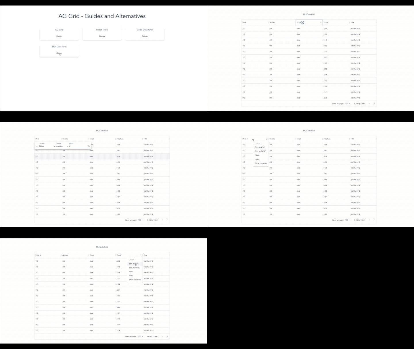
You can find the complete code for our MUI Data Grid example here.
In this guide, we introduced the basic functionalities of the ag-grid-react library and demonstrated how to use AG Grid to build and style a data grid in a React app. To compare alternatives to AG Grid, also built a similar data grid in TanStack Table, Glide Data Grid, and MUI Data Grid. Each library has a unique set of features and tradeoffs, so it’s important to choose the best option for your use case.
All of the code from this article is available on GitHub.
Install LogRocket via npm or script tag. LogRocket.init() must be called client-side, not
server-side
$ npm i --save logrocket

// Code:

import LogRocket from 'logrocket';
LogRocket.init('app/id');
// Add to your HTML:

<script src="https://cdn.lr-ingest.com/LogRocket.min.js"></script>
<script>window.LogRocket && window.LogRocket.init('app/id');</script>
Hey there, want to help make our blog better?
Join LogRocket’s Content Advisory Board. You’ll help inform the type of content we create and get access to exclusive meetups, social accreditation, and swag.
Sign up now
Learn how OpenAPI can automate API client generation to save time, reduce bugs, and streamline how your frontend app talks to backend APIs.

Discover how the Interface Segregation Principle (ISP) keeps your code lean, modular, and maintainable using real-world analogies and practical examples.

<selectedcontent> element improves dropdowns

Learn how to implement an advanced caching layer in a Node.js app using Valkey, a high-performance, Redis-compatible in-memory datastore.