
Visitors to your application and website expect a user experience that is tailored to their device. A bad user experience would not get you the user retention you need to achieve your marketing and sales targets.

The devices available to users have different specifications, which is why responsive design matters.
In this article, we’ll be covering how to create responsive designs in Flutter for mobile devices, beginning with a quick recap of why responsive design matters for Flutter.
The Replay is a weekly newsletter for dev and engineering leaders.
Delivered once a week, it's your curated guide to the most important conversations around frontend dev, emerging AI tools, and the state of modern software.
Some perks come with having a Flutter application created with responsive design.
Consistency in your application across different screen sizes ensures that you have a wider range of users. Tablets and smaller mobile devices can enjoy a tailored user experience.
In addition, retention rate in your application tends to be higher once you have considered responsive design.
Since Flutter is a good choice for web and mobile apps, responsive design ensures that the appeal of your application is consistent and gives users a seamless experience, no matter the size of the device in use.
It goes without saying that if you factor responsiveness into your application, it also prevents negative ratings. There are over 2 million applications on the App store and over 3 million more on the Google Play store. Most users decide which applications to download based on reviews.
You’ll want to be on the good side of these reviews. Hence, you should factor responsiveness into your app development checklist.
Responsive design in Flutter has no one-size-fits-all solution. There are different approaches to getting responsiveness in your Flutter application.
Some of the popular ways of doing this, according to the official documentation, include the following:
LayoutBuilderLayoutBuilder has a builder property that can provide us with the BoxConstraint object, which has the constraint information of the particular widget. We can use information like maxWidth and maxHeight to determine how we want to render our display.
These values would help us adjust our display based on the size constraints allocated to our widget. More importantly, when these values change due to events like screen rotation, LayoutBuilder would call our build function, which rebuilds the widget based on the new constraints we have.
MediaQueryThe MediaQuery class provides us with not just the widget size, but with the entire screen size of our application at runtime and the device orientation at the time.
Whenever those configurations change, our build method will also be called, which ensures that our widget tree is rebuilt to reflect the most recent changes.
AspectRatioAspectRatio is a widget that attempts to size the child to a specific aspect ratio.
The widget first tries the largest width permitted by the layout constraints. The height of the widget is determined by applying the given aspect ratio to the width, expressed as a ratio of width to height.
While the docs offer good options, this article will be exploring an easier approach to responsive design. It is advisable that you properly evaluate this to know if it might be the right approach for your application.
Thanks to the open source nature of Flutter and the collaborative efforts of the Flutter community, there are two packages you can use to achieve responsiveness:
We’ll cover FlutterScreenUtil in this tutorial.
To begin, we’ll build a simple user interface screen that looks like the image below:
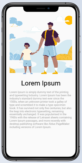
When creating user interfaces for mobile apps, it is always best to not hardcode values for the sizes of our widgets and instead use percentages for our sizes. In Flutter, this can be achieved using the MediaQuery class.
In order to create the screen above, here is the code snippet we are using:
import 'package:flutter/material.dart';

class HomePage extends StatelessWidget {
  const HomePage({Key key}) : super(key: key);

  @override
  Widget build(BuildContext context) {
    return SafeArea(
      child: Scaffold(
          body: Padding(
            padding: EdgeInsets.all(20),
            child: SingleChildScrollView(
              child: SizedBox(
                width:double.infinity,
                child: Column(
        children: [
                Container(
                  height:MediaQuery.of(context).size.height/2,
                  width: MediaQuery.of(context).size.width/2,
                  decoration: BoxDecoration(
                      image: DecorationImage(
                          image: AssetImage('assets/family.png'), fit: BoxFit.cover)),
                ),

                Text("Lorem Ipsum",
                    style: TextStyle(fontSize: 40, fontWeight: FontWeight.w700)),
                SizedBox(
                  height: 20,
                ),
                Text(
                    "Lorem Ipsum is simply dummy text of the printing and typesetting Industry. Lorem Ipsum has been the industry's standard dummy text ever since the 1500s, when an unknown printer took a galley of type and scrambled it to make a type specimen book. It has survived not only five centuries, but also the leap into electronic typesetting, remaining essentially unchanged. It was popularised in the 1960s with the release of Letraset sheets containing Lorem Ipsum passages, and more recently with desktop publishing software like Aldus PageMaker including versions of Lorem Ipsum.",
                    style: TextStyle(fontSize: 16, color: Colors.grey)),


        ],
      ),
              ),
            ),
          )),
    );
  }
}
As you can see from the image above, our text would be difficult to read on larger screens.
We simply proceed by adding the dependencies for the package we want to our pubspec.yaml file.
To do that, run the following command in your terminal:
flutter pub add flutter_screenutil
In order to use the FlutterScreenUtil package, you first need to initialize the parent widget in your application, which in our case is the MaterialApp.
That would look like this:
@override
Widget build(BuildContext context) {
  return ScreenUtilInit(
    designSize: Size(360, 690),
    builder: ()=> MaterialApp(
        title: 'Responsiveness Demo',
        debugShowCheckedModeBanner: false,
        theme: ThemeData(
          primarySwatch: Colors.blue,
        ),
        home:  HomePage()),
  );
}
The design size widget is optional and if not provided would default to using the values below:
static const Size defaultSize = Size(360, 690);
I love to use the extension functions of the FlutterScreenUtil package. To do this, just import the package to your library:
import 'package:flutter_screenutil/flutter_screenutil.dart';
For places where we have height values, we would append the extension function for it. Same for width values and text sizes, too.
This would look something like the code below:
Container(
    width: 70,
    height:250,
    child: Text("Responsive Design", style:TextStyle(fontSize: 18))
)


Container(
padding: EdgeInsets.all(10),
  height:MediaQuery.of(context).size.height/2,
  width: MediaQuery.of(context).size.width/2,
  decoration: BoxDecoration(
      image: DecorationImage(
          image: AssetImage('assets/family.png'), fit: BoxFit.cover)),
),
Container(
    width: 70.w, //Scaled based on the screen's width;
    height:250.h, //Scaled based on the screen's height;
    child: Text("Responsive Design", style:TextStyle(fontSize: 18.sp))//Adapted Font
)
Container(
padding: EdgeInsets.all(10.r),///Adapt according to the smaller of width or height
  height:0.5.sh,//50% of our screen height
  width: 0.5.sw,//50% of our screen width
  decoration: BoxDecoration(
      image: DecorationImage(
          image: AssetImage('assets/family.png'), fit: BoxFit.cover)),
),
Once we factor in the required changes to our initial code, using the extension values from the FlutterScreenUtil package, our HomePage class should now look like this:
import 'package:flutter/material.dart';
import 'package:flutter_screenutil/flutter_screenutil.dart';

class HomePage extends StatelessWidget {
  const HomePage({Key key}) : super(key: key);

  @override
  Widget build(BuildContext context) {
   return SafeArea(
      child: Scaffold(
          body: Padding(
            padding: EdgeInsets.all(20.r),
            child: SingleChildScrollView(
              child: SizedBox(
                width:double.infinity,
                child: Column(
        children: [
                Container(
                  height:0.5.sh,
                  width: 0.5.sw,
                  decoration: BoxDecoration(
                      image: DecorationImage(
                          image: AssetImage('assets/family.png'), fit: BoxFit.cover)),
                ),

                Text("Lorem Ipsum",
                    style: TextStyle(fontSize: 40.sp, fontWeight: FontWeight.w700)),
                SizedBox(
                  height: 20.h,
                ),
                Text(
                    "Lorem Ipsum is simply dummy text of the printing and typesetting Industry. Lorem Ipsum has been the industry's standard dummy text ever since the 1500s, when an unknown printer took a galley of type and scrambled it to make a type specimen book. It has survived not only five centuries, but also the leap into electronic typesetting, remaining essentially unchanged. It was popularised in the 1960s with the release of Letraset sheets containing Lorem Ipsum passages, and more recently with desktop publishing software like Aldus PageMaker including versions of Lorem Ipsum.",
                    style: TextStyle(fontSize: 16.sp, color: Colors.grey)),

        ],
      ),
              ),
            ),
          )),
    );
  }
}
If we run our application, we would have the following results:
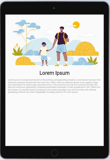

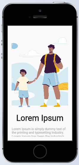
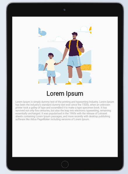
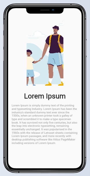
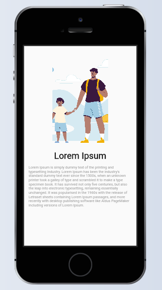
From the images above, you can see how the widgets resize themselves based on the device size to fit perfectly on each of the devices, and the main takeaway is that this was achieved using very few lines of code.
Responsive Sizer works in a similar way to FlutterScreenUtil, and the installation process is also similar to that of the package above. You just need to add the import for it and use the same extensions for adapted width and height.
Consistent UI design needs responsiveness. These packages make it easy to achieve much in that regard, without many lines of code.
Hopefully you get to explore this in your next application and get the job done much easier if you haven’t tried this before.
Install LogRocket via npm or script tag. LogRocket.init() must be called client-side, not
server-side
$ npm i --save logrocket

// Code:

import LogRocket from 'logrocket';
LogRocket.init('app/id');
// Add to your HTML:

<script src="https://cdn.lr-ingest.com/LogRocket.min.js"></script>
<script>window.LogRocket && window.LogRocket.init('app/id');</script>

useEffect breaks AI streaming responses in ReactSee why useEffect breaks AI streaming in React, and how moving stream state outside React fixes flicker and stale updates.

A real-world debugging session using Claude to solve a tricky Next.js UI bug, exploring how AI helps, where it struggles, and what actually fixed the issue.

CSS wasn’t built for dynamic UIs. Pretext flips the model by measuring text before rendering, enabling accurate layouts, faster performance, and better control in React apps.

Why do real-time frontends break at scale? Learn how event-driven patterns reduce drift, race conditions, and inconsistent UI state.
Hey there, want to help make our blog better?
Join LogRocket’s Content Advisory Board. You’ll help inform the type of content we create and get access to exclusive meetups, social accreditation, and swag.
Sign up now