When building web applications, you usually want to ensure that they are usable on as many browsers as possible. This is very much in line with what the web was designed to be in the first place.

One of my favorite things about the web is that it was designed to be the most universally accessible and expressive platform out there, regardless of hardware, software, network infrastructure, language, culture, geographical location, or physical and mental capability.
This is where progressive enhancements come into play.
The Replay is a weekly newsletter for dev and engineering leaders.
Delivered once a week, it's your curated guide to the most important conversations around frontend dev, emerging AI tools, and the state of modern software.
The first thing that comes to mind when building for the web is figuring out who the possible users for your application would be. Progressive enhancement focuses on the experiences of these users across different devices and ensures that they can get the value they desire from your website regardless of the device they use.
Progressive enhancement as a concept involves building an application at a base level of user experience and then adding functional enhancements when a browser supports it. These days, browsers are embedded in pretty much everything — mobile, laptops, gaming consoles, refrigerators, watches, and much more.
Each of these devices has a different screen size, browser-supported features, etc. that make the experience unique.
“If serving as many users as possible is the goal, why not first build the best experience you can, and then start supporting other browsers?” This is a common question I see around, and this other approach is termed graceful degradation.
Graceful degradation is the practice of building an application for modern browsers while ensuring it remains functional in as many older browsers as you can. In a way, you can call graceful degradation the opposite approach to progressive enhancement since it involves focusing on modern browsers first before attempting to ensure basic functionality on older ones.
With graceful degradation, previous releases of major browsers are the main focus, with small fixes made to accommodate these browsers as much as possible. Anything older or different than these can be expected to provide a poor experience.
However, with progressive enhancement, the focus begins with the content. When the content is made readily available before additional features and enhancements are added to it, a lot more users can get more value from your website regardless of their devices.
This is what makes progressive enhancement a more recommended concept.
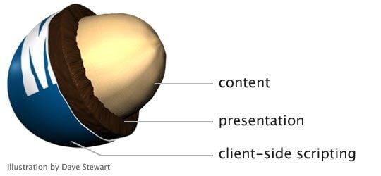
A popular analogy to describe progressive enhancements is that of the Peanut M&M. The Peanut M&M has three layers. Some prefer just the peanuts, others love the combination with the chocolate, and others love the entire package with the hard candy casing.
The peanut is your content, the chocolate coating is your presentation layer, and your JavaScript is the hard candy shell.

In web development, the layers include your HTML, CSS, and JavaScript.
This first layer is clean and semantic HTML that works on any browser or device; it works everywhere. It is the one layer that you can rely on with certainty, as browsers will always display something. HTML, as the name implies, is responsible for the structure and markup of your content.
Having your content structured properly means it can still be of value even when CSS and JavaScript are not available.
With CSS, we improve the visual design of our content and go on to provide more meaning to it. The level of support for CSS varies in different browsers, and users can also disable or specify a different stylesheet different from yours. CSS is progressively enhanced by default, so when a browser comes across a property it doesn’t recognize, it ignores it.
The layout of your application can even be enhanced greatly, providing an improved experience for browsers that support it without breaking for those that do not.
JavaScript is the least reliable of all these layers. For starters, many people disable JavaScript for security reasons. With JavaScript, you can go on to provide enhanced functionality for browsers that support it. The recommended approach here is feature detection instead of browser detection; this means you check if a browser has this feature available instead of trying to detect which browser it is.
Browsers are constantly evolving, and it would be insane to try to cater specifically to each one. Progressive enhancement helps you to plan out your application as a functional system with the content as the priority, enabling you to build a stable application that should work on any device and browser, even those you are not aware of.
Websites have continued to get larger in size over the years. According to HTTP Archive, the average web page size in 2017 was 3MB. This is a huge increase from the 1.6MB average of 2014. This increase in page sizes leads to an increase in loading time.
Optimizing for performance is not just important, it’s also necessary. Progressive enhancement prioritizes your content, ensuring users can begin to use your website as fast as possible.
Progressive enhancements involve using semantic HTML to mark up your content right from the start. This not only ensures that your content is always served, but also that it can always be read by search engine crawlers and screen readers.
To ensure clean and semantic HTML, we also have to separate styles from markup. This allows pages and content to be styled in many ways and changed as supported by the various browsers and devices.
This is a basic principle that hasn’t been formally defined. But it involves ensuring that any behavior or functionality dependent on JavaScript is completely separated from the actual content or presentation. To separate presentation, we should avoid formatting content with JavaScript and use CSS instead. Another example is to separate behavior from markup, as shown below:
<input type="text" name="date" onchange="validateDate()" />
The onchange attribute has been tied to the markup here and is not progressive. The recommended approach will be to separate both:
<input type="text" name="date" id="date" />
Then add an event handler to the element:
window.addEventListener("DOMContentLoaded", function(event) {
    document.getElementById('date').addEventListener("change", validateDate);
});
For unobtrusive JavaScript, you should also move your JavaScript to external files instead of embedding them in <script> tags.
A lot of websites use web fonts these days, which is understandable because they can be beautiful. However, when the user is on a slow network, they will take a lot longer to load and will surely degrade the user’s experience since content won’t show up until the font is loaded.
The progressive way to handle this is to set a system font as default that should be used as the fallback to render the content and then changed to a web font when it is done loading.
When building web solutions, the importance of having your application display well across devices cannot be overstated. A recommended practice is to follow the mobile-first approach, in which you start by building the mobile layout and then work your way up to bigger screens.
This allows you maximize the amount of CSS you can reuse since desktop layouts are generally more complex than mobile. Web responsiveness is achieved through the use of CSS media queries, and this great resource from internetingishard.com explains it well. With CSS media queries, you can present the same content in different layouts.
Lazy loading images is a technique used to improve web page performance by reducing the number of requests and data needed to render the initial page. With lazy loading, images don’t load until they come into the browser’s viewport. This is great for performance but usually involves using a JavaScript library to dynamically load these images.
For devices that don’t have JavaScript enabled, this becomes a problem, and we have to find a way to ensure the images are downloaded without JavaScript. To lazy load with progressive enhancement in mind, you could include a fallback <img> element within a <noscript> tag that the browser can rely on.
<img data-src="path/to/image.jpg" class="lazy-load"></img>
<noscript>
    <img  src="path/to/image.jpg"></img>
</noscript>
I also found a lazy loader that was designed to enforce progressive enhancement and valid HTML that you could choose to use instead.
It’s also important to ensure that when we try to carry out specific actions or load scripts, we check to see whether the features are available so that we aren’t loading unnecessary scripts or scripts that would fail if the device does not support them.
By checking if a feature exists, we are able to tailor an enhanced experience for those with newer browsers that supports the features needed.
Modernizr is a popular tool you can use for this as well. It automatically detects the availability of next-generation web technologies in users’ browsers. This way, we can avoid loading extra scripts when they are not required.
Progressive enhancement is not a new concept. It’s an important practice that helps us build websites and applications that can be used on as many devices as possible while still being able to scale, change, and implement new features as they become available. It’s important that we keep progressive enhancement in mind as we go on to continue building web solutions.
As web frontends get increasingly complex, resource-greedy features demand more and more from the browser. If you’re interested in monitoring and tracking client-side CPU usage, memory usage, and more for all of your users in production, try LogRocket.

LogRocket lets you replay user sessions, eliminating guesswork around why bugs happen by showing exactly what users experienced. It captures console logs, errors, network requests, and pixel-perfect DOM recordings — compatible with all frameworks.
LogRocket's Galileo AI watches sessions for you, instantly identifying and explaining user struggles with automated monitoring of your entire product experience.
Modernize how you debug web and mobile apps — start monitoring for free.

A side-by-side look at Astro and Next.js for content-heavy sites, breaking down performance, JavaScript payload, and when each framework actually makes sense.

AI-generated tests can speed up React testing, but they also create hidden risks. Here’s what broke in a real app.re

Why the future of DX might come from the web platform itself, not more tools or frameworks.

A hands-on test of Claude Code Review across real PRs, breaking down what it flagged, what slipped through, and how the pipeline actually performs in practice.
Would you be interested in joining LogRocket's developer community?
Join LogRocket’s Content Advisory Board. You’ll help inform the type of content we create and get access to exclusive meetups, social accreditation, and swag.
Sign up now