A few years back, I was looking at a feature comparison matrix on the landing page of one of our competitors. Within seconds, I realized that they copied us. Every checkbox we had, they had. On paper, a dead tie.
Except they weren’t. People who tried both kept coming back to ours, but they couldn’t explain why. “Yours just feels better,” they would say. We were winning on something I couldn’t put on a slide.
Then one of my coworkers tried the competitor’s product on hotel Wi-Fi. A refresh wiped out 20 minutes of edits, and he came back furious. That was the difference. What made our product better never appeared on the comparison grid.
It was the autosave nobody noticed, the retry logic that handled a flaky connection, and the undo action that recovered a misclick.
None of those capabilities had a row in the comparison table or a champion in roadmap planning. Together, however, they were a major reason users stayed. The competitor had copied the visible features and missed the product.
There’s a good chance the features keeping users in your product are the ones they could never name.
Roadmaps reward work that demos well, fits neatly into a comparison grid, and looks compelling in a deck. That’s the gravitational field of planning, and it works against one category of product investment in particular: features users notice only when they’re gone.
You can’t screenshot the absence of a bug.
An invisible feature is a product behavior or safeguard that users rarely notice when it works but immediately feel when it fails. Its presence earns little praise, while its absence creates frustration that users may struggle to explain.
Nobody writes a review that says, “Five stars. The autosave worked.” However, the day autosave fails, a user can lose trust in the entire product.
In roadmap planning, invisible features often lose to work that’s easier to demonstrate. They rarely feel as compelling as a shiny new capability, even when they’re more important to the user experience.
Don’t get me wrong, visible features still matter because they help a product get noticed. They simply aren’t enough on their own to keep customers.
These features are difficult to brainstorm in a conference room because, by definition, users rarely talk about them. You have to look for them deliberately. I use the following five moves, in order, to examine any workflow that matters.
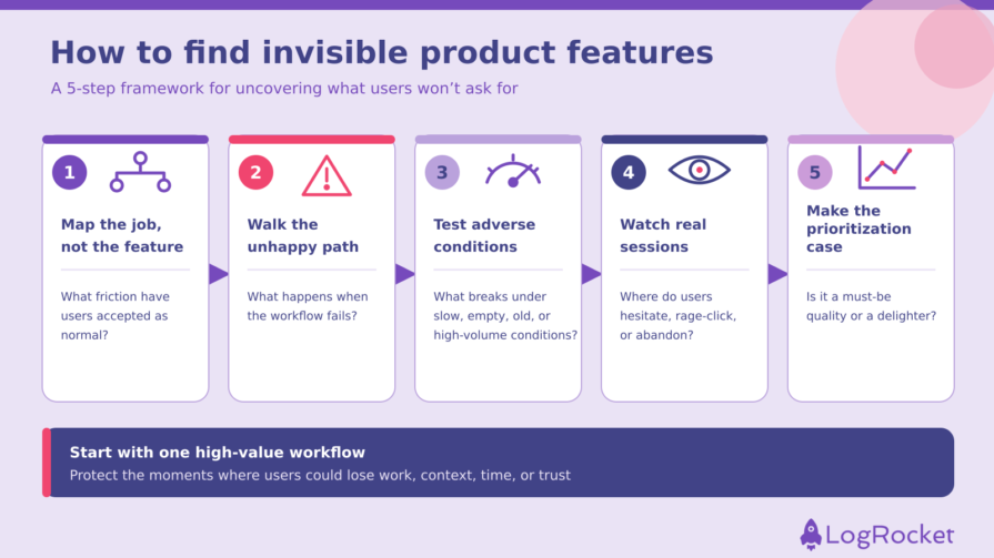
Break the actual workflow into steps. Don’t stop at “the search feature.” Map the full sequence of what the user is trying to accomplish, from intent to outcome.
At each step, ask: What friction have users learned to accept as normal? Teams often miss this because friction that users have adapted to stops getting reported. They have already built the workaround.
Think of the double-save habit or the “Let me copy this before I hit submit” reflex. That silence is exactly where invisible features hide.
Most teams lovingly design the happy path and treat everything else as an edge case. Invisible features often emerge from failure states such as a dropped connection, duplicate submission, concurrent edit, timeout, or declined card.
At every step, ask the blunt question: What happens when this fails? If the only answer is an error toast, you’ve found work to do.
Using your own product on a fast laptop with fiber, as a power user with three years of muscle memory, reveals little about how it behaves under stress. Throttle your connection to 3G, create an empty account, import 1,000 rows, or open the product on the four year old Android phone in your drawer.
A single afternoon of stress testing can uncover gaps that might never appear during clean-environment quality assurance.
Users may not mention small frustrations during an interview because they’ve normalized them or want to be polite. Ask how the experience went, and they may tell you the product was fine.
A session replay can tell a different story. You could see someone rage-click a dead button, hesitate because they can’t tell whether something is loading or broken, or abandon the same step session after session.
The body language is in the data.
Finding these features is half the battle. Getting one shipped instead of a feature with a compelling demo is the other half.
Use a simplified Kano analysis to distinguish must-be qualities, which users expect as a baseline, from delighters that create unexpected value. For must-be features, don’t present them as “a nice-to-have we could do later.” Frame them as table stakes and support the case with the frequency of the failure, the number of users exposed, the severity of the consequences, and how difficult it is to recover.
Delighters require a different case based on differentiation and potential impact. Must-be features, however, should compete on risk rather than excitement. That’s a prioritization case you can win.
To make the process systematic, map the underlying friction as an opportunity in an opportunity solution tree and add the invisible feature as a potential solution. Record the failure it prevents, the user or job it protects, its expected impact, and the signal you’ll use to measure success. This gives invisible work a visible home without mistaking the proposed feature for the underlying opportunity.
None of these are my preaching — they’re patterns I keep encountering across products. Your product probably has invisible features that matter more than half of the ones below, and finding them is the point of the framework above.
Still, it helps to understand the forms these features can take. For each example, I’ll explain what it does, what breaks without it, and a product that handles it well.
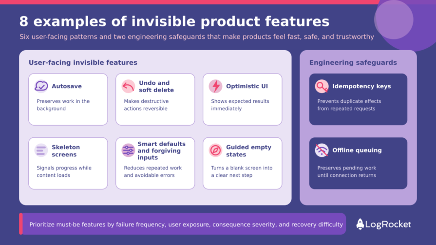
These features appear in the interface, but they work best when users don’t have to think about them.
Autosave continuously saves work in the background, making a manual save control largely unnecessary. Without it, a tab can crash or refresh after 40 minutes of work and erase everything without warning or recovery.
Google Docs, Figma, and Notion have made autosave so familiar that many users now expect saving to happen automatically.
Undo and soft delete route destructive actions through a recovery period instead of making them immediately permanent. Without that protection, every deletion becomes a tiny adrenaline spike because one misclick could destroy important work.
Gmail’s Undo Send can catch a reply-all you regret, while Notion’s trash gives deleted pages a recovery path. Both reflect the broader principle behind reversible actions: Forgiveness is a feature.
An optimistic interface shows the expected result of an action immediately while the request processes in the background. If the request fails, the product should reverse the change and clearly tell the user what happened.
Without this pattern, someone taps a reaction and waits for the server response before anything changes, making the product feel sluggish. In Slack, reactions appear immediately, keeping a small interaction from interrupting the user’s flow. instantly client-side and rolls back silently if the server says no.
A gray placeholder showing the shape of the expected content appears while the actual content loads. The load time might not change, but it can feel shorter because a spinner says, “Wait,” while a skeleton screen signals that the product is responding and shows what is coming.
LinkedIn, Facebook, and YouTube all use skeleton screens to manage perceived wait time. This is one way to design for the wait by giving users immediate evidence of progress.
Smart defaults reduce repeated work by remembering information such as home, work, or shipping addresses. Forgiving inputs accept familiar variations, such as (123) 456-7890, 123-456-7890, or 1234567890, and normalize the information instead of returning an avoidable validation error.
Without them, someone can abandon a checkout because the product rejected a hyphen or expected a different format. Stripe’s prebuilt payment interfaces use features such as autofill and input masking to reduce this friction. Every unnecessary rejection feels like a tiny insult, and those insults add up.
A guided empty state turns a blank screen into a first-run onboarding moment with one obvious next action. Without one, a new user can log in, see an empty dashboard, assume the product is broken, and leave before experiencing its value.
Slack, Asana, and Notion use empty states to show users how to begin. The difference between “This product is empty” and “This product is broken” comes down to how you design the nothing.
These are the deeper technical safeguards. They might not have a visible interface, but they still shape the user experience and require close collaboration among product, design, and engineering.
They can also be harder to copy because a competitor can’t see the implementation or all the failure states it protects against.
An idempotency key allows a server to recognize repeated requests as the same operation and prevent duplicate effects. Without one, a network timeout during a payment can trigger a retry that charges the customer twice or publishes the same post more than once.
There’s no pixel for this and no compelling demo. There’s only the catastrophe that doesn’t happen. Stripe’s API supports idempotency keys for POST requests, while some AWS APIs use client tokens to provide similar protection.
Offline queuing preserves work locally when a connection drops and synchronizes it after the user reconnects. Without it, entering a subway tunnel can erase the past 10 minutes of edits or prevent an action from completing without explaining what happened.
Google Docs allows users to create and edit selected files offline, while many mobile products preserve pending work until the connection returns. These safeguards matter most when users are already stressed and least likely to forgive the product.
That’s only eight examples, and I could name another eight just as easily. The bench is deep, which is part of the prioritization problem.
Generative AI has lowered the cost of reaching feature parity. A competitor can now prototype visible capabilities in days that once required weeks or months.
McKinsey argues that nearly nine out of 10 organizations use AI in at least one business function, with many relying on the same large language models to improve productivity. Access to those tools alone doesn’t create a durable competitive advantage.
If your differentiation depends on one visible feature, you have a head start with an expiration date.
In mature software categories, headline features quickly become table stakes. More durable differentiation often sits in the system surrounding those features: reliability, speed, recovery, thoughtful defaults, and years of edge-case handling.
A competitor might reproduce your primary workflow without understanding the failure states and safeguards your team has refined over time. They’ll copy the row on the comparison grid. They’re less likely to copy everything underneath it.
Not every invisible feature is a moat, either. Autosave, undo, and responsive loading states can all become baseline expectations. The advantage comes from the accumulated system of refinements that makes a product feel consistently fast, safe, and trustworthy.
Stripe illustrates how those refinements can add up. The company reports that businesses migrating from its older Card Element integration to its optimized checkout products saw an average revenue increase of 11.9 percent.
Stripe attributes the performance of its checkout suite to a collection of improvements across brevity, personalization, responsiveness, and extensibility. These include autofill, input masking, relevant payment-method selection, and clear error messages. The reported lift comes from many refinements working together.
You can’t capture that system in a single screenshot, and it’s much harder to reproduce than a checkbox.
Another example comes from Superhuman. It charges $30 per month for its Starter plan in a market that includes free personal Gmail. It differentiates itself through keyboard-first workflows, shortcuts, snippets, and other details intended to reduce the time users spend managing email.
Linear makes a similar bet by describing quality as a business strategy and positioning speed, focus, and design as sources of differentiation. Neither product proves that invisible features create an impenetrable moat, but both show how a company can build its positioning around the quality of the entire experience rather than the length of its feature list.
Visible features still matter. They’re the price of entry, and a product in a new category might genuinely win on one headline capability for a time.
In a mature market where every competitor has a similar comparison grid, but the visible feature isn’t always what keeps users. The more durable advantage often lies in the quality of everything surrounding it.
Skipping invisible features has a cost. So does building them and then allowing them to degrade. The damage tends to appear through three failure modes, and they compound.
Nobody files a ticket that says, “Your autosave got subtly worse last month.” Users may not have the vocabulary to explain what changed, and it isn’t their responsibility to diagnose the problem.
They simply experience the product as a little less trustworthy. Eventually, they might move to a competitor that “just works” without being able to explain why they left.
That’s what makes silent churn so difficult to address. You’re losing users without being able to connect their departure to a clear failure.
Silent churn often begins with the accumulation of micro-disappointments. Each slow response, confusing state, or failed recovery falls below the threshold that would prompt someone to report it.
No single disappointment is fatal. Together, they increase effort, weaken confidence, and make an alternative product feel more attractive.
Invisible features don’t only go unbuilt. They can also regress quietly.
A refactor can break an optimistic update. A dependency change can disrupt offline synchronization. A configuration change can stop retry logic from working as intended.
Because these capabilities attract little attention when they work, teams might not notice the regression for weeks. Users are unlikely to report that a behavior they never consciously noticed has stopped working.
The rule of thumb is simple: If an invisible feature is important enough to protect the user experience, it needs explicit guardrails.
Make the invisible explicit in your product requirements and quality plans. Define how the product should behave when something fails, assign an owner, and establish a signal that will reveal whether the safeguard is still working.
Ask your engineering team to add automated tests that verify saved work survives a refresh, monitor autosave success and latency, and include critical unhappy paths in continuous integration (CI). Otherwise, the first clear warning might be a decline in retention after user trust has already eroded.
So where do you start? Before the next shiny feature ships, choose one high-value workflow and audit its unhappy path. Look for the moments when users could lose work, context, time, or trust.
Then make one invisible safeguard explicit. Define the expected behavior, assign an owner, measure its health, and protect it with testing and monitoring.
Users may never thank you for the feature, but they’ll feel the difference. And competitors will have a much harder time copying what they can’t easily see.
Featured image source: IconScout
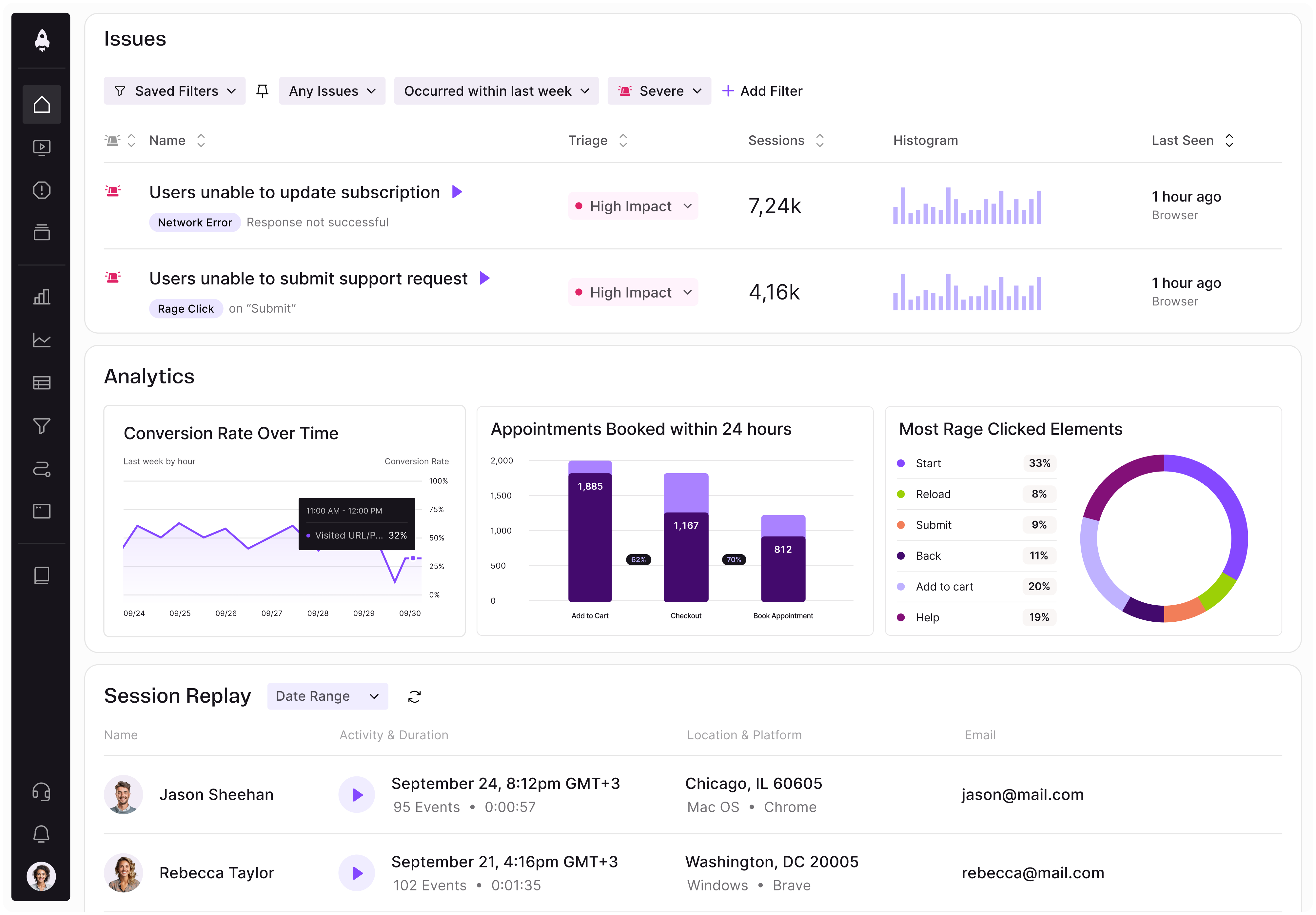
LogRocket identifies friction points in the user experience so you can make informed decisions about product and design changes that must happen to hit your goals.
With LogRocket, you can understand the scope of the issues affecting your product and prioritize the changes that need to be made. LogRocket simplifies workflows by allowing Engineering, Product, UX, and Design teams to work from the same data as you, eliminating any confusion about what needs to be done.
Get your teams on the same page — try LogRocket today.
Learn when prompt-first UX adds friction and how product managers can choose AI interfaces that balance flexibility, structure, and control.
Is the foldable iPhone true product innovation? See how PMs can assess user needs, weigh costs, and separate real value from technical hype.
Explore agentic AI security trade-offs product managers must own before launch, from permissions and human oversight to memory and recovery.
See how to define AI features that deliver user value. Validate needs, assess costs, and set reliability requirements before the team builds.


 Learn more →